Design is an ever-evolving field, with new trends and technologies emerging regularly. However, some fundamental principles remain constant, serving as the foundation for creating compelling, effective designs. In this article, we’ll explore 10 timeless principles of successful design that every creative should know and apply in their work.
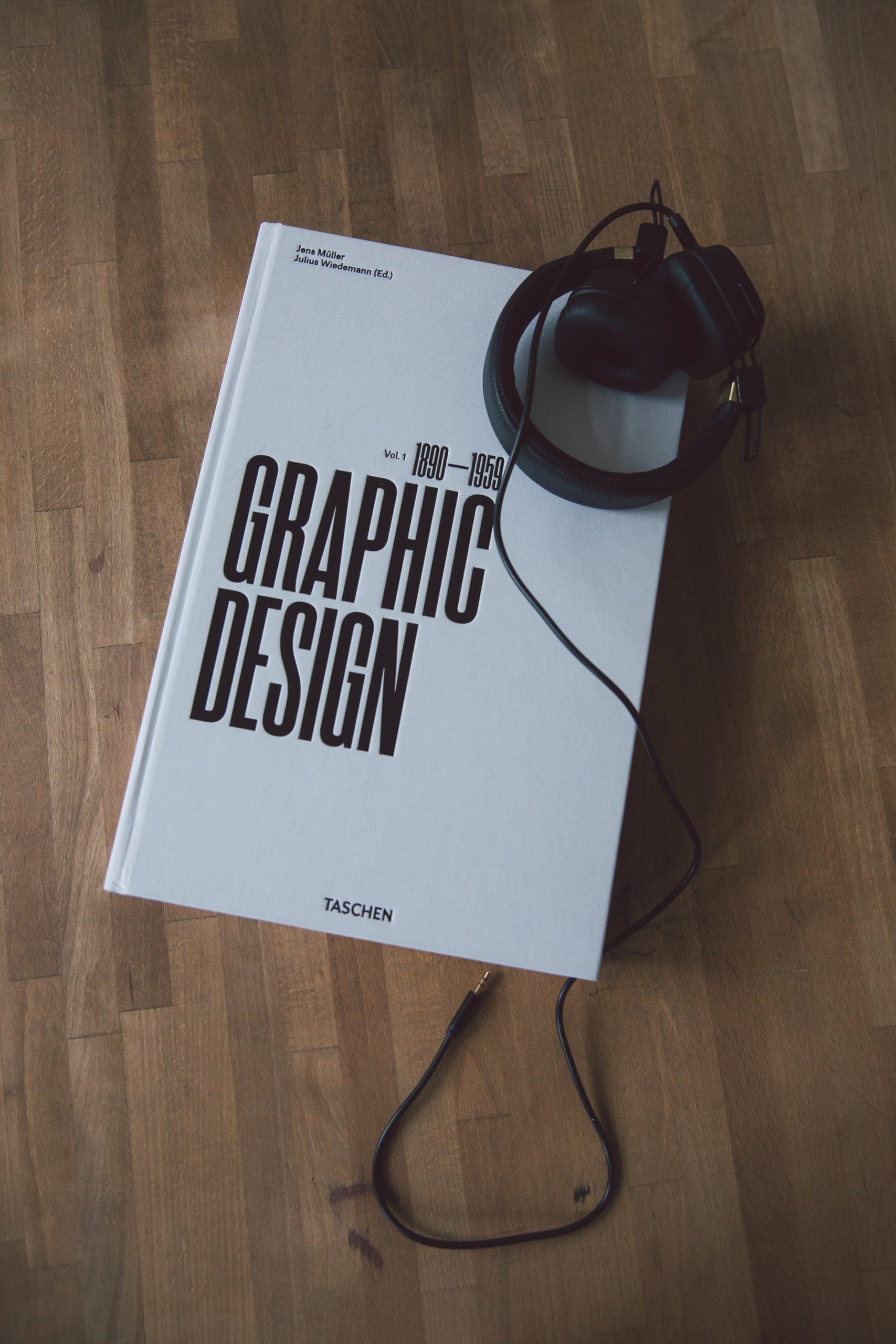
Photo by Tranmautritam
1. Balance

Balance is a crucial principle in design, as it ensures visual stability and harmony. A well-balanced design distributes elements evenly, preventing the composition from appearing too heavy on one side. There are two types of balance: symmetrical and asymmetrical. Symmetrical balance is achieved when elements are mirrored on either side of a central axis, while asymmetrical balance is achieved through the strategic placement of varying elements to create a sense of equilibrium.
Tips for achieving balance
- Use grids to guide the placement of elements.
- Consider the visual weight of different components, such as colors, shapes, and typography.
- Experiment with both symmetrical and asymmetrical layouts.

2. Contrast
Contrast adds interest and emphasis to designs by highlighting differences between elements. This principle can be applied to various aspects of design, including color, size, shape, and typography. By effectively using contrast, you can draw attention to key points and create a visual hierarchy that guides the viewer’s eye.
Tips for utilizing contrast
- Choose contrasting colors from opposite sides of the color wheel.
- Vary font sizes and weights to emphasize headings and subheadings.
- Use different shapes or textures to create points of interest.
3. Alignment

Alignment refers to the arrangement of elements along a common edge or axis, creating a sense of order and cohesion. Proper alignment eliminates visual chaos and ensures that your design appears polished and professional.
Tips for mastering alignment
- Align text and images to a grid or guide.
- Use left, center, or right alignment for text blocks, depending on the design context.
- Be consistent with alignment throughout your design.
4. Repetition
Repetition strengthens the unity and consistency of a design by reusing elements such as colors, shapes, or patterns. This principle helps to establish a visual identity, making your design easily recognizable and memorable.
Tips for incorporating repetition
- Apply a consistent color scheme throughout your design.
- Reuse design elements like icons or patterns in different parts of your composition.
- Use typography consistently, sticking to one or two typefaces.
5. Proximity

Proximity is the principle of grouping related elements together, making it easier for the viewer to understand the relationship between components. By organizing elements according to their relevance, you can create a clear visual hierarchy and improve the overall readability of your design.
Tips for employing proximity
- Group related elements, such as text and images, within a defined area.
- Use white space to separate unrelated items.
- Maintain consistent spacing between elements to avoid clutter.
6. White Space

White space, also known as negative space, refers to the empty areas around design elements. It is essential for creating breathing room and ensuring that your design doesn’t feel cluttered or overwhelming.
Tips for effectively using white space
- Avoid filling every inch of your design with content or graphics.
- Use white space strategically to guide the viewer’s eye and emphasize key elements.
- Balance white space with visual elements to create a harmonious composition.
7. Hierarchy
Hierarchy is the principle of organizing elements according to their importance, guiding the viewer’s eye through the design. This allows the audience to easily understand the order in which they should consume the content. A well-designed hierarchy helps create a clear visual structure and improves the overall user experience.
Tips for establishing hierarchy
- Use size, color, and contrast to differentiate between headings, subheadings, and body text.
- Arrange elements in a logical order that reflects their significance.
- Employ white space to separate different levels of hierarchy.
8. Scale and Proportion

Scale and proportion refer to the relative size and ratio of elements within a design. Properly scaled and proportioned elements contribute to a balanced and harmonious composition. Additionally, the strategic use of scale can create visual interest and emphasize important elements.
Tips for mastering scale and proportion
- Maintain a consistent scale for similar elements, such as buttons or icons.
- Use proportion to create a sense of depth and realism in your design.
- Play with scale to draw attention to key components or create a unique visual effect.
9. Unity
Unity is the principle of ensuring that all elements in a design work together cohesively, creating a sense of harmony and consistency. A unified design feels like a single, coherent piece, with each element contributing to the overall message.
Tips for achieving unity
- Stick to a consistent color palette and typography throughout your design.
- Use repetition and alignment to create a sense of cohesion.
- Ensure that all elements serve a purpose and contribute to the overall concept.
10. Functionality
Above all, successful design must be functional, effectively communicating the intended message and serving its purpose. Aesthetics are important, but if a design fails to meet its objectives, it is not truly successful.

Tips for ensuring functionality
- Prioritize clarity and legibility in your designs.
- Test your design on various devices and screen sizes to ensure usability.
- Continuously gather feedback from users and make adjustments as needed.
Conclusion
By understanding and applying these 10 timeless principles of successful design, creatives can create visually appealing and effective work that stands the test of time. Regardless of the medium or style, these fundamentals will serve as the foundation for any successful design project. Keep them in mind as you embark on your next creative endeavor and watch your designs flourish.
