
Re-Wineis the epitome of re-purposing, a creative solution for our trashy resources. Built-in interlocking joints and partially biodegradable materials, making trash bottles chic, practical, and planet-friendly. The reusable carrying case transforms into an energy-efficient LED desk lamp, using your empty wine bottle as a stand. Indeed, after the wine has been enjoyed, the innovative design allows the case to be reused in various ways. Made of 100% recycled materials, this chic wine case reduces the amount of waste in landfills. (more…)
Blog
-

Perfect Backdrop For Paintings and Photos
White walls are the perfect backdrop for various paintings and photographs, and windows framed by delicate white curtains become perspective that add color. Small accessories must always be chosen in terms of texture and chromatic, especially when you want to combine objects with totally different design. For example, furniture legs, armchairs, furniture, lamp rods, picture frames and photo gallery curtains, decorative objects are here all chrome. (more…)
-
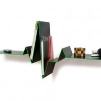
12 Creative Minimalist Bookshelf Designs
When it comes to how we display our books, bookshelves always draws attention due to designers and architects’ inventiveness for the past few years. For today we decided to show you that modern bookshleves with minimalistic design have a lot more to offer than simply store your books. This is why I gathered 12 incredible creative bookshelves that are inspiring and could radically transform your living room. All the bookcases in the photos below feature vivid colors, simplified forms, no details and different geometric shapes which highlights also functionality and good taste. The meanings that wanted to be transmitted through ingeniously combinations of functions are particularly interesting to observe. I invite you to have a look at this gallery and let me know what detail you find interesting. (more…)
-

Unique and Inspiring Wall Clocks for Your Home
Do you want a change in your home? You don’t have to change your furniture or wall color, you simply accessorized your rooms with interesting objects, which will attract unusual attention to the room. I found some interesting pictures that I want to present them as inspiration for your own homes or apartments. (more…)
-

Stunning Contemporary Interior Design at Phantom of the Opera
„A restaurant worthy of my Opera,” was one of architect Charles Garnier’ wish when designed the masterpiece that is the famous Palais Garnier Opera House from France. The Phantom restaurant is located at the eastern entrance in the Opéra Garnier, more commonly known as the Paris Opéra, a 1,600-seat opera house on the Place de l’Opéra in Paris, which was the primary home of the Paris Opera from 1875 until 1989. (more…)
-
9 Basic Styles in Interior Design
At the start of any interior design project, we wonder in what style should create our interior home in order to feel good in that environment. While I emphasize the main characteristics of each one of them, I will try to join some interiors or products that illustrate each style separately. If someone likes classic lines, you can’t suggest something modern because she believes that what is proposed isn’t represented for her taste, devoid of atmosphere, simple, and will not transmit anything.
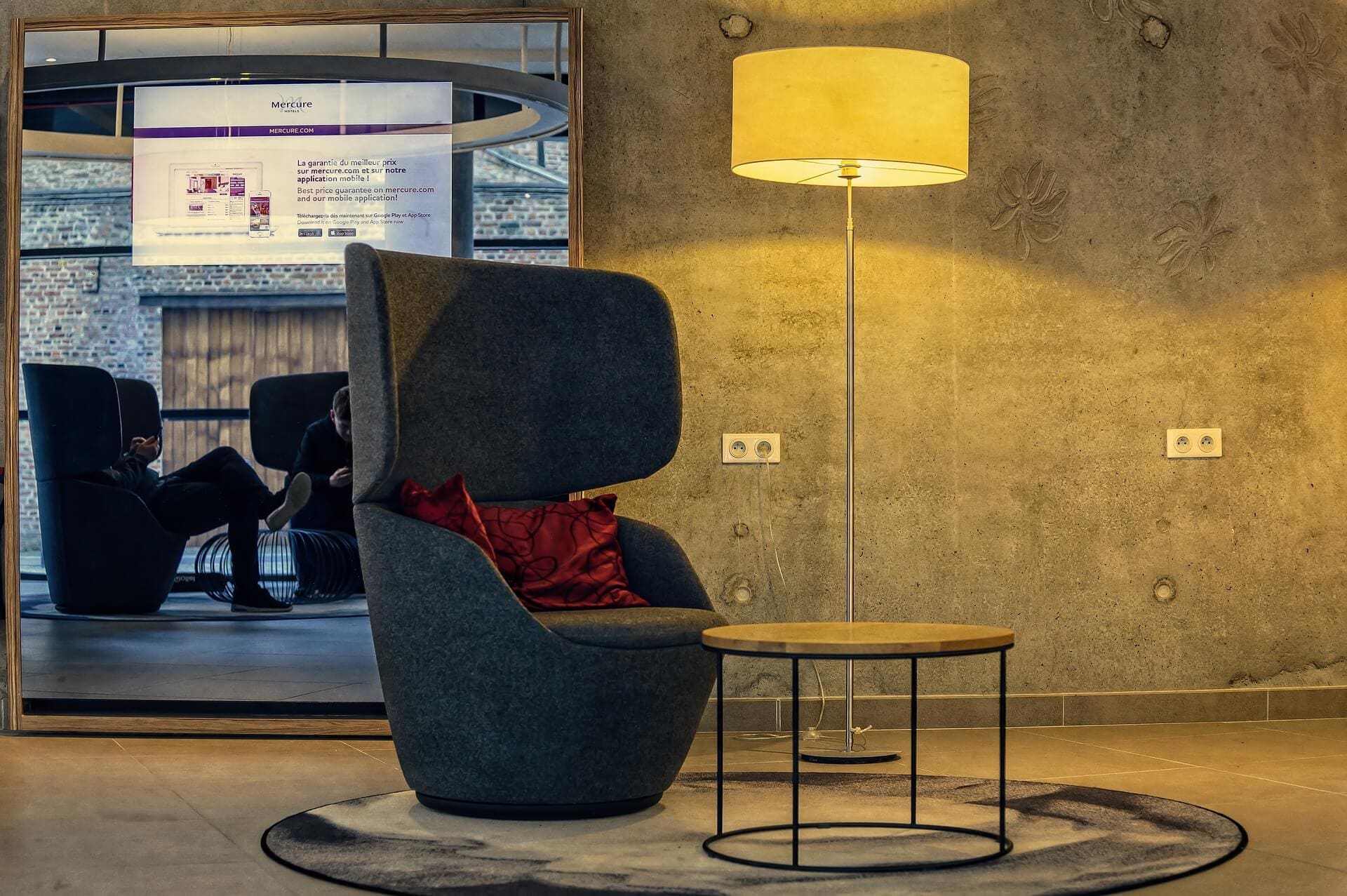
1. Modern Minimalist Style
This style is a form of extreme accuracy, nothing is too much, without heavy backgrounds. The emphasis is on simplicity, the colors may be dull or bright, in any case, flashy colors. Pieces are either geometric shapes – square, rectangular, round, but the surfaces are clean, no scenery, no details. Minimalist modern style by its name illustrates the simplified forms.
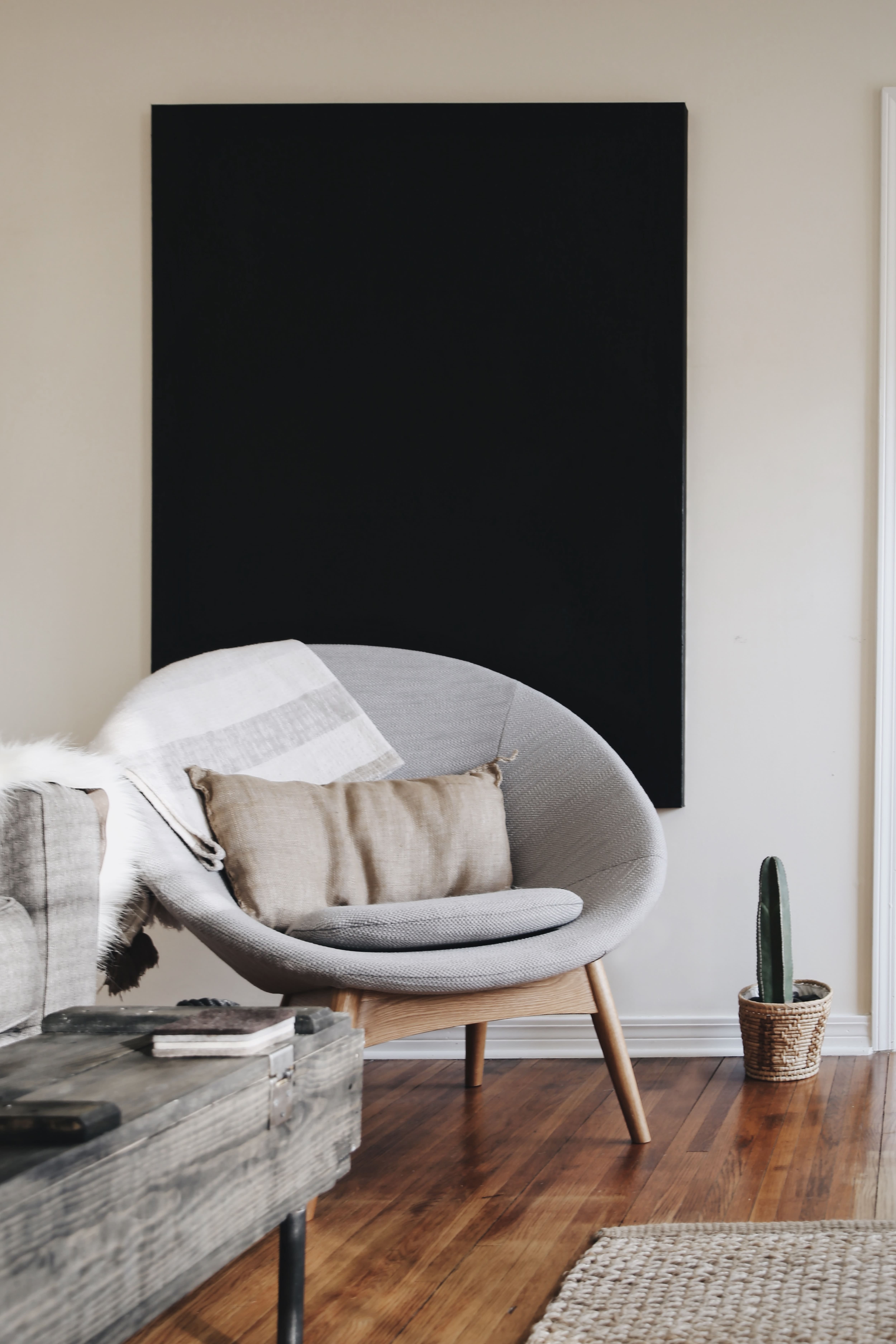
Photo by avery klein on Unsplash 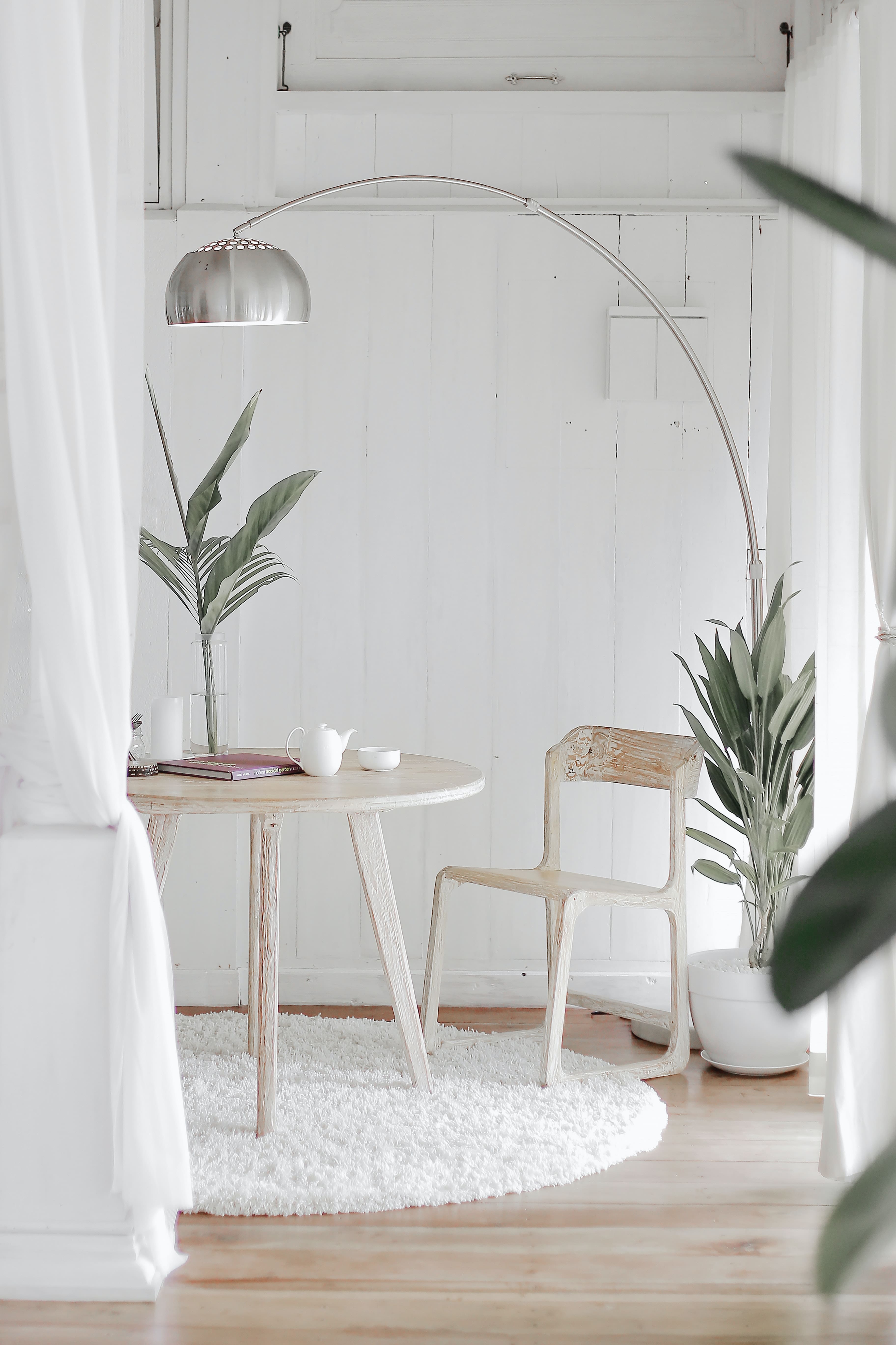
Photo by Hutomo Abrianto on Unsplash 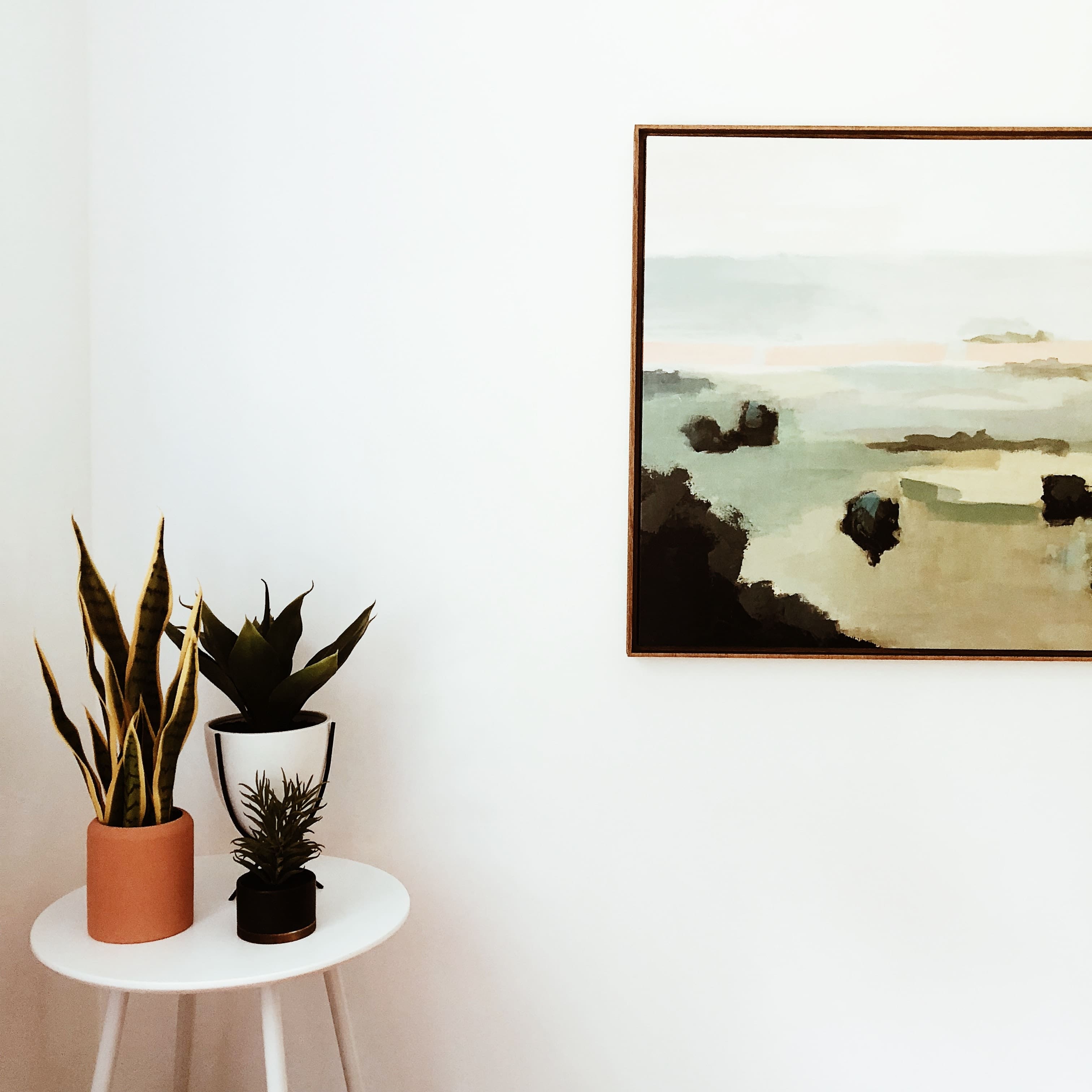
Photo by Hannah Busing on Unsplash 
Photo by Sarah Dorweiler on Unsplash 
Photo by Laura Davidson on Unsplash 2. Classic Style
It is a refined style, developed, rich in details, which are found both in the structure of furniture, lighting, etc. as well as in sets, prints. The furniture is the “art” type, carved or inlaid details and apply. Decorated with floral elements, vegetable, various leitmotif or scenes drawn from legends.
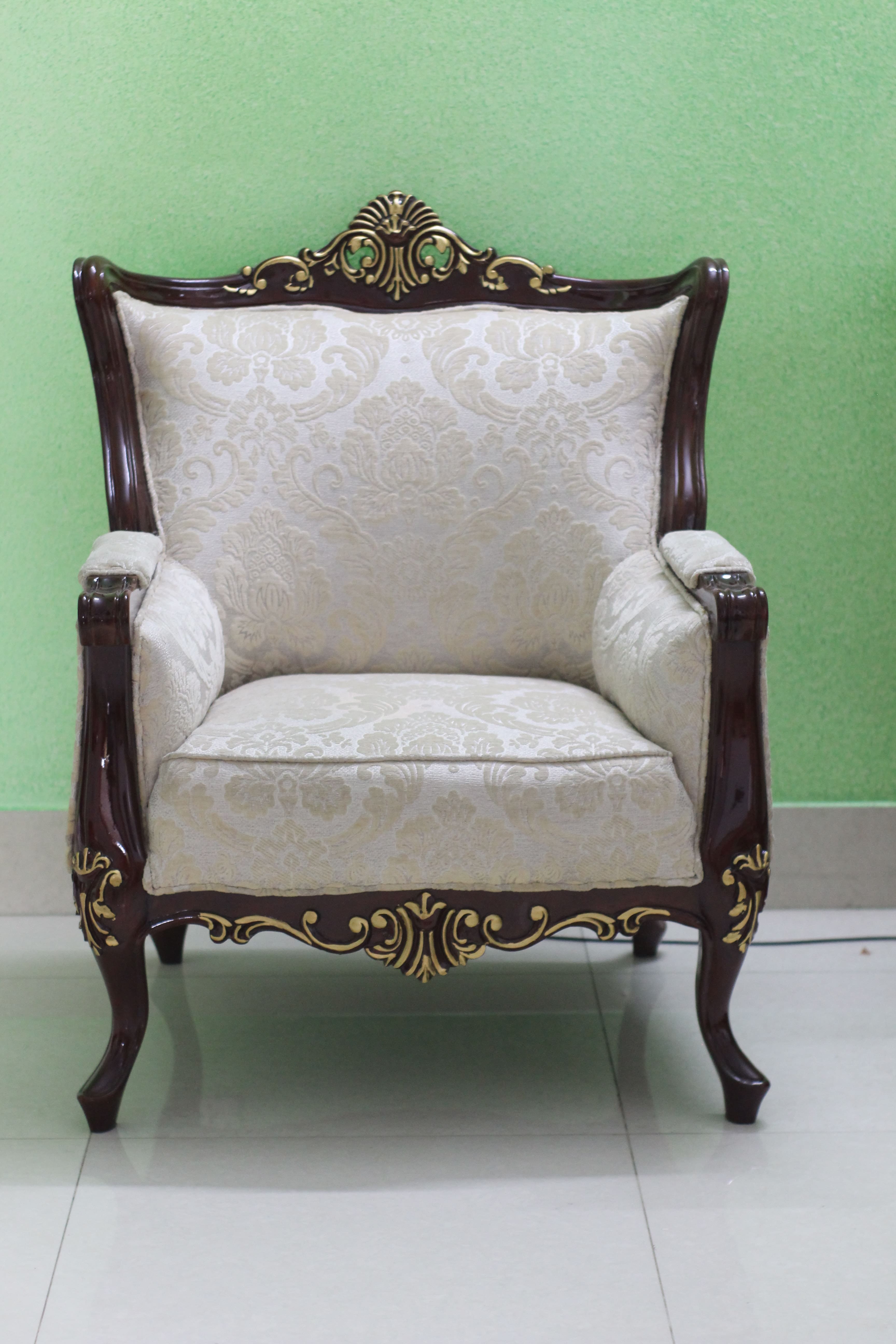
Photo by Monirul Islam Shakil on Unsplash 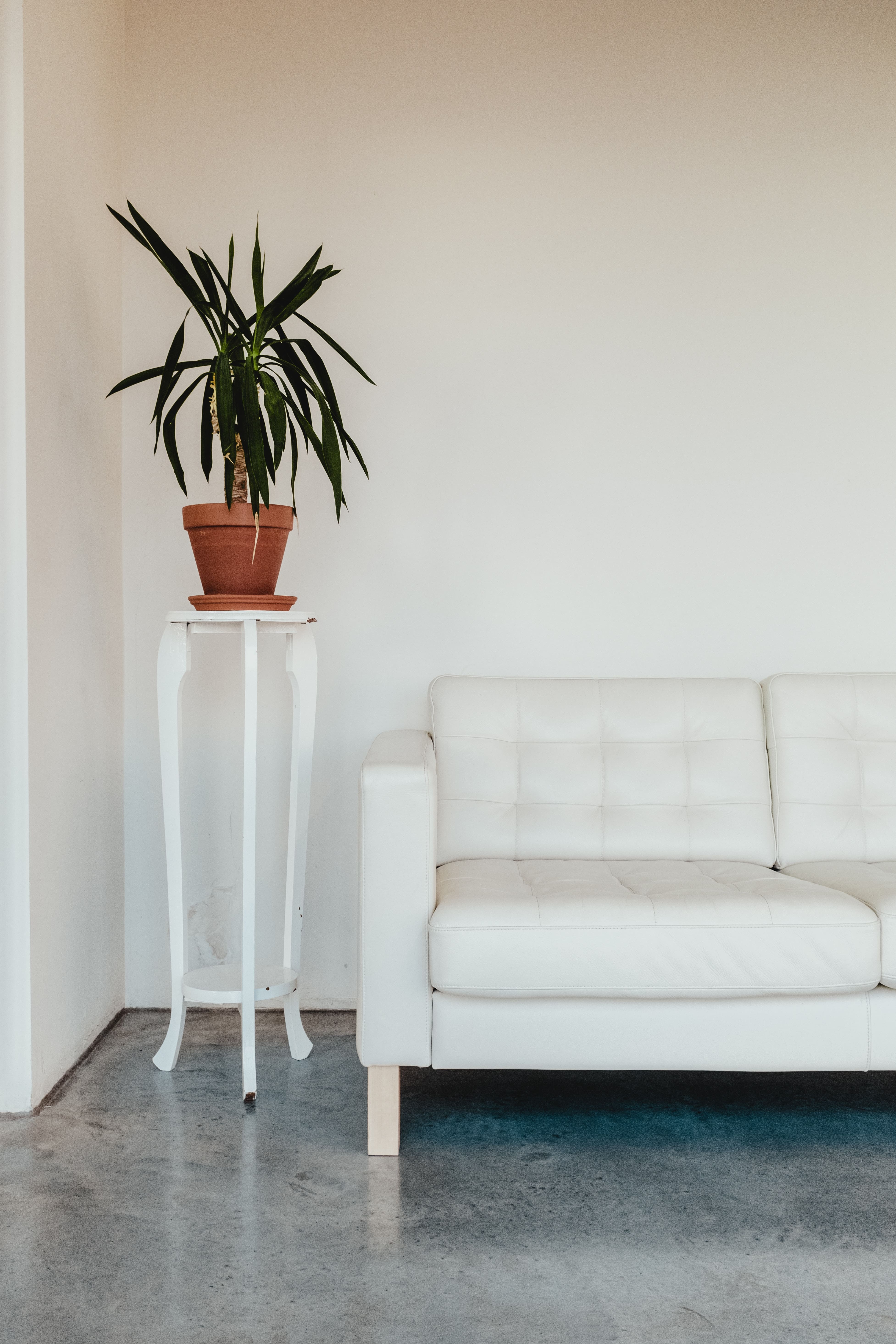
Photo by Bernard Hermant on Unsplash 
Photo by reisetopia on Unsplash 3. Rustic Style
Style structure is a crude, rough details, structure elements of furniture / lighting can be in tree trunks, logs, branches, jute. Style is found in mountain vacation homes, rural.
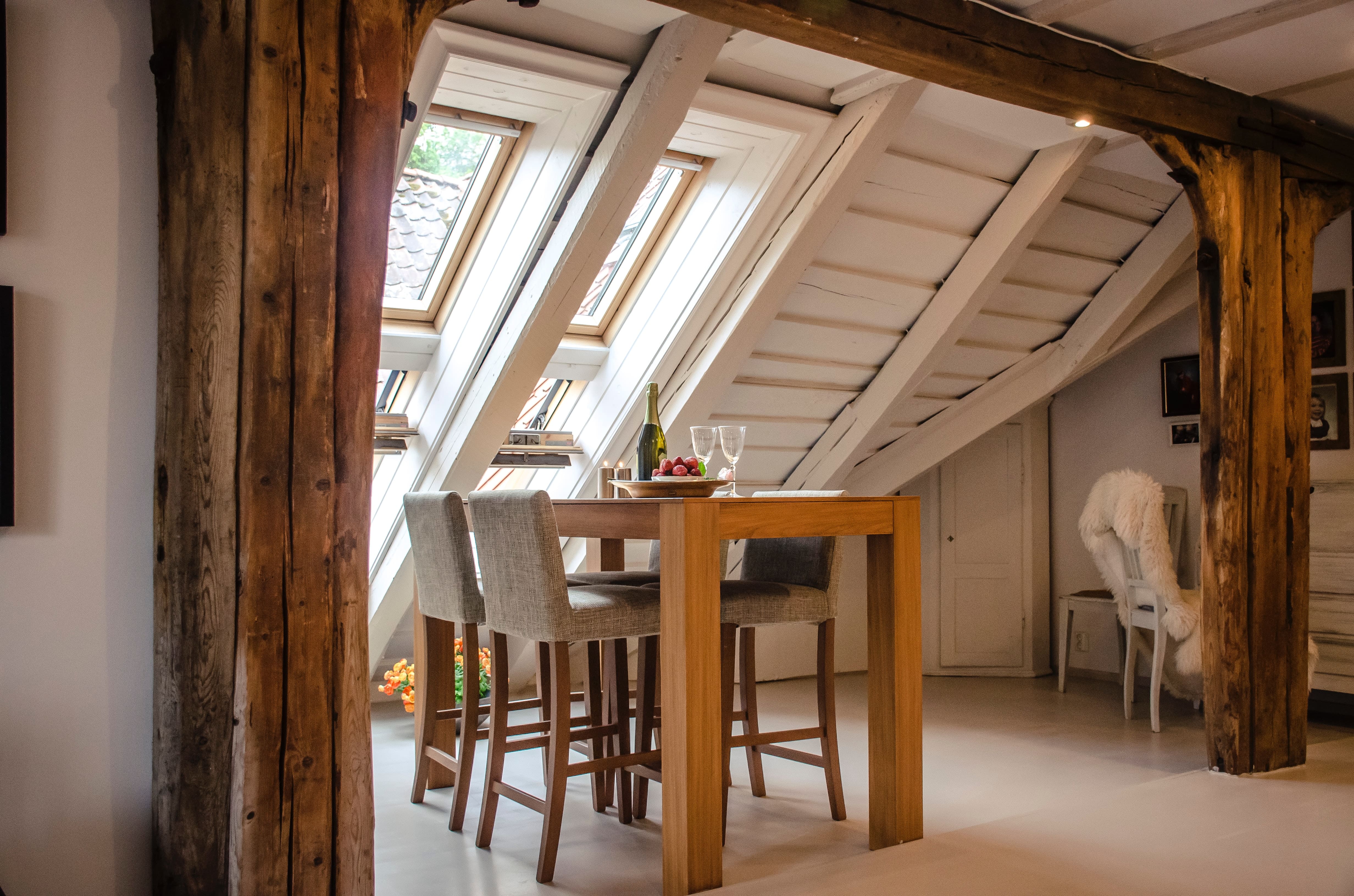
Photo by Alisha Hieb on Unsplash 
Photo by Joshua Ness on Unsplash 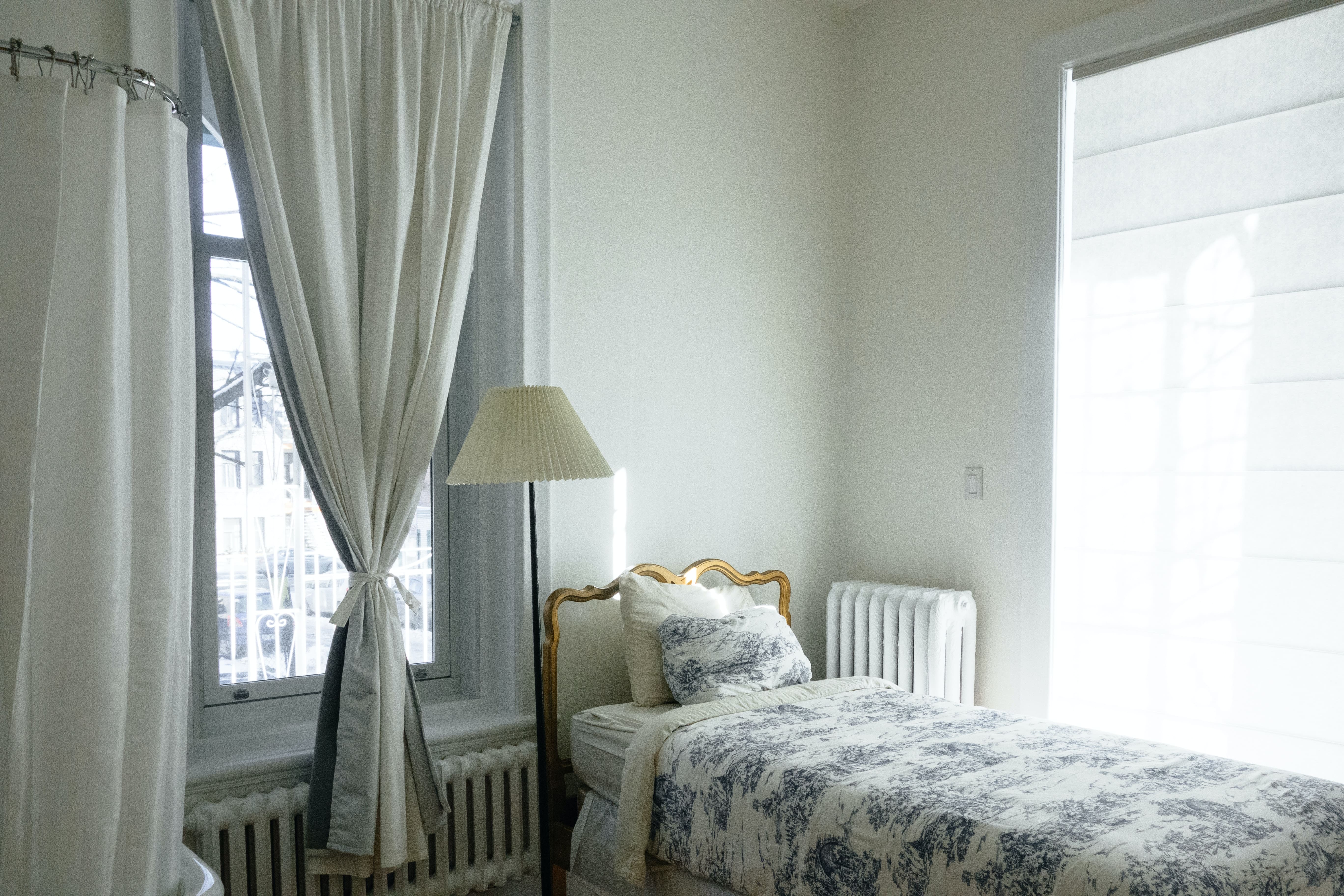
Photo by Ali Inay on Unsplash 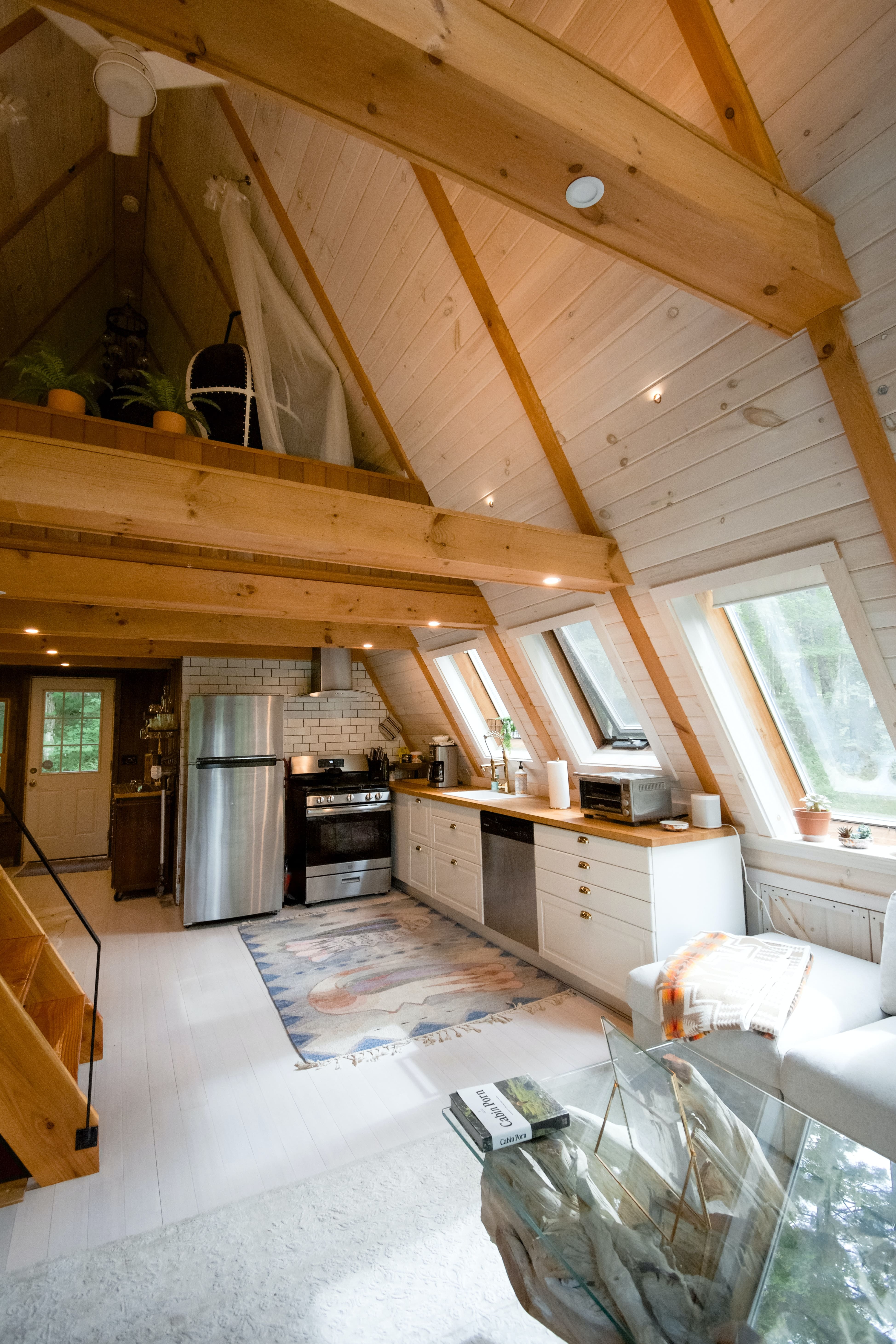
Photo by Andrea Davis on Unsplash 4. Classic Reinterpreted Style
It is a refined style, elegant, where classic forms details are found in a new approach. The forms preserves the structure of old forms or parts in general updating them sometimes, or some elements of a furniture style combined with modern elements, creating that fusion between old and new. Finishing parts are in a new approach-painted and varnished, with different and innovative colors, surface gold, silver, finished with patina or serigraphic.
Photo by Inside Weather on Unsplash 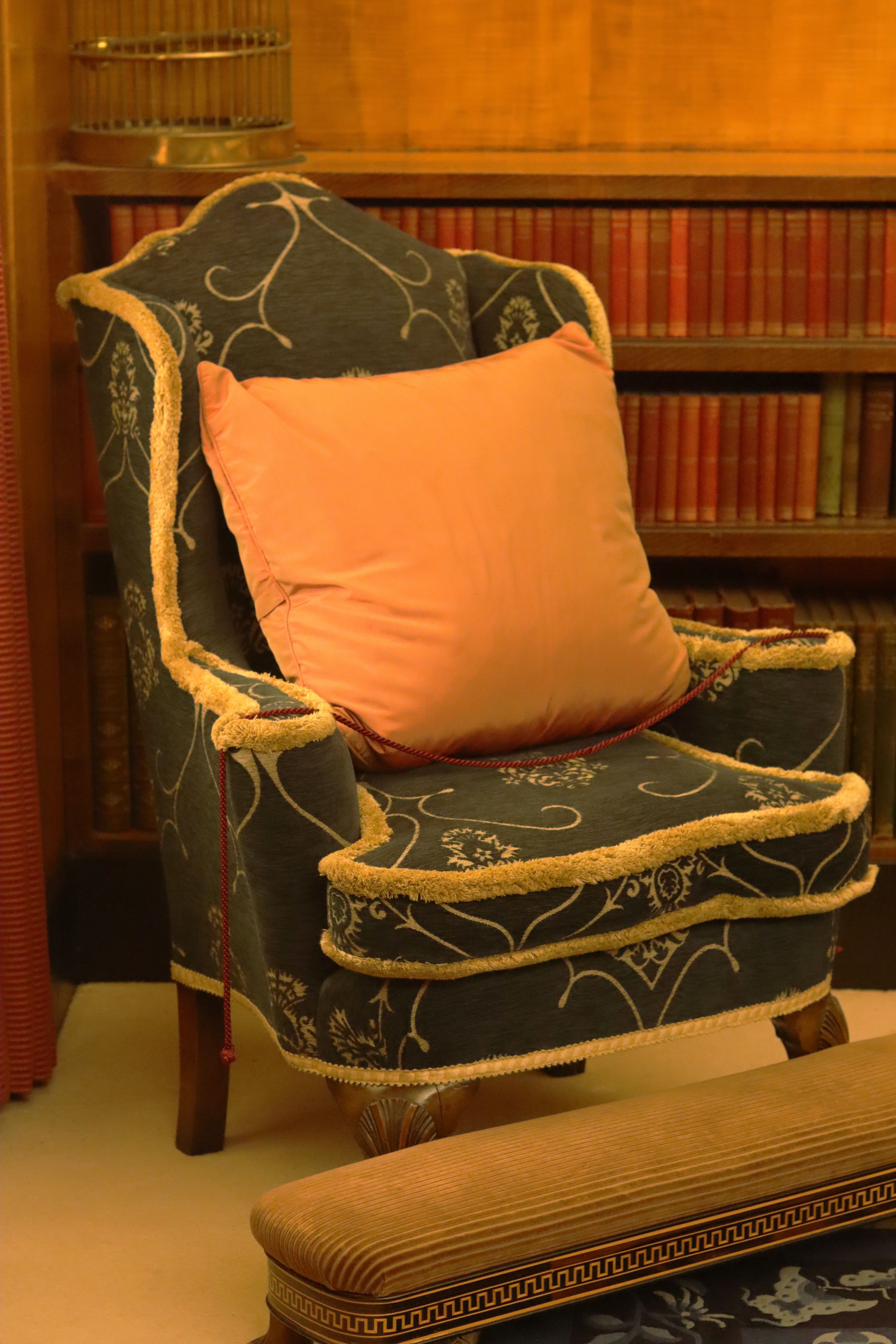
Photo by Call Me Fred on Unsplash 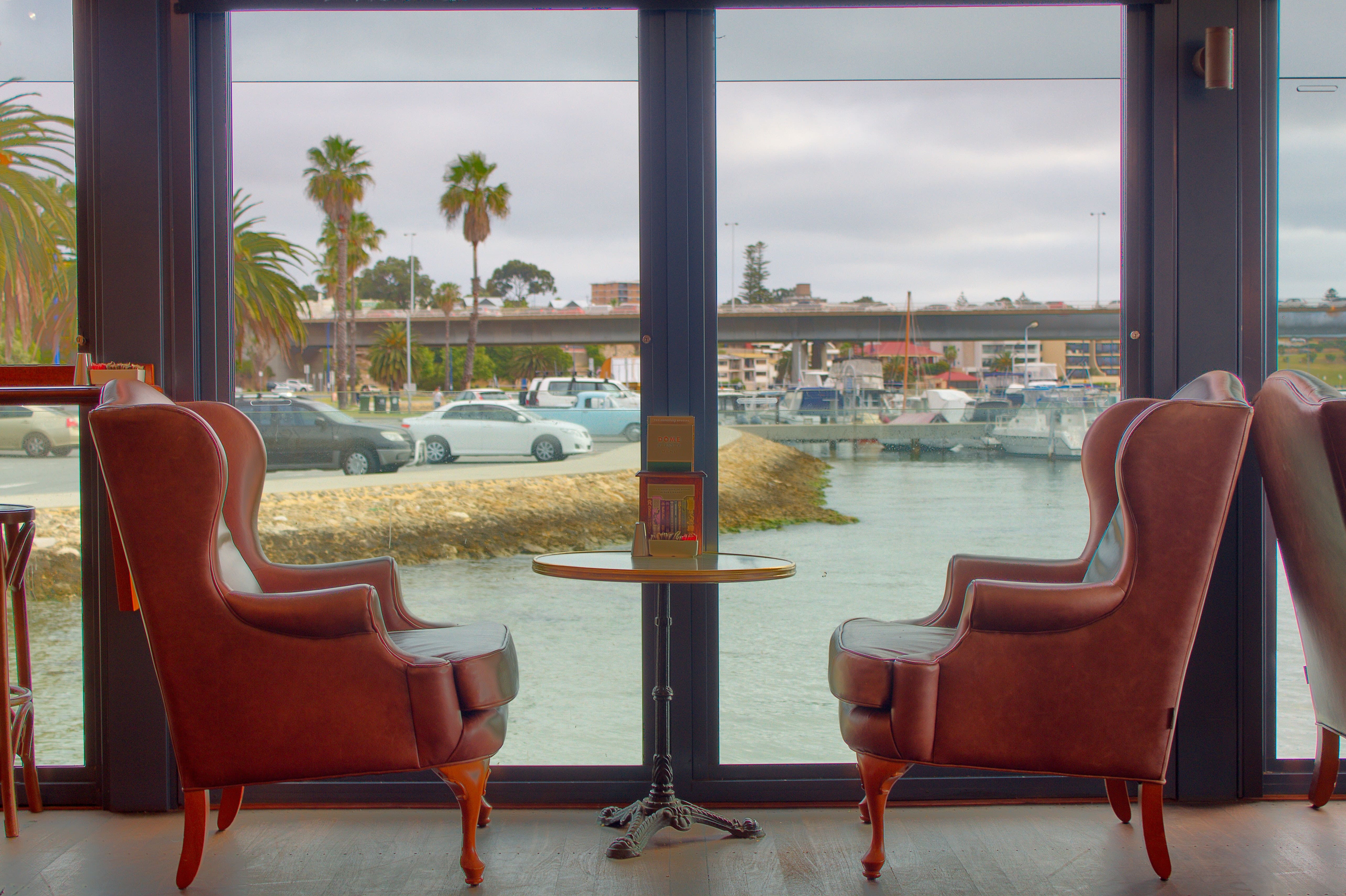
Photo by Steve Doig on Unsplash 
Photo by Gabriela Vinca on Unsplash 5. Retro Style
It is the style of ’50s, ’60s or ’70s. In that period it is anticipated design pieces to come. The songs have a playful approach, funny structure, their form and the play of colors and prints that we find in each piece. We find for the first time new approaches to design forms, yet they remain air-old began the design lines. Prints with geometric shapes, lines, plaid or printed with illustrations belonging to the Pop Art style.
Photo by Julian Hochgesang on Unsplash 
Photo by DESIGNECOLOGIST on Unsplash 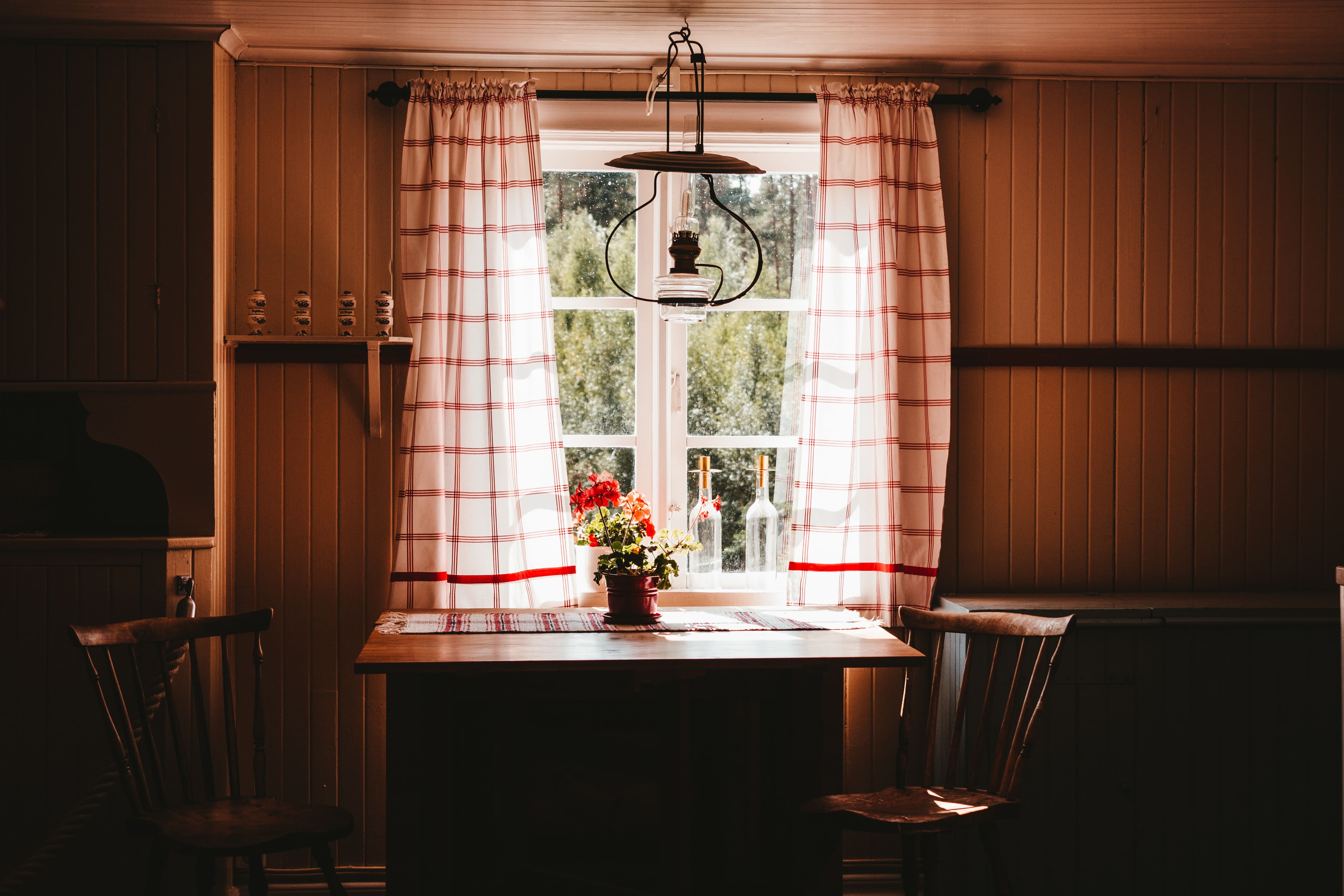
Photo by Julian Hochgesang on Unsplash 
Image by Free-Photos from Pixabay 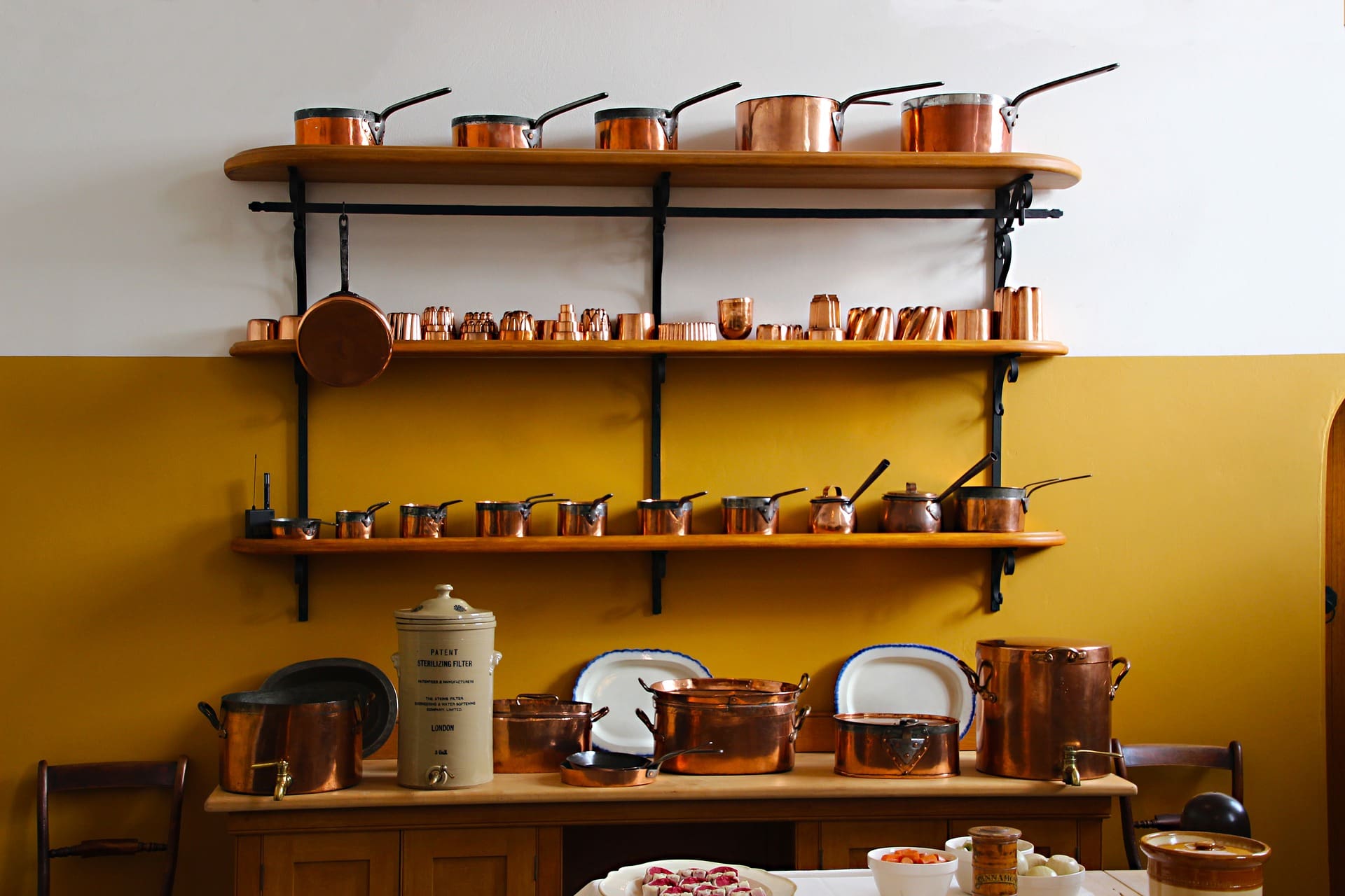
Image by Dean Moriarty from Pixabay 6. Maverick Style
It is part of modern style, his approach is very inventive, unusual, and unconventional. Young, explosive, inventive not respect the rules. The structure can be obtained by joining pieces, overlapping volumes and volumes twisting colors can be randomly chosen even for the same room, seemingly nothing happens, only part of the eccentricity of this style.
Image by ErikaWittlieb from Pixabay 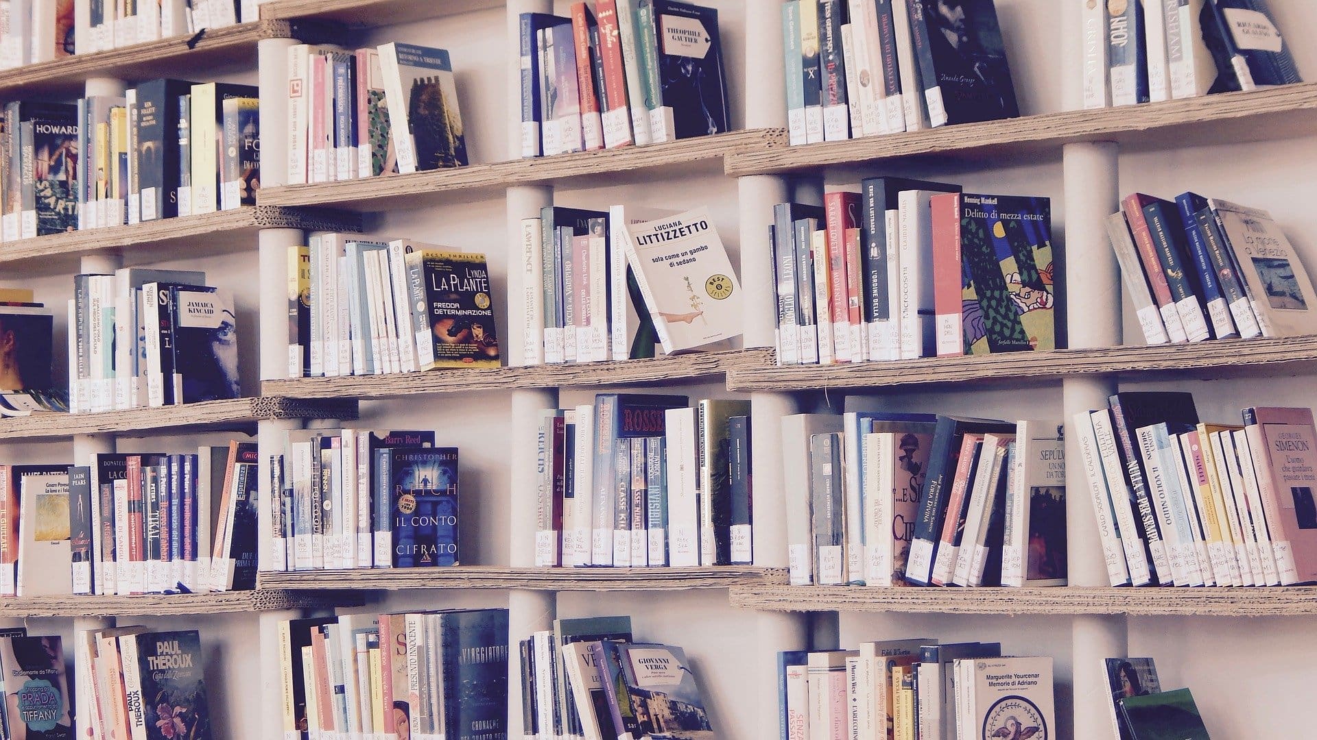
Image by Marisa Sias from Pixabay 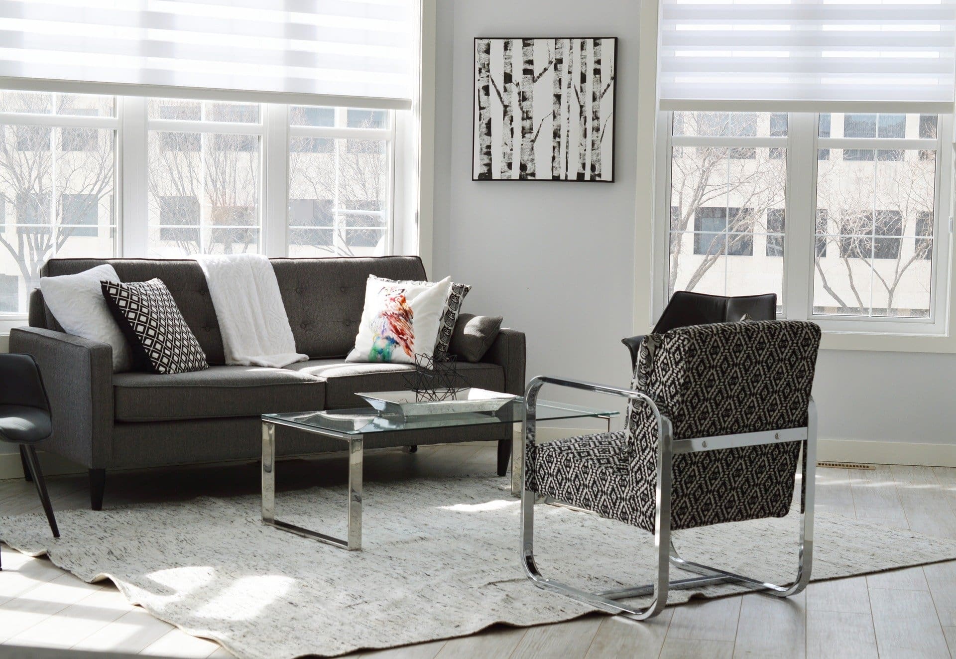
Image by ErikaWittlieb from Pixabay 7. Contemporary Style
The style is contemporary-modern style but maintains a hot line through selected finishes and color range used. The songs do not seem very new, modern, cool. Colors are balanced, warm, bright tones and pastel can be out of the question when it comes to these style. Finishes warm, wood-veneer, solid wood doors with frames or appearance to look more polished and panels upholstered with leather or sometimes, may be characteristic of this style. Textile materials, velvet, plush, upholstered pieces ptr skin are often used in shaping the ambience characteristic of this style. Printed plates, vegetable or floral color stains can not be used to amaze complete certain parts of decorated cushions, carpets, etc. Scandinavian modern style can be defined as a contemporary style.

Image by Pexels from Pixabay 
Image by edvaldocostacordeiro from Pixabay 
Image by ErikaWittlieb from Pixabay 8. Hightech Style
Image by Mario Vogelsteller from Pixabay Hightech style is an innovative modern style, the emphasis being on furniture structure where every detail of combination is not random and it is part of that structure. Screws, rivets, wheels apparent booms, rough metal finishes, appearances bulbs are specific to this style. The finishes used are often of metal, glass and plastic and wood in small proportions and for parts we find fabric-upholstered as simple as we can, leather. The colors are often dull-gray, white, small black scale.
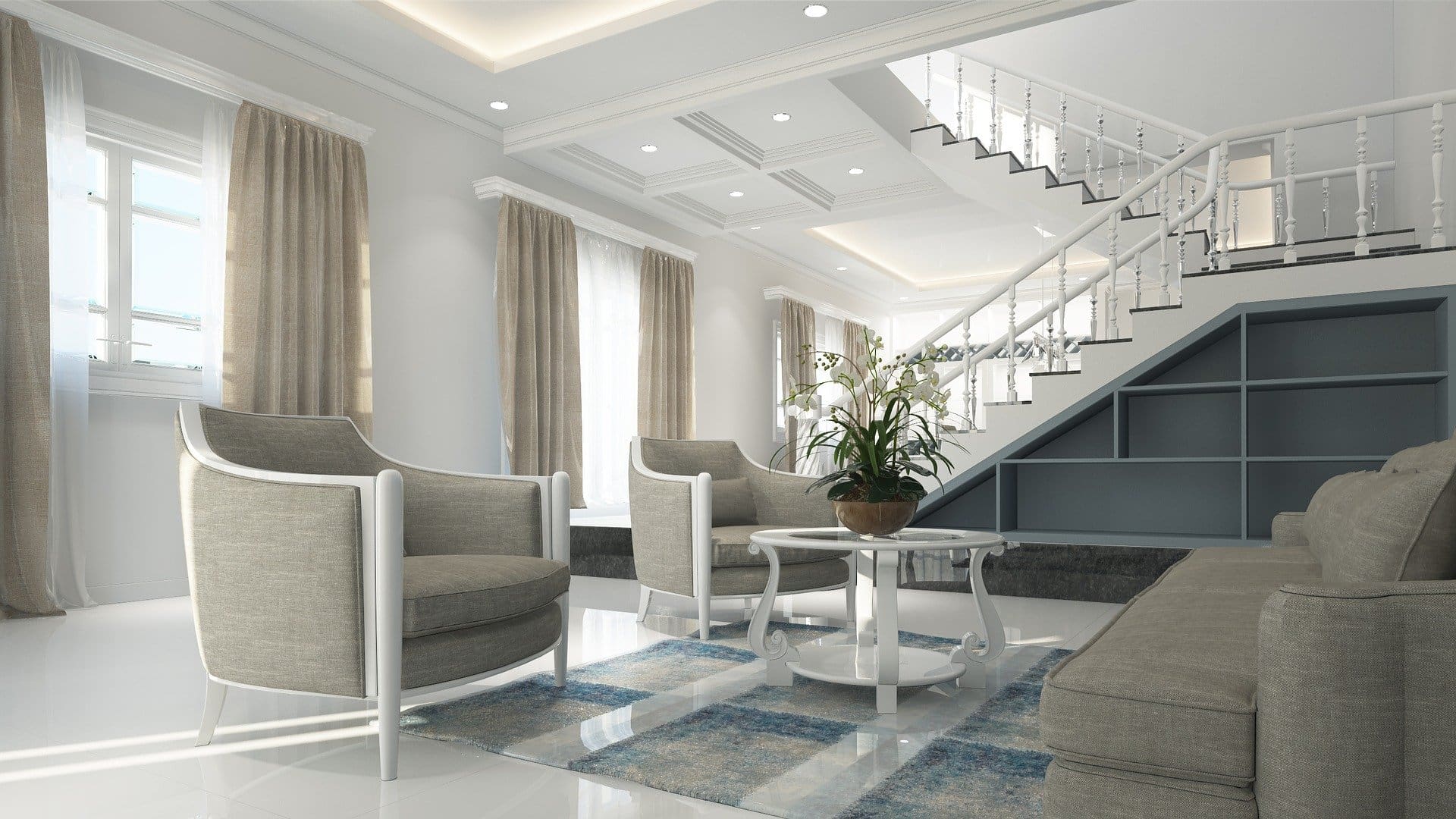
Image by khiem tran from Pixabay 
Photo by form PxHere 
Image by pixaoppa from Pixabay 
Image by Tumisu from Pixabay 
Photo by form PxHere 9. Elegant Country Style
Rural style is an elegant furniture style with influences from English, French, or Scandinavian classic pure style can be called rural chic. Furniture finishes are nice, bright colors-white, pastel colors, and forms were taking over traditional furniture but not abundant decorations. Surfaces are painted or sometimes have a slight patina.
Probably the most common variant of the elegant country style is the Cape Code style. Houses designed in the Cape Code style will include pastel colors, distressed wood features, wood-paneled walls, lots of windows, and what the folks at AnyWeather Roofing call “dormers,” which are windows that protrude from the roof of the house. Cape Cod-style homes are highly sought after for their cozy look and feel.
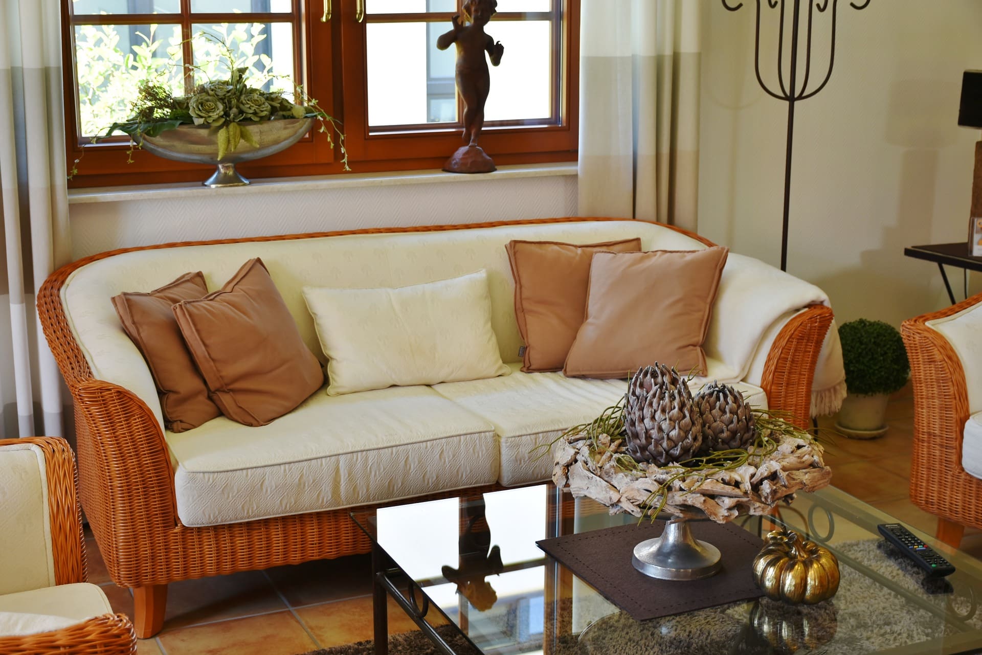
Image by RitaE from Pixabay 
Image by RitaE from Pixabay 
Image by Dagny Walter from Pixabay 
Image by 2020673 from Pixabay 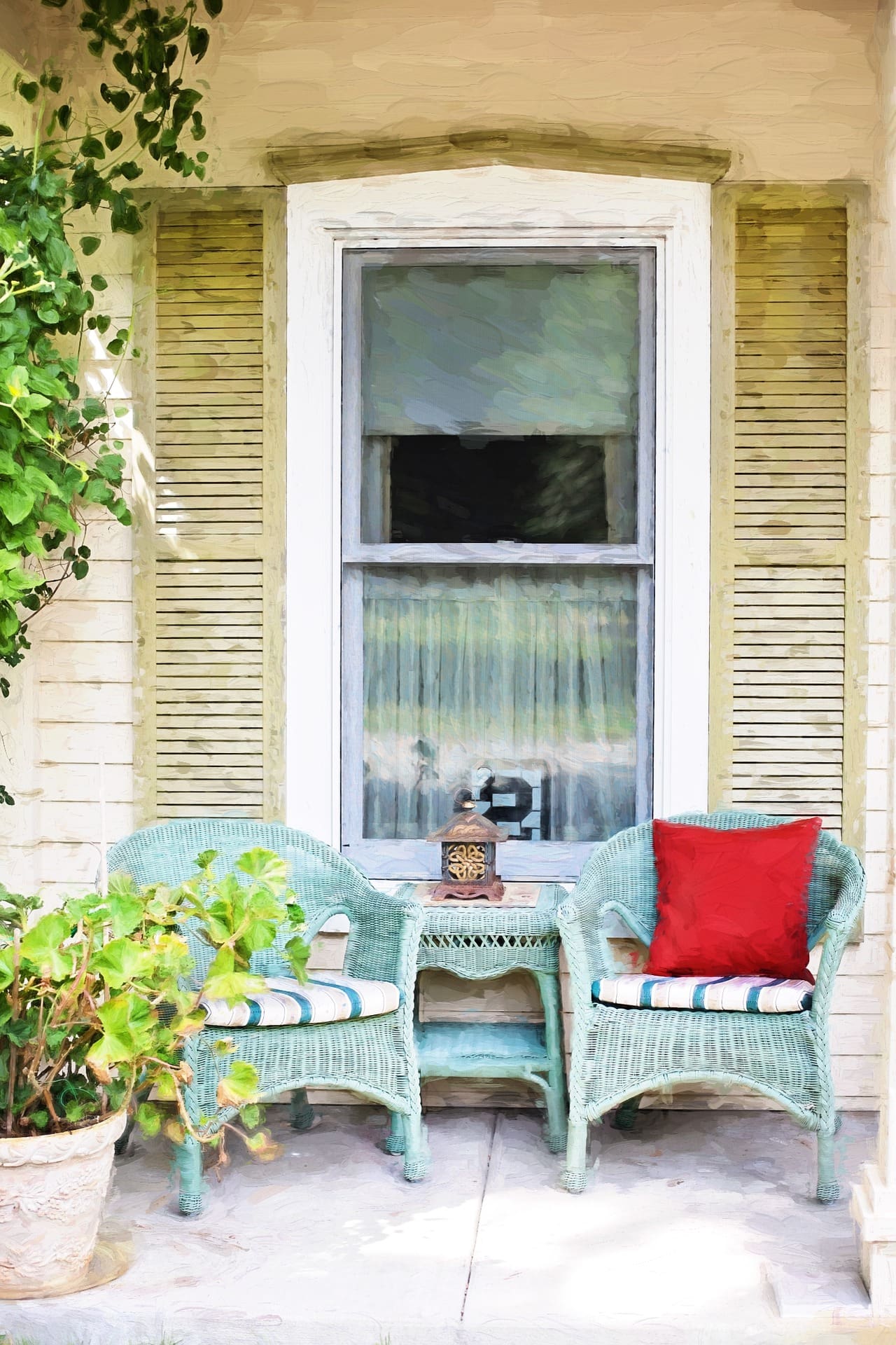
Image by Jill Wellington from Pixabay Note: All images are linked to their source.
-
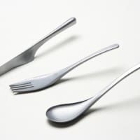
8 Beautiful Cutlery Design
It is very important what kind of cutlery you will use when you have guests at the table and for impressing them, you have to use the best quality of cutlery. The aspect of the table matters more because it is the first thing that gets out when guests sit at the table. Cutlery are the utensils used for serving food; most commonly cutlery used are: knife, spoon, fork and spoon. (more…)
-

The Psychology of Color for Interior Design
Colors aren’t randomly used when we talk about interior design colors. At first sight, we may think that it’s very easy to choose colors for a living room for example, or for our entire home because we choose what we love and what we would like to have.
Photo by R ARCHITECTURE on Unsplash
In many cases, the results are very good, but in most of the cases, if you don’t know anything about colors and what combinations would look great for your home style, the results might have nothing in common with a professional appearance. If you may decide to buy a Puffy or Purple mattress or blinds in worcester, then you need to keep in mind that the Psychology of Color is very important for your family comfort.
Color psychology is what interior designers are live for, says a senior editor at Health Nerdy, Bella Hardy. Psychology of color can influence people’s purchasing decisions
Bathroom style and matching toilet color also important, and it indicates your taste.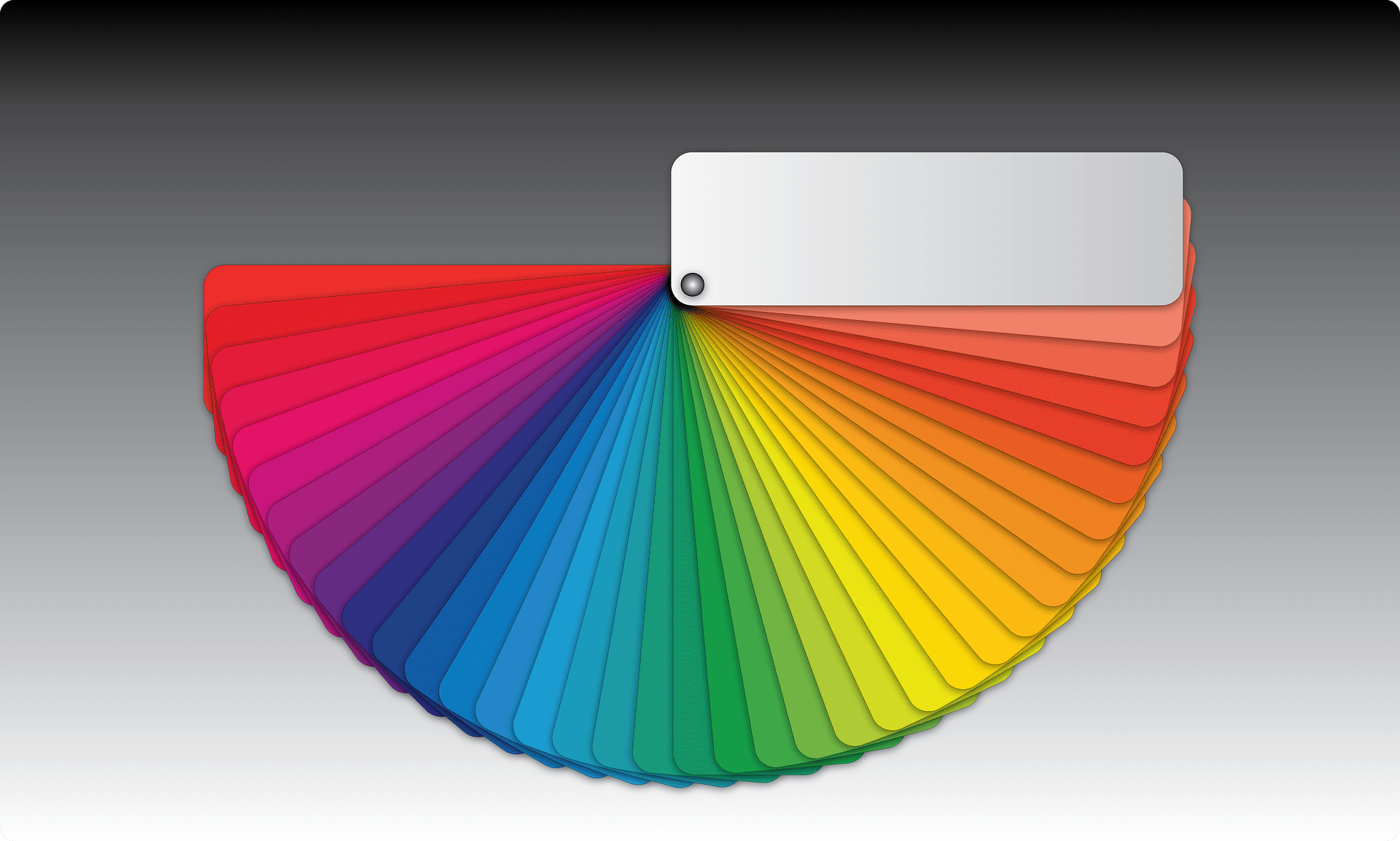
Image by Giuseppe Canale from Pixabay In most of the cases, those who are interior designers have solid knowledge about colors, know very well which category belong certain color, what colors are suitable for combinations, and most of all which are the psychological effects of one color or another and what fits better in order to obtain the desired result.
When decorating your sewing room, be sure to take into account the overall color palette of the room – minimal whites with subtle pops of color will be sure to fit in well with your sewing machine and fabrics.
I’ve always liked the idea that by adding a certain color or a combination of colors, you can simply change your mood, your room by creating an optical illusion and making it smaller or bigger, and so on. So, first, we have to know that we have three primary colors: yellow, red and blue. When we combine these primary colors together, we get the secondary colors: yellow and blue is green, yellow and red is orange, blue and red is purple. Mixing primary colors with secondary ones we get different color shades which are called tertiary colors. Complementary colors are opposite each other in the graph. Each pair of colors compliment each other and produce a neutral color.
The combination of black and white color such as Black and white wall art creates a feeling of calm and peace in your home.
Each person perceives colors as cool or warm. If you see the color chart, usually the cool colors are on the blue and green colors side and the warm colors are on the yellow and orange side. Colors give us a certain state of mind, can energize us, can cheer us, can make us feel safe, calm, relax, can increase the ability to concentrate or remember us pleasant things. There are also colors that depress us, let us remember the sad things, to be tiring or become irritating after a while. We must take this into account when we choose our best mattress colors. Eventually, we are the ones who stand in the house and it’s more important to feel good about it.
3 tips to consider when choosing your color:
1. We take each camera and think about how long we’ll spend in it and what times of day, what activities will take place in that room and the mood we want to induce the colors used.
2. You have to see if the sun entering the room and what times of day, morning, afternoon, throughout the day, or at all (it depends on the room position).
3. See how big is the room. According to this, use lighter or darker colors. Bright colors give the feeling of more space and the darker or warm colors make the room look smaller.
People perceive colors differently. Generally, they respond to colors in the same way, but the effects will not be the same for every person. For example, one certain color can unconsciously awaken you some memories or feelings, this can happen with someone else but sensations and memories being different. Another example would be the black color which many associates with mourning or something sad, while others may like and feel good surrounded by it. Using color psychology in interior design doesn’t guarantee that every person in the house will see and feel exactly as you want.
I’ll describe some psychological effects of colors like brown, white, grey, black, yellow, orange, red, pink, purple, blue, and green.The Psychology of Color may help you lose weight, colors plus a specialized site can give good results.
Choosing the right color to sell your home faster
Whether you own a starter house or a luxury home, from Los Angeles to West Vancouver, BC, painting your house is essential to attract home buyers and the right real estate agents to help sell your home faster. This is true for any real estate market, whether you are selling your home in New York or even in Canada. In fact, in high-end markets like West Vancouver Real Estate, it is essential that you choose the right colors to attract potential buyers. There are many reasons for choosing the right color: Improving curb appeal, decreasing foul odors, pet smells, and making your house feel like home.
A fresh coat of paint will certainly help you meet the expectations of the housing market. Selling your home will be much easier as the right colors help not only increase home value but also helps homes sell a lot faster. We hope you enjoy these tips on how to choose the right color to paint your home and make your house sparkle!Brown color
With the brown complementary color, you can induce a feeling of naturalness and comfort in your home. Brown is usually composed of the following colors and shades: black, yellow, gray, green, red or orange, and even purple. Because it is made of a mixture of several colors, brown is not found anywhere else in the color chart and is often considered a neutral color. Brown color can be very pleasant if we think of chocolate, coffee, and cakes. This color is found very often in nature. Almost every plant we find has a brown color. In many places, brown is the color of the earth. So brown can give us a sense of security and stability. This color is perfect for kitties if you are a feline lover like me. You can imagine having an Automatic Cat Litter Box sitting in the corner and you and your kitty sitting watching a movie with the heater on. In interior arrangements, brown color can add depth and warmth. In the neutral color schemes, you can add a bit of brown to make them more welcoming. Furniture finishes and a beautiful parquet floor or natural colors can be very fine and good taste. Or, if you use unpolished wood or wool textiles in natural shades of brown create a pleasant rustic effect.
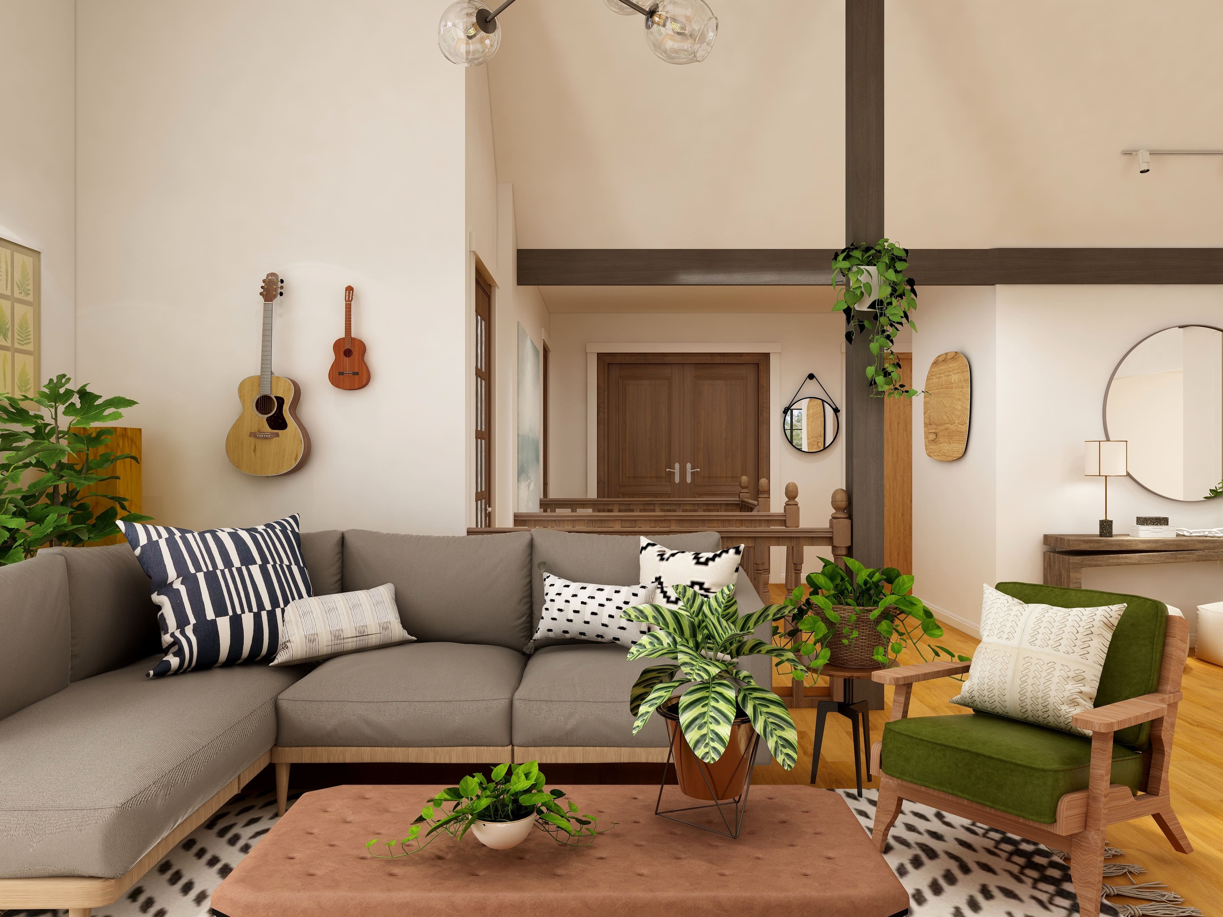
Photo by Collov Home Design on Unsplash 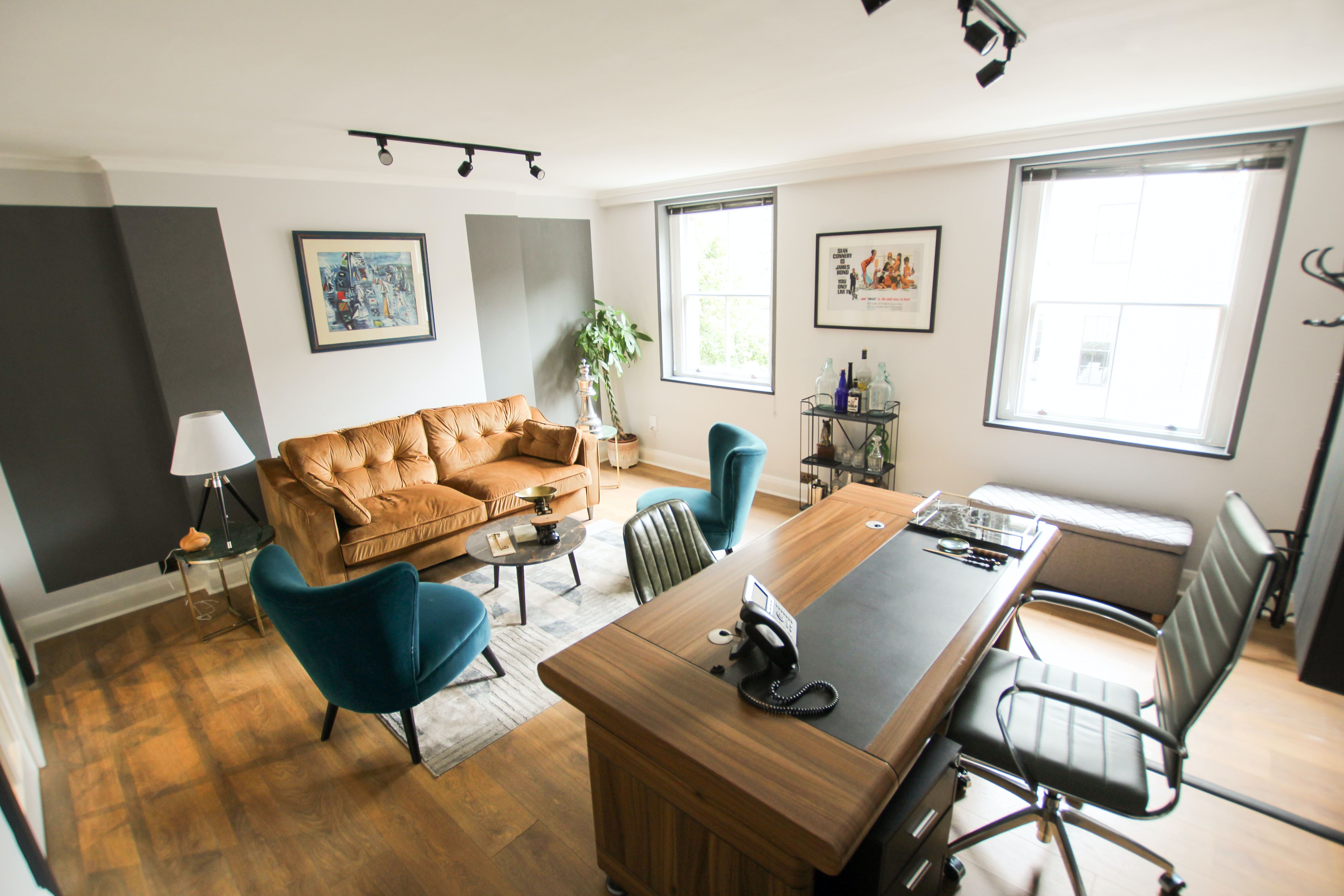
Photo by Gian Paolo Aliatis on Unsplash 
Photo by Collov Home Design on Unsplash White color
Use the psychological effects of the color of white to create a refreshing and clean look in your home. People associate different things with white. White is used to creating an airy appearance, quiet and pure. If a room is used on walls, furniture, or floor, white may give the impression that it is much higher than it is and can give an invigorating freshness. If you don’t want to have a very colorful room but no excess white, you can use white in combination with other neutral colors. Black, brown, or gray with white fit very well. To take advantage of the psychological effects of the white color, you should not use it much, just to emphasize certain things, such as windows and door frames.
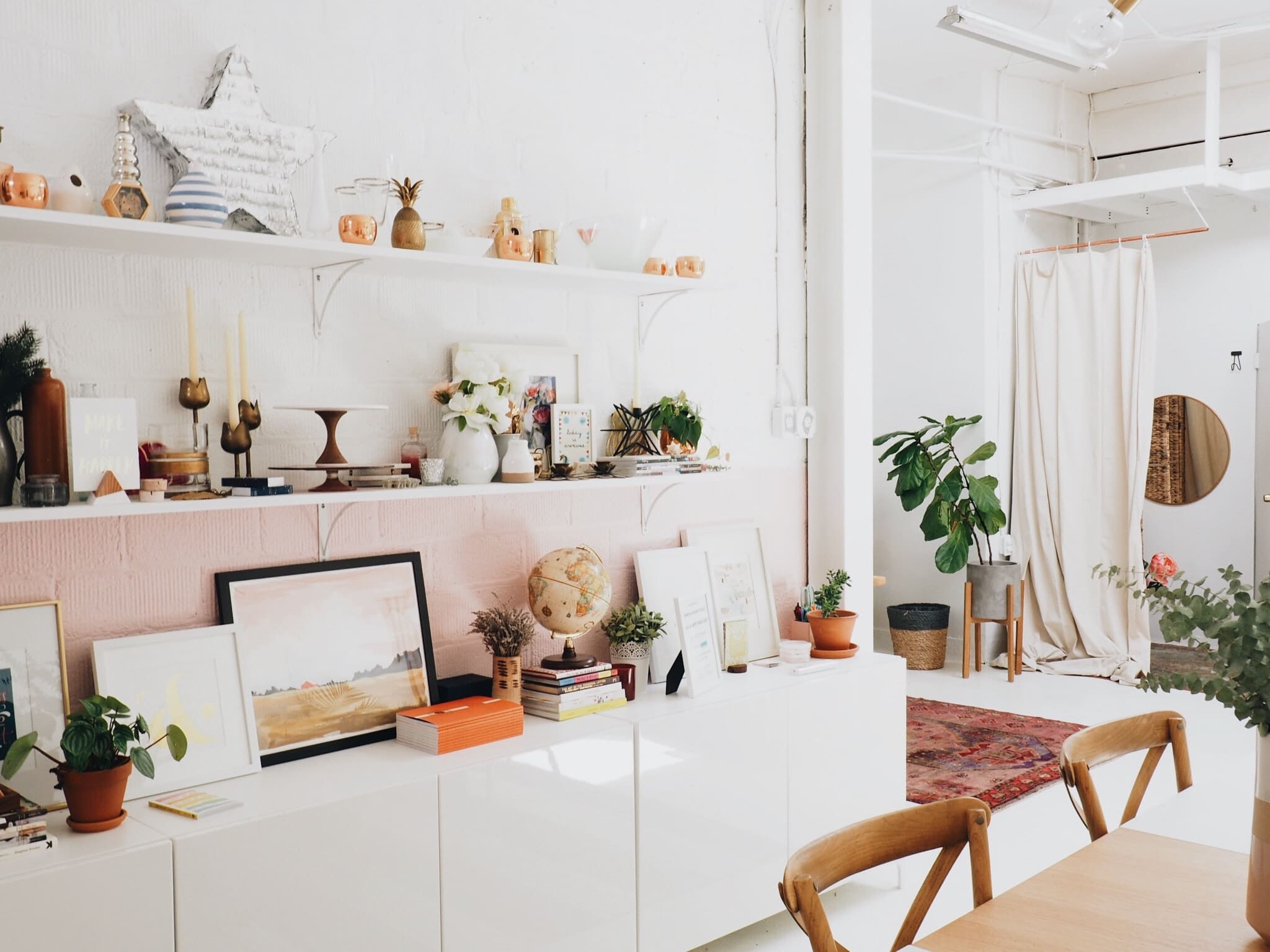
Photo by Anna Sullivan on Unsplash 
Photo by Jorge De Jorge on Unsplash 
Photo by Jorge De Jorge on Unsplash
Grey colorThe gray interior gives a formality that is subtle elegance without being too conservative. The gray color effect depends very much on the color shade that you will use. For example, if gray has a yellow tint may be depressed, especially if you have things in the room in various shades of brown. But a beautiful shade of gray, in combination with not very bright white color, can create a clean and refreshing appearance. If you have too many gray areas will become predominant and create a boring environment.
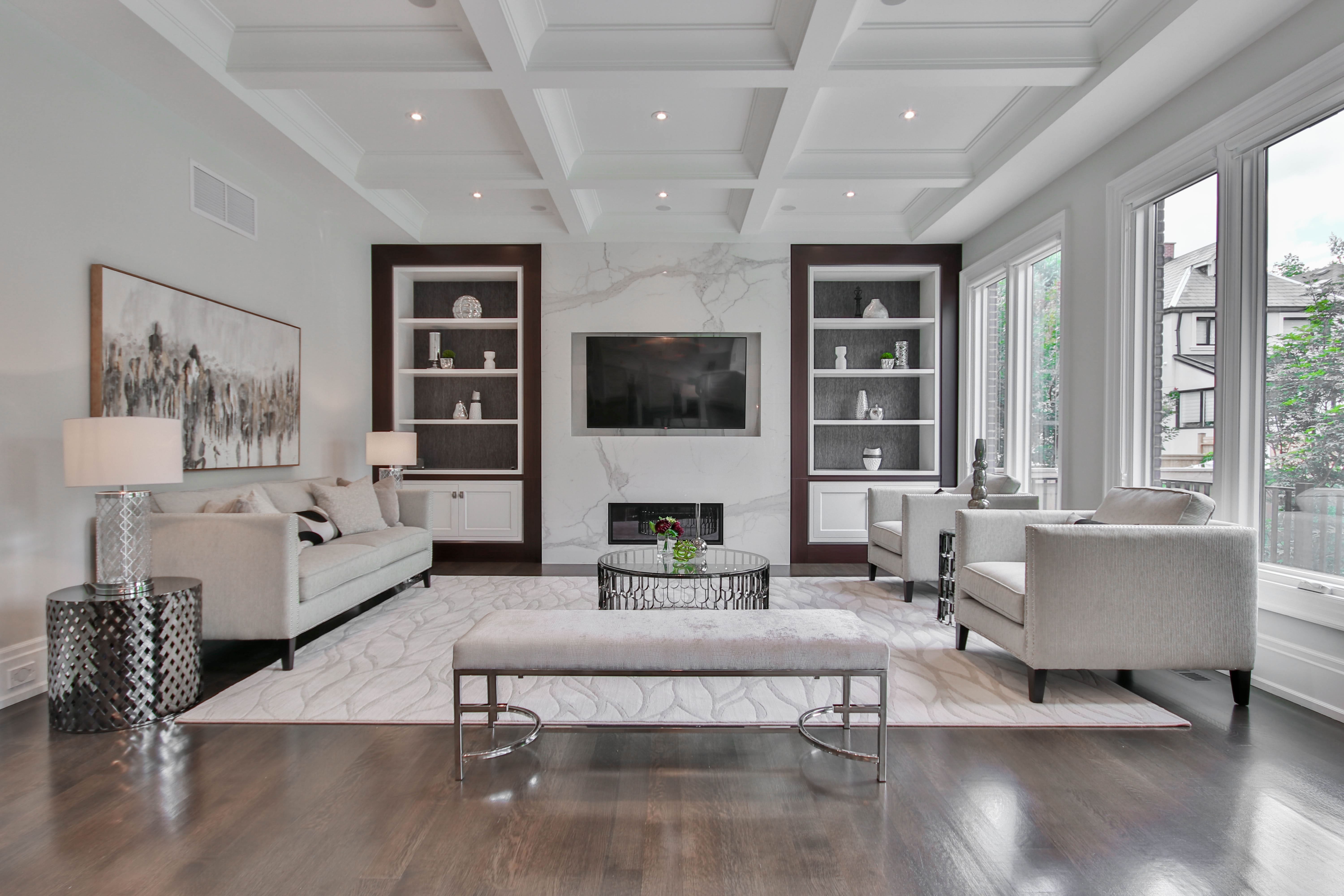
Photo by Sidekix Media on Unsplash 
Photo by Sidekix Media on Unsplash 
Photo by Sidekix Media on Unsplash Black color
Use psychological effects of black color to create an elegant and bold aspect for your home. If you use it in a smart way, black gives an elegant and sophisticated air to interior design. If it is put on a light or neutral background color, everything which is black will stand out. The black color is ideal to bring out certain things in a room. Most people associate black with death, mourning, widowhood, and generally with formal and serious occasions. In conclusion, do not use too much black, but only to highlight certain things like picture frames, small tables, etc.
Photo by Sanibell BV on Unsplash 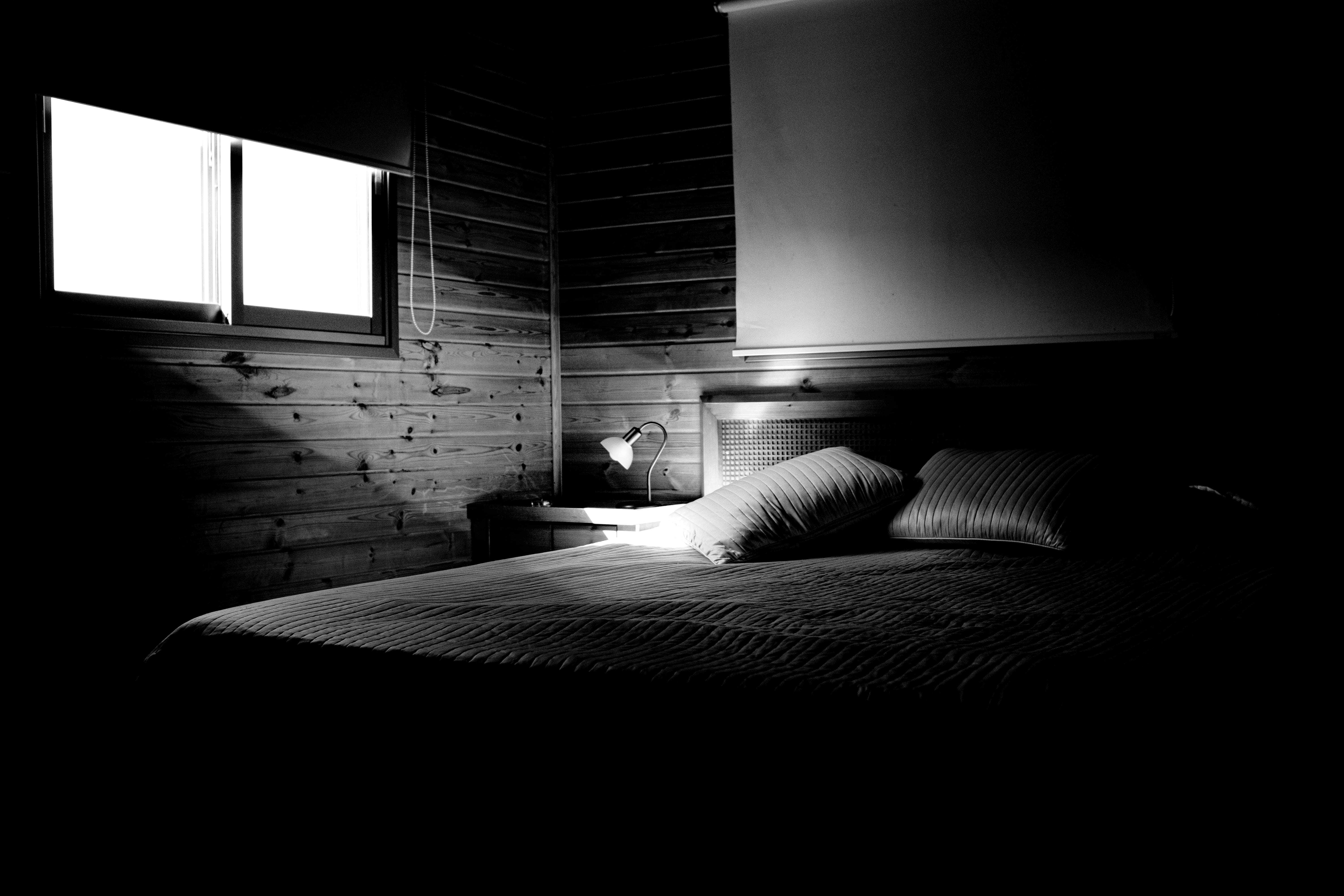
Photo by Adi Goldstein on Unsplash 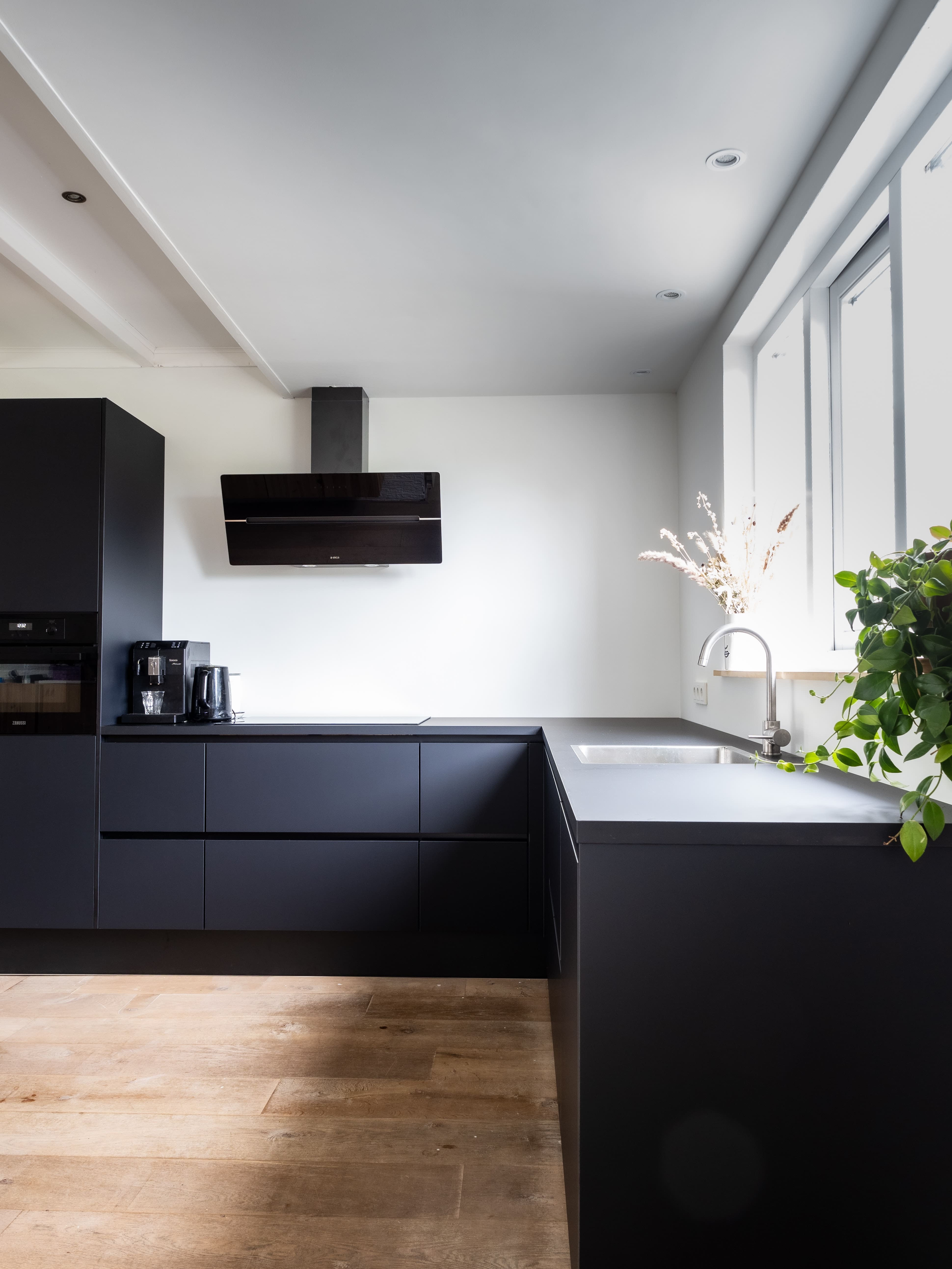
Photo by Sven Brandsma on Unsplash Yellow color
Use yellow color effects to give a bright and optimistic air to your home. Effects of yellow color vary with its nuances. A pale yellow applied on walls or ceiling can bring a little sunshine in your home, while a darker yellow may be a damper after a while. If you don’t want to use it on the walls, you can use its psychological effects in other ways. For example, yellow is great for standing things out. You can use smaller amounts of yellow accessories, flowers, or pictures.
Photo by Ralph (Ravi) Kayden on Unsplash 
Photo by Jonathan Borba on Unsplash 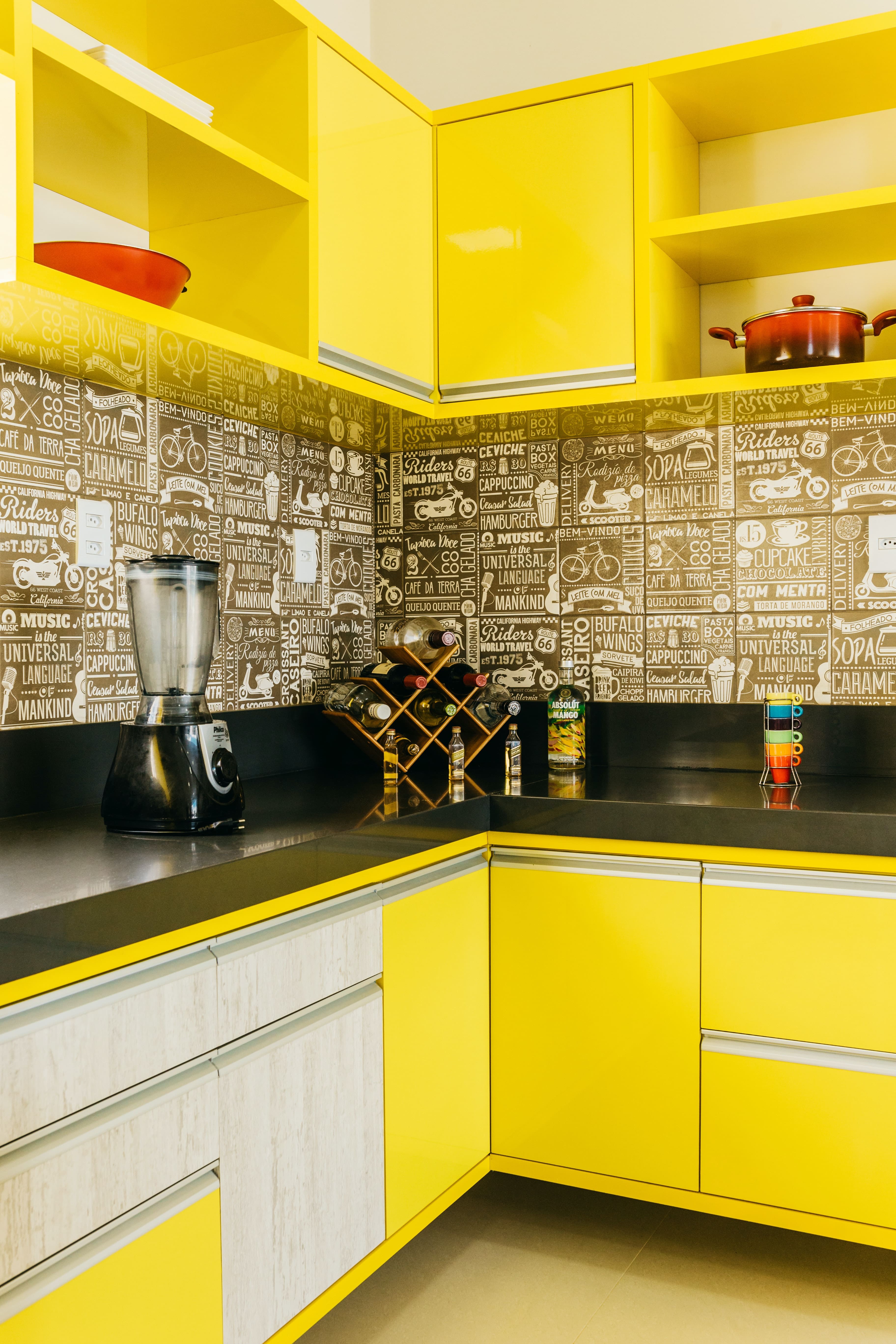
Photo by Jonathan Borba on Unsplash Red color
Use red to give a resonant and stimulating aspect to your rooms. The color red often indicates a threat, it can increase heart rate and blood but with a warmer shade, you can feel very good. A room with much red can increase the level of passion. Like orange, red is known to increase appetite and thus is widely used in kitchens.
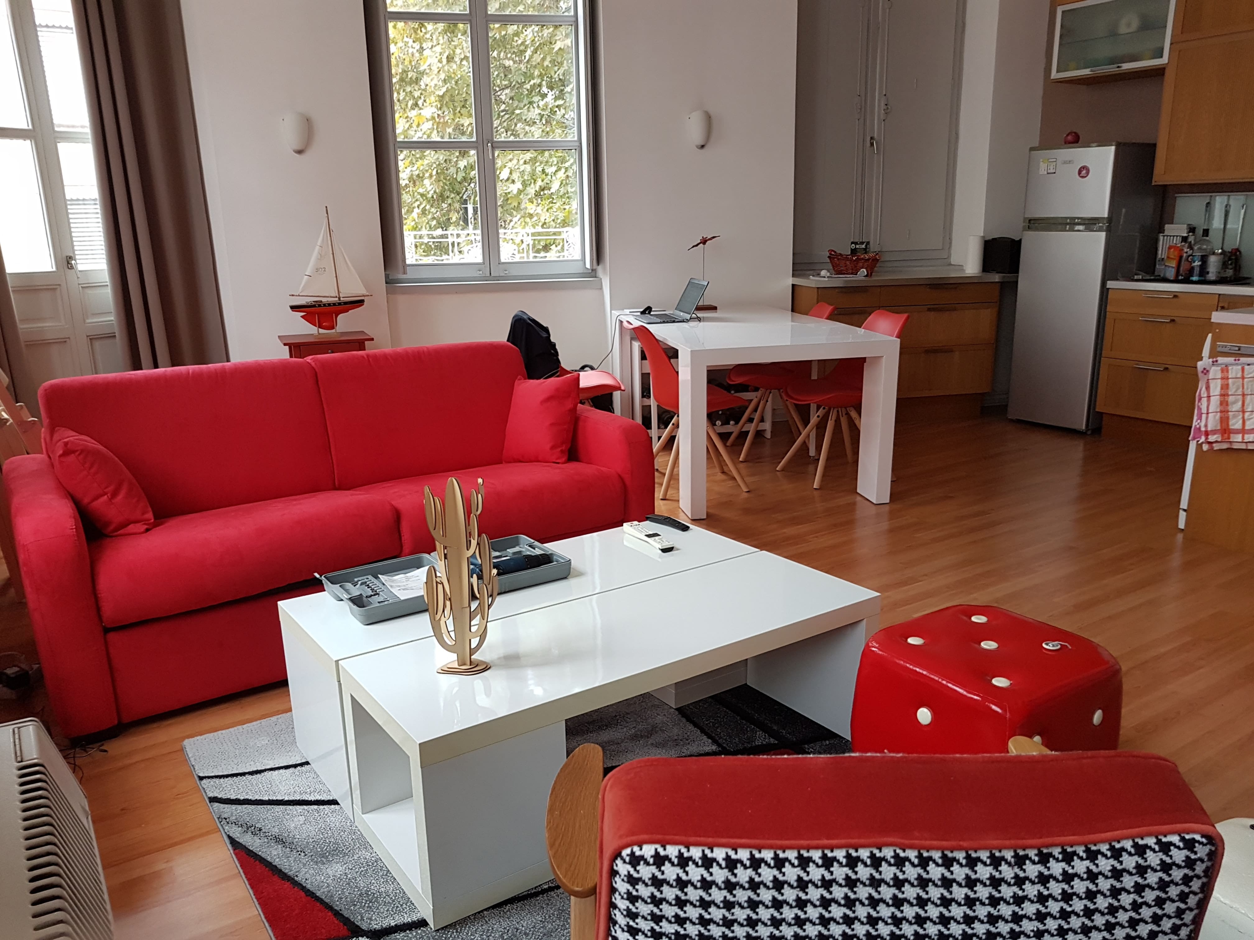
Photo by Emmanuel Martin on Unsplash 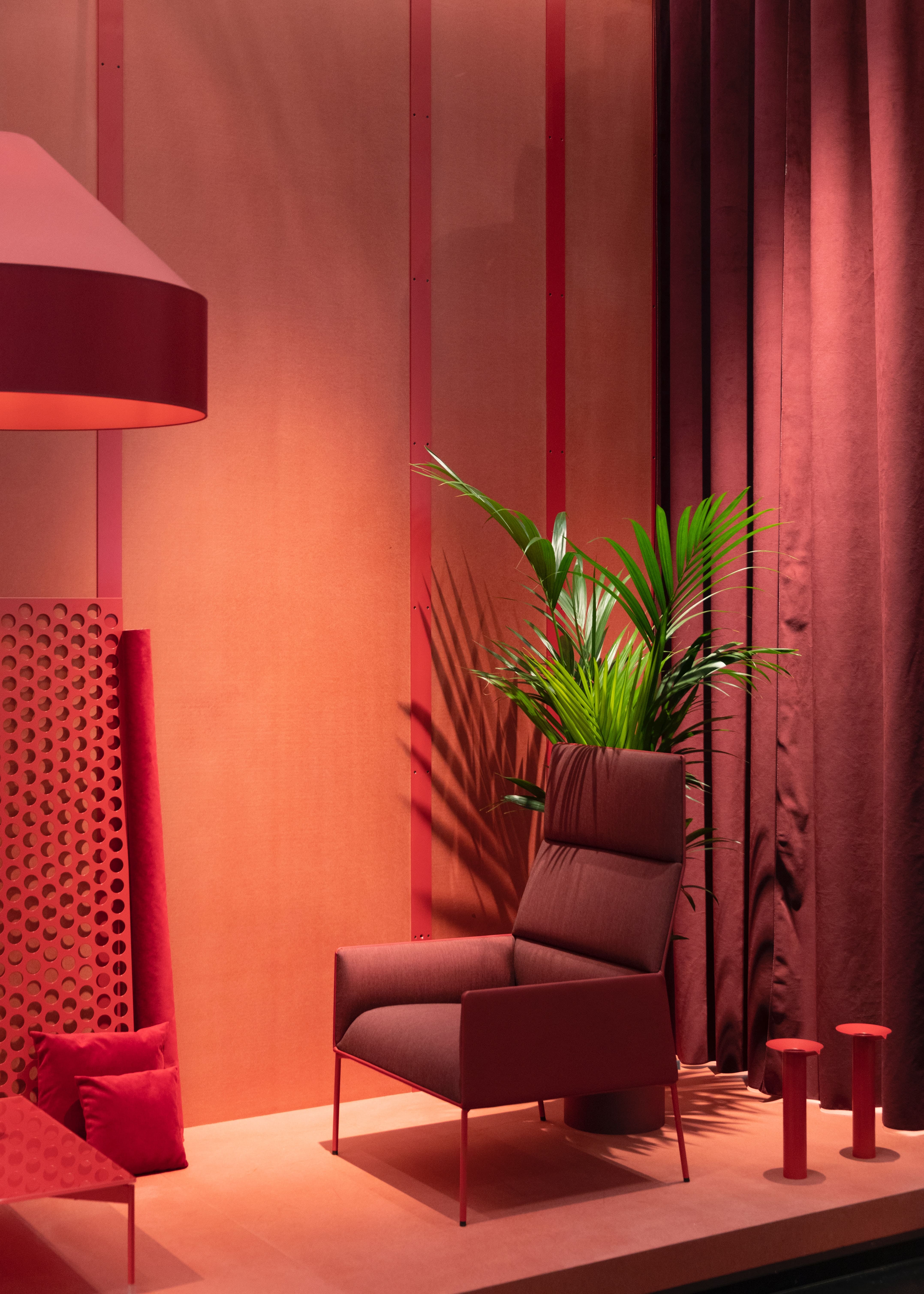
Photo by Jean-Philippe Delberghe on Unsplash 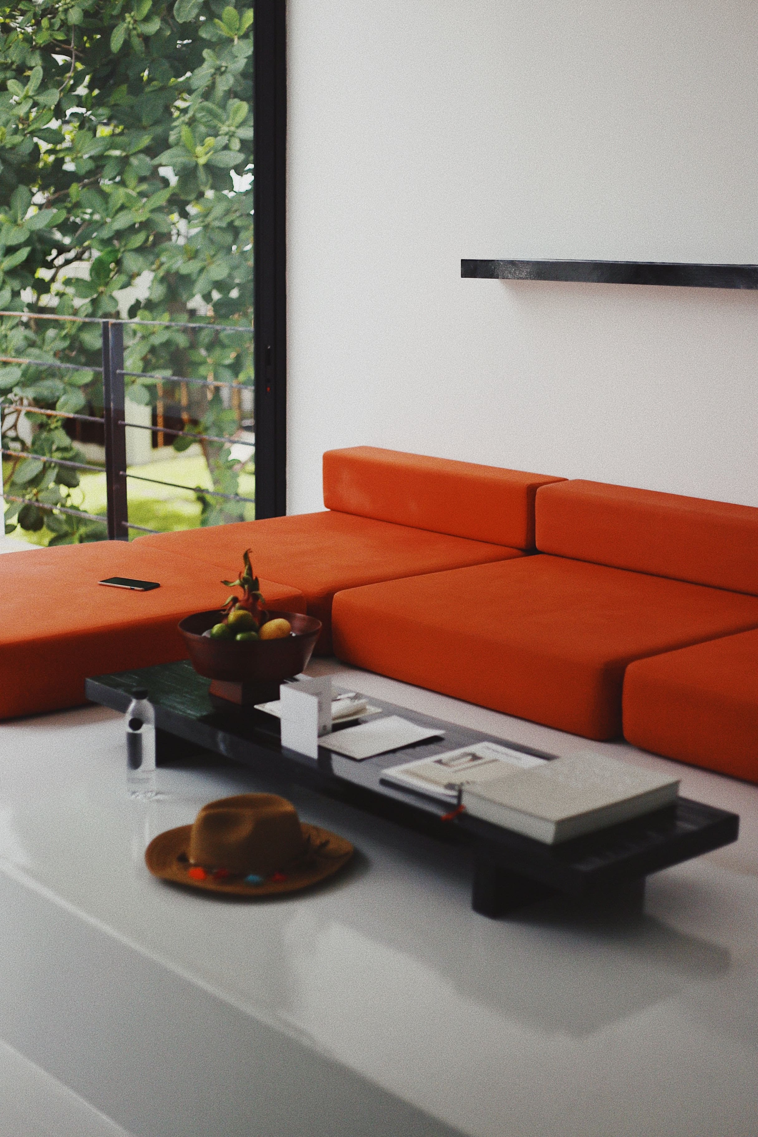
Photo by Taylor Simpson on Unsplash Pink color
You can use pink color to create a fresh and fine atmosphere in the house. In most countries, the color pink color is seen as a feminine color and it is often associated with everything related to girls. In general, used in interior design, the psychological effects of the color pink is soothing and comfortable. Some pink shades are fresh and sweet in them that can be associated with sweets.
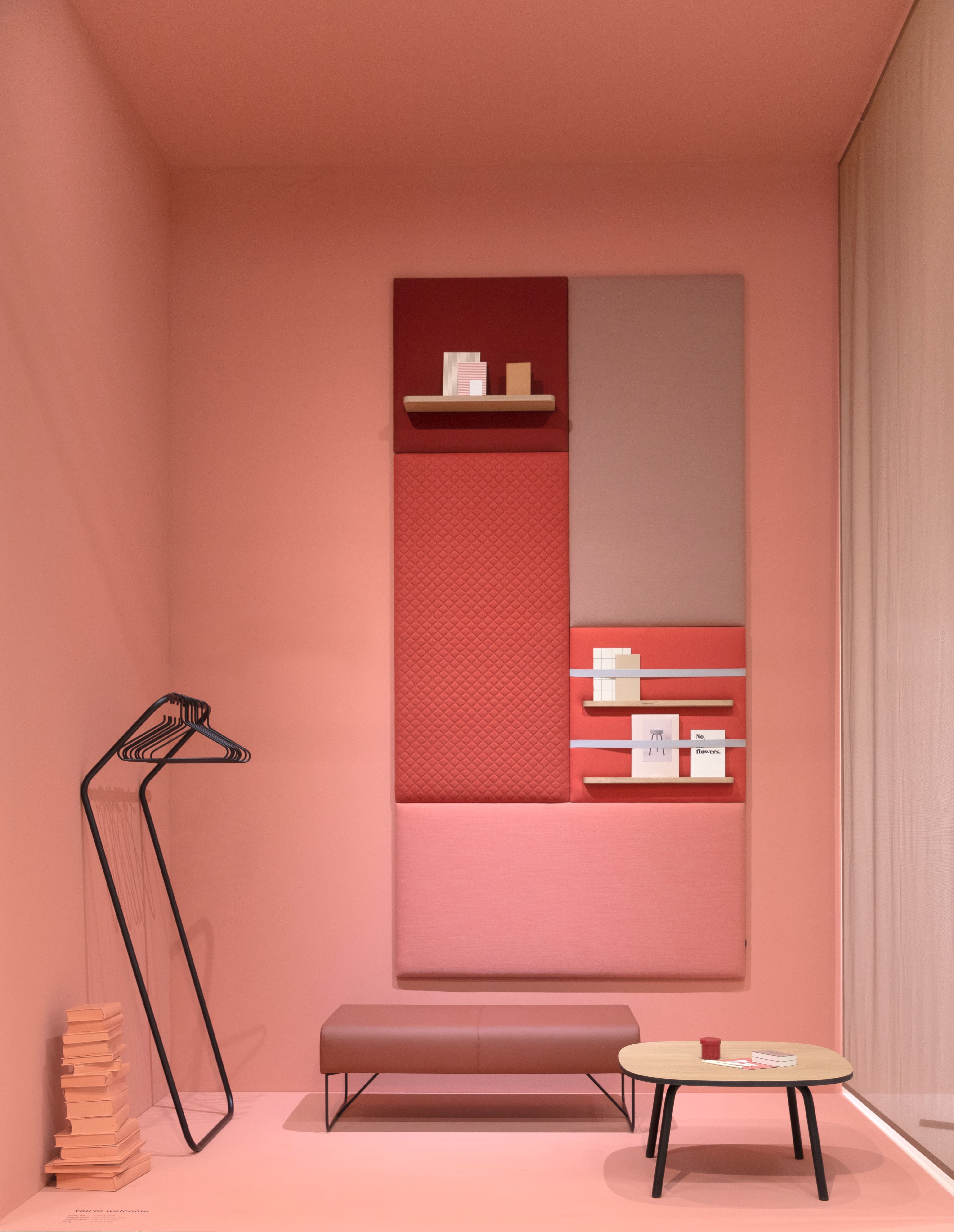
Photo by Jean-Philippe Delberghe on Unsplash 
Photo by Stefen Tan on Unsplash 
Photo by Scott Webb on Unsplash Purple color
Use the psychological effects of the color purple to create a luxurious and expensive environment for your home remodeling in San Diego If it has a bluish shade, it can be serene and calm and gives an air of mystery. Reddish shades attract more attention and dominate the room. Purple color has a long reputation of royalty and power.
Photo by Markus Spiske on Unsplash 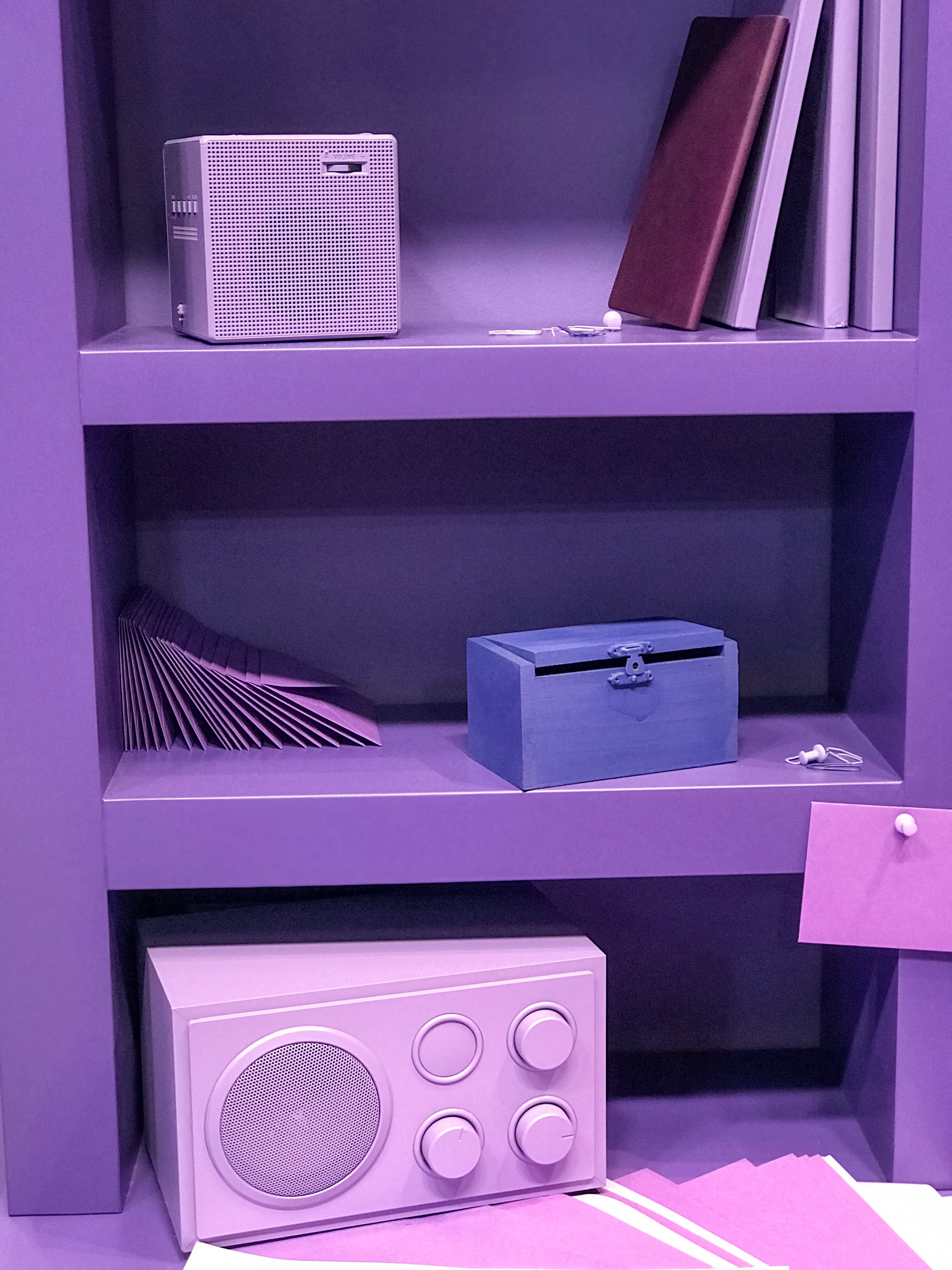
Photo by Jan Antonin Kolar on Unsplash 
Photo by Alexandru Acea on Unsplash Blue color
With a blue color, you can create a cool and clear look. In the interior design, you can use blue to create an atmosphere of work and meditation. The color blue has been shown to lower blood pressure and heart rate. It is used to design the interior space to enlarge the room by a very light shade of blue. You can use blue to cool a room with much sun and heat. If used in the kitchen, paint, furniture, or dishes, the blue color is said to decrease appetite and you can lose weight.
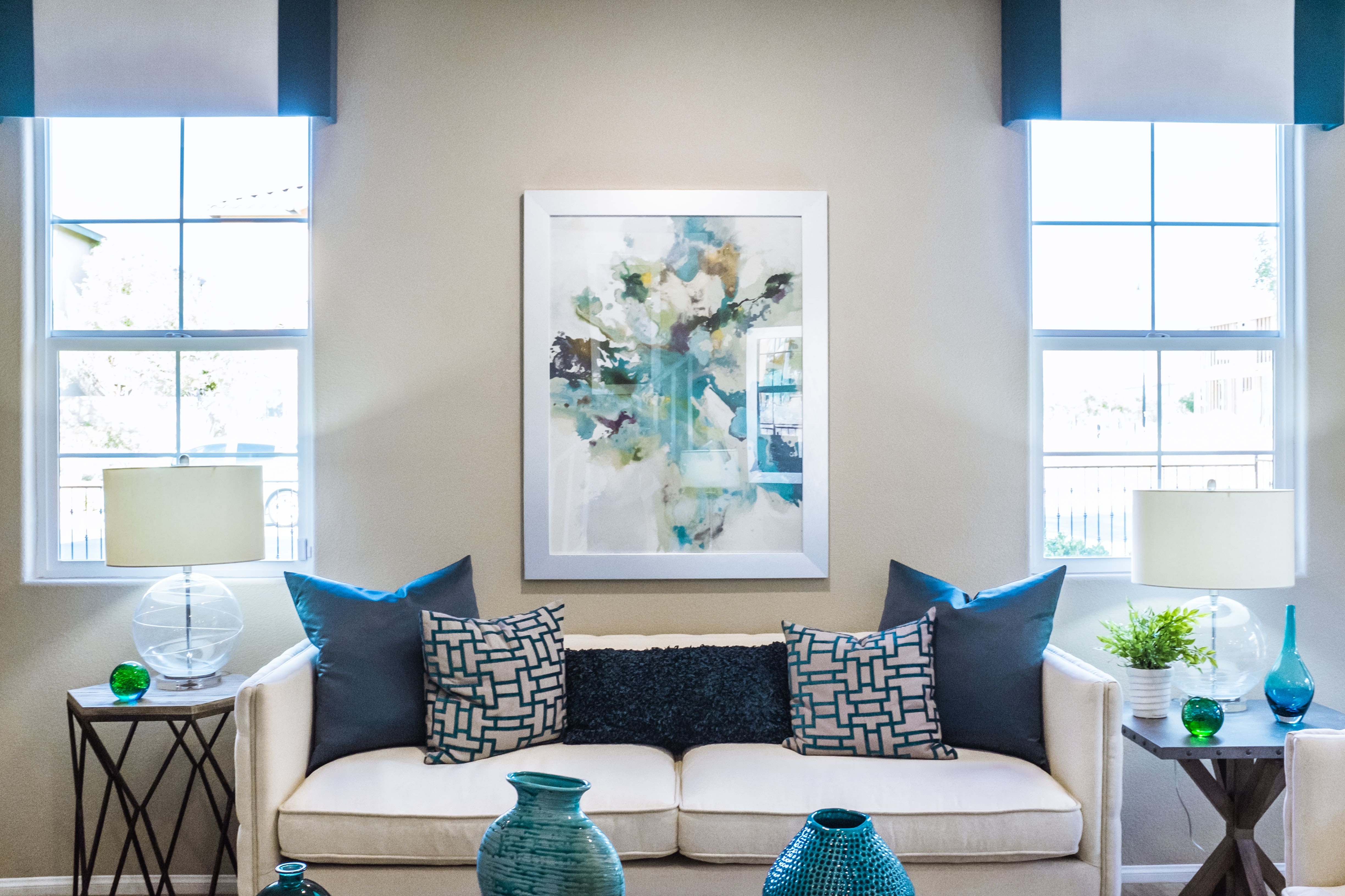
Photo by NeONBRAND on Unsplash 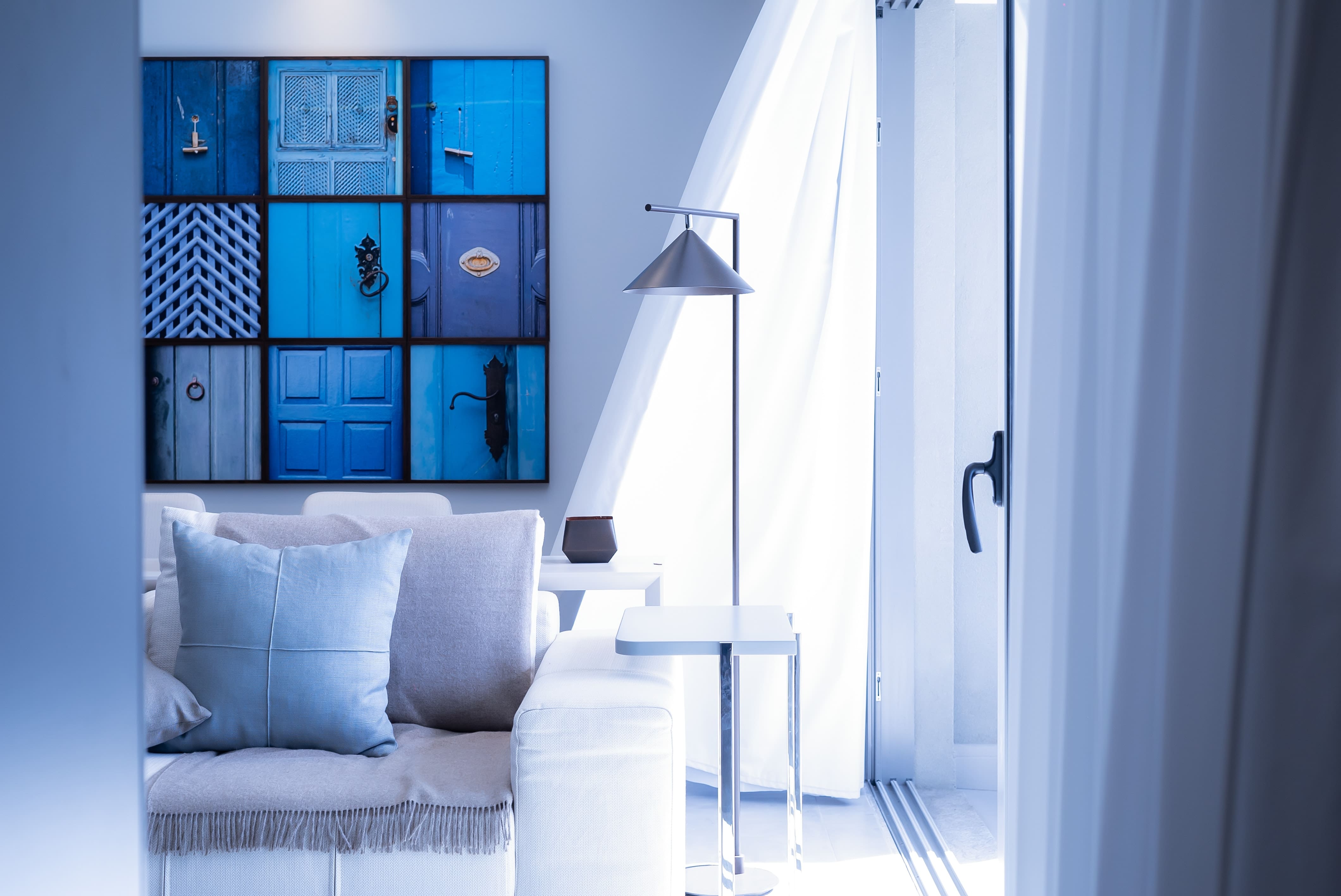
Photo by Vinicius “amnx” Amano on Unsplash 
Photo by Meelika Marzzarella on Unsplash Green color
Use the psychological effects of green color to create a calm and relaxing atmosphere in your home. The psychological effects of color green color are similar to those of blue, green is perceived as calm and clear. Green is very soothing to the eye and nature gives us a lot of nuances. The best way to use green in the interior design is to combine several colors, or green combined with other colors. See examples on the 122 Design website.
Photo by Jason Leung on Unsplash 
Photo by Emile Guillemot on Unsplash 
Photo by Alex Tapia on Unsplash