The best ecommerce design website should optimize the user journey to products.
Photo by mohamed hassan form PxHere
Visitors should immediately see clear and complete product information at all levels. This rule applies to all pages from the home page to the directory. Ecommerce web design trends focus on making it as simple and logical as possible.

To buy products online, people need to understand what the site is selling and find the product they are interested in. Some may search for a product knowing exactly what they want, but most rely on surfing the site to find out which products are available and which best suit their needs. User-friendly home pages, category pages, and product listing pages are critical to the browsing experience. This is exactly the solution that fireart.studio will offer you.
Success criteria
Of course, you cannot shift all responsibility for the development of your business to the website design. Your product or service must have a good reputation. It is very important to form a positive opinion about the brand. Also, you must have not only the target audience, but also the recognition in the market. If you are just starting a project, then your business card on the Internet should be given maximum attention.
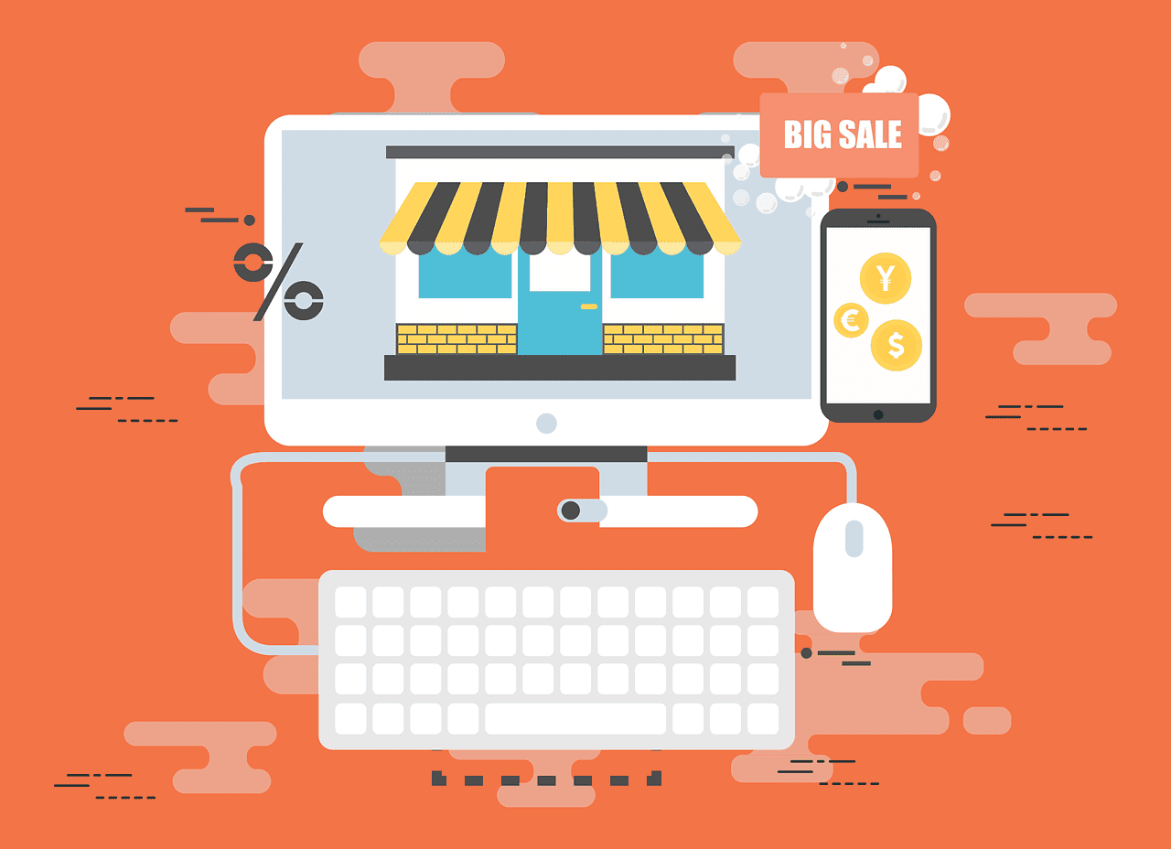
In order for users to want to make a purchase and return to your online store again, you need to think about the following points:
• The breadth of the range;
• The quality of the products offered;
• Possibility of delivery;
• Speed and accuracy of delivery;
• If you are selling furniture or equipment, it is very important to offer clients assistance with installation.
Users should easily find answers to all of the above questions on your site. If it is difficult for a visitor to find information, he is unlikely to write to technical support. Most likely, such a person will leave to look for another site.
How to build trust with design?
Have you noticed that respectable sites get better conversions? It is very important that visitors on the site feel your concern for them. Choose a simple domain name and be sure to use the https encryption protocol. The lock icon in the address bar is liked by all users, without exception.
Also, your reputation is undermined by the low speed of loading pages. Five seconds is the limit that only very large sites with tons of graphics and videos can afford. Landing pages and business card sites should open in 2-3 seconds on both PC and mobile devices. Every next second increases your chances of a prospect leaving. And if the page freezes after the client has entered payment details, this is very bad for the reputation.
Brand info
Add the history of the company, its mission and goals for the near future to the site. It’s great when team members are in touch with customers around the clock. If you cannot provide technical support 24/7, then be sure to embed chat bots with answers to questions about the product, payment, delivery, and so on. It is also very helpful to compose a section of answers to the most frequently asked questions.
Reviews
Add the ability to leave reviews under each product. To avoid fakes, you need to open access to writing comments only to those users who actually made a purchase on your site. All other visitors should be able to read reviews, watch photos and videos, as well as ask other participants or a store employee a question.
Memo to the designer:
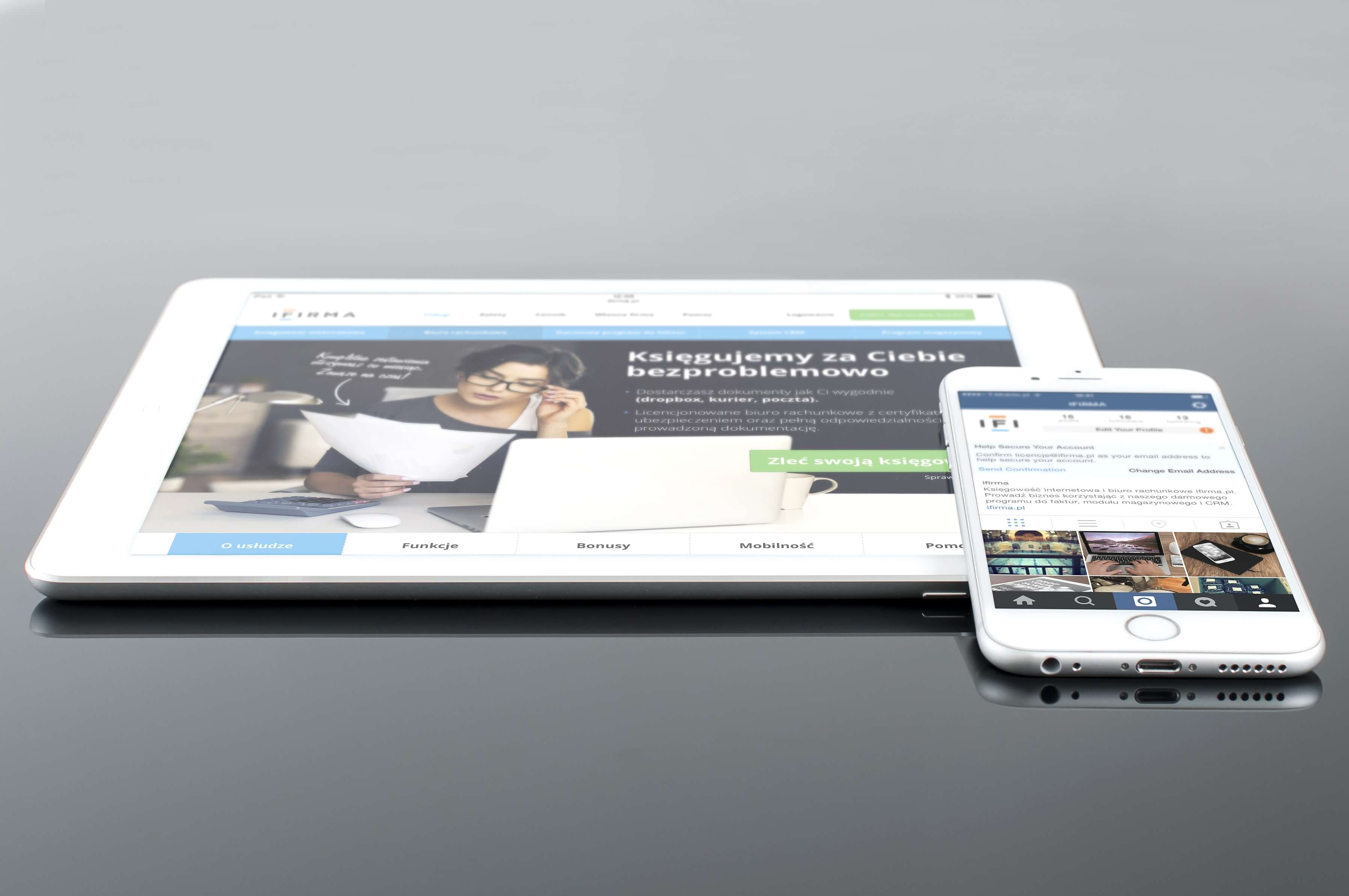
- Choose a responsive design so that a visitor can make a purchase from a PC, tablet or smartphone.
- Don’t forget about strict hierarchy. Highlight the main thing with large and bright fonts.
- Don’t forget about calls to action. You are promoting a store, not a gallery with photos.
- You don’t need to be too original in your choice of icons and buttons. If people find it hard to understand where the products are and how to buy them, no one will admire the beauty of your site. People will just leave.
- At one time, pop-ups were very popular. We do not know a single person whom they would not annoy.
Leave a Reply