The average American spends $300 on fall decor every year and replaces almost all of it within six weeks — not because the season ended, but because the look stopped working after the first week of November. That’s not a shopping problem. That’s a design problem, and nobody selling you a $14.99 faux pumpkin at Target is going to tell you that. If you’re serious about getting your entryway fall decor right this season — not just decorated, but actually right — the difference starts before you buy a single thing.
Quick Answer
The average American spends $300 on fall decor every year and replaces almost all of it within six weeks — not because the season ended, but because the look stopped working after the first week of November.
I spent eleven years designing interiors in Chicago and New York, and I watched the same cycle repeat itself in October: clients would go to HomeGoods, fill a basket, come home, arrange everything on the console table, and then call me two weeks later saying something felt off. The space looked decorated. It didn’t feel like fall. There’s a real difference, and getting to the bottom of it is what this article is actually about.
Why Most Fall Entryways Look Staged (And How to Avoid That Trap)
In This Article
- Why Most Fall Entryways Look Staged (And How to Avoid That Trap)
- The 9 Moves: A Quick Reference
- 1. Lead With Scent Before You Touch a Single Decorative Object
- 2. Swap Your Lighting Before You Swap Your Decor
- 3. Replace One Synthetic Material With Something That Has Actual Texture
- 4. Use One Oversized Element Instead of a Cluster of Small Ones
- 5. Bring in Something Living — Not Just Something Orange
- 6. Layer Your Rug Situation, Address the Door, and Edit to Your Strongest Three Pieces
- 7. Add One Unexpected Material With No Obvious Seasonal Association
- 8. Make the Entryway Work for the Whole Season, Not Just the First Week
- 9. Photograph It Before You Call It Done
Here’s the thing nobody wants to hear: the pumpkin-candle-wreath combination is not wrong because it’s cliché. It’s wrong because it’s reactive. You’re not making design decisions — you’re responding to what every store put on the shelf at the same time, in the same proportions, for the same customer. The result is an entryway that looks like everyone else’s entryway, which means it doesn’t look like yours.
The root problem is treating seasonal decoration as a category rather than as a design decision. Decoration is reactive — you see something seasonal and you buy it. Design is different. It starts with how you want the space to feel, then works backward to the objects that create that feeling. Most people skip the first step entirely.
The console table vignette formula — which every competitor article you’ve ever read defaults to immediately — fails for a specific reason. It treats the entryway as a display surface rather than as a transitional space. Your entry is the first room a nervous system encounters when someone arrives, and the last room they pass through when they leave. That deserves more than a curated shelf of seasonal objects. It deserves sensory intention.
Then there’s the scale problem. I once watched a client spend $800 on a matching seasonal set — coordinated pumpkins, a wreath, pillar candles in three heights, a runner — and the room looked like a craft store had robbed her. Everything was the same visual weight. Nothing led the eye anywhere. The space felt loud and still somehow empty.
The National Retail Federation reports that Americans spend over $3.6 billion on Halloween and fall decorations annually — yet interior designers consistently cite over-decoration as the number one mistake homeowners make during the season. More stuff does not produce more atmosphere. Restraint, scale, and material quality do.
What separates elevated entryway fall decor from something that looks tacky? Three things, in order of importance: restraint (not everything needs a seasonal counterpart), scale variation (objects at different heights and visual weights create movement), and material quality (one genuine terracotta pot beats four plastic gourds every single time). These principles apply before you touch a single pumpkin, and they apply harder in a small entryway where there’s nowhere to hide a bad decision.
Actionable takeaway: Before buying anything, write down three words that describe how you want your entry to feel in October. Not what it should look like. How it should feel. Design toward that.
The 9 Moves: A Quick Reference
Before going deep on each one, here’s the full list so you can scan for what your space needs most:
- Lead with scent before you touch a single decorative object
- Swap your lighting before you swap your decor
- Replace one synthetic material with something that has actual texture
- Use a single oversized element instead of a cluster of small ones
- Bring in something living — not just something orange
- Layer your rug situation
- Address the door itself, not just the console
- Edit down to your three strongest pieces and remove everything else
- Add one unexpected material that has no obvious seasonal association
Some of these cost nothing. A few cost under $30. One might require a Saturday morning. None of them require a trip to the seasonal section of any big-box store.
1. Lead With Scent Before You Touch a Single Decorative Object

Most people start with the eyes. That’s the wrong starting point.
Your entryway is the first sensory encounter anyone has with your home, and scent arrives before the eye fully registers decor — it hits the nervous system roughly 400 milliseconds faster than visual processing catches up. This is not a small thing. It’s the reason a house can smell like fall before you’ve hung a single thing on the wall, and why the right scent will make even a spare, minimal entry feel deeply seasonal.
Research from Rockefeller University found that humans recall scents with 65% accuracy after one year, compared to only 50% accuracy for visual memories after just three months. That means scent is literally a more durable memory-forming tool than the objects you’re spending money on. If your goal is to make your home feel memorable to guests — or to yourself, walking in after a long day — scent is doing more work than your console table.
The problem is that most people reach for pumpkin spice candles, and pumpkin spice is, at this point, a branding concept rather than an actual scent. It reads as generic the moment it hits the air. The fall scent profiles that actually feel sophisticated:
- Cedar and smoked wood — grounding, dry, almost architectural in the way it settles into a room
- Clove and dried citrus — warm without being sweet, reads as handmade rather than manufactured
- Fig and black pepper — unexpected, complex, not immediately seasonal in an obvious way; guests notice it without being able to name it
- Rosemary and eucalyptus — herbaceous, cuts through the sweetness of most fall rooms and works especially well in small entryways where heavy scents can feel suffocating
- Vetiver and sandalwood — earthy and deep, the olfactory equivalent of a wool blanket; holds up all day without fading into the background
For placement, a reed diffuser on the console table works because it’s consistent — it doesn’t require you to remember to light anything. A small bundle of dried rosemary or eucalyptus near the door is both visual and olfactory. If your kitchen is visible or adjacent from the entry, a pot of water simmering with orange peel, cloves, and a cinnamon stick is the oldest trick in the playbook and still the best one.
A note on layering scent: the entry should smell like one coherent thing, not three candles competing. If you have a diffuser running, skip the candle. If you have a simmering pot going in the kitchen, pull the diffuser. Scent layering works in perfumery because a trained nose does it intentionally. In home spaces, it usually just reads as too much.
What I’d avoid: any wax melt or plug-in diffuser near the door. The scent concentrates unevenly and the first person through the door gets a wall of it — which reads as trying too hard, even when the scent itself is good.
Actionable takeaway: Swap your entryway candle or diffuser this week to cedar, clove, or fig. That single change will shift the seasonal register of the space before you move a single object.
2. Swap Your Lighting Before You Swap Your Decor
This is the move that costs the least and changes the most, and almost no one does it first.
Cool-white LED bulbs — the kind that come standard in most fixtures, typically in the 4000K–5000K range — actively work against fall aesthetics. They flatten texture. They make warm materials like wood, linen, and terracotta look washed out. I’ve walked into entries where a client had done everything right — beautiful rug, genuine ceramics, a thoughtful arrangement — and the whole thing looked vaguely institutional because the overhead bulb was 4500K. You could feel it before you could explain it.
Switching to bulbs in the 2700K–2200K range — warm white to near-candlelight — is a $12 fix that changes the entire emotional register of a space. The Illuminating Engineering Society notes that color temperatures between 2700K and 3000K are consistently rated as “warm and inviting” in residential settings, while anything above 3500K begins to read as clinical or commercial.
Here’s what the lighting swap actually does for your entryway fall decor:
- It makes wood look like wood. At 4500K, a walnut console table looks flat. At 2700K, the grain comes alive and reads as genuinely warm.
- It changes how shadows fall. Warmer bulbs create softer shadow transitions, which makes any object — a ceramic vase, a stack of books, a dried stem arrangement — look more dimensional.
- It makes textiles feel textural. A linen runner under cool light looks beige. Under warm light, it looks intentional.
- It makes candles relevant. When your overhead lighting is warm, a lit candle feels like it belongs. When the overhead is cool-white, the candle looks like it’s fighting for attention it can’t win.
If your entryway has a dimmer, use it. The same 2700K bulb at 60% brightness will outperform the same bulb at 100% for fall atmosphere every time. Dimmed warm light is the single most reliable tool for making a space feel inhabited rather than just decorated.
One underused option for entryways specifically: a small table lamp or a plug-in sconce, if your layout allows it. Overhead lighting in entries tends to be a single ceiling fixture — one light source, one angle, one type of shadow. Adding a secondary light source at eye level or below completely changes the room’s depth. A lamp on the console table that you turn on when you get home costs $40 and does more for fall atmosphere than any amount of decorative objects.
Actionable takeaway: Replace your entryway bulb with a 2700K warm white LED this week. If you have a dimmer, set it to 60–70%. Do this before you buy a single decorative item and notice how differently your existing objects read.
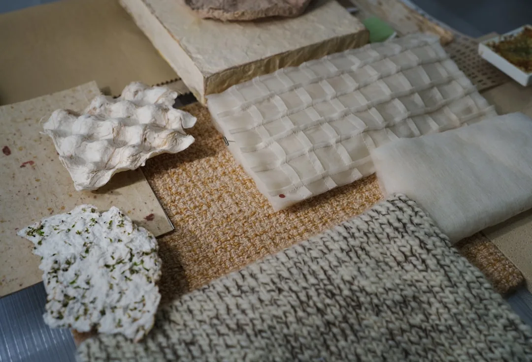
3. Replace One Synthetic Material With Something That Has Actual Texture
Fake fall decor has a tell. It’s not the color — manufacturers have gotten reasonably good at color. It’s the surface. Plastic and resin have a uniformity that natural materials don’t. Real dried things have variations in tone, irregularities in surface, imperfections that synthetic versions try to smooth out. Those imperfections are exactly what makes a material feel real.
You don’t need to replace everything. You need to replace one thing — the most prominent synthetic in your current setup — with something that has actual material character. The substitutions that make the biggest visual impact:
- Faux pumpkin → genuine dried gourd or heirloom variety squash. Heirloom squash in Jarrahdale, Marina di Chioggia, or Red Kuri varieties photograph almost identically to decorative faux versions and cost $4–$8 at a farmers market. They last four to six weeks without treatment. They don’t have the plastic sheen.
- Artificial wreath → eucalyptus or dried wheat bundle. A dried wheat bundle tied with jute twine costs under $15 at most craft stores and has the kind of tactile depth that synthetic wreaths charge $90 to approximate.
- Polyester table runner → washed linen or raw cotton. The weight of real fabric is immediately apparent when someone touches it, and subconsciously apparent even when they don’t.
- Plastic berry branches → real dried cotton stems or dried lunaria. Dried cotton stems in particular look architectural, photograph beautifully, and read as deliberately chosen rather than seasonally grabbed.
The reason this works psychologically is that our visual system is remarkably good at detecting material authenticity, even when we can’t articulate what we’re detecting. Guests won’t say “that’s not real.” They’ll say “I love your entryway” — which is a different thing that produces the same information.
Actionable takeaway: Identify the single most prominent synthetic object in your current entryway arrangement. Replace it with a genuine material equivalent before adding anything new.
4. Use One Oversized Element Instead of a Cluster of Small Ones
Most fall entryway decor fails at scale. People buy objects in the medium range — things that are roughly the same size, roughly the same height, roughly the same visual weight — and arrange them in groups. The result is visual noise without a focal point. The eye has nowhere to land.
The fix is counterintuitive: buy less and go bigger.
One genuinely large element — a 14-inch terracotta pot, a substantial ceramic vase at 18–24 inches, a single oversized dried floral arrangement, a statement mirror with a warm-toned frame — does more compositional work than seven coordinated smaller objects. It gives the eye somewhere to go first, which lets everything else fall into a supporting role rather than competing for attention.
Scale reference points that work for entryway fall decor:
- A ceramic vase or vessel that reaches at least elbow height when placed on the floor beside a console
- A dried pampas or millet arrangement where the stems are taller than the console surface by at least 12 inches
- A single large tray in raw wood or aged brass that grounds a console arrangement and reads as intentional rather than collected
- An oversized lantern on the floor — not a small lantern on a shelf, but a genuinely floor-scaled lantern that commands the corner
What you’re creating with scale is hierarchy. Hierarchy tells the eye where to look first, then second, then third. Without it, everything demands attention simultaneously, and the space feels cluttered even when the actual object count is low.
Actionable takeaway: Remove all the small-to-medium objects from your console and replace them with one or two genuinely large-scale pieces. Live with it for a day before adding anything back.
5. Bring in Something Living — Not Just Something Orange
There’s a difference between fall color and fall life. Dried stems, preserved botanicals, and synthetic foliage are static — they don’t change, they don’t move, they don’t respond to the light in the room. Living plants do all three, and that responsiveness is exactly what makes a space feel inhabited rather than staged.
The entryway fall decor that consistently reads as elevated almost always includes something living or recently living — something that still has the quality of having been grown rather than manufactured. The plants and botanicals that work best in low-light entryway conditions during fall months:
- Pothos in a terracotta pot — trailing varieties in smaller pots on a console read as genuinely effortless; terracotta ages over the season in a way that plastic nursery pots don’t
- Snake plant in a matte ceramic vessel — architectural, tolerates the temperature fluctuations that entryways experience when doors open and close
- A single seasonal branch — bare oak branches, smoke bush, or copper beech from a florist or your own yard; a few branches in a tall vase have more visual impact than an entire arrangement of artificial stems
- Dried stems you cut yourself — ornamental grasses, dried hydrangea heads from your garden, seed pods from a neighborhood walk; the irregularity of hand-gathered materials reads differently than anything you can buy in a packet
If your entryway has genuinely no natural light, skip the living plants and go for dried botanicals over synthetic ones. The distinction between dried and faux is material quality — dried things have texture, weight, variation, and a smell that’s faint but present. Synthetic things don’t.
Actionable takeaway: Add one living plant or one bundle of genuinely dried botanicals to your entryway this week. Place it where it gets whatever light is available, even if that’s just light from an open door.
6. Layer Your Rug Situation, Address the Door, and Edit to Your Strongest Three Pieces
The final three moves are grouped here because they often work together and because most entryways need all three in some form.
Layering rugs is one of the most underused tools in entryway fall decor. A natural fiber base rug — jute, sisal, or seagrass — layered with a smaller vintage or worn wool rug on top creates exactly the kind of textural depth that makes a space feel collected rather than decorated. The key is contrast: a rough-textured base with a pattern or color on top, or a solid base with a textural layer over it. For fall specifically, a layered rug situation in warm neutrals, rust, or deep ochre reads as seasonal without announcing itself as seasonal decor.
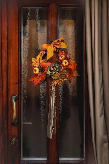
The door itself is the most neglected surface in fall entryway styling. The wreath is the obvious move and the most overused one. Consider instead:
- A single dried stem bundle or wheat sheaf hung flat against the door with a simple ribbon
- A door mat swap — a thick coir mat in a natural fiber reads as fall-appropriate without the seasonal print that expires by November 5th
- A fall-toned exterior wreath in something unexpected — dried lunaria, preserved eucalyptus, or cotton stems rather than faux maple leaves
Editing to your three strongest pieces sounds reductive until you try it. Take everything off the console. Put it on the floor. Now choose the three objects you’d keep if you could only keep three. Put those back. The remaining objects should pass a test before returning: does this add something the other three don’t have? If not, it stays on the floor, in a closet, or in a donation box. This process takes twenty minutes and typically produces a better result than two hours of rearranging everything.
Actionable takeaway: These three moves share a common logic — simplify the surface, address what you’ve been ignoring, and make the editing decision you’ve been avoiding. Do the console edit first. It takes the least time and produces the most immediate result.
7. Add One Unexpected Material With No Obvious Seasonal Association
This is the move that separates a thoughtfully designed entryway from a seasonal display.
Every other element in your fall entry is doing predictable work — warm tones, organic textures, dried botanicals. One material that doesn’t belong to that vocabulary creates tension, and tension creates interest. It’s the same reason a well-dressed person often has one piece that doesn’t obviously coordinate: that piece is what makes the whole thing memorable.
Materials that work as unexpected elements in entryway fall decor:
- Raw concrete or stone — a concrete candle holder, a stone bookend, or a raw slate tray reads as cool and architectural against warm fall materials; the contrast is what makes both elements more visible
- Aged brass or unlacquered bronze — not polished, not gold-toned, but genuinely aged metal; a single brass object among terracotta and linen shifts the whole register of the space upward
- Dark glass — a deep amber or smoked glass vessel holds dried stems differently than ceramic does; the transparency and depth add a layer that opaque materials can’t produce
- Worn leather — a leather tray, a leather-handled basket, or a leather-bound notebook on a console reads as personal rather than decorative; it suggests the space is used by someone specific, not styled for a catalog
- Raw wood with visible grain — not the smooth, finished wood of most furniture, but something with actual grain, knots, or edge character; a raw-edge wooden tray or a turned wooden vessel reads as made rather than manufactured
The unexpected material doesn’t need to be prominent. It needs to be present. One object is enough — more than one and you start building a new theme rather than creating contrast.
Actionable takeaway: Scan your entry for its current material palette. Identify what’s missing — the cool thing in a warm room, the rough thing in a smooth room, the dark thing in a light room. Add one object in that missing register.
8. Make the Entryway Work for the Whole Season, Not Just the First Week
Most fall entryways peak on October 1st and look tired by Halloween. The design problem here is that people style for a moment rather than for a duration.
The entryway fall decor that holds up from September through Thanksgiving shares a few structural qualities:
- It’s not Halloween-specific. The moment you introduce explicitly Halloween-coded objects — skulls, cobwebs, anything with a Jack-o’-lantern face — you’ve committed to a hard expiration date. Fall design that avoids Halloween-coded objects reads as seasonal for the full three months.
- It has components you can rotate. A base arrangement that stays constant, with one or two elements you can swap — a different stem variety, a new candle, a seasonal textile — gives you the ability to refresh without rebuilding.
- The materials age well. Real pumpkins and gourds last four to six weeks. Dried botanicals last the entire season and often into winter. Living plants will carry you through November and beyond.
A seasonal timeline that works in practice:
- Early September: Lead with dried botanicals, warm lighting, and scent. No explicit fall objects needed yet — the palette and materials do the work.
- Late September through October: Add one or two genuine seasonal objects — a heirloom gourd, a dried stem arrangement in fall tones, a textile in a warm rust or ochre.
- November: Swap the gourd for a more muted natural element — dried cotton, smoke bush branches, or a simple ceramic vessel with a late-season dried arrangement. The palette shifts from warm and bright to quiet and spare, which matches how November actually feels.
Actionable takeaway: Plan your entryway in two phases — October and November — rather than as a single static arrangement. The objects you need for the second phase are mostly the same ones you used in the first; it’s mostly an edit rather than a replacement.
9. Photograph It Before You Call It Done
This one sounds like vanity. It isn’t.
Your eye adjusts to a space as you spend time in it. You stop seeing what’s actually there and start seeing what you intended. A photograph short-circuits that adjustment and shows you what a first-time viewer actually encounters. I’ve used this technique with clients for years — sometimes photographing a completed arrangement and texting it back to the client is more convincing than anything I can say standing in the room.
What the photograph reveals:
- Scale problems become obvious. The arrangement you thought was substantial often looks small in a photo. Objects you thought were secondary often dominate.
- Color relationships clarify. What looks like a coherent warm palette in person sometimes reads as orange overload in a photograph.
- The lighting tells the truth. A photo taken in your actual evening lighting conditions — the lighting under which the space will be seen most often — shows you whether the warm bulb swap is doing its job.
- Negative space shows up. Entryways that feel sparse in person sometimes photograph with exactly the right amount of breathing room. Entryways that feel complete in person sometimes photograph as cluttered.
Take the photo on your phone. Stand where someone would stand when they first walk through the door. Shoot at the height you’d naturally hold your eyes — not down at the console, not up at the ceiling, but straight ahead at the space as a whole. If something bothers you in the photo, it’s bothering your guests in person. Fix it.
Actionable takeaway: Once your entryway fall decor is in place, photograph it from the entry point at eye level. Look at the photo rather than the space. Make one adjustment based on what you see. Photograph again. Repeat once more if needed.
Frequently Asked Questions About Entryway Fall Decor
How early should I start decorating my entryway for fall?
Late August to early September is a reasonable start window, but only if you’re using materials that carry the whole season rather than objects that read as October-specific. A change in lighting temperature, a new scent, and a dried botanical arrangement can signal fall starting in late August without looking like you jumped the gun. Explicit fall objects — gourds, harvest-toned textiles, dried leaf arrangements — read naturally from late September onward. The mistake is front-loading all your seasonal decor on September 1st and having nothing left to refresh by the time October and November actually arrive.
What’s the best entryway fall decor for a small space?
Small entryways suffer most from the over-decoration problem. The moves that work hardest in limited square footage: one oversized element instead of several small ones (scale variation reads better in tight spaces than abundance), a lighting swap to warm-tone bulbs (makes the space feel larger and warmer simultaneously), and a scent strategy that does seasonal work without taking up any physical room. In a small entry, a single well-chosen object — a genuine gourd, a ceramic vase with dried stems, a quality doormat — outperforms a curated collection of smaller seasonal items every time.
How do I make fall entryway decor feel upscale without spending a lot?
The highest-impact low-cost moves, in order: swap the light bulb to 2700K warm white ($10–$15), change the scent profile to something less generic ($15–$25 for a quality reed diffuser), replace one synthetic object with a genuine dried or natural material ($5–$15 at a farmers market or craft store), and edit your existing arrangement down to the three strongest pieces. Most elevated-looking fall entryways achieve that look through restraint and material quality rather than quantity or expense. A $6 heirloom gourd from a farmers market reads more luxurious than a $30 faux pumpkin from a seasonal display.
When should I take down fall entryway decor and transition to winter?
The transition point is personal, but Thanksgiving weekend is a natural inflection point for most households. Fall decor that isn’t Halloween-coded — dried botanicals, warm textiles, natural fiber elements — can carry through November and transition into early winter fairly seamlessly. The objects that most clearly signal “fall specifically” (gourds, harvest-toned arrangements, dried corn or wheat) are better swapped out after Thanksgiving in favor of more neutral winter elements. The good news: if you’ve used quality dried botanicals and genuine materials, many of them can stay through December with a simple edit rather than a full replacement.
Why does my fall entryway always look cluttered even when I haven’t added that much?
The culprit is almost always the same: too many objects at the same scale and visual weight, combined with a surface (usually a console table) that’s treated as a display shelf rather than a design element. The fix is to remove everything, choose your one or two strongest pieces, and put only those back. What feels like “not that much” when you’re adding things one at a time often adds up to a lot when you see it all together. The photograph technique described earlier in this article is particularly useful for diagnosing this — what feels fine in person often reads clearly as cluttered in a photo.