If you’ve ever searched for home clutter professional organizers tips and come away with advice about storage bins and label makers, you’ve been getting half the picture. Your home is clean — every surface has been wiped, every item has a place — and yet something still reads as chaotic. Professional organizers say the culprit almost certainly has nothing to do with storage. It’s not about what you own or how much of it you have. It’s about what your eyes are doing when they move through the room.
This is the part of home organization that almost nobody talks about: perceptual clutter. The visual static that makes a tidy home feel unsettled. The reason you can spend a full Saturday cleaning and still feel like something’s wrong when you sit down on the couch. The good news is that once you understand how your brain reads a room, the fixes are often faster and cheaper than buying another storage bin.
Why Visual Perception — Not Volume — Is the Real Clutter Problem
Your brain doesn’t experience your home the way a storage calculator does. It doesn’t count objects or measure square footage of clear counter space. It reads the room in a fraction of a second, pattern-matching against an internal template of “calm” versus “chaotic” — and that judgment happens before you consciously register a single item.
Research from Princeton University’s Neuroscience Institute found that visual clutter competes for neural representation in the brain, reducing focus and increasing stress — even in rooms that are objectively clean. The brain’s visual cortex is essentially fighting over bandwidth, and when too many competing elements demand attention simultaneously, the stress response kicks in regardless of whether anything is technically out of place.
Professional organizers draw a critical distinction that most decluttering content skips entirely: the difference between functional clutter and perceptual clutter. Functional clutter is the stack of mail on the counter, the shoes by the door, the things that genuinely need a home. Perceptual clutter is subtler and often more damaging — it’s the objects that disrupt visual calm even when they’re exactly where they’re supposed to be.
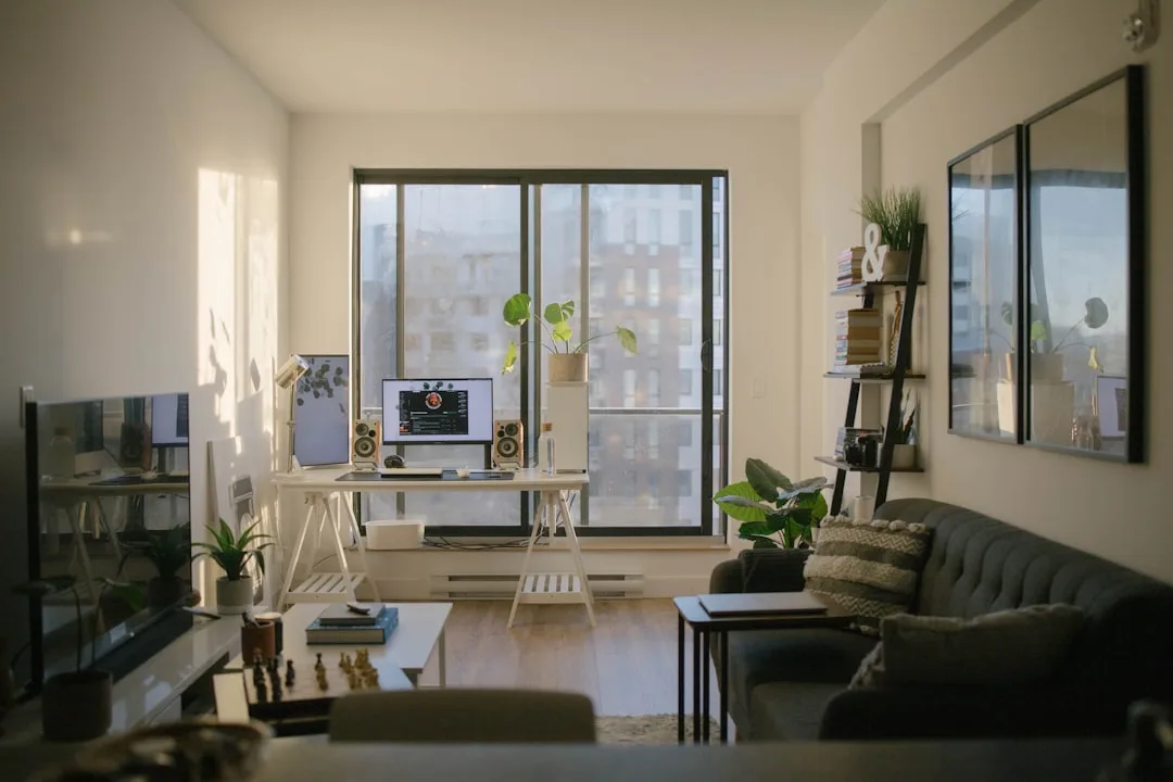
The mechanism behind this is the design concept of visual weight. Every object in a room carries a certain amount of visual gravity — determined by its color intensity, size, pattern complexity, and reflectivity. A single brightly colored ceramic vase on a shelf carries more visual weight than three neutral linen books next to it. When too many high-visual-weight objects occupy the same space, they don’t just add up — they compound, each one amplifying the visual noise of the others.
Here’s what this means practically:
- A room can contain 200 objects and feel serene if they share visual harmony
- A room can contain 40 objects and feel chaotic if they fight each other for attention
- The “tidiness” your eye perceives is a measure of visual coherence, not object count
- Objects at eye level carry more visual weight than those stored below knee height
- Irregular shapes demand more neural processing than clean geometric forms
- High-contrast items — a black frame on a white wall surrounded by warm wood tones — pull the eye disproportionately hard
The key insight: decluttering your visual field is a different task than decluttering your physical space — and it requires a different set of tools.
Actionable takeaway: Before your next organizing session, stop asking “what should I get rid of?” and start asking “what is my eye catching, and why?”
The Color Contradiction: When Your Decor Choices Create Clutter Without Adding a Single Item
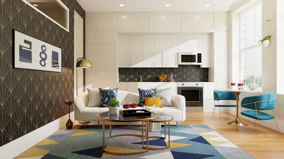
Walk into most professionally organized homes and you’ll notice something that has nothing to do with storage systems: the colors are calm. Not necessarily neutral — just consistent. That’s not an accident.
Interior design studies show that rooms with three or fewer dominant colors are consistently rated as “cleaner” and “more organized” by observers, regardless of the actual number of objects present. Your eye reads color variety as visual complexity, and visual complexity as disorder. A bookshelf with 60 books in similar tones reads as calmer than one with 20 books in clashing covers, even though the first shelf has three times the objects.
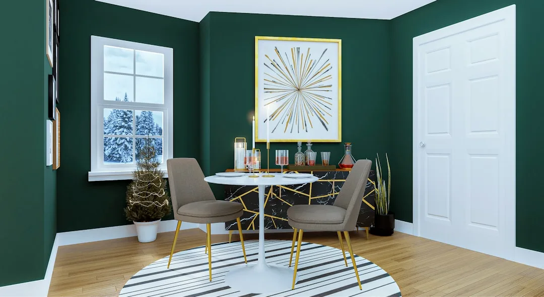
Professional organizers frequently recommend the 60-30-10 color rule not as an aesthetic preference but as a perceptual clutter-reduction tool. The formula works like this:
- 60% of the room should be a dominant color (walls, large furniture, flooring)
- 30% should be a secondary color (upholstery, rugs, curtains)
- 10% should be an accent color (artwork, throw pillows, small decor)
The moment you introduce a fourth competing color — an orange pillow when everything else is blue and white and wood-toned — the eye has to do extra work to process the room. That extra work registers as unease. It’s the same neural mechanism that makes perceptual clutter feel like physical mess.
One of the most overlooked offenders in otherwise tidy homes is exposed storage in mismatched containers. A laundry room shelf with a white wicker basket, a clear plastic bin, a terracotta pot, and a galvanized metal bucket might be perfectly organized inside each container — but the color and material scatter reads exactly like clutter to anyone looking at it. Swap those for matching bins in one material and one color, and the room instantly looks cleaner without a single item being moved or removed.
The same logic applies to:
- Throw pillow collections in too many competing patterns
- Gallery shelves mixing warm wood, black metal, and white ceramic frames
- Kitchen counters with appliances in different finishes (chrome, matte black, brushed nickel)
- Bathroom countertops where every product has a different label color and bottle shape
- Living room bookshelves where paperbacks, hardcovers, and decorative objects have no visual grouping logic
- Children’s toy storage in multi-color plastic bins mixed with natural wood boxes and fabric baskets
Actionable takeaway: Count the distinct colors in your most-used room. If you’re above four, identify the one that doesn’t connect to anything else — that’s your first perceptual clutter fix.
Surfaces That Sabotage: The Hidden Clutter Traps Professional Organizers Flag First
Ask a professional organizer where they look first when they walk into a home, and the answer is almost always the same: the surfaces. Not the closets, not the kitchen cabinets, not the storage situation. The surfaces — because surfaces are where the visual story of a home either holds together or falls apart.
According to professional organizer surveys cited in home staging research, entryway surfaces are the single most cited area where buyers and guests form their first impression of a home’s cleanliness level. A console table in a foyer tells a visitor everything they think they know about the rest of the house in under three seconds. If that table has a lamp, a bowl, a stack of mail, a candle, a framed photo, and a set of keys, it reads as cluttered regardless of whether each item “belongs” there.
The perceptual threshold for open shelving is more specific than most people realize. Professional organizers and interior designers generally agree that five to seven objects per shelf is the upper limit before a shelf crosses from “styled” to “crowded” in the viewer’s perception. Beyond that number, the brain stops reading individual items and starts reading noise.
Here are the specific surface types that professional organizers flag most consistently when working on home clutter issues:
Kitchen counters are the highest-traffic visual surface in most homes. The average American kitchen counter holds between eight and fourteen items at any given time — toaster, coffee maker, knife block, fruit bowl, paper towel holder, cooking utensils, cutting board, and more. Each of those items is individually justified. Together, they read as a visual wall. Professional organizers recommend applying a “counter editing” rule: only items used daily belong on the counter. Everything used three times a week or less earns cabinet space, even if retrieval takes thirty extra seconds.
Nightstands are a surface type most people underestimate. Because they’re adjacent to sleep, the perceptual clutter they generate has a direct impact on wind-down quality. A nightstand holding a lamp, two books, a phone charger, a glass of water, hand cream, a candle, and reading glasses is doing too much visual work in a space where your brain is trying to downshift. The professional organizer benchmark for a nightstand: three items maximum on the surface, not counting the lamp.
Coffee tables present a different challenge — they’re simultaneously a functional surface and a styling opportunity, which is exactly what makes them perceptual clutter magnets. The most common mistake is treating the coffee table as a display shelf rather than a living surface. The result is a styled tableau that has to be moved every time someone sets down a drink.
The practical rules professional organizers apply to coffee tables:
- Keep one tray as a visual container — items inside the tray read as one unit rather than many
- Limit decorative stacks to two or three items maximum
- Leave at least 40% of the surface completely clear
- Choose objects with similar tonal values to prevent visual jumping
Window sills are the forgotten surface. They accumulate plants, candles, small figurines, and objects placed there “temporarily” months ago. Because window sills are at or near eye level and lit from behind, every object on them is silhouetted against the light — which maximizes its visual weight and sends it straight into the brain’s pattern-detection system.
Actionable takeaway: Walk through your home and photograph every surface with your phone. Review the photos rather than the surfaces themselves — the camera removes your familiarity bias and shows you what a first-time visitor actually sees.
The Lighting Problem Nobody Mentions in Home Clutter Tips
Most home clutter professional organizers tips focus entirely on objects — what to keep, what to store, what to remove. Almost none of them address the way lighting interacts with visual clutter, which is a significant oversight because light is the medium through which your eye reads everything else in the room.
The core issue is this: harsh overhead lighting flattens a room and eliminates the visual hierarchy that makes spaces feel organized. When every object in a room is lit with equal intensity, your eye has no guidance about where to look first, second, and third. Without that hierarchy, everything demands equal attention simultaneously — which is functionally identical to the neural experience of clutter.
Professional interior designers and organizers who work on high-end residential projects apply the same lighting principle across different projects:
- Ambient lighting (general overhead light) should be dimmable and warm-toned rather than blue-white
- Task lighting (under-cabinet lights, reading lamps, desk lamps) directs attention purposefully and reduces the need for bright overhead light
- Accent lighting (picture lights, shelf lighting, candles) creates visual anchors that guide the eye through a room in a controlled sequence
The specific lighting mistakes that make organized rooms feel messier than they are:
- Single-source overhead lighting with no layering — one ceiling fixture lighting an entire room equally creates flat, institutional visual quality
- Cool-white LED bulbs in living spaces — color temperatures above 4000K increase perceived visual activity in a room
- Under-lit corners — dark corners that your eye tries and fails to resolve increase low-level visual anxiety
- Mismatched bulb temperatures — a room where some lamps are warm (2700K) and others are cool (4000K) creates a color inconsistency the eye reads as disorder
- Bare bulbs or exposed fixtures — a lamp without a shade or a pendant with a visible bulb creates a visual focal point that competes with everything around it
The fastest lighting fix that professional organizers and designers consistently recommend: replace every bulb in your main living spaces with 2700K bulbs and add at least one floor lamp or table lamp per room so you can turn off the overhead light entirely in the evenings. The visual calm that results surprises most people who’ve never experienced the difference.
Actionable takeaway: Spend one evening in your most-used room with only lamps running — no overhead lights. Note how the room reads differently. That’s your benchmark for what the space can feel like.
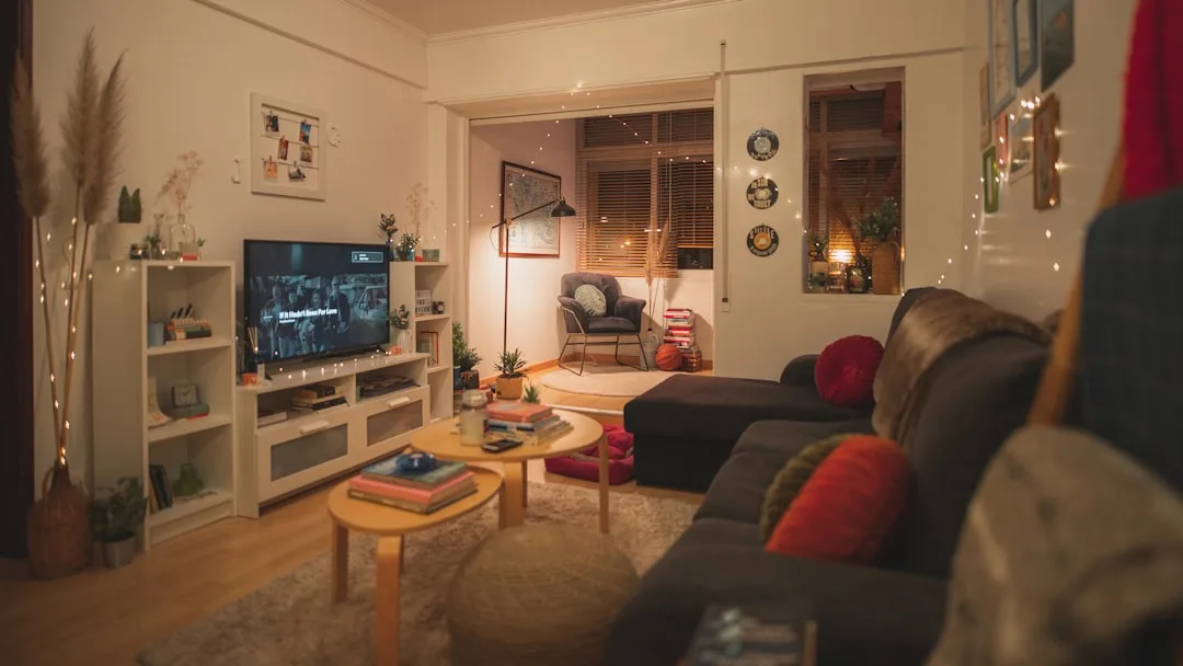
Pattern Overload: The Underestimated Clutter Multiplier
If color variety creates visual noise, pattern variety amplifies it exponentially. This is one of the areas where home clutter professional organizers tips most consistently diverge from mainstream decorating advice — because popular interior design content frequently encourages mixing patterns as a sign of confidence and style, while professional organizers see pattern mixing as one of the fastest ways to make a clean room feel chaotic.
The brain processes patterns differently than it processes solid colors. A patterned surface — a floral cushion, a geometric rug, a striped throw — requires active decoding rather than passive registration. Your visual cortex has to resolve the repeat, identify the motif, and file it as a complete object rather than just noting its presence. That takes more neural bandwidth than a solid object of the same size.
The compounding effect happens when multiple patterns share the same field of view. Two patterned items in a room are usually manageable. Three begins to strain. Four or more — even if each is individually beautiful — creates a room that feels busy regardless of how clean and organized it actually is.
The specific pattern combinations that professional organizers most frequently flag:
- Rugs and throw blankets in different geometric patterns — two competing grids or two different organic motifs in the same seating area
- Patterned upholstery with patterned throw pillows — if the sofa has texture or print, solid pillows reduce visual noise dramatically
- Multiple tile patterns visible from one standing position in a kitchen or bathroom — a patterned backsplash plus patterned floor tile plus a patterned rug creates three simultaneous decoding tasks
- Gallery walls that mix frame shapes, mat colors, and image styles — a collection of photos in matching frames reads as one unit; a mix of sizes, orientations, and frame finishes reads as accumulated objects
The professional organizer approach to pattern isn’t to eliminate it — it’s to apply a simple rule: let one pattern lead, and keep everything else solid. One patterned rug with solid-colored furniture. One patterned accent pillow with solid throw blankets. One tiled backsplash with a plain floor. The leading pattern becomes a feature; everything else gives it space to breathe.
Actionable takeaway: Stand in the center of your living room and count the patterned items visible from that position. If you count more than three, identify which pattern you love most and swap the others for solid alternatives in coordinating tones.
FAQ: Home Clutter and Professional Organizer Tips
Q: My home is actually clean and tidy, but it still feels messy. What’s going on?
This is one of the most common frustrations people bring to professional organizers, and it almost always comes down to perceptual clutter rather than functional clutter. The room isn’t messy — it’s visually noisy. The culprits are usually a combination of too many competing colors, mismatched materials in exposed storage, or too many objects at eye level demanding attention simultaneously. The fix isn’t more organizing — it’s editing the visual field. Start by removing every item from one shelf or surface, then only return what genuinely earns its place there.
Q: How many items should be on a shelf before it looks cluttered?
Professional organizers and interior designers consistently cite five to seven items as the threshold for open shelving before it tips from “styled” to “crowded.” More important than the exact number, however, is the principle of visual grouping — items that share color, material, or height read as a unit rather than as individual objects, which means you can sometimes display more without increasing the perception of clutter. Three white ceramic vases of varying heights read as one visual unit; one white vase, one terracotta pot, and one glass bottle read as three competing objects even if the count is the same.
Q: What do professional organizers say is the single fastest fix for a room that feels cluttered?
The most consistent answer across professional organizer recommendations is to clear every horizontal surface and only return items that are used daily or are genuinely beautiful. This isn’t about permanent minimalism — it’s a reset that forces you to make a conscious decision about each item rather than letting accumulation happen passively. Most people who do this exercise find that 40 to 60 percent of what was on their surfaces was there by default rather than by choice.
Q: Does the color of storage containers actually make a visible difference?
Yes — significantly. Exposed storage in mismatched containers is one of the most consistently flagged issues in home clutter professional organizers tips because the eye reads material and color variation as disorder even when the contents are perfectly organized. Swapping mismatched bins, baskets, and boxes for a uniform set — same material, same color, ideally the same size where possible — is one of the highest-impact, lowest-effort changes you can make to a room. You don’t need expensive containers; you need consistent ones.
Q: Is minimalism the only way to have a home that doesn’t feel cluttered?
No — and this is an important distinction. Perceptual clutter is not about quantity of objects, it’s about visual coherence. A maximalist room filled with collected objects can feel completely calm if those objects share tonal harmony, consistent materials, and thoughtful arrangement. The homes that feel cluttered despite being cleaned and organized are usually homes where objects are individually chosen without reference to what surrounds them. The goal isn’t fewer things — it’s things that work together visually so the brain can read the room as a whole rather than as a competition of individual items.