The room isn’t too small, too narrow, or too weird — it’s just being treated like a bedroom when it needs to function like a cockpit, and that single misunderstanding is behind almost every home office awkward room layout problem people can’t solve. Bedrooms are designed for passive rest. Home offices demand active, directed attention. The architecture that serves one purpose actively undermines the other, and no amount of tasteful throw pillows will bridge that gap.
Quick Answer
The room isn’t too small, too narrow, or too weird — it’s just being treated like a bedroom when it needs to function like a cockpit, and that single misunderstanding is behind almost every home office layout problem people can’t solve.
What surprises most people is that the frustration they feel in their home office isn’t aesthetic — it’s spatial and functional. They keep buying things. Desk organizers, better chairs, new shelving. Nothing works because they’re treating symptoms instead of the actual diagnosis.
This article works through the real problem, section by section, with tools and rules that professional designers use — applied specifically to the rooms that refuse to cooperate.
Why Most Home Office Rooms Feel Wrong Before You Even Add Furniture
In This Article
Most rooms that become home offices were designed for something else entirely. Bedrooms assume you’ll spend most of your time horizontal. Guest rooms are planned for occasional use with minimal furniture. Converted dining rooms assume you’ll move around the perimeter and view the space from a seated position at a table. None of these design assumptions translate to focused desk work, which requires sustained forward-facing attention, controlled sight lines, and a specific relationship between entry points and your seating position.
A home office awkward room layout almost always traces back to one of five structural realities — and identifying yours is the first real step toward fixing it.
The five failure points that ruin most converted rooms are:
- Doorways that cut the longest wall. A door in the center or near one end of the longest wall eliminates the most useful desk placement and fragments the wall into two unusable halves.
- Windows centered on the wrong wall. A window behind your monitor creates silhouetting and glare. A window to your left (if you’re right-handed) is ideal — centered on the wall you’re facing is the worst possible position.
- Closets that interrupt flow. Closet doors that swing outward consume clearance zone and create dead pockets of floor space on either side.
- Rooms that are too long and narrow. Proportions narrower than roughly 1:2 (width to length) create a hallway effect that makes any furniture arrangement feel like an afterthought.
- Angled walls, soffits, or dormers. These are genuinely tricky — not because they can’t be solved, but because most people try to ignore them instead of building around them.
Here’s what ties all five together: visual weight imbalance. It’s not about square footage. It’s about where the room’s mass congregates and where it empties out. A room where all the architectural features pile up on one side — door, closet, window — leaves the opposite side feeling hollow and unresolved, no matter what you put there. That hollow feeling is what people describe as “something’s off but I can’t explain it.”
I spent a year working with a client in a converted Chicago two-flat where the bedroom-turned-office had a door on the north wall, a closet on the east wall, and a window on the south wall. Three of four walls were compromised before a single chair entered the room. The west wall — plain, uninterrupted — became the entire solution. But getting her to leave it alone until we addressed the imbalance elsewhere took three conversations.
A 2023 NFID workplace survey found that 58% of remote workers say their home workspace negatively impacts their focus — and spatial discomfort was cited more often than noise as the primary cause. That finding matches everything I observed working with real clients: people will tolerate a loud street outside before they’ll tolerate a room that makes them feel subtly wrong.
Actionable takeaway: Before you move anything, identify which of your four walls is least compromised — that’s your anchor wall, and everything else in this article builds from it.
Map the Room Before You Move a Single Piece of Furniture
The single best thing you can do before rearranging your home office is walk it. Not stand in the doorway thinking about it. Actually walk the routes you take every day — entry to desk, desk to printer, desk to door, desk to window. Every one of those paths needs a minimum of 24 inches to feel passable and 36 inches to feel comfortable. Trace them on paper, or use a free browser-based tool like Roomstyler to map them digitally. Either way, you’re looking for where those paths collide, because collision points are where rooms become claustrophobic.
Natural light is more complicated than most advice acknowledges. You need to track it by time of day, not just note that you have a window. Morning light from the east hits at a low angle and creates severe horizontal glare across a monitor. Afternoon light from the west does the same thing, just four hours later. A north-facing window gives you flat, consistent light with no direct sun — ideal for monitor work but cold in color temperature. Mark on your map where the light falls at 9am, noon, and 3pm. Your monitor placement depends entirely on this.
The command position is a concept that comes up in both ergonomic design and biophilic workspace theory — it means placing your desk so you face the door without sitting directly in line with its opening. This isn’t mysticism. It’s practical: facing a door means you won’t startle every time someone walks by, you’ll have natural visual relief from your screen, and you’ll feel a baseline sense of control over your environment that translates into sustained focus. Sitting with your back to the door is the most common home office mistake I see, because it feels like it gives you more desk space. It does. It also keeps you in a low-grade state of alertness that drains you by 2pm.
Once you’ve traced traffic paths and light arcs, mark your anchor zone — the area with the clearest wall, best light control, and most direct sightline to the door — and your dead zones, which are the corners, alcove pockets, or angled wall segments where no standard furniture fits cleanly.
When mapping a home office awkward room layout, track these six things on paper before touching a single piece of furniture:
- Door swing radius — mark the full arc, not just the doorway opening
- Window light at three times of day — 9am, noon, and 3pm, marked as shaded zones
- Closet clearance zone — the floor area consumed when the door opens fully
- Traffic paths — every route you walk daily, minimum 24 inches wide
- Electrical outlet positions — these constrain desk placement more than people expect
- The command position — the desk location where you face the door without sitting in direct line with its opening
OSHA workstation guidelines set the minimum desk-to-wall clearance behind a rolling chair at 36 inches. That’s not generous. That’s just enough to push back from your desk without hitting the wall. If your room can’t give you that, the desk is in the wrong place — no matter how good the wall looks.
Actionable takeaway: Draw your room on graph paper (1 square = 1 foot), trace your daily movement paths, and mark your command position before you price a single piece of furniture.
What Is the 3-5-7 Rule in Decorating — and How It Rescues Broken Layouts
Most people encounter the 3-5-7 rule as a decorating guideline for shelf styling or coffee table arrangements. That’s where it lives in most content about it. But in rooms with awkward architecture — an oddly placed door, a window that sits too high, a sloped ceiling that cuts into usable wall space — the 3-5-7 rule becomes a structural tool, not just a styling one.
The rule states that visual groupings work best in odd numbers: three elements, five elements, or seven. The reason isn’t arbitrary. Even-numbered groupings create symmetry, and symmetry draws the eye to the center of the group rather than letting it travel. In a room where the architecture is already unbalanced, forcing symmetry into your furniture and decor doubles down on the problem. Odd groupings create implied movement — the eye bounces from object to object without landing and stopping, which makes a room read as larger and more intentional than it actually is.
How the 3-5-7 rule applies specifically to home office awkward room layout problems:
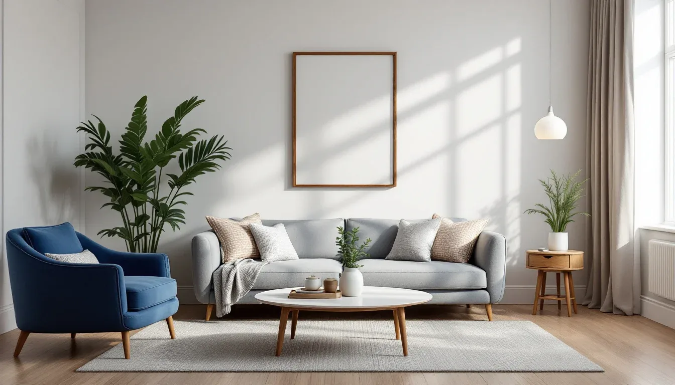
- Three anchor points, not two. Instead of desk plus chair (a symmetric pair that isolates itself), use desk, chair, and a floor lamp or open shelving unit as a third anchor. This triangulates the room’s visual weight and distributes it away from the compromised walls.
- Five storage elements, not four. Four shelves feel static. Five feel considered. This applies to wall-mounted shelving, drawer units, and even the number of items displayed on a surface — four identical objects feel like a set, five feel like a collection.
- Seven decorative points across the room, not clustered in one corner. In an awkward room, people tend to over-decorate the one good wall to compensate for the rest. That makes the imbalance worse. Seven points distributed across all visible surfaces — including the wall behind the door and the space above the closet — pulls the room into coherence.
The 3-5-7 rule also helps solve one of the most persistent home office awkward room layout problems: the dead corner. Most people leave corners empty because nothing fits cleanly, which makes the room shrink visually toward its worst edges. A corner treated as one point in a five- or seven-element distribution gets a narrow console, a tall plant, or a simple wall-mounted shelf — not because it needs storage, but because the room needs that corner to participate.
Practical applications by room type:
- Narrow rooms (1:2 ratio or worse): Use the rule along the long walls only, placing three groupings — one near each end and one at the midpoint — to interrupt the hallway tunnel effect.
- L-shaped or alcove rooms: Treat each section as its own 3-point system, then connect them with one shared element (a rug that spans both areas, or a light source positioned at the corner junction).
- Rooms with dormers or angled ceilings: Use the lower, flat-walled area for your five or seven points, and let the angled section serve as a single visual anchor rather than trying to populate it with standard furniture.
Actionable takeaway: Count the distinct visual elements in your current room. If you have an even number of groupings, add or subtract one. If your dead corner has nothing in it, it needs exactly one thing — not necessarily useful, just present.
The Fixes That Actually Work for Specific Layout Problems
Diagnosis is useful. Solutions are better. Here is how to address the most common home office awkward room layout configurations without rebuilding the room from scratch.
The Door-on-the-Longest-Wall Problem
What it creates: Two short, fragmented wall sections that can’t hold a standard desk or credenza. The wall you most need becomes the wall you can’t use.
The fix:
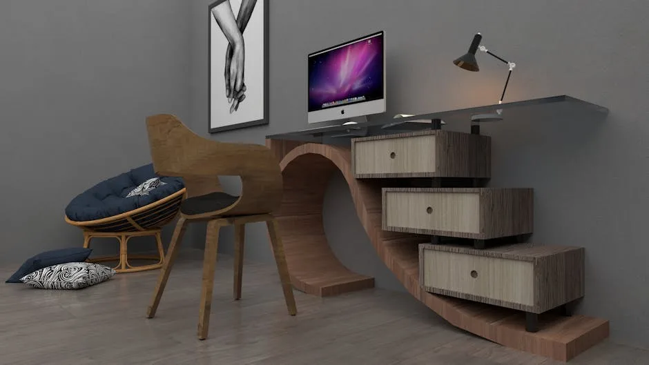
- Float the desk perpendicular to the compromised wall rather than parallel to it. A desk placed at 90 degrees to the door wall becomes its own room divider and creates a defined workspace without requiring uninterrupted wall space.
- Use the two short wall sections for vertical storage only — tall bookshelves or wall-mounted cabinets that don’t require floor-level continuity.
- Add a low bookcase or credenza on the opposite wall to create the visual anchor the longest wall can no longer provide.
The Window-Behind-the-Monitor Problem
What it creates: Constant glare, silhouetting, and eye fatigue — plus the psychological discomfort of facing away from the room’s natural focal point.
The fix:
- Reorient the desk 90 degrees so the window is to your side, not behind you. Even if this puts you at an angle to the room, the ergonomic and visual gain is worth the awkward positioning.
- If rotation isn’t possible, hang a sheer panel (not blackout) that diffuses direct light without eliminating it. This softens glare without making the room feel sealed.
- Add a monitor arm that allows you to angle the screen away from the light source independently of the desk position.
The Narrow Room Problem
What it creates: Any furniture arrangement looks like it’s been pushed against the walls to create a hallway. The room feels like a waiting area rather than a workspace.
The fix:
- Run one piece of furniture — ideally the desk — down the center of the long axis rather than against a wall. This is counterintuitive but correct: a desk in the center of a narrow room creates two usable zones rather than one cramped one.
- Use a rug that runs the length of the room, not the width. Width-oriented rugs emphasize the narrow dimension. Length-oriented rugs stretch the perceived proportion.
- Keep wall-mounted storage to one long wall only. Mirroring shelving on both long walls reinforces the tunnel effect.
The Angled Wall or Dormer Problem
What it creates: Dead zones where standard furniture won’t fit, awkward ceiling height transitions, and the constant temptation to leave the weirdest part of the room completely empty.
The fix:
- Commission or buy a custom-cut desk surface that follows the angle rather than fighting it. IKEA’s LINNMON tops are inexpensive and can be cut to angle with basic tools.
- Use the low-ceiling zone for storage only — rolling file cabinets, low bookshelves, or built-in cubbies. Nothing that requires you to stand or sit upright in a space where the ceiling won’t allow it.
- Place your primary desk in the flat-ceiling zone and treat the angled section as a secondary surface — reference materials, a printer, equipment you use occasionally but don’t need at eye level.
Quick-reference fixes by problem type:
| Layout Problem | Primary Fix | Secondary Fix |
|---|---|---|
| Door on longest wall | Float desk perpendicular to wall | Use short sections for vertical storage only |
| Window behind monitor | Rotate desk 90 degrees | Add sheer diffusing panel |
| Narrow room | Run desk down the long axis | Use length-oriented rug |
| Angled wall/dormer | Custom-cut desk surface to match angle | Reserve angled zone for low storage only |
| Closet interrupts flow | Convert to open shelving if possible | Use dead pockets beside door for vertical storage |
Frequently Asked Questions
What is a home office awkward room layout, exactly?
It’s any room repurposed as a home office where the original architectural design — door placement, window position, room proportions, ceiling angles — actively conflicts with the requirements of focused desk work. The room wasn’t designed for you to sit in one place for eight hours facing a specific direction, and that friction is what makes these layouts feel impossible to solve with standard furniture arrangement.
Can I fix an awkward home office layout without buying new furniture?
Often, yes. The most common fixes involve repositioning existing furniture rather than replacing it — rotating the desk away from a problematic window, floating it away from a fragmented wall, or moving storage to a different wall entirely. The mapping exercise in this article costs nothing and frequently reveals that the furniture you already have is fine; it’s just in the wrong place.
How do I handle a home office in a room with no good wall?
This happens more than people admit — rooms where every wall has a door, window, closet, or architectural feature that compromises it. The solution is to identify the least compromised wall (even if it’s not ideal) and treat it as your anchor. A wall with a window you can position to your side is better than a wall with a door you have to face. Work with your least-bad option rather than waiting for a perfect one.
Does ceiling height affect home office layout in awkward rooms?
Yes, significantly. Low ceilings compress a room’s perceived width — which is why narrow rooms with low ceilings feel almost impossible. To counter this, keep wall-mounted storage below eye level when possible, use tall narrow furniture rather than wide low furniture, and avoid overhead pendant lighting that hangs into the occupied zone. Ceilings above 9 feet open up vertical storage options and allow taller shelving units that draw the eye upward rather than around the room’s difficult proportions.
What’s the fastest way to identify why my home office layout feels wrong?
Sit at your desk and ask three questions: Can I see the door without turning my head? Is there a light source directly behind my monitor? Do I have at least 36 inches of clearance to push back my chair? If you answer no, yes, and no in that order, you’ve identified all three of the most common layout problems simultaneously. Start with whichever one you can fix without buying anything new.