From being all the rage among kids and teenagers for putting on their phones and laptops, self-adhesive stickers have progressed to one of the most happening advertising media.
Photo by form PxHere
Right from laptop skins to store window graphics and bumper stickers and much more, stickers are all around us. However, for stickers to be popular, they must be designed attractively and printed well. Some tips on getting it right:
Keep It Simple
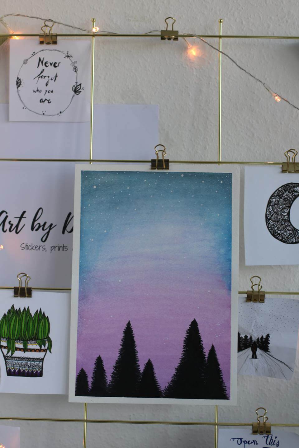
Regardless of their size, stickers have to be kept simple because people will typically encounter them on the go. If you expect people to read a mass of information on a bumper sticker or a window display, you cannot be more mistaken. When you are creating a sticker design, the emphasis should be on making it as simple as possible to drive home your point. Typically, a single image along with a crisp slogan is all that a sticker should contain for the maximum impact. Adding too many details can only deter people from reading it and, also, the sticker will look like a blurry mess from a distance.
Stand Out with a Different Shape
It is common to see most vinyl stickers around you as a square or a circle. While these are evergreen choices, there is absolutely no reason for you to create a little bit of freshness with a non-conventional or irregular shape. Of course, you must make sure that your graphic design supports the shape.

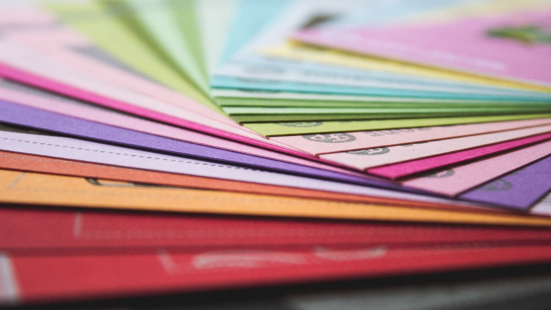
Use Your Brand Colors for a Better Impact
There is nothing to stop you from using any color in your sticker design but it makes more sense to incorporate the color scheme of your brand. It will create instant recognizability and more top-of-the-mind recollection. When designed right, using the brand color palette may not require you to include your brand logo, and you can use the extra space to create a stronger impact. According to Forbes, you must consider the psychological effect of colors before choosing them.
Ensure Legibility
While it is a good idea to attempt not to use any text at all, at least in the smaller stickers, if you must have text, you should ensure that it is readable from a normal viewing distance. Use crisp typefaces without elaborate decorative styles for better readability. Experiment with font size to get it right. Fonts that are too large are as bad as those that are too small. Make sure the contrast with the background color is maximum for best legibility.
Include Your Contacts
Unless you are designing a sticker to make people smile or issue an instruction or warning, including a phone number, website address, a social media handle will make your stickers more effective from the marketing point of view. Including a compelling CTA is also a good idea.
Conclusion
Even after following the best practices of sticker design, you can end up with a sub-standard product, if you don’t get the printing right. Ask the sticker printer, the file format, and color scheme acceptable, use high-resolution or vector graphics, ensure proper bleed, and discuss the vinyl and adhesive quality before you go into print.