If you’ve been asking yourself “what color kitchens are in for 2026?” — the honest answer is that the question itself has gotten more interesting. The all-white kitchen — for a decade the safest, most resaleable, most Instagrammable choice a homeowner could make — is finally losing its grip on the industry, and the colors replacing it are far more interesting than any trend list will tell you.
This isn’t a slow fade. It’s an accelerated departure from an entire era of design thinking, and the homeowners and designers leading it aren’t just bored with white. They’re actively seeking something that their kitchen hasn’t been able to deliver until now: a room that feels like a deliberate choice was made.
Here’s what the 2026 kitchen color shift actually looks like, why it’s happening, and how to use it in a real kitchen with real constraints.
Why 2026 Kitchen Colors Are Breaking from the ‘Safe Neutral’ Era
The cozy neutral wave that followed the pandemic made complete sense at the time. People were at home, nesting hard, and reaching for the psychological comfort of warm creams, soft greiges, and barely-there tones that felt both calming and universally appealing. That instinct was genuine. But five years on, the saturation point has arrived.
Walk into a kitchen showroom today and you’ll see the feedback playing out in real time. Homeowners aren’t asking for safer versions of what they already have. They’re asking what they can do that their neighbor hasn’t done, what will make the kitchen feel like theirs rather than a staged set piece lifted from a 2019 listing photo.
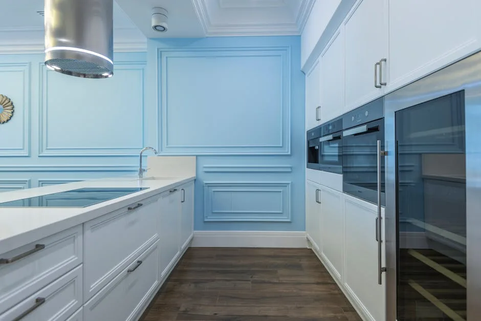
White is still common. It’s no longer dominant.
Several forces are converging to push this forward:
- Economic pressure is changing the calculus on resale. For years, white kitchens were justified partly as a resale strategy — broad appeal, nothing to offend a buyer. But in competitive real estate markets, a kitchen that makes no statement is increasingly reading as an opportunity cost, not a safe choice. Buyers who can afford a renovation don’t need a blank slate; they want to walk into something considered.
- Emotional interiors are replacing aspirational interiors. Post-pandemic design priorities reorganized around how a space feels to the person living in it rather than how it photographs for an audience. Color is the fastest, most economical way to shift a room’s emotional register.
- The ‘no decision’ look has been identified. Designers who work in mid-range to luxury residential markets report that flat greige and cool white are now being recognized — by buyers, by guests, by the homeowners themselves — as spaces where no real choice was made. That perception, once widespread, is corrosive to the whole premise of a ‘safe neutral.’
Actionable takeaway: Before you settle on a color, ask yourself whether you’re choosing it because you genuinely want to live with it or because you’re trying to protect yourself from an imaginary future buyer. In 2026, those two goals are more aligned than they’ve been in years.
The 2026 Kitchen Color Palette Taking Over: A Room-by-Room Breakdown
The colors landing hardest in 2026 aren’t loud. They’re complex. There’s a significant difference between those two things, and it’s worth understanding before you pull a paint chip.
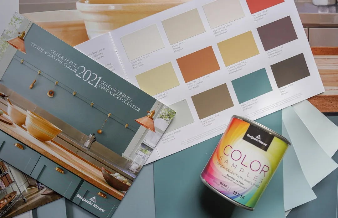
Benjamin Moore, Sherwin-Williams, and Behr all shifted their 2025 Colors of the Year toward warm, earthy, complex tones — a reliable leading indicator, given that residential kitchen palettes typically follow major brand color directions by twelve to eighteen months. The throughline across all three was depth without drama: colors that change character depending on the light, the season, and what’s sitting on the counter next to them.
Here’s where each major 2026 kitchen color actually lands in a room:
Aged terracotta and earthy clay tones are the most significant move of the cycle. These aren’t the burnt orange of the 1970s; they’re desiccated, sun-bleached, complex versions — think the exterior of a Portuguese farmhouse rather than a terracotta pot fresh from the garden center. They’re showing up most ambitiously as full cabinet finishes, not just backsplash accents. On lower cabinets against a natural limestone or honed travertine countertop, they anchor the room without overwhelming it.
Muted olive and dried sage are the direct successors to the saturated emerald and forest greens that peaked around 2022–2023. The difference is desaturation: these tones have more grey, more brown, more complexity built into their base. They read as almost neutral in north-facing light and warm significantly in evening lighting. This is the green that doesn’t announce itself.
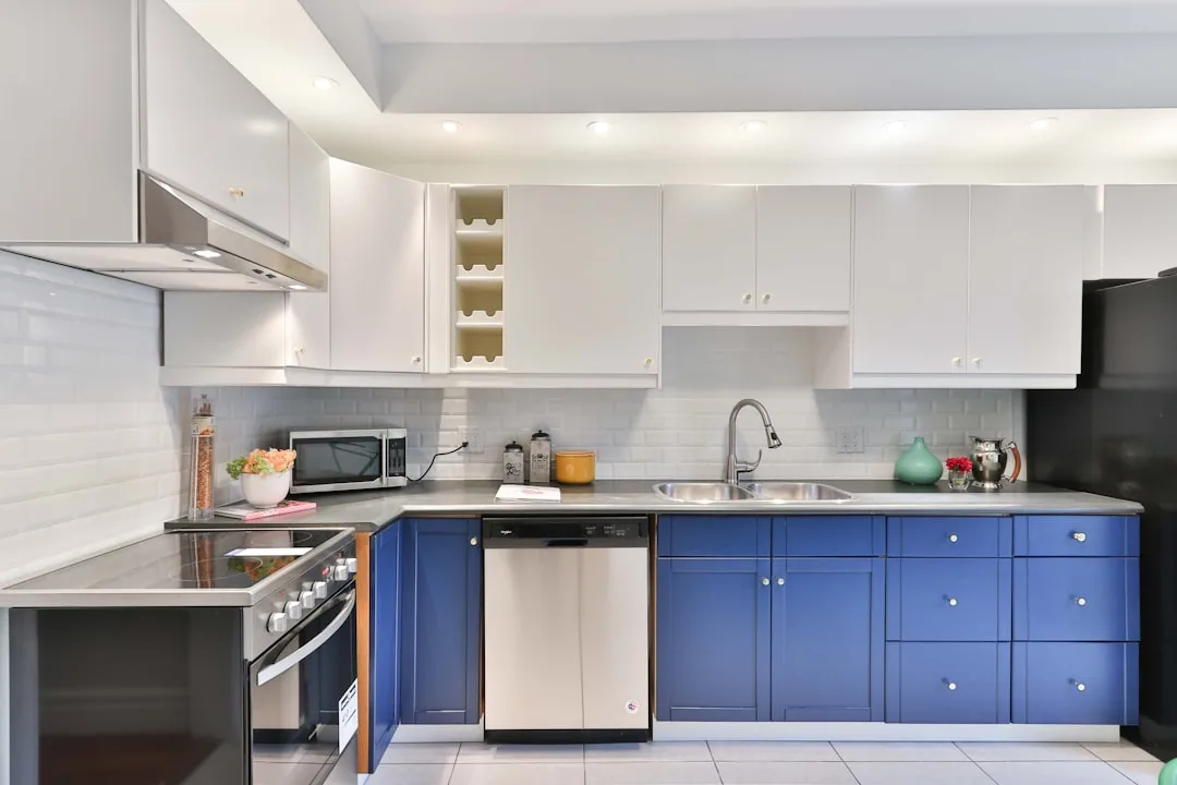
Smoked navy and slate blue are claiming the territory that flat black tried to occupy and couldn’t hold for long. All-black kitchens arrived, made a strong statement, and left a lot of homeowners with a space that felt more industrial than intentional. Smoked navy has the same visual weight but far more warmth and range — in a kitchen with south-facing windows, it shifts from almost purple at dawn to a deep, grounded blue in afternoon sun.
Warm putty and raw linen are the 2026 neutrals. Not crisp white, not greige. These are warmer, more tactile tones with a slightly sandy, raw quality — they suggest material rather than absence of color. They pair with natural wood effortlessly, which is part of their utility.
Two-tone combinations are maturing past the early, obvious phase of the trend. The 2026 version pairs a moody upper cabinet — smoked navy, olive, clay — with a natural oak or walnut lower, not another painted color. The result has visual layers without contrast for contrast’s sake.
Actionable takeaway: Choose one of these directions and commit to it fully — partial adoption (one terracotta accent wall, everything else white) loses the effect entirely.
What Kitchen Color Actually Works With Your Lighting (Before You Commit)
This is where most people make the expensive mistake. They fall for a color in a showroom lit by flattering pendant lights, take the swatch home, and discover something unrecognizable on their actual cabinet doors. The color hasn’t changed — the lighting environment has.
The most important thing to understand about kitchen lighting and color: every paint and cabinet finish has an undertone that becomes either an asset or a liability depending on your room’s light source and direction. A muted olive that reads beautifully warm in west-facing afternoon light can turn flat and grey-green in a north-facing kitchen under cool LED strips.
The specifics that matter:
- North-facing kitchens receive cool, indirect light all day. Any 2026 palette choice here needs warmth built into its base — lean toward clay, warm putty, or a smoked navy with a slightly purple rather than grey undertone. Avoid the cooler sage and olive tones unless you’re testing them extensively in your actual space first. Adding warm-spectrum under-cabinet LEDs (2700K–3000K) can meaningfully shift how these colors register, especially during evening hours when overhead natural light disappears entirely.
- South-facing kitchens are the most forgiving. Strong, warm natural light means you can work with the full 2026 palette without significant risk of a color turning on you. The one caution: terracotta and clay tones can read more orange and saturated than you intended in direct midday sun. Test in morning and afternoon light, not just at the brightest point of day.
- East-facing kitchens get strong morning light and cooler, flatter light for the rest of the day. Colors chosen primarily for how they look at breakfast will often disappoint by mid-afternoon. Test at both ends of the day and give more weight to how the color performs in the flatter afternoon conditions — that’s the light you’ll be working in most evenings.
- West-facing kitchens have the reverse problem: flat morning light, warm golden afternoon and evening light. This is actually an ideal orientation for smoked navy and deep olive, which come alive in warm directional light. Morning performance will be muted, but the evening payoff is significant.
- Artificial lighting undertones matter more than most people realize. Cool white LEDs (4000K and above) will push any color toward blue-grey and flatten warm undertones. Warm white LEDs (2700K–3000K) enhance terracotta, clay, putty, and warm olive. If you’re committed to a color that isn’t performing as expected, recalibrating the color temperature of your artificial lighting is often faster and cheaper than repainting.
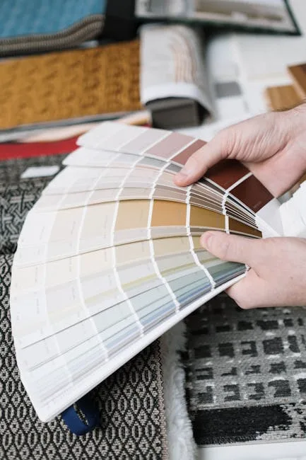
The right testing process: get a large paint sample — at minimum 12 inches by 12 inches, ideally painted directly on a cabinet door or a large piece of primed MDF rather than a paper swatch — and observe it at four different points across the day: early morning, midday, late afternoon, and under your evening artificial lighting. What you’re testing isn’t whether you like the color; you already know that. You’re testing whether your room’s light source is a partner to that color or working against it.
Actionable takeaway: Never commit to a kitchen color based on a swatch alone. The sample size and the lighting conditions of your test both have to match your actual kitchen conditions — anything less is guessing.
How to Transition Into a 2026 Color Without a Full Renovation
Not every kitchen color update requires tearing out cabinetry. The more useful question — especially for homeowners working with existing layouts and budgets that don’t include a full gut renovation — is how to introduce the 2026 palette meaningfully without replacing everything at once.
The hierarchy of impact, from highest to lowest, runs roughly as follows:
Cabinet painting or refinishing remains the highest-impact, most cost-effective intervention available. A professional cabinet repaint — which includes proper cleaning, sanding, priming, and spraying with a cabinet-specific finish — typically runs between $1,500 and $5,000 for an average kitchen, depending on size and condition. That’s a fraction of the cost of new cabinetry and, done correctly, produces a result that’s indistinguishable from factory finish. The 2026 colors that work best in this application are the ones with some complexity in their base: smoked navy, aged clay, and warm putty all spray and cure well in professional application.
Island-only color changes are the lowest-risk entry point. If your perimeter cabinets are white or off-white and in good condition, painting only the island in a deep, complex 2026 tone — a smoked navy, a dried sage, a warm clay — creates the two-tone effect without committing the entire kitchen to a single direction. This works particularly well in open-plan spaces where the kitchen island is visible from adjacent living areas and benefits from the visual weight of a deeper color.
Hardware replacement is underestimated as a color strategy. Switching from brushed nickel or chrome to unlacquered brass, aged bronze, or matte black shifts the warmth register of the entire kitchen without touching the cabinetry. In a kitchen that’s already leaning warm — cream cabinets, wood accents — unlacquered brass hardware can push the palette far enough toward the 2026 aesthetic to feel current without a single can of paint.
Backsplash material and grout color are more flexible than most homeowners assume. Replacing a white subway tile backsplash with a handmade terracotta zellige, a honed travertine, or a textured clay-colored ceramic introduces material complexity and color warmth simultaneously. The grout choice matters as much as the tile: a warm sand or buff grout on a handmade tile reads entirely differently than a bright white grout on the same tile.
Actionable takeaway: Identify the single highest-impact change available in your specific kitchen before budgeting anything. In most cases, that’s cabinets — but in kitchens with strong architectural bones and good existing cabinetry, hardware and backsplash changes can shift the color story significantly for a fraction of the investment.
FAQ: What Color Kitchens Are In for 2026?
What color kitchens are in for 2026, in plain terms?
The dominant directions are aged terracotta and clay tones, muted olive and dried sage, smoked navy and slate blue, and warm putty or raw linen as the 2026 neutral alternative to white. These aren’t loud colors — they’re complex, layered tones that change character across different lighting conditions throughout the day.
Is white completely out for kitchen cabinets in 2026?
Not out, but no longer the default. White still works in the right context — particularly in smaller kitchens where visual weight needs to be minimized, or in period properties where it reads as an intentional architectural choice rather than a neutral fallback. The shift is away from white as the absence of a decision. If you choose white in 2026, it should be a considered choice with a clear reason behind it, not the path of least resistance.
How do I know which 2026 kitchen color will work in my specific space?
Start with your lighting orientation and your existing fixed elements — flooring, countertops, hardware — before you choose a color direction. A smoked navy that looks extraordinary in a south-facing kitchen with warm oak floors can feel oppressive in a small, north-facing kitchen with cool stone tile. Test large samples in your actual space across multiple times of day before committing.
Are two-tone kitchens still a good choice for 2026?
Yes, but the approach has matured. The 2026 two-tone kitchen pairs a painted upper or lower cabinet in a complex, moody tone with a natural wood element — typically oak or walnut — rather than two contrasting painted colors. The result reads as layered and considered rather than trendy. The combinations that are working best: smoked navy uppers with natural walnut lowers, muted olive lowers with warm putty uppers, clay lowers with white oak.
Will 2026 kitchen colors hurt resale value?