If you’ve ever wondered how to get inspiration for home decor without drowning in images you’ll never actually use, you’re not dealing with a taste problem — you’re dealing with a method problem. The average person saves over 200 home decor images before buying a single thing — and most still feel like they have no idea what they actually want.
That’s not a discipline problem. It’s a method problem. The standard advice — open Pinterest, scroll Instagram, browse catalogs — creates the illusion of progress while quietly burying you in other people’s choices. Real inspiration doesn’t work that way. It comes from a completely different direction, and once you understand where to look, decorating decisions get dramatically easier and a lot more satisfying.
Why Most Home Decor Inspiration Advice Leaves You Feeling Stuck
Here’s what nobody tells you about the inspiration-seeking process: more information doesn’t produce more clarity. It produces more noise. That’s a striking finding. The thing most people do first (research) is the thing making the problem worse.
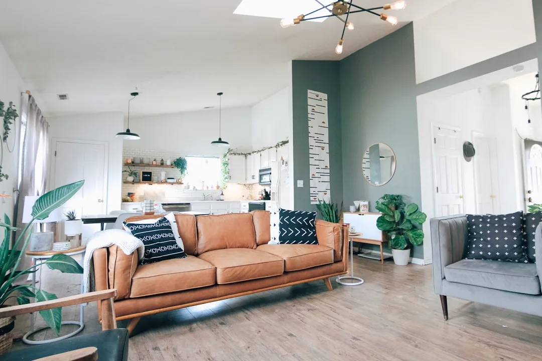
The platform-first approach has a specific failure mode. When you open Pinterest before you have any personal filter in place, you’re not discovering your style — you’re borrowing everyone else’s. The algorithm surfaces what’s popular, what’s aspirational, what photographs beautifully under professional lighting in a 4,000-square-foot loft. None of that tells you anything about your 11×13 bedroom or what you actually need from it.
Inspiration without a personal filter just creates expensive indecision. You fall in love with a Moroccan tile backsplash from a kitchen in Barcelona, a Japandi-inspired living room from a Tokyo apartment, and a maximalist gallery wall from a Brooklyn brownstone — all in one afternoon. They contradict each other completely. You’ve spent two hours and you’re further from a decision than when you started.
Before you search anywhere, it helps to identify your specific inspiration blockers:
- The comparison trap: You love an image, then immediately disqualify it because your space is smaller, darker, or cheaper
- The trend anxiety spiral: You like something but worry it’ll look dated in three years
- The coherence fear: You can’t figure out how your mixed instincts (industrial + cozy, minimal + colorful) could possibly work together
- The budget disconnect: Your taste and your budget feel like strangers
Naming your blocker isn’t therapy — it’s tactical. It tells you what kind of help you actually need before you spend another evening scrolling.
Takeaway: Before opening any platform, write down one sentence about what you want the finished room to feel like to be in. That sentence is your filter for everything that follows.
Start With Your Own Life Before Looking Outward for Home Decor Ideas
The most underused source of decor direction is already in your memory.
Experienced interior designers consistently report that clients who can describe a meaningful personal space from their past — a childhood kitchen with afternoon light hitting the linoleum just right, a hotel lobby in Lisbon with leather chairs worn smooth at the armrests — make faster, more satisfied decorating decisions than those who start with digital moodboards. The reason is simple: that memory contains encoded information about what actually makes you feel something, not just what looks good in a photograph.
Try the peak moments exercise. Identify three spaces where you’ve felt most comfortable, most alive, or most genuinely yourself. They don’t have to be homes. A diner booth you loved. A grandfather’s study. A rental cottage in Vermont. Then reverse-engineer why:
- Was it the light quality (warm, diffused, directional)?
- The scale (intimate, grand, low-ceilinged)?
- The texture density (lots of layered materials, or very spare)?
- The smell or sound environment that the visual space implied?
This exercise surfaces design preferences you didn’t know you had — and they’re more reliable than anything you’d find scrolling.
Your wardrobe and bookshelf are doing the same thing. If your closet runs to oatmeal linen, olive green, and cognac leather, you already know your color palette. If your books are organized by color, you’re wired for visual harmony. If they’re stacked sideways and stuffed with receipts, you probably need built-in storage before you need decorative objects. These aren’t stereotypes — they’re data about how you actually live.
Mapping your daily routine is equally revealing. Walk through your morning: where do you make coffee, eat, work, decompress? The rooms you use hardest deserve the most intentional design attention. A family that eats every meal at the kitchen island needs that surface to be functional and beautiful — not the formal dining room they enter twice a year.
The most honest style quiz is your actual daily life, not a twelve-question Buzzfeed format.
Takeaway: Spend 20 minutes writing down three memorable spaces from your life and list five specific sensory details about each. You’ll have more useful design direction than six hours on Pinterest.
The Offline World Is the Most Underrated Source of Home Decor Inspiration
Research published in the Journal of Environmental Psychology found that people report significantly stronger emotional responses to color and texture when encountered in physical environments compared to screens. If you’ve ever loved a paint color on your laptop and hated it on the wall, you already know this is true. Physical environments teach you things that pixels simply can’t.
Learning to read a room like a designer turns every restaurant meal, hotel stay, and boutique visit into free education. Next time you walk into a space that feels good, slow down and ask:
- What’s the ceiling height, and how is it being handled?
- Where is the light coming from, and what color temperature is it?
- How many distinct textures are in your sightline right now?
- What’s the ratio of furniture to open floor space?
- Is there a single material or color that repeats throughout?
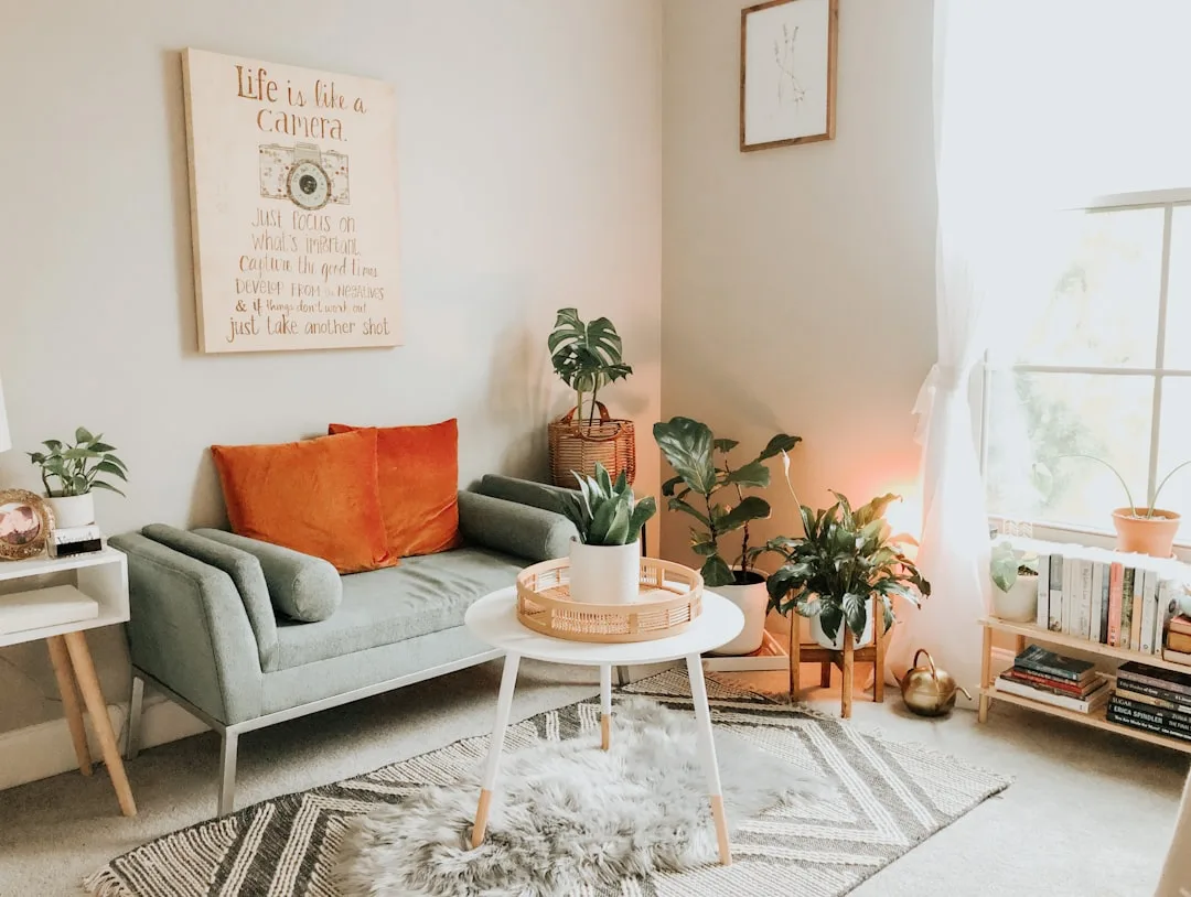
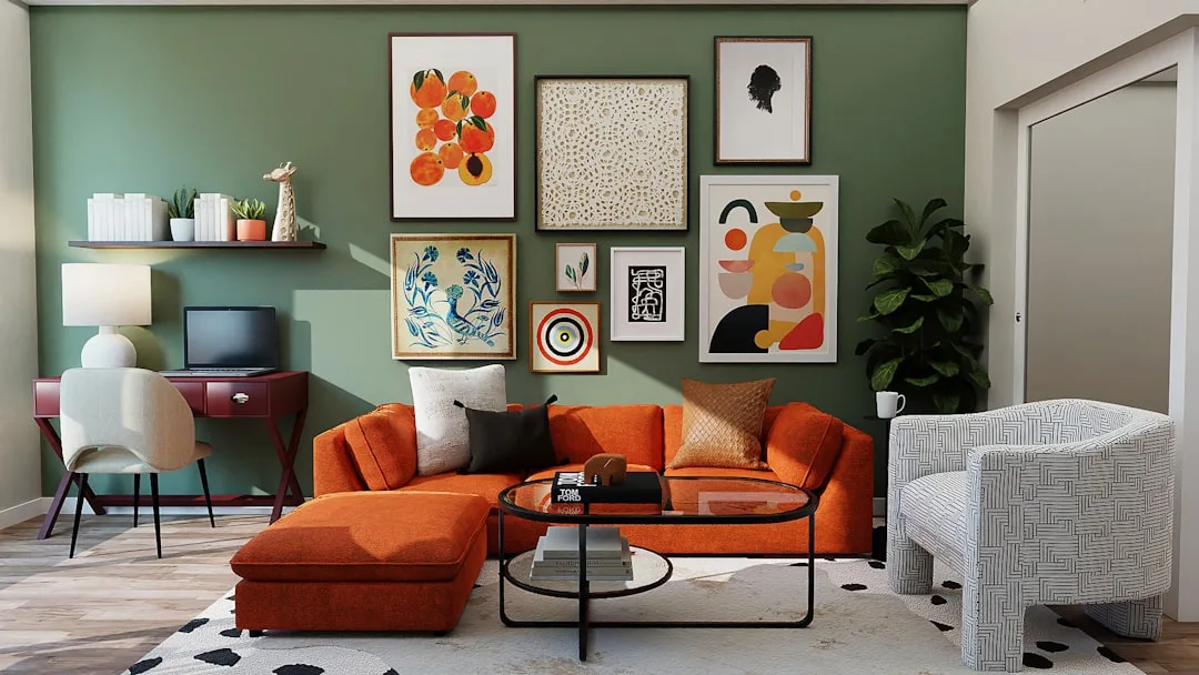
Photograph what works — not the whole room, but the specific detail. A junction where a brass fixture meets a plaster wall. The way a linen curtain pools on a concrete floor. These close-up shots are more useful than full room shots because they isolate the actual element you responded to.
Open houses and model homes are spectacularly underused for this purpose. You don’t need to be in the market to tour them. Developers spend serious money staging model units to feel aspirational — a furnished 900-square-foot apartment in a new building is essentially a free showroom where you can sit in the chairs, feel the countertop material, see how artificial light interacts with the wall color at 7pm. You get physical, real-time sensory information that no amount of screen time can replicate.
Furniture showrooms work the same way, but most people treat them like catalogs they walk through rather than learning environments. Sit on every sofa. Open every cabinet. Notice which rooms in the showroom make you slow down versus which ones you walk straight through. That instinct is data.
Even hardware stores have underused potential here. Benjamin Moore and Sherwin-Williams both offer large peel-and-stick paint samples for a reason — paint color is one of the most screen-unreliable variables in decorating. A color that reads as soft sage on your monitor will look seafoam green under fluorescent store lighting and warm gray on a north-facing wall at noon. Getting physical samples into your actual room, under your actual light conditions, at different times of day, is the only reliable method.
Takeaway: Before your next decorating decision, visit at least one physical space — a showroom, an open house, or a well-designed restaurant — and photograph three specific details rather than three wide room shots.
How to Use Digital Platforms Without Getting Buried in Them
This isn’t an argument against Pinterest or Instagram. It’s an argument for using them at the right moment, with the right question already formed.
The sequence matters enormously. If you complete the personal memory exercise and the offline observation practice first, you arrive at digital platforms with a specific filter: you’re not browsing, you’re confirming. You already know you want warm-toned lighting, natural wood grain, and high-contrast hardware. Now you’re searching for those specific elements rather than waiting for the algorithm to guess what you want.
Search with adjectives, not nouns. “Cozy bedroom” returns 40 million results and tells the algorithm almost nothing about you. “Low-light warm wood bedroom minimal” or “dark moody study brass concrete” returns a much smaller, more targeted pool — and more importantly, it forces you to articulate what you’re actually after before you start scrolling.
The 20-image audit is a practical reset for anyone who feels stuck in the digital loop. Go to your saved folder — on Pinterest, Instagram, or wherever you save things — and look at your last 20 saves. Don’t analyze them individually. Step back and look at them as a group. You’ll see a pattern immediately: a color family, a furniture scale, a light quality, a material tendency. That pattern is your style, already expressed. Most people are surprised to discover they have a much clearer, more consistent aesthetic than they thought — they just hadn’t looked at their own data.
Houzz is worth distinguishing from Pinterest here because it allows you to filter by room dimensions and architectural style, which cuts out the irrelevant-but-beautiful problem. A photo of a vaulted-ceiling kitchen in Malibu is interesting but useless if you have 8-foot ceilings in Chicago. Filtering by space type and size gets you into a more practically applicable pool of references.
Takeaway: Do the personal exercises first, arrive at digital platforms with adjectives already formed, and run the 20-image audit on your existing saves before adding anything new.
Turning Inspiration Into Actual Decisions
Knowing how to get inspiration for home decor is only half the problem. The second half is converting that inspiration into purchases and commitments you won’t regret.
The most common failure point is scale. Something looks right in an inspiration image and wrong in your room, and people assume they made a bad choice. Usually they made a correct choice in the wrong size. A rug that looks generous in a Pinterest bedroom might be 9×12 feet — and your bedroom, measured honestly, needs an 8×10. Those two feet make a significant difference. Before any major purchase, get the actual dimensions of the piece and tape them out on your floor. This sounds obvious and almost nobody does it.
Material sampling deserves the same attention as paint sampling. Fabric swatches, tile samples, and wood finish chips should all be brought into your actual room and evaluated over multiple days and lighting conditions. A linen that reads as white on a showroom floor may read as cream next to your trim, which may or may not be a problem depending on your wall color. These interactions only reveal themselves physically, in your space.
The one-in, one-out rule for inspiration images is useful here too. Every time you save a new reference image, ask what it’s replacing. If you can’t answer that, you’re still browsing rather than deciding. Deciding means narrowing, and narrowing means letting some options go.
Budget allocation is where inspiration most often collides with reality — and the collision doesn’t have to be fatal. The standard designer guideline is to spend the most on the things you touch most (sofa, mattress, dining chairs) and the least on the things you look at but don’t interact with (art, decorative objects, throw pillows). This runs counter to how most people actually shop, where the big furniture feels scary and the small decorative items feel manageable. The small items accumulate quickly and rarely transform a room; the right sofa does.
Takeaway: Before any purchase over $200, tape out the dimensions in your space, get a physical material sample into the room, and compare it in both daylight and evening light conditions.
Frequently Asked Questions
How to get inspiration for home decor if I have no idea what style I like?
Start with the peak moments exercise described above — identify three spaces from your past where you felt genuinely comfortable, then list the specific sensory details of each. Don’t name a style; describe a feeling. Warm or cool? Busy or spare? Rough-textured or smooth? You’ll find consistent preferences across all three memories, and those preferences are more useful than any style label.
Is Pinterest actually bad for home decor inspiration?
No — but it’s bad as a starting point. Used after you’ve done personal inventory work and have specific search terms ready, it’s genuinely useful. The problem is using it before you have a personal filter in place, which hands all the decision-making over to an algorithm optimized for engagement, not for your specific space and needs.
How many inspiration images is too many?
There’s no universal number, but a working rule: if you can’t identify three consistent elements across your saved images, you have too many and need to edit before adding more. Clarity comes from narrowing, not accumulating.
What’s the fastest way to figure out my decorating style?
Look at your wardrobe. The colors, textures, and silhouettes you reach for consistently in clothing are almost always transferable to interiors — people who wear structured, minimal clothing in neutral tones tend to want the same from their rooms. It’s not a perfect map, but it’s a faster and more honest starting point than any online style quiz.
How do I stay inspired without getting overwhelmed mid-project?
Finish your room concept on paper before you buy anything. That means a defined color palette (three to five colors maximum), a materials list (the specific finishes for every major surface), and a furniture plan drawn to scale. Once those three things are decided, you’re no longer looking for inspiration — you’re executing. Continuing to browse after that point introduces doubt, not improvement.