While numerous graphic components must be skillfully blended, color is one of the essential factors in conveying the meaning of your brand.
Photo by Yizheng Duanmu on Unsplash
Color has such power that it can alter one’s thoughts, feelings, and body hormones. It has a wide range of meanings that may be found in the natural world and various cultures worldwide.
The colors you’re surrounded by likely have a significant impact on how you’re feeling right now. Your feelings and mood are influenced by your surroundings, for better or worse, and color is a huge part of it. Color has a more profound psychological impact on people; therefore, designers can profit from embracing and integrating it into their work.
Imagine your business logo layout being released to the world, and a bigger proportion of your prospective customers are driven to seek out your services based on your color choices. Though attention to color psychology isn’t a guarantee of success, it’s worth investigating further if it can help your company expand.
When it concerns color psychology, no universal laws apply to every person. However, research suggests that when eliciting emotions in most viewers, you may attach a particular value to colors. Although people’s perceptions of color and tone differ, enough research has been done to provide some guidelines to deal with, especially when it comes to design decisions.
This article includes some basic color interpretations for you to learn to improve your logo design skills.
Selecting a Color Scheme for Your Business
When selecting a color palette for your company, keep in mind that a color palette encompasses more than just custom logo design. As you advertise your business, you’ll want to produce numerous visual aspects, including iconography and other images in addition to logo designs using any free logo maker. The easiest way to achieve consistent marketing for your business is to choose a color palette, including your logo design colors.
- Blue
When it concerns branding, blue is the most preferred color choice. It is universally adored and possesses various beautiful features, such as calm and tranquility. Tranquility, attention, professionalism, power, and integrity are further linked with blue.
Blue is a versatile hue that may be used in any business. It makes the most sense for firms in the scientific, medical, or health care industries that have to generate emotions of safety and expertise. It also works well for the government and their agencies who need to project power and indicate that they are genuine and sincere. The color blue is trendy among businesses and technology firms.
- Green
From a marketing standpoint, green is the next most common color choice. Green is associated with youth-oriented, eco-friendly, and natural features. Adventure, power, ecology, the ecosystem, and learning are all highlighted.
Green is a common hue for food-related businesses or businesses that wish to show their responsibility towards the environment. Green is also an excellent hue for firms that want to communicate their vitality without a bold color like Red. Green is also a perfect option for higher education institutes.
- Yellow
Yellow is a vibrant color that comes in a wide range of shades. Yellow is a terrific hue for businesses that need to convey a lot of vitality. Yellow is enthusiastic, motivated, innovative, inventive, youthful, sunny, optimistic, bright, encouraging, and cheerful. It can also be used to represent hazards or warnings. The tone of yellow employed, and other colors used in combination, are the key to the distinction.
Companies in the entertainment world like Designhill or those dealing with food should use yellow as their primary color. Anything that requires a lot of brightness and energy. Kid’s businesses, innovative technology, and automobile demands are excellent choices.
- Red
Red is an excellent hue for attracting attention, but its features aren’t appropriate for every brand. Red is energizing and can evoke love feelings. It can represent strength, urgency, and threat. It’s the hue that’s most likely to make you feel like you’re getting a burst of adrenaline.
Consider whether your company wants to be thrilling or convey a feeling of urgency when utilizing the color red in marketing. The color red is ideal for firms in the fashion, retail, food, and cosmetics industries. Sports, estate, and the entertainment sectors are all areas where Red excels. When it comes to emergency and health care services, urgency is a factor. Red is also a classic hue for anything that deals with people in a fast-paced environment, like public relations or advertising.
- Orange
Orange (like several of the previous hues) evokes a feeling of vigor, although it’s usually associated with youthful traits and intense excitement. It’s also ideal for companies who want to engage with a youthful vibe. For brands, orange is an entertaining hue. Orange is a beautiful hue to accent specific designs even if is flyer template design, brochure design, etc. since it can feel innovative and spark interest.
Companies that deal with kids or in education benefit from playfulness. You can also notice orange in entertainment and human resources-related businesses.
- Purple
Purple has a spiritual and mysterious quality to it. Purple is frequently connected with religious pursuits, spirituality, sensuality, mental connection, and general happiness. Purple can also be used to create a fantasy and a magical atmosphere.
Purple is an excellent hue for companies that focus on spirituality, self-care, the mind, or the body. Purple is a good choice for businesses like psychotherapy clinics, massage parlors, astrology offices, fitness centers, gyms, and spiritual groups. Purple can be a terrific selection for kids or a unique travel business when it conjures up images of enchantment and fantasy.
- Pink
Purity, sensitivity, caring, and kindness are all attributes associated with pink. Vibrance and youthful vitality are coupled with bright and vivid pinks. They can even elevate heart rates, and they’re lovely for getting people to interact with you.
Pink is a color frequently linked with women; hence it is used as a primary color by a range of women’s brands. Pink is also utilized to signify hope and to have a relaxing effect. With its darker shade, it’s a perfect choice for dessert stores or to add life and vibrancy to a room. Pink is commonly utilized in bakeries, wedding planning, and the fashion sector, but it can be used in any industry if the proper shade is chosen.
- Black
Black exudes power, accuracy, authority, and concentration. It is professional, but it also has a measure of force and directness. It is another serious color, but then when compared to white, it might appear more forceful.
Businesses in the corporate, beauty, finance, fashion and marketing industries use black the most. Black may be employed in various ways; however, one of the drawbacks is that it can give a brand that might typically be peppy or cheery a heaviness. Based on the industry, black must be carefully harmonized with other colors.
- White
White is a significant color. Don’t just list white as negative space if you intend to use it. White should be defined, and if it plays an essential role in your logo design, it should be mentioned in your brand’s stylebook whether using a free logo maker or not. White evokes feelings of comfort, purity, innocence, simplicity, and cleanliness.
White is best suited to businesses that require a high level of purity and clinical care. It’s a good fit for medical, dental, high-tech, scientific, and inventive companies. White can also be utilized in almost any color scheme. The disadvantage of using white is that it might convey a sterile/clinical environment, making a brand appear chilly.
- Brown
The color brown is employed more sparingly in branding. Brown looks best when used in a more balanced and even pattern with other colors. It is a color that is safe, dependable, and consistent. The color also evokes sentiments of grounding and connection to the soil.
Brown is best suited to enterprises dealing with the ground and must convey safety and dependability. Brown is a popular color scheme in the mining and construction industries. It is also commonly employed in the ecological, scientific, and financial fields.
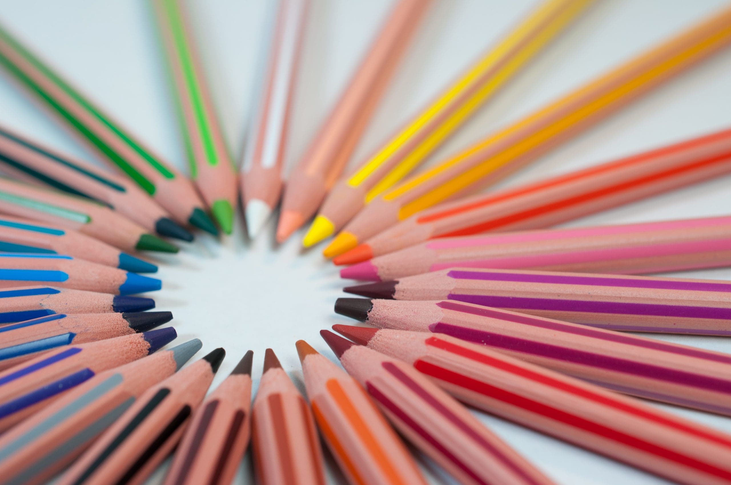
Using Color Wheel
The concept of creating a color wheel can be traced back to the early 1700s. It was intended to demonstrate the various color permutations that may be achieved by changing tints and tones. Choosing colors that go well together or give good contrast can be tricky, but using a color wheel can help eliminate some guessing.
Keep in mind the hues of the colors you chose. Mixing warm and cold colors, especially if they clash, can dilute the message you’re trying to send. Though color theory regulates how colors are chosen, especially when blended, color psychology also plays a role in the decision.
Color harmony is a crucial consideration when utilizing a color wheel to choose colors for your custom logo – not just the harmony of the hues but also the message the colors portray. Though color psychology isn’t a guarantee of a design’s success, it can offer you a leg up when it comes to creating a memorable, long-lasting, and original logo design.
Conclusion
Remember that the meaning of a hue differs across cultures and countries; what you may know about Red has an entirely different connotation in different regions of the world. Either you hire a designer or use online logo maker tools like Designhill, the meaning of color is also altered by its various tints, shades, and hues. As a result, you should be cautious about whatever color you select in your business logo design for your clientele.
Author Bio – Ombir is SEO Executive at eRank Solutions. He is a SEO and Writer who has an experience of 2 years in these respective fields. He likes to spend his time doing research on various subjects.