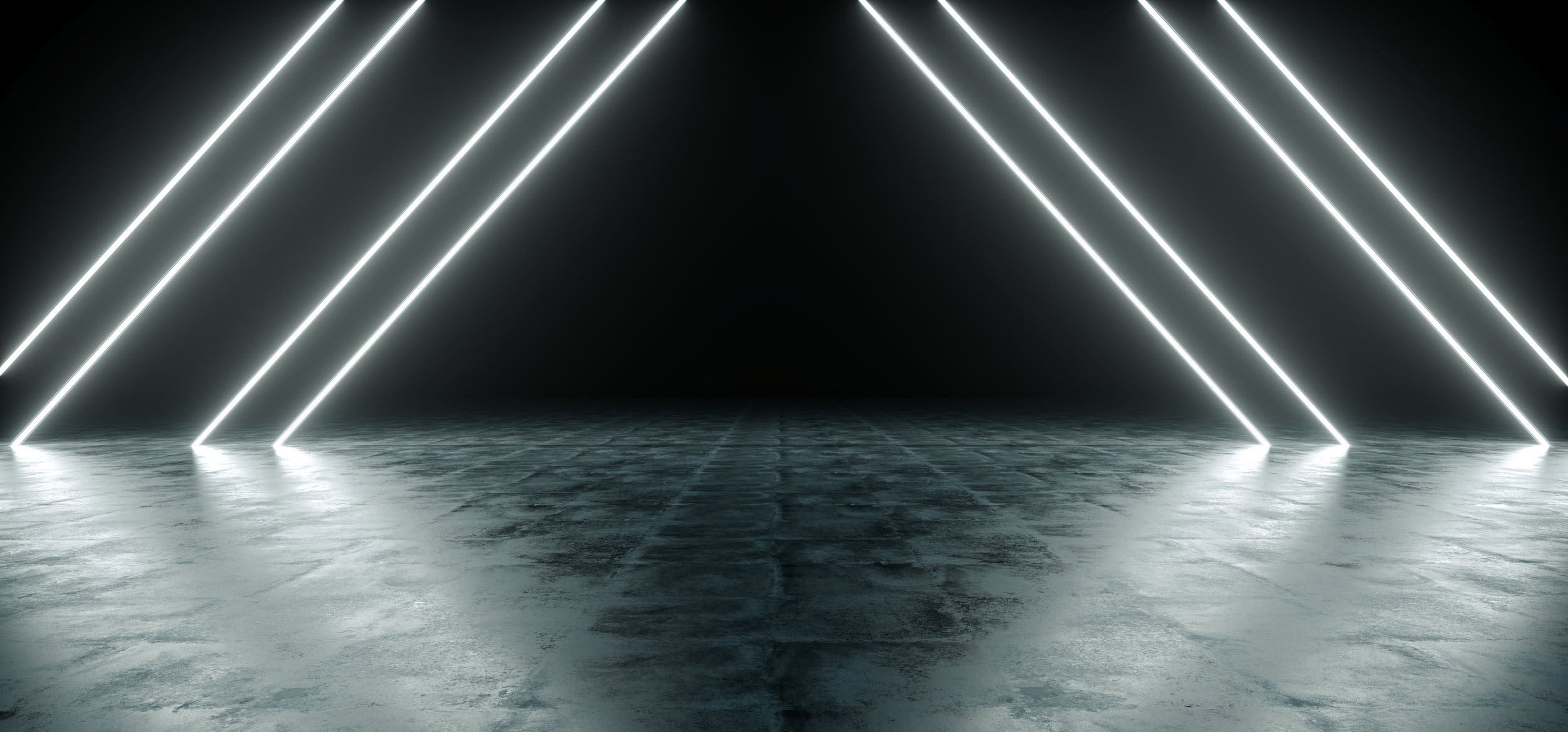
In art and cinema the use of light and dark is called Chiaroscuro (Italian for “light-dark), and it’s often used to give a feeling of depth and to really pull someone into a scene. This feeling of depth is appealing to the eye, and when applied to the realm of interior design adds a real eye-popping element! The mixing of light and dark doesn’t have to be purely black and white, either! Mixing bright colors into an otherwise dark space naturally draws the eye and the resulting texture of pleasing depth looks and (more importantly) feels great!
- Dark colors and light colors work together here to add an elegant feel to this dining room.
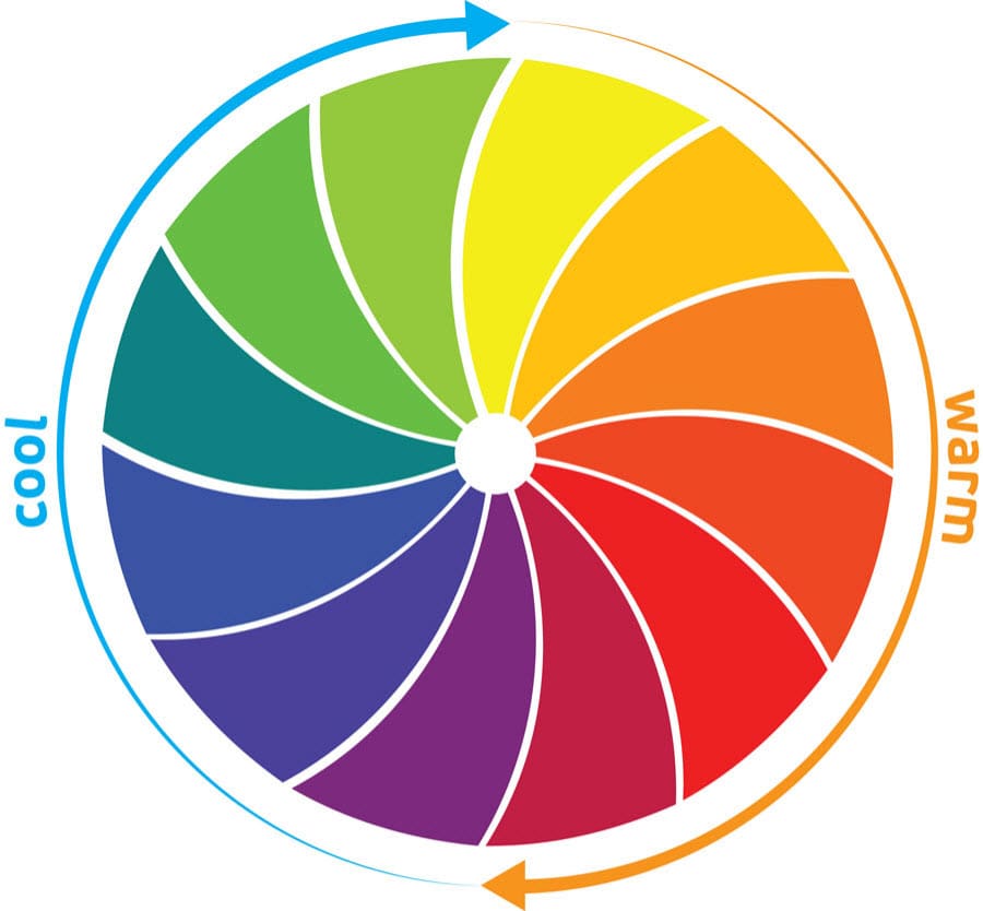
Contrast, in general, is a fantastic way to spice up your dining space. Remember, the sun is probably the best provider of light there is- natural lighting through large windows give a stunning backdrop to darker interiors. Dark colors don’t have to mean black, either, as earlier mentioned- yellows, sky-blues, warm amber, and browns can all be used to add additional contrast to your space. These kinds of color contrasts of dark and light that are specifically not white and black can be controled through color choices to feel warm, cold, sophisticated, homey, eclectic, or highly focused. If you play your color cards right, you can even hit more than one at the same time.
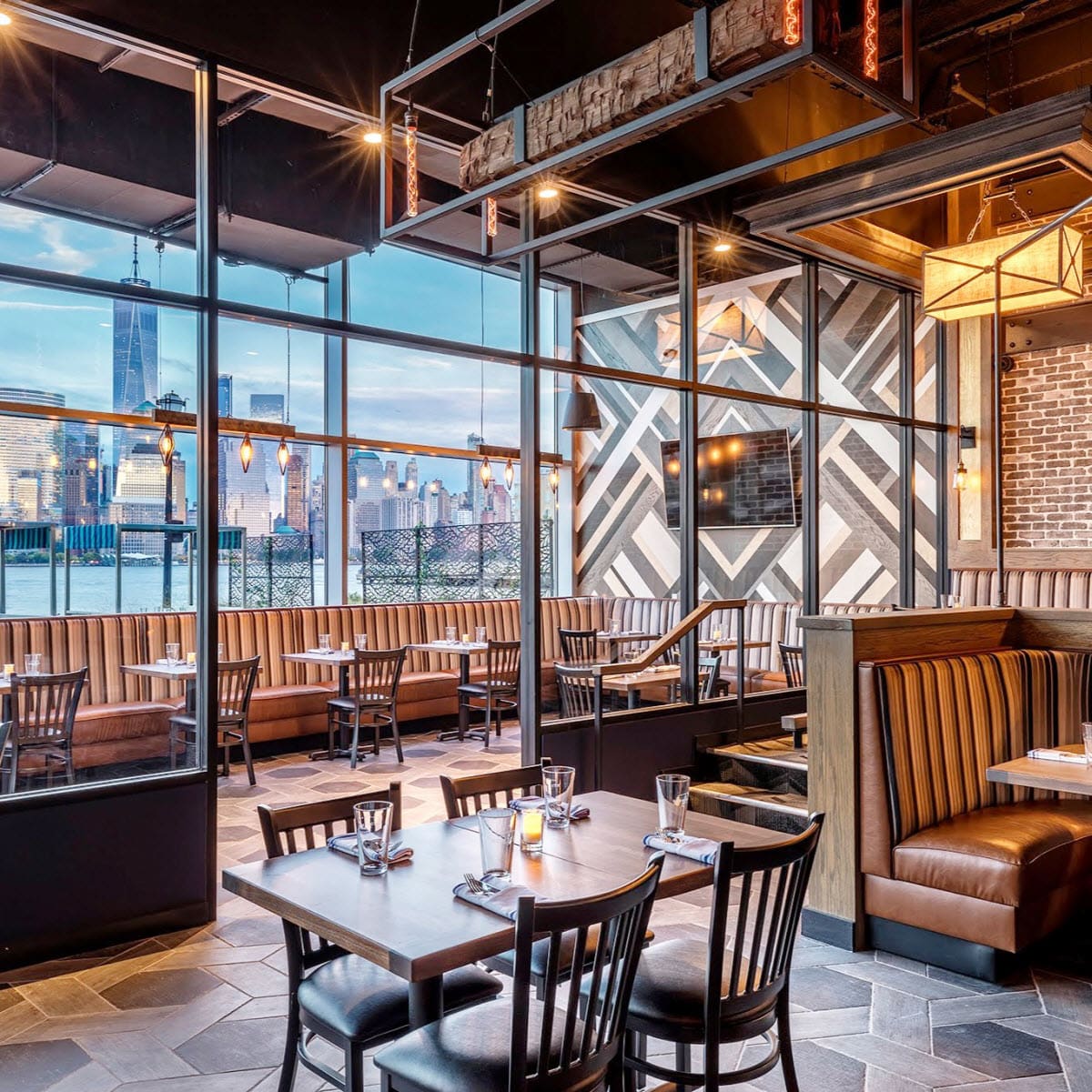
- The use of contrasting colors in this restaurant gives it a very comfortable and welcoming atmosphere. Dark restaurant furniture and the use of warm but contrasting colors in lighting choices are highlighted by the backdrop of the blue sky and water below. Just imagine what this view must be like at night when the city is all lit up and everything else is dark!
Perhaps the best outcome in the use of Chiaroscuro in your dining room is the solidity of form it achieves- that is to say how open or closed the space becomes through use of these contrasts. In having great solidity of form the room’s environment will support exactly the environment you desire for your diners.
- For instance, warmer colors and contrasts give your space a very comfortable, welcoming, homey feel. On the opposing side of the spectrum of that are the cooler colors providing a sense of elegance and sophistication.
Setting up this kind of environment doesn’t need to be expensive, either. A coat of white on the walls with dark chairs, booths, or tables will immediately take your dining room to the next level. Intelligent use of warm or cold in your lighting might be all you need to do- you’ll be surprised how much an interior changes under warmer or cooler lighting.
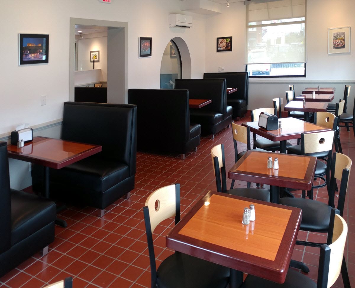
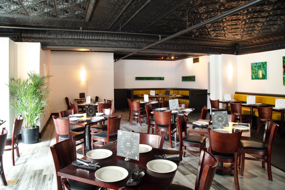
- The use of white walls here really helps the resin tables and custom booths of this dining room become focal points of the dining experience. The light that reflects of the white walls plays well with the warm, natural wood tones of the resin tables and chairs.
Color, as a contrast, can be used to ‘liven up’ a space. The green of plants, for instance, is quite cool and can brighten an otherwise dark space. Likewise, this veridity can be used in a well lit space to further add contrast to darker chairs.
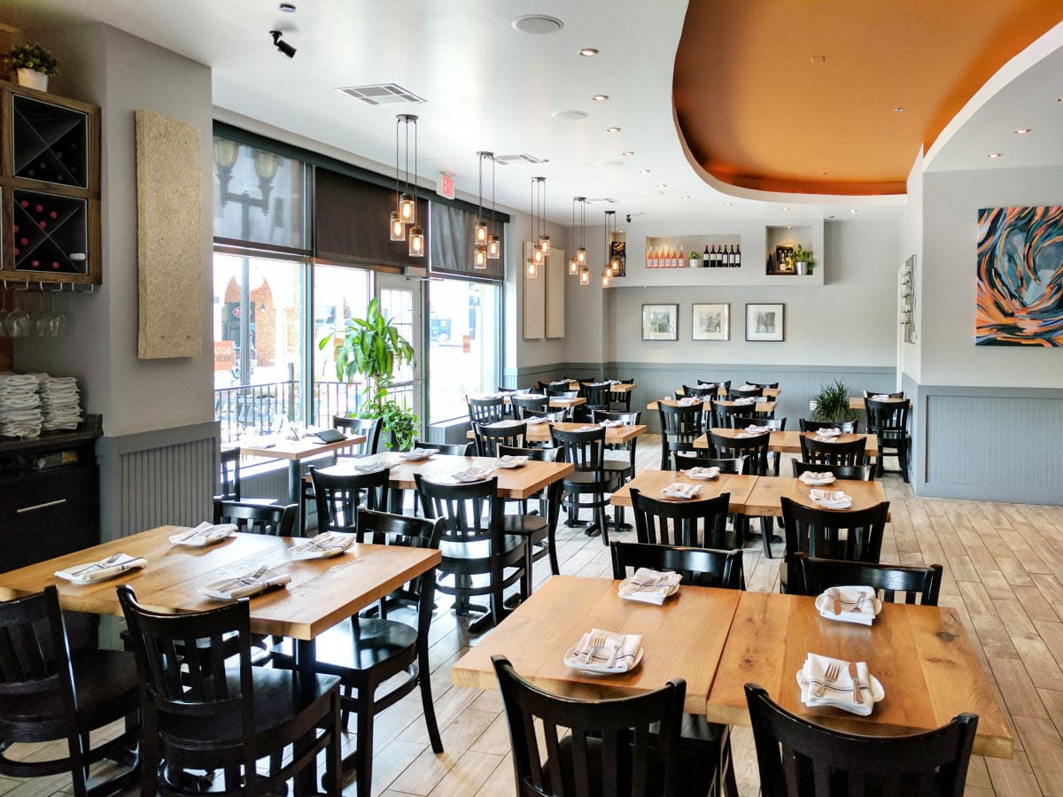
- The use of solid wood tables in light, natural colors along with the cool, netural tones of the walls really make these chairs stand out. The splashes of contrasting colors of greens, oranges, and blues helps this dining room become unforgettable.
In closing, Chiaroscuro is an extremely approachable design choice when creating your dining room. The sheer flexibility of the style is possibly it’s greatest strength- particularly when coupled with an understanding of just how natural things look in a space that has properly balanced their contrasts. We interact with the natural balance of light and dark on a daily basis so it’s pretty easy to find a balance that feels natural for most people- it’s such a part of your everyday experience that you just intuitively know what feels “right”!