Color is a powerful tool in interior design, capable of transforming spaces and influencing emotions. Choosing the perfect palette is no small feat. The right color can create a sense of harmony, set the mood, and reflect personal style. In this comprehensive guide, we delve into the impact of color in interior design and provide tips for selecting the ideal palette for your space.
Photo by Floreser on Unsplash
The Psychology of Color
Colors evoke emotions and can profoundly affect our moods. Understanding the psychology of color is crucial when designing a space that caters to specific needs or desires.
Warm Colors
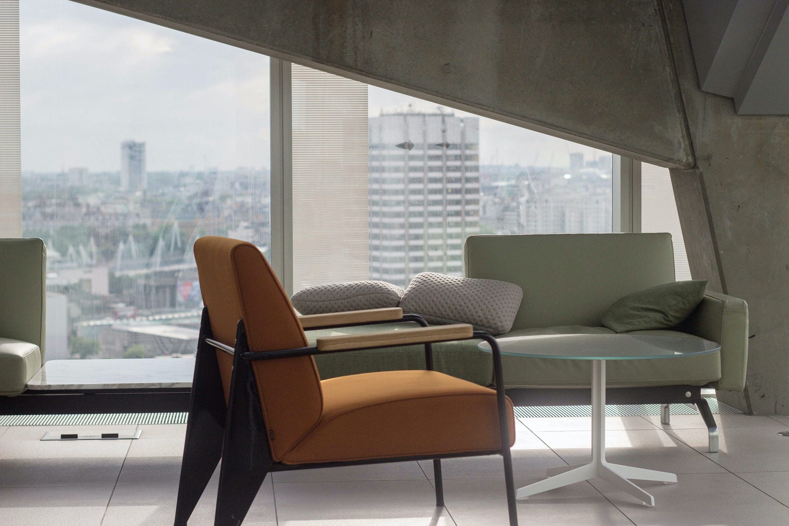
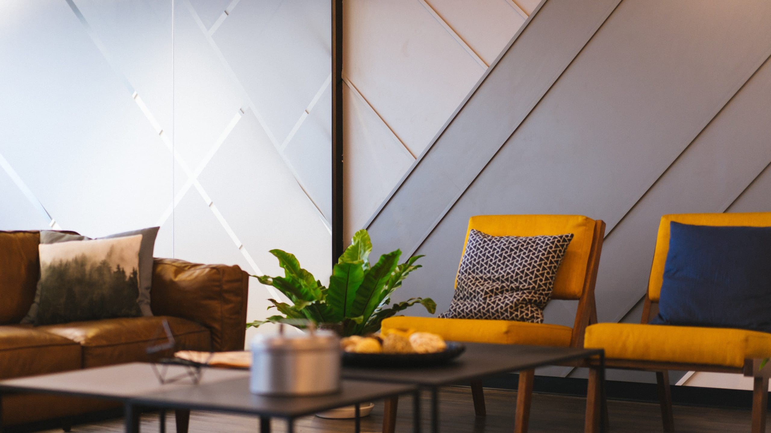
Warm colors, such as red, orange, and yellow, are vibrant and energizing. They can stimulate conversation, promote appetite, and generate a sense of warmth and comfort. These colors are ideal for social areas like living rooms, dining rooms, and kitchens.
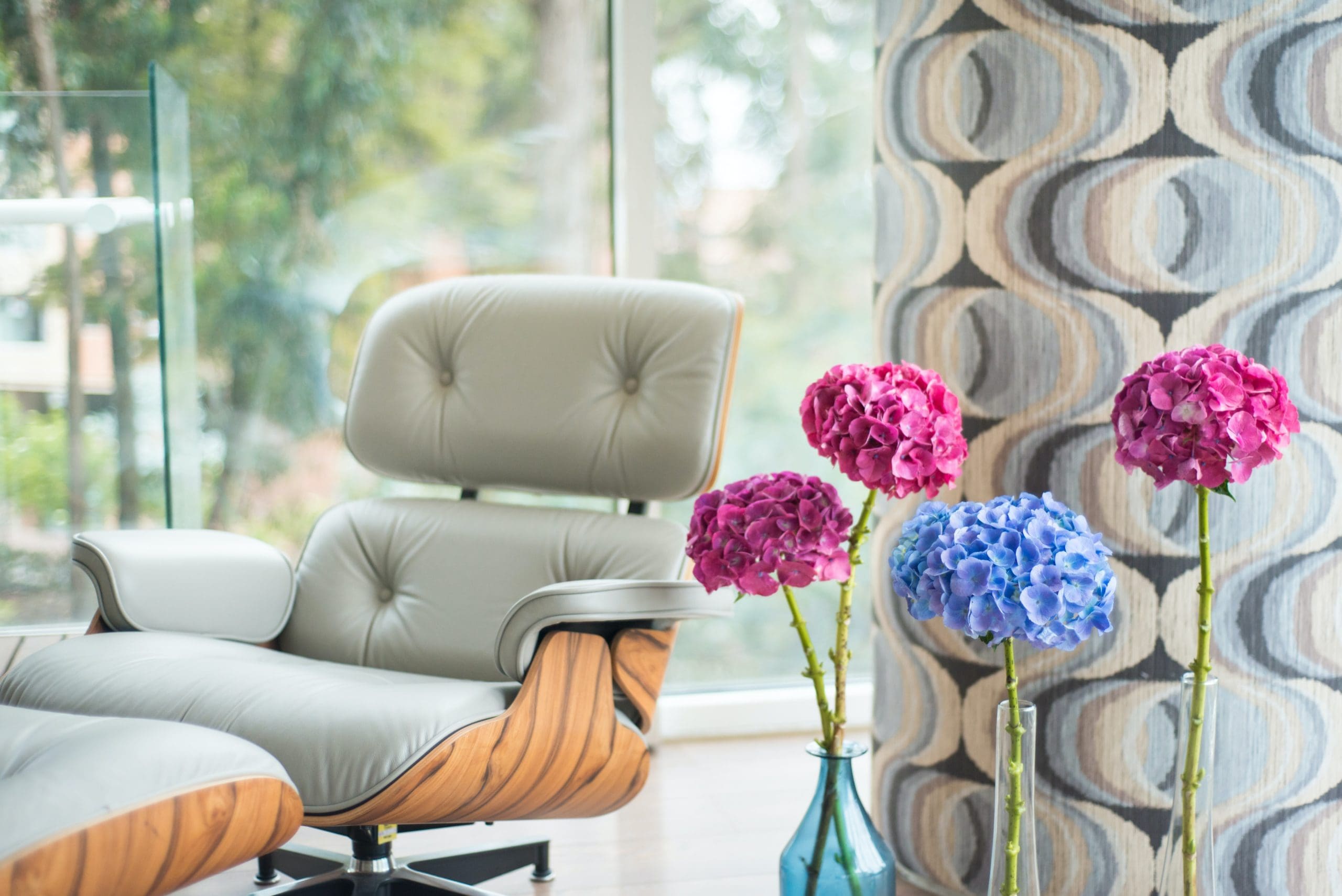
Cool Colors
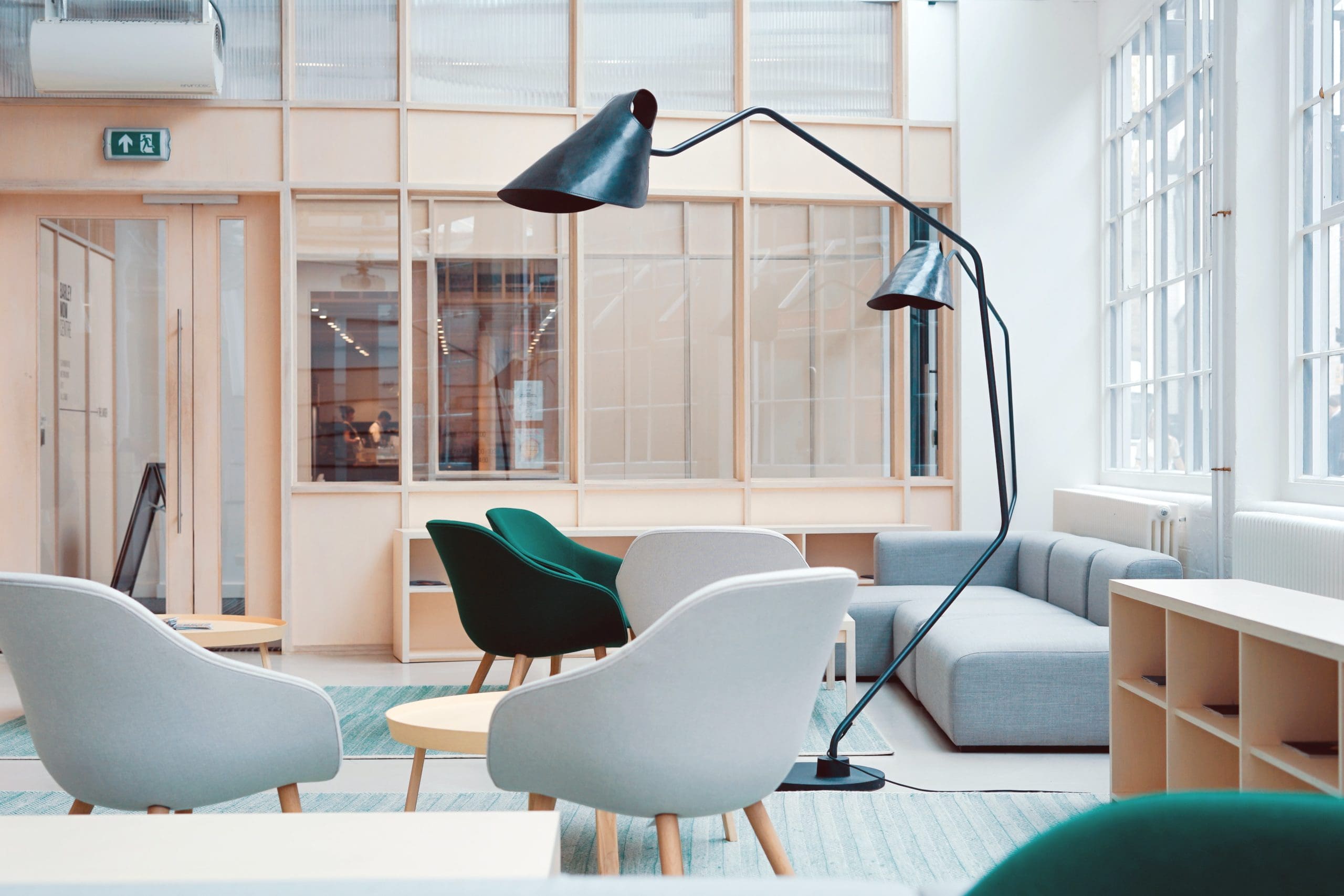
Cool colors, like blue, green, and purple, have calming and soothing effects. They can create a serene atmosphere and promote relaxation, making them perfect for bedrooms and bathrooms.
Color Schemes and Harmony
Creating a harmonious color scheme is essential for achieving a balanced and aesthetically pleasing interior. Here are some popular schemes to consider:
Monochromatic
A monochromatic color scheme utilizes various shades, tints, and tones of a single hue. This approach creates a cohesive and elegant look, suitable for minimalist and modern interiors.
Analogous
Analogous schemes incorporate colors that are adjacent on the color wheel. This results in a harmonious and visually appealing combination, often found in nature.
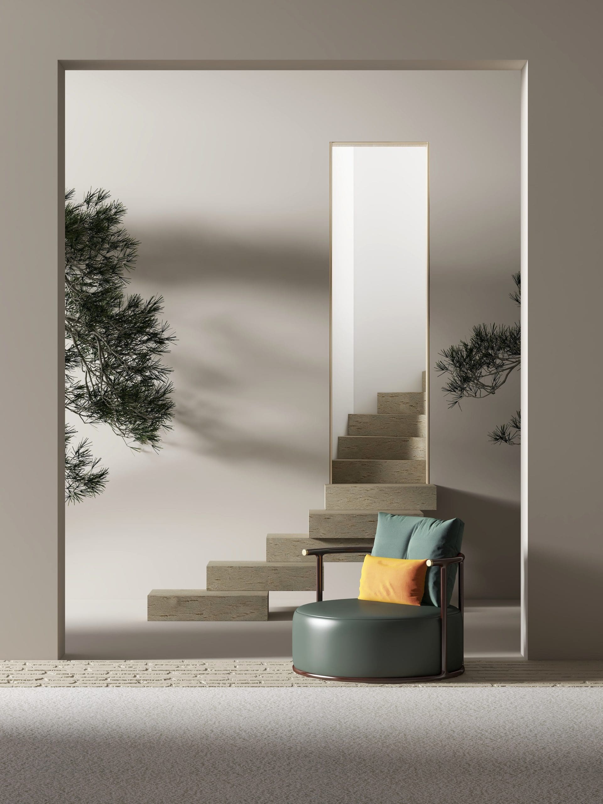
Complementary
Complementary colors sit opposite each other on the color wheel. When used together, they create a dynamic and high-contrast look, adding energy and excitement to a space.
Tips for Choosing the Perfect Palette
When selecting a color palette for your space, consider the following tips:
Assess the Space
Consider the room’s size, natural light, and function. Smaller rooms may benefit from lighter colors, while larger spaces can handle bolder hues. Keep in mind the room’s purpose, and choose colors that complement its intended use.
Reflect Your Personality
Your home should reflect your personality and style. Don’t be afraid to incorporate colors that resonate with you, even if they’re unconventional or daring.
Use the 60-30-10 Rule
To achieve balance and visual interest, consider the 60-30-10 rule. Allocate 60% of the room’s color to the dominant hue (walls), 30% to a secondary color (furniture), and 10% to an accent color (accessories).
Test Before Committing
Before making a decision, test paint swatches on your walls, and observe how they look at different times of day and under various lighting conditions.
Incorporating Color Trends
Color trends come and go, but some timeless hues remain classic choices. When incorporating trends, use them in moderation and focus on versatile colors that can adapt to future design changes.
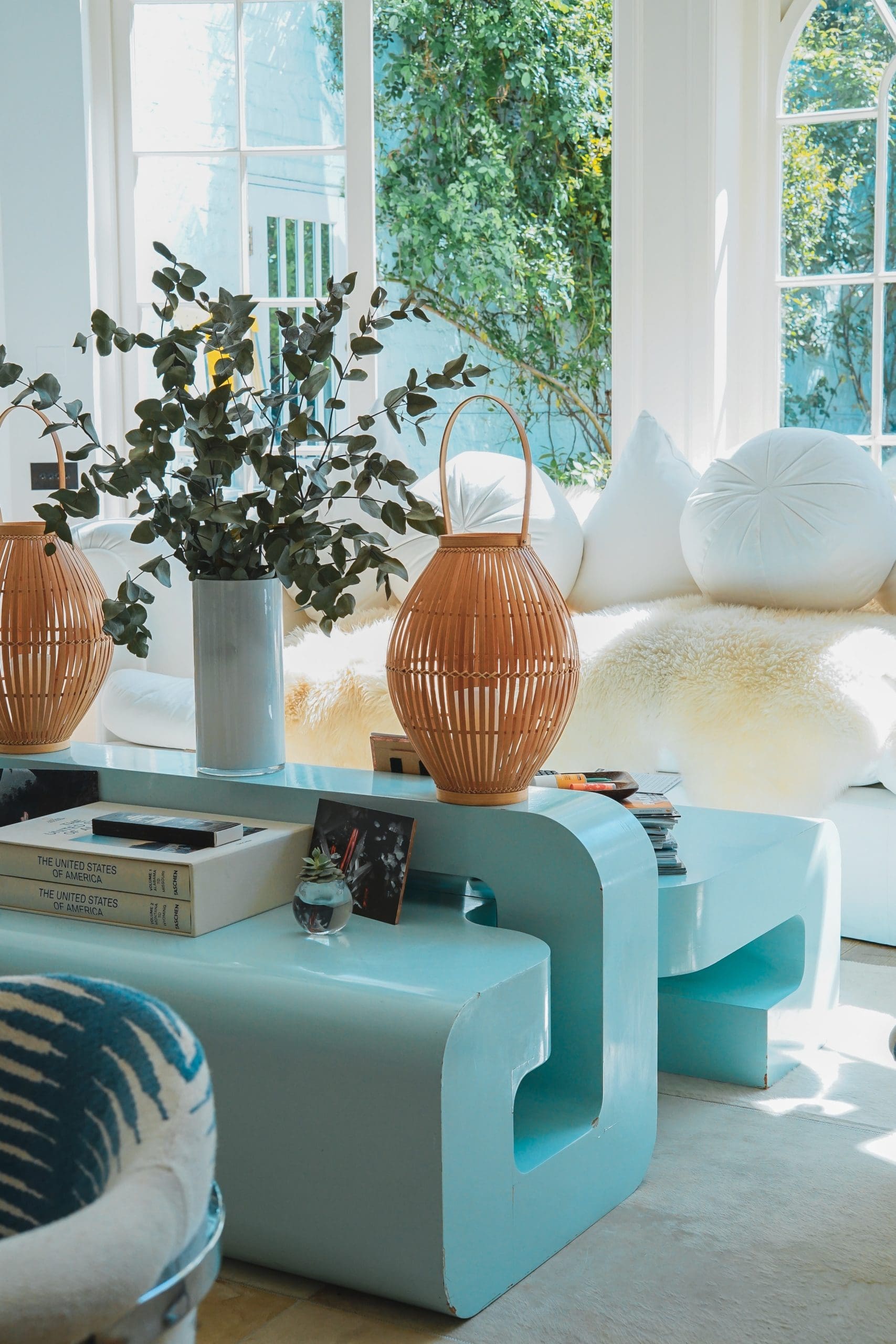
The Interplay of Texture and Pattern
In interior design, the interaction between texture and pattern serves to amplify the influence of color. By integrating an assortment of materials, fabrics, and designs, you can instill a sense of depth and captivate the viewer’s attention within your space.
Crucial Points to Remember
Choosing the perfect color palette for your interior design endeavor requires a thoughtful fusion of intricacy and diversity. By factoring in color psychology, compatible color arrangements, and pragmatic advice, you can fashion a stimulating and practical environment that genuinely reflects your distinct taste.