When designing a dream house there a lot of things to keep in mind so it turns out as it was pictured. Every room should be compatible with the next and details should be taken care of to avoid any mishaps that might require a shift or repair later, especially the living area. This is usually the case when we want to make some changes to the existing décor.
Here are top 5 common mistakes made when upgrading the living room.
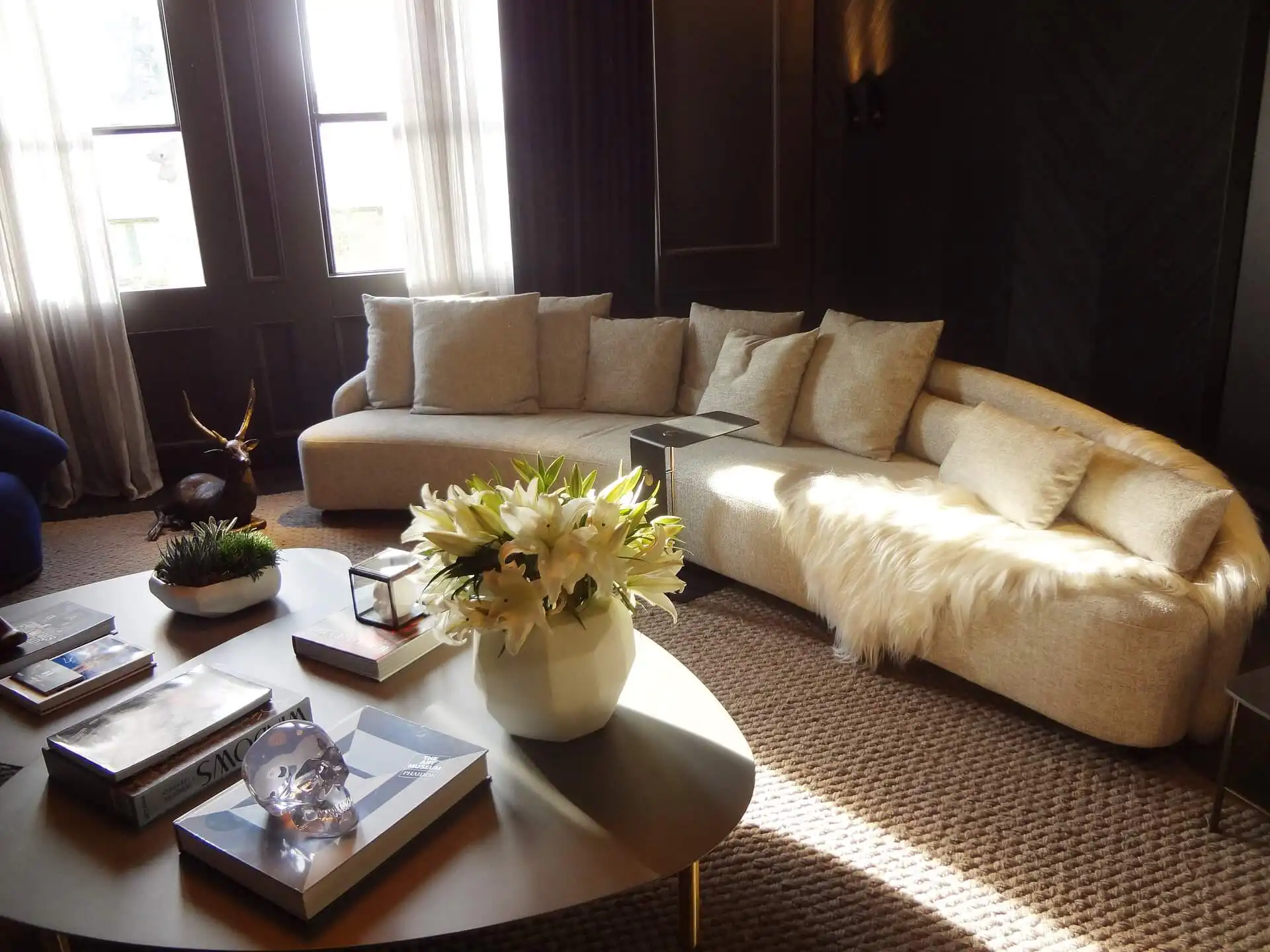
Tone and color issues
It all starts with the color. The ideal color choice can brighten up a tiny room and make it look a lot bigger than its actual size and similarly too dark of a tone for all of the walls will make a big room look quite small and create an uncomfortable vibe. If you plan on changing the living room color scheme, opt in for shades that are compatible with the rest of the house and compliments the overall theme. Lighter shades tend to reflect light while darker tones generally require more lighting. If you can’t choose between various color combinations, go for wallpaper instead.
Not efficiently utilizing available room space
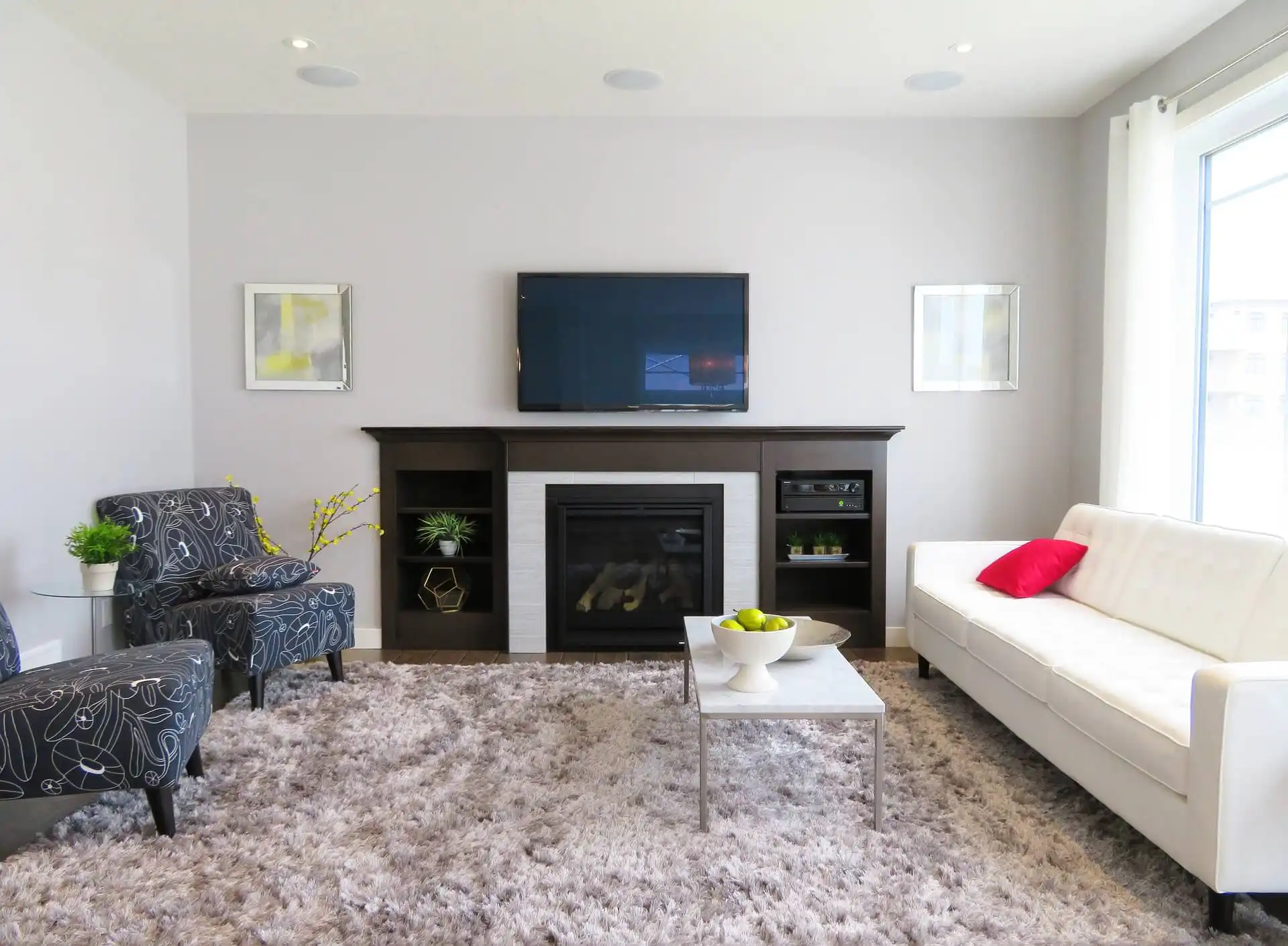
We usually pay more attention to the master bedroom or the kitchen but when it comes to the living area, our focus tends to be on the lower side and the room ends up looking like an entirely different portion of the house. One of the most commonly made mistakes is failing to understand the spaciousness of the living room and how much furniture and decorative material it can hold onto. A living room is usually meant to accommodate more people, including extended family members, friends and guests and so it should be designed and layered in a supportive manner.
Improper furniture size and décor
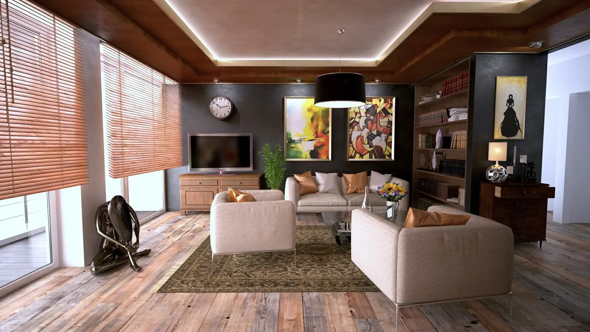
Furniture size is crucial as a sofa too big or a coffee table too small can result in an unpleasant transformation. Every nook and corner should be taken in consideration for proper sized furniture choice and placement accordingly. Also, décor items such as antiques, small statues or fancy glassware should be wisely chosen in accordance with the ambiance and theme of the room and too much or too little of it should be avoided at all costs. The key is to spend on the right commodities.
Too much or too little lighting
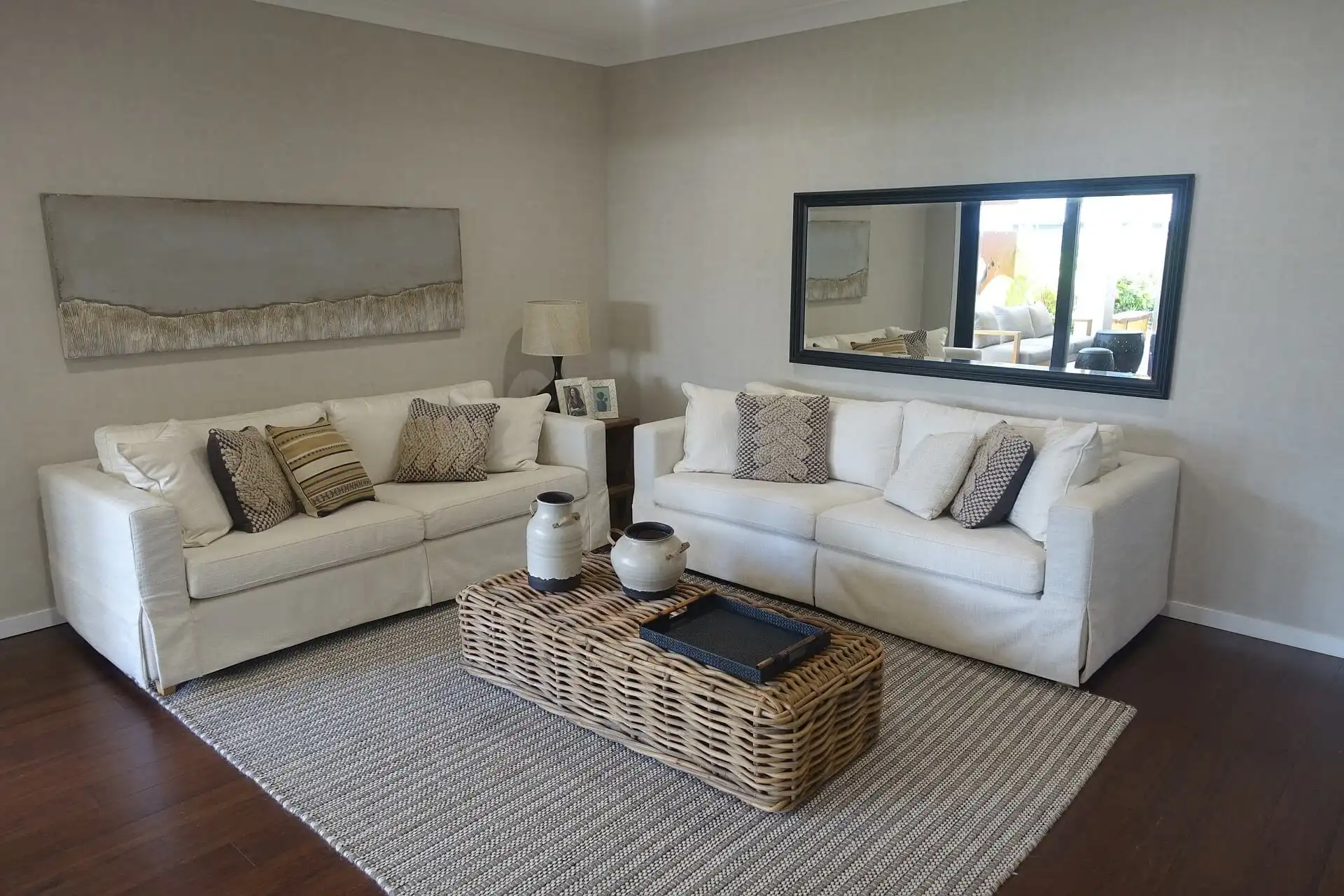
If your living room has access to natural lighting then it’s only beneficial to take advantage of it. A mistake often made in this department is by placing bulky furniture right in front of the curtains which blocks natural light access and in return, you spend on expensive lamps and ceiling lights. Letting in natural light will not only soothe one’s mood but also save on those electricity bills. But if your living room is somewhere in the center of the house, then it is important to spend on sufficient lighting for better visibility and ambiance. Check out House Tipster for some neat ideas and décor tips.
Not layering wisely
There is so much that can go into one room. When it comes to the living room, the first few things that come to mind are:
- A sofa, usually separate seats or an L-shape
- A fancy coffee table ·Vases or glassware ·
- Rugs and upholstery ·
Lighting
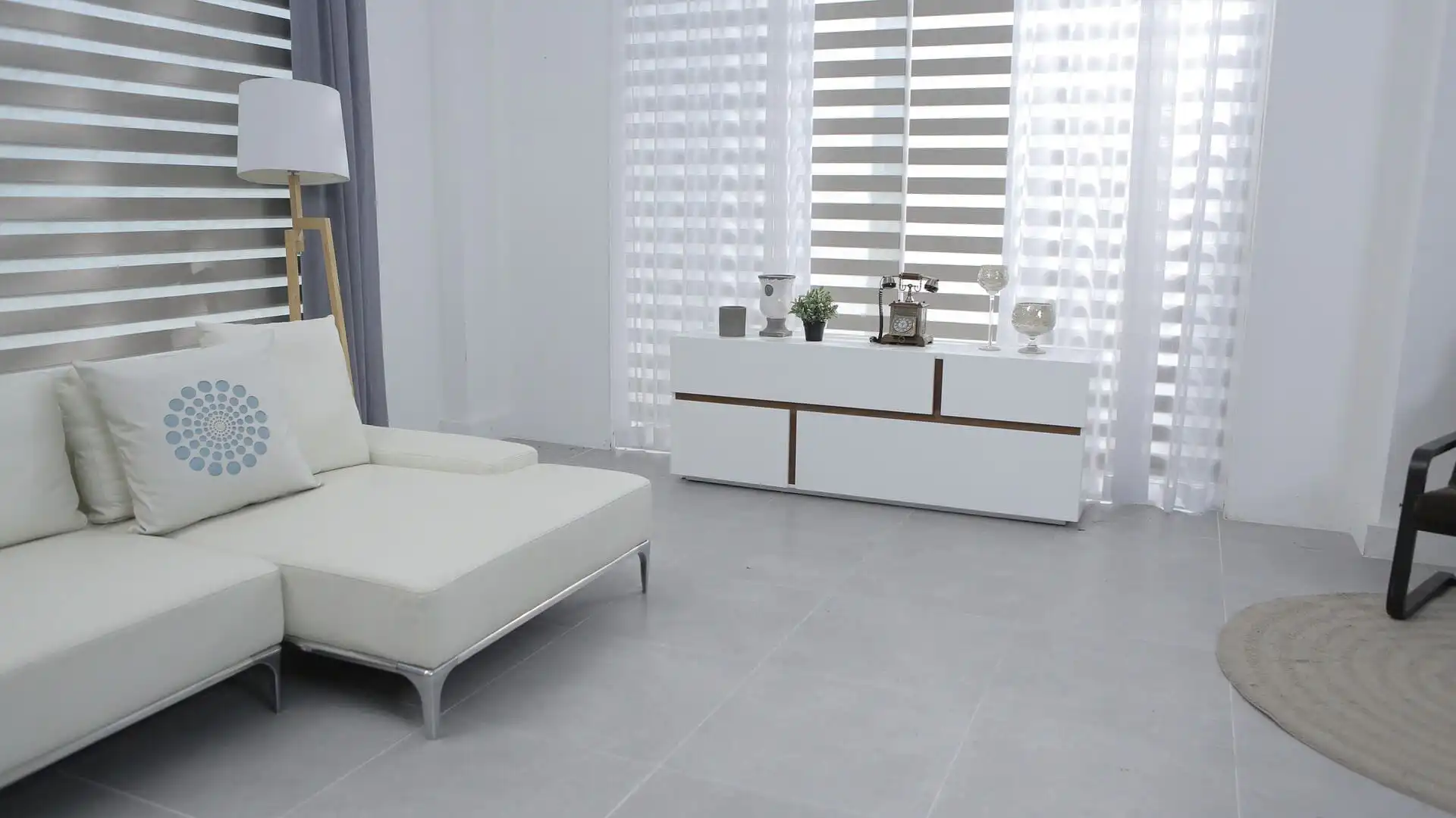
It is common for all of these to be either mismatched or disproportioned, making the living area look like a showroom. To avoid this mistake, the overall layout of the room needs to be studied and then organized in a way so that everything blends in really well.
By paying attention to detail and taking some expert advice, these commonly made errors can be avoided and creating a beautiful, well-decorated living room with a pleasant interior won’t be much of a hassle.
Leave a Reply