A tray without a system is just a container. Designers have been using a specific set of proportion rules and object hierarchies for decades to make any surface look like it was styled on purpose — and almost none of it involves the advice you’ve already read. No one’s going to tell you to “stack some books and add a candle” here. What follows is the actual formula: the proportion math, the material logic, the object hierarchy, and the seasonal swap system that keeps every tray looking like it was composed rather than assembled.
What Trayscaping Actually Means (And Why Most People Get It Wrong)
Trayscaping is not decorating a tray. That distinction sounds small, but it changes everything about how you approach the exercise. Trayscaping is using a tray to anchor a visual composition with intentional hierarchy — the tray is the frame, not the subject. Most people get this backwards, choosing objects they love and arranging them inside whatever tray fits. That’s how you end up with a flat, cluttered display that reads as random regardless of how beautiful the individual objects are.
The difference between a tray that looks styled and one that looks accidental comes down to three non-negotiable rules every professional stylist works with:
- Height variation — you need at least three distinct height levels within the tray, not two and not four
- Odd-number groupings — three or five objects, never four or six, because even numbers split the eye and stop visual movement
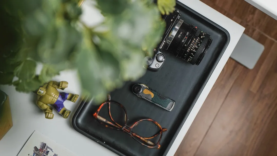
- One functional object per tray — a candle, a dish, a small bottle — something that justifies the tray’s existence beyond decoration
Google Trends data confirms that ‘trayscaping’ as a specific search term spiked significantly in 2024, following House Beautiful’s editorial coverage of the trend, separating it from the broader and far older category of general tray décor. This isn’t a rebrand of something you already know. It’s a specific compositional approach that borrows from retail display, editorial photography, and interior staging — and it has actual rules.
Why do most DIY trayscapes fail? Because people style by feel rather than proportion. They choose objects that match, place them symmetrically, and wonder why the result looks like a store display rather than a designed surface. Matching creates monotony. Symmetry creates stasis. A well-built trayscape has contrast, movement, and at least one element that makes the composition slightly unexpected.
The good news is that trayscaping ideas for home don’t require expensive objects or a professional eye. They require a system — and once you have the system, even a $12 tray from a discount store can produce a result that looks considered and intentional.
Actionable takeaway: Before touching a single object, look at your tray and ask: what is the tallest thing, what is the flattest thing, and what actually does something? If you can’t answer all three in ten seconds, your tray formula isn’t set yet.
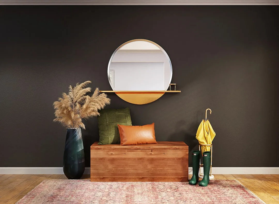
The Entryway Trayscape: Your Home’s First Impression Formula
The entryway is the highest-stakes surface in any home. Interior designers consistently identify it as the room that sets mood expectation for the entire home — and in staging contexts, a styled entry surface measurably increases perceived home value by signaling organization and intentionality before a buyer sees anything else. A tray here isn’t optional; it’s the visual anchor that separates an entry that reads as “we live here” from one that reads as “we haven’t thought about this yet.”
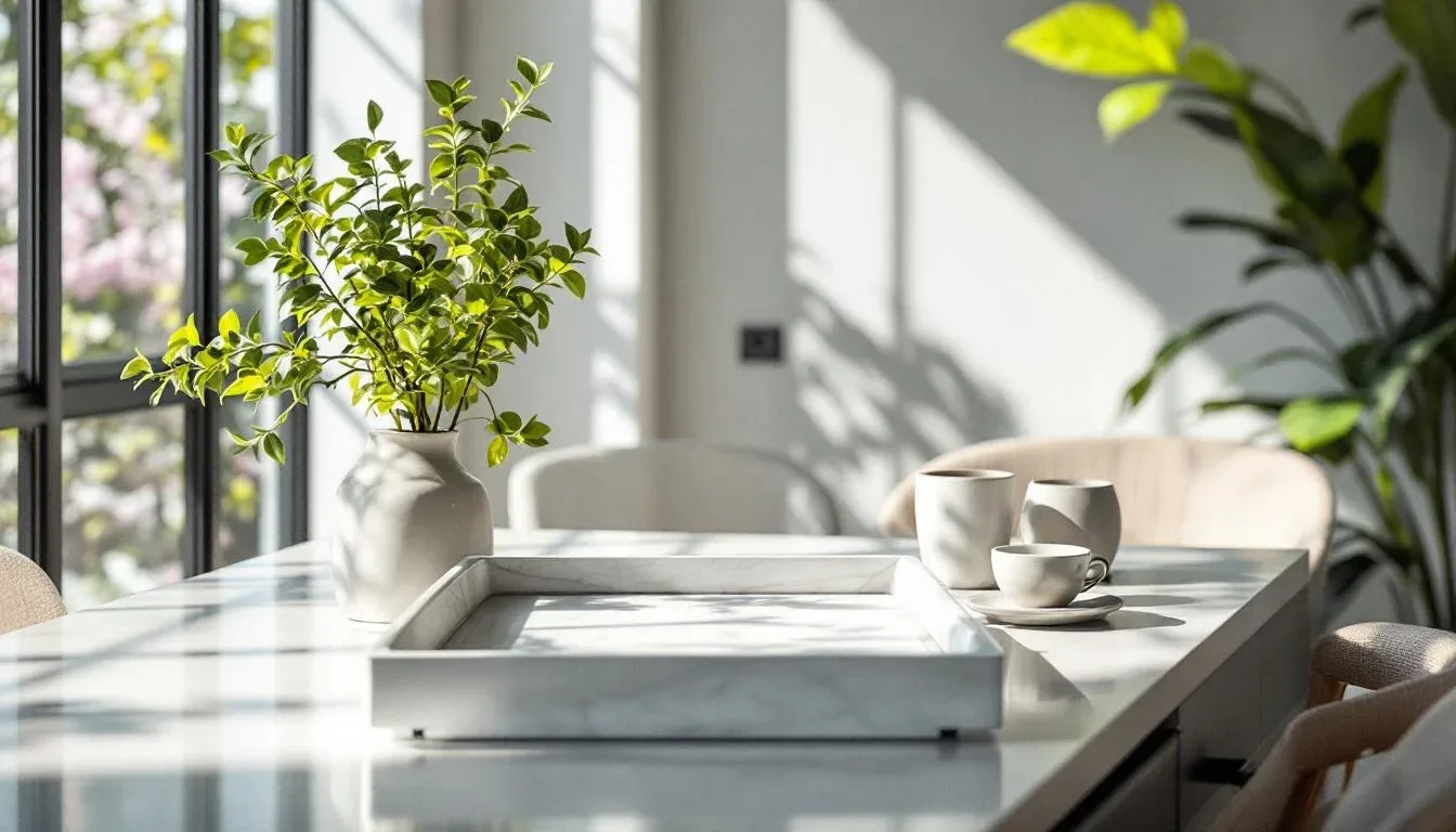
The proportional starting point: use a rectangular tray at least 14 inches long. This is the minimum dimension needed to accommodate the functional trio without crowding it:
- A key dish or small catchall bowl (flat, front position)
- A small candle or reed diffuser (mid-height, center position)
- One live or high-quality faux element — a small succulent, a single stem in a bud vase, dried botanicals (tallest, back position)
That height hierarchy — tallest at back, mid-height in center, flat at front — is not aesthetic preference. It’s how the human eye reads a composition from entry angle, which in an entryway is almost always head-on at a slight downward angle. Place your tallest object at the front and the composition collapses into itself.
The material rule for entryway trays is specific: the tray must include at least one tactile material — leather, rattan, or stone — somewhere in the composition. Not necessarily the tray itself, but somewhere. A leather key fob, a small river stone, a rattan coaster stack. Tactile contrast is what signals intention rather than randomness because it requires a deliberate choice. Anyone can place objects on a surface; choosing materials that engage the sense of touch is a curator’s decision.
Recommended tray dimensions for a standard entryway console (typically 48–60 inches wide): a tray 16–20 inches long, positioned off-center toward one end to leave visual breathing room on the opposite side.
One detail that separates entry trayscapes styled by designers from those assembled by feel: the tray itself is always chosen before the objects. The tray’s material sets the room’s material story. A black lacquer tray reads formal. A raw wood tray reads organic. A hammered brass tray reads global and collected. Once you choose the tray, every object inside it must either echo or contrast that material story — never ignore it. This is why shopping for “pretty objects” before choosing your tray consistently produces results that feel disconnected.
A secondary tip that applies specifically to high-traffic entryways: keep the front third of the tray intentionally clear. This isn’t a styling choice — it’s a functional buffer. Keys get dropped, mail gets set down, bags land on consoles. A tray with objects crowded to the front edge will be disrupted daily and will read as cluttered within 48 hours. The visual composition lives in the back two-thirds; the front third exists to absorb real life without breaking the trayscape.
Actionable takeaway: Place your entryway tray off-center on its surface, not centered — this single move signals design confidence more than any object you put inside it.
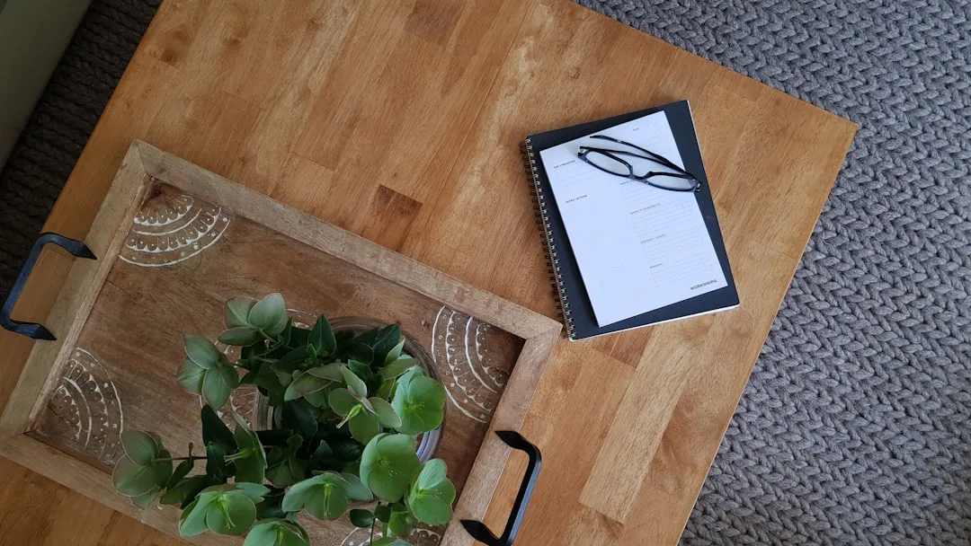
Coffee Table Trayscaping: The 60-30-10 Proportion Rule in Practice
Coffee table styling is the single most-searched home décor query on Pinterest, and tray-based compositions consistently outperform loose object arrangements in saves by a measurable margin. The reason is simple: a tray creates a boundary, and a boundary signals intention. But the specific proportions inside that boundary are what separate a styled coffee table from one that just happens to have a tray on it.
The sizing rule first: your tray should occupy no more than 60 percent of your coffee table’s surface area. On a standard 48-inch rectangular coffee table, that’s a tray roughly 18–22 inches long. The remaining 40 percent of table surface stays empty. That negative space is not wasted real estate — it’s what makes the tray read as a composition rather than coverage.
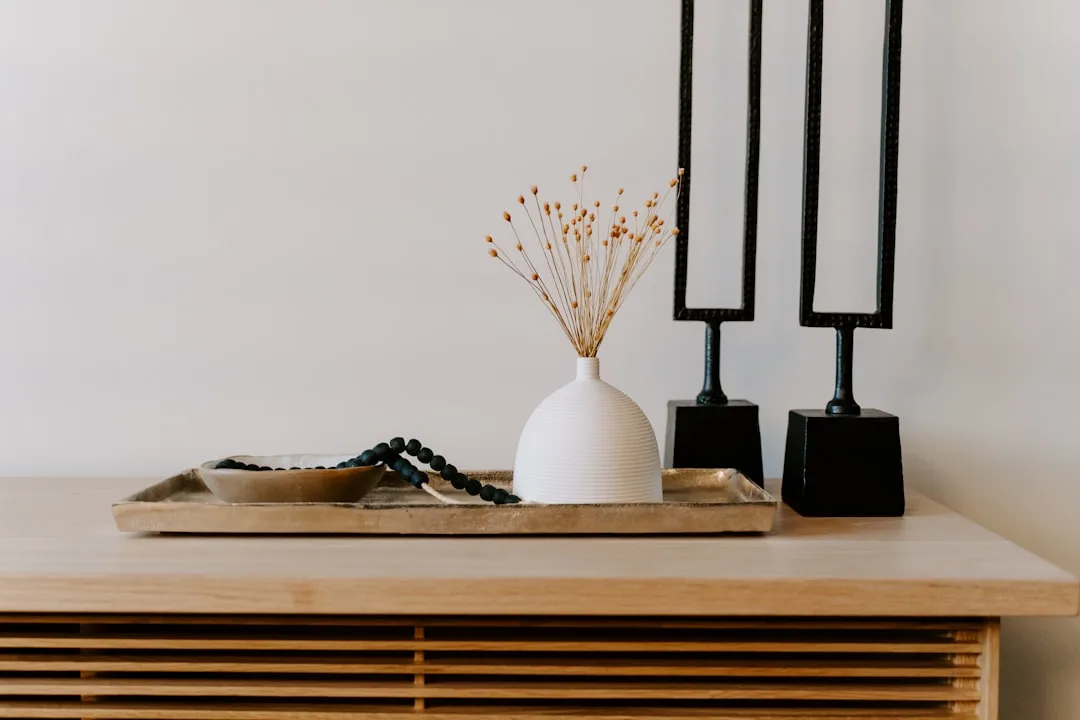
Inside the tray, the 60-30-10 proportion rule applies to visual weight, not object count:
- 60 percent visual weight: The dominant object — a sculptural bowl, a stack of exactly three hardcover books (not two, not four), an oversized candle in a vessel
- 30 percent visual weight: The accent object — a small decorative item, a bud vase with a single stem, a smaller candle
- 10 percent visual weight: The punctuation — one tiny object that catches the eye, a small crystal, a matchbox, a single stone
The material pairing rule is absolute: if your tray is wood, at least one object inside must be metal or glass. If your tray is marble, introduce a warm organic material like a wooden object or dried stem. Never style all same-material inside a single trayscape. The contrast is what generates visual interest.
The coffee table is also where trayscaping ideas for home tend to stall because people over-invest in the tray and under-invest in understanding the table’s relationship to the seating around it. A tray placed on a coffee table should be readable from the sofa — meaning the composition needs to make sense from a seated eye level, typically about 24–28 inches off the floor. Objects that look proportional when you’re standing and styling them can read as flat and insignificant from a seated position. Style your coffee table trayscape, then sit down on your sofa and evaluate it from there before committing.
One advanced technique designers use on rectangular coffee tables: two-tray layering. A larger tray anchors the composition at roughly 60 percent of the table surface, and a smaller accent tray — different material, different shape if possible — sits either partially overlapping it or positioned on the exposed table surface nearby. This technique is borrowed directly from retail display and creates depth that a single tray composition cannot achieve. The smaller tray holds one or two objects maximum; it functions as punctuation, not a second full composition.
For round coffee tables, the proportion rules shift slightly. A circular tray centered on a round table creates perfect symmetry, which as noted above produces stasis. Instead, choose an oval or rectangular tray placed off-center, leaving a visible arc of table surface on one side. This asymmetry is what gives a round table’s trayscape movement — the eye follows the edge of the tray around the curve of the table and keeps traveling rather than stopping dead center.
Actionable takeaway: After styling your coffee table trayscape, sit on your sofa and look at it from that angle for a full 30 seconds before making any final adjustments. What looks balanced standing up often needs a height adjustment when evaluated from actual use position.
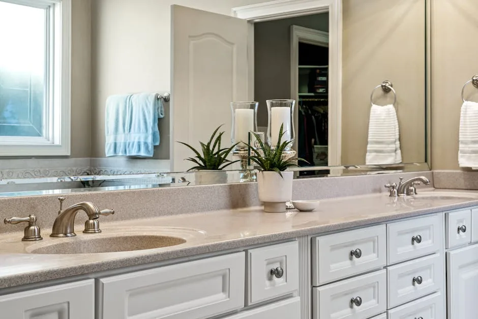
Bathroom and Vanity Trayscaping: The Functional Beauty Formula
The bathroom is where trayscaping ideas for home produce the fastest visible transformation relative to effort — and where most people miss the specific rules that make a vanity tray look like a spa rather than a cluttered counter. The functional constraint here is real: everything on a bathroom vanity serves a purpose, which means your trayscape has to absorb actual use objects and still look intentional.
The solution is what designers call the visibility edit. Before building a bathroom trayscape, every object that could go on the tray gets sorted into two categories: display-worthy and storage-worthy. Display-worthy objects are those with attractive packaging, interesting shapes, or deliberate material quality — a glass perfume bottle, a linen hand soap pump, a small ceramic dish for rings. Storage-worthy objects are everything else: plastic packaging, utilitarian bottles, anything with a label that reads as pharmaceutical rather than intentional. Storage-worthy objects go inside a cabinet or drawer. They are not on the tray. This is not about hiding your real life — it’s about curating what your real life looks like in this specific frame.
The tray itself matters more in a bathroom than in any other room because humidity, water, and daily contact require a material that holds up to use. Marble trays, lacquered wood trays, and resin trays are the three materials that survive bathroom conditions without warping, staining, or degrading. Unsealed natural wood and wicker are visually appealing but functionally problematic in wet environments.
For a standard bathroom counter, the composition formula is simpler than other surfaces because functional objects impose their own hierarchy:
- Back position: The tallest functional item — a hand soap pump, a diffuser, a tall glass vessel holding cotton swabs with visual appeal
- Middle position: A mid-height item — a small candle, a lotion bottle with good packaging, a bud vase with a single dried stem
- Front position: The flat functional dish — a ceramic ring dish, a small stone tray within the tray, a smooth river stone that reads as intentional rather than random
The one non-negotiable rule for bathroom trayscapes: every object must be able to get slightly wet without being damaged. A paperback book, a matchbox, anything with paper labels — these are not bathroom tray objects. The material logic here is both aesthetic and practical.
Actionable takeaway: Do the visibility edit before touching a tray. Every object that lives on your bathroom counter gets sorted into display-worthy or storage-worthy. Only display-worthy objects go on the tray. This single edit will transform most bathroom counters before you add a single new object.
The Seasonal Swap System: How to Keep Every Trayscape Looking Current
The most common trayscaping failure mode isn’t bad initial styling — it’s a well-styled tray that sits unchanged for six months and starts reading as furniture rather than composition. Designers working on residential projects build what they call a seasonal swap protocol into every trayscape they install, and it’s the reason styled surfaces in designed homes always look current while the same surfaces in other homes gradually fade into visual background.
The seasonal swap system operates on a simple principle: 80 percent of the tray stays constant, 20 percent rotates with the season. The structural objects — the dominant sculptural element, the functional item, the tray itself — stay in place. The accent and punctuation objects swap out four times per year on a loose seasonal schedule.
What constitutes a seasonal swap object:
- Spring: A small vessel with fresh or dried florals, a pastel ceramic object, a light linen texture element
- Summer: A woven natural element, a clear glass object that reads light and open, a single bright stem in a bud vase
- Fall: A small gourd or acorn vessel, a warm-toned candle (amber, tobacco, woodsmoke scents perform double duty as functional and seasonal), a dried grass stem in a clay vessel
- Winter: A small evergreen sprig in a narrow vessel, a metallic object (brass, gold, or pewter), a short pillar candle in a dark vessel
The swap objects for all four seasons can be sourced and stored in a single small box — literally a shoebox — that lives in a closet. The cost of a full year’s worth of swap objects for one tray is typically under $40 if sourced strategically from craft stores, farmers markets, and seasonal aisles at discount retailers. The investment in time is about ten minutes per season.
This system is also what allows trayscaping ideas for home to scale across multiple surfaces without becoming overwhelming. If you have trays on a coffee table, an entryway console, and a bathroom vanity, you’re maintaining three 20-percent-rotation systems — not three entirely new compositions four times per year. The structural core of each tray never changes. Only the accent objects move, and those can often be rotated between trays rather than replaced entirely.
One additional technique for keeping trayscapes visually current without seasonal swaps: the 90-degree rotation. Every four to six weeks, rotate your entire tray composition 90 degrees on its surface. Objects that were at the back are now at the side. The light hits them differently. The reading angle from the most common viewpoint in the room changes. The composition reads as refreshed without a single new object being introduced. It sounds too simple, but the reason it works is that most people view their home surfaces from the same position at the same angle every day — changing the orientation of the composition genuinely changes the visual experience.
Actionable takeaway: Source and store your seasonal swap objects for all four seasons at once, in a single labeled box. The upfront effort is about 30 minutes and under $40. The result is four trayscape refreshes per year that each take under ten minutes to execute.
Material Pairings That Always Work (And the Combinations to Avoid)
Every professional stylist has a mental library of material pairings that work regardless of color palette, room style, or object type. These aren’t aesthetic preferences — they’re based on how materials interact visually in terms of reflectivity, texture contrast, and visual weight. Understanding these pairings is what allows trayscaping ideas for home to work across wildly different room styles without requiring a complete rethink each time.
The pairings that always work:
- Matte ceramic + polished metal — the contrast between light-absorbing and light-reflecting surfaces creates natural visual tension that reads as intentional
- Raw wood + clear glass — organic warmth against transparency; the glass disappears visually and lets the wood read as the dominant material while adding height without visual weight
- Marble + brass — the coolness of stone against the warmth of aged metal; this pairing has appeared in designed interiors for over a century because the contrast is genuinely unresolved — neither material dominates
- Woven natural fiber (rattan, seagrass) + smooth ceramic — tactile contrast between rough and smooth that makes both materials more interesting than they would be in isolation
- Linen or cloth texture + stone — softness against hardness; a small linen-wrapped object or folded cloth element next to a river stone or marble piece creates the same tension as the ceramic-metal pairing but with warmer materials
The combinations to avoid:
- Two shiny surfaces in the same tray — polished metal next to glass next to lacquer creates visual noise rather than visual interest; reflective surfaces compete rather than contrast
- Two organic materials of similar texture — rattan next to rough wood next to jute creates a single undifferentiated texture mass; at least one smooth or polished element is required to create contrast
- All cold materials — marble tray, glass objects, metal candleholder with no warm element reads as sterile; introduce one warm material (wood, dried botanical, warm-toned ceramic) to make a cold palette livable
- All warm materials — the opposite problem; a wood tray, terracotta objects, and linen elements with no cool or light-reflecting surface reads as heavy and dim
The practical application of these rules is simple: before finalizing any trayscape, count your material categories. Identify which objects are warm, which are cool, which are shiny, which are matte, which are textured, which are smooth. A well-built trayscape has representation from at least three of those six categories. If you’re only hitting two, the composition will read as flat regardless of how good the individual objects are.
Actionable takeaway: List the material qualities — warm/cool, shiny/matte, textured/smooth — of every object before placing it in a tray. A balanced trayscape hits at least three of those six categories. If yours only hits two, swap one object before evaluating the composition as a whole.
Frequently Asked Questions About Trayscaping Ideas for Home
How many objects should go on a tray?
The number depends on tray size, but the principle is consistent: odd numbers only, and fewer than you think. For a tray under 14 inches, three objects is the maximum — one dominant, one accent, one punctuation. For trays 14–20 inches, five objects is workable if the height hierarchy is strong. For large trays over 20 inches, seven objects is the ceiling before a composition starts reading as crowded. The most common mistake is adding one too many objects because the tray “has room.” Empty space inside a tray is compositional, not wasteful.
What kind of tray works best for coffee tables?
Shape follows function here. Rectangular trays work best on rectangular coffee tables because the parallel lines echo the table’s geometry and create visual order. Round or oval trays work well on round tables — but only when placed off-center, as a centered round tray on a round table creates a symmetry that reads as static. For ottoman coffee tables, a rigid tray (wood, lacquer, or resin) is essential over a soft surface because it creates the stable flat plane that makes styling possible. Material-wise, the coffee table tray should contrast the table surface itself: a wood coffee table benefits from a marble, metal, or lacquer tray; a glass table benefits from a wood or woven tray.
Can trayscaping work in small spaces or on small surfaces?
Trayscaping actually performs better in small spaces than large ones because the constraint forces editorial decision-making. A nightstand tray, a small kitchen windowsill tray, or a compact bathroom shelf tray only accommodates three objects maximum — which means every object has to earn its place. The rules don’t change for small surfaces; the scale does. Use a tray that’s proportional to the surface (no more than 60 percent of the available surface area), and limit the composition to three objects with clear height variation. Small trayscapes that follow the formula read as curated; small trayscapes that ignore it read as cluttered.
How often should you update a trayscape?
The structural core — the dominant object, the tray itself, and the functional item — should stay in place indefinitely, or until you’re genuinely tired of it. The accent and punctuation objects should rotate seasonally, four times per year. In practice, this means one intentional 10-minute refresh per season to swap the 20 percent that signals currency and keeps the composition from becoming invisible background. Between seasonal swaps, the 90-degree rotation technique (turning the entire composition a quarter turn on its surface) provides a visual refresh without any new objects.
Is it necessary to buy new objects to start trayscaping, or can you work with what you have?
Almost always, you can start with what you have — but the visibility edit has to happen first. Go through every object currently on the surface you want to trayscape and sort them into display-worthy and storage-worthy categories. Display-worthy objects have interesting shapes, quality materials, or attractive proportions. Storage-worthy objects have utilitarian packaging, plastic materials, or paper labels. Once you’ve done the edit, arrange the display-worthy objects using the height hierarchy rule (tallest at back, mid-height in center, flat at front) inside whatever tray you own. Most people find that this edit alone — before buying anything — produces a result that looks significantly more intentional than what they started with. New objects are additions to a working system, not prerequisites for starting one.