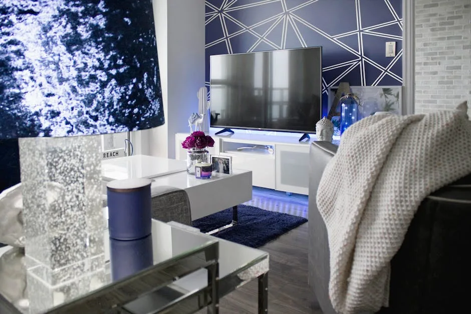
Most wall art looks wrong for one reason that has nothing to do with style, color, or price — it’s simply the wrong size relative to the furniture beneath it, and the 2/3 rule is the single fastest fix that professional designers use to solve it.
You’ve probably felt this before. You hang a piece you love, step back, and something’s off. The art looks like it’s floating. Or it’s so large it swallows everything around it. You haven’t chosen the wrong art — you’ve chosen the wrong scale. That distinction changes everything about how you shop and hang going forward.
The 2/3 Rule for Wall Art, Explained Without the Jargon
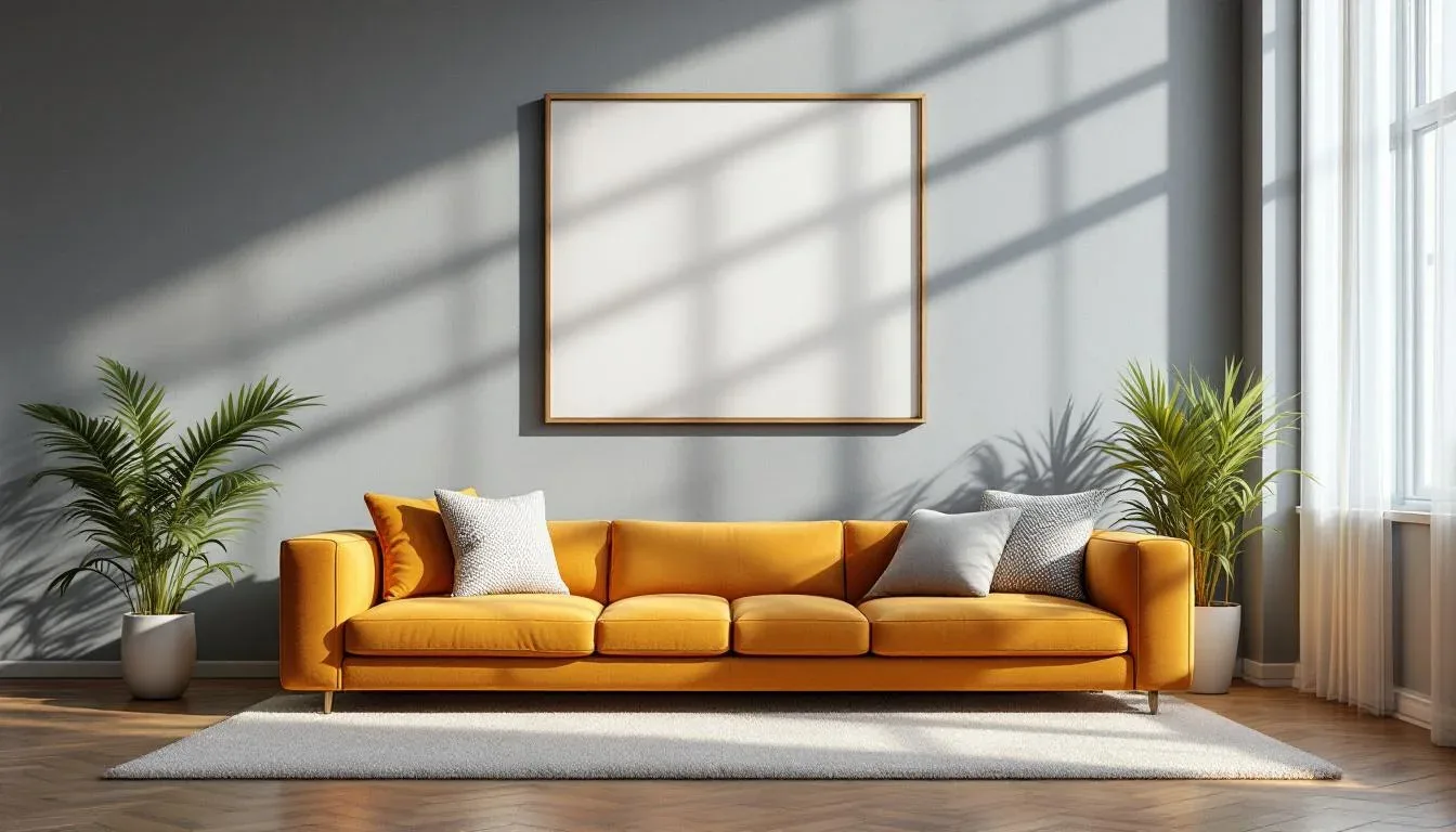
The 2/3 rule states that wall art should span roughly two-thirds the width of the furniture piece or wall space it’s anchoring visually. If your sofa is 84 inches wide, your art or art arrangement should land around 56 inches wide. That’s it. That’s the whole rule.
But here’s what most people miss: this rule isn’t sofa-specific. It applies to any furniture piece that creates a visual anchor in a room — beds, dining sideboards, entry consoles, floating shelves, home office desks. Wherever furniture meets wall, the 2/3 principle creates the proportional relationship between the two that the eye reads as intentional and resolved.
It’s also worth understanding that the 2/3 rule is a proportion principle, not a rigid measurement law. You’re not failing if your art lands at 65 percent or 70 percent of the furniture width. The rule gives you a target zone, not a single pass/fail number.
The rule works in both orientations:
- Horizontal walls (long sofa walls, dining room walls, bed walls): measure width and aim for 2/3 of the furniture piece’s horizontal span
- Vertical spaces (narrow hallway walls, stairwells, tall architectural niches): apply the ratio to height instead — art height should reach roughly two-thirds of the available vertical wall space
Mathematically, this rule has a respectable ancestor. Interior designers often reference the golden ratio (1.618) when discussing ideal proportions — and the 2/3 rule, which expresses as 0.667, approaches that same range of proportions the human eye instinctively reads as harmonious. Both principles aim at the same target: a ratio between two elements that feels balanced without looking symmetrically rigid.
Actionable takeaway: Before you measure anything, identify the single piece of furniture the art needs to “belong to” — that anchor piece, not the wall, is always your reference point.
Why the 2/3 Rule Works: The Visual Science Behind It
The 2/3 rule isn’t design folklore — there’s actual perceptual psychology behind why it works, and understanding that psychology lets you apply the principle confidently even when the math doesn’t give you a clean answer.
When you walk into any room, your brain immediately searches for a visual anchor — a dominant focal point to organize everything else around. Art sized correctly to the 2/3 target fuses with the furniture beneath it to create one clear focal point. Your eye lands on it, feels satisfied, and then moves on to read the rest of the room. That’s the sequence good design creates.
Undersized art breaks that sequence. When a small canvas floats above a large sofa, your brain registers an unresolved gap between the two elements. Designers call this “floating anxiety” — the piece looks lost, the furniture looks abandoned, and the overall wall reads as incomplete negative space. The discomfort is real, even when viewers can’t articulate what’s wrong.
Oversized art creates the opposite problem. Once wall art pushes past roughly 80 percent of the furniture width in a traditional or transitional space, it stops collaborating with the furniture and starts dominating it. The sofa or bed beneath begins to feel incidental — like it just happened to land there — rather than intentionally placed.
The 2/3 ratio also echoes the rule of thirds used in photography and classical painting composition. In both disciplines, placing key elements at one-third or two-thirds of a frame creates dynamic visual tension that feels more alive than centered, symmetrical arrangements. The same perceptual wiring that makes a well-composed photograph feel right makes correctly proportioned wall art feel right.
Research in environmental psychology supports this directly. Kaplan and Kaplan’s Attention Restoration Theory establishes that visually balanced environments reduce cognitive load — meaning they’re literally easier on your brain to process. A room where art and furniture are proportionally matched reads as coherent, and coherence is something humans find physically calming. This is why a well-hung piece of art can make an entire room feel more expensive and more comfortable simultaneously.
Actionable takeaway: If a room feels “off” but you can’t identify why, look at the art-to-furniture ratio before you look at anything else — that’s statistically the most likely culprit.
How to Measure and Apply the 2/3 Rule Step by Step
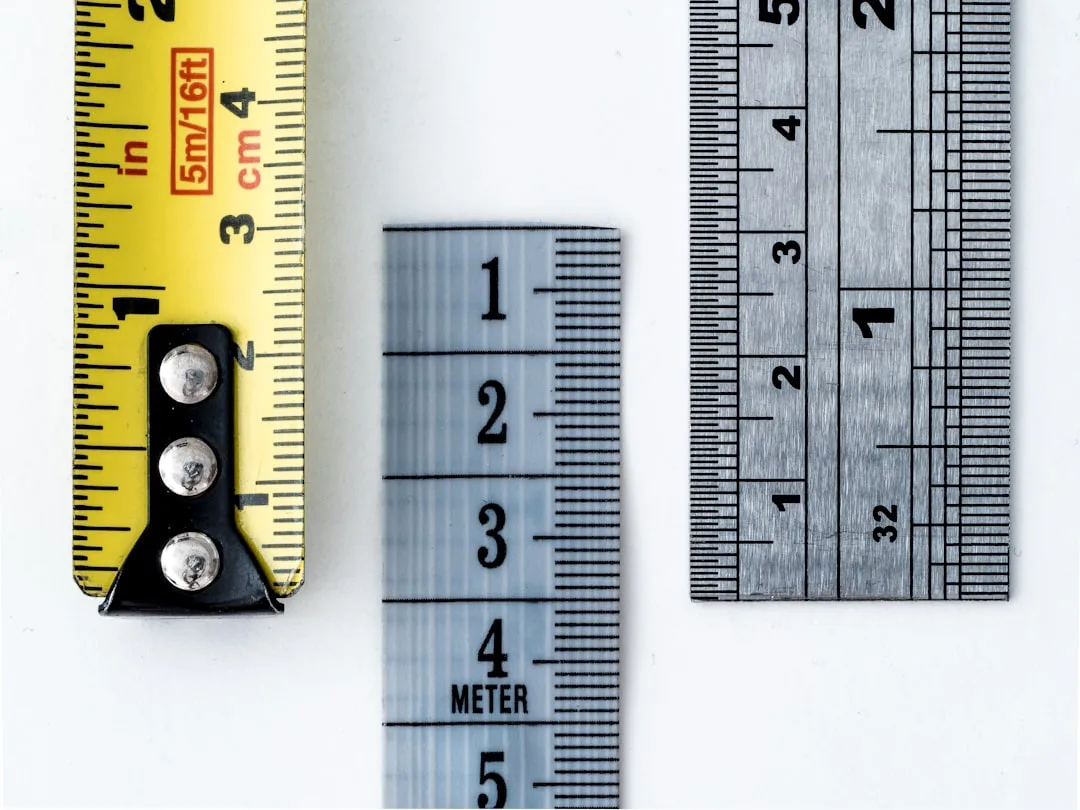
Grab a measuring tape and your phone. You can do this in about ten minutes.
Step 1: Measure the full width of your anchor furniture piece in inches.
For a sofa, measure arm-to-arm across the full exterior width. For a bed, measure the headboard or the full width of the frame at its widest point. For a sideboard or console, measure the total top surface width including any legs that extend beyond the cabinet body.
Step 2: Multiply that measurement by 0.67.
This gives you your target art width. An 84-inch sofa yields 56.28 inches — round to 56. A standard king headboard at 76 inches yields about 51 inches. A 60-inch dining sideboard yields 40 inches.
Step 3: Use painter’s tape on the wall to mock up the exact dimensions before buying anything.
Cut two strips of tape to your target width and tape them to the wall at approximately the height where the art will hang. Step back. Look at it from your normal vantage point in the room — seated, if the furniture is seating. This test prevents the most expensive mistake: buying and returning.
Step 4: Confirm your hanging height.
The standard professional target is 57 to 60 inches from the floor to the midpoint of the artwork — this approximates average seated and standing eye level. Measure up from the floor and mark that midpoint with a small piece of tape.
Step 5: Adjust for ceiling height.
Standard 8-foot ceilings: hang at the lower end of the 57–60 inch range. Ceilings at 9 to 10 feet: you can push toward the upper end, or even slightly above 60 inches, to prevent art from looking low against the taller wall plane. For ceilings above 10 feet, add roughly one inch of vertical adjustment for every additional foot of ceiling height beyond 8 feet.
Standard retail frame and canvas sizes cluster around 24×36, 30×40, 36×48, and 40×60 inches — knowing your 2/3 target width before you shop lets you filter immediately rather than eyeballing hundreds of options online.
- 72-inch sofa → 48-inch target → shop 48×30 or 48×36 frames
- 84-inch sofa → 56-inch target → shop the 60×40 range (±4 inches is acceptable)
- 96-inch sofa → 64-inch target → shop 64×44 or a gallery arrangement totaling that width
Actionable takeaway: Do the painter’s tape test for every single piece before purchasing — it takes four minutes and eliminates the most common sizing regret entirely.
Applying the 2/3 Rule to Every Room, Not Just the Living Room
The sofa example is useful but it’s given the 2/3 rule an unfairly narrow reputation. Every room in your home has furniture-to-wall relationships that benefit from this thinking.
Bedroom
Apply the rule to the headboard width specifically, not the full bed frame width and not the room wall. A queen bed with a 60-inch upholstered headboard calls for roughly 40 inches of art — a single piece or a pair of prints totaling that width. A king headboard at 76 inches brings you to about 51 inches. This tracks — people default to bedroom art that feels “delicate,” which usually means undersized.
Dining Room
Art above a buffet or sideboard follows the standard furniture-width formula. Art on a bare dining room wall with no furniture beneath it should relate instead to the table length — target two-thirds of the table’s length for visual alignment, since your eye draws a line between the two elements whether or not they’re physically connected.
Home Office
A single piece behind a desk should stay at or below two-thirds of the desk width. A 60-inch desk calls for art up to 40 inches wide. Going wider than this creates visual competition with the monitor sightline and makes the workspace feel cluttered rather than curated.
Hallways
In narrow corridors where the furniture reference point doesn’t exist, apply the rule vertically — art height should reach no more than two-thirds of the wall height between baseboard and ceiling. This prevents art from feeling either too cramped near the floor or awkwardly tall relative to the narrow horizontal space.
Bathroom
Even here. Art above a toilet tank or beside a vanity mirror benefits from the scaled-down calculation. A 24-inch vanity calls for art in the 16-inch range. Small spaces amplify proportion errors rather than hiding them, so the math matters more, not less.
Actionable takeaway: Walk through every room and identify the dominant anchor furniture piece — then apply one quick calculation to assess whether your existing art is proportionally matched.
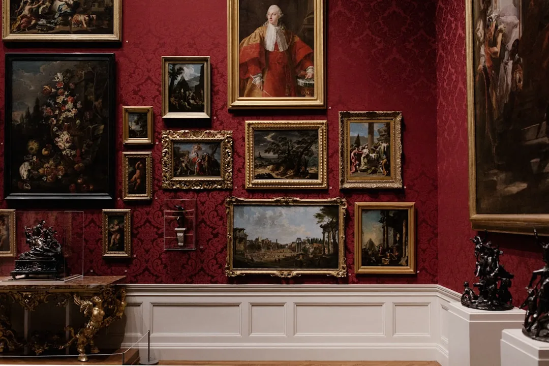
Gallery Walls and the 2/3 Rule: How to Treat a Collection as One Unit
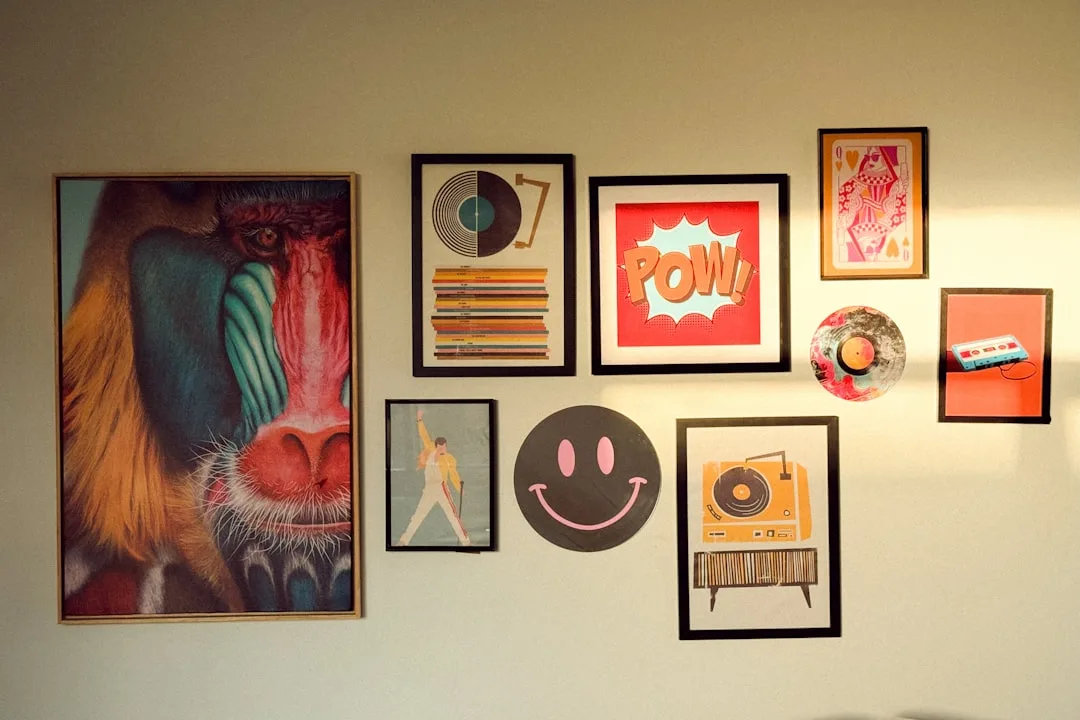
Gallery walls are where the 2/3 rule trips most people up, because they’re thinking about individual frames instead of the collective arrangement. Treat a gallery wall as a single piece of art. Its total combined width — measured from the outermost left edge to the outermost right edge of the arrangement — must hit your 2/3 target, regardless of how many pieces are inside that boundary.
Here’s the process that works:
- Calculate your 2/3 target width using your anchor furniture measurement
- Lay all frames on the floor in the arrangement you’re considering
- Measure the outer edges of that floor arrangement — that’s your actual “art width”
- Adjust the arrangement by adding, removing, or repositioning frames until the outer measurement matches your target
- Photograph the floor layout before touching the wall
Interior designers recommend maintaining 2 to 3 inches of spacing between frames consistently throughout the arrangement. Tighter spacing (under 2 inches) merges frames visually into one dense block that loses individual impact. Wider spacing (over 3 to 4 inches) fragments the arrangement and breaks the single-unit illusion you need.
Anchor the arrangement with the largest or heaviest piece slightly left of center — this mirrors how Western viewers naturally scan a composition from left to right and creates subtle visual momentum across the wall.
On numbers: odd-numbered groupings consistently outperform even-numbered ones in visual perception studies. Three, five, or seven pieces create natural asymmetry that the eye finds interesting. Even groupings tend to feel static or corporate. Designers generally cap living room gallery walls at seven pieces — beyond that, the arrangement loses cohesion and starts reading as clutter regardless of how carefully it’s composed.
Actionable takeaway: Before hanging a single nail, measure your floor layout’s outer edge against your 2/3 target — that one measurement saves hours of patching and rehanging.
When to Break the 2/3 Rule (And How to Do It Intentionally)
The 2/3 rule is a teaching tool, not a commandment. Designers at the American Society of Interior Designers note that proportion rules like this guideline are starting points — and professional designers break them deliberately in approximately 30 percent of residential projects. The key word is deliberately.
Here’s when breaking the rule actually works:
Intentional overscale
In minimalist or contemporary interiors, a single large-format piece spanning 80 to 90 percent of a wall — or even the full wall — can be the correct choice. When art IS the architectural statement, the 2/3 rule’s caution about dominance becomes the goal. Think a 72-inch abstract canvas in an all-white room with a low-profile platform sofa. The art dominates because that’s the design intent.
Eclectic and maximalist spaces
When visual complexity is the deliberate design goal, strict proportion rules relax. In maximalist interiors, cohesion comes from repetition of color, frame style, or subject matter rather than proportional math. Use those elements to create order instead.
Architectural interruptions
A fireplace, window, or doorway within the same wall section overrides the furniture measurement. In these cases, measure the usable wall segment between architectural breaks and apply 2/3 to that dimension instead of the furniture width.
Very small furniture
A narrow entry console under 36 inches produces a 2/3 target of roughly 24 inches — which is difficult to find in standard sizes and risks looking too petite in an entryway. In these cases, allow art up to the full console width. The visual risk of going slightly over is lower than the awkwardness of going too small.
When your eye beats the math
After taping up your target dimensions, if a slightly larger piece feels more balanced in the actual space — with actual lighting, actual ceiling height, actual furniture colors — trust that. The tape test exists precisely so you can make that judgment before spending money.
Actionable takeaway: Breaking the rule intentionally requires knowing the rule first — nail the formula, then decide whether your specific space calls for an exception.
Common 2/3 Rule Mistakes That Make Art Look Wrong
A 2022 consumer survey by Framebridge found that 73 percent of homeowners unhappy with their wall art cited “wrong size relative to furniture” as the primary issue — ranking above color mismatch and style conflicts combined. Here’s exactly where those sizing decisions go wrong:
Measuring the wall instead of the furniture
The wall is almost always wider than the furniture in front of it. Measuring the wall produces an oversized target that makes the furniture look small and randomly placed. Always measure the anchor piece.
Ignoring vertical proportion
A piece can hit the 2/3 width target perfectly and still look wrong if it hangs too high or sits too low. Art hung above 60 inches to midpoint creates the “floating” effect everyone recognizes but can’t name. Art hung too low merges visually with the furniture rather than floating above it intentionally.
Right width, wrong aspect ratio
A 56-inch wide piece that’s only 12 inches tall creates a horizontal strip that looks like a shelf label rather than artwork. Your 2/3 target width should inform aspect ratio too — generally, art above a sofa looks best with a height of 18 to 24 inches minimum. Match the visual weight of the piece to the furniture, not just the linear width.
Measuring the image instead of the frame
Many online retailers list canvas or print dimensions separately from framed dimensions. A 30×40 print in a 3-inch frame actually measures 36×46 — that’s a significant difference when you’re targeting a specific width. Always confirm the framed outer dimensions before purchasing.
Misidentifying the anchor in open-plan spaces
In a combined living and dining area, the largest furniture grouping is the visual anchor — not the nearest sofa to the wall you’re decorating. Step back to the widest vantage point in the space and identify what your eye goes to first. That’s your anchor.
Actionable takeaway: Check these five failure modes against your current setup before buying — at least one of them is probably the reason any art that’s been bothering you looks slightly wrong.
Quick Reference: 2/3 Rule Calculations for Standard Furniture Sizes
Use this as your cheat sheet. Bookmark it. The target widths below are calculated at exactly 0.67 of the furniture width, then noted with the nearest standard frame size you’d actually find in retail.
Sofas
| Sofa Width | 2/3 Target Width | Nearest Standard Frame |
|—|—|—|
| 72 inches | 48 inches | 48×30 or 48×36 |
| 84 inches | 56 inches | 60×40 (go slightly large) |
| 96 inches | 64 inches | Gallery arrangement |
| 108 inches | 72 inches | Gallery arrangement |
Beds (Headboard Width)
| Bed Size | Headboard Width | 2/3 Target Width | Nearest Standard Frame |
|—|—|—|—|
| Twin | 38 inches | 25 inches | 24×36 (vertical) |
| Full | 54 inches | 36 inches | 36×24 or 36×48 |
| Queen | 60 inches | 40 inches | 40×30 or 40×60 |
| King | 76 inches | 51 inches | 48×36 or pair of 24×36 |
Sideboards and Buffets
| Sideboard Width | 2/3 Target Width | Nearest Standard Frame |
|—|—|—|
| 48 inches | 32 inches | 30×40 or 36×24 |
| 60 inches | 40 inches | 40×30 or 40×60 |
| 72 inches | 48 inches | 48×30 or 48×36 |
Desks
| Desk Width | 2/3 Target Width | Nearest Standard Frame |
|—|—|—|
| 48 inches | 32 inches | 30×40 or 36×24 |
| 60 inches | 40 inches | 40×30 or 40×60 |
Important note on rounding: Standard retail art and frame sizes cluster around 24×36, 30×40, 36×48, and 40×60 inches. When your calculated target falls between standard sizes, go slightly larger rather than slightly smaller — undersized is the more common and more visually damaging error.
Always run the painter’s tape test before purchasing anything on this list. Dimensions on paper and dimensions on your actual wall in your actual lighting are different experiences.
Actionable takeaway: Screenshot or bookmark this table, pull your furniture measurements before you start shopping, and filter product searches by your target width — you’ll cut your decision time by more than half.
Frequently Asked Questions
Does the 2/3 rule apply to gallery walls or just single pieces?
It applies to gallery walls — but the math works at the arrangement level, not the individual-frame level. Measure the total outer width of your entire gallery grouping (from the leftmost frame edge to the rightmost) and that combined measurement should hit your 2/3 target. Individual frames can be any size as long as the collective footprint is correct. Lay everything out on the floor first, measure the cluster’s outer edges, and adjust before touching the wall.
What if my furniture is too small to find art in the right 2/3 width?
This happens most often with narrow entry consoles (under 36 inches) and small bathroom vanities. When the calculated 2/3 target falls below 24 inches — the smallest common standard frame size — you have two practical options. First, allow the art to span up to the full furniture width rather than strictly two-thirds. Second, use a vertically oriented piece instead of a horizontal one; a 20×30 frame on a 30-inch console reads as proportional because the vertical emphasis creates visual presence without needing extra horizontal width. Small spaces amplify scale errors, so when in doubt, use the painter’s tape test to evaluate both options before deciding.
How does the 2/3 rule change for very high ceilings?
High ceilings (9 feet and above) shift two things. First, hanging height: the standard 57–60-inch midpoint guideline can push slightly higher — up to 63 to 65 inches for ceilings at 10 feet or above — to prevent art from looking anchored to the floor rather than the wall. Second, art scale: in rooms with 10-foot-plus ceilings, the visual weight of the ceiling creates more negative space above the furniture grouping, which can make correctly sized 2/3 art feel small. In these spaces, pushing toward the upper end of the acceptable range (70 to 75 percent of furniture width rather than 67) is often the better call. The painter’s tape mock-up is especially important in high-ceiling rooms because the spatial math shifts more dramatically than in standard-height spaces.
Should I measure the sofa with or without the arms when using the 2/3 rule?
Measure arm-to-arm, including the full width of both arms. That full exterior measurement is what the eye reads as “the sofa” from across the room, so it’s the correct reference point for the art above it. The one exception: if your sofa has unusually deep or wide rolled arms that extend significantly beyond the seat cushions, you can mentally subtract about half the arm width on each side, because very wide arms often read as separate visual elements rather than part of the main horizontal mass. When in doubt, tape both measurements on the wall and compare — you’ll see immediately which proportion feels locked in.
Start Today: The Ten-Minute Wall Art Audit
Here’s what to do right now, before you buy anything new or move a single nail.
Grab a measuring tape and walk to the room where your art feels most wrong. Measure the anchor furniture piece — full width, arm to arm or edge to edge. Multiply by 0.67. Write that number on your phone.
Now measure whatever’s currently hanging above it. Compare the two numbers. If your current art is more than 15 percent narrower than your target, you’ve found your problem. If it’s within 5 percent, the issue is probably hanging height — measure from the floor to the artwork’s midpoint and check whether it’s landing between 57 and 60 inches.
Then tape your target dimensions on the wall using painter’s tape and live with that template for 24 hours. Look at it in morning light and evening light. Look at it seated. Look at it from the doorway. That tape rectangle will tell you more about what to buy than any product listing ever will.
The 2/3 rule doesn’t require expensive art, a designer, or a renovation. It requires a tape measure, two minutes of math, and the patience to mock up before you commit. Do those three things and your walls will look like someone who knows what they’re doing hung them — because now you do.