Design is about putting people first. It’s vital for businesses to allow consumers to interact with them in the easiest, most convenient way possible.
Photo by Christopher Burns on Unsplash
As more brands take an omnichannel approach to consumer interaction, the emphasis is now on designers. More than ever, they need to approach design in a way that can facilitate a frictionless experience for everyone.
Inclusive design seeks to include as many people as possible while delivering a positive experience. It enables designers to consider a range of human diversity and thus reach a broader audience. This removes existing barriers and enables everyone to participate equally in day-to-day activities.
We’ve taken a look at inclusive design, why it’s important in 2022, and the principles of inclusive design that pave the way for seamless execution.
What is inclusive design?
Inclusive design is an approach to the design of products to make them accessible to, and usable by, as many people as reasonably possible, without the need for adaptation.
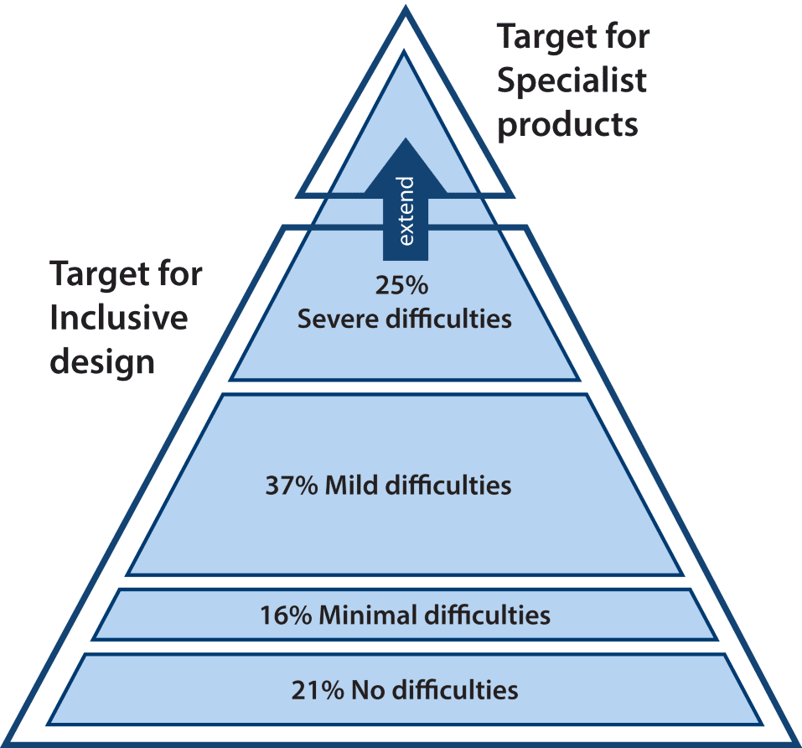
It’s important to note that it is not always possible to design a product in a way that can address the needs of the entire population. If we look at the pyramid model of diversity, there will always be a need for specialist products to assist those at the top. We do, however, need to consider more. In a society where website personalization is at the forefront of digital strategy, it’s important to think of those users often overlooked in design.

Image source: Inclusive Design Toolkit.
Inclusive design aims to extend a target market to include those who have limitations. Accessibility exists on a spectrum, and it’s not always applicable (or appropriate) to design in a way that can accommodate everyone. Inclusive design instead guides an appropriate response to diversity by:
- Developing products to provide largest possible coverage of the population
- Ensuring each product has clear and distinct target users
- Reducing the level of ability required to use a product, to improve the user experience for more customers
Why is inclusive design important?
There are no two ways about it, inclusive design is no longer a nice-to-have, it should be a consideration throughout the entire design process.
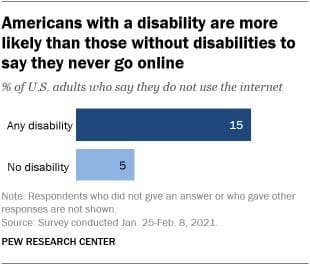
Around 15% of the world’s population experience some form of disability. Research has shown that those with a disability are significantly more likely not to use the internet than those without. Businesses have a responsibility to ensure digital transformation doesn’t leave population segments behind. Enter, inclusive design.

Source: Pew Research
Inclusive design expands the audience for any digital product, simply by making it not only accessible but optimized for them. It helps create an experience where users can feel like they can seamlessly use a product, rather than settling for a lesser version.
Altruism and morals aside, inclusive website design can also improve conversion rates. Simply by making a user experience accessible to a larger consumer base, there is more opportunity to turn them into customers.
Inclusive design can also help position brands at the forefront of the market. While inclusive design should be practised by all brands, it is not, and this leaves the door wide open. Providing equal access and a consistent experience will not go unnoticed by consumers. 63% prefer to support companies that stand for a purpose while avoiding those who don’t.
Inclusive digital design can also boost your organic traffic. Search engines place value on user experience, and we’re not talking about customer service techniques. Search engine optimization and inclusive design go hand in hand. By including alt text for images, closed captions in videos or descriptive link text, your page may rank higher than one without. It’s a win-win for everyone.
Principles of inclusive design
We know what inclusive design is, and we know why we should be utilizing it, but where do we begin? The overarching aim for a UX designer is to make every action useful, usable, and enjoyable for the user.
There is no template for inclusive design that will work across the board. The needs for a virtual law firm will be different to that of a price comparison tool for domestic flights. But regardless, both should be inclusive and easy to use. The user is more important than ever, and it’s key when utilizing an inclusive design approach that the user is considered at every touchpoint. This is easily done using the seven principles of inclusive design:
- Provide a comparable experience
Adding different ways to experience your product can increase the chances of meeting the needs and abilities of each of your users. However, it’s vital they do so without compromising the quality of the content. Ensure that all methods are equal in the value they provide.
This can be as simple as adding basic content alternatives. From alt-text descriptions for images, video captions, or audio descriptions. Let’s consider notifications as an example. Interactive web design dictates that these are often visually obvious. Unfortunately, though, they often require active discovery when someone’s using tools such as screen readers.
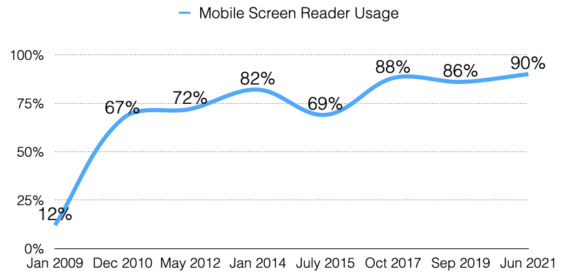
With 90% of visually impaired internet users using a mobile screen reader, this is important. For those using a screen reader, there is no notification and therefore a lesser experience. This can be avoided by utilizing audio or live regions, but requires empathetic consideration of all end users.

Source: Web Aim
- Design with various situations in mind
Just as users don’t experience products in the same way, they don’t access them in the same way. Users may be browsing in a number of different contexts—at home, in the garden, on the bus. For those who already find interaction challenging, environmental impact can make usage particularly difficult. It’s vital design is approached to accommodate the range of circumstances.
Consider the use of contrasting colors to lessen the impact of outdoor lighting, or a dark mode feature to accommodate different situations. It’s also important to consider whether or not users will be first-time or returning users. For those confronted with forms or processes for the first time, could they benefit from a virtual agent or chatbot support to assist? Thereafter, this may not be needed and this can be factored into the design process.
- Maintain consistency
Users need to know what to expect from a business. At the heart of any design should be a coherent interface that utilizes well-established design conventions. Implement consistent web and platform design patterns to assist with understanding.
If you think of how you would optimize UX design for eCommerce, this would involve a predictable hierarchy that is simple to understand. Users expect navigation to be found at the top of a page. If navigation is too complicated or difficult to find, users may become discouraged.
- Create an intuitive design
While we can all appreciate creative user experiences, this can make the interaction more difficult for certain users. Designing for aesthetics rather than function is one of the most common usability mistakes in web design. An intuitive design is a good design.The design of any interface should guide users to perform the task at hand. It’s important to consider that minimalist web design can improve customer experience.
In practice, this can include simple navigation or visual or other indicators to signal that an element is clickable.
- Collaborate to overcome personal biases
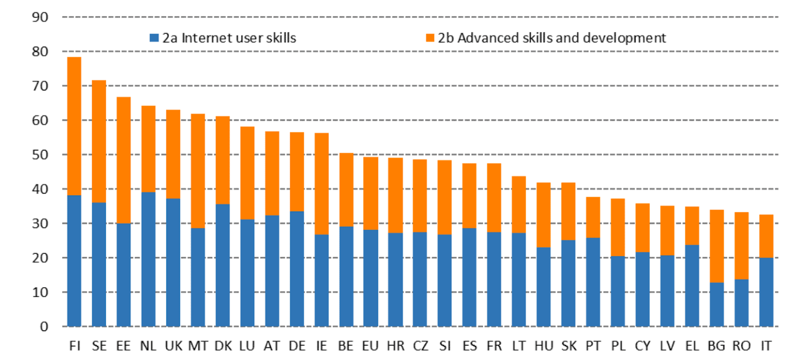
We all have subconscious biases that lead us to design for users who are similar to us. It’s natural. But it’s wrong. Unfortunately, when we design for ourselves, we often miss the mark on creating products that are inclusive. If we consider the distribution of computer skills amongst adults, designers will most likely possess advanced skills and development. Those they are designing for, may not.

Source: DESI 20 European Commission
To overcome this bias, work collaboratively with a wide range of individuals. From background, to demographic, to experience, as well as in physical, cognitive, and learning abilities. By increasing the diversity of a team, you also increase the unique insight about the product and its pain points.
- Consider user error
At all points of the design process, consider that any user can make mistakes. Allowing room for user error means offering the chance for users to correct their mistakes. For example, include options to undo and provide success or error messages that indicate status. By doing so, users can enjoy the benefit of knowing that their actions are reversible.
Similarly, make any 404 pages friendly and accessible—this can ease the tension in that inevitable uh-oh moment and keep your users on site (and on side).
- Test and measure
Like any other part of the design process, inclusivity of your products should also be checked and tested. Check your interface for accessibility compliance, ensuring it meets all of the required criteria.
More importantly, test the product with the help of people whose needs and abilities are different from your own, and then test again with others. Feedback is key and will be vital to ensure those who may struggle the most are considered.
Should we adopt an inclusive design method?
Adopting an inclusive design method is a great way to ensure your product considers a diverse group of users in different environments. By doing so, you work from a place of empathy for all users, regardless of ability. This removes barriers that create separation and enables more people to participate.
Bio:
Jenna Bunnell – Senior Manager, Content Marketing, Dialpad
Jenna Bunnell is the Senior Manager for Content Marketing at Dialpad, an AI-incorporated cloud-hosted unified communications system that provides valuable call details for business owners and sales representatives. She is driven and passionate about communicating a brand’s design sensibility and visualizing how content can be presented in creative and comprehensive ways. She has written for websites such as Smile.io and Crocoblock. Check out her LinkedIn profile.

Leave a Reply