
A product page that is both high-converting and aesthetically pleasing is the ultimate goal for any retailer.
Strategic eCommerce web design is the key – any single element can, and will, impact conversions if not executed correctly.
Hundreds of product pages on the Internet put off potential customers every day because they don’t meet certain criteria. We all worry about the effects of shopping cart abandonment, and the effort to reduce them begins with improving your product pages.
So, how can you avoid the same pitfalls as these unsuccessful product pages?
7 Strategies for High-Converting Product Pages
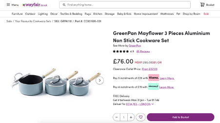
- Your product pages should make sense with the rest of the website
This might seem simple, but it’s often ignored – your product page needs to fit with the rest of your website. Whether you’re undertaking web design for startups or enterprises, this aspect remains unchanged: product pages must match your brand’s aesthetic.
If your website theme is green, your product page should have (the same!) elements of green. If you use a particular font in your blogs, use the same font on your product pages. If your logo or brand name isn’t included somewhere in your product pages? Well, you might need to rethink your overall website design.
Your product page should be a seamless part of the greater whole. Ultimately, branding is how your customer knows they are in the right place and something as minor as a color mismatch could deter the customer from buying from that page.
- Use a template-based layout approach
Although we are in the era of uber personalized shopping experiences, there are some online aspects that still benefit from a template-based approach, and your product page is one of them.
Firstly, a template can be copied between product pages. Adding new product pages becomes a lot easier for you, saving your staff a substantial amount of time.
The main reason to use a template is for ease of navigation for your customer. If they are browsing products and each product page has a different structure, then they’re not going to be able to find things easily. It goes without saying you should not be hiding important buttons from your customer, particularly the ‘Add to Cart’ button.
Imagine a customer is browsing through deskphones, and they find one that’s VoIP enabled. With a clear template, they’ll be able to spot the FAQs at the bottom and easily find answers to questions like ‘what is cloud communication?’ or ‘does this need an internet connection’. That means they’ll stay on the page while they read, instead of clicking away to try and find answers.

- Mobile optimization
Today’s shoppers utilize phones, computers, tablets, and maybe even smartwatches to shop on the web. Does your product page still look good on all of these devices? If you are not sure of the answer, it’s time to find out.
The biggest difference between these devices is the layout of the screen. A computer screen or tablet is usually a rectangle sitting on its widest side, whereas the mobile is on its shortest. A mistake retailers often make is only catering for a computer screen and forgetting a mobile-friendly layout, so having interactive web design is key.
Mobile optimization isn’t just shrinking a page down – you’ll need to ensure buttons are easily clickable, the font is readable, and your images aren’t ridiculously large. With over half of all web traffic coming through mobile, it’s a market you can’t afford to alienate.
- Excellent product photos and videos
It’s the first thing that will catch your customer’s eye and it should say it all – your product photo.
The best product photos will be high quality; they should show your product in its natural setting and capture all potential angles of your product. Since the photos will not only go on your product page but may be included in your newsletter or social media presence, it’s worth learning some basic Instagram photography tips, like planning shoots in advance and taking a large variety of photos.
As well as showing off your product, you need to show off how it will make your customer feel – and why they want it. If your product is a lawn chair, show someone lounging on it on a sunny day. If your product is a killer pair of heels, show someone strutting along the street.
While these tips are great for physical products, you might be wondering how they apply to software. Luckily, it’s surprisingly similar. Dialpad has a good example of how they work around this issue, by taking screen-captures of their product in action.
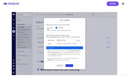
In this example, Dialpad demonstrates how easy and simple it is to add toll free telephone numbers to a website. By showing how to use their product, they can persuade the customer to give it a go.
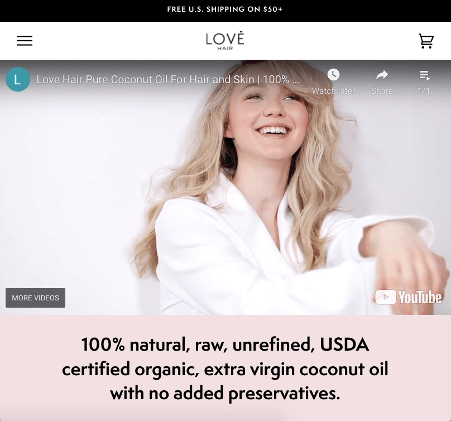
You can even go a step further and make a video walking through your software – what it is, how to use it and why your customer would benefit from it. Love Hair has a great example of this for their Pure Coconut Oil. They show their product in action and someone, who is theoretically their target customer, loving it.
- The perfect product description
Who even reads the product description anyway? Well, according to an eCommerce study conducted by NNgroup, a lot of people! Poor or unclear product descriptions could be hurting your conversions by around 20%, so it’s time to step-up your product description game.
There is no right answer to what makes the perfect product description – it all comes down to knowing your audience and what compels them to buy your product. So if you’re a furniture brand, you really need to include all those detailed measurements – customers will want to know if it fits in their room! Make sure these are front and center.
In contrast, a skincare brand will find that a little less relevant. You’ll want to include it (product size will affect customer choices) but it’s not necessarily the core information your audience are seeking out. Instead, highlight the active ingredients and explain what they do.
You should also use the product description to inform the customer of why your product is the best on the market, demonstrating your industry expertise. For example, if you are offering a Zoom alternative, you can use the product description to briefly compare the two and explain why yours is better.
- Don’t shy away from customer photos and reviews
It may seem contradictory after insisting you use only the highest-quality images to suggest you display a customer’s phone image on your product page. However, including customer reviews on your product page is the single biggest change you can integrate in order to increase conversions.
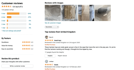
This Amazon page, for example, highlights reviews with images by placing them near the top. These images are not by any means perfect, quite far from it, but other customers see them and can trust that your product photo and these unfiltered images match. It adds another dimension of trust, and increases the chance of converting your audience into customers.
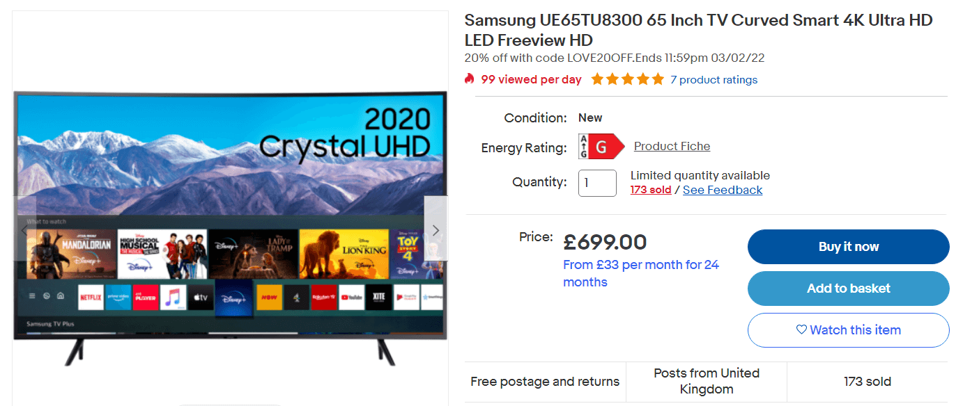
- Clear calls to action
Whatever steps you want your customer to take need to be clearly marked. In particular, the ‘Add to Cart’ button should be large and unmissable. Make sure it’s easy to add a product multiple times, rather than having to go back and forth, and avoid immediately taking the customer to checkout – they might still be browsing.
Some sites have started including ‘Add to Cart’ and ‘Buy Now’ as separate options. This is a great way to speed up the journey for those looking for a single item, without inconveniencing customers who want to continue browsing.
Other calls to action you could consider are ‘Contact Us’ or ‘Save for Later’. Your ‘Contact Us’ button should lead directly to a web chat or a custom domain email specifically for your website.
Build those pages!
A compelling product page tells a story that entices the customer. Big, bold photos show the customer what your brand is all about and customer reviews demonstrate your trustworthiness. Combine these elements with intuitive navigation and clear product descriptions and you’re on to a winner.
Your product pages should also be updated over the years. Search engines visit websites that update their pages and add new content more frequently. So in order to improve website SEO, you should continue to add new products and update product descriptions.
A successful product page can make or break your online presence. With the above tools, you should be equipped to perfect your product page into one that is both high-converting and aesthetically pleasing.
Bio:
Grace Lau – Director of Growth Content, Dialpad
Grace Lau is the Director of Growth Content at Dialpad, an AI-powered cloud communication platform with PBX phone system for better and easier team collaboration. She has over 10 years of experience in content writing and strategy. Currently, she is responsible for leading branded and editorial content strategies, partnering with SEO and Ops teams to build and nurture content. Here is her LinkedIn. She has also written for Small Business Sense and Updraftplus.
Headshot: Image