
Bar graphs and histograms are two different types of graphs used in business to display data.
Photo by Lukas Blazek on Unsplash
Both graphs show comparisons between data sets, but they are used for different purposes. These charts can help businesses analyze data and much more. Today, we’ll explore what each of these graphs are, when to use them, and how bar charts and histograms differ.
What is a histogram?
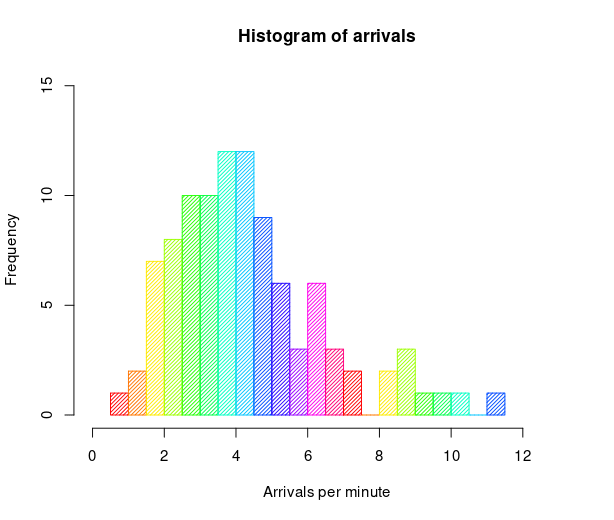
A histogram is a graphical representation of the distribution of data. It is an estimate of the probability distribution of a continuous variable. This graph usually consists of a series of rectangles, one for each data class. The width of the rectangle is proportional to the frequency of data in that class. The height of the rectangle is proportional to the relative frequency of data in that class. The area of the rectangle is proportional to the frequency of data in that class.
When would you use a histogram?
Histograms are used in business to measure the distribution of data. This can help you identify any patterns in the data and see where there may be opportunities for improvement.
Patterns in data can help identify areas for improvement. Looking at data over time can help you see if there are any trends and whether or not they are favorable. Additionally, you can compare your data to that of your competitors to see where you may have opportunities to excel.
What is a bar chart?
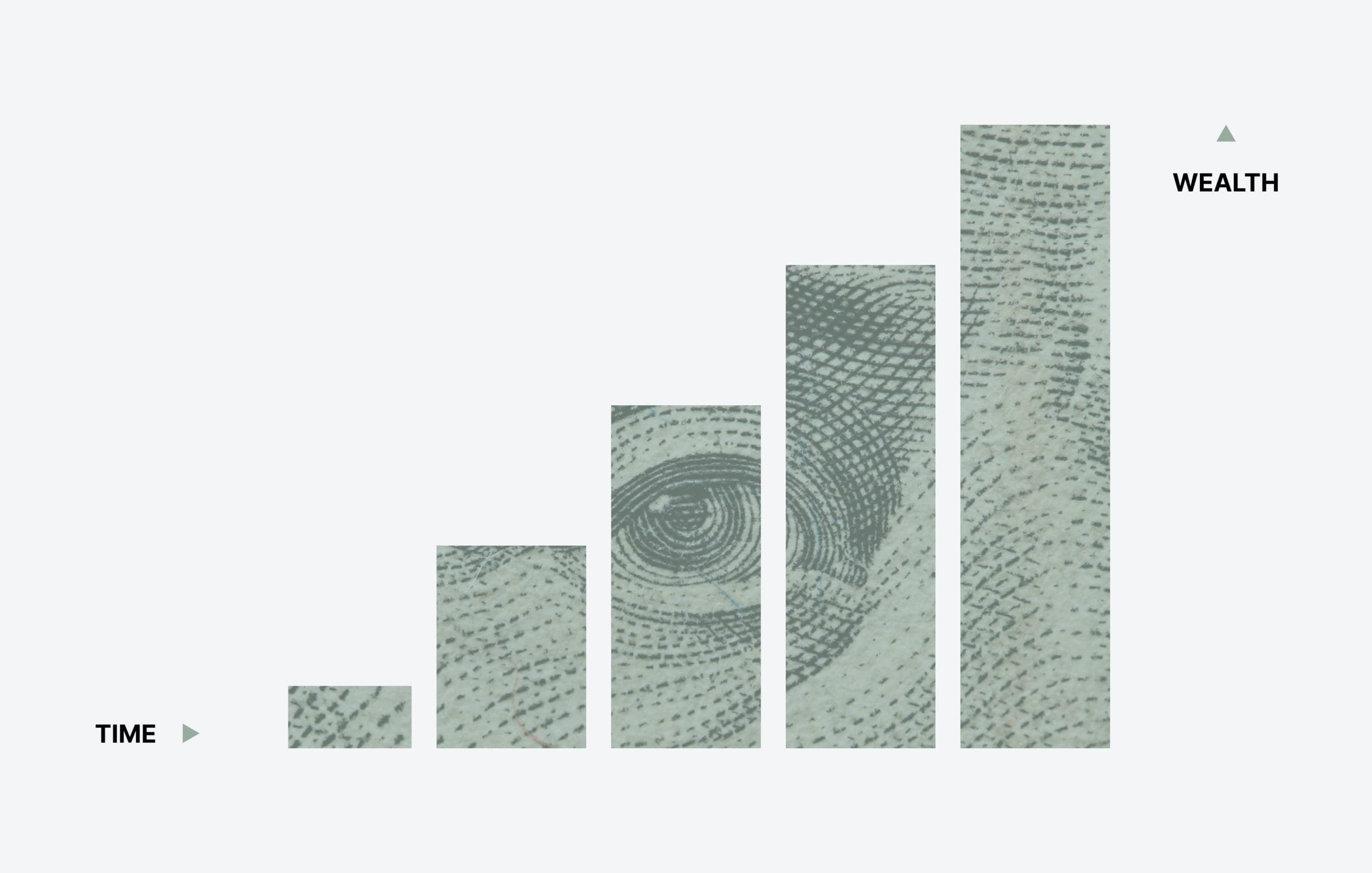
A bar chart, also known as a bar graph or column chart, is a graphical representation of data. The data is displayed as a series of bars, with each bar representing a different value. The length of the bar corresponds to the value of the data.
There are a few different types of column charts. The most common type is the vertical bar chart. The bars are displayed vertically in a vertical bar chart, with the tallest bar at the top. Another type of bar chart is the horizontal bar chart. In a horizontal bar chart, the bars are displayed horizontally, with the longest bar on the left.
Column charts can also be used to display data in three dimensions. In a three-dimensional bar chart, the bars are displayed as a series of cubes, with each cube representing a different value.
When would you use a bar chart?
A bar chart is a great way to display comparisons between sets of data. For example, you can use a bar chart to compare the sales of different products over time. You can also use a bar chart to compare the sales of the same product in different geographical regions.
Bar graphs are not just for displaying financial data. They can be used for a variety of business purposes. One common business use for bar graphs is to display data on customer demographics. For example, you might use a bar graph to show your customers’ age, sex, and location. Another common use for bar graphs is to display data on product popularity. For this scenario, you might use a bar graph to show which products are most popular among your customers.
What’s the difference between these types of charts?
Both types of these graphs are used to display data. They are both used to show the distribution of data. However, there are some key differences between these graphs.
The most obvious difference between these two graphs is that histograms display frequency data and show data distribution, while a bar chart is used to display numerical data and compare data sets.
Another difference between these graphs is that histograms are always vertical and display data in groups, while a bar chart can be vertical or horizontal and display data in individual bars. This difference is due to the way that the data is displayed.
Finally, histograms always have a horizontal axis representing the class intervals, while bar graphs may or may not have a horizontal axis. The horizontal axis on a bar chart is used to compare data sets.
Start charting your business data.
Now that you know what these graphs are and how they differ, you can begin using them to compare your business data and make more informed decisions.