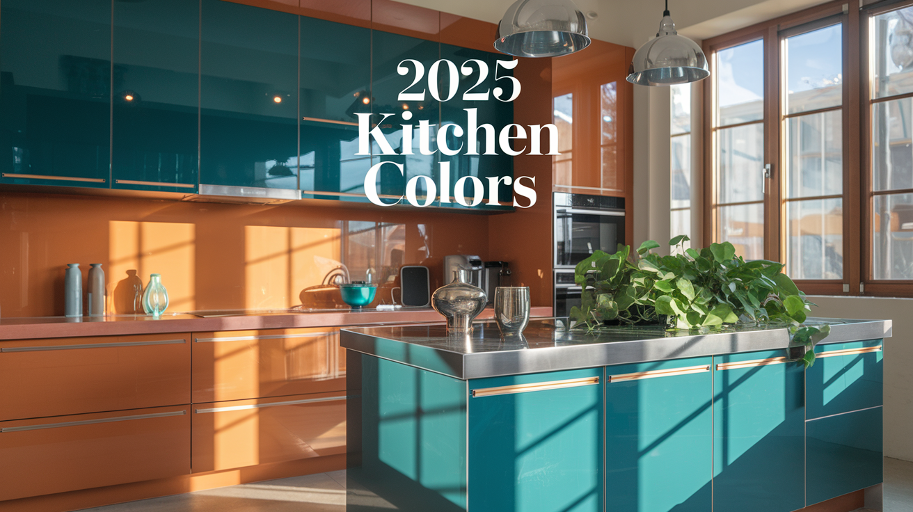
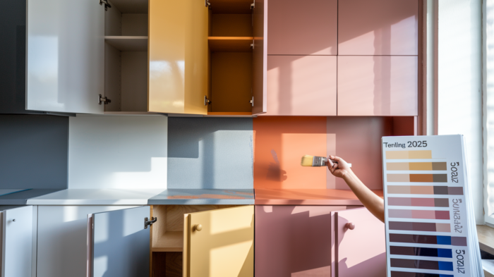
🎨 Are you ready to transform your kitchen into a stunning masterpiece? As we approach 2025, a wave of exciting new cabinet color trends is about to hit, and you won’t want to miss out! Gone are the days of playing it safe with neutral tones – it’s time to embrace bold, inspiring hues that will breathe new life into your culinary space.
Imagine walking into a kitchen that not only functions perfectly but also ignites your passion for cooking and entertains your guests with its visual appeal. Whether you’re a seasoned home chef or a casual cook, the right cabinet colors can elevate your kitchen from ordinary to extraordinary. But with so many options out there, how do you choose? Don’t worry – we’ve got you covered!
In this blog post, we’ll explore the trendiest cabinet colors for 2025, show you how to transform your kitchen with color, and reveal popular color combinations that will make your space pop. We’ll also dive into sustainable style options, finish choices, color psychology, and how to adapt these trends to your unique kitchen style. Get ready to be inspired and obsessed with the kitchen of your dreams! 🏠✨
Trendsetting Colors for 2025
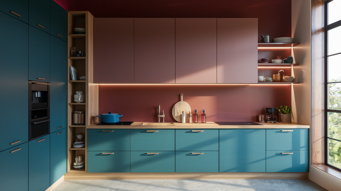
Bold and Vibrant Hues
As we step into 2025, kitchen design is taking a daring turn with bold and vibrant hues leading the charge. Gone are the days of playing it safe with muted tones; it’s time to make a statement with your kitchen cabinets. These eye-catching colors are not just about aesthetics; they’re about infusing personality and energy into the heart of your home.
Some of the most exciting bold colors for kitchen cabinets in 2025 include:
- Electric Blue: A vibrant, attention-grabbing shade that adds depth and intrigue
- Emerald Green: A rich, luxurious color that brings the outdoors in
- Sunshine Yellow: A cheerful, energizing hue that brightens up any space
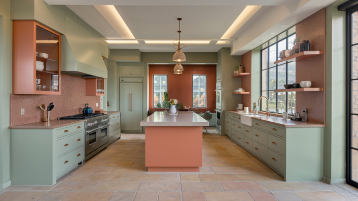
- Coral: A warm, inviting color that creates a welcoming atmosphere
- Deep Purple: A regal, sophisticated shade that adds drama and elegance
These bold colors are perfect for homeowners who want to make a strong visual impact and aren’t afraid to push design boundaries. They work particularly well in modern and contemporary kitchen styles, but can also add a surprising twist to traditional designs.
When incorporating bold colors into your kitchen, consider the following tips:
- Use them as accent pieces for a pop of color
- Pair with neutral countertops and backsplashes for balance
- Ensure proper lighting to showcase the vibrant hues
- Complement with metallic hardware for added sophistication
Remember, while these colors are trendy, they should also resonate with your personal style and the overall aesthetic of your home.
Sophisticated Neutrals
While bold colors are making waves, sophisticated neutrals are holding their ground in 2025 kitchen design trends. These refined hues offer a timeless appeal and versatility that many homeowners find irresistible. The key to 2025’s neutral palette is depth and complexity, moving beyond basic beige and gray to more nuanced shades.
Here’s a comparison of traditional neutrals versus 2025’s sophisticated neutrals:
| Traditional Neutrals | 2025’s Sophisticated Neutrals |
|---|---|
| Beige | Greige (Gray-Beige) |
| White | Warm Ivory |
| Gray | Taupe |
| Brown | Mushroom |
| Black | Charcoal |
These sophisticated neutrals offer several advantages:
- Timeless appeal that won’t quickly go out of style
- Versatility in pairing with various design elements
- Ability to create a calm, serene atmosphere
- Potential to make small kitchens appear larger
- Easy coordination with changing decor over time
When working with sophisticated neutrals, consider layering different shades to add depth and interest to your kitchen. For example, pair lighter upper cabinets with darker lower cabinets, or use contrasting neutral tones for your island and perimeter cabinets.
Nature-Inspired Palettes
As we continue to seek connections with the natural world, nature-inspired palettes are emerging as a significant trend for 2025 kitchen cabinet colors. These colors draw inspiration from the earth, sea, and sky, bringing a sense of calm and harmony to your kitchen space.
Some popular nature-inspired colors for 2025 include:
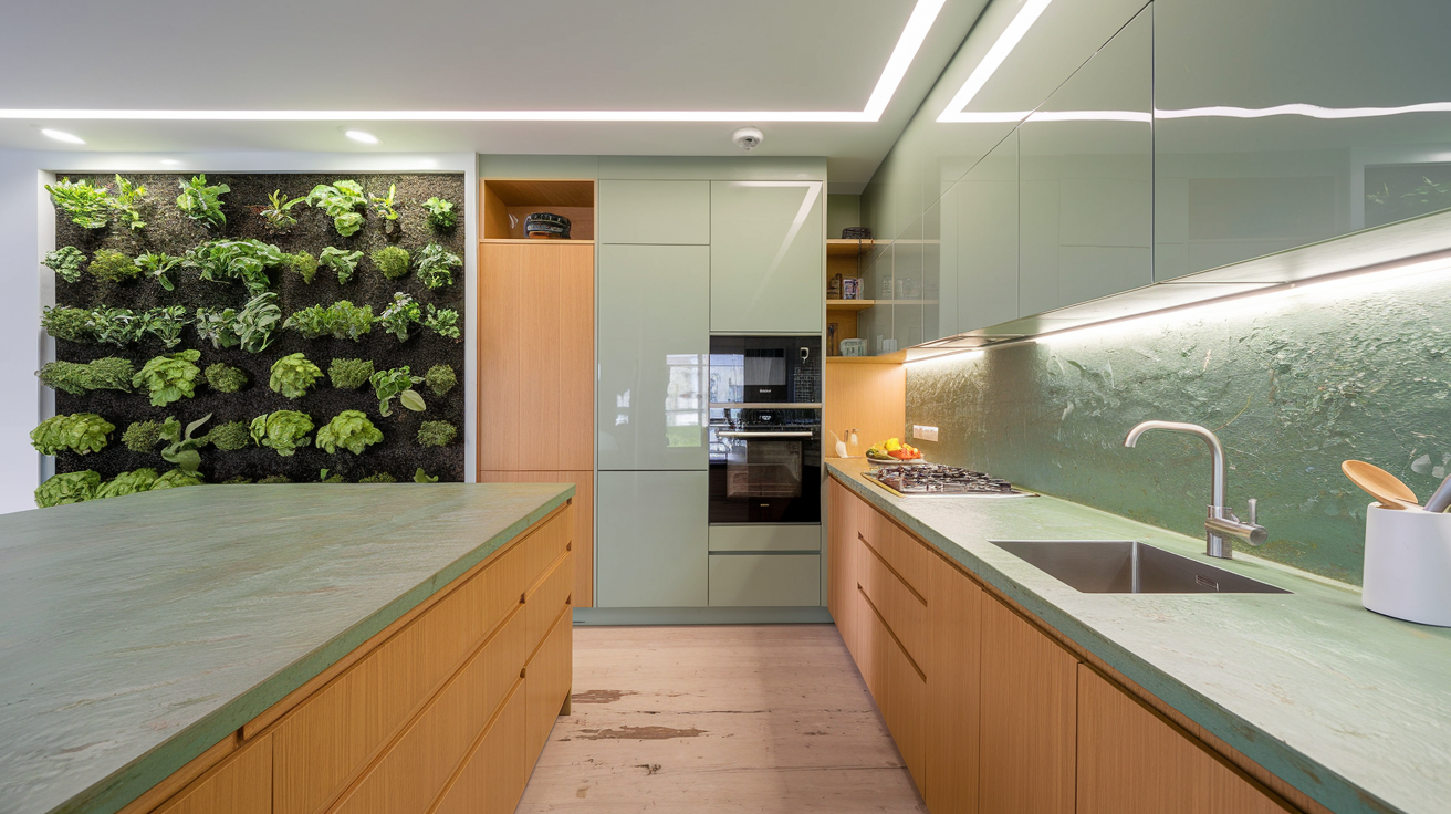
- Sage Green: A soft, muted green reminiscent of herbs and foliage
- Ocean Blue: A serene blue that evokes the tranquility of the sea
- Terracotta: A warm, earthy tone that adds a rustic touch
- Moss Gray: A subtle gray with green undertones, inspired by forest floors
- Sand Beige: A light, warm neutral reminiscent of sandy beaches
These nature-inspired colors offer several benefits:
- Create a soothing, relaxing atmosphere in the kitchen
- Easily pair with natural materials like wood and stone
- Promote a sense of well-being and connection to nature
- Offer versatility in design, working well with various styles from rustic to modern
When incorporating nature-inspired colors into your kitchen, consider using them in combination with natural textures and materials. For example, pair sage green cabinets with wooden countertops or ocean blue cabinets with a pebble-textured backsplash.
Metallic Accents
While not typically used as the main color for kitchen cabinets, metallic accents are set to play a significant role in 2025 kitchen design trends. These shimmering hues can add depth, sophistication, and a touch of glamour to your kitchen space.
Popular metallic accents for 2025 include:
- Brushed Gold: A warm, luxurious finish that adds elegance
- Copper: A rich, earthy tone that brings warmth and character
- Pewter: A soft, muted metallic that offers a subtle sheen
- Rose Gold: A trendy, feminine hue that adds a touch of romance
- Gunmetal: A dark, dramatic finish for a bold, modern look
Here are some ways to incorporate metallic accents into your kitchen cabinet design:
- Use metallic finishes for cabinet hardware (handles, knobs)
- Apply metallic paint to select cabinet doors or drawer fronts
- Install metallic kickplates or toe kicks beneath cabinets
- Choose metallic-finish appliances to complement cabinet colors
- Use metallic backsplash tiles to tie in with cabinet accents
When working with metallic accents, it’s important to strike a balance. Too much can overwhelm the space, while too little might not achieve the desired effect. Consider using metallic elements strategically to highlight certain areas or features of your kitchen.
As we look ahead to 2025, these trendsetting colors – bold and vibrant hues, sophisticated neutrals, nature-inspired palettes, and metallic accents – offer exciting possibilities for kitchen cabinet design. Whether you prefer a dramatic statement or a subtle, refined look, there’s a color trend that can transform your kitchen into a stylish and inviting space. Remember, while trends can guide your choices, the most important factor is selecting colors that resonate with your personal style and create a kitchen environment you’ll love for years to come. With these color trends in mind, let’s explore how to effectively transform your kitchen using these exciting new hues.
Transforming Your Kitchen with Color
Maximizing Space Perception
When it comes to transforming your kitchen with color, one of the most powerful techniques is using hues to maximize space perception. The right color choices can make a small kitchen feel more spacious or a large kitchen feel cozier. Here’s how you can use 2025’s trendy kitchen colors to create an illusion of space:
Light and Bright:
- Opt for light, airy colors like soft whites, pale greys, or gentle pastels
- These shades reflect light, making the room feel more open and expansive
- Consider popular cabinet color combinations like cream and light blue
Monochromatic Scheme:
- Use varying shades of the same color for a cohesive look
- This creates a seamless flow, reducing visual clutter and enhancing spaciousness
Vertical Stripes:
- Incorporate vertical striped patterns or textures in cabinet designs
- This draws the eye upward, creating an illusion of height
Glass and Mirrors:
- Use glass-front cabinets or mirrored backsplashes
- These elements reflect light and create depth, making the space feel larger
Here’s a comparison of color choices and their effects on space perception:
| Color Choice | Effect on Space Perception |
|---|---|
| Light Colors | Expands space, brightens room |
| Dark Colors | Adds depth, can make space feel smaller |
| Cool Tones | Recedes, creates a sense of openness |
| Warm Tones | Advances, can make space feel cozier |
By strategically applying these color principles, you can transform your kitchen’s perceived size and create a more inviting atmosphere.
Creating Focal Points
Focal points are essential in kitchen design as they draw the eye and create visual interest. In 2025, trendy kitchen cabinet colors will play a crucial role in establishing these attention-grabbing areas. Here are some ways to use color for creating stunning focal points:
Accent Cabinets:
- Choose a bold, contrasting color for a specific set of cabinets
- This could be an island, a pantry door, or a section of upper cabinets
- Popular choices might include deep blues, rich greens, or vibrant yellows
Colorful Backsplashes:
- Use a bold backsplash color to complement neutral cabinet colors
- This creates a striking visual element without overwhelming the space
Statement Hoods:
- Paint the range hood in a standout color
- This draws attention to the cooking area and adds personality
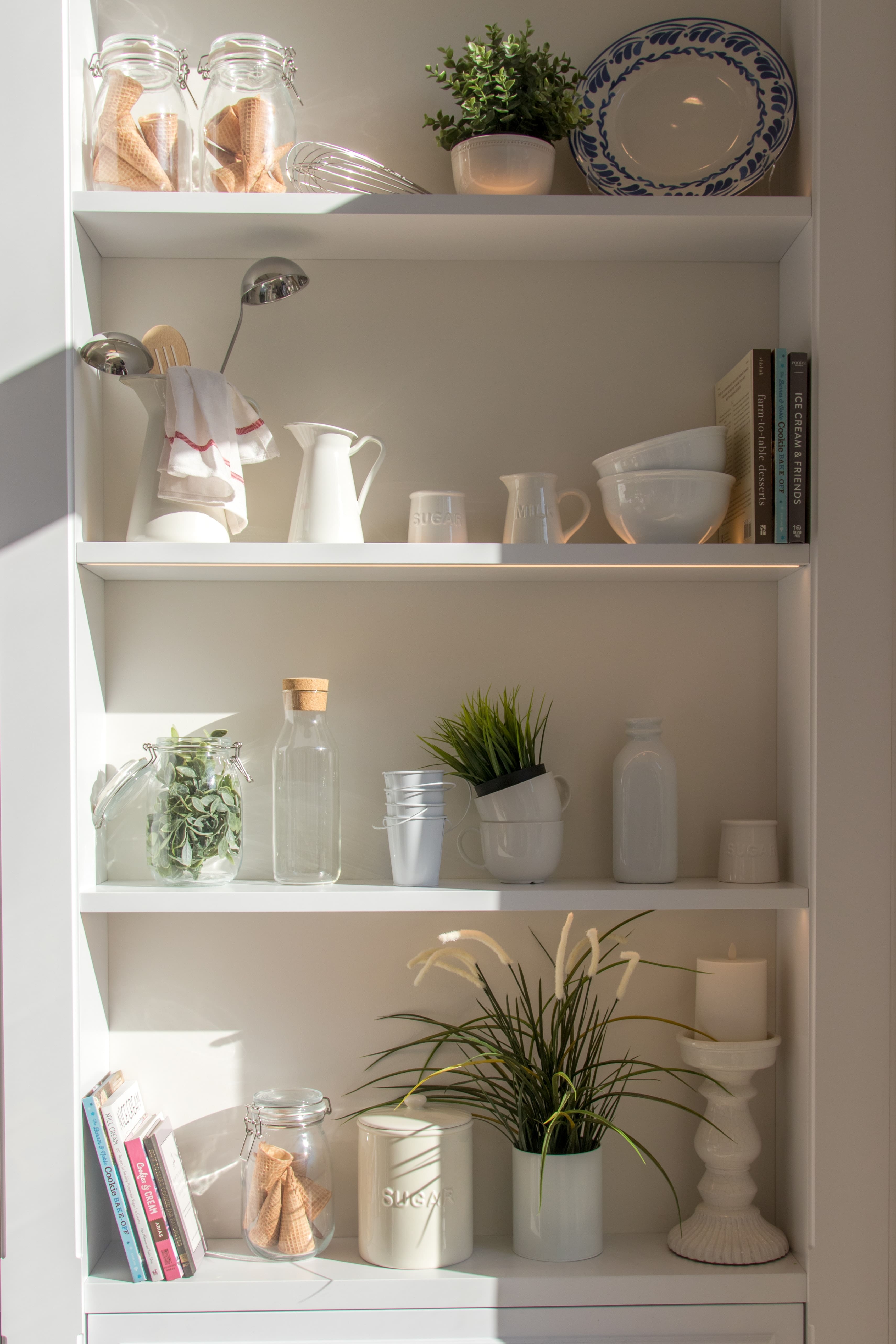
Open Shelving:
- Use color on the back wall of open shelves
- This highlights displayed items and adds depth to the design
Contrasting Upper and Lower Cabinets:
- Apply different colors to upper and lower cabinets
- This creates visual interest and can help define zones in the kitchen
When creating focal points, it’s essential to consider the overall balance of the space. Here’s a list of tips to keep in mind:
- Limit bold colors to one or two areas to avoid visual chaos
- Ensure the focal point color complements the overall color scheme
- Use lighting to enhance the focal point and draw attention
- Consider the size of the focal point in relation to the room’s dimensions
- Balance bold colors with neutral tones for a harmonious look
By thoughtfully incorporating these color strategies, you can create captivating focal points that elevate your kitchen’s design and reflect the latest trends in kitchen cabinet colors for 2025.
Balancing Light and Dark Shades
Achieving the perfect balance between light and dark shades is crucial for creating a harmonious and visually appealing kitchen. As we look towards 2025 kitchen cabinet colors, the interplay between light and dark will continue to be a key aspect of modern kitchen design trends. Here’s how you can strike the right balance:
The 60-30-10 Rule:
- Use 60% of a dominant color (usually lighter)
- 30% of a secondary color (can be darker)
- 10% of an accent color for pops of interest
Contrast for Drama:
- Pair light upper cabinets with dark lower cabinets
- This creates visual interest and can make ceilings appear higher
Gradual Transitions:
- Use a color gradient from light to dark
- This creates a smooth, cohesive look throughout the space
Light Countertops with Dark Cabinets:
- Balance dark cabinet colors with light-colored countertops
- This prevents the space from feeling too heavy or closed-in
Dark Accents in Light Kitchens:
- Add dark hardware or appliances to a light-colored kitchen
- This creates depth and prevents the space from feeling too sterile
When balancing light and dark shades, it’s important to consider the natural light in your kitchen. Here’s a table showing how different lighting conditions can affect your color choices:
| Lighting Condition | Light Cabinet Recommendation | Dark Cabinet Recommendation |
|---|---|---|
| Abundant Natural Light | Cool whites, light greys | Deep blues, forest greens |
| Limited Natural Light | Warm whites, soft creams | Rich browns, charcoal greys |
| Artificial Lighting | Neutral whites, pale yellows | Navy blues, burgundy reds |
By carefully considering the balance of light and dark shades, you can create a kitchen that feels both dynamic and harmonious. This approach allows you to incorporate trendy kitchen colors while ensuring a timeless appeal.
As we move towards choosing the right finish for your cabinets, it’s important to keep in mind how the sheen of the finish can affect the perception of color and space. A high-gloss finish can make dark colors appear even deeper, while a matte finish can soften the impact of bold hues. The interplay between color and finish will be crucial in achieving the perfect look for your 2025 kitchen design.
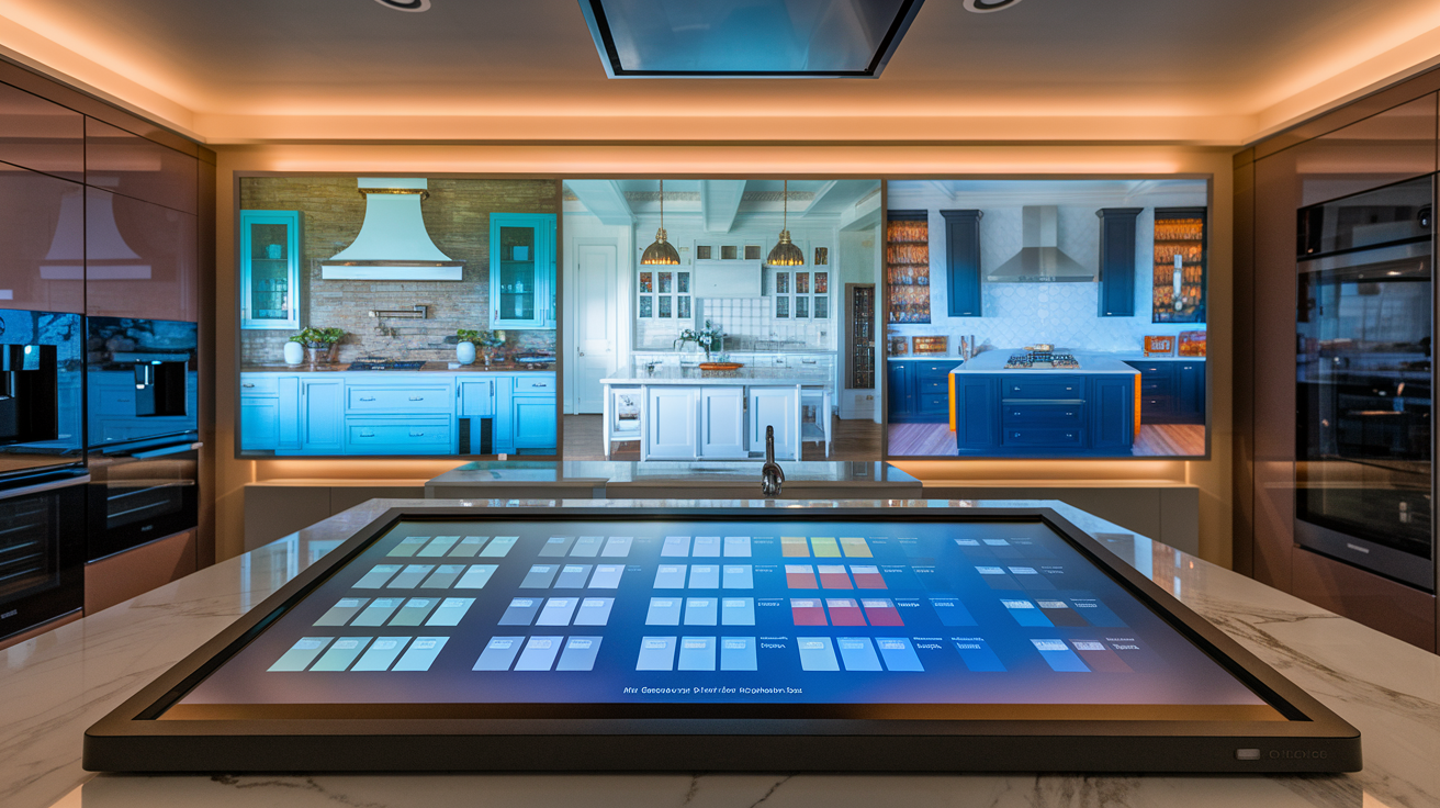
Popular Cabinet Color Combinations
Two-Tone Cabinet Designs
Two-tone cabinet designs are set to be a major trend in 2025, offering a perfect balance between sophistication and visual interest. This approach allows homeowners to experiment with color while maintaining a cohesive look in their kitchens. Here are some popular two-tone combinations that are expected to dominate in 2025:
- Navy Blue and Soft Gray
- Forest Green and Warm Wood Tones
- Matte Black and Crisp White
- Sage Green and Cream
- Charcoal Gray and Light Oak
To help you visualize these combinations, here’s a table showcasing how these colors can be paired:
| Primary Color | Secondary Color | Effect |
|---|---|---|
| Navy Blue | Soft Gray | Sophisticated and calming |
| Forest Green | Warm Wood Tones | Natural and inviting |
| Matte Black | Crisp White | Modern and dramatic |
| Sage Green | Cream | Serene and organic |
| Charcoal Gray | Light Oak | Contemporary and warm |
When implementing a two-tone design, consider using the darker or bolder color for lower cabinets and the lighter shade for upper cabinets. This creates a grounded look while keeping the space feeling open and airy.
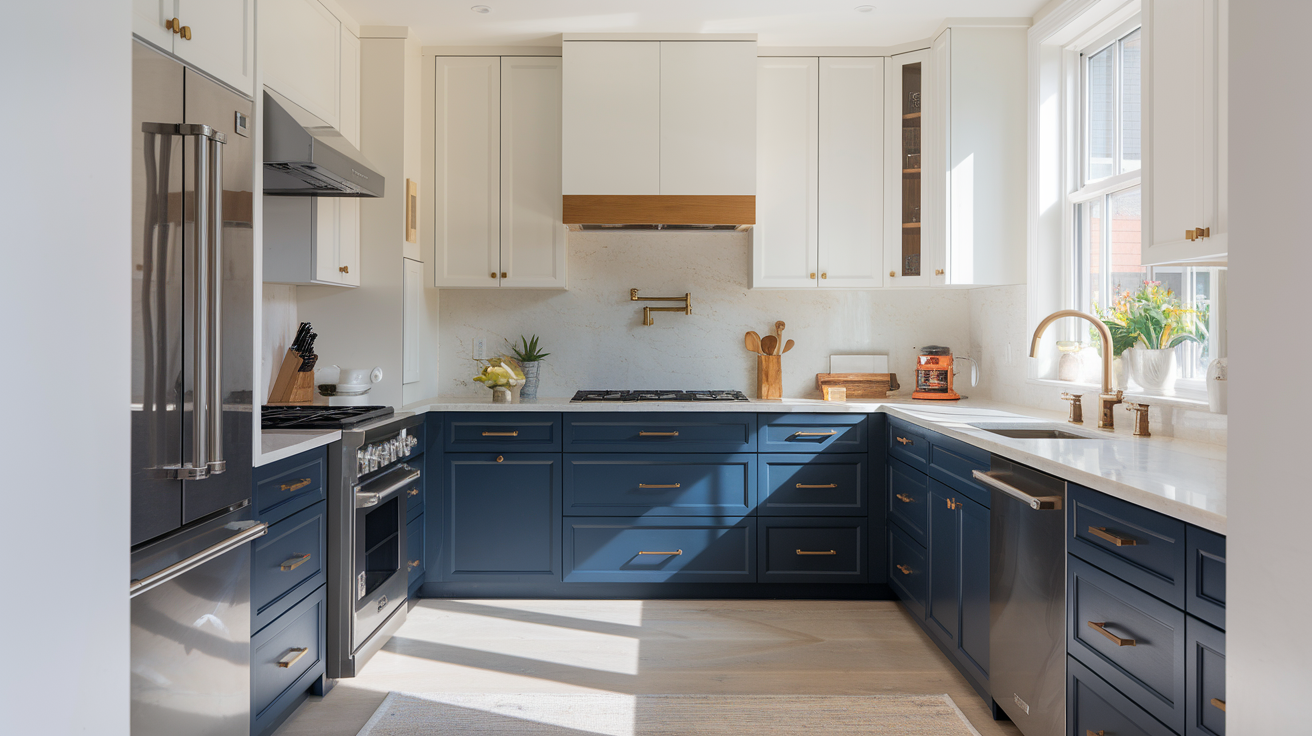
Contrasting Upper and Lower Cabinets
Contrasting upper and lower cabinets is a design technique that can dramatically transform your kitchen’s appearance. This approach involves using different colors or finishes for the upper and lower cabinets, creating a visually striking effect. In 2025, we expect to see bold contrasts that make a statement while maintaining harmony in the overall design.
Some popular contrasting combinations for 2025 include:
- Dark lower cabinets with light upper cabinets
- Colored lower cabinets with white or neutral upper cabinets
- Textured lower cabinets with smooth upper cabinets
To achieve a successful contrasting look, consider the following tips:
- Maintain balance: Ensure that one color doesn’t overpower the other.
- Use complementary colors: Choose colors that work well together to create a cohesive look.
- Consider lighting: Take into account how natural and artificial light will affect the chosen colors.
- Incorporate unifying elements: Use hardware or countertops to tie the contrasting cabinets together.
Complementary Island Colors
Kitchen islands are perfect opportunities to introduce a pop of color or a contrasting element to your cabinet design. In 2025, we’ll see more homeowners opting for islands that stand out while complementing the main cabinet colors. Here are some trendy island color ideas:
- Bold jewel tones (emerald green, sapphire blue, amethyst purple)
- Earthy neutrals (terracotta, sand, clay)
- Metallic finishes (brushed gold, copper, bronze)
- Pastel hues (soft pink, mint green, pale yellow)
When choosing a complementary island color, consider the following factors:
- The overall color scheme of your kitchen
- The size of your island (larger islands can handle bolder colors)
- The function of your island (prep area, dining space, or both)
- The style of your home (modern, traditional, farmhouse, etc.)
Here’s a table showcasing how different island colors can complement various cabinet combinations:
| Cabinet Colors | Complementary Island Color | Style Effect |
|---|---|---|
| White and Gray | Navy Blue | Classic and sophisticated |
| All-White | Emerald Green | Fresh and vibrant |
| Wood and White | Matte Black | Modern and sleek |
| Beige and Cream | Terracotta | Warm and inviting |
| Light Gray | Brushed Gold | Luxurious and elegant |
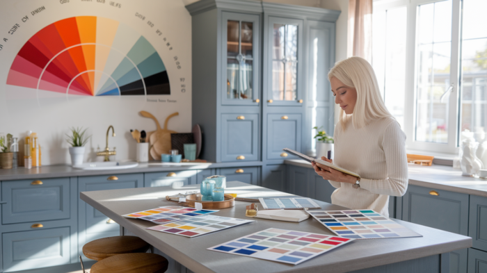
Harmonizing with Countertops and Backsplashes
To create a cohesive kitchen design, it’s crucial to harmonize your cabinet colors with your countertops and backsplashes. In 2025, we’ll see a focus on creating seamless transitions between these elements, resulting in kitchens that feel well-thought-out and professionally designed.
Here are some tips for harmonizing your cabinet colors with countertops and backsplashes:
- Use a color wheel: Choose colors that are adjacent or complementary on the color wheel for a harmonious look.
- Consider undertones: Ensure that the undertones of your cabinets, countertops, and backsplashes work well together.
- Create contrast: Use contrasting colors or textures to add visual interest while maintaining harmony.
- Opt for neutral countertops: If you have boldly colored cabinets, consider neutral countertops to balance the look.
- Use the backsplash as a bridge: Choose a backsplash that incorporates colors from both the cabinets and countertops to tie everything together.
Popular combinations for 2025 include:
- White cabinets with marble countertops and a subtle patterned backsplash
- Navy blue lower cabinets with white upper cabinets, paired with quartz countertops and a white subway tile backsplash
- Wood-toned cabinets with concrete countertops and a geometric patterned backsplash
When selecting materials for your countertops and backsplashes, consider both aesthetics and functionality. Durable materials that complement your cabinet colors will ensure your kitchen remains stylish and practical for years to come.
Now that we’ve explored popular cabinet color combinations, it’s important to consider how these choices can impact the overall feel of your kitchen. The colors you choose can significantly influence the mood and atmosphere of the space, which brings us to our next topic: Color Psychology in Kitchen Design.
Sustainability Meets Style
Eco-Friendly Paint Options
As we move towards more sustainable living practices, eco-friendly paint options for kitchen cabinets are becoming increasingly popular. These environmentally conscious choices not only reduce your carbon footprint but also contribute to a healthier indoor environment.
Low-VOC and Zero-VOC paints are leading the charge in sustainable cabinet finishes. VOCs, or Volatile Organic Compounds, are harmful chemicals that can off-gas for years, affecting indoor air quality. By choosing low-VOC or zero-VOC paints, you’re ensuring a safer space for your family while still achieving stunning 2025 kitchen cabinet colors.
Here’s a comparison of traditional and eco-friendly paint options:
| Paint Type | VOC Content | Durability | Environmental Impact |
|---|---|---|---|
| Traditional | High | Good | High |
| Low-VOC | <50g/L | Very Good | Low |
| Zero-VOC | <5g/L | Excellent | Minimal |
Some top eco-friendly paint brands to consider for your kitchen cabinets include:
- Benjamin Moore Aura
- Sherwin-Williams Harmony
- Behr Premium Plus
- Farrow & Ball Estate Eggshell
These brands offer a wide range of trendy kitchen colors while prioritizing sustainability. When selecting your paint, look for certifications like Green Seal or GREENGUARD to ensure you’re making an environmentally responsible choice.
Upcycling Existing Cabinets
One of the most sustainable approaches to kitchen cabinet renovation is upcycling your existing cabinets. This method not only reduces waste but also saves money and preserves the character of your kitchen. Here are some creative ways to breathe new life into your old cabinets:
- Refinishing: Sand down your cabinets and apply a fresh coat of eco-friendly paint or stain.
- Refacing: Keep the cabinet boxes and replace only the doors and drawer fronts.
- Hardware upgrade: Sometimes, simply changing out the handles and knobs can transform the look of your cabinets.
- Glass inserts: Replace solid cabinet doors with glass panels for a modern, open feel.
- Open shelving: Remove some cabinet doors entirely to create trendy open shelving.
When upcycling, consider incorporating some of the popular cabinet color combinations for 2025. For instance, you might paint your lower cabinets in a deep, rich color while keeping the upper cabinets light and airy. This two-tone approach is not only on-trend but also adds depth and interest to your kitchen.
To ensure a professional finish when upcycling, follow these steps:
- Clean thoroughly
- Sand surfaces
- Apply primer
- Paint or stain (using eco-friendly products)
- Seal for protection
Remember, upcycling isn’t just about saving money – it’s about reducing waste and creating a unique, personalized space that reflects your style and values.
Long-lasting Color Choices
When it comes to sustainable kitchen design, choosing long-lasting colors is key. By selecting timeless hues, you reduce the need for frequent repaints, which is both eco-friendly and cost-effective. Here are some enduring color choices that align with modern kitchen design trends:
- Neutral tones: Shades of white, beige, and gray provide a versatile backdrop that can adapt to changing styles.
- Earth tones: Warm browns, soft greens, and muted blues connect your kitchen to nature and stand the test of time.
- Classic black and white: This high-contrast combination never goes out of style and can be easily accessorized.
When choosing your kitchen cabinet colors, consider the following factors to ensure longevity:
- Natural light: Colors appear differently based on the amount and direction of natural light in your kitchen.
- Kitchen size: Lighter colors can make small kitchens feel more spacious, while darker hues add coziness to larger spaces.
- Existing elements: Consider the colors of your flooring, countertops, and appliances when selecting cabinet colors.
To help you visualize how different colors might work in your space, here’s a table showcasing popular long-lasting color choices and their effects:
| Color | Effect | Best for |
|---|---|---|
| Crisp White | Clean, bright, spacious | Small kitchens, modern styles |
| Warm Beige | Cozy, inviting, versatile | Traditional or transitional kitchens |
| Sage Green | Natural, calming, timeless | Kitchens with a connection to outdoors |
| Navy Blue | Sophisticated, bold, classic | Large kitchens, coastal or contemporary styles |
| Charcoal Gray | Modern, sleek, adaptable | Urban kitchens, minimalist designs |
By choosing these enduring colors, you’re not only creating a stylish kitchen but also making a sustainable choice that will look fresh for years to come.
As we look towards 2025 kitchen cabinet colors, it’s clear that sustainability and style are no longer mutually exclusive. By opting for eco-friendly paints, upcycling existing cabinets, and choosing long-lasting colors, you can create a kitchen that’s both on-trend and environmentally responsible.
Next, we’ll explore how to choose the right finish for your newly colored cabinets, ensuring that your sustainable choices stand up to the rigors of daily kitchen use.
Choosing the Right Finish
Matte vs. Glossy
When it comes to choosing the right finish for your 2025 kitchen cabinets, the battle between matte and glossy finishes is more relevant than ever. Both options offer unique aesthetic and practical benefits, making the decision a crucial one for your kitchen’s overall look and feel.
Matte finishes have gained significant popularity in recent years, and this trend is expected to continue into 2025. These finishes offer a smooth, non-reflective surface that exudes sophistication and understated elegance. On the other hand, glossy finishes provide a high-shine, reflective surface that can make your kitchen appear brighter and more spacious.
Let’s compare the two finishes in terms of their key characteristics:
| Characteristic | Matte Finish | Glossy Finish |
|---|---|---|
| Light Reflection | Low | High |
| Fingerprint Visibility | Low | High |
| Scratch Resistance | High | Low |
| Cleaning Ease | Moderate | Easy |
| Visual Depth | High | Low |
| Color Perception | True to color | Can appear darker |
Matte finishes are excellent at hiding imperfections, fingerprints, and minor scratches, making them ideal for high-traffic kitchens or homes with young children. They also provide a more accurate representation of the chosen color, as there’s less light reflection to alter the perception.
Glossy finishes, while more prone to showing smudges and scratches, are incredibly easy to clean and maintain. They reflect light beautifully, which can be a game-changer in smaller or darker kitchens. The reflective nature of glossy cabinets can create an illusion of more space and brightness.
When deciding between matte and glossy finishes, consider your kitchen’s lighting, size, and your personal maintenance preferences. For a modern, minimalist look, matte finishes are an excellent choice. If you’re aiming for a more traditional or glamorous aesthetic, glossy finishes might be the way to go.
Textured Finishes
As we move into 2025, textured finishes are emerging as a exciting trend in kitchen cabinet design. These finishes add depth, character, and tactile interest to your kitchen, creating a unique and personalized space. Textured finishes can range from subtle wood grains to more pronounced patterns, offering a wide array of options to suit various design preferences.
Here are some popular textured finishes to consider for your 2025 kitchen cabinets:
- Wood Grain Textures: These mimic the natural patterns of wood, providing warmth and organic appeal.
- Linen Textures: Offering a fabric-like appearance, these finishes add a soft, sophisticated touch to cabinets.
- Concrete-Inspired Textures: Perfect for industrial or modern kitchens, these finishes bring an urban, edgy feel.
- Brushed Metal Textures: Ideal for contemporary kitchens, these finishes offer a sleek, professional look.
- Geometric Patterns: For bold, statement-making cabinets, consider finishes with embossed geometric designs.
Textured finishes offer several advantages:
- They hide fingerprints and minor scratches more effectively than smooth finishes.
- They add visual interest and depth to monochromatic color schemes.
- They can complement various kitchen styles, from rustic to ultra-modern.
- They provide a unique tactile experience, making your kitchen more engaging and memorable.
When selecting a textured finish, consider how it will interact with your chosen cabinet color. Some textures can alter the perception of color, making it appear lighter or darker depending on how light hits the surface. It’s always a good idea to view samples in your kitchen’s lighting conditions before making a final decision.
Mixing Finishes for Visual Interest
As we approach 2025, one of the most exciting trends in kitchen cabinet design is the art of mixing finishes. This approach allows for a more dynamic and personalized kitchen space, breaking away from the monotony of uniform cabinet finishes. By strategically combining different finishes, you can create focal points, add depth, and enhance the overall visual appeal of your kitchen.
Here are some effective ways to mix cabinet finishes:
- Contrast Upper and Lower Cabinets: Use a different finish for your upper and lower cabinets. For example, pair matte lower cabinets with glossy upper cabinets, or combine a textured finish on the lower cabinets with a smooth finish on the uppers.
- Highlight the Island: Make your kitchen island a standout feature by giving it a different finish from the perimeter cabinets. This can create a beautiful focal point in your kitchen.
- Mix Materials: Combine wood finishes with painted finishes for a rich, layered look. For instance, use a natural wood finish for some cabinets and a complementary paint color for others.
- Play with Texture: Incorporate cabinets with different textured finishes alongside smooth finishes. This can add depth and interest without necessarily changing the color palette.
- Accent with Glass: Introduce glass-front cabinets with a different interior finish to add visual interest and break up solid cabinet fronts.
When mixing finishes, it’s crucial to maintain a sense of cohesion. Here are some tips to ensure your mixed-finish kitchen looks intentional and harmonious:
- Stick to a consistent color palette
- Use no more than three different finishes
- Ensure the finishes complement each other and your overall kitchen style
- Consider the visual weight of different finishes and distribute them evenly
Here’s a table showcasing some popular finish combinations for 2025:
| Base Finish | Accent Finish | Style |
|---|---|---|
| Matte White | Glossy Navy | Modern Coastal |
| Natural Oak | Matte Black | Scandinavian |
| Glossy Cream | Textured Wood | Transitional |
| Concrete Texture | Brushed Metal | Industrial |
| Matte Green | Gold Hardware | Luxe Contemporary |
Mixing finishes allows you to create a kitchen that truly reflects your personal style. It’s an opportunity to experiment with different looks and create a space that’s uniquely yours. As you plan your 2025 kitchen, don’t be afraid to think outside the box and combine finishes in unexpected ways.
Remember, the key to successfully mixing finishes is balance. While you want to create visual interest, you also want to maintain a cohesive look that doesn’t overwhelm the space. Consider the overall aesthetic you’re aiming for and how different finish combinations can help you achieve that vision.
As we look towards the future of kitchen design, the ability to personalize and customize our spaces becomes increasingly important. By mastering the art of choosing and mixing cabinet finishes, you can create a kitchen that’s not only on-trend for 2025 but also timeless in its appeal and functionality.
Color Psychology in Kitchen Design
Energizing Shades for Busy Kitchens
In the bustling heart of your home, where meals are prepared and memories are made, the right color can make all the difference. Energizing shades in your kitchen can boost productivity and create a lively atmosphere that keeps you motivated throughout the day.
When it comes to energizing colors for busy kitchens, vibrant hues like yellow, orange, and red take center stage. These warm tones are known to stimulate activity and increase appetite, making them perfect for high-traffic cooking spaces.
Here’s a breakdown of energizing colors and their effects:
| Color | Effect | Best Used For |
|---|---|---|
| Yellow | Promotes optimism and creativity | Accent walls, small appliances |
| Orange | Boosts enthusiasm and sociability | Cabinet fronts, backsplashes |
| Red | Increases energy and passion | Decorative elements, cookware |
To incorporate these energizing shades without overwhelming your space, consider using them as accent colors. A bright yellow backsplash can add a cheerful pop to neutral cabinets, while orange cabinet handles can infuse energy into a more subdued color scheme.
For those who prefer a more subtle approach, pastel versions of these colors can still provide an energizing effect without being too intense. Soft coral or peach tones can create a warm, inviting atmosphere that encourages activity without being overpowering.
Remember, balance is key. Pair energizing colors with neutral tones to create a harmonious and functional kitchen design that doesn’t feel chaotic.
Calming Colors for Relaxed Cooking Spaces
In contrast to the high-energy hues, calming colors can transform your kitchen into a serene oasis where cooking becomes a meditative experience. These soothing shades are perfect for those who view their kitchen as a retreat from the hustle and bustle of daily life.
Cool tones like blues, greens, and soft purples are known for their calming properties. They can lower heart rate and blood pressure, promoting a sense of tranquility and peace in your cooking space.
Consider the following calming colors for your kitchen:
- Soft Blue: Reminiscent of clear skies and calm waters, light blue hues can create a sense of spaciousness and serenity.
- Sage Green: This earthy tone brings the calming effects of nature indoors, promoting balance and harmony.
- Lavender: A gentle purple shade that can add a touch of sophistication while maintaining a relaxed atmosphere.
To implement these calming colors effectively, try the following ideas:
- Paint your kitchen cabinets in a soft, muted blue for a soothing backdrop to your culinary activities.
- Use sage green as an accent color on a feature wall or through decorative elements like curtains or seat cushions.
- Incorporate lavender through small appliances or kitchen textiles for a subtle touch of calm.
When using calming colors, it’s important to consider the natural light in your kitchen. In spaces with limited natural light, opt for lighter shades to prevent the room from feeling too dark or enclosed.
Appetite-Stimulating Hues
While the primary function of a kitchen is food preparation, it’s also a space where we gather to enjoy meals. Certain colors can actually stimulate appetite and enhance the dining experience. Understanding these appetite-stimulating hues can help you create a kitchen that not only looks great but also encourages healthy eating habits.
The most well-known appetite-stimulating colors are:
- Red: Often used in restaurants, red is known to increase appetite and create a sense of urgency.
- Orange: This warm color can evoke feelings of comfort and increase sociability during meals.
- Yellow: Associated with happiness and optimism, yellow can stimulate appetite in a cheerful way.
However, it’s important to use these colors judiciously. Here’s a table comparing the effects of different appetite-stimulating hues:
| Color | Appetite Effect | Best Use in Kitchen |
|---|---|---|
| Red | Strong stimulant | Accent pieces, small appliances |
| Orange | Moderate stimulant | Warm wood tones, fruit bowls |
| Yellow | Mild stimulant | Backsplashes, curtains |
To incorporate these colors without overwhelming your space:
- Use red sparingly as an accent color. A red kettle or toaster can add a pop of appetite-stimulating color without dominating the space.
- Consider orange-toned wood for cabinets or flooring. This provides a warm, inviting feel that subtly encourages appetite.
- Paint a feature wall in a soft yellow to create a cheerful, appetite-enhancing atmosphere.
It’s worth noting that while these colors can stimulate appetite, they should be balanced with calming or neutral tones to create a harmonious kitchen design. For example, pairing a bright red backsplash with crisp white cabinets can create a striking and appetite-stimulating effect without being overwhelming.
When considering appetite-stimulating hues, also think about the type of atmosphere you want to create. If you’re aiming for a space that encourages lingering over meals and conversation, warmer tones like orange and yellow might be more appropriate than the urgency-inducing red.
As we’ve explored the various aspects of color psychology in kitchen design, from energizing shades to calming tones and appetite-stimulating hues, it’s clear that the colors you choose can significantly impact the functionality and feel of your kitchen. By carefully selecting and combining these colors, you can create a kitchen that not only looks beautiful but also supports your lifestyle and cooking habits. With this understanding of color psychology, you’re now better equipped to make informed decisions about your kitchen’s color scheme. In the next section, we’ll look at how to adapt these color principles to different kitchen styles, ensuring your color choices complement your overall design aesthetic.
Adapting Colors to Your Kitchen Style
Modern and Minimalist
In the realm of modern and minimalist kitchen designs, color plays a crucial role in achieving the desired aesthetic. For 2025, we’re seeing a shift towards bold yet refined color choices that complement the clean lines and uncluttered spaces characteristic of this style.
Color Palette for Modern Kitchens
When adapting colors to a modern and minimalist kitchen style, consider the following palette:
- Matte Black: A striking choice for cabinets that creates a sleek, sophisticated look.
- Crisp White: Perfect for maintaining a bright, open feel while providing contrast.
- Warm Gray: Adds depth without overwhelming the space.
- Navy Blue: A rich, timeless color that adds character to minimalist designs.
- Sage Green: A soft, natural hue that brings a touch of nature indoors.
To illustrate how these colors can be combined effectively, consider the following table:
| Primary Cabinet Color | Accent Color | Complementary Elements |
|---|---|---|
| Matte Black | Crisp White | Stainless steel appliances |
| Crisp White | Warm Gray | Black hardware and fixtures |
| Navy Blue | Sage Green | Light wood flooring |
| Warm Gray | Matte Black | Marble countertops |
When implementing these colors in a modern kitchen, remember that less is more. Choose one dominant color for your cabinets and use others as accents or complementary elements.
Rustic and Farmhouse
As we move from modern designs to rustic and farmhouse styles, the color palette shifts to embrace warmth and natural tones. The 2025 trends for rustic and farmhouse kitchens focus on creating a cozy, inviting atmosphere with a touch of sophistication.
Rustic Color Choices
For rustic and farmhouse kitchens, consider these color options:
- Warm White: A softer alternative to crisp white, perfect for creating a light, airy feel.
- Earthy Green: Brings the outdoors in, reminiscent of herb gardens and country landscapes.
- Barn Red: A bold choice that adds character and warmth to the space.
- Weathered Blue: Evokes the feeling of faded denim, adding a casual, lived-in charm.
- Natural Wood Tones: Embrace the beauty of wood grain with clear finishes or light stains.
Here’s a table showcasing effective color combinations for rustic kitchens:
| Cabinet Color | Accent Color | Complementary Elements |
|---|---|---|
| Warm White | Barn Red | Butcher block countertops |
| Earthy Green | Natural Wood | Copper fixtures |
| Weathered Blue | Warm White | Wrought iron hardware |
| Natural Wood | Earthy Green | Stone flooring |
In rustic and farmhouse kitchens, don’t be afraid to mix and match colors and textures. The key is to create a cohesive look that feels authentic and inviting.
Traditional and Classic
Transitioning to traditional and classic kitchen styles, we find a balance between timeless elegance and subtle modern touches. The color palette for 2025 in this category leans towards refined hues that stand the test of time while incorporating contemporary elements.
Timeless Color Selections
For traditional and classic kitchens, consider these sophisticated color choices:
- Creamy Off-White: A versatile neutral that adds warmth without being too stark.
- Deep Forest Green: A rich, luxurious color that exudes elegance.
- Soft Gray: A contemporary neutral that pairs well with traditional elements.
- Navy Blue: A classic choice that adds depth and character.
- Warm Beige: A timeless neutral that creates a welcoming atmosphere.
Here’s a table illustrating effective color combinations for traditional kitchens:
| Main Cabinet Color | Island Color | Complementary Elements |
|---|---|---|
| Creamy Off-White | Deep Forest Green | Brass hardware |
| Soft Gray | Navy Blue | Marble countertops |
| Navy Blue | Creamy Off-White | Crystal chandeliers |
| Warm Beige | Soft Gray | Dark wood flooring |
In traditional and classic kitchens, consider using two-tone cabinets to add visual interest. For example, you might paint the upper cabinets in creamy off-white and the lower cabinets in deep forest green for a striking yet classic look.
Eclectic and Bohemian
As we explore the final kitchen style in our color adaptation journey, we arrive at the vibrant and expressive world of eclectic and bohemian designs. For 2025, these styles embrace a bold mix of colors, patterns, and textures, allowing for maximum creativity and personal expression.
Vibrant Color Choices
For eclectic and bohemian kitchens, consider these exciting color options:
- Mustard Yellow: A warm, energetic hue that adds a sunny disposition to the space.
- Teal Blue: A rich, jewel-toned color that brings depth and intrigue.
- Coral Pink: A playful, feminine color that adds a touch of whimsy.
- Emerald Green: A luxurious, nature-inspired hue that creates a focal point.
- Deep Purple: A regal color that adds drama and sophistication.
Here’s a table showcasing bold color combinations for eclectic kitchens:
| Cabinet Color | Accent Color | Complementary Elements |
|---|---|---|
| Mustard Yellow | Teal Blue | Patterned tile backsplash |
| Emerald Green | Coral Pink | Gold hardware |
| Deep Purple | Mustard Yellow | Colorful pendant lights |
| Teal Blue | Deep Purple | Exotic wood countertops |
In eclectic and bohemian kitchens, don’t be afraid to mix multiple colors and patterns. The key is to create a cohesive look by repeating colors and motifs throughout the space.
When adapting colors to different kitchen styles, it’s essential to consider the overall atmosphere you want to create. Whether you’re aiming for a sleek modern look, a cozy rustic feel, timeless elegance, or a vibrant eclectic space, the right color choices can make all the difference. Remember to balance your chosen cabinet colors with complementary elements like countertops, backsplashes, and hardware to create a harmonious and stylish kitchen that reflects your personal taste and the latest 2025 trends.
As we look ahead to 2025, kitchen cabinet colors are set to become more diverse and expressive than ever before. From bold, trendsetting hues to sustainable options and carefully chosen color combinations, homeowners have a wealth of exciting possibilities to transform their kitchens. By understanding color psychology and selecting the right finish, you can create a space that not only looks stunning but also reflects your personal style and enhances your mood.
Whether you’re planning a complete kitchen overhaul or simply want to refresh your existing cabinets, consider the trends and tips we’ve explored. Remember to choose colors that resonate with you and complement your home’s overall aesthetic. With the right cabinet colors, your kitchen can become the vibrant heart of your home, combining functionality with style that will stand the test of time.