
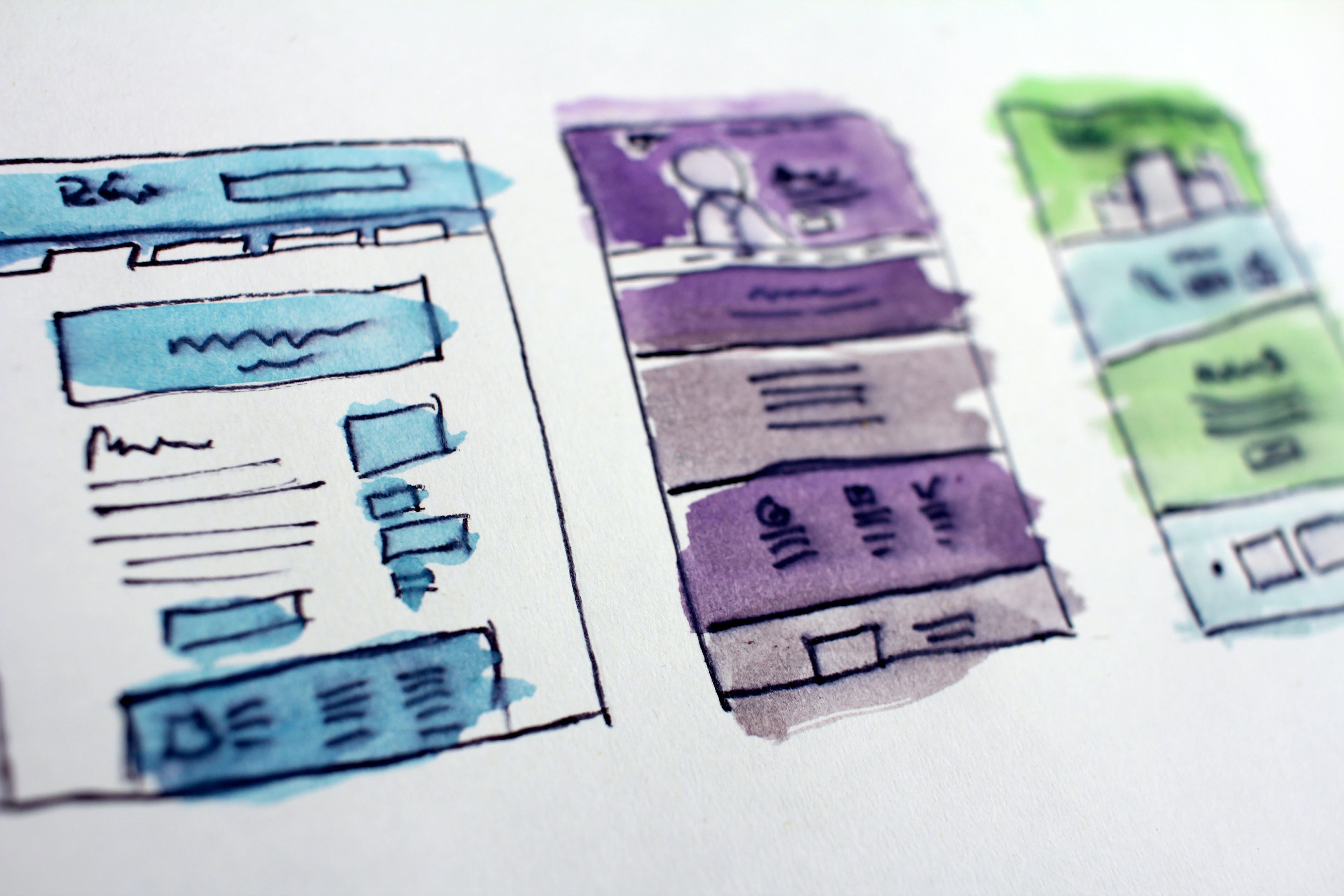
Today, the Internet is accessed by a diverse array of devices using different screen sizes, operating systems, browsers, hardware, and much more. Having a responsive website that displays correctly on different screen sizes is paramount for success. This is why we’ve compiled a list of tips that are sure to help any website manager achieve an excellent, responsive website.

#1 Test the Site Carefully on Different Devices
You won’t be able to know whether your site displays correctly or not without first testing the site thoroughly on different devices. The devices should not just have different screen sizes, but they should also have different hardware and operating systems. This way, you can be sure that you’re not leaving out segments of the population from visiting your website.

Of course, getting your hand on such a range of devices can be hard and expensive. This is one of the main issues that face website developers nowadays. There are two paths forward for you: either spend money on a testing platform that lets you virtually simulate different types of devices or use a high-quality web development agency like Acclaim to help you design and test a responsive website.
#2 Pay Careful Attention to the Navigation Menu
The navigation menu is one of the hardest things to get right on a responsive website. Because the navigation menu animates and responds to client interaction, it regularly gets messed up when you use it on different screen sizes it was not designed for. This is why when you design the navigation menu, you need to be extra careful about the way you design the navigation menu.

#3 The Content Should be Easily Readable
The content of the website needs to be easily readable despite the size of the screen and the different browser designs. Some websites are only designed for desktop devices and this shows: they have large paragraphs of eye-catching text, they make use of a lot of lengthy paragraphs, etc. These make reading fairly difficult on mobile devices. You have to pay extra attention to the readability of the content to ensure a good experience for all users.
#4 Make Sure Floating Elements Don’t Block The Screen
Floating elements are one of the hardest things to get right when designing a responsive website. Floating elements don’t usually resize with the screen size of the visitor, so they end up taking a large chunk of the screen and making the website unviewable. If you’re going to implement floating elements, make sure they resize correctly when displaying on different screen sizes.

#5 Accommodate Touch Screens
A significant number of your visitors likely use touch screens. The way people interact with a website when they use touch screens is fundamentally different from the way people interact with a website when they use a keyboard and a mouse. It would behove you to change around your website in a way to ensure a good experience regardless of the way a person interacts with your experience – you’ll increase conversion rates and revenues this way.