If you’ve ever searched what are the 7 rules of Japandi home style, you’ve probably landed on mood boards full of beige walls, wooden bowls, and trailing plants — and still felt like something was missing. That gap between what looks like Japandi and what actually feels like Japandi is exactly what these seven rules address. Most rooms labeled ‘Japandi’ on Pinterest are missing at least three of its seven core rules — and that gap is exactly why they feel almost right but never quite peaceful. You’ll recognize the beige walls, the wooden bowl on a white shelf, the single trailing plant. But something’s off. The room looks like a photo you’d scroll past, not a space you’d want to stay in. That disconnection isn’t accidental. It’s what happens when a living philosophy gets reduced to an aesthetic checklist.
Here’s what most decorators miss: Japandi isn’t a style you apply. It’s a way of thinking about objects, space, and comfort that produces a specific feeling when you get it right. Learn the actual rules — not the Pinterest shorthand — and that feeling becomes completely replicable.
Why Japandi Is More Than Just a Minimalism Trend
The word “Japandi” blends two cultures, but it also blends two distinct philosophies about what makes a home feel good. Japanese wabi-sabi finds beauty in imperfection, transience, and the natural aging of things. Scandinavian hygge (pronounced hoo-gah) centers on cozy contentment, warmth, and the pleasure of simple daily rituals. These aren’t competing ideas — they’re complementary ones, and their overlap is where Japandi lives.
Japandi became a recognizable design category around 2020, but calling it a trend undersells it badly. Both wabi-sabi and hygge draw on centuries of craft tradition — Japanese joinery techniques that predate modern tools, Scandinavian woodworking rooted in harsh winters and scarce resources. Google Trends data shows searches for ‘Japandi’ increased over 900% between 2019 and 2023, making it one of the fastest-growing interior design search terms globally. That number reflects genuine cultural hunger for something that feels real, not just a fleeting decorating fashion.
Most decorators fail because they treat Japandi as an aesthetic to purchase rather than a philosophy to practice. They buy the right-looking furniture and stop there. But wabi-sabi asks you to consider why an object exists in your space. Hygge asks whether your room actually makes you feel good when you’re inside it on a dark Tuesday evening. Both questions matter more than the color of your walls.
This is also why you can’t shortcut to Japandi by editing your Amazon cart. The rules that follow aren’t specifications for a look — they’re a framework for making decisions. Understand that distinction, and every room you touch will shift.
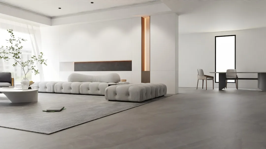
1. Intentional Minimalism, Not Empty Rooms
Here’s the mistake most people make first: they hear “minimalism” and they start removing things. Out goes the art, the books, the accumulated objects of a lived life. What’s left feels barren and cold. They’ve mistaken emptiness for intention, and the room shows it.
The Japanese concept of ‘ma’ — negative space — treats emptiness as an active design element, not an accidental byproduct. A bare stretch of wall isn’t a blank waiting to be filled. It’s breathing room for the eye, a deliberate pause that makes the things around it more meaningful. In Japanese aesthetic thinking, that empty space has as much weight as the objects beside it.
A 2021 Princeton University Neuroscience study found that visual clutter directly competes for neural resources, reducing focus and increasing cortisol. Your brain is literally working harder in a cluttered room. Japandi’s restrained approach isn’t aesthetic snobbery — it’s neurologically sound.
The practical test for every object in a Japandi space is a dual one:
- Does it serve a clear function?
- Does it bring a quiet sense of calm or meaning — not just look good in a photo?
If an object fails both questions, it doesn’t belong. If it passes one strongly, it might earn its place. If it passes both, keep it and stop questioning it.
For implementation, edit in rounds rather than one dramatic clear-out. Remove roughly 30% of your current décor, live with the result for a full week, and then honestly assess what you genuinely missed — not what you assumed you’d miss before the experiment. Most people find they miss far less than expected. The items that don’t get retrieved are the ones that were filling space, not earning it.
Actionable takeaway: Identify one surface in your home — a shelf, a console table, a windowsill — and remove everything from it today. Live with it bare for five days before deciding what, if anything, goes back.
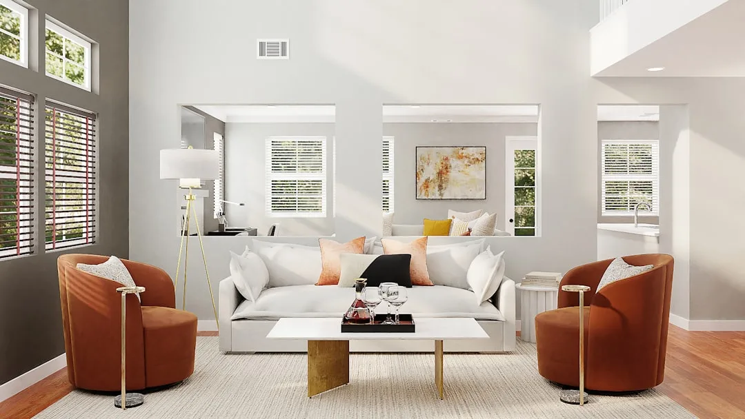
2. A Restricted, Earth-Anchored Color Palette
The word “neutral” gets thrown around so loosely in interior design that it’s almost meaningless. Japandi neutrals aren’t all neutrals — temperature matters enormously, and most rooms get this wrong by defaulting to whatever reads as “minimal” rather than what actually creates warmth.
The Japandi palette operates across three distinct tiers:
- Dominant warm neutral — off-white, warm grey, or sand. This covers walls, larger upholstered pieces, and flooring. Benjamin Moore’s White Dove OC-17 or Farrow & Ball’s Elephant’s Breath are frequently cited by designers as anchors that hit this register without veering into stark.
- Secondary organic mid-tone — clay, sage, warm taupe, or terracotta in small doses. This appears in textiles, medium-sized furniture, and accent surfaces. It’s the tone that gives the room its character.
- Dark grounding accent — charcoal, deep forest green, near-black, or dark walnut. Usually appears in furniture legs, a single larger piece, or carefully placed objects. Without this, a room reads as washed out rather than serene.
Interior color psychology research published in Color Research & Application found that warm neutral palettes with dark anchors consistently score highest for perceived calm and safety in residential settings — exactly the feeling Japandi is engineered to produce.
The mistake that collapses Japandi rooms most often isn’t adding a bold color. It’s using too many accent tones, or choosing a cool-based white (anything with a blue or grey undertone) that strips out the warmth entirely. Cool whites belong to stark Scandinavian minimalism or clinical modernism. They don’t belong here.
The entire room should use no more than three to four tones across all surfaces, furniture, and textiles. Count yours. Most rooms hovering around “Japandi” on Instagram are running six or seven.
Actionable takeaway: Pull paint chips for your walls and hold them against warm and cool white cards simultaneously. If your current wall color leans even slightly blue, consider Benjamin Moore’s Pale Oak OC-20 or Sherwin-Williams Accessible Beige SW-7036 as reliable warm alternatives.
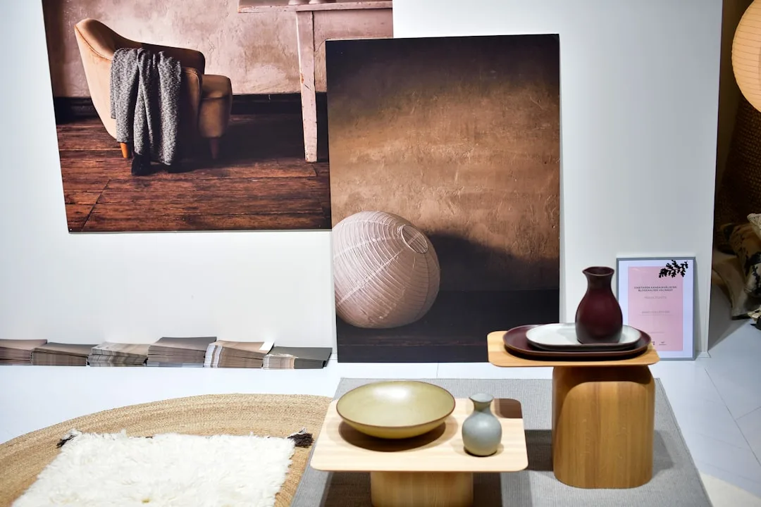
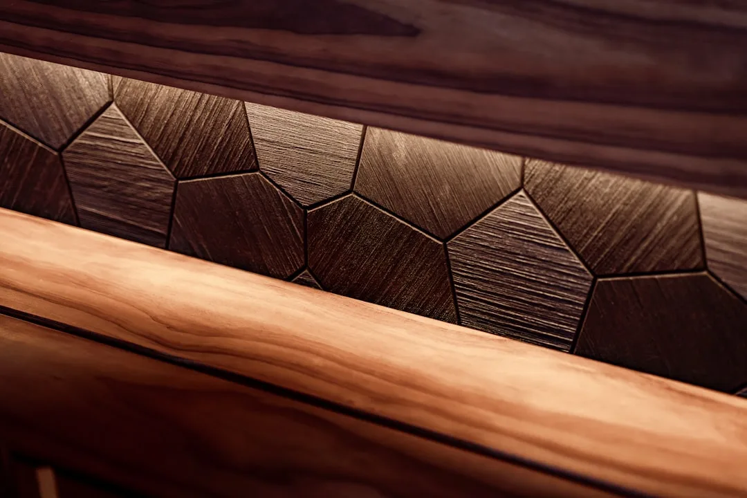
3. Natural Materials With Visible Craft Marks
Walk into a room trying to pass as Japandi that’s furnished from a fast-furniture retailer, and you’ll feel the wrongness before you identify it. The surfaces are too uniform. The finishes are too perfect. Every edge is machined to the same radius. It looks like a showroom for a style rather than a home shaped by a philosophy.
Japandi’s material language centers on natural materials that show evidence of how they were made and how they’ve been used. This is wabi-sabi made physical: a linen cushion with visible weave texture, a ceramic bowl with an uneven rim where the potter’s hands guided the clay, a wooden table where the grain rises slightly under a matte oil finish rather than disappearing beneath lacquer.
The specific materials that recur in authentic Japandi spaces aren’t arbitrary. They’re chosen because they age honestly:
- Oak, ash, and walnut — particularly in lighter, matte-finished forms. Avoid high-gloss or heavily lacquered wood; it reads as decorative rather than honest.
- Linen and undyed cotton — textiles with texture that you can feel. Avoid anything synthetic that mimics the look without the tactile quality.
- Washi paper and rattan — used sparingly in lighting or small accent pieces, never as a theme.
- Handmade or hand-finished ceramics — not the mass-produced kind where every piece is identical.
- Natural stone — particularly in matte or honed finishes rather than polished.
The craft marks matter. A slight variation in a ceramic glaze, a visible mortise-and-tenon joint in a wooden frame, a textile where individual threads catch the light differently — these are what tell your nervous system that something real was made by someone who cared about it. That feeling is not decorative. Research in environmental psychology consistently links perception of craftsmanship and natural materials with reduced stress and increased sense of safety in interior spaces.
Actionable takeaway: Pick up one object in your current space that’s meant to look natural but is actually synthetic or machine-perfect. Find one handmade or genuinely natural equivalent — a ceramic from a local maker, a piece of solid wood furniture at a secondhand shop — and make the swap. The difference in how the room feels will be immediate.
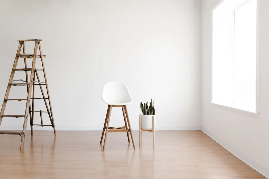
4. Low, Grounded Furniture With Clean Lines
Japanese interior design has always favored proximity to the floor. Traditional tatami rooms, low dining tables, futon bedding — the floor isn’t just where you walk, it’s where you live. This isn’t cultural arbitrage when it appears in Japandi; it’s a functional principle. Lower furniture lowers your visual center of gravity and makes a room feel more stable, more restful, and perceptually larger.
Scandinavian design contributes the clean-line principle: furniture should have a clear, readable silhouette. No ornate detailing, no carved legs, no decorative molding. The beauty is in the proportion and the material, not in added decoration.
Together, these produce the Japandi furniture signature: pieces that sit low, read simply, and are made from honest materials. Specific characteristics to look for:
- Seat height between 14 and 17 inches for sofas and lounge chairs, rather than the standard 18–20 inches of Western furniture
- Tapered, splayed, or straight legs in solid wood — never chrome, never ornate
- Integrated storage — drawers and shelving built into furniture so storage doesn’t require additional pieces
- Proportions that favor length and width over height — a long, low sideboard rather than a tall bookcase
The mistake most commonly made here is buying furniture that has clean lines but sits at conventional Western height. It looks right in photos but breaks the grounded feeling the moment you’re actually in the room. Height matters as much as silhouette.
Actionable takeaway: Measure the seat height of your current sofa or primary lounge chair. If it’s above 18 inches, place a folded blanket or floor cushion nearby and spend one evening sitting lower than usual. Notice whether the room feels different. That feeling is what low-profile furniture produces permanently.
5. Functional Objects as the Only Decoration
This rule is where Japandi diverges most sharply from Western decorating convention, which treats decorative objects as a separate category from functional ones. In Japandi, that distinction largely disappears. An object earns its place by being used, not by being looked at.
The Japanese concept of ‘shokunin’ — roughly translated as artisan mastery — holds that objects made with genuine skill for genuine use carry their own beauty. A well-thrown ceramic tea bowl is beautiful because it’s perfectly shaped for the hand that will hold it, not because someone decided to display it. That orientation produces a different kind of object in a space: quieter, more purposeful, more satisfying to be around.
Practically, this means:
- A cutting board on a kitchen counter is décor and tool — if it’s beautiful and you use it, it belongs
- A woven blanket draped over a chair arm is there to be used on cold evenings, not to look good in photographs
- Books on a shelf are there to be read, not arranged by color for Instagram
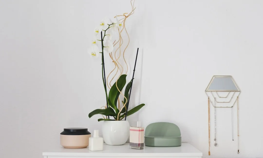
- A single ceramic vase holds seasonal branches or dried stems — it functions as a vessel, which is the only reason it’s there
What this rule eliminates is the category of objects bought purely to look good: decorative spheres, abstract sculptures chosen to “add interest,” trays that hold other decorative objects. These are visual noise in Japandi, even when they’re beautiful in isolation.
The test is honest: if someone asked you what that object does and the true answer is “nothing, it just looks nice,” it’s working against the room, not for it.
Actionable takeaway: Walk through your main living space and mentally tag every object as either “used regularly” or “purely decorative.” Remove the purely decorative ones for two weeks. The items whose absence you don’t notice after two weeks don’t need to come back.
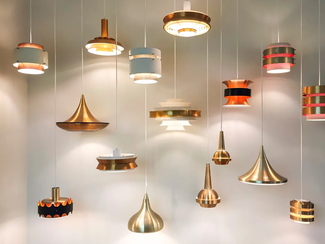
6. Considered, Layered Lighting
Lighting is where Japandi rooms fail most quietly. The bones can be right — the palette, the furniture, the materials — and the room still feels flat or harsh because the lighting is doing the wrong job. Most homes default to overhead lighting that illuminates a room uniformly, the way a grocery store or office does. That’s functional, but it’s antithetical to both wabi-sabi and hygge.
Japandi lighting works in layers, each serving a different function and a different time of day:
- Ambient light — the general illumination of a space. In Japandi, this is usually diffused rather than direct: a paper lantern, a fabric-shaded ceiling fixture, or recessed lighting on a dimmer. The goal is even, soft illumination without harsh shadows or visible bulbs.
- Task light — directed light for specific activities. A reading lamp positioned precisely, an under-cabinet light in a kitchen workspace. Task lighting is functional and honest about its purpose.
- Accent light — the most Japandi tier. A candle on a low table, a small lamp casting a warm pool of light in a corner, the glow from a paper pendant at dusk. This is where hygge lives.
Specific choices that consistently work in Japandi spaces: Muuto’s E27 pendant in natural materials, any washi paper lamp from Isamu Noguchi’s Akari series (the original Japandi lighting object), simple ceramic table lamps with linen shades, and raw brass or matte black adjustable reading lamps with visible mechanical simplicity.
Color temperature matters as much as fixture choice. Bulbs in the 2700–3000K range produce the warm, amber-toned light that makes natural materials glow correctly. Anything above 3500K produces a cool, clinical light that works against every material and color choice you’ve made elsewhere in the room.
Actionable takeaway: Replace one overhead bulb in your main living space with a 2700K equivalent and add one low table lamp or candle at floor or coffee table level. Use only those two light sources for one evening. This is the lighting register Japandi rooms are designed around.
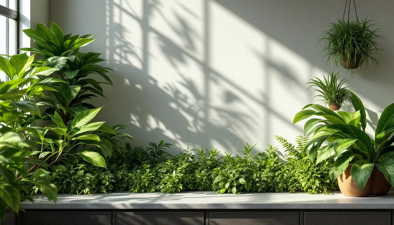
7. Purposeful Nature, Not Decorative Greenery
Plants appear in almost every room that claims to be Japandi — but the way they’re used is usually wrong. A shelf lined with ten small succulents, a kitchen windowsill crowded with herb pots, a living room corner with three different species competing for attention: this is maximalism wearing a natural disguise. It looks collected rather than considered, and it reads as visual clutter regardless of how organic the individual elements are.
Japandi’s relationship with nature follows the Japanese practice of ‘ikebana’ — the art of flower arranging — which works with a minimum of elements to suggest the natural world rather than reproduce it. A single branch in a ceramic vessel. Three stems of dried pampas grass in a corner. One substantial plant — a fiddle-leaf fig, a mature snake plant, a large-leafed monstera — as the single natural gesture in a room.
The principle behind this isn’t scarcity for its own sake. It’s that one well-placed natural element carries more visual and emotional weight than ten scattered ones. A single branch of cherry blossom in a matte ceramic vase communicates the season more powerfully than a collection of spring flowers arranged abundantly. That restraint is the point.
Specific plants that recur in well-executed Japandi spaces tend to share certain qualities: strong, readable silhouettes; minimal fuss; slow growth that allows them to develop genuine presence over time. Fiddle-leaf figs, snake plants, bonsai (when genuinely tended rather than purchased as décor), large-leafed monsteras, and simple arrangements of dried naturals — pampas grass, wheat stalks, eucalyptus — all fit this register.
Seasonal rotation also matters. Ikebana practice is inherently seasonal — what you place in your space reflects what exists in nature right now. Fresh stems from a market in spring, dried grasses in autumn, bare branches in winter. This keeps the natural element in the room genuinely alive to the present moment, rather than becoming permanent, unchanging decoration.
Actionable takeaway: Remove all plants and natural elements from one room in your home. Reintroduce exactly one — either a single substantial plant or a simple stem arrangement in one vessel. Live with just that one element for a month before deciding whether anything else needs to return.
How the 7 Rules Work Together
Understanding each rule separately is useful. Understanding how they interact is what actually changes rooms.
The rules aren’t a checklist to complete in sequence — they’re a system where each element reinforces the others. The restricted color palette makes natural materials read more clearly. The low furniture creates the right proportions for layered lighting to work at human scale. The single natural element has more presence because intentional minimalism has cleared space around it. The functional objects feel purposeful because the materials around them are honest.
When people ask what are the 7 rules of Japandi home style, they’re often looking for a formula. The real answer is closer to a set of decision filters — questions to ask about every choice in a room. Does this object do something? Does this material show how it was made? Does this light source create warmth or just illumination? Does this plant suggest nature or try to replicate it wholesale?
Run every decision through those filters and the room that results will feel like Japandi even if you never explicitly followed a rule. That’s the mark of a philosophy rather than a style.
Frequently Asked Questions
What are the 7 rules of Japandi home style in simple terms?
The seven rules are: intentional minimalism (not empty rooms), a restricted warm-neutral color palette, natural materials with visible craft marks, low and grounded furniture with clean lines, functional objects as the only decoration, layered lighting built around warmth rather than uniform brightness, and purposeful use of nature following ikebana principles. Each rule reflects either Japanese wabi-sabi or Scandinavian hygge — usually both.
Can I achieve Japandi style on a budget, or does it require expensive furniture?
Japandi is actually more achievable on a budget than most design styles because restraint is the point. Fewer, better objects — sourced secondhand or from local makers — beat a room full of expensive fast furniture every time. The most common Japandi move that costs nothing is removing things, not adding them. Secondhand solid wood furniture, ceramics from local potters, and linen textiles from mid-range retailers all hit the right material register without requiring significant spend.
What’s the difference between Japandi and Scandinavian minimalism?
Scandinavian minimalism tends to run cooler — more white, more grey, more graphic contrast, occasionally more stark. Japandi is warmer in both palette and feeling, specifically because wabi-sabi asks for imperfection and age in materials, and hygge asks for genuine coziness rather than cool restraint. A Scandinavian minimal room can feel like a design statement. A Japandi room should feel like somewhere you’d want to spend a quiet Sunday.
How do I know if my room is actually Japandi or just beige minimalism?
The honest test is whether your room passes the functional object rule and the craft marks rule — not just the palette and the emptiness. Beige minimalism looks spare and uses neutral colors. Japandi looks spare, uses neutral colors, and every object has a purpose, every material shows honest making, the lighting is warm and layered, and there’s one considered natural element. If your room is empty and beige but the surfaces are all smooth, the furniture is all standard height, and the lighting is all overhead, it’s minimalism — not Japandi.
Is Japandi suitable for families with children, or is it only realistic in adult-only homes?
Japandi is more family-compatible than its serene appearance suggests, because it favors durable natural materials over precious or fragile ones, integrated storage over exposed surfaces, and honest wear over pristine perfection. Wabi-sabi specifically finds beauty in the marks of use and time — a well-worn wooden table, a linen cushion that’s been washed many times. The adjustment for family spaces is practical: prioritize integrated storage, choose materials that age honestly rather than showing damage, and apply the functional object rule to children’s belongings the same way you would to your own.