You are about to enter a well planned place, a fresh small apartment, where modern blend of materials, textiles and colors invites to relaxation and recharging batteries after work in an agitated European capital, Bucharest. For those of you who like more youtful interior design, this lovely and calm retreat designed by talented Romanian interior design architects Monica Corduneanu and Paula-Maria Duta from ArchInteriors will be eye candy. As an enchanting one room apartment enriched with creative details, making everything look cozy, managed to make an impression on us! With its simplicity and dedication towards clear lines, this small apartment, specifically designed for a young and energetic couple, is beautiful, dynamic and modern.
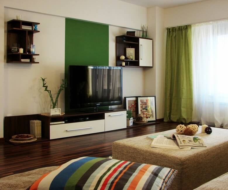
Interior design architects brought to life the living room, bathroom and kitchen areas by creating a perfect symbiosis between distinct zones of interest: relaxation zones (defined by a warm beige color palette) and more active ones highlighted in green. We love how this interesting color combination conveys the idea of a multifunctional space: cheerful and energetic on one hand, cozy and relaxing on the other hand. Those warm, earthy colors used on one side of the room highlights the bold green used as accent on the opposite wall, creating in this way a strong visual impact and a center on interest, which is the TV set.
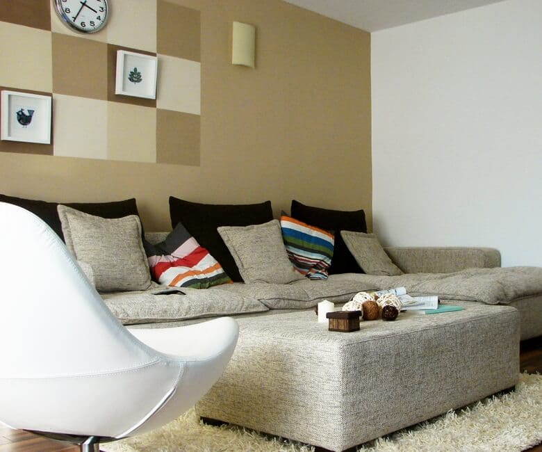
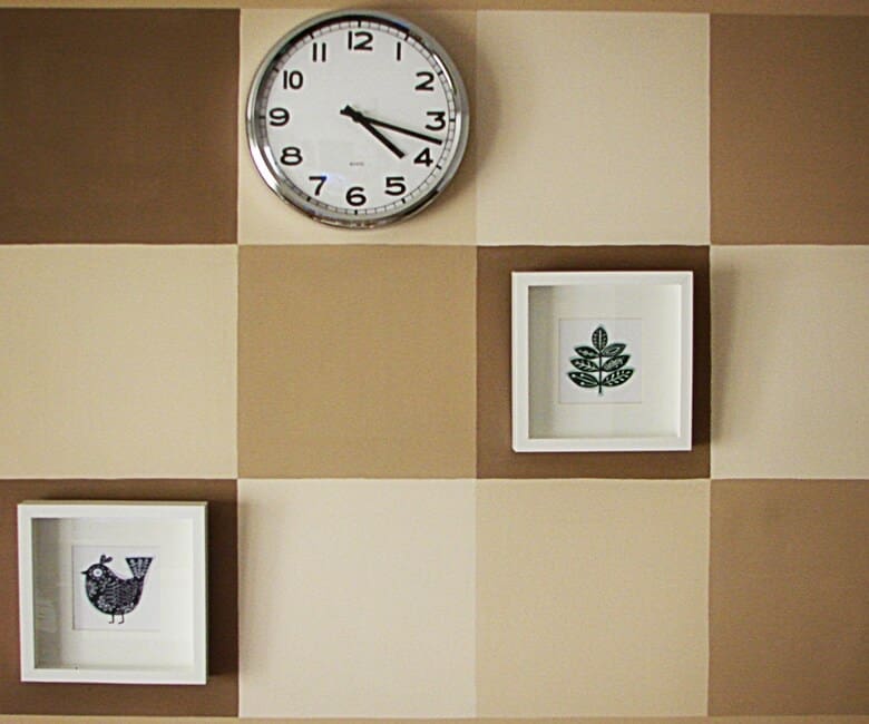
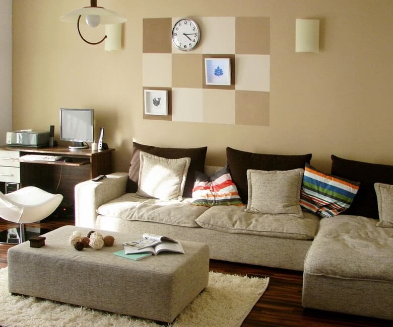
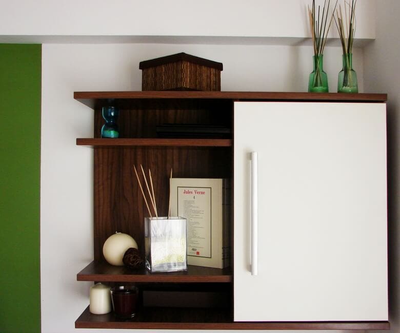
To add a touch of originality, the other accent wall isn’t just simple painted, but it’s out of the ordinary through a creative drawing alternating dark and light shades of the background color, which frames some decorations items. The soft and comfortable-looking couch also enhances the impression of a peaceful and inviting place. Modern and minimalist furniture, decorations along with an airy white curtain with drapery in the same shade of green on the wall beautifully complement the entire living space that greatly enjoy light. Both kitchen and bathroom designs follows the same pattern as living room.

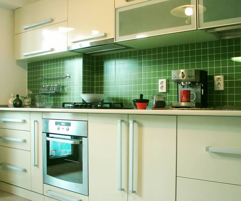
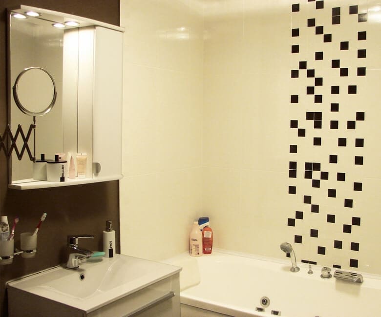
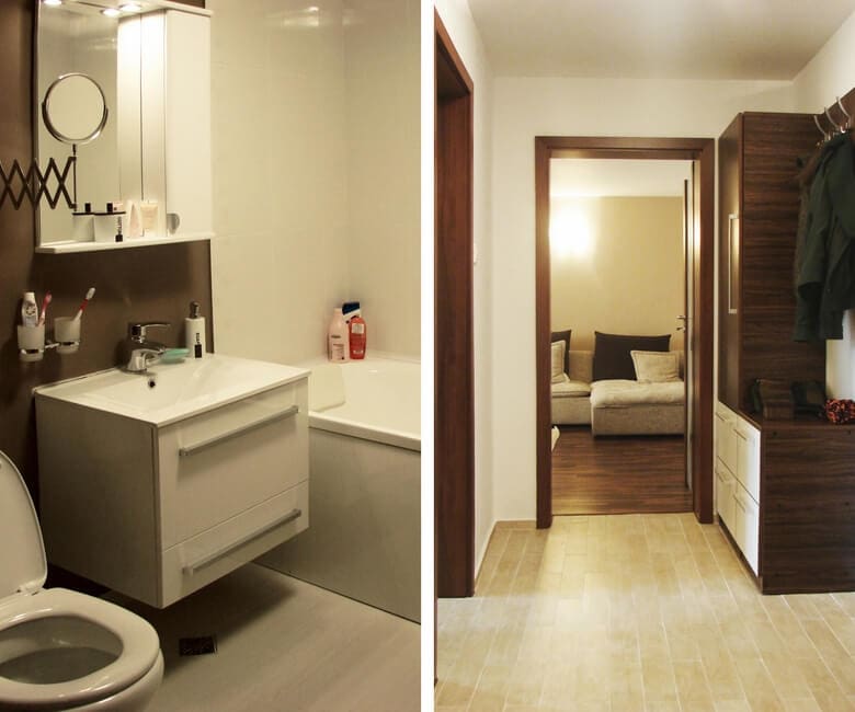
Small yet practical and comfortable, the kitchen environment communicate energy and joy, brightening it through the use of the same vivid green color, that creates dimension in combination, with plain white, that make the kitchen feel more spacious than it actually is. Some cute pictures with simple white frames give a playful touch to the overall look of the room. Simple yet stylish, the bathroom is a warm space, that surprises the eye due to the dark graphic element used against the immaculate white tiles. Designers choose to dress in tiles only the bathtub area, the other one painting it with an earthy dark shade, which makes quite an interesting contrast with white. How do you feel about this relaxing ambience?


Photos © ArchInteriors

Leave a Reply