You’ve probably used dozens of fonts out of the thousands that exist. . But have you ever thought about the work that goes into them?
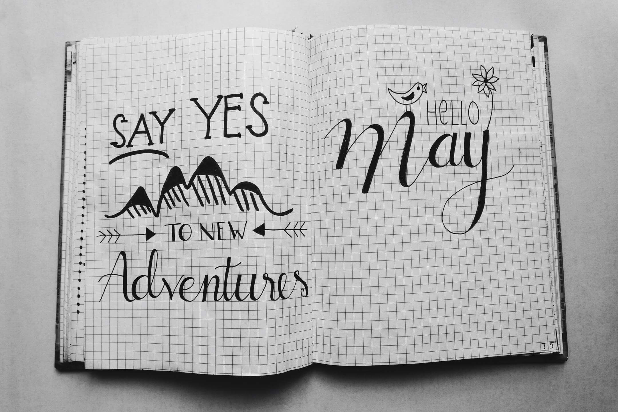
Photo by rawpixel.com form PxHere
Names like Serif and Sans Serif will be familiar to you, but these typefaces didn’t magically appear from nowhere…they are the result of careful and purposeful design. While great, however, the popularity of these typefaces means they lack the novelty factor.
If your chosen typeface exists everywhere, viewers are likely to get bored and skip over your content. Setting a good first impression with your font is therefore imperative for sending out the right signals for your brand and message.
The good news is that in 2021, the digitalization of business communications and software advancements have seen a rise in clever font creation tools.
But this doesn’t mean they’re easy to use.
So, read on for an end-to-end guide on typography and the process of creating your own font.
What’s so important about typography and fonts?
Text takes up large parts of modern content. From social pages and emails to games, movies, and billboards, fonts play a central role.
Whether it’s an online guide on how to do conference call on android, or simply an effort to spice up your excel to-do list template, your chosen typography is important
Some of the more obvious advantages of typography for businesses include:
Branding

Typography can be one of the most visual aspects of your branding, making it instantly recognizable.
Take this example from Adidas which uses the avant garde font. In combination with the logo, the font is recognizable as Adidas.
If the font were to change, it would change the whole visual brand too.
Creating a tone
Some fonts are better suited for quirky or exciting brands, while others may be more informal and serious in tone.
For example, calligraphy-style fonts used in flower and bridal businesses wouldn’t suit a business update on what is contact center IVR. A more suitable font here would be Arial, which is common, informative, and less stylistic.
Remember, in some cases, you’ll want the font to take center stage, but in other cases, you’ll want it to go unnoticed so the reader can focus on the actual message itself.
Easier scanning of pages
With almost 2 billion websites on the internet, the ability to scan the page is important, especially given the shortened attention spans of modern-day consumers.

Research indicates humans commonly view web pages in a certain way. By understanding this and using it to your advantage, you can ensure you use the best fonts for making your content easily scannable. If you were creating a leaflet for 3D printed furniture, for example, having a scannable font would allow modern readers to absorb the information quickly.
Consumers expect a faultless experience in today’s digital world, so make sure your choices add to this.
Typography key terms
Before looking at the process of creating your own font, it will be useful to understand some of the key terms involved in typography.
Typography
Typography refers to the art of arranging type so that written text is easily readable and easy on the eye. This could be anything from the size of each letter to the way they are displayed on the page.
Typeface
This often gets mixed up with font, but a typeface is a group of characters that share the same design. Commonly used typefaces include Arial and Serif.
Fonts
Fonts are individual styles within a typeface. For example, Arial Rounded is a font within the Arial typeface. Each typeface can contain several fonts, for example, Arial also contains Arial Black and Arial Narrow.
Fonts have a certain point size, width, weight, and other design elements.
Weight
Weights refer to the thickness of each character’s strokes. Weights are usually- thin, thick, normal, bold, black, etc.
Spacing
There are several spacing elements involved with fonts, these include:
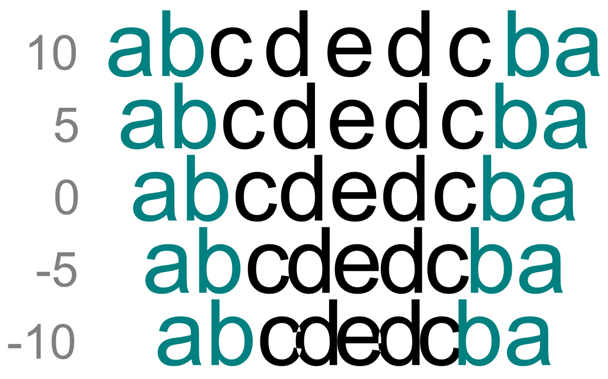
- Kerning: the space between characters.
- Tracking: the general spacing for a complete block of text.
- Leading: the space between the lowest point of two lines.

Point
This is the size of the font from top to bottom and includes the whole font, not just single letters.
Styling
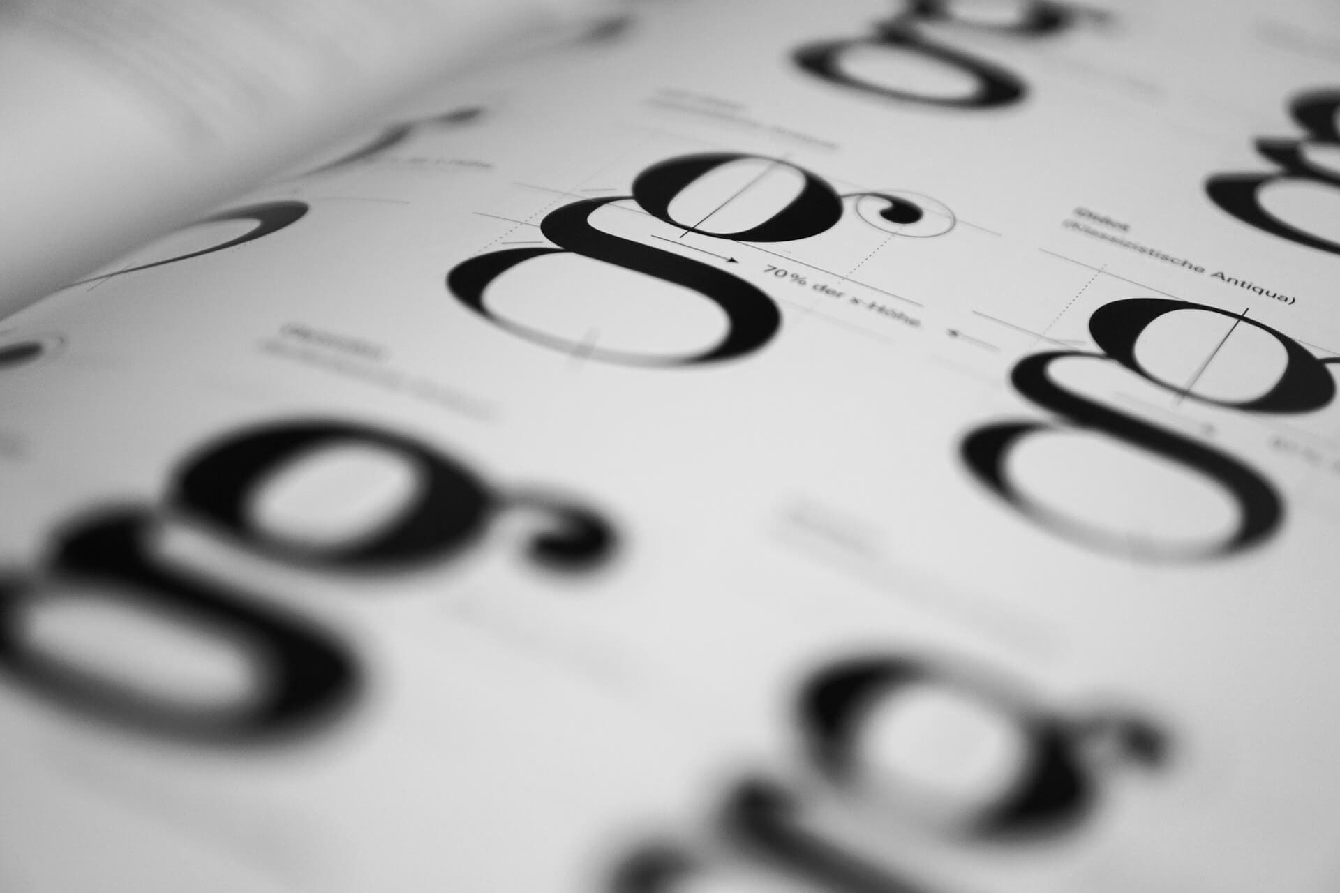
This includes style elements. One example is Serif, this refers to the small stylish flicks that trail off the end of characters. Then we have Sans Serif. ‘Sans’ means ‘without’ in French, so Sans Serif refers to a typeface with no added style embellishments.

There are also Script typefaces that resemble handwriting, and Gothic typefaces which have an old, medieval look.
The process of creating your own font
The length of your efforts and chosen techniques will depend on your overall goals. Are you making a new font for a bit of fun? If so, try some of the cheaper and easy-to-use tools such as PaintFont and FontStruct.
Or perhaps you’re looking to increase your brand’s recognizability with a unique font across all of your content? In this case, the rest of this guide should help you overcome some of the technical and design decisions you will need to make.
- Have a plan
As the saying goes, fail to prepare…prepare to fail.
Creating a font that’s worthy of your brand requires some planning. Start by asking yourself questions such as:
- Does your font need to cover your whole brand or just one specific piece of content?
- What size should this be?
- Would Sans or Sans Serif be the better typeface?
- Do you already have a good idea of how you want the font to look?
- What have competitors used?
Stay focused on this plan. For example, if you’re writing an infographic on ‘what is automation testing,’ center your font around the needs of a business tech audience.
- Start your font design by hand
Before you blindly jump onto the computer, begin to sketch your ideas onto paper without the shackles of getting too technical at this early stage.
Look at how other fonts repeat characters and use spacing. For example, if you’re creating a guide on the home building process, experiment with what looks right for this niche. Perhaps look at competitors here for an idea of current trends.
You don’t need to sketch every letter of the alphabet, but make sure your choices have plenty of lines and curves to think about.
Starting your designs by hand will help you further down the line when it comes to using software.
- Select a software option
There are several tools available online for creating your own fonts such as FontForge, FontStruct, and Glyphr Studio. Thankfully, these are free and come packed with features.
Ultimately, your choice in software will come down to preference. Most of the available tools have similar features, so if there’s something specific you need, compare them before deciding what to choose.
- Begin creating your font
Once you’ve chosen your font design tool, it’s time to start learning how to use it.
Watch some online tutorials on your software of choice. These may vary, for example some tools convert your hand-drawn sketches into a font, whilst others will require you to design the font from scratch. For the more technical aspects, here are some key terms to know:
- Glyph: an individual character.
- Baseline: the lowest point of the characters on a line.
- Ascender line: the point where letters with an ascender reach.
- Ascender height: the height of the ascender (‘b’ ‘d’).
- Descender depth: how low the descender goes (‘p’ ‘q’).
- Stem: vertical lines through letters such as ‘T’ and ‘K’.
- Bowl: the rounded shapes in letters such as ‘p’ and ‘b’.

- How’s it looking?
It’s easy to lose focus of the overall look of your font when you’ve spent hours painstakingly perfecting the finer details.
At this stage, you’ll want to pause, step back, and take a look at your font compared to the vision you originally had in mind. Ask yourself these questions:
- Is your spacing and kerning looking good across whole words and sentences?
- Does your font look okay with both large and small point sizes?
- How does it come across to other people?
For example, if you’re creating a landing page for your new call center WFM software, make sure the font looks fit for its purpose.
In this case, you’d want to lean towards a more formal and ‘professional’ font that doesn’t distract from the software itself. Your audience, after all, will primarily be made up of decision-makers at businesses and organizations.
When looking for a software solution, they’ll only trust a professional provider with expertise in their field. Everything you present to them must convey this appearance; even down to your landing page font.
You’d also want to make sure the spacing and kerning make it easy to scan through. Your audience won’t have time to read essays, they need to pick out key features without being overwhelmed by text.
Look at other businesses in your industry to see how their landing page fonts look, if you need further inspiration.
Once you’re satisfied things look good, it’s time to get your font out there into the world.
- Export your font for use
Now you’ve put in all the hard work to craft your perfect font, it’s time to start using it.
Export your font and trial it across a range of mediums. See how it looks on the laptop, a phone, a tablet. Look more specifically at the function of the font, is it satisfying your brand’s objectives? Will it work with your target audience?
As a web designing hack, perhaps you could switch out the font of your old content with your newly designed font. This way you could measure engagement to see if the font has had the positive impact you require. If not, a trip back to the drawing board and some minor tweaks could rejuvenate things.
Final Thought
Designing your own font can have a huge impact on branding, user experience, and setting the right tone. It pays to go beyond what already exists, and the novelty factor awarded by creating your own font is an attractive reward.
Hopefully, by becoming a master of the typeface, your business will hold more influence when it comes to capturing and keeping the attention of new customers. But one thing to keep in mind is that typography is a creative process and behind this should be experts and professionals with the calibre to implement the advice we’ve offered.
One good idea if you’re building your creative team is having more Gen Z in the workforce. Gen Z staff are young and have lots to offer when it comes to computer skills and inspired creativity. They’ll also have a good understanding of what the modern-day consumer expects, as well as how fonts may look across different platforms, so use them as part of your font strategy team to maximize your potential.
Good luck, let the process commence.
Bio:
Grace Lau – Director of Growth Content, Dialpad
Grace Lau is the Director of Growth Content at Dialpad, an AI-powered cloud communication platform for easier team collaboration and better customer relationships with services such as the Dialpad small business contact center. She has over 10 years of experience in content writing and strategy. Currently, she is responsible for leading branded and editorial content strategies, partnering with SEO and Ops teams to build and nurture content. Here is her LinkedIn.

Leave a Reply