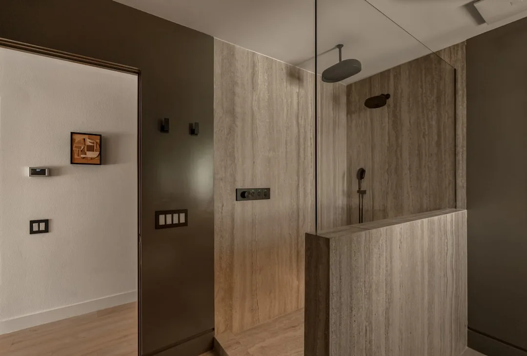
When searching for bathroom accent wall tile ideas, most people start in the wrong place — they start with the tile. The tile you choose matters far less than the wall you choose, and most bathroom renovations get this backwards, which is why so many expensively tiled bathrooms still feel like nothing happened.
Quick Answer
The tile you choose matters far less than the wall you choose — and most bathroom renovations get this backwards, which is why so many expensively tiled bathrooms still feel like nothing happened.
I’ve watched homeowners spend $4,000 on handmade zellige and then press it onto a wall that faces a closet door. I’ve seen gorgeous fluted porcelain disappear behind a swing-open shower door because nobody thought about clearance before the tile was ordered. The tile wasn’t the problem. It never is. The problem is that most people treat wall selection as an afterthought — something to decide after the sample board is already narrowed down — when it should be the first decision made and the last one compromised.
This article is a decision framework, not an inspiration dump. Every section is structured to help you answer a specific question before you spend a dollar on material or labor.
Why Most Tiled Focal Walls Fall Flat (And the One Planning Step That Fixes It)
In This Article
- Why Most Tiled Focal Walls Fall Flat (And the One Planning Step That Fixes It)
- Which Wall Should Be an Accent Wall in a Bathroom?
- What Is the Best Tile for an Accent Wall? (Matched to Your Specific Goal)
- The Mistakes That Waste Good Tile (And How to Avoid Each One)
- Bathroom Accent Wall Tile Ideas by Room Type
Most bathroom renovation content gives you ideas. This is the part where I give you a process — because ideas without sequence produce exactly the kind of expensive, forgettable results I spent eleven years cleaning up for clients.
The single most common mistake is choosing tile first and wall second. It seems harmless. You fall in love with a sample at the tile showroom, you bring it home, and then you figure out where to put it. But tile selection is a context-dependent decision. A dark, matte, heavily textured tile that looks extraordinary on the wall opposite a south-facing window will look funereal on the wall adjacent to it. The tile didn’t change. The context did everything.
Before you look at a single sample, answer three questions about your bathroom — in this order:
- Where do eyes land first? Stand in the doorway. Don’t look around. Notice where your gaze goes instinctively in the first two seconds. That wall is your primary candidate.
- Where does natural light enter, and where does it land? A window at eye level throws light forward; a skylight drops it down. The wall that catches — or could catch — the most natural light is where reflective or glazed tile will do its best work.
- What is the wall’s relationship to plumbing fixtures? Wet zones already require waterproofing. Tiling a wall that needs moisture protection anyway costs you nothing extra in substrate prep — and that’s a real budget consideration, not a design one.
Square footage changes the rules significantly here. In a 40-square-foot powder room, every wall is close. There’s no “background wall” the way there is in a sprawling primary bath. What reads as a dramatic focal point in a large bathroom becomes overwhelming in a small one — or, if handled correctly, intensely intimate and intentional. The rules aren’t reversed in small spaces; they’re compressed.
The pattern I kept seeing in failed renovations was this: homeowners skipped these three questions entirely, chose tile based on aesthetics alone, and ended up with a statement surface on a wall that nobody looks at, in a finish that fights the light instead of working with it.
Actionable takeaway: Before your next showroom visit, photograph your bathroom from the doorway and mark the wall where your eye lands first. That photograph is your design brief.
Which Wall Should Be an Accent Wall in a Bathroom?
There is a remarkably reliable rule that works across almost every bathroom layout I’ve encountered, and it goes like this: the wall your eye hits first when entering is almost always the strongest candidate for tile. This is typically the wall directly opposite the door, or the wall perpendicular to it if the room is long and narrow. It’s not complicated. It’s spatial logic — you give the most visual investment to the surface that gets the most visual attention.
What complicates this is the vanity wall versus shower wall debate, which comes up in nearly every primary bathroom renovation. Here’s how I think about it:
- The vanity wall wins when the vanity is the first thing you see entering the room, when the bathroom lacks a dedicated shower enclosure, or when the mirror above the vanity will amplify and frame the tile (effectively doubling its visual surface area at eye level).
- The shower wall wins when the shower is a dedicated enclosure with glass panels — because glass makes it a display case — and when the vanity wall is broken up by doors, windows, or medicine cabinets that would interrupt any tile pattern.
The wet-zone advantage is real and worth emphasizing. A shower surround wall already requires a waterproof substrate, cement board, and a proper membrane system. Tiling it for design impact adds zero additional waterproofing cost compared to tiling a dry wall, which requires all that work as extra. This is not a minor consideration when you’re budgeting.
Here’s how layout type changes the decision:
- Single-wall galley bathroom: The end wall — the short wall you walk toward — is the obvious candidate. It’s the terminus of the sightline and usually undisrupted by fixtures.
- Three-wall wet room (shower on one wall, toilet and vanity on others): The shower wall is your feature surface. The other two walls should support it, not compete.
- Separate shower-and-tub layout: You now have two wet zones, which means two surfaces that could take tile without additional waterproofing cost. Choose based on which one is more visible from the entry point — don’t tile both with statement material unless you have a very clear material hierarchy planned.
- Powder room: This is the only bathroom type where all four walls are legitimate candidates. With no shower or tub, there are no wet zones and no obligatory tiling constraints — which makes the powder room the best room in any house for genuinely bold material decisions.
One more factor that most articles completely ignore: the wall perpendicular to a window amplifies natural light more than any other position. Reflective or glazed tile on that perpendicular wall catches light from the side and scatters it across the room. It functions almost like a second light source. On the wall facing a window, the same tile gets backlit and looks flat.
Actionable takeaway: If you have a shower with glass panels, that wall is your feature surface by default — you’ve already built a display case around it. Use it.
What Is the Best Tile for an Accent Wall? (Matched to Your Specific Goal)
“Best tile for an accent wall” is a question that cannot be answered without knowing what you’re trying to accomplish. I know that sounds like I’m hedging, but I’m not — I’m telling you that the best tile for making a 45-square-foot bathroom feel twice its size is actively wrong for creating a moody, enveloping primary bath. These are opposite goals. They require opposite solutions.
The bathroom accent wall tile ideas worth stealing from designers are always matched to a specific spatial outcome, not just an aesthetic preference. Here’s how to match tile type to goal:
Goal: Make a small bathroom feel larger
Large-format tile in a light, neutral tone — think 24×48 porcelain slabs in warm white or soft greige — with minimal grout lines. The fewer the interruptions across a surface, the further that surface appears to recede. Avoid highly directional patterns like herringbone in small spaces; they create movement, which reads as busyness, which shrinks a room. If you want pattern, use it on the floor where it reads as a rug, not a wallpaper.
Goal: Create a moody, enveloping feel in a primary bath
Dark, matte, textured tile in format sizes that match the room’s proportions. Zellige in charcoal or deep olive. Fluted terracotta in a warm brown. Handmade subway in an ink glaze. The texture catches artificial light and creates depth — a flat, polished dark tile in a low-light room just looks like a void. Matte absorbs; texture gives the absorption somewhere interesting to go.
Goal: Make a dated bathroom feel current without a full renovation
This is the scenario where a single accent wall does its best work, and where bathroom accent wall tile ideas from social media most reliably mislead people. The tile itself isn’t doing the transformation — it’s the contrast between the new and the existing. A wall of unlacquered brass zellige against existing white subway tile doesn’t update the whole bathroom; it recontextualizes it. The existing tile suddenly reads as intentional backdrop instead of outdated leftover.
Goal: Add warmth to a bathroom dominated by cold finishes
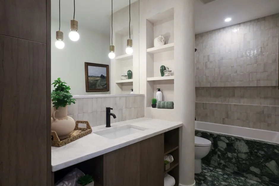
Natural stone in warm tones — travertine, warm limestone, honey-colored marble — on a single wall introduces organic texture and temperature that porcelain cannot replicate. Even large-format porcelain printed to look like travertine reads colder than the real material at close range, because it lacks the variation in surface depth that natural stone has. If warmth is the goal, budget for real stone on the accent wall even if you use porcelain everywhere else.
Goal: Create a spa-like atmosphere
Continuous material from floor to ceiling — sometimes called a wet room or monolithic approach — using the same tile family on accent wall, shower floor, and adjacent surfaces. The continuity is what reads as spa, not the material itself. A single marble slab surface on the shower accent wall tiled floor-to-ceiling with no interruption has more visual calm than the same marble interrupted by a niche, a soap shelf, and a contrasting threshold tile.
The Mistakes That Waste Good Tile (And How to Avoid Each One)
These are the specific, recurring errors I watched clients make across hundreds of renovations. They’re not about taste. They’re about process failures that good bathroom accent wall tile ideas will not save you from.
Mistake 1: Ordering tile before confirming fixture placement
The most expensive mistake, because it often can’t be fixed without retiling. A shower door that swings inward will cover your accent wall for every second it’s open. A medicine cabinet that recesses into the wall will interrupt a pattern that was planned as continuous. Both of these are discoverable during planning. Neither is discoverable once the tile is set.
Mistake 2: Choosing a tile format that fights the wall’s proportions
A 4×12 subway tile laid in a horizontal stacked bond on a wall that’s 48 inches wide and 96 inches tall will emphasize how tall and narrow the wall is — every horizontal line becomes a measuring stick that reads the height. If your wall is taller than it is wide, either go vertical with your format or use a square tile that doesn’t emphasize either dimension. This is proportional logic, not personal preference.
Mistake 3: Using a statement tile on a broken-up wall
A wall with a window, two electrical outlets, a towel bar, and a door switch is not a blank canvas — it’s an obstacle course for any continuous pattern. Statement tiles, particularly those with large-scale geometric patterns, require uninterrupted runs to read correctly. A single interruption can center the pattern awkwardly, cut through a motif mid-repeat, or create a partial tile situation that makes the whole installation look like a mistake. If your candidate wall has multiple interruptions, choose a tile that handles cuts gracefully — solid color, small format, or a random variation like zellige.
Mistake 4: Ignoring grout color as a design decision
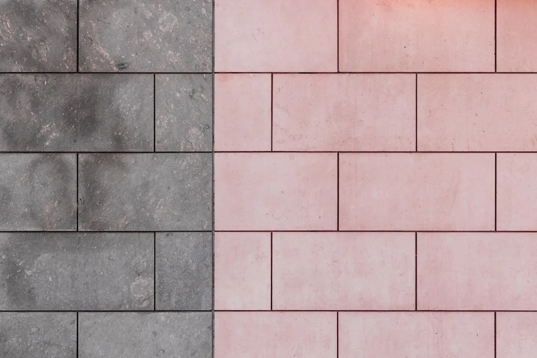
Grout color determines whether tile reads as individual units or as a continuous surface. Matching grout to tile body color creates a seamless, expansive read. Contrasting grout emphasizes every joint and makes the pattern more graphic. Neither is wrong — but they produce opposite effects, and I’ve watched homeowners choose a tile based on a sample board with matched grout, then specify a contrasting grout during installation because “it was less expensive,” and end up with a completely different room than they were expecting. Grout color is a design specification. Treat it as one.
Mistake 5: Tiling an accent wall without a transition plan
Where does the tile stop? This is a question that will absolutely be asked during installation, and if you haven’t answered it during design, the default answer from most tile setters is “at the corner” — which is usually fine but occasionally wrong. In some layouts, stopping at a corner means the tile terminates mid-sightline, visually cutting a room in half. In others, carrying the tile around a corner onto a return wall creates an unintended boxing-in effect. The transition — whether it’s a metal edge strip, a bullnose tile, or a material change — needs to be specified before installation begins.
Bathroom Accent Wall Tile Ideas by Room Type
This section is organized differently from the rest of the article. Instead of principles, it’s specific. Each scenario maps to a tile strategy that I’ve seen work — not “work” as in look good in photographs, but work as in hold up under daily use, maintain its visual logic over time, and satisfy the homeowner three years later.
Primary bathroom, large format (over 100 sq ft), separate shower and soaking tub
The shower wall behind the main showerhead is your first priority. If the shower has three walls, tile only the back wall in statement material and use a complementary field tile on the two side walls — this creates depth by implying that you’re looking into the tile rather than being surrounded by it. For the soaking tub, a slab surround (single piece or matched book-matched slabs) reads more luxurious than individual tiles because the joint lines stop. If budget requires tile on the tub surround, use the largest format available and match the grout to the tile body.
Primary bathroom, medium format (60–100 sq ft), combined shower/tub
You have one wet zone and one surface to work with. Tile the back wall of the tub-shower combination floor-to-ceiling and let it be the room’s only statement. Side walls get either the same tile in a simpler configuration or a painted finish that recedes. The common mistake here is trying to create a “feature wall moment” on the vanity wall opposite — in a room this size, competing statements create visual noise, not sophistication.
Guest bathroom (typically 35–55 sq ft), tub-shower combination
The tub surround back wall is the right call 90% of the time, for all the wet-zone reasons already covered. What changes in a guest bathroom is the license to be more experimental with pattern — guests encounter this room occasionally, not daily, so the fatigue threshold is higher. A graphic cement tile or a large-format geometric that might feel exhausting in a daily-use bathroom reads as delightful in a guest context. Use that.
Powder room (no wet zone, often under 30 sq ft)
The only room where the question “which wall” has a genuinely correct answer of “any of them.” I’d argue the powder room is where the most interesting bathroom accent wall tile ideas get to exist, precisely because there are no wet zone constraints, no daily-use fatigue considerations, and the room is small enough that a single wall of something extraordinary doesn’t require a large material budget. The wall directly opposite the door is still the first-look surface, but in a powder room the toilet wall — the wall you face when seated — is also a legitimate contender because guests spend a stationary, captive moment looking directly at it.
Ensuite bathroom opening directly from the bedroom
Here the sightline starts in the bedroom, not at the bathroom door. The wall visible from the bed is the one that matters — often the vanity wall, depending on the layout. Tile on that wall needs to be legible from a greater distance than typical, which means large-format tile or bold pattern rather than the small-scale textures that read well up close but dissolve into visual texture from fifteen feet away.
Frequently Asked Questions
Do I need to waterproof a dry wall before tiling it as an accent wall?
Yes, if there’s any chance of steam or moisture reaching it — which in most bathrooms there is, even on walls far from the shower. In a powder room with no shower, a standard tile backer board is sufficient. In any bathroom with a shower, treat all four walls as potentially wet-zone adjacent and use a proper membrane system on any wall you tile, regardless of its distance from the shower. The cost of waterproofing a wall during installation is a fraction of the cost of removing and retiling when moisture damage appears two years later.
How do I choose between a patterned tile and a textured solid tile for an accent wall?
The decision hinges on the wall’s role in the room. If the accent wall is competing with other strong visual elements — a dramatic vanity, a freestanding tub, a large mirror — choose texture over pattern. Texture adds dimension without adding graphic complexity. If the wall is the only strong element in an otherwise quiet room, a bold pattern can carry the full weight of the room’s personality. The mistake is using pattern in a room that already has pattern elsewhere; it almost never resolves cleanly.
Can I use large-format tile in a small bathroom?
Yes, and often you should. The widespread advice against large-format tile in small spaces is based on a misunderstanding of why large tile works — it works because it reduces grout line frequency, which reduces visual interruption, which makes surfaces read as continuous rather than segmented. A continuous surface recedes; a segmented surface advances. In a small bathroom, that recession is exactly what you want. The real constraint with large-format tile in small spaces is cut complexity: large tiles cut awkwardly around fixtures, and a small room means more cuts per square foot. Account for that in your labor estimate.
What’s the difference between an accent wall and a feature wall in bathroom design?
In practice, designers use the terms interchangeably, but there’s a useful distinction. An accent wall uses a different material, color, or pattern to draw attention to a specific surface — it punctuates the room. A feature wall is designed to be the room’s primary visual statement, often running floor-to-ceiling and functioning as the room’s dominant element. The distinction matters for material selection: accent walls can work with moderate materials because contrast does most of the work. Feature walls require materials that hold up under sustained attention, which usually means higher quality, more variation, or more precise installation.
How do I know if my accent wall tile idea will look dated in five years?
No honest answer exists here, but there are useful proxies. Tile shapes and formats with long design histories — subway tile, zellige, hexagon mosaic, natural stone slab — tend to cycle through trends without becoming trend-specific, because they predate the trend cycle. Tile formats invented to capitalize on a specific trend moment — a very specific geometric that appeared everywhere in a single year, a color that was explicitly named as the color of the year — tend to date faster. When evaluating a tile, ask whether it existed thirty years ago in some form. If yes, it has enough design history to outlast the current trend cycle. If no, you’re making a more speculative choice.