Most people rearrange their bedroom furniture at least three times before giving up and assuming the room just doesn’t work — but in the majority of cases, the room is fine and the arrangement sequence is the problem. These bedroom furniture arrangement tips exist precisely because the sequence matters more than the furniture itself. People start with what’s easiest to move — a lamp, a nightstand, a chair they never sit in — rather than working from the foundational piece outward. Then they layer on paint samples, throw pillows, and decorative objects hoping something will finally click. It doesn’t click. Not because the room is hopeless, but because you can’t style your way out of a structural arrangement problem.
Quick Answer
Most people rearrange their bedroom furniture at least three times before giving up and assuming the room just doesn’t work — but in the majority of cases, the room is fine and the arrangement sequence is the problem.
Eleven years of working with clients taught me one thing with more consistency than almost anything else: the furniture placement conversation is the one people most want to skip. They want to talk about color palettes and textiles and whether to get a rattan headboard. Those things matter, but a beautifully styled room with bad furniture placement still feels wrong at 10pm when you’re trying to wind down and can’t figure out why you feel vaguely uncomfortable in your own bedroom.
This is the conversation we’re having instead.
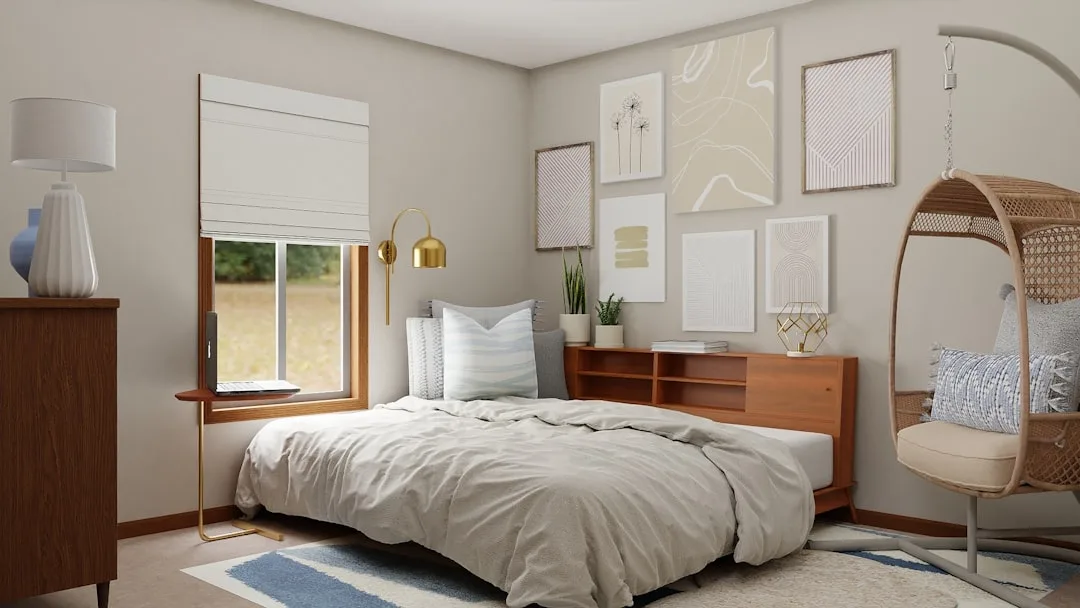
Start With the Bed: The Anchor Point That Decides Everything Else
In This Article
- Start With the Bed: The Anchor Point That Decides Everything Else
- What the 2/3 Rule for Furniture Actually Means (And When to Break It)
- The Four Core Rules of Furniture Arrangement (With the One Nobody Talks About)
- Clearance Numbers That Actually Matter
- Small Bedroom Arrangements: What Changes When Square Footage Gets Tight

A queen bed measures 60 by 80 inches. In a standard 12×12 bedroom — which accounts for a significant portion of American bedrooms — that single piece of furniture occupies nearly 28% of the total floor space before you’ve placed a single other thing. That number changes how you have to think about placement. This isn’t décor. It’s spatial planning.
The principle I return to constantly is this: the bed should give you a clear sightline to the room’s entry door without putting you directly in the door’s path. This matters for two distinct reasons that most arrangement guides treat as one. The psychological reason is that humans sleep better — measurably, consistently — when they can see a potential threat (a door opening) without being immediately exposed to it. The practical reason is traffic flow. A bed positioned directly across from the door, centered on that wall, creates a corridor effect that makes every trip to the bathroom at 2am feel like navigating a hotel hallway.
I had a client in Lincoln Park with a bedroom that looked, on paper, completely reasonable. Bed on the wall opposite the door, dresser to the left, two matching nightstands. She’d lived with it for two years and still hated the room. When we moved the bed to the adjacent wall — slightly off-center, with one nightstand pushed close to the corner — she described sleeping there for the first time as “finally feeling like it’s my room.” Nothing else changed. Same furniture. Same bedding. Different wall.
Avoid placing the bed under a window if you have any alternative. The draft problem in older buildings is real, especially in Chicago winters, but the glare issue is underestimated everywhere. Morning light directly over your sleeping surface wakes you earlier than you want and limits your headboard options to things that won’t block the window — which usually means no headboard at all, which is one of the fastest ways to make a bedroom feel unfinished.
In rooms where a solo occupant is working with limited square footage, pushing the bed into a corner can free up 30 to 40 percent more usable floor space. Yes, you sacrifice accessibility from one side. For someone sleeping alone, that trade is almost always worth making — the open floor space changes how the entire room breathes.
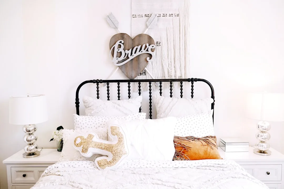
Use nightstands and a properly sized rug to extend the visual anchor of the bed intentionally. The bed shouldn’t look like it’s floating. It should look like it belongs to the room.
What “properly sized” actually means: a rug under a queen bed should extend at least 18 inches on each side and 24 inches at the foot. A 5×8 rug shoved under a queen bed is one of the most common mistakes I see — it looks like the rug is hiding under the furniture rather than grounding it. An 8×10 is the minimum most designers would recommend for a queen, and a 9×12 is often better if the room can absorb it. The rug creates a defined zone that tells your eye where the sleeping area begins and ends, which is a significant part of why some bedrooms feel intentional and others feel like furniture was just placed wherever it fit.
Actionable takeaway: Before moving anything else, stand in your bedroom doorway. Can you see your bed clearly from there? Now lie down — can you see the door without turning your head? If either answer is no, the bed position is the first thing to address.
What the 2/3 Rule for Furniture Actually Means (And When to Break It)
Here’s what I find frustrating about how the 2/3 rule gets explained online: it’s taught as a measurement rule when it’s actually a visual weight rule, and that distinction changes everything about how you apply it.
The rule states that furniture groupings — a dresser with a mirror, a bed flanked by nightstands, a reading chair with a floor lamp — should occupy roughly two-thirds of the wall they anchor against, leaving one-third as negative space. Interior designers cite it as one of the most frequently misapplied proportional guidelines in residential work, and I’d agree. Clients come to me having measured their walls, divided by three, and placed furniture accordingly — then stood back wondering why the room still looks off. The measurement was right. The visual weight distribution was wrong.
Visual weight isn’t the same as physical footprint. A dark walnut dresser reads heavier than a pale oak piece of the same dimensions. A tufted upholstered headboard carries more visual mass than a thin metal frame at twice the width. When you apply the 2/3 rule, you’re calibrating how the eye moves through the room, not where your tape measure lands.
Applied practically to a bedroom: your dresser, nightstands, and any accent furniture should collectively anchor about two-thirds of the available wall space, leaving breathing room that keeps the room from feeling compressed. A room where every inch of wall is claimed by furniture feels like storage, not a place to sleep.
The rule breaks down in rooms under 100 square feet — and I’ll cover those specifically in a later section — where maximizing storage matters more than visual breathing room. It also breaks down when you’re working with architectural features. A chimney breast, a built-in alcove, a bay window — these eat wall space in ways that throw the math off completely, and fighting the math is less useful than reading what your eye actually tells you.
If a layout feels balanced at 55% or at 75% of wall coverage, trust the visual result over the formula. The 2/3 rule is a calibration tool, not a law.
Actionable takeaway: Step back from each wall in your bedroom and squint slightly — not to see detail, but to read mass. Does one wall feel overwhelmingly heavy while another feels empty? That imbalance is what the 2/3 rule is trying to prevent. Adjust accordingly.
The Four Core Rules of Furniture Arrangement (With the One Nobody Talks About)
A 2022 National Sleep Foundation survey identified room disorganization and perceived clutter among the top five environmental factors affecting sleep quality. Not actual clutter — perceived clutter. Which means a room can be physically clean and still feel wrong if the arrangement reads as chaotic. That distinction is worth sitting with before we get into the rules, because it reframes what bedroom furniture arrangement tips are actually solving for. You’re not just moving furniture. You’re managing what the eye perceives at the end of a long day.
Here are the four rules that underpin nearly every functional bedroom layout:
1. Maintain 24 inches of circulation clearance around the bed
This is the minimum, not the target. Twenty-four inches is enough for one person to walk without turning sideways. Thirty inches is comfortable. Anything under 18 inches starts to feel like a squeeze, and over time that friction — the micro-annoyance of navigating your own room — contributes to the ambient sense that something is wrong. If maintaining clearance means downsizing a dresser or removing a bench at the foot of the bed, that trade is almost always worth making.
2. Keep the dominant furniture pieces at or below eye level when seated
A tall armoire placed directly in the line of sight from the bed creates visual pressure — your brain registers it as looming, even if you don’t consciously identify it. Bedroom furniture arrangement tips that address this usually recommend keeping pieces over 60 inches tall on walls that are outside your natural sightlines from bed. If tall storage is unavoidable, placing it near the entry wall rather than the foot or side of the bed significantly reduces that effect.
3. Match furniture scale to room scale, not to personal preference
This one creates more problems than almost anything else I see. People buy the king bed they’ve always wanted in a room that reasonably holds a queen, or they place a large sectional-scale chair in a corner because they love the chair. The room then organizes itself around compensating for the oversized piece instead of functioning as a coherent space. Bedroom furniture arrangement only works when the scale conversation happens before the purchase, not after.
4. Create a visual destination — the one rule most guides skip
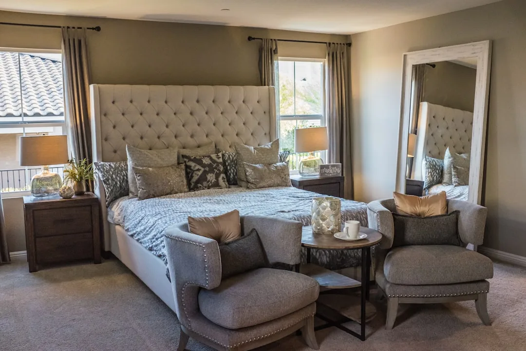
This is the rule that separates arrangements that feel designed from arrangements that just feel organized. Every room that reads as intentional has a visual destination: one focal point that your eye moves toward naturally and settles on. In a bedroom, this is almost always the bed wall — headboard, framed art or wall treatment above it, flanking nightstands, a unified lighting scheme. When that destination exists, everything else in the room reads as supporting it. When it doesn’t exist — when every wall is competing for attention equally — the room feels restless, and no amount of tidying resolves that.
Clearance Numbers That Actually Matter
Most bedroom furniture arrangement advice discusses clearance in vague terms. Here are the specific numbers that come up repeatedly in functional layouts:
- Between bed and opposite wall: 36 inches minimum for a dresser with drawers that open fully; 48 inches preferred
- Between bed and side wall (one side): 24 inches minimum; 30 inches if a nightstand with a lamp is involved
- Closet door clearance: Bifold doors need 24 inches; swing doors need the full door width plus 6 inches
- Between foot of bed and any furniture: 30 inches minimum to avoid the corridor effect
- Walking path width in any direction: 18 inches is functional but uncomfortable over time; 24 inches is the real minimum for a room you use daily
What these numbers reveal is that bedroom furniture arrangement is largely a clearance problem before it’s a style problem. Most arrangements that feel claustrophobic aren’t actually cramped — they’re violating one or two of these clearances in ways that create friction without being obviously visible. Walk your room with a tape measure before you decide the furniture doesn’t fit.
Small Bedroom Arrangements: What Changes When Square Footage Gets Tight
Rooms under 120 square feet operate under different priorities than larger bedrooms, and trying to apply standard arrangement logic to them produces predictably bad results. The primary shift is this: in a small bedroom, vertical space is your primary resource, not floor space.
A few specific changes that apply when square footage is limited:
- Tall, narrow storage beats wide, low storage. A 72-inch tall dresser with a small footprint clears more floor space than a 36-inch tall dresser at twice the width, even if the storage volume is similar.
- Floating nightstands are not just aesthetic. Wall-mounted nightstands eliminate the footprint of two pieces of furniture while keeping the function. In a tight room, recovering those 4 to 6 square feet changes how the room moves.
- Mirrors placed opposite windows. Not for decoration — for the functional effect of making the room read as larger. A floor-length mirror on a wall opposite a window doubles the perceived depth of the space in a way that’s not subtle.
- The bed against the wall trade-off applies here. Losing one-side accessibility is worth the floor space recovery in most single-occupant rooms under 100 square feet.
- Under-bed storage is non-negotiable. If your bed frame doesn’t offer it, a platform with drawers or simple bed risers and shallow bins recovers storage without occupying a single additional square foot of floor space.
The goal in a small bedroom isn’t to make it feel like a larger bedroom. The goal is to make it function without friction — to move through it, sleep in it, and dress in it without navigating obstacle courses. Those are solvable problems regardless of square footage, and they’re solved primarily through arrangement, not renovation.
Frequently Asked Questions About Bedroom Furniture Arrangement
Should the tallest piece of furniture go against the longest wall?
Not automatically. The tallest piece should go where it creates the least visual pressure from your natural sightlines — which usually means the entry wall or a side wall rather than the wall directly facing the bed. Placing a tall armoire or wardrobe at the foot of the bed on the facing wall creates a looming effect that makes the room feel smaller and more closed-in, regardless of how long that wall is.
How do I arrange bedroom furniture in an L-shaped or awkward room?
Start by identifying which section of the room has the best wall configuration for the bed — ideally a solid wall without windows or doors, long enough to accommodate the bed with at least 24 inches of clearance on the accessible side. Treat the two sections of an L-shaped room as having distinct functions: sleeping zone and dressing or seating zone. The awkward angles stop feeling awkward once the room has a clear organizational logic.
Is it bad to put a dresser in front of a window?
It depends on the window. Blocking a window that provides meaningful light and ventilation is worth avoiding. But a small window positioned high on the wall, or a window that faces a wall or fence rather than an open view, may be a reasonable trade if the dresser placement solves a larger arrangement problem. The mistake is treating all windows as equally important. They’re not.
What’s the best bedroom furniture arrangement for a couple with different sleep schedules?
Prioritize clearance on both sides of the bed as a starting point — the partner who wakes earlier needs a path to the door that doesn’t cross directly over the other’s sleeping space. Positioning the bed so the light sleeper is on the wall side and the early riser has the open-side position close to the door resolves most of the practical friction. Separate lighting on each nightstand, independently controlled, handles the rest.
Why does my bedroom look fine in photos but feel wrong in person?
Photos flatten space. A room can photograph as balanced while feeling claustrophobic or off in person because the camera doesn’t register the friction of moving through it, the ceiling height relative to furniture, or the way your eye actually travels around a three-dimensional space. If a room photographs well but feels wrong, the problem is almost always clearance or scale — something is slightly too large for the space, or the walking paths are slightly too tight. Walk the room with a tape measure rather than a camera.