The hallway is the one room in your home that every guest walks through twice — and most decorating guides treat it like an afterthought borrowed from living room advice that was never designed for a 38-inch corridor. Creating a gallery wall for hallway spaces is genuinely different from any other wall display project in your home, and treating it that way from the start is the difference between something that looks curated and something that looks like it happened to you.
Quick Answer
The hallway is the one room in your home that every guest walks through twice — and most decorating guides treat it like an afterthought borrowed from living room advice that was never designed for a 38-inch corridor.
That mismatch explains why so many hallway gallery walls feel off without the homeowner knowing exactly why. The frames are fine. The art is fine. But something about the whole arrangement reads as accidental — like someone hung things and hoped for the best. The problem isn’t taste. It’s that the specific physics of a corridor — the narrow width, the movement, the sequential sightlines — demand a completely different logic than the one most guides hand you.
Here’s what actually works.
Why Hallways Kill Most Wall Display Attempts (And What to Do Instead)
In This Article
- Why Hallways Kill Most Wall Display Attempts (And What to Do Instead)
- What to Actually Put on a Hallway Gallery Wall
- How to Do a Gallery Wall in a Hallway Without Measuring Everything Twice
- The 2/3 Rule for Wall Art (And the One Place It Actually Breaks Down)
- Lighting a Hallway Gallery Wall Without Installing New Fixtures
- How to Refresh a Gallery Wall for Hallway Spaces Without Starting Over
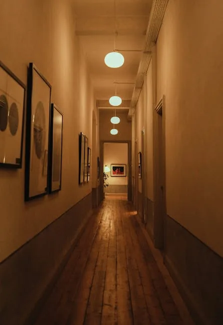
A standard hallway runs between 36 and 42 inches wide. That single fact invalidates most of the gallery wall advice floating around online, because virtually all of it was written for living rooms with 12-foot walls and a sofa to anchor everything.
In a hallway, the viewer is always moving. You don’t stand and study a hallway wall the way you sit across from a fireplace mantle. You walk past it in roughly three seconds, catching it in peripheral and direct vision at close range. That changes everything — what reads as cohesive from eight feet away reads as chaotic from two.
The National Kitchen & Bath Association identifies hallways as the most under-decorated space in American homes, despite the fact that they form the first and last impression of every room they connect. That’s a remarkable design opportunity most homeowners leave entirely on the table.
The shift in thinking you need: stop treating a gallery wall for hallway spaces as a static composition meant to be viewed all at once, and start treating it as sequential storytelling. Each piece is a moment in a short narrative your guests experience while walking. The arrangement has a beginning, middle, and end — even if no one consciously registers it.
Practical implications of this reframe:
- Visual weight shouldn’t all cluster at the hallway entrance. Front-loading your strongest pieces at the start of the corridor leaves the rest of the walk feeling anticlimactic.
- A single repeated visual element (consistent frame finish, a recurring color in the artwork, uniform mat width) gives the moving eye something to track and follow — which feels intentional.
- Empty wall space in a hallway isn’t failure. It’s pacing. The pause between pieces is part of the composition.
- Pieces hung too high disappear when someone is walking with their head at a natural angle. The sweet spot in a hallway is slightly lower than standard picture-hanging height — aim for 56 inches to center rather than the usual 57–60.
- Mixing too many frame orientations (portrait, landscape, square all in one cluster) creates visual noise that compounds at close range. In narrow corridors, limiting yourself to two orientations per cluster keeps things readable.
Takeaway: Before you hang a single nail, walk the hallway three times and notice where your eyes naturally want to land. Those spots are your anchor points — not the corners, not the start.
What to Actually Put on a Hallway Gallery Wall
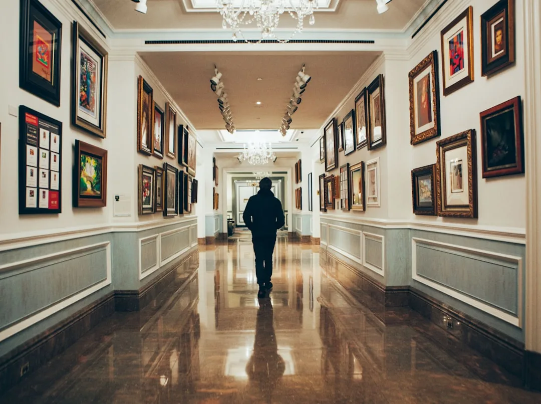
This question gets skipped by most guides, which assume you already have a pile of art waiting to be hung. In reality, the gallery wall for hallway spaces that looks most intentional is usually built from a more deliberate mix of object types — not just framed prints stacked end to end.
The most successful hallway displays tend to combine at least three categories from this list:
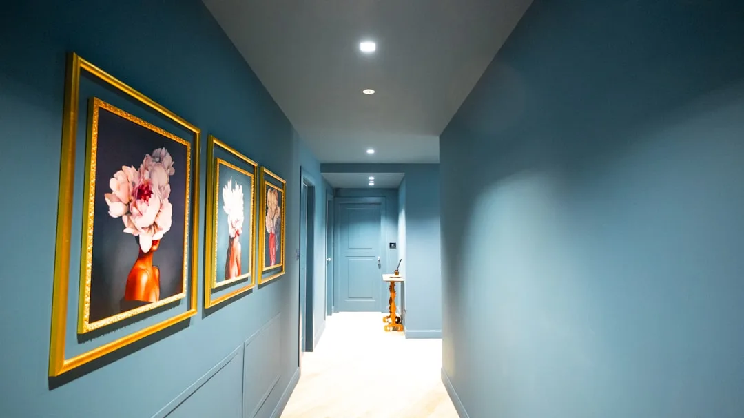
- Framed photography — black and white family photos or travel shots hold up especially well in corridors because they read clearly at close range and low light
- Typographic prints — single words or short phrases that can be absorbed in a glance, which suits the three-second viewing window perfectly
- Mirrors — not just decorative, but functionally useful in narrow corridors; a round mirror in the middle of a gallery arrangement breaks up the flatness and bounces light
- Small shelves or ledges — a single narrow ledge mounted within the arrangement lets you add three-dimensional objects (small plants, ceramic pieces, a single candle) without drilling multiple holes
- Woven or textile pieces — macramé, a small woven wall hanging, or even a piece of fabric in a simple hoop adds texture that photographs and prints can’t provide
- Children’s artwork — in a family home, one or two pieces of framed kids’ art grounded within a more polished arrangement actually raises the overall feel rather than lowering it, because it signals intention
What tends to work against a hallway gallery wall:
- Large oil paintings or heavily varnished pieces that create glare under hallway lighting
- Anything that requires prolonged reading — long quotes, dense typographic prints, detailed maps — because the viewing time just isn’t there
- Shadow boxes deeper than 1.5 inches, which physically narrow the corridor further
- Highly reflective glass in frames placed directly across from a window, which creates uncomfortable glare at certain times of day
The principle underneath all of this: hallway art should reward a glance, not demand a study. Every piece should communicate its essential character within the first second of being seen.
How to Do a Gallery Wall in a Hallway Without Measuring Everything Twice

Every competitor article tells you the same thing: trace your frames onto paper, cut them out, tape them to the floor in a box-shaped area, then transfer the whole arrangement to the wall. It sounds methodical. It’s also somewhat useless for hallways, because a floor layout tells you nothing about how pieces interact in vertical space, under actual hallway lighting, at the close viewing distance of a three-foot corridor.
There’s a faster method that gives you more accurate information.
Use kraft paper cutouts taped directly to the wall. Trace each frame or object onto brown kraft paper, cut it out, and start arranging on the wall itself using painter’s tape. You’re not drilling anything — you’re seeing the real composition in real light at real height. Move pieces around until the arrangement feels right, then mark your hanging points through the paper. Total time: about 45 minutes, including the time you’d have spent on a floor layout anyway.
The bigger upgrade: don’t start at the left edge of the wall and work right. Instead, find the visual midpoint of the hallway’s longest wall and place your anchor piece there first. Interior design research consistently shows that arrangements anchored at the visual midpoint of a long wall are rated as significantly more intentional by viewers than those that start at one edge — even when the total number of pieces is identical. Starting from the middle creates natural, relaxed balance as you work outward in both directions, rather than the slightly off-kilter feeling of a composition that begins at a corner.
For narrow hallways under 40 inches wide, frame depth matters more than most people realize. Frames that project more than 1.5 inches from the wall — heavily molded ornate frames or deep shadow box styles — eat into the already-tight passage and make the space feel physically cluttered, not just visually busy. In a corridor that tight, lean toward frames with minimal projection: thin metal profiles, flat wood frames, or frameless canvas wraps.
A quick planning sequence that works:
- Identify your anchor piece — your largest, most visually interesting item
- Tape its kraft paper cutout at the midpoint of the wall, centered at 57–60 inches from the floor
- Add flanking pieces outward in both directions, keeping 2–3 inches between edges
- Step back, then walk through at normal pace — not standing still — and adjust
- Once satisfied, use a pencil to mark hanging points through the kraft paper before removing it
- Double-check hardware weight ratings before driving any nail — hallway vibration from foot traffic and door closures is real, and pieces hung with insufficient hardware work loose faster than they would in a static room
Takeaway: Ditch the floor layout entirely. Kraft paper on the actual wall gives you better spatial information in half the time.
The 2/3 Rule for Wall Art (And the One Place It Actually Breaks Down)
The 2/3 rule is one of those design principles that sounds authoritative and holds up well — right up until you apply it somewhere it doesn’t fit, which is exactly what hallways often are.
The rule itself: a piece of art or wall grouping should span roughly two-thirds of the width of the surface, furniture, or architectural feature it relates to. Hang art above a 60-inch console table? Your arrangement should run about 40 inches wide. The logic is solid and traces directly back to classical proportion — specifically the golden ratio of approximately 1:1.618, which the simpler 2/3 fraction (0.667) closely approximates in practical use. It’s one of those cases where a design shortcut actually has mathematical grounding.
In hallways without furniture, the “furniture” becomes the wall segment between two architectural breaks — a doorframe on one end, a window or corner on the other. Measure that span and target 60–66% coverage with your arrangement. That guidance holds.
Where it falls apart: long, unbroken hallway walls. Applying the 2/3 rule strictly to, say, an 18-foot wall leaves awkward, arbitrary dead zones at each end with no architectural logic to explain them. The better approach for a long unbroken hallway wall is to break it into implied zones rather than treating it as a single surface.
Here’s how to apply that in practice:
- Identify natural visual breaks — a light switch, an outlet, a change in baseboard height — and treat each segment between them as its own mini-surface
- Apply the 2/3 rule within each segment independently
- Use consistent frame finish or mat color across all segments to signal that the separate clusters belong to a unified scheme
- Leave slightly more breathing room between clusters than between individual pieces within a cluster — that gap is what creates the implied zone boundary
This approach solves the dead-zone problem without abandoning the proportional logic that makes the 2/3 rule useful in the first place.
Lighting a Hallway Gallery Wall Without Installing New Fixtures
Most hallways are lit by a single overhead fixture — often a flush-mount positioned near the center of the ceiling, which is nearly the worst possible light source for a wall display. It throws flat, downward light that creates shadow below each frame and washes out anything hung above eye level.
The good news: you have more options than most people realize, and several of them require no electrician and no new holes in the ceiling.
Battery-powered picture lights have improved dramatically in the last few years. The better models run on rechargeable batteries, have adjustable color temperature (warm white around 2700K reads best in most hallways), and can mount directly to the top of a frame or to the wall just above a cluster. A single picture light above the anchor piece of a gallery wall for hallway spaces changes the entire mood of the display — it signals that the arrangement was considered, not accidental.
Options to work with what you have:
- Swap your existing fixture bulb for a directional LED that angles toward the primary wall. Some flush-mount fixtures accept BR30 bulbs, which have a built-in reflector and throw light in a controlled direction rather than straight down.
- Use plug-in sconces on either side of the display rather than above it. Flanking light sources minimize harsh shadows and create the kind of even wash that makes a gallery arrangement look polished.
- Add a small table or console below the display with a lamp on it. The upward light from a table lamp is flattering to wall art in a way that overhead fixtures simply aren’t, and it adds another layer of intentionality to the whole scheme.
- Clip-on picture lights attached directly to individual frames work well for a single hero piece within a larger arrangement — use them selectively rather than on every frame.
What to avoid: cool white or daylight-temperature bulbs (5000K+) in hallway lighting. They make warm-toned wood frames look gray and drain color from photography. Stick to 2700–3000K for a hallway gallery wall that looks rich rather than clinical.
How to Refresh a Gallery Wall for Hallway Spaces Without Starting Over
Most hallway gallery walls get abandoned rather than evolved. The homeowner hangs everything, lives with it for two years, gets tired of it, and then either leaves it indefinitely or tears it all down and starts from scratch. Both outcomes waste the work already done.
A gallery wall for hallway spaces is actually one of the easiest displays in your home to refresh in stages, because the corridor format allows you to swap individual pieces without disrupting the whole composition. The key is building that flexibility in from the start.
Strategies for a gallery wall that ages well:
- Use picture rail hooks or rail systems where possible. A picture rail — a horizontal molding near the ceiling from which wires or cords hang — lets you move pieces horizontally along the wall without adding new holes each time. Many older homes already have them; they can also be added with minimal installation.
- Keep one or two “placeholder” positions in the arrangement — spots designated for rotating pieces that change seasonally or whenever you find something new. These positions should sit toward the edges of the arrangement, not at the center anchor point.
- Invest in quality frames once and swap prints within them. A set of five matching frames that you reuse for years costs less over time than buying new framed pieces every time your taste shifts.
- Document your current layout with a photograph before you change anything. This sounds obvious and almost no one does it. Having a reference image means you can return to a layout that worked if the new experiment doesn’t.
- Add rather than replace when the display starts feeling stale. A single new piece added to an existing arrangement often reads as fresher than swapping multiple pieces, because it changes the visual rhythm without dismantling what was already working.
The hallway gallery wall that looks most intentional after five years is almost never the one that was hung perfectly on day one and never touched. It’s the one that was treated as a living thing — adjusted slowly, with each change considered against what was already there.
Frequently Asked Questions About Gallery Walls for Hallways
How many pieces do I need for a gallery wall in a hallway?
There’s no fixed number, but the corridor format has a practical ceiling: most hallways can absorb between five and twelve pieces before the arrangement starts reading as cluttered at close viewing distance. For a short hallway under eight feet, three to five pieces in a tight cluster often works better than a sprawling arrangement. For a longer run of wall, seven to ten pieces spread across two or three implied zones tends to hit the right balance between fullness and breathing room. The better question to ask isn’t “how many pieces” but “does the arrangement feel resolved” — which you can only answer by walking past it at normal pace, not standing still in front of it.
What size frames work best for a narrow hallway?
In hallways under 40 inches wide, mid-size frames in the 8×10 to 11×14 range are the workhorses. They’re large enough to register visually as you walk past, but not so dominant that they make the corridor feel like it’s closing in. One larger anchor piece — up to 16×20 — works well at the midpoint of the arrangement. Anything larger than that in a narrow hallway tends to feel oppressive rather than dramatic. Avoid going too small as well: a collection of 4×6 frames in a tight hallway disappears entirely, especially in lower light.
Do I need to use matching frames for a hallway gallery wall?
No, but you need some unifying logic if you’re mixing frames. The most flexible approach: vary the frame style (thin metal, chunky wood, ornate plaster) but hold one element constant — finish color. A collection of frames in different styles but all in black, or all in natural wood tones, reads as curated. A collection of frames in different styles AND different colors with no connecting thread reads as accumulated. The other reliable approach is to vary finish and style freely but use identical mats throughout — uniform white mats act as a visual reset between pieces and make almost any combination of frames look intentional.
How high should I hang a gallery wall in a hallway?
The standard recommendation of 57–60 inches to center applies in hallways, but lean toward the lower end of that range — 56 to 57 inches — because hallway viewing happens at close range and at a slight downward angle of the head. Art hung at the upper end of the standard range can feel like it’s looming in a narrow space. For arrangements that include both larger and smaller pieces, center the anchor piece at 57 inches and let surrounding pieces float around it rather than forcing every piece to share the same center line — a slight variation in vertical positioning within the arrangement (keeping most pieces within a 6-inch vertical band) actually looks more deliberate than a perfectly rigid grid.
Can I create a gallery wall in a very short hallway or entryway?
Short hallways — anything under six feet of usable wall — actually work well for gallery walls because the limited length forces a tight, decisive composition. Three to five pieces in a compact cluster tend to perform better than a sparse spread in a short corridor. The key adjustment: treat the short wall as a single composition anchored at the exact center, and resist the urge to fill every inch. A tight cluster with clear empty space on either side reads as intentional in a way that edge-to-edge coverage in a small space does not. If the hallway doubles as an entryway, prioritize one piece that can be seen directly upon entering — that single sightline anchor is worth more than a complex arrangement nobody ever fully faces.