The Metropolitan Museum of Art will give you 490,000 pieces of wall-ready art for free — and most people decorating on a budget have never heard of it. That’s not a footnote. That’s the whole point of this article: the resources that would make budget friendly gallery wall ideas actually look designed are sitting in plain sight, and the advice recycling through every other guide on this topic is too busy telling you to “check your local thrift store” to mention any of them.
Quick Answer
The Metropolitan Museum of Art will give you 490,000 pieces of wall-ready art for free — and most people decorating on a budget have never heard of it.
Eleven years of client work across Chicago and New York taught me one thing about decorating on a budget: the gap between cheap and cheap-looking is almost never about money. It’s about sequencing. People skip the planning, rush to hang, and then can’t figure out why a wall full of frames they love looks like a yard sale. This article is about the step that creates that gap — and how to close it without spending more than you already planned to.
How to Do a Gallery Wall for Cheap (Without It Looking Like You Did)
In This Article
Most budget gallery wall advice fails before it starts because it treats aesthetics as the goal. The goal is a wall that feels right to live with — one that doesn’t announce its budget every time you walk past it.
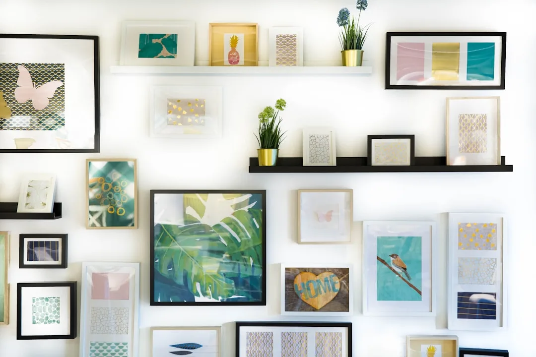
The single most common mistake I see is inconsistent undertones across frames — not the price of the frames themselves. You can thrift twelve frames in an afternoon, but if six of them have warm honey-brown undertones and six have cool gray-black finishes, the wall reads as chaotic no matter how carefully you space them. The frames don’t have to match. They have to agree.
One coat of paint fixes this. Not spray paint — spray paint creates bubbles on raw wood and uneven plastic frames, and I learned this the hard way after ruining a set of frames for a client’s nursery in Wicker Park. Use chalk paint or a satin latex in a single color: matte black, warm white, and terracotta are all strong choices right now. Brush it on, let it dry fully, and your mismatched thrift haul suddenly looks like a deliberate collection.
The other mistake that budget guides quietly encourage is buying volume. Twelve frames at $2 each feels like a win. It almost never is. The anchor-and-fill method — three statement pieces that do the structural work, surrounded by four to six smaller supporting pieces — consistently outperforms a wall of uniform fillers at the same total cost. The eye needs something to land on. Without an anchor, it just wanders.
For the art itself, pharmacy photo centers are drastically underused. CVS and Walgreens consistently price 8×10 prints between $3 and $5. The same size through a dedicated online art print retailer runs $18 to $40 — for identical paper, dramatically different margin. Pair that with free high-resolution downloads from museum archives, and the art portion of your project becomes almost free.
The Metropolitan Museum of Art alone offers over 490,000 free high-resolution images through its Open Access program. These are not low-quality scans. Many are suitable for printing at 16×20 and larger. Most decorators scrolling through art print Etsy shops have genuinely never heard of this.
Other free and low-cost art sources worth bookmarking:
- The Art Institute of Chicago — over 50,000 images in the public domain, downloadable at print resolution
- The Rijksmuseum — Dutch Golden Age paintings including Vermeer and Rembrandt, free high-res downloads
- Rawpixel.com — curated public domain art organized by style, color palette, and era, which makes matching across a wall much faster
- Unsplash — free photography under a license that permits personal printing; search by color for cohesive results
- Wikimedia Commons — less curated but enormous; useful when you’re hunting for a very specific subject or period
One detail these sources rarely mention: file format matters. Download the highest-resolution TIFF or JPEG available, not whatever the default download button serves you. On the Met’s site, look for the “Download” button on the full image page — it defaults to a medium file, but clicking through to the full original gives you a dramatically larger file. That difference shows up clearly when you’re printing at anything above 8×10.
Choosing a cohesive color story before you source art is as important as the frame finish. This is another step that most budget friendly gallery wall ideas skip entirely. Decide whether you’re working in warm tones, cool tones, or a neutral palette, and filter every piece you source through that lens. A photograph with a blue-gray cast and a botanical print with amber-yellow tones will fight each other on the wall even if both pieces are individually beautiful. When you’re sourcing from free archives, you have thousands of options — use that abundance to be selective, not just comprehensive.
Actionable takeaway: Before buying a single frame, decide on one unifying finish color. Paint everything that color before you hang anything. That one decision does more for your wall’s final look than any individual piece you put on it.
The 2/3 Rule for Wall Art (And the Part Every Tutorial Leaves Out)
Every tutorial defines the 2/3 rule. Almost none of them explain why it exists — and without understanding why, you can’t adapt it intelligently when your budget limits your options.
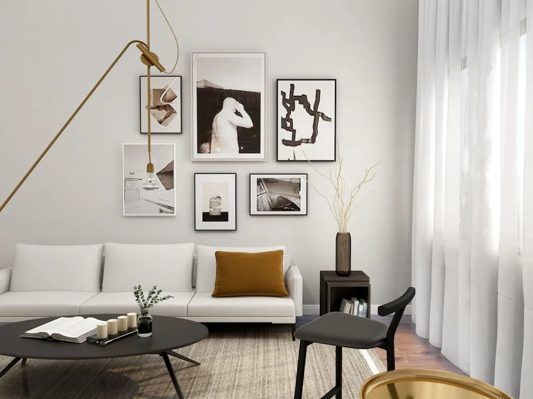
The 2/3 rule states that wall art, or a gallery arrangement treated as a single unit, should span approximately two-thirds the width of the furniture piece it hangs above. Above a 72-inch sofa, your arrangement should read as roughly 48 inches wide. The rule exists because of visual weight — art that’s too narrow appears to float, disconnected from the furniture below it. Art that’s too wide competes with the room’s architecture rather than anchoring the seating zone.
Here’s what tutorials leave out: you don’t need more frames to hit two-thirds width. A tight cluster of three or four pieces, centered within the two-thirds zone, reads correctly from across the room. Negative space between your cluster and the edges of the two-thirds boundary is not a failure. It’s a decision. The eye reads the implied boundary, not the literal one.
The height rule that pairs with the 2/3 rule is just as important, and just as frequently broken. 57 inches from floor to the center of your arrangement is the standard used by most museums and galleries — not because someone invented a number, but because it matches average human eye level for someone standing between 5’4″ and 5’6″. It’s not arbitrary. It’s calibrated to how people actually look at walls.
The budget mistake this creates: people hang art too high, usually because they’re trying to fill vertical wall space or because they’re measuring from the top of their furniture instead of from the floor. Both errors break the 2/3 rule and the eye-level rule simultaneously — and the result is a wall that feels disconnected from the room, no matter how good the individual pieces are.
How to apply this on a budget without buying more pieces:
- Measure two-thirds of your sofa or bed width and mark that span lightly in pencil on the wall
- Center your arrangement within that span, not within the full wall width
- Measure 57 inches from the floor and mark the center point of where your arrangement will sit
- Treat the cluster of frames as a single object when doing both calculations
- Test your layout on the floor first using painter’s tape to outline each frame before committing a single nail hole
- Photograph your floor layout from standing height — this approximates how it will read on the wall better than crouching over it does
The spacing question that comes up constantly: how far apart should frames be? The standard answer is 2 to 3 inches between frames. The better answer is: consistent, whatever that number is. A wall where every gap measures exactly 2.5 inches reads as intentional. A wall where gaps range from 1 inch to 5 inches reads as rushed, regardless of how good the individual pieces are. Use a small piece of cardboard cut to your chosen gap width as a spacer while you’re working — it costs nothing and eliminates the guesswork that produces uneven walls.
Mixing frame sizes is where budget friendly gallery wall ideas either succeed or collapse. The rule of thumb I use with clients: no more than three distinct frame sizes in a single arrangement, and each size should appear at least twice. A 4×6, an 8×10, and a 16×20 are a workable trio. Adding a 5×7, an 11×14, and a 12×16 to that same wall creates a sizing confusion that no amount of careful spacing can fix. Constraints on frame sizing, counterintuitively, create more visual freedom — the eye can group and categorize what it sees, which makes the whole arrangement feel more deliberate.
Actionable takeaway: Measure before you hang anything. Write “57 inches from floor” on a piece of tape and stick it to the wall as a reference point. Every frame decision gets easier once you have a fixed center to work from.
Are Gallery Walls Out of Style?
Honest answer: it depends entirely on how you define gallery wall, and most people are working with an outdated definition.
The version that feels dated is the one that dominated 2014 through 2019 — symmetrical grids of identical white frames, all the same size, hung with millimeter precision over a shiplap feature wall. That specific expression of the gallery wall has aged. The underlying idea — grouping meaningful images and objects on a wall in a way that reflects the person who lives there — has not aged and will not age, because it’s not a trend. It’s just decorating.
What’s replaced the symmetrical grid in current interiors is something looser and more personal. Mixed media arrangements that include frames alongside small shelves, ceramic objects, woven pieces, or even architectural salvage. Asymmetric layouts that feel accumulated rather than installed. Fewer frames, chosen more carefully, with more breathing room between them. The movement is away from the curated-showroom look and toward something that reads as genuinely lived-in.
For anyone working on budget friendly gallery wall ideas right now, this shift is actually good news. The most current version of a gallery wall is also the most forgiving to execute on a limited budget — because it doesn’t require precision matching, it doesn’t require large quantities of frames, and it rewards personal objects that cost nothing over purchased prints that cost a lot. A wall that includes a child’s drawing, a postcard from a trip, a small mirror, and three museum prints in mismatched frames is more interesting and more current than a perfect grid of identical white frames ever was.
The staircase wall is a specific case worth addressing separately. It’s one of the most commonly searched gallery wall configurations, and it has its own set of rules. The arrangement should follow the diagonal of the stair — frames positioned so their centers track along an imaginary line parallel to the stair angle, not hung at uniform heights from the floor. The spacing between frames should be identical going both horizontally and diagonally. Getting this right on a budget means doing the math before you start: measure the rise and run of your staircase, calculate the diagonal, and map your frame centers along that line before a single nail goes in.
What to Do When Your Budget Is Truly Minimal
There is a version of this project that costs almost nothing, and it’s worth being specific about it.
The all-in budget breakdown for a seven-piece gallery wall:
- Frames: Estate sales, Facebook Marketplace, and Goodwill reliably produce frames in the $0.50 to $2 range. Seven frames at an average of $1.50 each: $10.50
- Paint: A small sample pot of chalk paint runs $4 to $6 at most hardware stores and covers far more frames than you’ll need
- Art: $0 if sourced entirely from museum open access programs, printed at a pharmacy photo center
- Pharmacy printing (seven prints, mix of 4×6 and 8×10): approximately $20 to $28
- Painter’s tape for layout testing: $4 if you don’t already have it
- Command strips or nails: $6 to $10 depending on wall type
Total: $45 to $58 for a seven-piece gallery wall, including frames, art, and hanging hardware. That’s the actual floor of this project when you sequence it correctly.
The places people inadvertently spend more than they need to are predictable: buying frames new because thrifting feels uncertain, printing through online art retailers instead of pharmacy counters, and buying more frames than the anchor-and-fill method requires. Those three habits alone typically triple the cost of a project that didn’t need to cost more than $60.
Matting is the one place I would encourage spending a little more than feels necessary. A frame that costs $1 at a thrift store can look like a $40 frame if it contains a well-cut mat — because matting adds perceived depth and signals that someone thought carefully about the presentation. Pre-cut mats at craft stores run $3 to $6 each. Custom-cut mats from a local frame shop are more, but they’re cut to the exact dimensions you need, which eliminates the fitting problems that pre-cut mats sometimes create with non-standard thrifted frames. The mat is not where you cut corners on a budget gallery wall.
Frequently Asked Questions
How many pieces do I need for a gallery wall?
Seven to nine pieces is the range that works best for most walls. Below seven, the arrangement can feel sparse unless the individual pieces are quite large. Above twelve, it becomes difficult to maintain visual coherence without a very deliberate layout system. If you’re working within the anchor-and-fill method, start with three anchor pieces and add supporting pieces until the wall feels balanced — which usually happens somewhere between four and six supporting pieces. The specific number matters less than having a clear anchor that the eye returns to.
Can you do a gallery wall with all different frame colors?
Technically yes, but the result is almost always weaker than a unified finish approach. The exception is when the variation in frame color is itself the organizing principle — an entirely black-and-white photograph collection can work in mixed natural wood frames, for instance, because the art creates the cohesion that the frames don’t. In most cases, painting frames a single color before hanging is the single highest-return intervention available on a budget gallery wall. It costs less than $10 in paint and does more for the finished look than any other single decision.
What’s the best wall for a first gallery wall?
A wall with a natural stopping point on at least two sides — a doorframe, a window, a corner — is significantly more forgiving than an open expanse of wall. The architectural boundary does some of the visual containment work for you, so the arrangement doesn’t have to float and define its own edges simultaneously. The wall behind a sofa is the most common starting point for a reason: the furniture anchors the bottom boundary, the ceiling provides the top, and you only need to manage the left-right span. For a first project, that constraint is helpful.
How do you hang a gallery wall without damaging the wall?
Command strips rated for the weight of your frames work reliably on painted drywall for frames up to approximately five pounds. For heavier frames, a nail into a stud is more reliable — locate studs with a stud finder or the knock-and-listen method before you commit to a layout. The painter’s tape floor layout method is worth doing regardless of your hanging approach, because it lets you finalize your arrangement before any nail holes or adhesive marks exist. Once you’ve photographed and confirmed your floor layout, transfer measurements to the wall rather than re-eyeballing the spacing from scratch.
How do you refresh a gallery wall that already looks dated?
The fastest intervention is usually editing, not adding. Remove the pieces that feel most dated — often the most on-trend pieces from whenever the wall was originally installed — and see what remains. In many cases, the remaining pieces create a more interesting arrangement with less visual noise than the full wall did. Replacing identical white frames with a painted-to-match mix of thrifted frames is the second intervention, and it’s worth doing before replacing any of the art. The frame finish ages faster than most of the art will.