Most rooms painted chocolate brown look wrong for the same reason: the designer treated brown like a neutral and forgot it behaves like a dominant — and that single misunderstanding explains every dark, heavy, claustrophobic room you’ve walked into and immediately wanted to leave.
Quick Answer
Most rooms painted chocolate brown look wrong for the same reason: the designer treated brown like a neutral and forgot it behaves like a dominant — and that single misunderstanding explains every dark, heavy, claustrophobic room you’ve walked into and immediately wanted to leave.
Brown doesn’t sit quietly in the background the way greige does. It asserts itself. It pulls light toward it, it anchors everything around it, and if you don’t build the room with that force in mind — if you just slap it on one wall and call it an accent — it will fight everything else in the space and win badly. I watched this happen in a Wicker Park condo in 2016: a client had painted a single wall in a deep espresso brown, surrounded by cool gray furniture and white trim, and the whole room looked like someone had made a mistake. Which they had. Just not the one they thought.
Chocolate brown interior design isn’t complicated. But it is unforgiving — and the difference between a room that feels like a five-star hotel and one that feels like a dentist’s waiting room from 1987 comes down to about six decisions, most of which have nothing to do with the paint itself.
The Real Reason Chocolate Brown Interior Design Fell Off — And Why Designers Brought It Back
In This Article
- The Real Reason Chocolate Brown Interior Design Fell Off — And Why Designers Brought It Back
- What Colors Actually Go With Chocolate Brown Interior Design (Skip the Generic Lists)
- The 3-5-7 Rule in Interior Design and How to Use It With Brown Tones Without Getting It Wrong
- Is Chocolate Brown a Flattering Color for a Room — Or Does It Make Spaces Feel Smaller?
- How to Layer Chocolate Brown So It Feels Luxe, Not Heavy
- Room-Specific Moves: Where Chocolate Brown Performs Best (And One Place to Use It Sparingly)
- What Color Top Goes With Chocolate Brown? (Applying Fashion Color Logic to Your Rooms)
- What You Can Do Today
There’s a specific era of American interior design that most professionals quietly want to forget, and it runs roughly from 1997 to 2009. This was the period when big-box furniture retailers decided that dark brown was “rich” and started building entire product lines around it. Chunky espresso-finish bedroom sets. Brown microfiber sectionals with matching ottomans. Complete “room kits” — God, I hated those — where every piece was the same muddy brown, the same gloss level, the same visual weight.
By 2012, brown had a reputation problem. Not because the color was wrong, but because the execution had been so relentlessly mediocre for so long that the association was impossible to shake.
What replaced it? Gray. Then greige. Then the long, slow tyranny of all-white interiors that peaked around 2017 and felt cleansing for about eighteen months before everyone realized their homes looked like a tech company’s lobby. The post-pandemic design shift was a reckoning — people who’d spent a year and a half inside their homes finally admitted that “clean” and “calm” are not the same thing, and that a room with no warmth, no depth, and no visual tension is just boring in a very expensive way.
Editorial design moved first. Architectural Digest and its French counterpart began publishing rooms where chocolate brown wasn’t a background note but a full structural commitment — walls, upholstery, millwork, all pulling in the same direction. The result looked nothing like the flat, matchy rooms from the early 2000s. It looked deliberate. Considered. Expensive.
Google Trends data supports the timing: searches for “chocolate brown interior” surged measurably after 2021, tracking directly alongside the rise of related searches like “warm neutrals” and “cozy home aesthetic.” This wasn’t nostalgia. It was correction.
The design world didn’t bring chocolate brown back because it’s timeless — every color gets called timeless by someone trying to sell it. They brought it back because they finally learned how to use it properly.
Takeaway: If you dismissed chocolate brown because of what it looked like in 2003, you’re rejecting a different color than the one designers are working with now. The palette hasn’t changed. The understanding has.
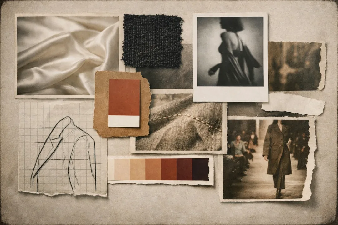
What Colors Actually Go With Chocolate Brown Interior Design (Skip the Generic Lists)
Every color pairing guide for chocolate brown leads with the same trio: cream, gold, and sage. And look — those work. I’m not going to pretend they don’t. But they’ve been repeated so many times that rooms built around them now feel like they were assembled from a mood board someone found on Pinterest in 2019. You can do better.
Here’s what the guides don’t tell you, but should: chocolate brown sits within the red-orange family on the color wheel, which means its true complements lean toward muted blues and cool greens — not gold, which is an analogous pairing, not a complementary one. Gold works because it’s warm, not because it’s correct. The distinction matters when you’re trying to build a palette with actual visual tension rather than one that just feels cozy.
Pairings that most articles won’t mention, and why they work:
- Dusty rose and chocolate brown. The overlap in warm undertones creates cohesion without contrast. This is the pairing that makes a room feel like it has a point of view. Not pink-and-brown in the way a 1970s bathroom was pink-and-brown — dusty rose has enough gray in it to read as sophisticated.
- Cobalt blue and chocolate. High contrast, and when applied with the 70/20/10 method — which I’ll cover in the next section — it reads as deliberate and expensive rather than chaotic. The key is volume: cobalt works as the accent, not the co-star.
- Deep olive or moss green. Underrated. Completely. This combination reads as editorial and earthy without tipping into rustic, which is the thing most people are trying to avoid.
- Warm white, specifically. Not cool white. This matters more than most people realize. Cool white has blue undertones that actively fight the warmth in chocolate brown. The result looks wrong in a way that’s hard to diagnose — you know something is off, but you blame the furniture instead of the trim color.
What to avoid: cool grays, stark blacks that flatten depth rather than adding it, and anything with a strong blue-green undertone.
Takeaway: Before you buy a single throw pillow or paint a single sample, identify the undertone of your specific chocolate brown (red-leaning or yellow-leaning) and build every other choice from that base.
The 3-5-7 Rule in Interior Design and How to Use It With Brown Tones Without Getting It Wrong
Quick clarification before anything else: the 3-5-7 rule and the 60-30-10 rule are the same thing described with different framing. The paint and textile industries tend to use 60-30-10 because percentages feel more actionable. The staging and furniture world tends to use 3-5-7 because the numbers suggest piece counts. Both refer to the same proportional logic — one dominant color, one secondary, one accent — and understanding this removes a source of confusion I’ve seen trip up clients who’d read conflicting guides before calling me.
Here’s how the logic applies specifically to chocolate brown:
When brown is your dominant (roughly 70% of the room’s visual weight — walls, large upholstery, or both), the secondary (roughly 20%, usually textiles, rugs, and mid-sized furniture) needs to be warm but lighter: camel, warm cream, or aged linen. The accent — 10%, and only 10% — can afford to be bold. Cobalt. Rust. A deep forest green. At this volume, those colors create energy without destabilizing the room.
The mistake I see constantly: someone puts a chocolate brown sofa in a room that’s otherwise cream and white, thinks they’ve used brown as a grounding accent, and then wonders why the whole room feels heavy and unresolved. Because it is. A single large piece of chocolate brown in a light room reads as an intrusion. It doesn’t anchor the space. It dominates it without permission — all the weight of a dominant color applied in the wrong position.
When to flip the rule entirely:
- In maximalist rooms with pattern-heavy textiles, brown works beautifully as the 20% secondary — it anchors the pattern without competing with it.
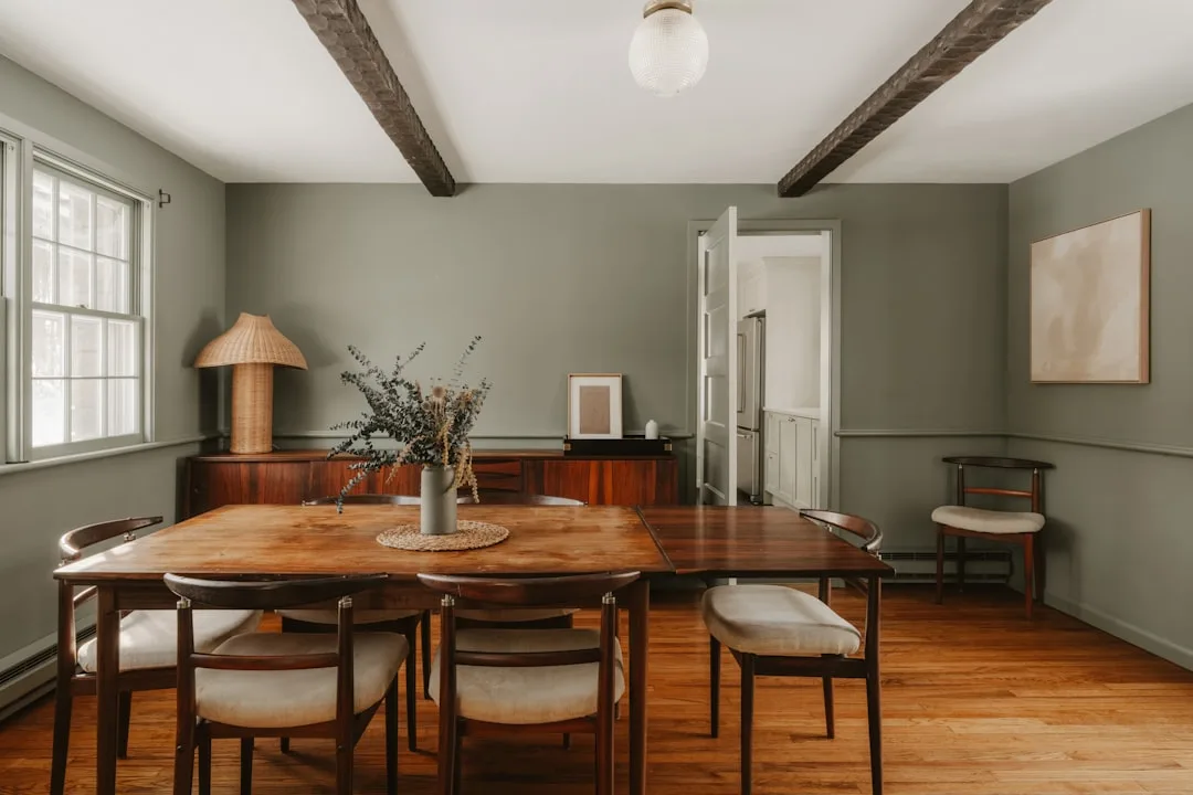
- In rooms where the architecture is the star (exposed beams, detailed millwork, strong window shapes), brown as a supporting role lets the structure speak.
Takeaway: Decide what job chocolate brown is doing before you commit — dominant, secondary, or accent — and then design every other decision around that role, not the other way around.
Is Chocolate Brown a Flattering Color for a Room — Or Does It Make Spaces Feel Smaller?

The question I got asked more than almost any other, across eleven years of client work, was some version of: will this make my room feel smaller? And the honest answer is — it depends on conditions that have nothing to do with the color and everything to do with the room.
Ceiling height is the single biggest factor. Chocolate brown on walls in a room with 9-foot or higher ceilings reads as dramatic and intentional. In a room with 8-foot ceilings, it reads as pressing. Not always — a light ceiling and reflective surfaces (mirrors, lacquered furniture, brass hardware) can compensate significantly — but you’re working against gravity instead of with it.
Natural light is the other deciding variable, and it’s the one most people underestimate. South- and west-facing rooms with warm afternoon light are almost ideal for chocolate brown — the light enriches the tone rather than fighting it. North-facing rooms are workable but require intervention. Specifically, warm artificial lighting at 2,700K to 3,000K is essential. Research on interior lighting consistently shows that bulbs above 4,000K — the cool white and daylight range — desaturate warm brown pigments and can make them appear grayish or outright muddy on the wall. The color you tested in the paint store, under fluorescent lighting, is not the color you’ll live with.
A few things that matter more than most guides acknowledge:
- Finish choice. Matte finishes in chocolate brown feel sophisticated and absorb light in a way that reads as intentional depth. Satin and gloss introduce a sheen that can look cheap on dark colors in residential settings — it works in commercial spaces where the lighting is controlled, not in most homes.
- Furniture scale. An oversized sofa in chocolate brown in a mid-sized room reads as a design choice. Three scattered small brown pieces in the same room read as an accident waiting for a solution.
Takeaway: Test your paint sample under the lighting conditions you’ll actually live with — not midday with all the lights off — and make the ceiling and reflective surface decisions before the paint goes on the walls.
How to Layer Chocolate Brown So It Feels Luxe, Not Heavy
This is where most execution fails. Not in the color choice, not in the palette — in the flat, one-note delivery that makes a chocolate brown room feel like a cave rather than a sanctuary.
The problem is almost always texture. Or rather, the absence of it.
Tonal layering — using three or more values within the same hue family to create depth — is a technique that luxury hotel designers use almost reflexively, and it is completely distinct from monochromatic design. Monochromatic uses one hue at different saturations. Tonal layering works with a family of related but distinct shades: espresso walls, caramel leather armchair, milk chocolate linen throw. Each reads as brown. None of them is exactly the same brown. The variation creates visual movement that a single flat shade cannot.
The texture stack I come back to most consistently: matte walls paired with linen or velvet upholstery, leather or warm wood accents, and metallic hardware — specifically brass or unlacquered bronze, never chrome or nickel near deep brown. Each surface reflects light differently. The matte wall absorbs it. The velvet catches it at an angle. The leather bends it. The brass throws it. Together, they prevent the visual monotony that makes people walk into a brown room and immediately feel tired.
Some specifics that make a measurable difference:
- Rugs. The single highest-impact decision in a chocolate brown room is the rug. A warm ivory or natural sisal rug prevents the floor from visually merging with dark furniture and grounds the space without interrupting the palette. I’ve seen this one swap — just the rug — transform a room that felt like a problem into a room that felt like a solution.
- Plants. I know. I said I distrust vague “add some greenery” advice. But here’s the specific version: deep greens — monstera leaves, olive-toned plants, anything with large leaf mass — act as a natural break in an all-brown scheme in a way that light-green or variegated plants don’t. The contrast in value is what matters, not the presence of a plant.
- Mixed brown shades. Espresso, caramel, milk chocolate in the same room, done intentionally, reads as layered. The same single shade on every surface reads as underdeveloped.
Takeaway: Before you question the color, count your textures. If everything in the room has the same surface quality, add a material — not a different color.
Room-Specific Moves: Where Chocolate Brown Performs Best (And One Place to Use It Sparingly)
Not every room is equally forgiving, and a lot of the anxiety people carry about chocolate brown comes from applying advice meant for one room type to a completely different situation.
Bedrooms are where chocolate brown earns its reputation without effort. The cave effect — that enclosed, cocooning quality that makes dark rooms feel oppressive in a living room — is exactly what you want in a space designed for sleep. A feature wall behind the headboard in deep chocolate brown changes the entire sleep quality of a room in a way I’ve had clients call me specifically to thank me for. Embarrassing but true. Full wrap works beautifully if the warm lighting is in place; without it, even a bedroom can feel like a mistake.
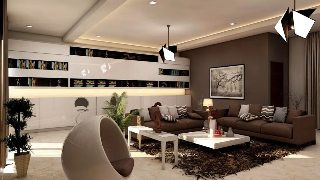
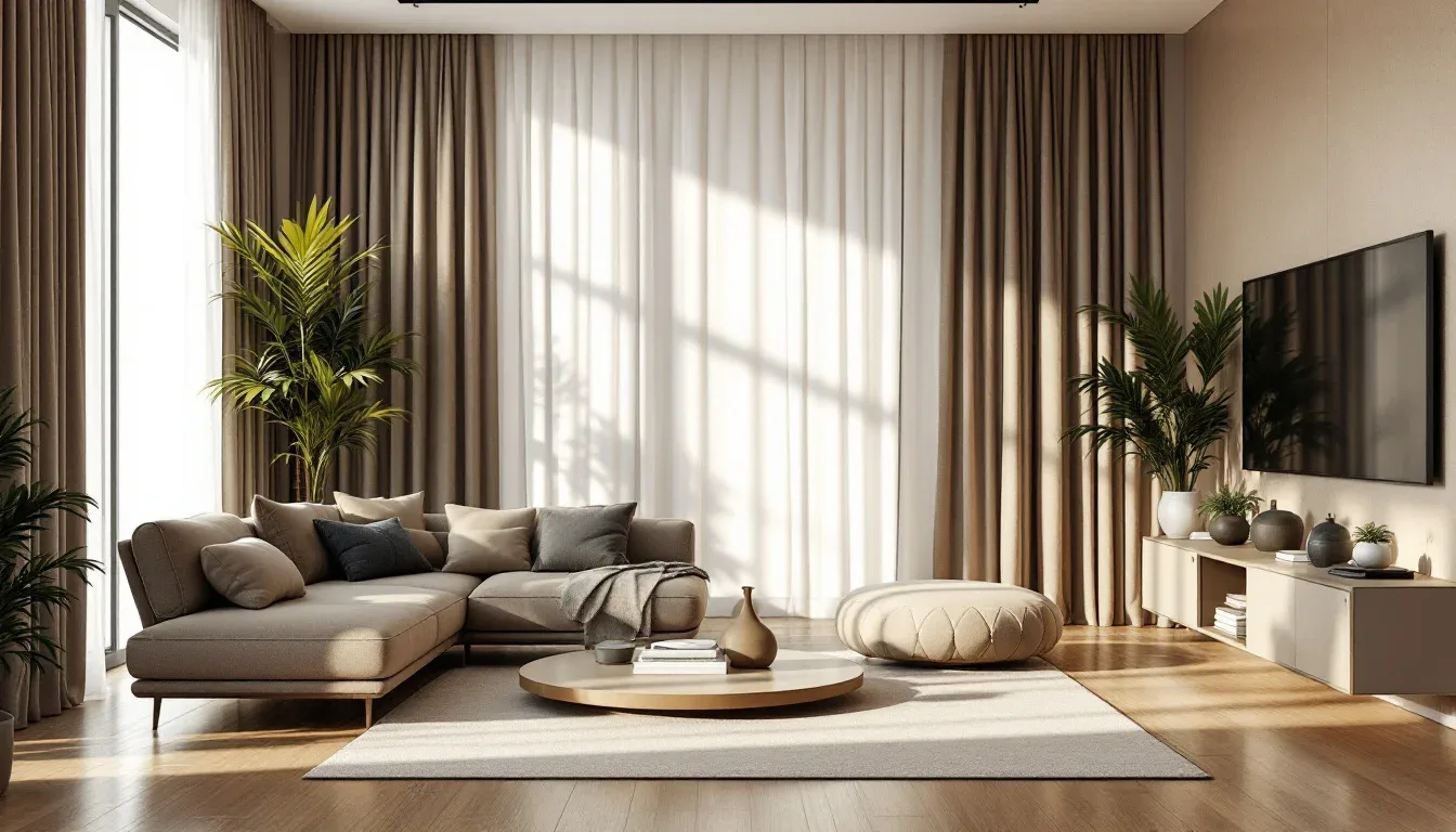
Living rooms need more structure. Chocolate brown as the dominant color works, but it needs a strong counterpoint — a statement rug in a warm contrasting tone, brass or unlacquered bronze hardware, and at least one lighter anchor (a cream linen sofa against a chocolate wall, for example) to give the eye somewhere to rest.
Home offices are an underrated application that almost nobody talks about. Brown reduces visual fatigue in extended focus sessions better than white or gray, both of which create a brightness that becomes subtly exhausting over a full workday. I’ve done this in my own workspace. The difference is real.
Kitchens require discipline. Lower cabinetry only — not upper. Chocolate brown lowers with cream or warm white uppers is one of the strongest kitchen combinations in current design, and the reason it works is proportion: you’re using brown where the visual weight belongs (low in the room) and keeping the upper half light. Reverse that logic and you’ve built a bunker.
Bathrooms: But be careful. In a large, well-lit bathroom, chocolate brown tile or a chocolate brown vanity reads as luxurious. In a small bathroom with limited natural light, full brown coverage is almost always too much. Use it as a vanity accent or in tile detailing rather than on every wall.
Takeaway: Match the application to what the room needs emotionally, not just aesthetically — and treat kitchen and bathroom chocolate brown as accent decisions until you’ve tested how the light behaves.
What Color Top Goes With Chocolate Brown? (Applying Fashion Color Logic to Your Rooms)
Fashion color logic is one of the most useful shortcuts in interior design, and almost nobody uses it explicitly. The reason it works: most people have decades of intuitive experience pairing clothes. They know instantly that a cream blouse works with chocolate brown trousers and a fuchsia top doesn’t. That knowledge transfers directly.
The translation is almost literal. Cream, ivory, and camel — the tops that work effortlessly with chocolate brown in a wardrobe — are the same tones that work on walls, textiles, and upholstery around a chocolate brown sofa or in a chocolate brown room. Burnt orange reads bold but confident in both contexts. Cobalt blue creates that high-fashion contrast that lands when the proportions are right and falls apart when they’re not.
The pattern logic is one I’ve leaned on with clients who struggled to understand why certain textiles felt right in a chocolate brown room and others didn’t. In fashion, animal prints — leopard especially — function as a neutral against brown. They’re warm, they share undertones, and they add pattern without adding competition. In interiors, the same rule applies. A leopard-print textile or a zebra-stripe rug against a chocolate brown wall reads as deliberate and sophisticated rather than busy.
What doesn’t work in fashion absolutely doesn’t work in interiors either. Cool-toned pinks — fuchsia, hot pink, anything with a blue base — create an undertone clash against chocolate brown that reads as unresolved. You know the feeling when an outfit looks like the pieces belong to different people? Same thing. The tension isn’t interesting. It’s just wrong.
Color consultants working with the Munsell color system — a measurement approach that identifies hue, value, and chroma separately — consistently find that chocolate brown carries either a red or yellow undertone depending on the specific shade. That undertone is the key to every pairing decision. Warm undertone brown needs warm undertone companions. The moment you introduce a cool-toned element without intention, the whole room starts to look like it’s asking a question it can’t answer.
Takeaway: The next time you’re unsure whether a textile, paint color, or furniture piece will work with your chocolate brown room, ask yourself whether you’d wear those two colors together. The answer will be right about 80% of the time.
Frequently Asked Questions
What colors go with chocolate brown interior design?
The reliable core palette is warm white or cream, camel, and dusty rose — all of which share warm undertones with chocolate brown and create cohesion without fighting the room’s dominant tone. For more tension and visual interest, cobalt blue works as an accent at low volume (around 10% of the room’s color), and deep olive or moss green creates an earthy, editorial quality that most people haven’t tried but almost everyone responds to well. The thing to avoid is cool-toned companions — cool gray, stark black, anything with a blue-green undertone — which flatten brown’s warmth and make the room look unresolved rather than sophisticated.
What is the 3-5-7 rule in interior design?
It’s a proportion guideline — also called the 60-30-10 rule in paint and textile contexts — that suggests distributing colors across a room in roughly three tiers: one dominant color at about 60-70% of the room’s visual weight, one secondary color at about 20-30%, and one accent color at around 10%. With chocolate brown, the most effective application puts brown as the dominant (walls and large upholstery), a warm lighter tone like cream or camel as the secondary (textiles, rugs, smaller furniture), and a single bold accent — rust, cobalt, forest green — at the 10% level. The critical mistake to avoid is using chocolate brown as a single-piece accent in an otherwise light room, where it reads as an intrusion rather than an anchor.
Is chocolate brown a flattering color for a room?
Yes, under the right conditions — and the conditions matter enormously. Rooms with 9-foot or higher ceilings, warm-facing natural light, and lighting at 2,700K to 3,000K are ideal. In those environments, chocolate brown creates depth and warmth that feels intentional and luxurious. In low-ceiling rooms with north-facing light and cool fluorescent or daylight-range bulbs, the same color can look muddy and oppressive. Matte finish performs significantly better than satin or gloss in residential settings. And furniture scale matters: a large-scale piece in chocolate brown reads as a design decision; scattered small brown pieces in an otherwise light room read as inconsistency.
What color top goes with chocolate brown?
In fashion terms: cream, ivory, camel, burnt orange, cobalt blue (as a bold accent), and warm whites all work — and this logic translates directly to interior design. The undertone rule applies in both contexts: warm undertones pair with warm undertones, and cool-toned pinks, blues, or anything with a fuchsia base will create visual tension that feels unresolved rather than intentional. Animal prints in warm tones function as a neutral with chocolate brown in interiors just as they do in fashion, adding pattern without disrupting the palette’s warmth.
What You Can Do Today
Pull every paint sample, textile swatch, or product photo you’re considering and hold them next to each other in the room you’re designing — not on a screen, not in a store, not under your kitchen lights. In the actual room. At the time of day when that room is most often occupied. If anything in that grouping looks cool-toned, blue-leaning, or grayish next to the chocolate brown, remove it. That single edit, done honestly, will eliminate the most common reason dark rooms go wrong before you’ve spent a dollar.
If you don’t have a starting point yet, start with the walls. Pick your brown. Identify its undertone — red-leaning or yellow-leaning. Then build every other decision from that answer outward, one layer at a time.
The room you’re picturing is achievable. It just requires treating chocolate brown as a dominant, not a neutral — and building with that understanding from the first decision to the last.