Over a third of homeowners who painted their walls a neutral color repainted within two years — not because they chose the wrong shade, but because no one told them about undertones. That single omission has cost people more money, time, and confidence than almost any other design mistake I witnessed during eleven years of working in residential interiors. The neutral room that “felt wrong” wasn’t a color failure. It was a chemistry failure — between the paint, the light, the floor, and the furniture that had been there for years before anyone opened a paint chip. This article is about fixing that, specifically, with no vague advice about “keeping it simple.”
Quick Answer
Over a third of homeowners who painted their walls a neutral color repainted within two years — not because they chose the wrong shade, but because no one told them about undertones.
What Is a Good Neutral Color Palette for Interior Design?
In This Article
- What Is a Good Neutral Color Palette for Interior Design?
- What Color Is Replacing Grey in 2026 — and Why It Changes Everything
- The 3-5-7 Rule in Interior Design (And Where Most People Apply It Wrong)
- The 3-4-5 Rule in Interior Design: How It Differs From 3-5-7
- Undertone Mapping: The Step Competitors Skip That Decides If Your Palette Works
- How to Layer Texture in a Neutral Scheme Without Adding Color
- Room-Specific Neutral Palette Formulas That Actually Account for Light
- The 5 Neutral Palette Mistakes That Make a Room Look Cheap (Not Calming)
Most explanations of neutral palettes stop at the surface: whites, beiges, greys. That’s the equivalent of explaining cooking by listing pots. A genuinely workable neutral palette is built on undertone harmony — and the absence of that understanding is the direct reason so many neutral rooms feel vaguely wrong without anyone being able to say why.
Here is the structural reality. A neutral palette needs three things working together: a dominant hue that anchors the room (your walls, your largest sofa, your flooring family), a mid-tone bridge that connects the dominant hue to your accents (think rugs, curtains, secondary seating), and an accent neutral that introduces enough tonal difference to give the eye somewhere to move. Three random swatches you liked at the hardware store will not do this. Swatches need to be tested against each other, in your room, in your light.
The three palette architectures that actually hold up over time are these:
- Warm earth-anchor — built around yellow-orange undertones: aged linens, raw oak, warm terracotta, oat-cream whites
- Cool mineral-anchor — built around blue-grey and green-grey undertones: slate, soft sage, pale stone, zinc
- Greige-bridge — a hybrid approach that sits between warm and cool, using a grey-beige that shares undertones with both families; the most forgiving for mixed-material rooms, and the one most beginners never consider because it doesn’t show up on either end of the warm-cool spectrum
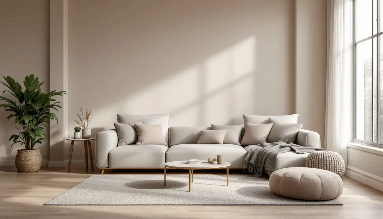
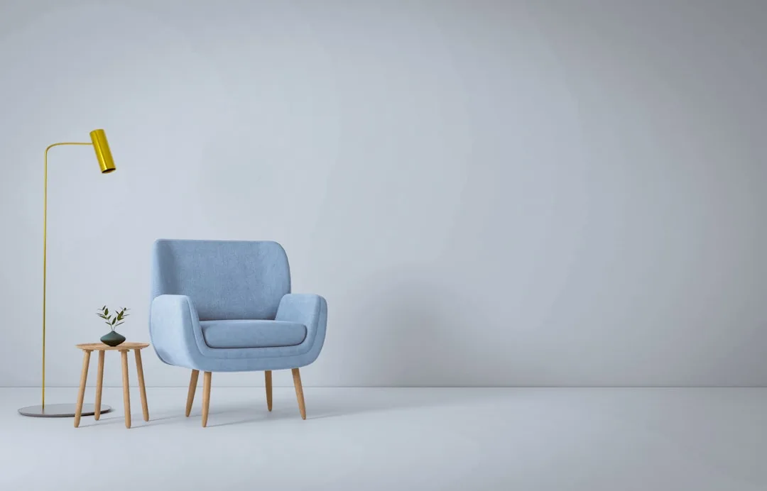
One distinction that took me embarrassingly long to understand clearly: the difference between a backdrop neutral and a working neutral. Backdrop neutrals carry the room — walls, large upholstery, flooring. They need to be stable and recessive. Working neutrals — textiles, trim, small furniture pieces, accessories — carry out the visual dialogue. Mix these categories up, and you end up with a working neutral on your walls (too visually active) and a backdrop neutral on your throw pillows (too flat to register).
Actionable takeaway: Before buying a single paint chip, identify whether your fixed surfaces — flooring, brick, countertops, existing wood — lean warm or cool. Your palette starts there, not at the paint display.
What Color Is Replacing Grey in 2026 — and Why It Changes Everything
Cool grey had a longer run than it deserved. From roughly 2012 through 2022, it dominated new builds, rental renovations, and real estate staging because it photographed beautifully and offended no one. I repainted at least a dozen apartments in shades of Agreeable Gray and Repose Gray during that decade, and yes, they looked calm and clean in the listing photos. In person, under warm LED lighting, they often looked like the waiting room of a dental office that had tried to seem modern.
The structural flaw of cool grey was always there. It reads cold under warm artificial lighting — which is what most of us live under after 5 pm — and it has no natural warmth to fall back on. When the Scandi-minimalist wave that popularized it began to soften into something more organic and tactile, cool grey had nowhere to go.
Pantone named Mocha Mousse (17-1230) as its 2025 Color of the Year — a warm brown-neutral — marking the first time in over a decade that a brown-family tone topped the annual forecast. That is not a coincidence. It confirms an industry-wide pivot that the paint brands, the furniture manufacturers, and the renovation contractors had all already started making. Heading into 2026, the direction is clear: warm greige, clay-adjacent mid-tones, dusty mushroom, raw linen, and fired terracotta are systematically replacing blue-leaning greys in new interiors.
Practically, this means:
- If you’re transitioning a grey-heavy room, start with soft furnishings and wood tones before you touch the walls. A warm linen sofa cover, an oak side table, a jute rug — these shift the room’s temperature dramatically and cost a fraction of a repaint. Walls come last.
- If you have a north-facing room, hold on before you strip out the cool grey. North light is already cool and bluish — a grey that reads clinical elsewhere can actually read calm and consistent in north light. Don’t reflexively follow a trend when your room’s geography argues against it.
- If you’re building or renovating from scratch, skip the cool-grey default entirely. The clay-and-warm-linen palette has the longevity that grey never had because it aligns with natural materials — stone, wood, earth — rather than working against them.
The shift away from grey is not about grey being wrong. It’s about the specific cultural moment that made cool grey feel safe having passed. Warmth, texture, and earthiness have replaced minimalist cool as the dominant residential aesthetic.
Actionable takeaway: Pull your existing furniture and flooring samples into natural daylight. If they lean warm — yellow, orange, red undertones — a clay-adjacent neutral will integrate better than any grey you’re considering, regardless of what the paint chip looks like in the store.
The 3-5-7 Rule in Interior Design (And Where Most People Apply It Wrong)
The 3-5-7 rule is one of those design principles that gets repeated constantly and applied almost universally wrong. The rule itself is clean: arrange objects in odd-numbered groupings — 3, 5, or 7 — because odd numbers create a visual tension the eye reads as intentional rather than symmetrical or accidental. It originates from classical feng shui grouping principles and was absorbed into Western interior design theory largely through compositional work by American designer Albert Hadley in the mid-20th century. It is a perception principle, not a styling preference.
Here is where people go wrong. Every person I’ve ever walked through a design consultation with understood the rule as it applies to a shelf. Three candles, five books, seven objects on a console. Fine. But they had never once considered applying it to furniture arrangement, textile layering, or the way tonal weights move through a room.
In a neutral palette specifically, the 3-5-7 rule is most powerful as an anti-sameness tool. When everything is the same color family, visual rhythm comes from scale and grouping. Three objects of graduated height. Five textile variations across the sofa. Seven tonal steps from the darkest anchor to the lightest trim. Without this kind of deliberate odd-number tension, a neutral room doesn’t feel calm — it feels dead.
For sofa styling alone, the rule scales usefully:
- 3 pillows — your dominant neutral in one size and one texture
- 5 pillows — add a pattern variation that shares the dominant undertone
- 7 elements — incorporate a throw and a contrasting material (boucle against linen, say)
The exception worth knowing: very large rooms and gallery walls are cases where even-number groupings can create a deliberate symmetry that reads as architectural rather than sterile. A gallery wall of eight frames in two rows of four can work when the wall itself is large enough that the symmetry reads as structural. But that is a specific condition. In most rooms, odd numbers move the eye. Even numbers stop it.
Actionable takeaway: Walk through your main living area and count the groupings on your surfaces and shelves. Any even-numbered grouping of same-scale objects — fix it by removing one piece, or adding one at a radically different height.
The 3-4-5 Rule in Interior Design: How It Differs From 3-5-7
These two rules get collapsed into each other constantly, and the conflation causes genuine practical problems. They are not the same thing. They don’t govern the same decisions.
The 3-5-7 rule is about object grouping and visual rhythm. The 3-4-5 rule — also expressed as 60-30-10 in its percentage form — governs color and tonal distribution across the total volume of a room. Different problem, different tool.
Here is the breakdown:
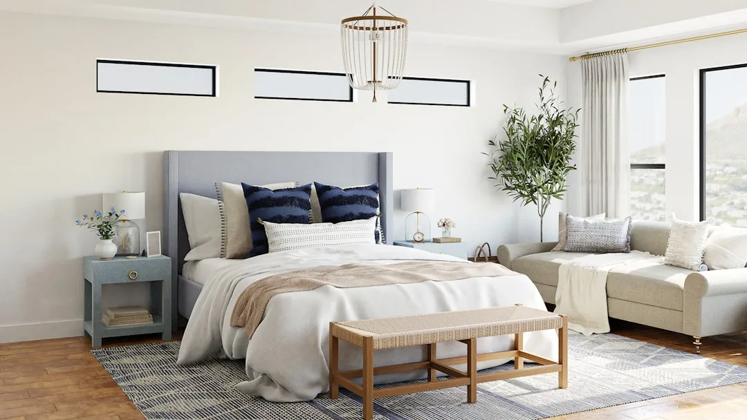
- 60% dominant neutral — walls, large sofa, flooring (the backdrop layer)
- 30% secondary neutral or mid-tone — accent chairs, curtains, rugs (the bridge layer)
- 10% contrast or pop — cushions, art, hardware, a single dark accent piece
The designer and TV host Candice Olson is widely credited with popularizing this framework in accessible interior design education, and it now appears in NCIDQ exam prep curricula as a foundational distribution principle. That legitimacy is earned — it works because it mirrors how the eye moves naturally through a room: from mass, to mid-ground, to detail.
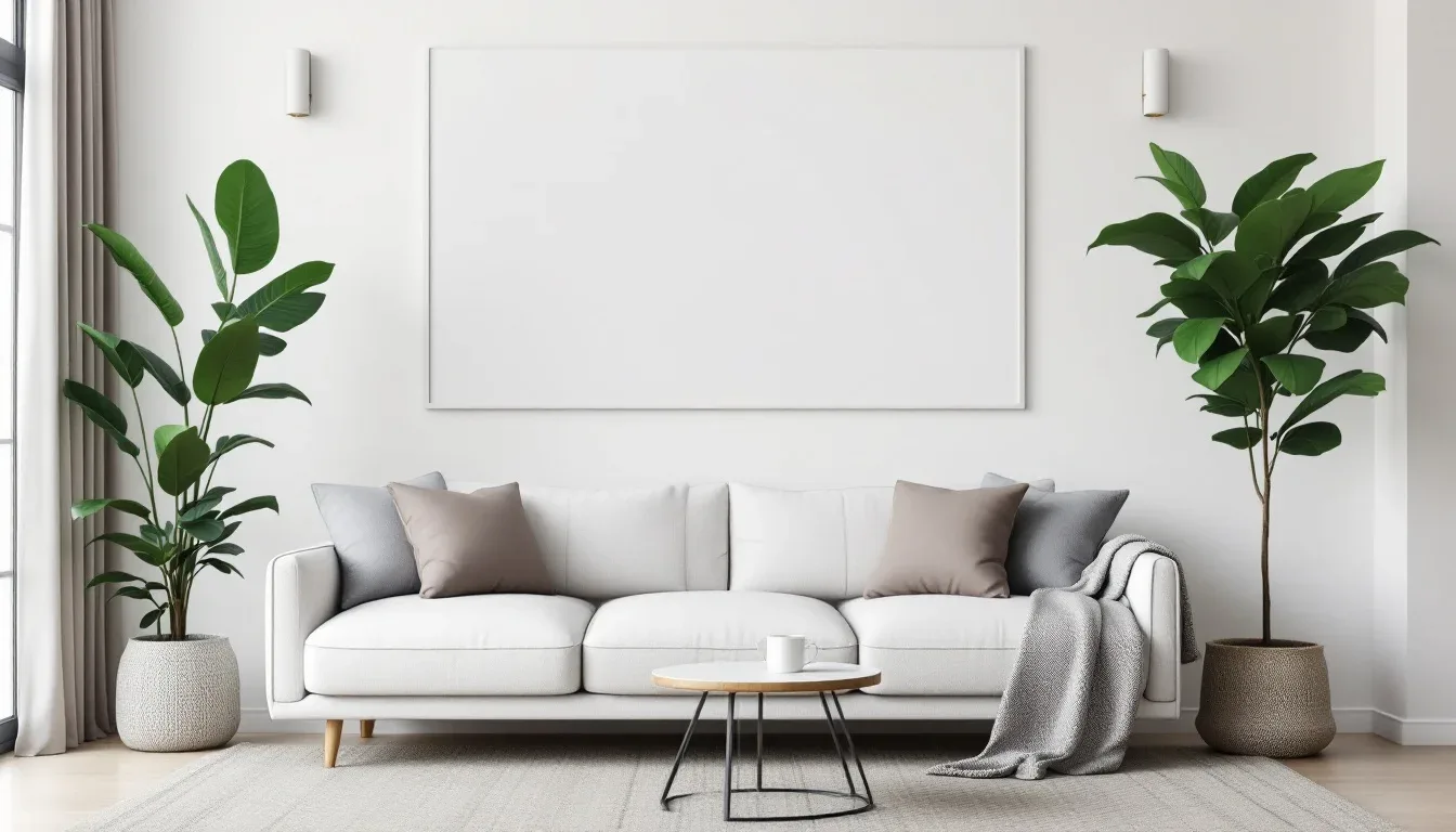
In a strictly neutral palette, the 10% is the most critical layer. I have seen more neutral rooms fail at this exact point than at any other. People get so committed to keeping everything neutral that they apply a neutral to the 10% too — a slightly darker beige cushion on a beige sofa in front of a beige wall. The room has technically followed the rule but functionally has no focal point. The 10% is where you earn your texture contrast, your deepest tone, your one non-neutral element. A near-black walnut frame. A single deep olive cushion. Anything that gives the lighter tones something to rest against.
Why the rule is often misquoted as purely a color rule is worth addressing — it originates as a furniture-to-room-volume ratio concept. Understanding that origin matters because it tells you the percentages apply to visual weight, not just paint coverage. A dark walnut dining table at 10% can visually anchor a room more powerfully than 10% of colored throw pillows because it has more mass.
Here is a practical diagnostic I use constantly. Photograph your room in black and white. If all three zones — backdrop, bridge, contrast — read at the same grey value in the photo, your distribution has collapsed. The room will feel one-dimensional in person, regardless of how carefully you chose each individual piece.
Actionable takeaway: Take a black and white photo of your main room right now. Count how many distinct tonal zones you can identify. If you see fewer than three, your 60-30-10 distribution needs work before you buy anything new.
Undertone Mapping: The Step Competitors Skip That Decides If Your Palette Works
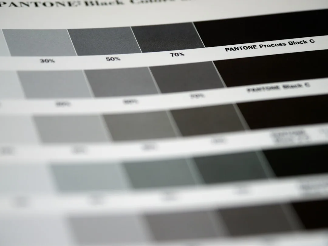
This is the section I wish existed when I was starting out. Every neutral has an undertone — pink, yellow, green, blue, violet, or orange — and a room’s light source amplifies whatever undertone is present in the paint. Not slightly. Dramatically. Benjamin Moore’s color research team documented that over 70% of paint return requests stem from undertone mismatch: the color looked right on the chip but wrong once applied, a direct consequence of failing to account for the room’s existing light temperature and fixed surfaces. Seventy percent. That is not a fringe problem.
Reading undertones without expensive tools is simple once you know the method. Place the paint swatch flat against a pure white card — a piece of printer paper works. The shift you perceive away from that pure white is your undertone. A “white” that looks slightly pink against the white card has a pink undertone. A “greige” that looks slightly green has a green undertone. Your eye is doing the work; you’re just giving it a clean baseline.
The four undertone pairings that reliably harmonize in neutral palettes:
- Yellow-orange (warm earth) — works with natural oak, warm brass, aged terracotta
- Blue-violet (cool mineral) — works with zinc, chrome, pale concrete, cool linen
- Pink-beige (soft blush neutral) — works with rose gold, white marble, blush ceramics
- Green-grey (organic modern) — works with raw plaster, dark walnut, sage textiles
The three undertone conflicts that fail. Consistently. Pink-undertone walls with yellow-toned wood floors — the pink reads garish and the yellow reads sick against each other. Green-grey paint with orange-toned brick — the green and orange fight visually in a way that makes the room feel unresolved. Blue-grey walls with warm brass hardware — the brass looks cheap and the blue looks cold simultaneously.
One more thing that took me years to understand properly: you can use undertone intentionally to correct a room’s fixed light temperature rather than just matching it. A north-facing room with cold ambient light doesn’t need a warm-undertone paint to “match” the warmth — it needs one to counterbalance the cold. That’s a different logic than harmony matching, and it’s the right one for rooms with a dominant light problem.
Actionable takeaway: Take your shortlisted paint chips and hold each one against white printer paper in your actual room, at the time of day you spend the most time there. Write down what color shift you see. That shift is your decision-maker.
How to Layer Texture in a Neutral Scheme Without Adding Color
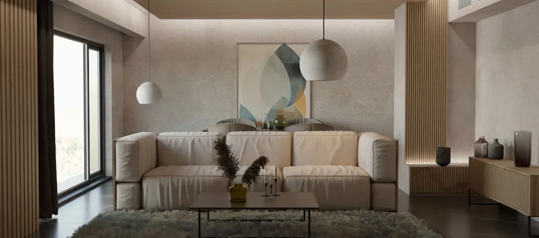
Here is the thing about high-end neutral rooms that the aspirational Pinterest content never explains: they look expensive because of what your hand would feel, not just what your eye sees. The visual sophistication of a well-done neutral interior comes almost entirely from material variation — and this is exactly what flat, budget neutral rooms are missing.
A 2022 study by the Color Marketing Group found that tactile texture is increasingly used as a substitute for color contrast in professional design, with 67% of designers surveyed reporting they deliberately increase material variety when working within a restricted neutral palette. That tracks with everything I observed working in actual rooms. When you remove color contrast, texture has to carry the weight.
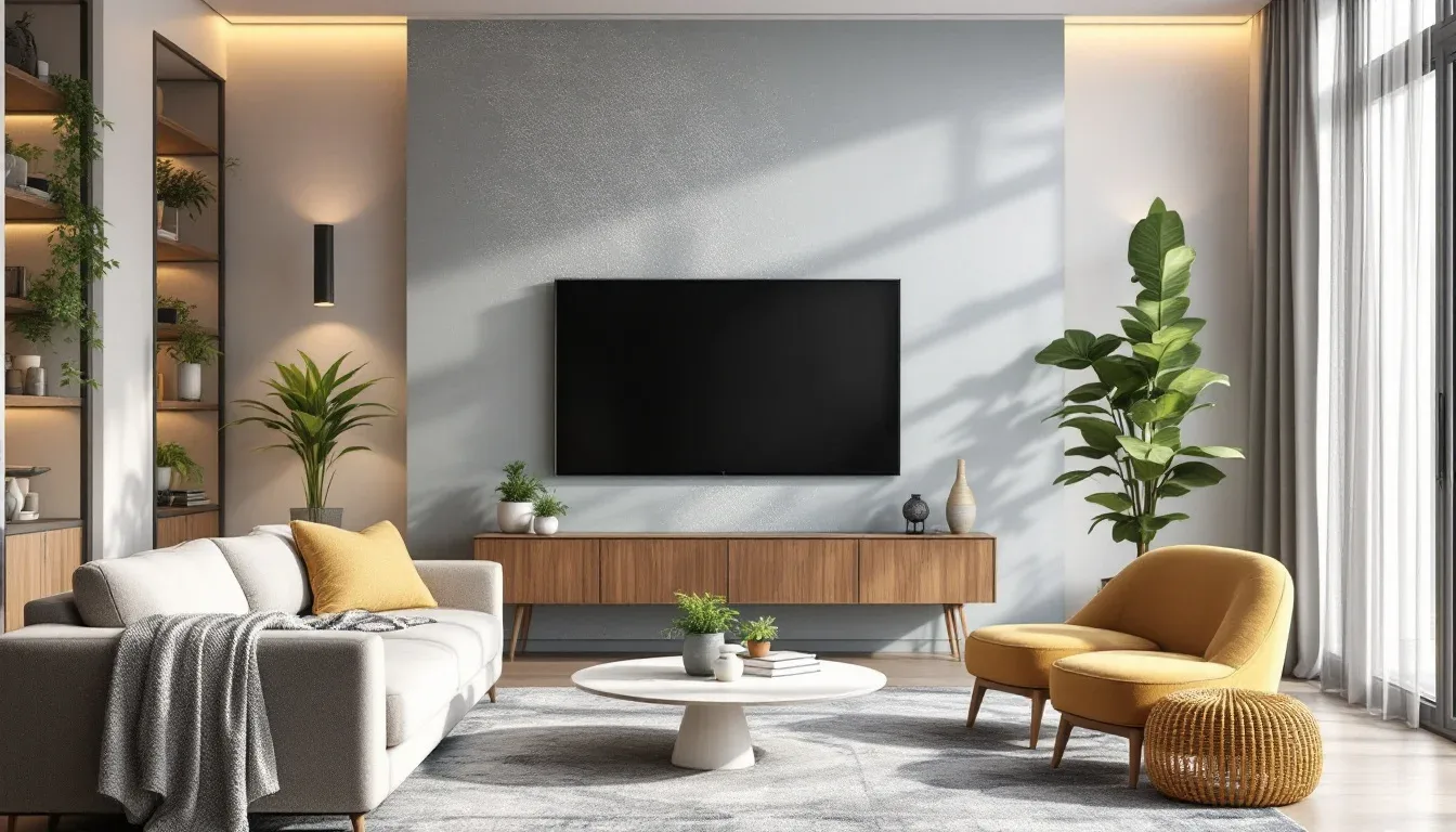
The framework I use is what I call the texture stack: work across five material categories and ensure at least three appear in every zone of the room.
- Matte — flat paint, linen, unfinished wood, raw plaster
- Gloss — lacquered surfaces, glazed ceramics, polished stone
- Woven — jute, rattan, basket weave, textured upholstery
- Napped — velvet, bouclé, shearling, mohair
- Rough — natural stone, reclaimed wood, raw terracotta, concrete
Linen, bouclé, and raw plaster are dominating neutral interiors in 2026 specifically because they introduce micro-variation in tone under changing light. A bouclé sofa in oat white reads slightly different at noon than at 7 pm under lamplight — that living quality is exactly what makes a room feel considered rather than staged.
The sheen ladder is worth understanding separately. Matte walls → eggshell trim → satin furniture → gloss ceramics — moving up the sheen scale within a single neutral creates depth that reads as sophisticated without adding a single new color. It’s the same principle as tonal dressing in fashion. One color, multiple surfaces.
Pattern absolutely can exist in a neutral palette. The one type that reliably works: tone-on-tone patterns — same hue, different value. A cream-on-cream jacquard cushion. A sand-toned geometric rug where the pattern is visible only as a shadow. These introduce visual complexity without breaking the palette’s tonal unity.
The mistake I see constantly — and made myself in a loft apartment on Chicago’s north side — is too many smooth surfaces together. Painted walls, leather sofa, glass coffee table, lacquered side tables. The colors were beautiful. The room felt like a hotel lobby that had been cleared out for renovation. One woven element, one rough element, would have solved it entirely.
Actionable takeaway: Walk through your space and categorize every surface material. If you can’t find at least one rough or woven element in each zone, that’s your first purchase — not more paint, not new cushions.
Room-Specific Neutral Palette Formulas That Actually Account for Light
Generic neutral palette advice — “works in any room,” “timeless in any space” — is the design equivalent of recommending paracetamol for everything. It’s not wrong exactly. It’s just useless. Light condition is the single variable that separates a neutral palette that works from one that costs you a repaint.
Research published in the journal Building and Environment (2021) confirmed that wall color saturation and undertone significantly affect perceived room size and occupant mood — specifically, warm low-saturation neutrals in small spaces consistently rated as more comfortable than high-contrast white in participant studies. That finding contradicts the conventional wisdom that small rooms need light walls. Light and airy is not the same as warm and enveloping.
Here is how the room-specific logic actually runs:
North-facing rooms receive cool, bluish ambient light all day. Avoid cool greys and blue-whites entirely — they will read flat and cold. Lean into warm taupes, aged linens, and yellow-cream whites. The goal is to counterbalance the light temperature, not mirror it.
South-facing rooms get strong, warm, direct natural light for most of the day. They can handle cooler neutrals without reading clinical — a warm greige, a pale sage, even a cool white will stay alive because the light constantly animates them.
Open-plan spaces present the most complex neutral challenge because the same palette must read consistently under morning light, afternoon light, and evening artificial light — three completely different conditions. Test every swatch at all three times before committing. I once had a client choose a wall color based on the afternoon reading alone and then live with a room that turned greenish every evening. We repainted. Twice.
Small rooms — this is where the conventional wisdom is actively harmful. Very light neutrals in small rooms can feel harsh and empty, especially if they share a cool undertone with the artificial lighting. Mid-tone neutrals — warm putty, dusty rose-beige, aged mushroom — used on all four walls and the ceiling create an enveloping effect that makes small rooms feel intentional and intimate rather than just cramped.
Home offices are the rare case where cool mineral neutrals actually outperform warm ones. Blue-grey and sage-grey tones have a documented association in environmental psychology research with sustained cognitive focus — making them the specific exception to the “warm neutrals work everywhere” rule.
Actionable takeaway: Identify which direction your main window faces before you select any neutral. That single piece of information will eliminate half the wrong choices immediately.
The 5 Neutral Palette Mistakes That Make a Room Look Cheap (Not Calming)
These are the five specific failure patterns I saw repeated in apartment after apartment.
Mistake 1: Matching instead of coordinating. Buying a furniture suite where the sofa, the side chairs, and the console are all the same beige — matched, not coordinated — is the fastest way to eliminate every scrap of tonal depth from a room. Cohesion comes from shared undertones. Not shared hex codes.
Mistake 2: Leaving the ceiling bright white. When your walls are a warm neutral and your ceiling is standard builder’s white, the ceiling floats disconnected — too bright, too cool, visually separate from the room. Tint the ceiling 25-30% lighter than your wall color. The room integrates. The ceiling lowers optically in the best possible way.
Mistake 3: Using cool grey as a safe default. Grey is not neutral under warm lighting. Under incandescent bulbs or warm LEDs — which most residential spaces use — cool grey reads corporate, clinical, or just sad. I know this because I did it. Repeatedly. The client always eventually called me back.
Mistake 4: Skipping the dark anchor. Every neutral room needs at least one element that reads genuinely dark. Deep walnut. Near-black iron. Charcoal upholstery. Without a dark anchor, the lighter tones have no contrast point — they float. The room looks unfinished even when every individual piece is beautiful.
Mistake 5: Overloading on same-value beige textiles. When the sofa, rug, curtains, and walls all sit within the same narrow tonal range of beige, the room has no focal point. Doesn’t matter how expensive each piece is individually. The eye moves in and immediately moves back out because there’s nowhere to land.
Actionable takeaway: Before your next purchase, ask whether it introduces tonal contrast or merely tonal similarity. If it’s the latter, your room already has enough of it.
Frequently Asked Questions
What is a good neutral color palette for interior design?
A good neutral color palette has three working layers: a dominant backdrop neutral (60% of the visual field — walls, large furniture, flooring), a mid-tone bridge neutral (30% — rugs, curtains, secondary seating), and a contrast accent (10% — cushions, art, hardware, dark anchor pieces). The palette holds together through undertone harmony — every piece needs to share or complement the same undertone family rather than simply being a muted color. The three most versatile palette structures are warm earth-anchor (yellow-orange undertones with natural wood and brass), cool mineral-anchor (blue-grey undertones with stone and zinc), and greige-bridge (a grey-beige hybrid that bridges warm and cool materials). Test all swatches in your actual room at the time of day you spend the most time there, against a pure white card to expose undertones, before committing to any of them.
What color is replacing grey in 2026?
Warm greige and clay-adjacent tones — raw linen, fired terracotta, dusty mushroom, warm oat — are systematically displacing cool grey in both new builds and renovation projects. Pantone’s 2025 Color of the Year, Mocha Mousse (17-1230), was the first brown-family tone to top the annual forecast in over a decade, confirming an industry-wide direction that paint brands and furniture manufacturers had already been moving toward. The core weakness of cool grey — it reads cold and clinical under warm artificial lighting — is now widely understood, and the warmer brown-neutral palette solves it structurally. The caveat: cool greys still perform well in north-facing rooms with strong natural daylight, where the cool ambient light and the cool wall tone create consistency rather than conflict. Don’t reflexively replace grey if your room’s light conditions actively support it.
What is the 3-5-7 rule in interior design?
The 3-5-7 rule is a compositional principle — originating from classical feng shui grouping theory and absorbed into Western design largely through the work of Albert Hadley — that states objects arranged in odd-numbered groupings of 3, 5, or 7 create visual tension that the eye reads as intentional. In neutral interiors specifically, it prevents the sameness-paralysis that happens when everything is the same color family. The rule applies to decorative object groupings on shelves and surfaces, but also — and this is where most people stop short — to furniture arrangement, textile layering, and tonal weight distribution across a room. For sofa styling: 3 pillows in the dominant neutral, 5 if adding a pattern variation, 7 if incorporating a throw and contrasting texture. The exception is large rooms and gallery walls, where even-numbered symmetrical arrangements can read as architectural rather than static.
What is the 3-4-5 rule in interior design and how is it different from 3-5-7?
The 3-4-5 rule — more commonly expressed as the 60-30-10 rule — governs color and tonal distribution across a room’s total visual volume, not object grouping. The 3-5-7 rule is about how you arrange things. The 3-4-5 rule is about how much of each color or tone should exist. The breakdown: 60% dominant neutral (walls, large sofa, flooring), 30% secondary neutral or mid-tone (curtains, rugs, accent chairs), 10% contrast (cushions, art, hardware, dark anchor). Popularized in accessible design education largely through Candice Olson’s work and now part of NCIDQ exam prep curricula, the rule mirrors the way the eye naturally scans a room — from mass, to mid-ground, to detail. In a strict neutral palette, the 10% layer is the most critical and most commonly misapplied: people fill it with more beige, eliminating the only contrast point the room had. The 10% is where your darkest tone, your texture contrast, or your one genuine departure from the palette should live.