Most rooms that fail at Japandi don’t fail because they used the wrong furniture — they fail because the person decorating them was actually following minimalism advice, not Japandi philosophy, and no one told them the difference.
That distinction matters more than any paint color or furniture choice you’ll make. Japandi isn’t a visual shorthand for “beige and calm.” It’s a negotiation between two living philosophies — Japanese wabi-sabi and Scandinavian hygge — that have genuinely different priorities, occasionally conflicting rules, and zero interest in looking like a mood board. When you misread it as an aesthetic instead of a practice, every decision that follows is built on the wrong foundation.
This guide is for people who tried Japandi and got a cold, empty room instead. It’s also for people who want to get it right before spending anything.
Why Japandi Decor Mistakes Are So Easy to Make (And Misunderstood Online)
Here’s the uncomfortable truth about most Japandi content online: it was written while the trend was still being invented. Google Trends data shows searches for “japandi style” grew over 900% between 2019 and 2023 — which means the vast majority of articles explaining the style were published during the same window when designers, bloggers, and home decor retailers were still figuring out what it actually was.
What filled that vacuum was generic minimalism advice with Japanese and Scandinavian buzzwords layered on top. “Use natural materials.” “Keep it simple.” “Neutral palette.” None of that is wrong, exactly. But none of it captures what Japandi actually requires from a room.
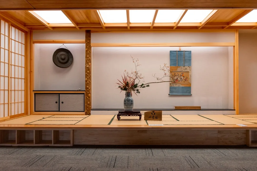
Japandi is not a third aesthetic — it is a negotiation. Wabi-sabi, the Japanese philosophy at its core, finds beauty in imperfection, age, and impermanence. Hygge, the Danish concept anchoring the Scandinavian side, prioritizes warmth, togetherness, and sensory comfort. These two philosophies agree on a lot — natural materials, unpretentious living, quality over quantity — but they pull in different directions on warmth, ornamentation, and emotional tone.
Most readers misidentify Japandi as “beige minimalism,” which is where the trouble starts. Minimalism is a reductive discipline: remove until nothing unnecessary remains. Wabi-sabi is additive in a specific way: include objects that carry time, imperfection, and story. Those are not the same instruction. Following minimalism rules in a Japandi room is how you end up with a space that looks disciplined but feels sterile — like a showroom that hasn’t been lived in yet.
The most dangerous Japandi decor mistake isn’t choosing the wrong sofa. It’s reading the wrong philosophy and executing it flawlessly.
Actionable takeaway: Before your next purchase, ask whether you’re making a minimalism decision or a Japandi decision. They’re different questions.
Mistake: Treating Japandi as Pure Minimalism and Stripping Out All Warmth
The “cold room” problem is the most universal Japandi failure, and it almost always comes from the same source: treating subtraction as the goal rather than the method.
Wabi-sabi has a specific demand that minimalism doesn’t share: visible imperfection and evidence of age are not flaws to correct — they’re design requirements. A perfectly smooth, machine-finished room doesn’t just miss the point; it actively violates the philosophy that gives Japandi its soul. If every surface in your room is flawless, every edge crisp, every finish uniform, you’ve built the opposite of what wabi-sabi asks for.
Research from the Scandinavian Journal of Design supports this from the hygge side: spaces aligned with hygge principles require at least three distinct tactile material variations per room to register as psychologically warm to occupants. Not three furniture pieces — three different material textures that you can feel a difference between when you touch them.
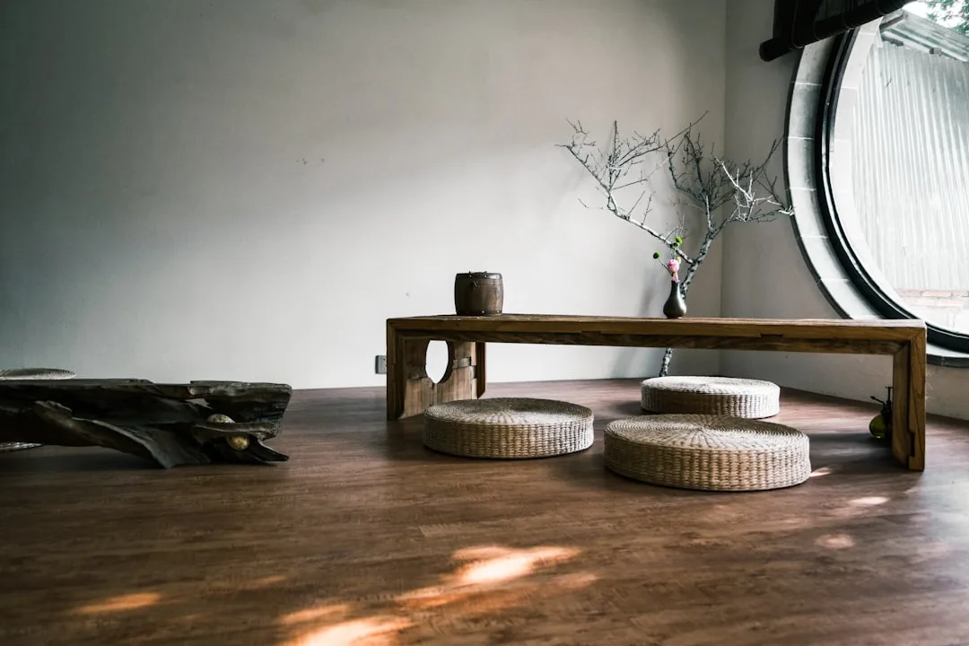
Here’s what that looks like in practice. Warmth signals that belong in a Japandi room:
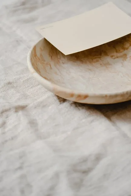
- Hand-thrown ceramics — irregularity in the rim and walls is the point, not a defect
- Linen with visible weave texture — not ironed flat, not perfectly smooth; the slub and variation are part of the material’s honesty
- Wood with natural grain variation — knots, color shifts, and grain figure are features, not inconsistencies to sand away
- Aged brass or matte black hardware — not polished, not reflective, not chrome
- A well-worn textile — a throw that looks like it’s been used fifty times is more Japandi than one still folded in a store crease
There’s a simple diagnostic for this mistake. If your room looks like a furniture catalog photograph — where every object is pristine, every surface gleams, and the space could belong to anyone — you’ve removed too much. Japandi rooms should look and feel inhabited. There should be evidence that someone actually chose these objects carefully, used them, and left traces of their presence.
The test isn’t “does this room look minimal?” The test is “does this room feel like someone lives here intentionally?”
Actionable takeaway: Add one hand-thrown ceramic object and one piece of linen with visible texture to any surface that currently looks too polished. Those two moves shift a room from minimalist-cold to Japandi-warm faster than any furniture change.
Mistake: Using the Wrong Neutrals — Japandi Beige Is Not All Beige
Not all neutrals are created equal, and this is where rooms go wrong in ways that are genuinely hard to diagnose without some color theory knowledge. The palette looks neutral. It even looks calm. But something feels off — the room doesn’t cohere, the materials fight each other subtly, and you can’t explain why.
The answer is almost always undertone.
Japandi neutrals pull from a specific source: soil, stone, bark, and moss. Warm undertones are non-negotiable. The earth palette that runs through both Japanese natural interiors and Scandinavian cabin aesthetics shares a warm, organic base — the kind of color that sits comfortably next to raw wood and undyed linen without competing.
The Munsell color system, which professional designers use to specify color with scientific precision, classifies Japandi-appropriate neutrals as low-chroma values ranging between 2 and 4 on its saturation scale. To put that in practical terms: these colors are so muted and low-saturation that they barely register as colored at all. They’re quieter than most paint swatches you’ll find labeled “neutral” at a hardware store.
Where rooms go wrong:
- Cool-toned Scandinavian whites (those with blue or gray undertones) clash with the warm earth palette of Japanese interiors — the visual conversation between the two reads as discord, not harmony
- Stark whites reflect too much light and read as clinical — they’re the enemy of wabi-sabi’s soft, absorbed quality
- Chalky matte beiges with pink or violet undertones miss the soil-and-bark warmth that Japandi requires
The compromise that works: warm white, off-white, or warm greige with a yellow or red undertone. Farrow & Ball’s “String” (No. 8) and “Elephant’s Breath” (No. 229) sit in roughly the right territory. Benjamin Moore’s “White Dove” is acceptable. “Simply White” is too bright.
Acceptable Japandi accent colors are few and specific: muted sage, dusty terracotta, deep indigo, and charcoal. Never the neon, pastel, or high-saturation versions of these hues — a sage that reads as bright green has left the palette entirely.
Here’s the fastest field test: hold your paint swatch or fabric sample next to a piece of raw, unfinished linen and a piece of natural wood. If the color fights those materials — if it looks colder, brighter, or more saturated by comparison — it’s wrong for Japandi.
Actionable takeaway: Run every proposed paint color and fabric through the linen-and-wood test before committing. If it clashes with those two reference materials, it won’t work in the room.
Mistake: Buying Japandi Furniture Without Understanding the Two Wood Rules
“Use natural wood” is the furniture advice you’ll find in almost every Japandi article. It’s true and almost completely useless without the two rules that make it actually work.
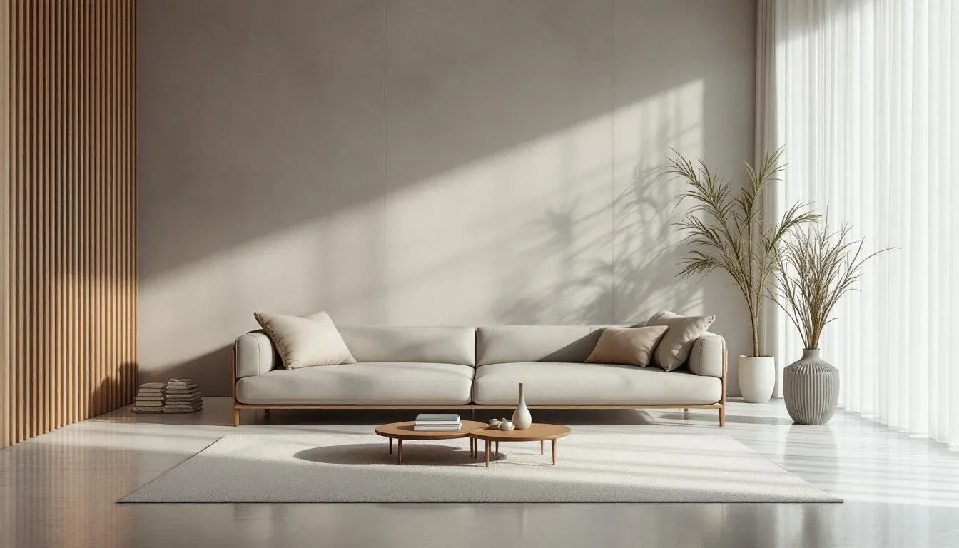
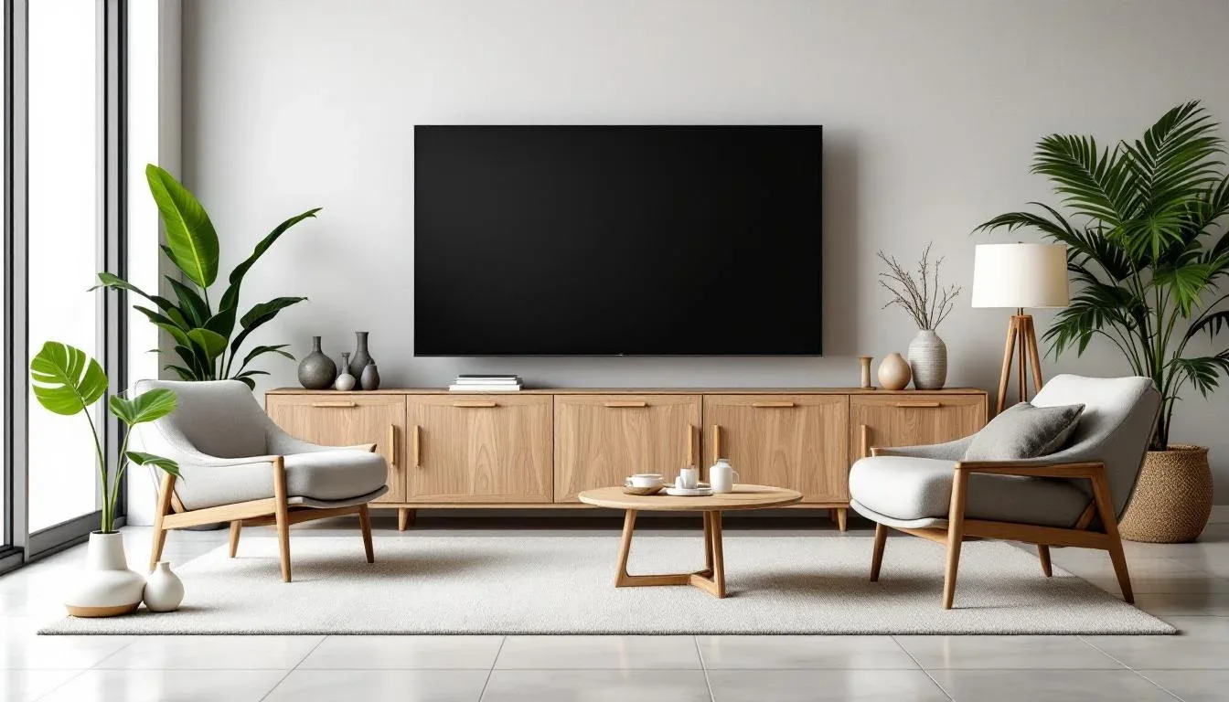
Rule one: Japandi uses two distinct wood tones — and each has a designated role. The Japanese aesthetic gravitates toward darker, moodier woods: walnut, dark oak, blackened cedar, bamboo with rich tonal depth. The Scandinavian side brings lighter, cleaner woods into the conversation: ash, beech, and light pine. The most common furniture mistake is defaulting entirely to one or mixing them indiscriminately so no visual logic emerges.
The correct approach is to anchor large pieces — the bed frame, dining table, sofa frame — in one dominant wood tone, then introduce the contrasting tone as an accent through smaller pieces: a side table, a stool, a wooden tray. The two woods should be in conversation, not competition. A dark walnut dining table with light ash chairs works. A room where walnut, oak, beech, and pine appear in equal measure in similarly sized pieces does not.
Rule two: finish matters as much as species. This is where flat-pack furniture kills the look even when the silhouette is exactly right. High-gloss, lacquered, or polyurethane-coated wood reads as contemporary or commercial — not Japandi. The finish you want is matte oil or wax: it lets the wood grain show, develops a patina over time, and communicates craft rather than manufacture.
Solid wood furniture in Japan has historically used urushi lacquer or natural tung oil as its primary finish. Neither produces the high-gloss, light-bouncing shine you see on Western mass-market furniture. That’s deliberate — the finish is meant to enhance the wood’s natural character, not override it.
Flat-pack furniture with printed wood-grain vinyl veneer deserves special mention: it destroys Japandi authenticity even when the silhouette is perfect. The visual profile of an Ikea Hemnes dresser might be close. The surface — which doesn’t absorb light, doesn’t develop patina, and reads as synthetic on close inspection — undoes the entire effort.
Actionable takeaway: When buying wood furniture for a Japandi room, ask two questions: Is it solid wood with a matte, oil, or wax finish? And does it belong to either the dark or the light wood family I’ve established as my anchor?
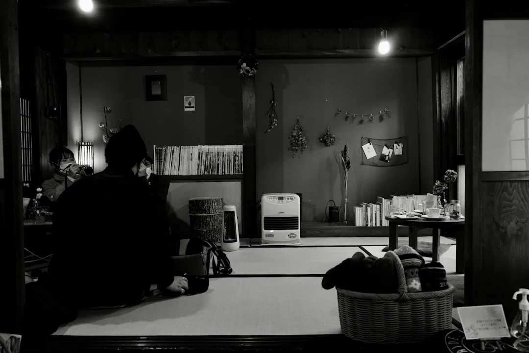
Mistake: Getting Japandi Lighting Wrong in Ways That Ruin the Entire Room
Lighting is the fastest way to destroy or save a Japandi room, and the advice most sites offer — “avoid bright white overhead lights” — scratches the surface of a problem that goes much deeper.
Start with bulb temperature, because it’s both the most important and most precise variable. The correct color temperature for Japandi is 2200K to 2700K — the range from candlelight warmth to warm white. Research from the Lighting Research Center at Rensselaer Polytechnic Institute confirms that warm-toned light sources below 2700K measurably increase perceived room comfort and relaxation compared to neutral or cool-toned sources. Anything above 3000K reads as clinical and breaks the mood entirely. Most standard “daylight” bulbs run at 5000K to 6500K. They’re wrong for this style by a significant margin.
The second — and more structural — lighting mistake is single-source illumination. Japandi lighting must be layered across three distinct levels:
- Ambient layer — a paper pendant (Isamu Noguchi’s Akari lights remain the defining reference), natural rattan shade, or washi paper fixture; this softens and diffuses light rather than projecting it
- Task layer — a low arm lamp or table lamp with a ceramic or linen shade in a matte finish, placed at seated eye level
- Accent layer — candles, a small low-wattage floor lamp, or candlelight-adjacent sources that shift the room’s emotional register in the evening
Fixture materials matter as much as the light they produce. Washi paper shades, raw linen pendants, ceramic bases, and natural rattan are correct. Chrome, polished nickel, and geometric metal fixtures are not — even if the silhouette is otherwise clean.
Dimmer switches aren’t optional in Japandi design. The hygge philosophy is built around responsive comfort — the idea that a home should feel different at 8am than it does at 8pm. A fixed-intensity overhead light forces the room to have one emotional register all day. A dimmer-controlled layered system lets the space respond to time, mood, and season.
Professional interior designers report that lighting correction is cited in over 60% of redesign consultations involving failed Japandi attempts — the single most requested fix after a Japandi room doesn’t work.
Actionable takeaway: Install dimmer switches and replace any bulb above 2700K this week. Do this before buying any furniture or decor — the shift in how the room feels will likely change what you think you need.
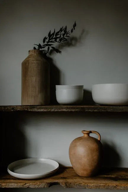
Mistake: Decorating With the Wrong Objects — How Japandi Handles Accessories
The objects in a Japandi room are where philosophy becomes practice most visibly — and where well-intentioned decorating fails most specifically.
Every object in a Japandi room should pass three tests:
- Natural material — ceramic, wood, stone, glass, fiber, metal with patina
- Singular purpose or beauty — it either does something or it is genuinely beautiful; it doesn’t need to do both, but it must do at least one with conviction
- Evidence of craft — you should be able to imagine the hands that made it
Mass-produced decorative objects with no functional origin — the kind sold in bundles on Amazon labeled “Japandi aesthetic set” — fail all three tests simultaneously. Matching sets are the clearest signal that a room was retail-assembled rather than curated. Mix pieces with different origins, different ages, and different patinas. A handmade bowl from a local ceramicist next to a smoothed river stone next to a single dried stem in a bud vase reads as considered. A set of three matching matte black geometric objects reads as a shopping cart.
Japandi doesn’t mean no objects. It means the Japanese concept of ma (間) is applied: negative space is treated as an active element with as much design intent as any physical object. Architects and designers trained in Japanese aesthetics don’t leave space empty by default — they choose where to leave it, and why, with the same care they’d use selecting a piece of furniture.
For plants: the species matters. Bonsai, moss arrangements, simple ferns, snake plants, and low-profile succulents align with both aesthetics. Oversized tropical plants — Birds of Paradise, large Monstera, heavily manicured topiaries — don’t carry the quiet restraint the style requires.
Actionable takeaway: Remove every matching retail decor set from your shelves. Replace them with three to five individual objects that each pass the material, purpose, and craft test independently.
Mistake: Ignoring Textile Layering — The Silent Japandi Failure Most Rooms Share
Walk into a failed Japandi room and you’ll usually find the furniture right, the colors close, and the textiles completely wrong. A synthetic throw folded over the arm of a sofa. A polyester area rug in a woven pattern. Curtains that look like linen but aren’t. The textile layer is Japandi’s primary warmth delivery system — and it’s the mistake most rooms make quietly.
Japandi textiles must be natural fiber. Linen, wool, cotton, jute, hemp, and silk are correct. Synthetic fleece, polyester velvet, microfiber, and faux-anything actively contradict both wabi-sabi and hygge values — not just aesthetically but in the tactile experience they create. When you sit in a hygge-aligned room, the way surfaces feel under your hands and feet is part of the philosophy. Synthetic fibers communicate the wrong message at the sensory level, regardless of how they look in a photograph.
Linen, worth noting for its symbolic weight, has been documented in both Japanese mingei craft traditions and Scandinavian home design for over 1,000 years. Its continued presence in Japandi is not trend-following but shared material heritage — two cultures independently arriving at the same honest, durable, beautiful fiber.
Patterns in Japandi are either completely absent or drawn from nature and tradition:
- Subtle stripes emerging from the weave structure of the fabric itself
- Organic abstract patterns with no forced geometry
- Traditional Japanese geometric patterns like asanoha (hemp leaf) — structured, ancient, and deeply quiet
- Not: floral prints, Moroccan tile patterns, global-inspired textile prints, or anything that competes visually with the room’s material palette
The layering logic follows a three-tier system:
- Ground layer — a natural fiber rug (jute, wool, or undyed cotton) that anchors the seating area
- Seating layer — a linen or wool throw with visible texture weight, generous enough to look considered rather than tossed
- Accent layer — a single lumbar cushion in a contrasting but muted tone; one, not three
The most common textile failure isn’t choosing the wrong pattern. It’s one thin synthetic throw draped over a sofa that reads as an afterthought. Japandi textiles should feel deliberate, heavy enough to be tactile, and natural enough to age well.
Actionable takeaway: Replace any synthetic textile in your room with a natural fiber equivalent. Start with the rug if you have one — it affects more visual and tactile surface area than any other textile in the space.
Mistake: Forcing Japandi Into Spaces That Need Different Layout Logic
This is the dimension every competitor skips entirely, which is part of why so many Japandi attempts look right in individual pieces and wrong as a complete room. The layout has its own philosophy, and it conflicts with how most Western rooms are conventionally arranged.
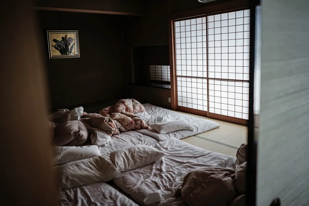
Japandi favors low furniture profiles. Sofas, beds, and storage that sit closer to the floor shift the visual weight of a room downward, creating the calm, grounded quality the style requires. Traditional Japanese interior design designates functional zones within a single room using subtle level changes and material shifts — not walls, not room dividers, not separate furniture groupings. That principle flows directly into how Japandi manages spatial function without visual division. A platform bed frame that sits eight inches off the floor reads as Japandi. A standard four-post bed frame at twenty-six inches creates a silhouette that pulls against everything else in the room.
The most common layout mistake is centering all furniture on a feature wall or media console. Japandi rooms are arranged around human activity and natural light — not screens. If your sofa faces a television as its primary orientation, the entire room logic is organized around something that contradicts the philosophy’s values around presence and sensory attention.
Clutter management is structural, not decorative. Decorative baskets covering visual chaos are not a Japandi solution — they’re a visual patch over a storage problem. Japandi requires built-in storage, sliding panels (shoji-influenced), or furniture with integrated storage that removes visual noise rather than containing it behind attractive surfaces. The Muji-adjacent philosophy here is real: if you can see the storage solution, it’s probably still too visible.
Traffic flow matters more in this style than in most others. Overcrowded room layouts with furniture pushed to walls in an attempt to “open up” the center space misunderstand how Japandi uses negative space. The empty center of a room isn’t wasted — it’s the ma principle in action at the spatial scale.
Actionable takeaway: Draw your current room layout and identify whether your furniture arrangement is oriented around a screen, a feature wall, or human activity and natural light. If it’s the first two, rearranging costs nothing and changes the room’s logic completely.
How to Audit Your Own Space for Japandi Decor Mistakes Before You Spend Anything
The most useful thing you can do before buying a single new object is to evaluate what’s already there — honestly and systematically.
Professional interior designers report that the most common client request after a failed Japandi attempt is lighting correction, cited in over 60% of redesign consultations involving the style. Which means the first thing most people need to fix isn’t furniture — it’s the light under which everything else is being evaluated.
Here’s a five-question room audit you can run right now:
- Does every object pass the material and craft test? Natural material, singular purpose or beauty, evidence of craft. Anything that fails all three gets removed.
- Is your lighting layered and warm? Three levels, all below 2700K, on dimmers. If you have a single overhead fixture at 4000K, that’s where to start.
- Are all textiles natural fiber? Pick up everything fabric in the room and read the label. Anything over 30% synthetic is a candidate for replacement.
- Does your wood tone strategy have logic? One dominant tone in large pieces, contrasting tone as accent. Or does your room have four different wood tones in equally sized pieces with no clear hierarchy?
- Is empty space intentional or just incomplete? There’s a real difference between ma — deliberate, purposeful negative space — and a room that looks unfinished because you haven’t gotten around to filling it yet. You can feel the difference when you sit in the room.
Start with subtraction, not addition. Before buying anything, remove every synthetic material, every matching retail decor set, and every object that doesn’t have a clear reason for existing in the space. Most rooms reveal themselves after that step — you’ll see what’s actually working and what the room genuinely needs, rather than what a mood board told you to buy.
Photograph your room in grayscale. This is a technique professional photographers and designers use, and it works: a successful Japandi room holds its visual coherence in black and white because material variation, texture, and tonal contrast carry the composition. If your room looks flat, undercooked, or incoherent in grayscale, the problem is in the materials and layering — not the color choices you’ve been agonizing over.
The single fastest Japandi fix for most rooms is replacing overhead lighting with a layered, warm-toned plan. This one change — before any furniture moves, before any new decor — shifts the room’s emotional register more powerfully than almost any other intervention available.
Start there. Tonight, if you can.
Frequently Asked Questions
What is the most common Japandi decor mistake beginners make?
The most common mistake is treating Japandi as a minimalist aesthetic rather than a lived philosophy, then stripping a room down to almost nothing and wondering why it feels cold and empty instead of calm and warm. The second most common is lighting: replacing warm, layered light sources with a single overhead fixture at the wrong color temperature. Interior designers consistently identify this as the first thing they fix in a failed Japandi room. A space lit by a single 4000K overhead light will never feel like Japandi regardless of what furniture is in it.
Can you mix Japandi with other interior design styles without making mistakes?
You can, but with specific guardrails. Japandi sits close enough to other nature-forward styles — Wabi-sabi-only interiors, Scandinavian modern, and even some quiet traditional Japanese styles — that thoughtful overlap is possible. What it cannot absorb without losing coherence: maximalism, coastal, bohemian, farmhouse, or any style that relies on pattern, color saturation, or high-contrast visual energy. The test is whether the other style’s signature elements — a gallery wall, a bold patterned rug, a distressed white-painted surface — pass the Japandi material and philosophy tests. Most don’t.
What colors are wrong for Japandi and why do so many rooms use them?
Cool-toned whites, stark whites, grey-based neutrals, and any saturation level above “muted” are wrong for Japandi. The reason so many rooms use them is that Scandinavian interior design — which Japandi is commonly confused with — does use cool whites and light greys extensively. When people absorb Scandinavian aesthetics and try to apply them as Japandi, they carry those cooler tones over. The Munsell color system places Japandi-appropriate neutrals at chroma values of 2–4 — extremely muted, warm-toned, and nature-derived. Bright pastels, neons, and high-saturation accent colors of any kind break both the wabi-sabi and hygge values simultaneously.
How do I know if my room looks Japandi or just empty and unfinished?
This is one of the most useful questions to ask, and the answer comes down to intentionality and material warmth. An unfinished room feels sparse because things are missing — there’s no visual or tactile layering, surfaces are bare, and the room hasn’t been thought through. A successful Japandi room feels considered even in its emptiness: every object that’s there has obvious intention, the textiles are generous and tactile, the lighting is warm and layered, and the negative space feels like a choice rather than an oversight. The grayscale photograph test helps: a Japandi room that reads as coherent and warm in black and white is working. A room that looks flat and incomplete in grayscale needs more material layering — more texture, more tonal variation — not necessarily more objects.