The most expensive mistake in a large home has nothing to do with budget — it’s treating a mansion like a bigger version of an ordinary house and decorating it the same way. Scale is not a design strategy. Neither is spending. I watched a client in Lincoln Park drop $340,000 furnishing a 7,200-square-foot home that ended up feeling like a Marriott lobby — enormous, technically impressive, and completely soulless. Everything was proportionally wrong, the lighting was an afterthought, and the furniture came in three coordinating sets from the same showroom. It looked finished. It felt like nothing.
Quick Answer
The most expensive mistake in a large home has nothing to do with budget — it’s treating a mansion like a bigger version of an ordinary house and decorating it the same way.
What distinguishes a contemporary mansion interior isn’t money. It’s the application of a completely different spatial logic — one built around volume, restraint, material intelligence, and the deliberate manipulation of how a person moves through and feels inside a space.
What Separates a Contemporary Mansion Interior from Just an Expensive House
In This Article
- What Separates a Contemporary Mansion Interior from Just an Expensive House
- 1. Architectural Volume Used as a Design Element
- 2. A Material Palette Built Around Three Anchors
- 3. Lighting Designed as Architecture, Not Afterthought
- 4. Furniture Scaled to the Room, Not the Retailer
- 5. Art Treated as Architecture
- 6. Integrated Technology That Disappears
- 7. The Circulation Plan as a Design Feature
- 8. Outdoor-Indoor Continuity as a Spatial Strategy
- How a Contemporary Mansion Interior Handles Indoor-Outdoor Continuity
- 9. Restraint as the Final Material
Most people confuse “modern” and “contemporary” and use them interchangeably, which immediately signals they’re decorating by feel rather than by principle. Modern, as a design term, refers to a specific historical era — the mid-century movement that peaked roughly between 1945 and 1975. Contemporary means now. It’s time-stamped to the present moment, which means it shifts, absorbs new influences, and reflects current material culture. That’s not a semantic quibble — it’s the entire difference between a home that reads as timeless and one that reads as dated.
The defining principle of contemporary luxury is restraint with impact. Traditional luxury relied on ornamentation — crown molding stacked four layers high, gilded furniture legs, hand-painted murals on every ceiling. Contemporary luxury strips all of that away and replaces it with something harder to execute: spaces that feel expensive because of what isn’t there. Empty wall planes of book-matched stone. A staircase that appears to float without visible support. A room where every object was clearly chosen, not accumulated.
Scale alone doesn’t make a mansion interior work. What makes it work is proportion, material hierarchy, and spatial rhythm — the sense that the home has been choreographed rather than assembled. The American Institute of Architects reports that requests for open-concept, minimalist large-home designs increased over 34% in the last five years, which tells you that the market has largely moved away from the traditional estate aesthetic. Clients no longer want what a wealthy person’s house used to look like. They want something that feels more alive, more considered, and — paradoxically — less full.
The mental framework worth carrying into every section below: a well-executed contemporary mansion interior is designed from the architecture outward, not from the furniture inward.
1. Architectural Volume Used as a Design Element
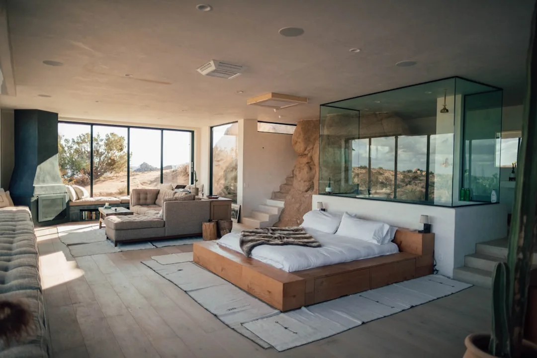
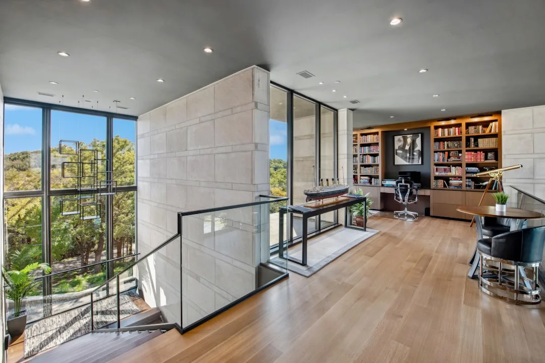
Walk into a well-executed contemporary mansion and the first thing you feel — before you register any specific object — is the space itself. That’s intentional. Double-height entry halls are not a structural accident; they are the opening sentence of the home’s design language, and they set a tonal register that every subsequent room either honors or disrupts.
The spatial logic here is about arrival. A two-story foyer with a floating staircase and a pendant fixture that drops 18 feet tells you, immediately, that this is not a home where corners were cut or scale was avoided. Mezzanine levels work similarly — they add visual drama and spatial complexity without adding a single square foot to the floor plan. A library that sits one level above the main living space, visible through a glass railing, creates a layering effect that photographs can barely capture. You have to stand in it.
Zillow’s research on luxury property premiums found that homes with ceiling heights above 10 feet are valued up to 25% higher per square foot — which is remarkable when you consider that ceiling height costs relatively little to build into a new construction compared to what it returns in perceived and actual value.
For those working within existing structures, the fix isn’t always architectural. Vertical artwork — pieces that are taller than they are wide, hung at a height that forces the eye upward — can functionally replicate the spatial effect of height. So can tall cabinetry that runs to the ceiling line, or a pendant fixture hung on a long cord that makes a standard 9-foot ceiling feel intentionally dramatic rather than just low.
Here’s what I keep seeing people get wrong: they buy art based on what fits above a sofa, then wonder why the room still feels squat. The ceiling height isn’t the problem. The visual anchors are.
- Hang pendant lights lower than feels natural — the tension between a long drop and a low terminus makes the volume legible
- Use a single vertical element per room as the eye-director: a floor-to-ceiling curtain panel, a tall sculptural lamp, a full-height stone column
- Don’t break vertical lines with furniture — a console table pushed against a window wall interrupts what the architecture is trying to do
Actionable takeaway: Before buying a single piece of furniture, stand in your largest room and identify where the vertical lines are — then design everything else to support rather than interrupt them.
2. A Material Palette Built Around Three Anchors
Every serious interior project I worked on that went wrong had the same diagnosis: too many materials competing for attention. A kitchen with six different surface finishes. A living room where the stone fireplace, the wood floors, the metal window frames, and the upholstery each came from a completely different visual universe. The result isn’t interesting. It’s exhausting.
Contemporary mansion interiors operate on a three-anchor material rule: one stone, one wood tone, one metal finish — and everything else in the space is a derivative or a neutral that supports those three. Not four. Not two. Three. The specificity matters because it forces the decisions that most homeowners try to avoid.
Travertine, honed marble, and large-format concrete are the dominant stone choices in current high-end residential work — not because they’re fashionable, but because they age genuinely well and read as substantive rather than decorative. U.S. Geological Survey mineral trade data shows that travertine imports rose 41% between 2021 and 2023, which tracks exactly with what I saw happening in design studios: it became the contemporary luxury stone of the decade, largely because its warm, natural variation sits well against the cooler tones that dominate contemporary architecture.
The warm-cool combination is worth understanding because it prevents the sterile problem. A room that is all marble, brushed steel, and concrete is technically sophisticated and also deeply uncomfortable — nobody lingers in it. The three-anchor rule forces a counterbalance. If your stone reads cool, your wood tone should read warm. White oak with a slight amber cast next to honed Calacatta creates a tension that feels resolved rather than cold. Fumed oak against grey concrete reads like a deliberate design choice rather than an accident of procurement.
The metal finish is where most people lose the thread. They mix brushed brass with satin nickel with matte black across a single floor plan because each individual piece seemed right in isolation. Seen together, it reads like a showroom that couldn’t commit. Pick one finish and hold it: hardware, plumbing fixtures, light fixture armatures, stair railings. The discipline feels excessive until you see the result — a home where every reflective surface is speaking the same language.
- Honed rather than polished stone — the texture reads more architectural, less decorative, and shows fewer fingerprints in high-traffic areas
- Rift-cut rather than flat-sawn wood — the grain is tighter and more uniform, which reads as intentional rather than natural at large scale
- Brushed rather than polished metal — it absorbs light rather than reflecting it, which keeps it from competing with the stone and wood
What to avoid: Mixing stone families — travertine in the entry and marble in the kitchen and quartzite in the primary bathroom. Each is beautiful. Together, they suggest the house was designed in three separate sessions by three separate people who never spoke.
Actionable takeaway: Pull samples of your three anchor materials and lay them on a flat surface together before committing to any of them individually. The relationship between them matters more than any single material in isolation.
3. Lighting Designed as Architecture, Not Afterthought
The Lincoln Park house I mentioned at the start had recessed can lights spaced on a grid — eight inches deep, positioned based on the electrical plan rather than the furniture plan, throwing downward cones of light that created a dotted ceiling effect and left every corner of every room in shadow. This is the default. It is also, in the context of a large home, genuinely ruinous.
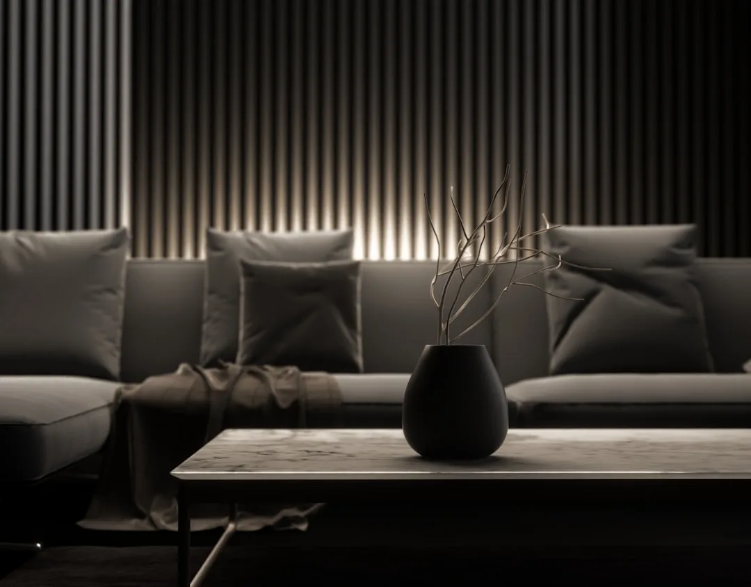
Lighting in a well-designed large home operates on three distinct layers, and all three have to be present and independently controlled for the space to work: ambient (general fill), task (functional and focused), and accent (architectural highlighting). The mistake isn’t using recessed lighting — it’s using only recessed lighting, which collapses all three layers into one and flattens everything.
In large-volume spaces, the ceiling is simply too far away to do the job alone. A 20-foot ceiling with can lights is functionally useless as a primary light source for a human being standing at floor level — the light dissipates before it reaches the conversation area. The solution is to bring the light down: pendants dropped on long cords into the conversation zone, table lamps that create pools of warm light at seated eye level, floor lamps that graze a wall and reveal its texture.
Cove lighting is the most underused tool in large-home design. Recessing a light source into an architectural reveal — a soffit edge, a dropped ceiling plane, a floating millwork band — creates indirect light that reads as luminous architecture rather than installed fixtures. You see the glow, not the source. It makes a room feel like it’s generating its own warmth, which is exactly the effect that separates a carefully considered interior from a well-furnished one.
The American Lighting Association notes that layered lighting plans with scene control increase a home’s perceived value in buyer assessments by a meaningful margin — but more practically, they change how you feel in the room every hour of the day. A space that works at 7am in flat daylight and also works at 9pm with three circuits dimmed to 20% is a designed space. A space that only works at one setting is a lit space.
- Scene control is not optional at this scale — a Lutron or similar system that allows you to set and recall lighting scenes across zones is the infrastructure that makes layered lighting functional rather than theoretical
- Specify color temperature deliberately — 2700K reads warm and residential; 3000K reads cleaner and more contemporary; mixing them across a single open floor plan is visible and wrong
- Light the walls, not just the floor plane — a room where the walls glow feels larger than a room of identical dimensions where the walls are in shadow
Actionable takeaway: Map your furniture plan first, then design your lighting plan around it. The light should serve the human positions in the room, not the grid of the ceiling above them.
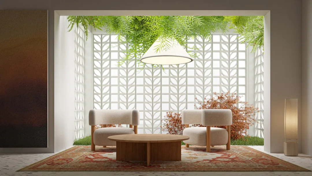
4. Furniture Scaled to the Room, Not the Retailer
Standard residential furniture is designed for standard residential rooms — 12-by-14-foot bedrooms, living rooms where the sofa sits 8 feet from the television. In a large home, standard furniture reads as dollhouse-scaled against the architecture. A 96-inch sofa — large by normal retail standards — can disappear into a 30-foot living room the way a normal sofa disappears into a studio apartment.
The rule I use: In any room larger than 400 square feet, every anchor piece of furniture should be custom or contract-grade. Not because custom is inherently better, but because the standard retail size range simply doesn’t extend far enough. A dining table for a proper mansion dining room is 120 inches minimum — often 144. A sectional configuration in a great room needs to close off a seating area large enough to feel intimate despite the surrounding volume.
Contract-grade furniture — pieces designed for hospitality and commercial applications — tends to run larger, more durable, and more architectural in profile than residential retail. Brands like Restoration Hardware’s RH Contract, B&B Italia, and Minotti design pieces at a scale that reads correctly against high ceilings and long sight lines. The proportions were engineered for the same spatial problem you’re solving.
Rug sizing is where scale errors are most visible. A 9-by-12 rug under a furniture grouping in a 600-square-foot room looks like a place mat. The standard guidance — all furniture legs on the rug, or at minimum all front legs — still applies, but the rug has to be large enough for that guidance to be meaningful. In large rooms, that often means 12-by-18 or larger, and it often means custom.
- Float furniture away from walls — pushing everything to the perimeter of a large room makes it feel like a waiting room; groupings pulled into the center of the space create rooms within the room
- Use multiple seating groupings in rooms above 500 square feet — a single conversation area in a 900-square-foot great room leaves most of the space feeling purposeless
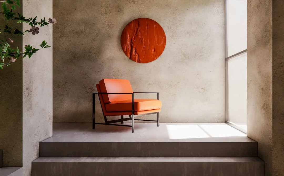
- Choose furniture with visual weight proportional to the space — a glass coffee table that would feel elegant in a smaller room reads as insubstantial against heavy architecture; stone-top tables, thick-gauge metal frames, and substantial upholstery read correctly at scale
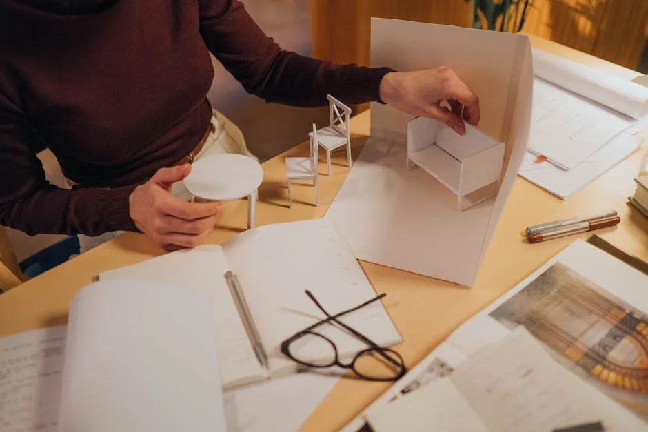
Actionable takeaway: Tape out the footprint of every piece of furniture on the actual floor before ordering anything. The floor plan looks different in paper than it does at scale, and the error is always in the same direction — everything smaller than it needed to be.
5. Art Treated as Architecture
In a large home, art is not decoration. It is a structural element of the visual experience — it defines scale, creates focal points, and either confirms or undermines everything the architecture is doing. A single large-scale work on a 20-foot wall reads as intentional. A gallery wall of medium-sized pieces on that same wall reads as an attempt to solve a problem with quantity.
The contemporary approach to art at mansion scale is commitment. One museum-quality piece per major wall. Not a collection assembled over time hung in proximity — a single work chosen for that specific wall, that specific light, that specific relationship to the room. This is how residential interiors in that price range are photographed and how they actually function in person. The restraint is the point.
Sculpture is underused in large-home interiors. A significant three-dimensional work — stone, bronze, resin, whatever the material — placed on a plinth in a double-height space or at the terminus of a long corridor does something that wall-hung art cannot: it gives the space a center of gravity. You orient toward it. It changes how you move through the room.
Commission relationships with galleries matter here. Most of the best large-scale work is not available through normal retail channels — it exists through gallery relationships, artist studios, and auction. A design firm that has established those relationships is worth more, in the context of a large home, than their hourly rate suggests.
- Scale artwork to 60–80% of the wall width for primary feature walls — anything smaller reads as incorrectly sized, regardless of quality
- Light art with dedicated picture lights or adjustable accent spots — ceiling wash lighting flattens the work; directional lighting reveals it
- Treat the floor plane as a display surface — large ceramic vessels, sculptural objects, and significant plants placed on the floor rather than on surfaces add layers to the vertical experience
Actionable takeaway: Before sourcing art, photograph each major wall with a person standing in front of it for scale reference. The wall dimensions in the photo will show you exactly what size work is needed — and it will almost certainly be larger than your first instinct.
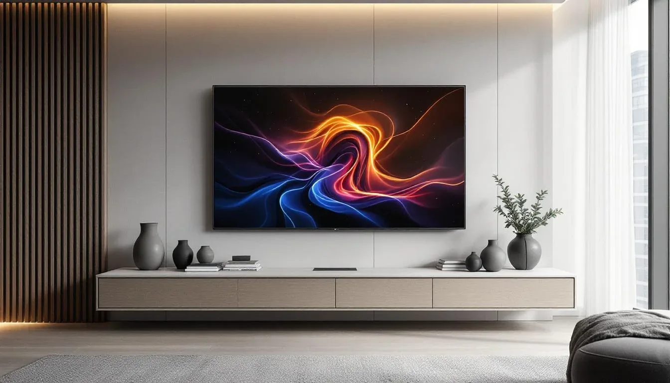
6. Integrated Technology That Disappears
The defining characteristic of technology in a well-executed large home is that you can’t see it. Speakers recessed into ceilings with grilles finished to match the surrounding surface. Motorized shades that sit inside window pocket reveals rather than hanging in front of the glass. A home automation panel that lives inside a closet rather than on a corridor wall. Television screens that recess flush into millwork cavities or descend from ceiling pockets when needed and disappear when not.
Visible technology is a design failure at this scale. A television mounted on a bare wall in a room with a $40,000 stone fireplace surround is a contradiction. The technology budget in a large home should reflect the same priority as the architecture budget — because in practice, it is part of the architecture.
The integration principle extends to practical infrastructure: charging stations built into drawer interiors, USB outlets hidden inside millwork pulls, data cabling routed through wall cavities during construction rather than surface-mounted afterward. These decisions cost almost nothing to make correctly during construction and cost significant money to fix after the fact.
Lighting control, HVAC zoning, shade control, audio distribution, and security should operate from a unified platform. The practical reason is obvious — one interface rather than six. The design reason is less obvious but more important: a unified platform means the physical interfaces can be standardized and minimized, which means fewer visual interruptions in the wall surfaces and ceiling planes that the architecture worked hard to establish.
- Specify all technology integration before framing — the wall cavities, conduit runs, and blocking for screen mounts have to be built in; they cannot be effectively added later
- Recess everything that can be recessed — speakers, thermostats, sensor panels, intercom screens — the discipline of concealment is what separates an integrated home from an equipped one
- Work with an AV integrator who collaborates with the architect and interior designer — not after the design is complete, but during it
Actionable takeaway: During the design development phase, walk through every room with your AV integrator and mark every surface where technology will live. Then redesign each of those surfaces to conceal it.
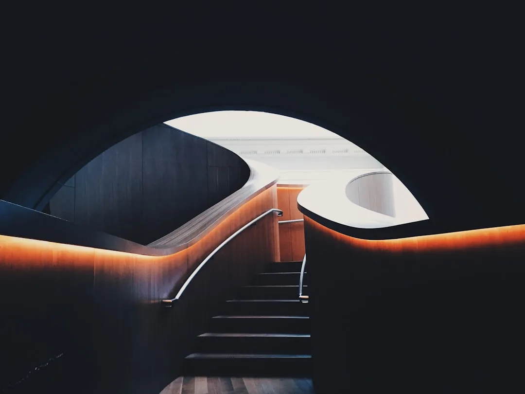
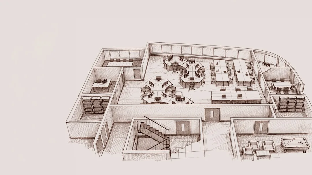
7. The Circulation Plan as a Design Feature
Most houses treat hallways as connective tissue — the space between the real rooms. In a large home, this is a significant missed opportunity. The movement path through a mansion is itself an experience, and in the best examples, it is designed as deliberately as any individual room.
Long corridors need a terminus. A 60-foot hallway that ends at a door is a maintenance corridor. A 60-foot hallway that ends at a full-height window, a significant sculpture, or a dramatic light fixture is a gallery. The difference is not structural — it is compositional, and it costs almost nothing extra if the decision is made before construction.
Transition spaces — the moments between rooms — are where the emotional register of the home changes. A low, intimate passage that opens into a double-height great room produces a specific psychological effect: compression followed by release. Japanese architecture formalized this as ma — the meaningful pause — and contemporary residential architects who understand large-scale design use it deliberately.
Stair design in particular carries an enormous amount of the home’s design character. A floating staircase with a single structural spine, open risers, and a continuous handrail of blackened steel is a different architectural statement than a box stair with painted drywall walls, regardless of how well both are executed. The stair is always visible from the entry. It is one of the first and last things a visitor registers. It should be treated accordingly.
- Design secondary circulation paths for service functions — a back-of-house corridor that keeps housekeeping, deliveries, and maintenance traffic out of the primary living spaces is a functional and design investment
- Use ceiling height variation along the circulation path — dropping the corridor ceiling to 9 feet before it opens into a 14-foot living space makes both feel more significant
- Light the path, not just the destinations — wall sconces along a corridor at consistent intervals create a rhythm that makes the movement feel intentional
Actionable takeaway: Walk the circulation path of your home as if arriving as a guest for the first time. Every decision you made — or didn’t make — about what that path looks, feels, and concludes at will be visible in that experience.
8. Outdoor-Indoor Continuity as a Spatial Strategy
How a Contemporary Mansion Interior Handles Indoor-Outdoor Continuity
The boundary between interior and exterior in a well-designed large home is a design decision, not a default. Floor-to-ceiling glazing that slides entirely into a wall pocket removes the threshold entirely — the living room and the terrace become one space when open, and the terrace becomes a framed view when closed. This is not a new idea, but it is consistently one of the most impactful features in large-home design because it functionally doubles the usable volume of the primary living spaces during the months when the climate allows it.
Material continuity is what makes this work. If the interior floor is large-format limestone and the exterior terrace switches to brick pavers, the transition reads as a wall — even if the wall is glass. Running the same stone from interior to exterior, specifying an appropriate exterior finish for weather resistance, dissolves the boundary at the floor plane and allows the eye to read both spaces as continuous. This is not always possible given climate and stone porosity, but it is always the goal.
Landscape architecture in this context is not gardening — it is the exterior room design program. The question is not what plants go where. The question is what the view from every significant interior window looks like at every season, what structures define the outdoor rooms, and how the exterior lighting at night creates the right relationship between what’s inside and what’s reflected in the glass.
- Specify exterior material finishes to match interior material temperature — even if you can’t use the same material, a warm exterior stone next to a warm interior stone reads as continuous; mismatched temperatures read as disconnected
- Design the outdoor dining and seating areas as rooms — defined by pergola structures, stone walls, or grade changes, not just furniture placed on an open terrace
- Exterior lighting should be designed by the same person who designs interior lighting — the relationship between the two at night, seen from inside, is a designed condition
Actionable takeaway: Stand inside your primary living space at night with the lights on and look at what you see in the glass. That reflection and the view beyond it is a designed condition. It should look intentional.
9. Restraint as the Final Material
Everything above — volume, material discipline, lighting layers, scaled furniture, art, integrated technology, circulation, indoor-outdoor continuity — is undermined by the failure to edit. The most common mistake at the finish line of a large home project is filling the space because it exists. A 12-foot console table with nothing on it except two objects feels wrong to most homeowners, who instinctively add a third object, then a fourth, then a vase, then a stack of books, until the restraint is gone and the table looks like everyone else’s.
The contemporary approach to large-scale residential design is predicated on negative space — the deliberate decision to leave areas of a room empty, to allow a wall to be just a wall, to let a material speak without competing commentary. This is the most difficult design discipline to maintain because it runs counter to every furnishing instinct most people have. A room that feels slightly sparse when you’re standing in it almost always photographs and experiences as perfectly calibrated. A room that feels finished when you’re standing in it almost always reads as overdone.
The test I use: if you can remove one object from every surface in every room and the space improves, it was over-furnished. Apply that test iteratively until it no longer improves. That’s the edit.
Actionable takeaway: After the home is furnished and styled, walk through with a trusted eye — a designer, an architect, a person with genuine visual calibration — and remove rather than add. The final 10% of the work in a large home is subtractive, not additive.
FAQ
What’s the most important difference between decorating a large home and decorating a regular one?
The fundamental shift is that large homes require a spatial logic built around volume and sequence, not just surface choices. In a standard home, you can make room-by-room decisions and the result feels reasonably coherent. In a large home, every decision has to account for sight lines, scale, and the relationship between spaces — because in an open-plan or high-volume layout, everything is visible from everywhere. The most common failure is applying normal-scale furniture and art to mansion-scale rooms. The proportions that work at 2,400 square feet are simply wrong at 7,000.
How do you keep a large contemporary home from feeling cold or sterile?
The answer is almost always warmth in the material palette and human-scale layering in the lighting. A home that relies entirely on stone, concrete, and metal — even beautifully executed — will feel inhospitable at a certain point. Introducing a warm wood tone, natural fiber textiles, and lighting that operates at table-and-floor level rather than exclusively from the ceiling creates the thermal and visual comfort that makes a large space feel like a home rather than a showroom. The architecture can be rigorous without being cold.
How much should technology integration cost as a percentage of total build budget?
For a large home where full integration is the goal — unified lighting control, motorized shading, distributed audio and video, HVAC zoning, security — a reasonable benchmark is 5–8% of the total construction budget. That number shifts based on the complexity of the system and the degree of concealment required, but projects that try to do it for less typically end up with compromised integration: systems that work but show, or systems that are installed but not properly programmed and calibrated.
Can you achieve a contemporary mansion interior look in a home that isn’t a mansion?
The principles translate — material discipline, lighting layers, scaled artwork, edited negative space — but the specific executions shift. You’re not running 20 feet of book-matched stone in a 1,800-square-foot home, but you are making the same decision about anchoring the material palette to three elements rather than six. The restraint principle is universally applicable. The volume-specific moves — double-height entries, floating staircases, mezzanine levels — require the architecture to support them, which is either there or it isn’t.
How do you find furniture scaled correctly for very large rooms when retail sizes aren’t sufficient?
Three reliable paths: custom fabrication through a local furniture maker or millwork shop, contract-grade furniture through commercial hospitality suppliers who regularly produce pieces at larger scales, and European brands (B&B Italia, Minotti, Flexform, Poliform) whose standard size range extends beyond what most American residential retailers offer. The custom path takes longer and costs more, but produces exactly what the room requires. The contract and European paths often have stock or short lead-time options that get close enough at a lower premium. What doesn’t work: ordering the largest available size from a standard retailer and hoping it reads correctly. It usually doesn’t.