Most people trying to create a dark aesthetic room end up with something that just looks gloomy — and the reason is almost never the paint color they chose.
Quick Answer
Most people trying to create a dark aesthetic room end up with something that just looks gloomy — and the reason is almost never the paint color they chose.
I know this because I made the same mistake professionally. Eleven years of designing spaces for real people in real apartments, and I still remember the client in Wicker Park whose bedroom I painted Tricorn Black before we’d sorted out a single light fixture. She called me three days later and said it felt like sleeping inside a closet. She wasn’t wrong. The color was perfect. Everything else was wrong. That experience rewired how I think about dark interiors — not as a color project, but as an atmosphere project where color is just one layer of something much more deliberate.
What follows isn’t a list of things to buy. It’s a framework for understanding how dark rooms actually work, why most attempts fail, and what separates a space that feels enveloping and psychologically rich from one that just feels dim and sad.
What a Dark Aesthetic Room Actually Means (And What It Doesn’t)
In This Article
- What a Dark Aesthetic Room Actually Means (And What It Doesn’t)
- The Color Question: What Actually Works on Dark Aesthetic Room Walls
- Lighting: The Layer That Makes or Breaks a Dark Aesthetic Room
- Texture and Materials: Why Dark Rooms Require More, Not Less
- Objects and Curation: The Difference Between Atmosphere and Clutter
- The Practical Build Sequence: How to Actually Execute a Dark Aesthetic Room
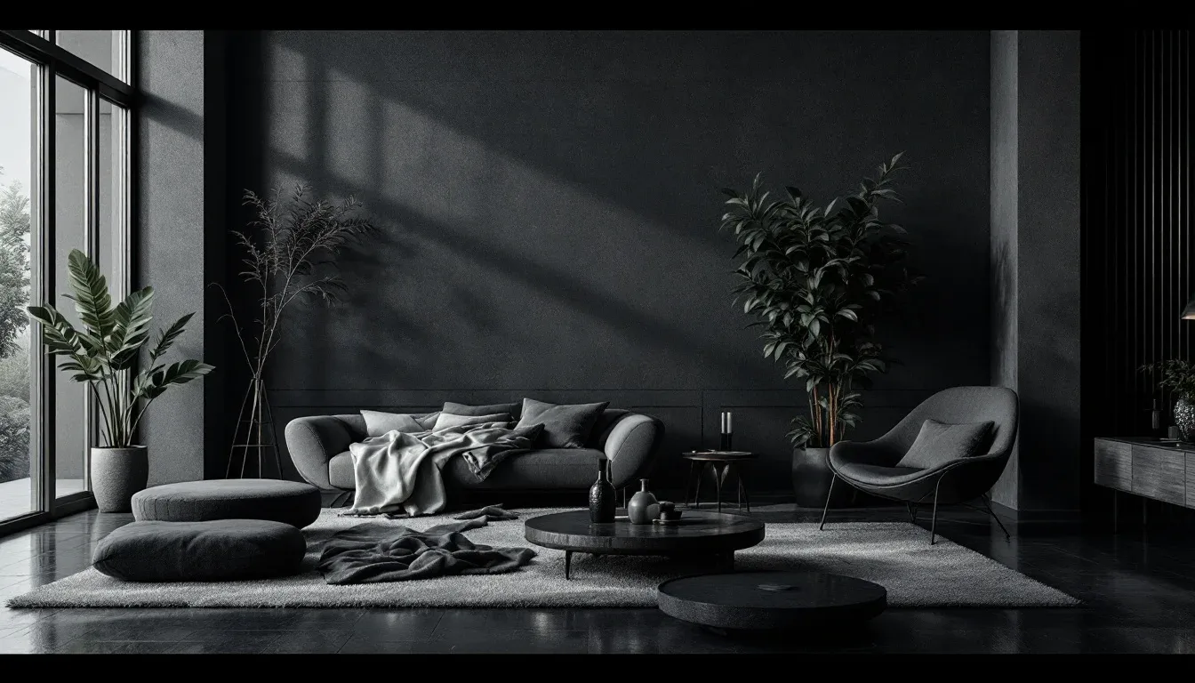
Dark aesthetic is a design philosophy before it’s a color palette. That distinction matters enormously, because the people who get it wrong are almost always treating it as a paint-and-product decision rather than a spatial and psychological one.
At its core, dark aesthetic design is about intentional contrast, controlled atmosphere, and psychological enclosure — the feeling of being held by a space rather than exposed by it. It draws from Victorian interior logic, which used heavy drapery, layered textiles, and low candlelight not as decoration but as environmental control. It borrows from noir film staging, where directors like Carol Reed and cinematographers of the 1940s understood that a single lit object against deep shadow creates more emotional weight than a fully lit scene. Japanese wabi-sabi contributes a different thread — the beauty of imperfection, aged materials, and the acceptance of shadow as a positive presence rather than an absence of light.
What it does not mean is black paint and candles. That formulation — I’ve seen it in dozens of articles and I find it genuinely useless — reduces a sophisticated design approach to a shopping list.
The sub-styles operating under the dark aesthetic umbrella each follow different material and color logic:
- Gothic dark: Heavy symmetry, ecclesiastical references, deep jewel tones, iron and velvet
- Moody romantic: Soft edges, layered textiles, muted warm darks, candlelight as a genuine anchor
- Industrial dark: Raw concrete, matte black metal, exposed structure, minimal softness
- Dark academia: Warm wood tones, aged leather, deep forest and oxblood, stacked books as visual texture
- Witchcore: Organic shapes, dried botanicals, earthy darks, ritual objects with genuine character
- Cottagecore dark: Unexpected — it uses the natural palette of cottagecore (moss, bark, shadow) but deepens it into something more nocturnal
Color psychology research published in the journal Color Research & Application has found that dark-colored rooms are consistently rated as feeling more intimate and emotionally safe than light-colored rooms — but only when proper lighting contrast is present. Remove that contrast, and those same dark rooms rate poorly for comfort and wellbeing. That finding validates everything I observed in practice: the darkness isn’t the problem. The flatness is.
The biggest misconception most beginners carry into this project is that dimming the lights creates the aesthetic. It doesn’t. It creates depression. The difference between a space with a dark aesthetic that feels like sanctuary and one that feels like neglect is intentional layering — color against texture against directed light against meaningful objects. Every element has to be doing something.
Actionable takeaway: Before purchasing anything, identify which dark aesthetic sub-style you’re working toward. The material and lighting logic differs enough between them that buying for the wrong sub-style is how you end up with a room that feels confused rather than curated.
The Color Question: What Actually Works on Dark Aesthetic Room Walls
Color selection for a dark room is where most people start and where most people make their first significant error. They pull a paint chip, hold it up against the wall in daylight, decide it’s dark enough, and move forward. Two weeks later the walls are painted and the room reads either like a jewelry box gone wrong or — as in my Wicker Park situation — an unfinished basement.
The finish matters as much as the color. For black walls specifically, matte and eggshell finishes absorb light in a way that creates genuine depth; satin and semi-gloss on dark colors picks up every imperfection in your drywall and creates a visual noise that reads as cheap rather than atmospheric. I’ve seen beautifully chosen dark colors completely undermined by the wrong sheen. If you’re going black, go matte or eggshell and don’t let anyone talk you out of it.
Farrow & Ball’s Off-Black and Sherwin-Williams’ Tricorn Black consistently rank as the top two best-performing true blacks for interior walls across design community testing — and the reason they perform well isn’t magic, it’s pigment density and undertone control. Off-Black pulls slightly warm; Tricorn pulls cool and clean. Which you choose should depend on your light exposure.
The warm-versus-cool dark distinction is one that most budget decorating content ignores entirely:
- Warm darks — charcoal with brown undertones, forest green, rust-adjacent burgundy, deep terracotta — perform significantly better in north-facing rooms where natural light is already cool and limited. They prevent the room from reading as cold and clinical.
- Cool darks — slate, true navy, pure black, steel blue — suit south- and east-facing rooms where natural light is stronger and warmer. The cool color counterbalances the warmth.
Deep jewel tones are more forgiving than black in smaller rooms. Emerald, sapphire, oxblood, and plum create richness and depth without the full commitment of a true black — they’re the appropriate middle ground for someone who wants a dark aesthetic without wanting to feel like they’re living inside a shadow.
Ceiling color is the single most underused tool in dark room design. Painting the ceiling the same tone as the walls — or one shade deeper — creates a cocoon-like enclosure that is definitional to the aesthetic. A dark-walled room with a white ceiling reads as unfinished. The white ceiling floats above the space and breaks the sense of envelopment entirely. One of my clients resisted this for weeks before I finally convinced her to paint the ceiling in Hague Blue to match her walls, and she told me afterward it was the single change that made the room finally feel like what she’d been imagining.
A few additional color rules worth keeping:
- Test paint samples at night, not in daylight. A dark color that reads as rich and moody at noon can look flat or greenish under incandescent light. Always evaluate your sample swatches under the actual lighting conditions the room will use.
- Paint large sample patches — at least 12 by 12 inches. Small chips lie. Dark colors especially shift dramatically at scale.
- Consider the floor. Dark walls against a pale blonde hardwood floor create an unresolved contrast. Dark walls against dark stained wood, concrete, or a deep area rug feel unified. The floor is part of the color story.
- Trim color matters more than people expect. White trim against very dark walls creates a sharp, graphic contrast that reads more modern than gothic. Painting trim in the same dark tone — or a complementary deep neutral — reinforces the enveloping quality the aesthetic depends on.
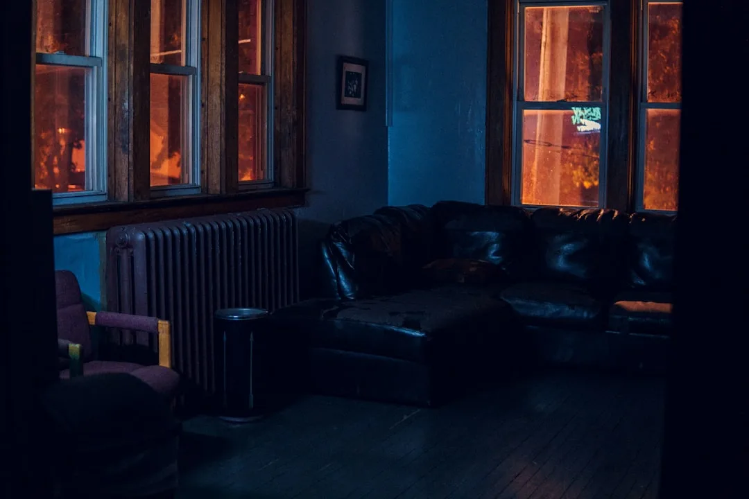
Lighting: The Layer That Makes or Breaks a Dark Aesthetic Room
This is the section that most articles skip, and it’s the reason most dark aesthetic rooms fail. Color without deliberate lighting is just paint. Lighting is the mechanism that turns paint into atmosphere.
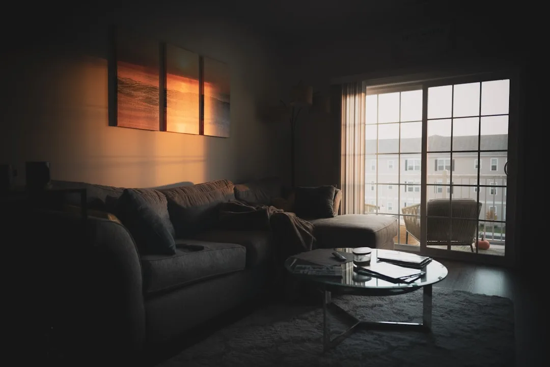
The core principle is directional layering: using multiple low-level light sources at different heights rather than one or two overhead fixtures. Overhead lighting in a dark room is almost always a mistake. It throws light downward, creates unflattering shadows, and illuminates the floor more than any of the surfaces you’ve worked to make beautiful. In a properly designed dark aesthetic room, the ceiling should often be the darkest part of the space. Overhead fixtures work against that.
What to use instead:
- Wall sconces at eye level or below — these throw light horizontally and upward, creating the glow-against-dark-wall effect that photographs beautifully and feels deeply atmospheric in person
- Table lamps with opaque or dark shades — the shade directs light downward onto surfaces and creates pools of warmth rather than broadcasting light broadly
- Floor lamps positioned in corners — corner placement bounces light off two dark walls simultaneously, which multiplies the warmth without increasing the brightness
- Candles used intentionally, not decoratively — real flame creates micro-movement in the light that no LED replicates; a cluster of pillar candles on a tray does more for a dark aesthetic room than a dozen well-chosen throw pillows
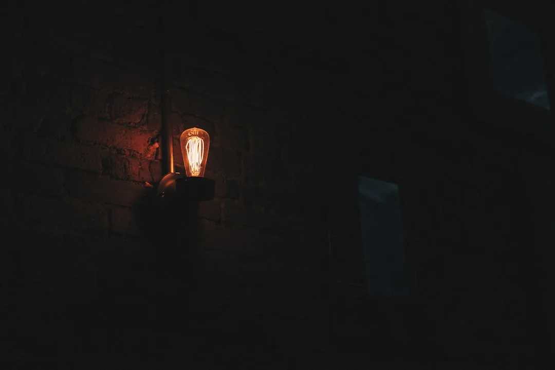
- Edison bulbs and warm-toned LEDs (2700K or lower) — color temperature is critical; anything above 3000K will read cool and clinical against dark walls, destroying the warmth the color is trying to create
- Dimmer switches on everything possible — the ability to adjust light levels throughout the day is not a luxury in a dark aesthetic room, it’s a functional requirement
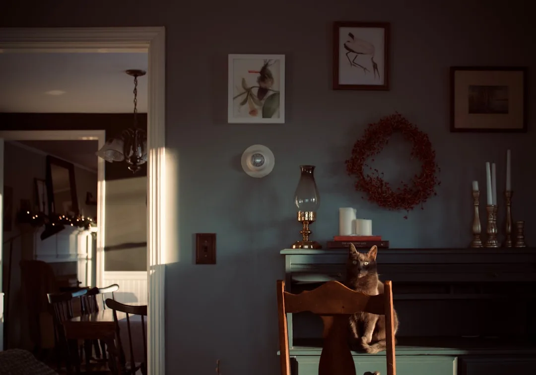
The Rembrandt principle is worth understanding directly: in his paintings, Rembrandt consistently placed his brightest light on a single focal point and let everything else fall into graduated shadow. That’s not accident, it’s craft. Apply it to a room by identifying one object or area that you want to be the visual anchor — a reading chair, a bed headboard, a piece of art — and light it more brightly than everything else. The contrast between that lit focal point and the surrounding dark does the emotional work you’re trying to achieve.
Avoid lighting symmetry. Two matching lamps on matching nightstands creates a hotel-room balance that works against the asymmetric intimacy of dark aesthetic design. Vary the heights, vary the sources, vary the warmth levels slightly across the room.
Texture and Materials: Why Dark Rooms Require More, Not Less
One of the counterintuitive truths about designing a dark aesthetic room is that surface texture becomes more important as color darkens, not less. In a light-colored room, contrast comes naturally from the color differences between objects. In a dark room, most of your objects are operating in a similar value range — so texture has to carry the visual differentiation that color can no longer provide.
A dark room with no textural variation reads as flat and oppressive. A dark room with layered texture reads as rich and complex, even if you can’t articulate exactly why.
Materials that perform well in dark aesthetic rooms:
- Velvet — absorbs light in a way that makes it look almost liquid; works on sofas, headboards, throw pillows, and curtains; particularly effective in jewel tones
- Aged or patinated metal — brass that’s been allowed to oxidize, wrought iron, blackened steel; raw shiny metal reads as modern rather than atmospheric
- Dark stained or reclaimed wood — grain texture reads beautifully against dark walls; avoid wood with orange or honey tones, which clash with most dark palettes
- Woven textiles with visible structure — chunky knits, linen with visible weave, wool throws; the texture catches light differently at different angles, creating visual movement
- Stone and ceramic with matte or rough finishes — decorative objects in these materials add weight and tactile interest without competing with the dark palette
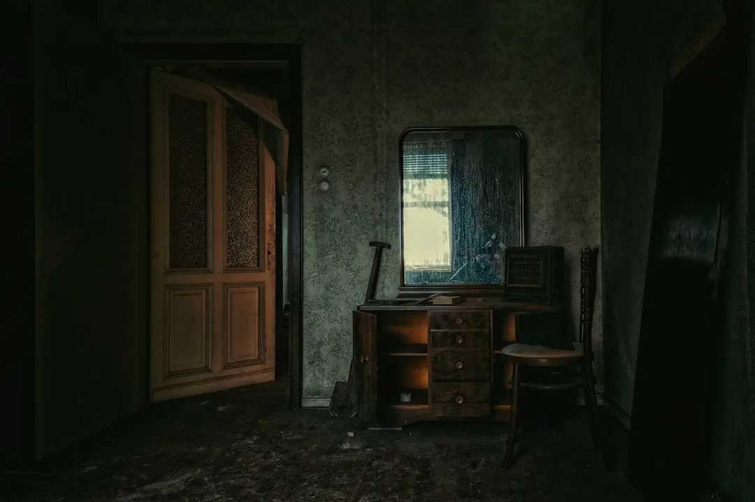
- Leather, particularly aged leather — develops patina over time and suits the dark academia and moody romantic sub-styles especially well
- Dried botanicals and organic objects — branches, seed pods, dried flowers in dark tones; these add organic irregularity that manufactured objects can’t replicate
What to avoid:
- Highly polished surfaces in large quantities — they reflect light in ways that interrupt the atmosphere
- Sheer or light-colored curtains — these admit daylight in a way that bleaches out the dark color story; blackout or heavy-weight curtains in dark tones are the correct choice
- Plastic and synthetic materials with obvious sheen — they cheapen the material vocabulary the aesthetic requires
- Too much matching — a perfectly coordinated dark room reads as a showroom display; deliberate mixing of different dark tones and textures is what creates the sense of accumulated meaning
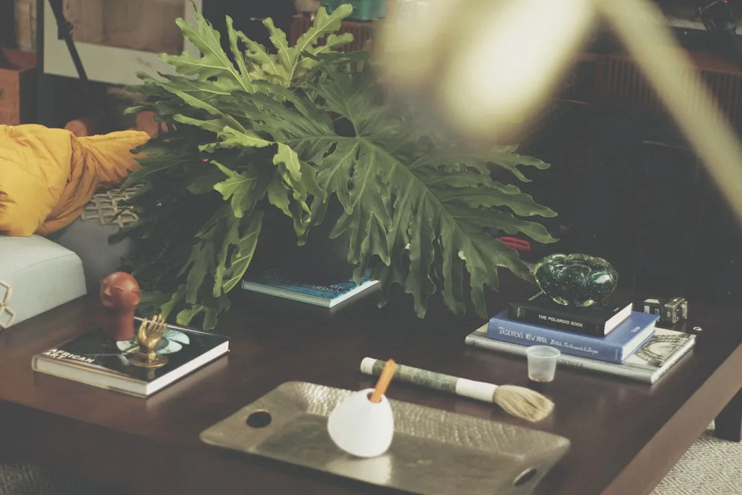
Objects and Curation: The Difference Between Atmosphere and Clutter
A dark aesthetic room lives or dies by the quality of its objects. This is the layer where most people either overshoot into clutter or undershoot into emptiness — and the difference between those failure modes is curation logic, not budget.
The guiding principle I use with clients: every object in a dark aesthetic room should justify its presence through meaning, texture, or silhouette. If it doesn’t offer at least one of those three things, it shouldn’t be there. That standard sounds harsh, but it’s what separates a room that feels like it has a point of view from one that feels like a collection of dark-toned things.
Objects that earn their place in a dark aesthetic room:
- Books with visible spines — not decorative books turned spine-inward, but actual books that communicate something about who lives in the space
- Candles in varied heights and vessels — the layering of heights creates visual rhythm; mismatched holders read as collected, not purchased as a set
- Art with weight and intention — dark-toned paintings, botanical prints, figure drawings, framed vintage illustrations; the subject matter should connect to the sub-style logic of the room
- Ceramic and pottery with handmade character — irregularity and glaze variation suit the aesthetic; mass-produced ceramics with too-perfect edges work against it
- Mirrors in ornate or unusual frames — these serve the double purpose of adding visual interest and bouncing light from your low-level sources back into the room
- Plants, particularly those with strong silhouettes — a tall fiddle-leaf fig, a trailing pothos in a dark vessel, a cactus collection; avoid flowering plants with bright blooms, which read as incongruous
- Found and collected objects with personal history — a dark aesthetic room should feel inhabited, not installed; objects with genuine personal meaning read differently than objects purchased to achieve an aesthetic
Arrangement principles:
- Group objects in odd numbers — threes and fives create more dynamic compositions than pairs
- Vary height within groupings — flat arrangements read as decoration; varied heights read as composition
- Leave negative space deliberately — a dark aesthetic room is not a maximalist room by default; the shadow between objects is part of the visual language
- Use trays to contain collections — a tray grounds a grouping of small objects and prevents them from reading as scattered
The Practical Build Sequence: How to Actually Execute a Dark Aesthetic Room
Most people approach a room redesign by buying things and then figuring out where they go. That sequence produces confusion. Here’s the order that actually works:
- Identify your sub-style and commit to it — Gothic dark, dark academia, moody romantic, industrial dark, witchcore, or cottagecore dark. Write it down. It’s your decision filter for every choice that follows.
- Audit your lighting before touching paint — identify where your light sources will be, what fixtures you’ll need, and what bulb temperatures you’ll use. The color you choose for the walls should be selected under the lighting conditions the finished room will have.
- Select wall color based on room orientation and light temperature — warm darks for north-facing rooms, cool darks for south- and east-facing rooms. Test large samples at night under your actual fixtures.
- Paint walls and ceiling together — ceiling should match the walls or go one shade deeper. Do not paint the ceiling last as an afterthought.
- Establish your anchor furniture — the piece the room is organized around, usually a bed, sofa, or reading chair. Its material and color sets the tone for everything else.
- Layer textiles — add curtains first (blackout, dark-toned, floor-length), then rugs, then furniture textiles, then throw pillows and blankets. Each layer adds depth.
- Install and test lighting at each stage — don’t wait until the room is complete to evaluate how the lighting reads. Check after the walls are painted, after furniture is placed, and after each lighting layer is added.
- Add objects last and edit ruthlessly — bring in your curated objects, place them, and then remove anything that isn’t earning its place through meaning, texture, or silhouette.
FAQ: Dark Aesthetic Room Questions Answered Directly
Will a dark aesthetic room make a small space feel smaller?
Only if you do it wrong. A properly lit dark aesthetic room with good textural layering can feel more spacious than a poorly lit white room — because the eye is drawn to the lit focal points rather than the boundaries of the space. The walls recede rather than advancing toward you. Where dark rooms fail in small spaces is when there’s no lighting contrast at all; then the walls close in. The fix is directional lighting and at least one mirror to extend the visual depth of the room.
Can I create a dark aesthetic room in a rental without painting?
Yes, though it takes more planning. Dark removable wallpaper has improved significantly in quality — Tempaper and Chasing Paper both offer dark-toned options that install cleanly and remove without damage. Large dark area rugs do substantial work in changing a room’s color story even with pale walls. Heavy blackout curtains in dark tones shift the atmosphere considerably. Dark furniture and textiles carry a lot of the palette when the walls can’t. The result won’t be identical to a fully painted dark aesthetic room, but it can be genuinely effective.
What’s the best paint color to start with for a first dark aesthetic room?
For a first attempt, I consistently recommend a deep forest green or a warm charcoal rather than true black. Both are forgiving — they read as dark and atmospheric while being less demanding about the lighting perfection that true black requires. Farrow & Ball’s Studio Green and Sherwin-Williams’ Cascades are reliable starting points for green; Benjamin Moore’s Wrought Iron works well as a warm charcoal entry point. Once you understand how your room handles dark color and directed light, stepping up to a true black becomes a much less risky decision.
How do I keep a dark aesthetic room from feeling depressing?
The answer is almost always lighting and organic material. Depression in dark rooms comes from flatness — no contrast, no warmth, no living elements. Add warm-toned directional light sources, bring in plants with strong silhouettes, incorporate natural materials like wood and stone and dried botanicals, and ensure that at least one area of the room has a deliberately bright focal point. Personal objects with genuine meaning also matter here — a room that reads as inhabited rather than installed doesn’t feel depressing even when the palette is very dark.
Do dark aesthetic rooms work in living rooms and kitchens, or only bedrooms?
They work in any room, but the application logic shifts. Living rooms benefit from dark accent walls rather than all-four-wall coverage in many cases — this is the one context where a single dark wall can be the right call, because it creates a focal backdrop without enclosing the entire social space. Kitchens are the most challenging context: dark cabinets work very well, dark walls work if you have adequate task lighting (non-negotiable in a kitchen), but dark countertops require more maintenance than most people anticipate. Libraries, home offices, and dining rooms are actually among the most natural fits for dark aesthetic design — the enclosure quality suits focused, intimate activities particularly well.
How much does it cost to do a dark aesthetic room properly?
The honest answer is that the lighting investment is the most significant one, and it’s the one most people underestimate. Quality dimmer-compatible sconces, warm-toned bulbs across multiple fixtures, and potentially an electrician to add outlets or switches can run several hundred dollars before you’ve bought a single piece of furniture. Paint quality matters — premium dark paints like Farrow & Ball are expensive, but the pigment density at the price point is genuinely different from budget options. That said, a dark aesthetic room doesn’t require expensive furniture; it requires interesting furniture. Thrift stores and vintage markets are better sources for the aged, textured, characterful pieces this aesthetic depends on than most furniture retailers at any price point.
Will a dark aesthetic room make a small space feel smaller?
Only if you do it wrong. A properly lit dark aesthetic room with good textural layering can feel more spacious than a poorly lit white room — because the eye is drawn to the lit focal points rather than the boundaries of the space. The walls recede rather than advancing toward you. Where dark rooms fail in small spaces is when there’s no lighting contrast at all; then the walls close in. The fix is directional lighting and at least one mirror to extend the visual depth of the room.
Can I create a dark aesthetic room in a rental without painting?
Yes, though it takes more planning. Dark removable wallpaper has improved significantly in quality — Tempaper and Chasing Paper both offer dark-toned options that install cleanly and remove without damage. Large dark area rugs do substantial work in changing a room’s color story even with pale walls. Heavy blackout curtains in dark tones shift the atmosphere considerably. Dark furniture and textiles carry a lot of the palette when the walls can’t. The result won’t be identical to a fully painted dark aesthetic room, but it can be genuinely effective.
What’s the best paint color to start with for a first dark aesthetic room?
For a first attempt, I consistently recommend a deep forest green or a warm charcoal rather than true black. Both are forgiving — they read as dark and atmospheric while being less demanding about the lighting perfection that true black requires. Farrow & Ball’s Studio Green and Sherwin-Williams’ Cascades are reliable starting points for green; Benjamin Moore’s Wrought Iron works well as a warm charcoal entry point. Once you understand how your room handles dark color and directed light, stepping up to a true black becomes a much less risky decision.
How do I keep a dark aesthetic room from feeling depressing?
The answer is almost always lighting and organic material. Depression in dark rooms comes from flatness — no contrast, no warmth, no living elements. Add warm-toned directional light sources, bring in plants with strong silhouettes, incorporate natural materials like wood and stone and dried botanicals, and ensure that at least one area of the room has a deliberately bright focal point. Personal objects with genuine meaning also matter here — a room that reads as inhabited rather than installed doesn’t feel depressing even when the palette is very dark.
Do dark aesthetic rooms work in living rooms and kitchens, or only bedrooms?
They work in any room, but the application logic shifts. Living rooms benefit from dark accent walls rather than all-four-wall coverage in many cases — this is the one context where a single dark wall can be the right call, because it creates a focal backdrop without enclosing the entire social space. Kitchens are the most challenging context: dark cabinets work very well, dark walls work if you have adequate task lighting (non-negotiable in a kitchen), but dark countertops require more maintenance than most people anticipate. Libraries, home offices, and dining rooms are actually among the most natural fits for dark aesthetic design — the enclosure quality suits focused, intimate activities particularly well.