Most rooms look forgettable not because they lack decor, but because they were styled from the wrong end — starting with objects instead of atmosphere. You buy the throw pillows, the candle, the little ceramic mushroom from TikTok Shop, and the room still feels like a hotel hallway. Nothing coheres. Nothing breathes. The problem isn’t your taste — it’s your sequence. Whether you’re chasing cute aesthetic rooms or something more minimal and editorial, the fix is always the same: start with layers, not objects.
Quick Answer
Most rooms look forgettable not because they lack decor, but because they were styled from the wrong end — starting with objects instead of atmosphere.
I spent eleven years walking into apartments across Chicago and New York, and the same issue appeared in nearly every space I was hired to fix. The room had plenty of stuff. What it lacked was intention — a clear sense of what the room was supposed to feel like before a single item was purchased. That’s the difference between a space that looks curated and one that looks like a clearance sale survived it.
This article is about the layers. All of them, in order, with nothing left vague.
How Do You Actually Make a Room Feel Cute and Aesthetic?
In This Article
Cute aesthetic rooms are built around a feeling first — not a shopping cart. Before you look at a single product, you need to answer one question honestly: what emotion do you want this room to produce the moment you walk in? Calm? Romance? Energy? Playful warmth? That answer determines everything — your palette, your textures, your furniture silhouettes. Skipping this step is why people end up with a sage green throw blanket next to a hot pink alarm clock next to a motivational print in a chunky black frame, and wonder why the room feels unsettled.
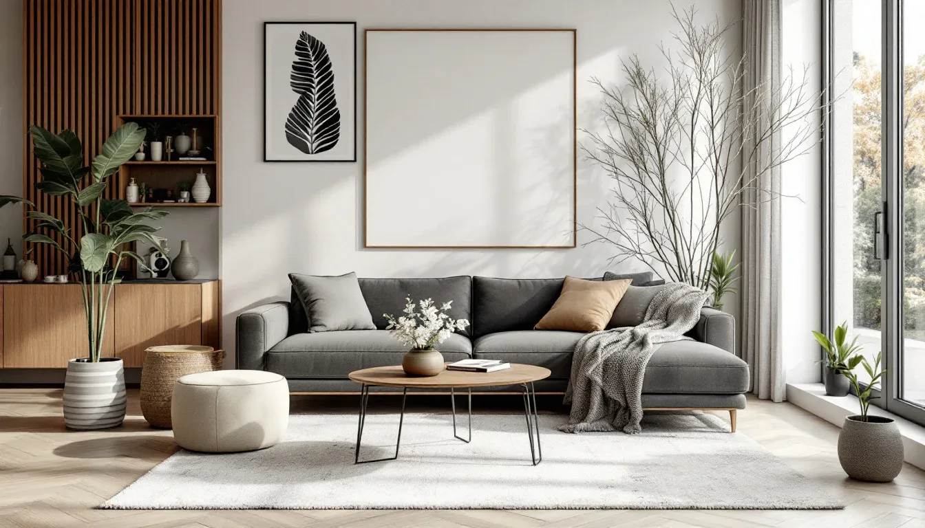
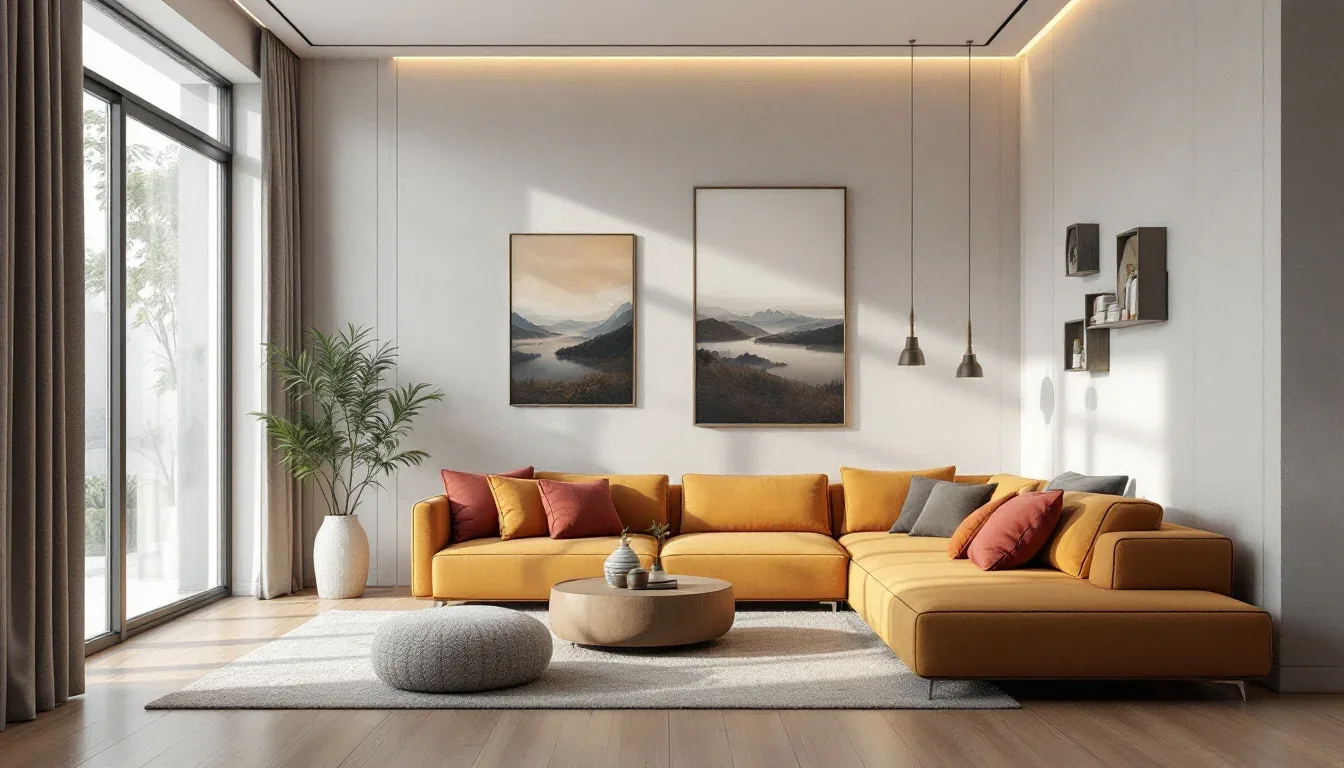
Start with three colors. One dominant, one secondary, one accent. The dominant should cover roughly 60% of visual surfaces — walls, large textiles, the biggest piece of furniture. Secondary covers around 30%. Accent — the color you use for small objects, a single pillow, maybe a lamp base — covers the remaining 10%. This isn’t rigid math; it’s a proportion framework that keeps rooms from looking visually scattered.
Pick one dominant texture before you add anything else. Boucle and linen read differently than velvet and satin. Natural materials (rattan, jute, raw wood) pull a room toward warmth. Smooth synthetics and glass push toward cool and polished. Neither is wrong, but you need to commit to a direction before introducing contrast.
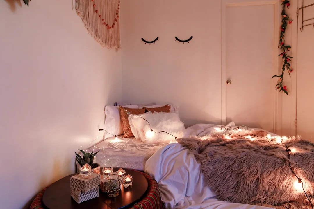
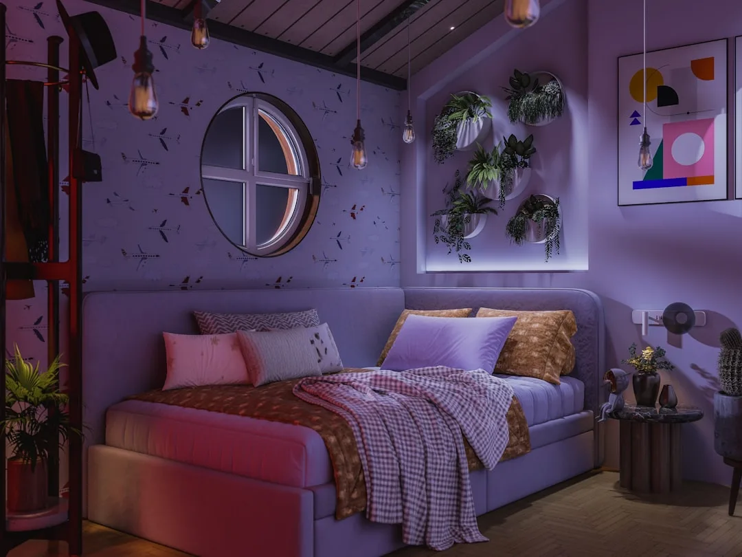
Lighting — not fairy lights, not candles, not a ring light in the corner — is where most rooms quietly fail. Overhead-only lighting flattens a room completely. It removes depth, washes out color, and makes even beautiful furniture look institutional. Most designers I’ve worked with would rather rip out recessed lighting than work around it. The pattern I kept seeing was that clients who felt their rooms were “off” despite good furniture almost always had only one light source. Fix the lighting before you buy another decorative object. That tracks with everything I watched happen in real spaces.
The most practical lighting fix requires no electrician and costs under $100. Add three light sources at three different heights: a floor lamp in a corner, a table lamp on a nightstand or dresser, and one small accent light lower than eye level — a plug-in sconce, a small lamp on the floor behind a plant, even a well-placed candle cluster. Three heights, three points of warmth, one room that suddenly reads as intentional. That’s the formula behind nearly every cute aesthetic room you’ve saved on Pinterest without being able to identify why it looked so good.
Actionable takeaway: Before your next purchase, write down three words that describe how you want your room to feel. Every future buying decision gets filtered through those words. If the item doesn’t serve at least one of them, it stays in the cart.
The 3-4-5 Decorating Rule (And Why It Changes How You Style Every Surface)
Here’s something formal design education teaches early: the human eye doesn’t rest comfortably on even-numbered groupings. Two identical candles flanking a plant feels static. Three objects of varying height — that feels like it was arranged by someone who knew what they were doing. The 3-4-5 rule is simply the principle of odd-numbered groupings applied with enough specificity to be actually usable.
The rule refers to grouping decorative objects in clusters of three, four, or five — never two, rarely six or more. But the number alone isn’t the mechanism. What makes it work is what you do within the grouping: you vary height, texture, and scale so the eye has somewhere to travel.
Every cluster needs this:
- One tall element — a vase, a tall candle, a stack of books, a plant
- One medium element — a framed photo, a bowl, a small sculpture
- One low element — a tray, a small figurine, a single bloom in a short vessel
- One unexpected material — something that contrasts the dominant texture in the grouping, like a brass piece in an otherwise ceramic cluster, or a raw wood element in an otherwise soft, textile-heavy arrangement. For trays specifically, the trayscaping method gives you a repeatable system for surface styling
Apply this across every horizontal surface you have: nightstands, shelves, windowsills, the top of a dresser. A gallery wall follows the same logic — even when you’re working with frames in a grid, you want a mix of sizes so no single row reads as perfectly symmetrical.
The mistake I see constantly — and I made this myself early on when I was arranging a client’s bookshelf in a Lincoln Park two-flat — is grouping items by material. All ceramics together. All metal objects in one cluster. It feels logical but reads as dull. Mix finishes within each grouping: a ceramic pot next to a brass tray next to a linen-bound book. The contrast is what creates visual interest.
Interior designers reference the rule of odds as a foundational principle in formal design training — it mirrors the same natural asymmetry found in landscape design, where planters, trees, and ground cover are almost never arranged in pairs.
The same rule applies to layering textiles on a bed. One duvet (large, dominant) plus one throw folded at the foot (medium) plus two accent pillows in a contrasting texture (small) — that’s a cluster of three textile elements at three scales. Beds styled with only a duvet and matching shams look made, not designed. The throw does more visual work than almost any other single item in a bedroom refresh.
Actionable takeaway: Pick one shelf or surface in your room right now and rearrange it into a single cluster of three objects. Vary the heights intentionally. Notice how different it reads from what was there before.
What Is a Coquette Room — And Is It Right for Your Space?
Coquette aesthetic is often reduced to “pink and bows” in the kind of content that treats aesthetic as costume rather than atmosphere. The actual reference is much older. Coquette pulls from 18th-century French femininity — the visual language of Versailles salons, powder rooms, and boudoirs. Blush pinks, lace edging, pearls used as accents, ornate gilded mirrors, soft candlelight, and an overall mood of restrained opulence.
Key furniture silhouettes that define the look: tufted headboards (button-tufted specifically, not channel), vanity tables with oval or arch-top mirrors, upholstered armchairs with curved cabriole legs, and bed frames with decorative carved or metalwork details. These shapes are doing as much work as the color palette.
Speaking of palette — this is where most people go wrong. The coquette color palette anchors in dusty rose, champagne, ivory, and soft mauve. Saturated hot pinks push the whole room from “romantic” into “loud,” which is a completely different aesthetic. There’s nothing wrong with loud, but if you want coquette’s specific quality of softness — the sense that the room has been lived in by someone with quiet, deliberate taste — the tones need to stay muted.
Coquette is not maximalism. The items are delicate and ornate, but restraint is still part of the framework. One gilded mirror, not four. One vanity tray arranged with perfume bottles and a small bud vase, not every surface covered in collectibles. The version of coquette that reads as sophisticated rather than cluttered is always edited — carefully chosen pieces with negative space between them, so each item registers individually rather than blurring into visual noise.
Where coquette overlaps with cute aesthetic rooms more broadly is in the attention to small details: the satin ribbon tied around a curtain rod, the pearl-handled drawer pulls on a white dresser, the tiny framed botanical print above the nightstand. These micro-details are what separates a room that photographs beautifully from one that just looks like it has a lot of pink furniture.
Surfaces to focus on in order of visual impact:
- The bed — headboard shape and textile layering do the most work in any bedroom; coquette lives or dies on the headboard
- The mirror — an ornate gilded or antiqued frame transforms any wall from flat to finished
- The nightstand — styling this surface with a cluster (tall lamp, small tray, single bloom) pulls the whole look together
- Window treatments — sheer white or ivory curtains hung high and wide make the entire room feel softer and taller simultaneously
- Small hardware details — drawer pulls, curtain rod finials, and light switch covers are consistently overlooked and consistently noticed by anyone who walks into a room that has them right
Actionable takeaway: If you’re building toward a coquette or romantic-leaning cute aesthetic room, start with one statement mirror before anything else. A single well-chosen ornate mirror does more atmospheric work than a full cart of smaller accessories.
The Styling Layers in Order (So You Stop Working Against Yourself)
Most people approach room styling the way they approach getting dressed — they start with the accessories. That’s exactly backward. Accessories are the final layer, not the foundation. When you work from accessories inward, everything you add has to fight with what’s already there. When you work from foundation outward, each layer supports the next one.
The correct sequence:
- Define the feeling first — three words, written down, non-negotiable filter for every purchase
- Set the light — natural light direction, overhead situation, and at least two additional light sources before any decor goes in
- Establish the color architecture — dominant, secondary, accent in the 60/30/10 proportion
- Choose the dominant texture — one material that sets the tactile tone of the whole room
- Place the large furniture — scale, traffic flow, and negative space before anything smaller enters the conversation
- Layer the textiles — rugs, curtains, bedding, throw blankets, and pillows in a deliberate order of scale
- Add the functional decorative objects — lamps, mirrors, plants, trays
- Style the surfaces — apply the 3-4-5 grouping rule across every horizontal plane
- Add the small details last — candles, small figurines, ribbon details, tiny framed prints, the ceramic mushroom
The reason this sequence matters: each layer sets the context for the one that follows. If you choose a rug before you’ve established your color architecture, you’ll end up reverse-engineering a palette around the rug — which sometimes works, but more often creates subtle tension throughout the room that you can feel without being able to name.
The two layers people skip most consistently are Layer 2 (lighting) and Layer 6 (textiles at scale). A room without a rug in a space that has hard floors will always feel unfinished regardless of how good the furniture is. And a room with a single overhead light source will always feel flat regardless of how carefully the surfaces are styled.
Actionable takeaway: Identify which layer you’re currently skipping in your space. Most people are missing Layer 2 or Layer 6. Fix the missing layer before adding anything else.
FAQ: Cute Aesthetic Rooms
What makes a room look cute and aesthetic without feeling childish?
Scale and restraint. Cute aesthetic rooms that read as mature rather than juvenile tend to use softer, muted versions of playful colors rather than saturated primaries, and they mix in at least one grounding element — a natural wood piece, a linen textile, a simple architectural detail. The “childish” feeling usually comes from saturated color combined with very small-scale accessories and no visual weight anywhere in the room. Add one piece with visual mass — a substantial mirror, a real plant in a large pot, a textured rug — and the whole room shifts register.
How do I start building a cute aesthetic room on a tight budget?
Start with textiles, not furniture. A new duvet cover, a throw blanket, and two accent pillows can completely change the feeling of a bedroom for under $80. Textiles are the highest-impact-per-dollar category in any room. After textiles, lighting: a single well-placed lamp from a thrift store or a budget retailer does more work than most decorative objects at twice the price.
Why does my room look good in photos but feel off in person?
Almost always a lighting and scent issue. Photographs flatten and simplify — they can’t capture the way overhead-only lighting feels institutional in person, and they obviously can’t capture the absence of scent. Rooms that feel genuinely good to be in have layered lighting (at least two non-overhead sources), some form of ambient scent (a candle, a diffuser, even dried botanicals), and enough negative space that the room doesn’t feel crowded when you’re physically inside it. Style for the body, not just the camera.
What’s the difference between cute aesthetic rooms and cottagecore?
Cute aesthetic rooms is a broader category that includes several sub-aesthetics — cottagecore is one of them. Cottagecore specifically references rural English and European country life: linen and cotton in muted earth tones, dried flowers, vintage ceramic pitchers, botanical prints, worn wood furniture, and a general sense of domesticity and nature. Cute aesthetic rooms can include cottagecore, but they also cover kawaii-influenced spaces, coquette, soft girl, Danish pastel, and a number of other distinct visual languages. The common thread across all of them is intentional softness and personal warmth — but the specific objects and references differ significantly between sub-aesthetics.
How many decorative objects is too many?
The clearest signal of over-decorating is when your eye has nowhere to rest. If every surface is covered and every wall has something on it, the room stops reading as curated and starts reading as busy. A useful test: stand in the doorway of your room and identify three spots where your eye lands naturally and feels at ease. If you can’t find three, you have too much on the surfaces. Start removing rather than rearranging — take objects off surfaces entirely and live with the negative space for a few days before deciding what to bring back.