The most common grunge room aesthetic on the internet is not actually grunge — it is a retail mood board featuring matching plaid bedding, brand-new Edison bulbs, and a vinyl record display that has never been played, and understanding why it falls flat is the fastest way to get the real thing right.
Quick Answer
The most common grunge room on the internet is not actually grunge — it is a retail mood board featuring matching plaid bedding, brand-new Edison bulbs, and a vinyl record display that has never been played, and understanding why it falls flat is the fastest way to get the real thing right.
I spent eleven years designing interiors in Chicago and New York, and the clients who asked for “grunge” were almost always showing me Pinterest boards full of IKEA-adjacent products arranged to suggest a life rather than reflect one. The gap between those images and what a grunge room actually does spatially, emotionally, and atmospherically is enormous. So before you buy anything, understand what you are actually building.
What Is Grunge in Interior Design — Beyond the Band Posters
In This Article
- What Is Grunge in Interior Design — Beyond the Band Posters
- What a Grunge Room Really Is (Not What Influencers Sell You)
- The Grunge Aesthetic Explained: What It Borrows From and Why It Works Spatially
- How to Actually Build a Grunge Room Without Buying a Kit
- The Colors and Materials That Actually Work
- Common Mistakes and Why They Happen
Grunge interior design is a design philosophy rooted in deliberate imperfection — not a product category, not a color palette you can buy at Target, and emphatically not a theme in the same sense that “coastal” or “farmhouse” is a theme. It borrows its logic from industrial decay, punk DIY culture, and the kind of spaces that accumulate meaning over years rather than afternoons.
The term “grunge aesthetic” saw a 312% increase in Pinterest saves between 2020 and 2023, largely driven by Gen Z reclaiming 90s subcultural identity through interior spaces rather than fashion. That number tells you something important: the aesthetic is being absorbed into mainstream decorating culture at speed, which is exactly when its core principles get diluted beyond recognition.
What those principles actually are:
- Anti-polish as a visual statement. Surfaces should look like they have been lived on. Wear is not a flaw to correct — it is information about how a space is actually used.
- Emotional loading over visual symmetry. Objects in a grunge room should hold meaning, memory, or tactile weight. A poster you found in a record shop matters. A “vintage-style” print from Society6 does not register the same way, visually or philosophically.
- Imperfection as architecture. Raw materials, exposed structures, and unfinished edges are not evidence of incompletion — they are the aesthetic content.
- Resistance to curation. A real grunge room looks like no one arranged it for a photograph. The moment it looks styled, something has gone wrong.
- Time as a design material. The patina, the wear, the accumulated layers — these are not byproducts of living in a space, they are the primary visual content.
This distinguishes grunge sharply from dark academia and gothic aesthetics, both of which actually embrace ornament, symmetry, and a certain kind of prettiness dressed in dark colors. Grunge resists prettiness entirely. There is nothing romantic or graceful about a grunge room — it is confrontational, personal, and aggressively un-staged.
The misunderstanding I see constantly is people treating grunge as a dark color palette with some band references layered on top. That produces a room that looks theatrical — like a costume, not a character.
Actionable takeaway: Before you buy or change anything, ask one question about every object you are considering: does this feel like it was found, or does it feel like it was purchased for this purpose? That distinction is the entire design brief.
What a Grunge Room Really Is (Not What Influencers Sell You)

A grunge room should feel slightly chaotic, deeply personal, and resistant to outside approval. That is the emotional specification. Everything else — the furniture choices, the wall treatment, the lighting — exists to serve that atmosphere, not the other way around.
I once watched a client spend four hundred dollars on a “grunge bedroom kit” from an online retailer: matching plaid duvet, two coordinating pillowcases, a string light set, and a cardboard-backed vinyl record display. She arranged it perfectly, stepped back, and immediately said it looked like a dorm room designed by a committee. She was right. The grunge aesthetic was originally anti-commercial, and the sanitized retail version of it is almost a direct inversion of what made the real thing compelling.
What defines a real grunge room spatially:
- Mismatched furniture from genuinely different eras — not “mix and match” sets from the same retailer, but pieces with incompatible origins and timelines
- Surfaces that show use: rings from cups, scratches in wood, paint scuffs on walls that were never touched up because touching them up would erase something true
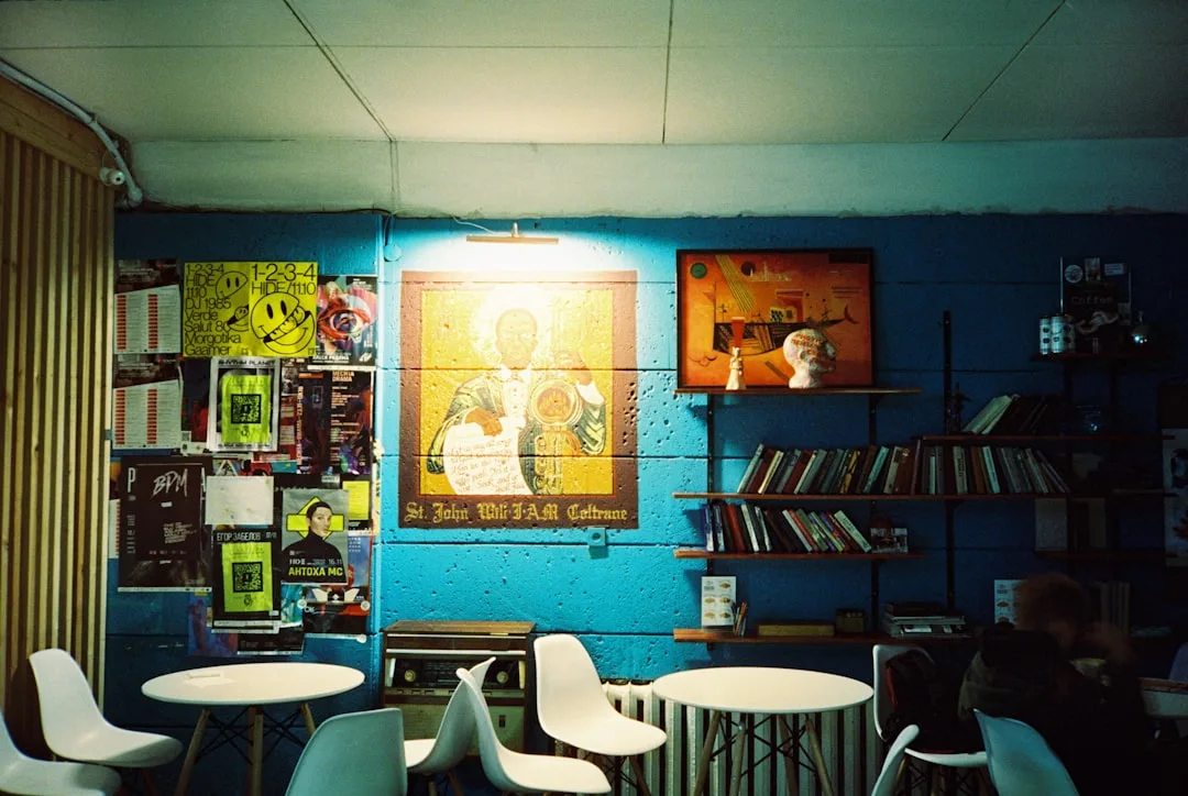
- Lighting that is never clean or even. Grunge rooms use layered low sources — floor lamps in corners, clip-on bulbs aimed at specific objects, candles on surfaces — to create zones of shadow rather than even illumination. The ceiling fixture is the enemy.
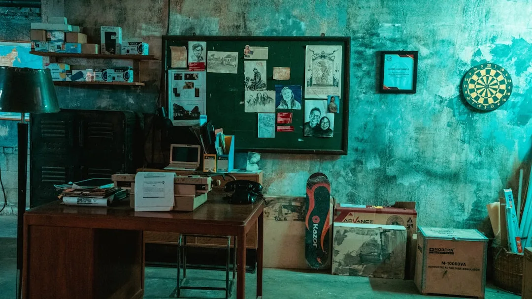
- Objects with personal provenance rather than visual symmetry: the ticket stub tacked to the wall, the broken amp used as a side table, the jacket thrown over a chair that hasn’t moved in six months
- Walls that work as archives. Not gallery walls with matching frames — torn magazine pages, handwritten notes, stickers that have partially peeled, photos held up with tape that has yellowed at the edges
- Textiles that are layered, not coordinated. A flannel shirt used as a throw blanket. A sleeping bag folded over a chair. A rug that was clearly bought at a different decade than everything around it.
The pattern I kept seeing in my practice was that clients who asked for grunge but ended up with “grunge-inspired” had all decorated in a single session. They had bought everything at once. Grunge rooms accumulate. They are not assembled.
Actionable takeaway: If you can describe your current room as “themed,” you have the retail version. Remove three things that match each other and sit with what remains. That remainder is usually closer to the real thing.
The Grunge Aesthetic Explained: What It Borrows From and Why It Works Spatially
Three converging sources feed a grunge room aesthetic, and understanding all three is the reason some rooms pull it off while others just look dirty or sad.
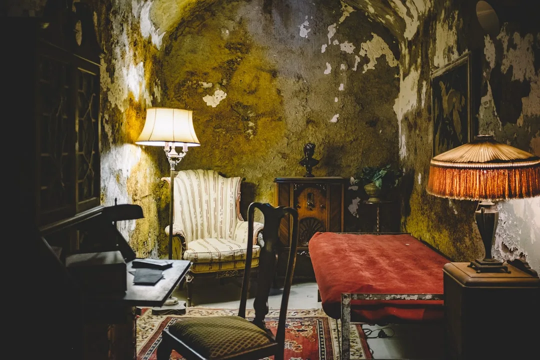
Industrial decay contributes the material vocabulary: exposed brick, raw concrete, metal that shows oxidation, wood that shows grain and age. This is not “industrial chic” — grunge borrows the decay specifically, not the clean loft-warehouse version of industrial that got popular in the 2010s.
Punk DIY culture contributes the methodology: hand-altered surfaces, collage logic, reclaimed and repurposed objects used in contexts they were not designed for. A milk crate as a bookshelf is not laziness — it is a philosophical statement about ownership, resourcefulness, and refusal to participate in retail furniture logic.
Pacific Northwest environmental texture contributes the palette and atmosphere: muted earth tones, moss-like greens, the specific color of damp weather and overcast skies. Charcoal, rust, olive, ochre, faded burgundy. Never bright. Never clean white. Never coordinated.
Imperfection reduces visual tension — this is the spatial psychology that explains why grunge rooms work. Rooms that feel slightly undone are psychologically easier to inhabit for long periods because they make no demands on the occupant to maintain a pristine standard. There is nothing to protect. Nothing is precious. That creates a specific kind of freedom that over-designed spaces cannot replicate.
This is also why grunge rooms photograph poorly by conventional interior photography standards and exceptionally well by editorial and documentary standards. A perfect grid flat-lay cannot capture them. A slightly out-of-focus shot in bad light captures them exactly.
The material hierarchy in a functioning grunge room looks like this:
- Surfaces first — walls, floors, and ceilings carry the foundational atmosphere. Unpainted drywall, scuffed hardwood, or dark painted concrete sets the room’s emotional register before any furniture arrives.
- Large textiles second — the bed, the main seating, the dominant rug. These should be the oldest things in the room, the most visibly worn, and the least color-coordinated with each other.
- Lighting third — positioned low, aimed at specific objects or corners, never overhead and never matching.
- Objects last — and objects should arrive over time, not in a single shopping session. Each object should be explicable by a memory or a find, not by a “this fits the aesthetic” logic.
What grunge borrows that it does not replicate:
- From punk: the DIY alteration, not the uniform
- From industrial: the material honesty, not the renovation aesthetic
- From 90s youth culture: the emotional rawness, not the nostalgia merchandise
- From thrift culture: the genuine secondhand provenance, not the “thrifted look” from fast fashion
How to Actually Build a Grunge Room Without Buying a Kit
The practical problem most people face is that they want the result immediately, and grunge rooms are constitutionally opposed to immediacy. But there are approaches that create genuine grunge atmosphere without waiting a decade.
Start with what you already own and stop apologizing for it.
The furniture you have been meaning to replace because it is scratched, stained, or worn is almost certainly more grunge-authentic than anything you would buy to replace it. A scratched wooden desk with paint marks from a project three years ago is exactly right. A pristine desk from a furniture retailer is not.
Practical steps that work, in order of impact:
- Remove all overhead lighting from regular use. Switch to floor lamps, desk lamps, and clip-on lights positioned below eye level. This single change does more for atmosphere than any furniture purchase.
- Stop touching up the walls. Every scuff mark, every nail hole, every patch of paint that has slightly different sheen — leave it. If your walls are currently perfect, consider a single section of deliberately unfinished treatment: a painted rectangle that stops short of the ceiling, a section of exposed drywall, a stretch of unpainted brick.
- Introduce texture through layering, not purchasing. Pile rather than arrange. A stack of books that has been used is more grunge than a curated bookshelf. A layered pile of records pulled out and replaced is more grunge than records displayed in a purpose-built holder.
- Spend your budget at estate sales and thrift stores, not online retailers. The specific objects matter less than their provenance. Something with a visible history — a water stain, a repair, evidence of a previous life — does more design work than something pristine.
- Add weight with dark textiles that do not coordinate. A military surplus wool blanket, a secondhand flannel duvet, a rug that was clearly made for a different room in a different era. The lack of coordination is not a problem to solve — it is the solution.
- Let things accumulate on horizontal surfaces. Not in a way that suggests hoarding or neglect — in a way that suggests occupation and use. A half-read book face-down, a mug used as a pen holder, a collection of objects gathered because they were interesting rather than because they looked good together.
- Hang things imperfectly. Not crooked for the sake of crooked — but without the level, without the grid, without the measured spacing that gallery walls require. Things taped directly to walls. Things overlapping. Things at slightly different heights.
What not to do:
- Do not buy matching sets of anything labeled “grunge aesthetic” or “vintage-inspired”
- Do not use string lights as your primary lighting strategy — they are decorative, not atmospheric, and they read as college dorm rather than grunge room
- Do not apply a consistent color palette — grunge rooms are not monochromatic
- Do not display objects in dedicated display furniture — shelving units with evenly spaced objects are the opposite of the visual logic grunge uses
- Do not replace worn furniture with new furniture unless the new piece has more visible wear than what it is replacing
The Colors and Materials That Actually Work
Color in a grunge room is never chosen — it arrives. But if you are starting from scratch or repainting, the palette that reads authentically comes from a specific set of conditions.
Colors that work:
- Charcoal and near-black — not warm gray, not “greige,” but the specific dark of old concrete and overcast sky
- Rust and oxidized orange — not terracotta, which reads as warm and intentional, but the specific brownish-orange of metal left in weather
- Olive and moss — muted greens with significant brown and gray content, never yellow-leaning
- Ochre and aged yellow — the color of old paper and nicotine-stained walls, not the fresh yellow of a cheerful accent wall
- Faded burgundy — not wine red, not crimson, but the specific color of something that used to be brighter and has been washed and worn
- Dirty white and off-white — never bright white, never clean white; the white of a wall that has not been repainted in eight years
Colors that kill the atmosphere:
- Anything described as “warm and inviting” in a paint catalog
- Bright or saturated anything
- Clean white
- Coordinated neutrals in the greige or taupe family
- Anything that reads as “cozy” rather than “used”
Materials that work:
- Raw or lightly finished wood with visible grain and ideally visible damage
- Metal with oxidation, patina, or visible age — not brushed chrome, not matte black powder coat
- Concrete, either real or in the form of genuinely aged surfaces
- Worn leather, ideally cracked and faded rather than intentionally distressed
- Heavy woven textiles: wool, canvas, denim — materials with weight and structure rather than softness
- Glass that is smoked, colored, or old enough to have slight imperfections
Materials to avoid:
- Anything described as “faux” in its product listing
- Resin or plastic attempting to simulate organic materials
- Shiny or polished metal finishes
- Linen and cotton in their light, airy, Scandinavian applications
- New leather without significant treatment to age it
Common Mistakes and Why They Happen
The mistakes follow predictable patterns because they come from the same root cause: treating grunge as a visual style rather than a material philosophy.
Mistake 1: Buying new things to look old.
Intentional distressing almost never reads as authentic. The specific way something ages in actual use — the concentration of wear in certain spots, the random nature of damage, the way patina develops unevenly — is not replicable by a manufacturing process. Buy genuinely old things or use the genuinely old things you already own.
Mistake 2: Applying grunge to a room that is otherwise clean and well-maintained.
Grunge details in a clean, bright room just look like mistakes. The atmosphere requires the whole room to operate under the same logic. You cannot have grunge band posters in a room with matching IKEA furniture and expect the logic to hold.
Mistake 3: Treating band merchandise as the primary content.
Band posters, record displays, and music references are common in grunge rooms because the people who created those rooms were actually into that music. But the merchandise is incidental to the music, and the music is incidental to the design philosophy. A grunge room full of band merchandise that was bought online to “complete the aesthetic” is a costume.
Mistake 4: Cleaning too much and too often.
Not squalor — but the specific lived-in quality of a grunge room requires some tolerance for the evidence of occupation. A perfectly made bed with artfully mussed pillows is a different thing entirely from a bed that looks like someone actually slept in it and did not perform the ritual of making it because the ritual felt pointless.
Mistake 5: Matching the lighting to the aesthetic rather than using the lighting to create the atmosphere.
Edison bulbs in a visible-filament style are not grunge — they are farmhouse. The lighting that creates genuine grunge atmosphere is low, uneven, warm in temperature but positioned in ways that create shadow rather than illumination. A single work lamp aimed at a corner. A floor lamp with a heavy shade that blocks most of its own light. Candles on a surface covered in wax drips from previous candles.
Frequently Asked Questions
Is a grunge room aesthetic the same as just having a messy room?
No, and the distinction matters. Mess is the byproduct of disorganization. A grunge room is the product of a specific design philosophy that values evidence of use, personal accumulation, and material honesty over tidiness and visual coherence. The difference is visible: a grunge room has intentional material choices, a considered atmosphere, and objects with genuine personal meaning. A messy room has none of that — it is just disorganized. You can have a grunge room that is functionally tidy; the clothes are away, the floor is clear, but the surfaces show wear, the walls show history, and nothing coordinates or matches.
Can I create a grunge room aesthetic on a small budget?
Yes, and a small budget is actually more compatible with authentic grunge logic than a large one. The most effective moves — stopping wall touch-ups, removing overhead lighting, using objects you already own, shopping estate sales and thrift stores — either cost nothing or cost very little. The expensive version of grunge, purchased from retailers who sell “vintage-inspired” or “grunge aesthetic” products, is also the least authentic version.
How is a grunge room different from an industrial interior?
Industrial interiors in their mainstream form are about the clean version of raw materials: exposed brick that has been sealed, concrete that has been polished, metal that has been powder-coated. The finished result looks intentional and pristine despite its raw material references. Grunge borrows the materials but specifically uses them in their unfinished, aged, or decaying state. The industrial aesthetic is something a high-end developer applies to a loft renovation. The grunge aesthetic is what happens when someone lives in a space for years without trying to make it look designed.
What kind of furniture works best in a grunge room?
Furniture from genuinely different eras with visible wear — pieces that arrived at different times and show evidence of different histories. Specific types that work well: heavy wooden furniture with scratches and paint marks, metal furniture with surface rust or chipped paint, upholstered pieces where the fabric shows wear at the arms and seat. Furniture that does not work: anything new, anything from a matching set, anything described as “distressed” in its product listing (because intentional distressing reads differently than actual wear), anything minimalist or Scandinavian in its design logic.
Can a grunge room also be functional and comfortable to live in?
This is the question that matters most and gets asked least. Yes — and the best grunge rooms are extremely livable precisely because they make no demands on the occupant to preserve a pristine standard. Nothing is precious, nothing needs protecting, nothing requires careful maintenance to keep looking right. The psychological effect of living in a space that accepts evidence of use rather than fighting it is a specific kind of comfort that over-designed rooms cannot provide. The grunge room is not a display — it is a place to actually be.