Most dark rooms fail not because the color is too dark, but because everything in them absorbs light at exactly the same rate — and that single mistake is the difference between a space that feels intentional and one that just feels like the bulb burned out. I’ve walked into dark rooms that made me want to stay for hours and dark rooms that made me check my phone out of vague anxiety, and the difference between them was never the paint color. It was always the layers — or rather, the absence of them.
Quick Answer
Most dark rooms fail not because the color is too dark, but because everything in them absorbs light at exactly the same rate — and that single mistake is the difference between a space that feels intentional and one that just feels like the bulb burned out.
This is the thing no listicle will tell you: the dark aesthetic is an engineering problem disguised as an aesthetic one. You’re not decorating a room. You’re managing how light moves, bounces, and disappears inside a space. Get that right, and almost any dark color works. Get it wrong, and even the most beautiful shade of Railings looks like a mistake.
What the Dark Aesthetic Actually Means in Interior Design
In This Article
- What the Dark Aesthetic Actually Means in Interior Design
- What Is a Baddie Room — and Is It the Same Thing?
- Colors That Work in a Dark Room — and the Ones That Backfire
- How to Make a Dark Room Aesthetic That Doesn’t Look Like a Cave
- Furniture and Materials That Hold Their Own Against Dark Walls
- Dark Aesthetic Beyond the Bedroom — Living Rooms, Studies, and Bathrooms
- Mistakes That Make a Dark Room Feel Oppressive Instead of Intentional
Calling something a “dark aesthetic” and meaning “I painted the walls black and added some candles” is like calling something a “Japanese aesthetic” because you own a bamboo plant. The actual philosophy is older, more considered, and considerably more interesting than TikTok has made it appear.
Atmosphere and emotional weight — not color — define the dark interior tradition. Designers and architects working in this vein are thinking about chiaroscuro: the relationship between light and shadow as the primary compositional tool. The walls are dark because darkness is what makes candlelight matter. Without the shadow, there’s no drama. Without the contrast, there’s no depth.
The historical context here matters. Victorian parlors were deliberately dim — heavy drapes, dark mahogany, gas light flickering against deep-toned wallpaper — because enclosure was considered a form of comfort, not a problem to solve. The Arts and Crafts movement pushed back against industrial brightness by embracing rich wood, muted color, and shadow as texture. Mid-century designers like Paul Laszlo built entire identities around cave-like studies and libraries where the absence of light wasn’t an accident but the point. None of them were following a trend. They were working from a consistent human insight: that some of our most productive, most grounded mental states happen in low, warm, bounded light.
The psychology backs this up. A 2021 study published in the Journal of Environmental Psychology found that enclosed, lower-light environments increased feelings of calm and creative focus compared to bright, open-plan spaces — the kind of finding that explains why people instinctively retreat to a dim corner of a café when they need to think. Darkness isn’t oppressive by nature. It’s neurologically regulating. It reduces visual noise, lowers environmental stimulation, and creates what researchers sometimes call a “cocoon effect” — a sense of bounded safety that the human nervous system finds genuinely calming.
Where the dark aesthetic diverges into territory I’m more skeptical about is the TikTok-era version, which often treats darkness as a personality delivery system rather than a spatial philosophy. Maximalist goth bedrooms and “baddie rooms” (more on those in a moment) prioritize visual impact — they want to photograph well, they want to signal something about the person who lives there. That’s not inherently wrong. But it’s a different goal than designing a room that feels good to inhabit at 7pm on a Tuesday when nothing special is happening.
The distinction I’d draw: dark-as-trend is about what the room says. Dark-as-design-philosophy is about what the room does.
Takeaway: Before you buy a single can of paint, decide which of those goals you’re after — because they require different decisions at almost every step.
What Is a Baddie Room — and Is It the Same Thing?
“Baddie room” is one of those terms that emerged fully formed from social media and immediately meant something specific to everyone who encountered it. As of 2024, #baddieroom has accumulated over 1.2 billion views on TikTok — which makes it, whatever else it is, a genuine mainstream decorating phenomenon rather than a niche subculture.
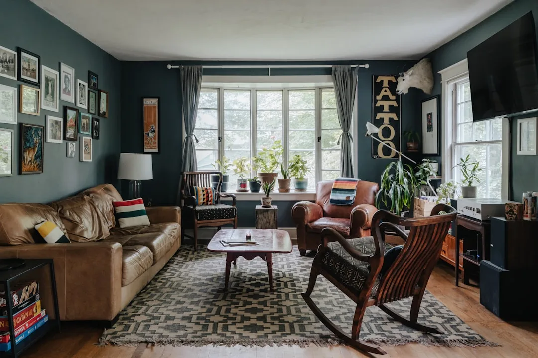
Here’s what a baddie room actually is: a social-media-born aesthetic built around bold self-expression, featuring jewel-tone or dark walls, LED strip lighting (often color-changing), gallery walls of personal imagery, maximalist layering of objects, and a general refusal to be subtle about anything. It’s a teenager’s vision of a powerful adult space filtered through Instagram influencer culture. And honestly? At its best, it has real energy.
The overlaps with serious dark-interior design are meaningful:
- Rich, dark color palette — deep burgundy, forest green, plum, and near-black walls appear in both
- Low ambient light as the default mood rather than bright overhead fixtures
- Mirror use to amplify both light and visual complexity
- Textile layering — throw blankets, rugs, and cushions in abundance
Where they part ways is worth understanding if you’re trying to build something that lasts longer than a renter’s lease. Baddie rooms prioritize visual impact over spatial balance. The LED strips that look incredible in a 15-second video read as cheap and slightly exhausting in person at 10pm. Poster tape and adhesive hooks that seem like efficient decorating solutions become, six months later, a commitment to rearranging everything when the tape fails.
The move I’d suggest — especially if you’re in your twenties and renting — is to keep the boldness of baddie-room energy and swap the impermanent elements for choices that age better. Replace LED strips with plug-in sconces or dimmable Edison bulbs. Swap laminated posters for framed prints behind glass. Choose a jewel-toned velvet throw over a synthetic faux fur blanket. The visual impact stays. The sense that it’s a considered space rather than a filmed one improves dramatically.
The core baddie-room instinct — that your living space should reflect you loudly and unapologetically — is actually quite compatible with serious dark interior design. The execution is where they diverge.
Takeaway: If you love baddie-room aesthetics, you’re already halfway to a dark interior that works. Audit what’s designed to look good versus what’s designed to feel good, and start making swaps.
Colors That Work in a Dark Room — and the Ones That Backfire
Every competitor article about dark rooms serves you the same list: navy, charcoal, forest green, black. The list isn’t wrong. It’s just not useful, because the variable that actually determines whether a dark color works isn’t the hue — it’s the undertone, and almost nobody talks about it with any specificity.
Here’s the undertone rule, stated plainly: dark colors with warm undertones — brown-blacks, green-blacks, red-based charcoals — create an enveloping quality because they read as organic and grounded. Cool-undertone darks — blue-grays, stark neutral black, cool-based charcoals — can slide into institutional or clinical territory without serious intervention from warm light sources and materials. The cold dark reads as absence. The warm dark reads as presence.
Colors that consistently work in practice:
- Off-black with green undertone — Farrow & Ball Railings is the benchmark here, which is why it’s been in their top 5 bestselling colors every year since 2018, consistently outperforming pure black options. The green undertone keeps it alive.
- Deep aubergine — brown-purple moves with both warm and cool light, shifts dramatically by time of day, and reads sophisticated rather than dramatic
- Tobacco brown — underused, forgiving, and extraordinarily warm at night
- Ink blue with red undertone — navy shades like Hague Blue (another Farrow & Ball perennial) or Benjamin Moore’s Newburyport Blue that lean purple rather than gray
- Aged bronze green — a particular shade that references both the Arts and Crafts movement and Japandi sensibility; hard to find, worth the search
Colors that backfire with painful regularity: pure cool gray at scale reads as exactly what it is — a failed attempt at sophistication that ends up looking like an unfinished rental renovation. Flat matte black without any textural variation looks genuinely unfinished, like a photo backdrop rather than a room. Dark purple without sufficient contrast collapses into visual flatness where nothing reads clearly — I’ve seen this happen twice with clients who were sold on the idea by a mood board that didn’t account for their actual lighting conditions.
Test methodology matters. Paint a sample board at least 12 inches square — not the little swatch chips — and observe it at three separate times: morning with natural light, afternoon, and evening with your actual bulbs switched on. Color shifts by three to five shades across those conditions. What looks moody and sophisticated at 8pm can look genuinely grim at 10am, and you need to be able to live with both.
One variable almost every competitor ignores entirely: the ceiling. Painting the ceiling one shade lighter than the walls — not white, just lighter — preserves the dark atmosphere while preventing the room from feeling like a box you’ve been put in as a consequence.
Takeaway: Pull a paint chip, tape it to cardboard, and live with it for 48 hours before committing. If it looks wrong in morning light, no amount of evening candles will save it.
How to Make a Dark Room Aesthetic That Doesn’t Look Like a Cave
The $800 sectional I once talked a client into — dark charcoal, matte fabric, placed against a dark gray wall in a north-facing room with a single overhead fixture — is why I now deliver this particular advice with some force. The room was beautiful in photographs taken with a professional camera. In person, at 6pm in November, it felt like sitting inside a closed eye. We fixed it over the course of two visits and about $400 in lighting. The lesson was permanent.
Here’s the layered framework, in the order it should actually be applied:
Layer 1 — Anchor the walls with orientation in mind. South-facing rooms receive warm, direct light for much of the day and can handle cooler dark tones without feeling dead. North-facing rooms — and this is critical — need warm undertones in their dark palette or they will feel actively unpleasant during the day regardless of your evening lighting setup.
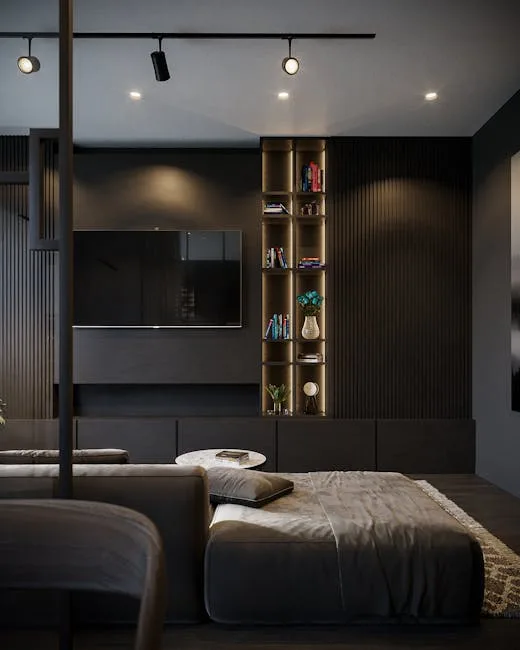
Layer 2 — Control the light sources. This is the single most important technical decision in a dark room. The default — one overhead fixture — is responsible for approximately 90% of dark rooms that feel oppressive rather than atmospheric. You need at minimum three light sources at different heights: something at ceiling level (but ideally recessed or a statement pendant rather than a bare overhead), something at midpoint (wall sconces, a table lamp on a sideboard), and something low (a floor lamp behind a chair, a table lamp on a nightstand). Bulbs should sit between 2700K and 2900K — warm white, not the blue-white of a hospital corridor or the orange of an old incandescent.
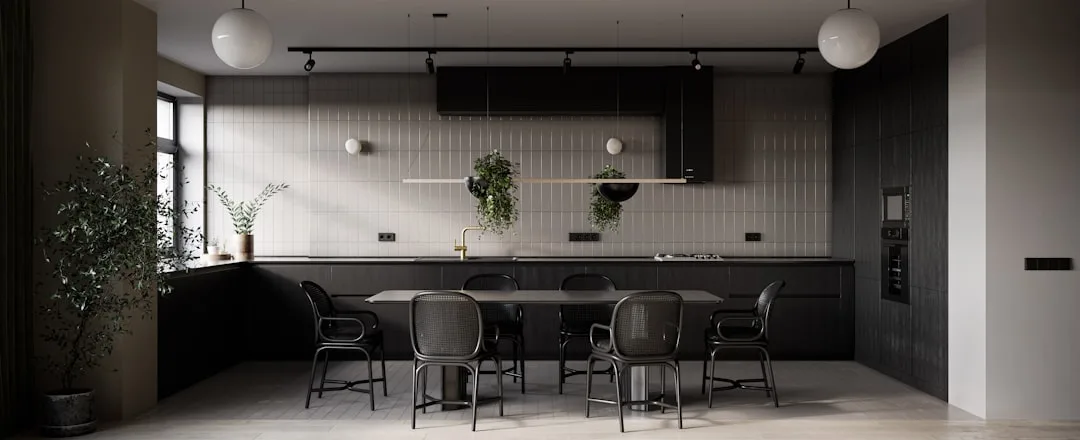
Layer 3 — Vary texture within the dark palette. This is where the magic actually lives. Interior designers reference the 60-30-10 color rule, but in dark rooms it shifts — dark tones can safely occupy 70-80% of the visual field when texture variation and deliberate light sourcing are applied consistently. The formula: matte wall, satin or eggshell trim, velvet upholstery somewhere, brushed metal on hardware, at least one woven or nubby textile. The eye needs surface variation to read depth instead of flatness. Without it, even a beautifully chosen color reads as wrong.
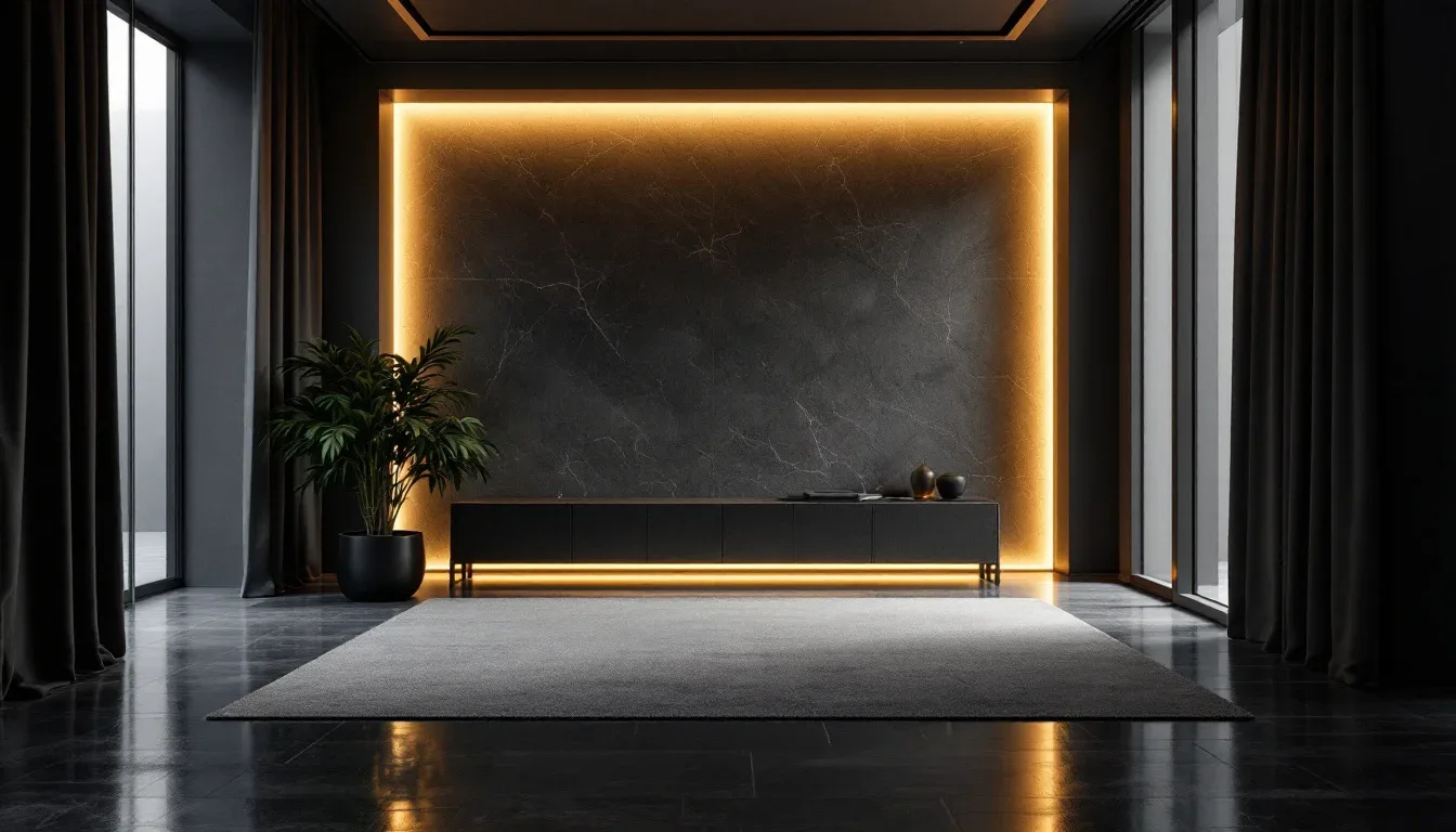
Layer 4 — Install strategic light points. Mirrors, glazed ceramics, metallic objects, lacquered surfaces — these act as light anchors that keep the eye moving around the room rather than flattening against the walls. This is not about adding bright spots. It’s about placing objects that catch and redirect the light you already have.
Layer 5 — Break the dark with one deliberate light element. A pale ceiling. A single linen chair in warm oatmeal. A painting with high internal contrast. This is the contrast that makes the dark read as intentional rather than overwhelming. Without it, even a beautifully executed dark room tips into oppressive. One light element. Placed deliberately. Not three, not scattered throughout — one anchor.
The mistake I see most often: dark walls and dark floor with no tonal variation between them. When the floor and wall read as the same value, spatial definition disappears and the room feels smaller, not larger. Introduce contrast at the floor level through a lighter-toned rug, visible grain in the wood, or simply a different material entirely.
Takeaway: Before you assess anything else, count your light sources. If the number is one, that’s your first problem to solve — before the paint, before the furniture, before anything else.
Furniture and Materials That Hold Their Own Against Dark Walls
Furniture disappears into dark rooms more often than people expect, and it’s not because the pieces are too dark — it’s because the finish is wrong. Matte-black furniture against a matte-black or very dark wall produces approximately nothing. The eye has no information to work with. The piece exists in the room but doesn’t register as a presence.
Furniture finish matters more than furniture color in a dark interior. Specifically: any dark piece that has even a slight sheen — oiled walnut, lacquered ebony, aged brass hardware, a satin-finished painted surface — will catch available light and stay visually present in a way that a flat matte piece won’t. This is the difference between furniture that adds to the room and furniture that the room swallows.
For upholstery: don’t match the wall color exactly. A slightly different dark hue in a high-texture fabric — boucle, ribbed velvet, heavy linen — reads as deliberate layering. The exact same color in a flat fabric reads as an oversight.
Hardware is a smaller decision with a disproportionate impact. Chrome and cool-toned metal reads harsh against warm dark palettes — clinical, bathroom-adjacent, incongruous. Choose instead:
- Brushed brass — warm, slightly aged, works with almost every warm-undertone dark
- Unlacquered bronze — develops a patina over time; genuinely improves with age
- Blackened steel — appropriate when the palette is cooler and more graphic in character
Floor considerations deserve more attention than they typically get. A dark floor combined with dark walls is only successful when the flooring carries visible grain, texture, or pattern — something that gives the eye information about where the floor ends and the wall begins. A flat, featureless dark floor in a dark room erases spatial depth entirely and creates the sensation of floating in a void rather than standing in a room.
Takeaway: Before buying any large furniture piece, hold a material sample against your dark wall in evening light. If it disappears, the finish is wrong — not the color.
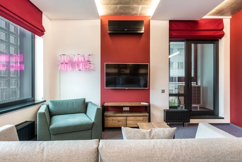
Dark Aesthetic Beyond the Bedroom — Living Rooms, Studies, and Bathrooms
Most dark-room content targets bedrooms exclusively, which makes sense given search behavior but leaves an enormous practical gap. Pinterest reported a 60% increase in saves for “dark living room” searches between 2022 and 2024, overtaking “dark bedroom” as the fastest-growing dark-interior search category on the platform. People are clearly ready to take the aesthetic beyond the one room where darkness is socially sanctioned.
Dark living rooms present a specific challenge that bedrooms don’t: they need to feel welcoming to guests who didn’t choose to be in a dark room and may arrive with some ambient skepticism. The solution is a lighter ceiling — cream, warm white, or simply one value lighter than the walls — combined with generous ambient lighting from multiple sources and at least one highly reflective surface. A large mirror or a lacquered side table does meaningful work here: it signals to anyone who walks in that the darkness is considered rather than accidental.
Dark home offices and studies are, honestly, where the aesthetic performs best. The cocooning effect isn’t a side effect here — it’s the point. Reduced visual stimulation correlates with deeper focus, and a visually bounded space discourages the kind of distracted scanning that a bright, open room invites. The one non-negotiable: task lighting, placed specifically and used aggressively. A beautiful dark study that strains your eyes within 20 minutes is a failure regardless of how good it photographs.
Dark bathrooms have become a genuine design-forward choice rather than an eccentric one, and there are some functional advantages people overlook. Dark tile grout — as anyone who has spent years maintaining pristine white grout will tell you with some bitterness — is simply more forgiving to live with. In dark bathrooms, warm-toned lighting is non-negotiable: cool white in a dark bathroom reads as a crime scene. Maximize mirror surface to keep the space from feeling compressed.
The one room where I’ll push back on dark walls as a default: small, windowless kitchens. This isn’t an aesthetic objection — it’s a functional one. Without natural light or the reflective surfaces that a kitchen requires for safe food preparation, darkness creates a genuine problem that no amount of pendant lighting fully solves. It’s one of the few spaces where the aesthetic runs directly into practical reality and loses.
Takeaway: If you’re ready to try dark beyond the bedroom, start with a home office or study — the cocooning effect serves function there in a way it doesn’t in every room.
Mistakes That Make a Dark Room Feel Oppressive Instead of Intentional
If your dark room feels wrong and you can’t identify why, the problem is almost certainly one of these five things. Not the color. Not the style. One of these five.
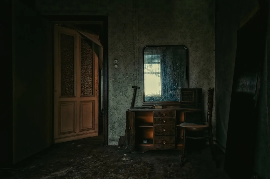
Mistake 1: Single overhead lighting in a room where every surface absorbs. This is the most common dark room failure, and the American Lighting Association found data that speaks to exactly this: 68% of homeowners in spaces with only overhead lighting reported dissatisfaction with evening ambiance, versus 21% of those using layered, multi-source lighting. The overhead fixture in a dark room isn’t doing you any favors — it creates a flat, downward light that hits absorptive surfaces and essentially stops there. Layer your sources or live with the consequences.
Mistake 2: No tonal or textural break within the dark palette. When every element sits in the same chroma range and the same matte surface finish, the room reads as unfinished rather than intentional. It looks like you started decorating and got distracted. The cure is not adding light — it’s adding variation within darkness.
Mistake 3: Blocking natural light to enhance the dark feel. I’ve seen this decision made confidently and regretted within a month. Natural light in a dark room isn’t the enemy of the aesthetic — it’s the variable that makes the aesthetic dynamic rather than static. The interplay between afternoon sun hitting a dark wall and the shadow it creates at the furniture line is genuinely beautiful. Blackout curtains during the day eliminate this entirely and replace it with something that looks less like atmosphere and more like a room where someone is sleeping off a bad decision.
Mistake 4: All warm light at the same temperature. Counter-intuitive as it sounds, a room filled entirely with warm candle-toned light from multiple identical sources creates a muddy visual field rather than a rich one. The slight variation between a 2700K ambient source and a 3000K task light creates dimension — the eye reads two distinct types of light and interprets the space as having depth. All the same temperature collapses that distinction.
Mistake 5: Forgetting that atmosphere is multisensory. Dark aesthetic spaces work because they create an overall sensory environment, not just a visual one. A dark room with hard floors, no soft furnishings, poor acoustics, and no scent source delivers the visual information of the dark aesthetic without the physical experience that makes it desirable. Sound matters — rugs and soft furnishings absorb echo and make the room feel genuinely enveloping. Scent matters. The difference between a dark room that feels atmospheric and one that just feels dim is often entirely non-visual.
Takeaway: Do a 10-minute audit of your dark room tonight: count your light sources, check whether any surface variation exists within the palette, and notice whether you’ve blocked your natural light. Those three observations will tell you what’s wrong.
Frequently Asked Questions
How do you make a dark room aesthetic without it feeling oppressive?
The answer is almost always light sourcing before anything else. A dark room with a single overhead fixture will feel oppressive regardless of how carefully you’ve chosen the paint color or how good the furniture is. Introduce at minimum three light sources at different heights — something overhead, something at mid-level (sconces or table lamps), and something low. Use bulbs between 2700K and 2900K for warmth. After light, address texture: the eye needs surface variation to read a dark room as intentional rather than flat. Matte walls, satin trim, velvet or boucle upholstery, and brushed metal objects give the eye enough variation to perceive depth. Finally, include one deliberate light element — a pale ceiling, a single light-toned chair, a high-contrast painting — that signals the darkness is a choice rather than a default.
What is a baddie room and how is it different from a dark aesthetic?
A baddie room is a social-media-originated decorating style built around bold self-expression — typically featuring dark or jewel-tone walls, LED strip lighting, maximalist layering of objects, mirrors, and a strong sense of personal identity broadcast through the space. It shares significant DNA with the dark aesthetic: similar color palettes, low ambient light, and an embrace of richness over minimalism. Where they diverge is intent and longevity. The dark aesthetic as a design philosophy prioritizes how a space feels to inhabit over time, with an emphasis on spatial balance, material quality, and the relationship between light and shadow. Baddie rooms prioritize visual impact and immediate self-expression — they’re optimized for how they look in a video rather than how they feel at 9pm on a weeknight. The good news: you can borrow baddie-room boldness and build it into a more considered dark interior by swapping impermanent elements (LED strips, adhesive hooks, laminated posters) for choices that age better.
What are the best colors for a dark room aesthetic?
The most important variable isn’t the hue — it’s the undertone. Warm-undertone darks (brown-blacks, green-blacks, red-based charcoals, aubergine) create enveloping warmth; cool-undertone darks (blue-grays, stark neutral black) risk reading as clinical without significant intervention from warm lighting and materials. Colors that perform consistently well include off-black with a green undertone (Farrow & Ball Railings is the standard-bearer), deep aubergine, tobacco brown, ink blue with red undertone, and aged bronze green. Colors that backfire: pure cool gray at scale, flat matte black without textural variation, and dark purple without enough contrasting elements to create visual definition. Always test your chosen color on a sample board at least 12 inches square, across morning light, afternoon light, and evening with your actual bulbs — color shifts dramatically across those conditions and what works at night may be genuinely miserable in daylight.
Can you do a dark aesthetic in rooms other than the bedroom?
Not only can you — in some cases you should. Home offices and studies are arguably the most successful application: the cocooning effect supports focus and deep work in a way that a bright, open space often doesn’t. Dark living rooms work well when you account for guests by using a lighter ceiling, multiple light sources, and at least one highly reflective surface to signal intentionality. Dark bathrooms are increasingly common in design-forward homes and offer the practical bonus of forgiving grout maintenance; pair dark walls with warm-toned lighting and maximize mirror surface. The one room where I’d urge real caution: small, windowless kitchens. The lack of natural light and the functional need for reflective work surfaces create a genuine problem that the dark aesthetic cannot aesthetically resolve. Every other room is fair territory — just adapt the lighting strategy to the room’s function.
Here’s what you can do today: Walk into the room you want to darken and turn off every light except your main overhead fixture. Sit with it for two minutes. That flat, dim, slightly grim experience is what your dark room will feel like if you stop at paint. Now go find every lamp you own, bring them into the room, turn them all on with the overhead off, and sit with it again. That second experience — varied, warm, textured by shadow — is what the dark aesthetic actually feels like when it’s working. The paint is the last decision, not the first.
How do you make a dark room aesthetic without it feeling oppressive?
The answer is almost always light sourcing before anything else. A dark room with a single overhead fixture will feel oppressive regardless of how carefully you’ve chosen the paint color or how good the furniture is. Introduce at minimum three light sources at different heights — something overhead, something at mid-level (sconces or table lamps), and something low. Use bulbs between 2700K and 2900K for warmth. After light, address texture: the eye needs surface variation to read a dark room as intentional rather than flat. Matte walls, satin trim, velvet or boucle upholstery, and brushed metal objects give the eye enough variation to perceive depth. Finally, include one deliberate light element — a pale ceiling, a single light-toned chair, a high-contrast painting — that signals the darkness is a choice rather than a default.
What is a baddie room and how is it different from a dark aesthetic?
A baddie room is a social-media-originated decorating style built around bold self-expression — typically featuring dark or jewel-tone walls, LED strip lighting, maximalist layering of objects, mirrors, and a strong sense of personal identity broadcast through the space. It shares significant DNA with the dark aesthetic: similar color palettes, low ambient light, and an embrace of richness over minimalism. Where they diverge is intent and longevity. The dark aesthetic as a design philosophy prioritizes how a space feels to inhabit over time, with an emphasis on spatial balance, material quality, and the relationship between light and shadow. Baddie rooms prioritize visual impact and immediate self-expression — they’re optimized for how they look in a video rather than how they feel at 9pm on a weeknight. The good news: you can borrow baddie-room boldness and build it into a more considered dark interior by swapping impermanent elements (LED strips, adhesive hooks, laminated posters) for choices that age better.
What are the best colors for a dark room aesthetic?
The most important variable isn’t the hue — it’s the undertone. Warm-undertone darks (brown-blacks, green-blacks, red-based charcoals, aubergine) create enveloping warmth; cool-undertone darks (blue-grays, stark neutral black) risk reading as clinical without significant intervention from warm lighting and materials. Colors that perform consistently well include off-black with a green undertone (Farrow & Ball Railings is the standard-bearer), deep aubergine, tobacco brown, ink blue with red undertone, and aged bronze green. Colors that backfire: pure cool gray at scale, flat matte black without textural variation, and dark purple without enough contrasting elements to create visual definition. Always test your chosen color on a sample board at least 12 inches square, across morning light, afternoon light, and evening with your actual bulbs — color shifts dramatically across those conditions and what works at night may be genuinely miserable in daylight.
Can you do a dark aesthetic in rooms other than the bedroom?
Not only can you — in some cases you should. Home offices and studies are arguably the most successful application: the cocooning effect supports focus and deep work in a way that a bright, open space often doesn’t. Dark living rooms work well when you account for guests by using a lighter ceiling, multiple light sources, and at least one highly reflective surface to signal intentionality. Dark bathrooms are increasingly common in design-forward homes and offer the practical bonus of forgiving grout maintenance; pair dark walls with warm-toned lighting and maximize mirror surface. The one room where I’d urge real caution: small, windowless kitchens. The lack of natural light and the functional need for reflective work surfaces create a genuine problem that the dark aesthetic cannot aesthetically resolve. Every other room is fair territory — just adapt the lighting strategy to the room’s function.