The average U.S. dorm room is 120 square feet — roughly the size of a parking space — and yet some students manage to create an aesthetic dorm room that looks like it belongs in an interior design magazine, while others spend twice as much and end up with something that still looks like a dorm. The difference almost never comes down to budget. It comes down to sequence: what you address first, what you leave alone, and what you actively work with instead of against.
Quick Answer
The average U.S. dorm room is 120 square feet — roughly the size of a parking space — and yet some students transform theirs into rooms that look like they belong in an interior design magazine, while others spend twice as much and end up with something that still looks like a dorm.
I spent eleven years doing this professionally — mostly apartments, but enough small-space projects to recognize the same failure patterns everywhere. The dorm room is just an extreme version of a problem I saw constantly: people treating square footage like a canvas to fill rather than a system to understand. Once you shift that framing, 120 square feet stops feeling like a limitation and starts feeling like a design problem with an actual solution.
Why Most Dorm Rooms Look Worse After Decorating (And What Goes Wrong First)
In This Article
- Why Most Dorm Rooms Look Worse After Decorating (And What Goes Wrong First)
- The Vertical Zone: Treating Your Walls Like Floor Space You Haven’t Used Yet
- Lighting Architecture in a 120 Sq Ft Box: Layers That Change the Entire Mood
- Color and Texture: How to Build a Palette That Holds Together in 120 Square Feet
- Storage as Design: Making Functional Objects Pull Aesthetic Weight
- The Institutional Furniture Problem: Working With What You Cannot Remove
Most students walk into their dorm with a cart full of items they picked based on how each one looked individually, then wonder why the room still feels wrong once everything is in place. The problem isn’t taste. It’s sequence.
U.S. dorm rooms average between 100 and 150 square feet — smaller than many walk-in closets, and smaller than the average bathroom in a new construction home. At that scale, spatial intention matters more than any individual item you could possibly buy. A room that size will not absorb visual mistakes the way a 400-square-foot studio can. Everything is visible, all the time, from every angle.
The pattern I kept seeing: students adding layers before establishing a base layer. They hang artwork before deciding what the wall is doing. They put down a rug before thinking about how the furniture will relate to it. They add throw pillows before the bedding has a clear color story. Each decision made in isolation looks fine. Together, they create visual noise that reads as chaos — not coziness, not personality. Just clutter with better Instagram packaging.
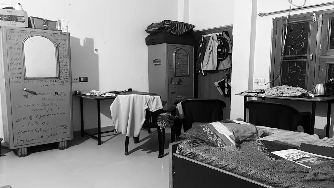
Institutional furniture is the second issue. And it is worse than most students realize, because ignoring it doesn’t make it disappear. A beige laminate desk doesn’t become invisible because you put a cute lamp next to it. It anchors the room’s visual tone whether you engage with it or not. The students whose dorm rooms actually look designed are the ones who either concealed the institutional pieces, matched them intentionally, or incorporated them into the room’s material story.
Here’s what separates a decorated dorm from a designed one:
- A decorated room has items placed where there was empty space
- A designed room has a clear visual hierarchy — one thing your eye goes to first, then secondary points of interest, then supporting texture
- A decorated room uses color to add interest; a designed room uses color to create coherence
- A designed room has edited negative space — empty areas that are intentional, not just unfilled
Start by removing everything that came with you. Then stand in the empty room and look at what the university gave you: the furniture placement, the light source, the wall surface, the floor. That’s your base layer. Every decision you make next should work with that layer, not over it.
Takeaway: Before buying a single item, photograph the empty room and identify the two or three institutional elements that will dominate the space no matter what. Your design strategy should address those first.
The Vertical Zone: Treating Your Walls Like Floor Space You Haven’t Used Yet
Floor space in a dorm is a zero-sum game. You cannot create more of it. But vertical space — the full height of the wall from baseboard to ceiling — is almost always completely wasted, and that is the first place where a small room can expand dramatically without touching the floor plan at all.
The most useful framework I’ve used for wall planning: divide your walls into three horizontal zones and treat each one differently.
- Zone 1 (floor to desk height, roughly 0–30″): This is your storage and utility zone. Hooks, cable management, under-desk bins, and low shelving belong here. It should be functional and mostly enclosed — visual clutter at floor level makes a room feel smaller and more cramped than almost anything else.
- Zone 2 (desk height to eye level, roughly 30–65″): This is your focal point zone. Art, mirrors, mood boards, and any item with strong visual presence belongs here. This is what you see when you look straight ahead from anywhere in the room. It earns the most careful editing.
- Zone 3 (above eye level to ceiling, roughly 65″+): This is your texture and depth zone. Plants hung at height, lightweight textiles, string lights, and decorative objects with visual interest live here. Nothing heavy, nothing that requires daily interaction, nothing cluttered.
Most students put everything in Zone 2 and leave the rest completely bare. The result is a wall that looks busy in one band and institutionally empty everywhere else.
On adhesive strips: Command strips (standard) hold up to 16 pounds per pair. Most students hanging a frame use one strip when the frame requires three. I have received texts from clients — actual adults in apartments — at 2am because a mirror came down. In a dorm, with hard floors, this matters. For anything heavier than a lightweight frame, use the large picture-hanging strips, use three pairs minimum, and press firmly for 30 seconds per strip. The instructions exist for a reason.
Mirror placement is the single highest-ROI move in a small room. A full-length mirror on a side wall — not the back of the door, but an actual wall — reflects light, doubles perceived depth, and requires exactly zero ongoing effort to maintain its effect. One leaning mirror in the right position does more for a room’s aesthetic than a carefully curated gallery wall.
Takeaway: Map your walls into zones before hanging anything. If Zone 3 is completely bare, the room will always feel unfinished no matter how good Zone 2 looks.
Lighting Architecture in a 120 Sq Ft Box: Layers That Change the Entire Mood
“Add fairy lights” is advice I’ve seen in approximately four hundred articles. It is the decorating equivalent of “add salt to taste” — technically not wrong, but spectacularly useless without the rest of the recipe.
The reason lighting matters in a dorm room more than almost anywhere else is that overhead fluorescent lighting does something specific and hostile to a space: it flattens every surface, eliminates shadows, and removes the visual depth that makes a room feel like a place rather than a box. You cannot fix that with one strand of lights draped over a headboard. You fix it by building layers that replace the overhead light as your primary source.
The three-layer approach to dorm lighting:
- Layer 1 — Ambient replacement: A floor lamp or desk lamp with a warm bulb (2700K–3000K) placed in a corner creates a pool of light that reads as “room light” without the harshness of overhead fluorescents. This is the layer most students skip entirely. It is also the most important one. Once you have a warm ambient source, you can stop using the overhead light for anything except getting dressed in the morning.
- Layer 2 — Task lighting: A dedicated desk lamp with a daylight bulb (5000K–6500K) for studying. The color temperature difference matters: warm light for atmosphere, cool light for focus. Using the same lamp for both tasks is why so many students either ruin the mood of their room or strain their eyes doing homework.
- Layer 3 — Accent lighting: This is where string lights, LED strips, and candle-adjacent sources actually belong. They add depth and texture to specific zones — behind a monitor, along a shelf edge, above a headboard — but only after Layers 1 and 2 are already doing their jobs. Accent lighting on top of nothing is just decoration. Accent lighting on top of a real lighting plan is the detail that makes the room look finished.
On LED strips specifically: The ones worth buying have a CRI (Color Rendering Index) above 90. Lower CRI strips make everything look slightly wrong — skin tones, fabric colors, and artwork all shift in ways that are hard to identify but immediately felt. The cheap multicolor strips that cycle through RGB colors are the fastest way to make an otherwise good aesthetic dorm room look like a gaming setup from 2014. If you want color, use a single warm accent tone and commit to it.
The overhead fluorescent problem has a simple fix: A fabric canopy or paper lantern hung below the existing fixture diffuses the light without requiring any electrical work. Alternatively, simply never turning on the overhead light — once your ambient layer is in place — is a completely valid strategy. Most well-designed dorm rooms are lit entirely from below eye level, which is exactly why they photograph well and feel better to live in.
Takeaway: Set up your warm ambient lamp first, before any other lighting decision. Then sit in the room with only that lamp on and evaluate what else is needed. You will probably need less than you think.
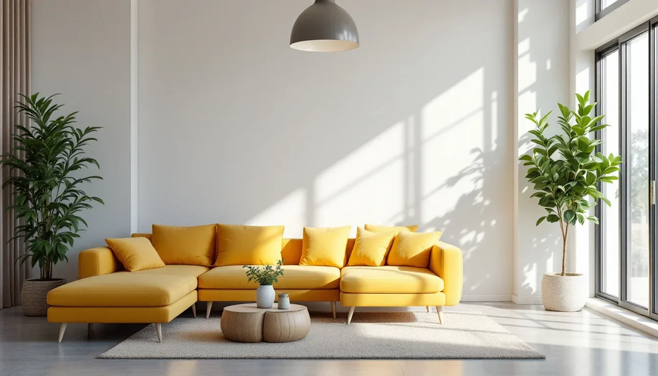
Color and Texture: How to Build a Palette That Holds Together in 120 Square Feet
Small spaces expose color mistakes immediately. In a larger room, a slightly off accent color reads as an interesting choice. In a dorm room, it reads as an error, because there is nowhere for the eye to rest between the mistake and everything else.
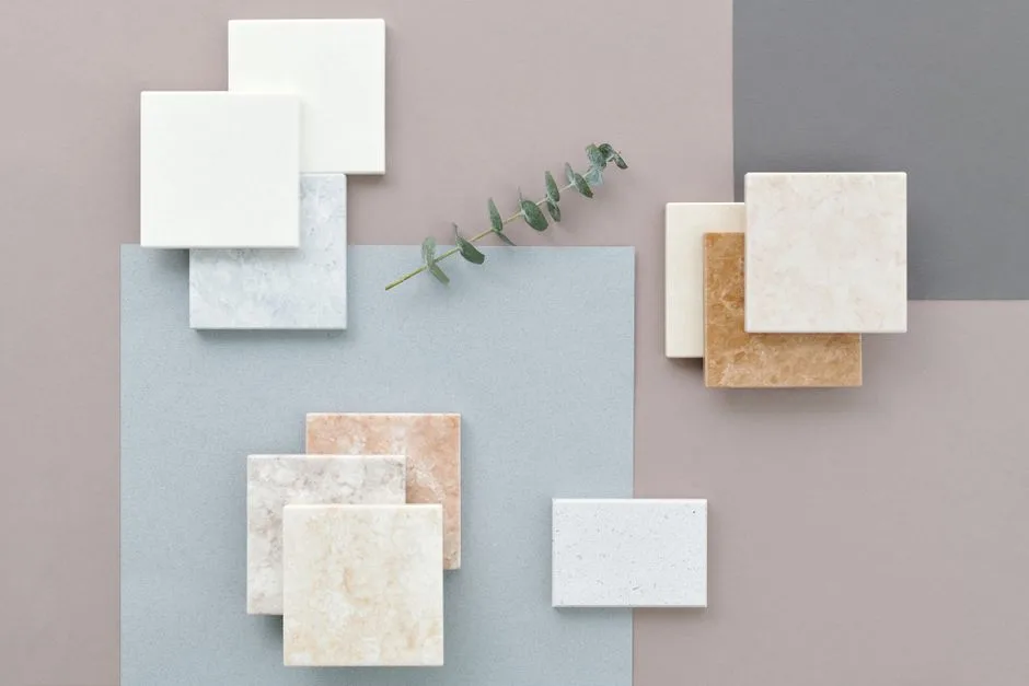
The approach that works most consistently in small spaces is a 60-30-10 distribution with a hard limit on hue count. Sixty percent of the room should be one dominant neutral — the wall color, the bedding base, the rug. Thirty percent should be a secondary color that appears in at least three different objects (a pillow, a lamp shade, a desk accessory). Ten percent should be an accent that shows up in two places maximum. That’s three colors. Not three color families. Three actual colors.
The students who build the most coherent aesthetic dorm room setups are almost always working with a tighter palette than they think. What reads as “rich and layered” in a well-designed small space is usually one neutral in six different textures — linen, cotton, matte ceramic, wood, paper, woven wool — rather than six different colors in similar textures. Texture variation within a single color family creates depth. Color variation across similar textures creates noise.
On white and off-white specifically: True white (pure, cool, blue-toned) is very difficult to work with in institutional spaces because it reads as clinical against the existing white of dorm walls and fixtures. Off-white — anything with a warm or slightly yellow undertone — softens the institutional baseline without requiring you to introduce a strong color. Bedding in off-white linen, for example, reads as intentional and calm rather than sterile, even against a white cinderblock wall.
Pattern mixing has one rule that covers most situations: Vary the scale. A large-scale pattern (a big geometric duvet) can coexist with a small-scale pattern (a fine stripe on a pillow) because the eye reads them at different distances. Two medium-scale patterns in the same color family will fight each other. Two patterns at different scales in the same color family will layer correctly.
Takeaway: Before buying any textile, hold it up against your phone photo of the existing institutional furniture. If the colors fight, they will fight in the room. If they work together, you have the beginning of a coherent palette.
Storage as Design: Making Functional Objects Pull Aesthetic Weight
In a dorm room, you cannot afford the luxury of separating storage from decoration. Every item that serves only one function is taking up space that a better item could serve twice. This is not minimalism — it is just math.
The highest-impact storage moves in a dorm room:
Bed risers plus under-bed storage: Raising the bed six to eight inches creates a storage zone large enough to hold rolling bins, flat storage boxes, and soft storage bags. This is the single largest storage gain available without any permanent modification. The risers themselves should be uniform in height and ideally not visible from the room’s main sight line — fabric bed skirts solve this while also adding a soft element at floor level that helps anchor the room visually.
Vertical shelving instead of horizontal spreading: A narrow bookshelf at 72″ tall takes up roughly two square feet of floor space and provides more than twelve square feet of display and storage surface. A low dresser takes up the same or more floor space and provides far less vertical storage. If your dorm allows additional furniture, vertical shelving is almost always the better investment.
Closed storage for anything that cannot be curated: The objects that are necessary but not beautiful — chargers, extra toiletries, medication, academic supplies in bulk — need homes that are completely out of sight. Lidded bins in a single material (all fabric, all wicker, all matching plastic) on an upper shelf or under the bed read as a storage system rather than accumulated stuff. The difference between a room that looks organized and a room that looks designed is usually this: in a designed room, you cannot see the storage working.
Pegboards and wall-mounted organizers: A pegboard in Zone 1 or Zone 2 can hold bags, hats, jewelry, and accessories in a way that displays them rather than hiding them — but only if the objects on it are curated as carefully as anything else in the room. A pegboard with seventeen items on it is just a cluttered wall. A pegboard with six items, spaced deliberately, with matching hooks, reads as an intentional design choice.
Takeaway: For every horizontal surface in your room, ask whether the storage happening there could be moved vertical or behind a closed door. Horizontal surfaces should be reserved for curated display, not functional storage.
The Institutional Furniture Problem: Working With What You Cannot Remove
Almost every student starts their dorm design plan by ignoring the furniture they were given. This is the single most common reason otherwise well-executed dorm rooms still look like dorms.
The standard dorm furniture package — bed frame, desk, desk chair, dresser, and sometimes a bookshelf — is designed for durability and standardization, not aesthetics. The finishes are almost universally beige, oak laminate, or painted metal in institutional colors. None of this is hidden by putting a nice lamp next to it. It is the backdrop for everything else in the room.
Strategy 1: Match it. Identify the dominant finish of your institutional furniture and bring that tone into your decorative choices intentionally. If the desk is a warm oak laminate, use warm wood tones in your accessories — a bamboo lamp base, wooden frames, a rattan storage basket. If the furniture is painted metal in a cool gray, lean into cool tones and matte black accents. You are not celebrating the furniture. You are neutralizing it by making it feel like a choice.
Strategy 2: Conceal it. A fitted desk cover or removable contact paper can change the surface finish of a laminate desk completely. Fabric panels hung from a tension rod can enclose an open-frame bed and make it read as a lofted platform. A chair cushion in the right fabric makes an institutional desk chair read as a neutral rather than an eyesore. None of these require permission or permanent modification.
Strategy 3: Anchor it. Place your most visually strong decorative element directly adjacent to the least attractive institutional piece. A beautiful floor lamp next to an ugly dresser draws the eye to the lamp and makes the dresser recede. A gallery wall directly above the desk shifts attention to the wall surface and away from the desk’s finish. This is basic compositional logic — you cannot see the background when the foreground is interesting enough.
Takeaway: Photograph each piece of institutional furniture individually and identify its dominant color and finish tone. Every decorative decision you make should either match, conceal, or redirect attention from those pieces.
Frequently Asked Questions
How do I make a dorm room look aesthetic without spending a lot of money?
The highest-impact moves in an aesthetic dorm room — mirror placement, lighting layers, wall zone planning, and a tight color palette — cost less than most decorative items students buy by default. A single leaning mirror from a discount retailer, one warm floor lamp, and bedding in a coherent neutral will do more for a room than fifty dollars worth of miscellaneous decorative objects. Start with the structural decisions before buying anything decorative.
What is the biggest mistake students make decorating a dorm room?
Buying items before establishing a design framework. Every item purchased in isolation looks fine in the store. In the room, items chosen without a shared color story, material language, or scale relationship will compete with each other regardless of individual quality. The sequence matters more than the budget.
Can I really make a noticeable difference in a dorm room I’m not allowed to paint or modify?
Yes. The most effective changes in a dorm room — lighting, textiles, mirrors, vertical storage, and furniture concealment — require no paint, no drilling, and no permanent modification. The rule to follow: if it changes the surface of a wall, floor, or university-owned furniture permanently, it probably violates the housing agreement. If it attaches temporarily or sits freestanding, it almost certainly does not.
How many throw pillows is too many for a dorm bed?
For a twin XL bed, three to four pillows is the functional ceiling before the bed starts reading as cluttered rather than layered. The arrangement that works best: two sleeping pillows in matching shams pushed to the back, one larger accent pillow in front, and one smaller lumbar pillow or folded throw at the foot. Everything beyond that competes for space you need to actually sleep.
What should I do first when I arrive at my dorm before unpacking anything?
Photograph every wall and every piece of institutional furniture in the existing light. Then look at those photos rather than the room itself — the camera flattens the space in a way that makes the real design problems visible. Identify the two or three elements that will dominate the room no matter what you do, and decide how you will address each one before unpacking a single box. Fifteen minutes of planning at this stage eliminates most of the decisions that students spend weeks second-guessing later.