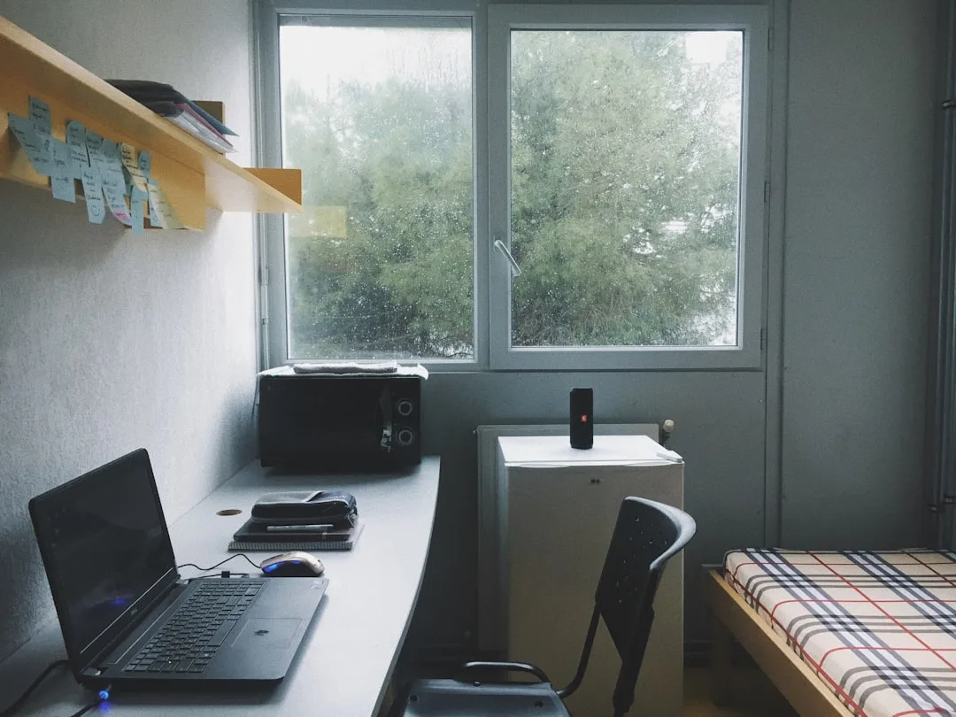
The average dorm room is smaller than a luxury SUV, yet interior designers consistently say it is one of the most stylistically achievable spaces to transform — because every square inch is accountable, and that constraint is actually a design advantage. I’ve worked in studios and junior one-bedrooms across Chicago that had more dysfunction per square foot than any dorm I’ve ever walked into. The problem was never the size. It was always the absence of a plan before the first trip to Target.
Quick Answer
The average dorm room is smaller than a luxury SUV, yet interior designers consistently say it is one of the most stylistically achievable spaces to transform — because every square inch is accountable, and that constraint is actually a design advantage.
Why Dorm Room Decorating Fails Before You Even Unpack
In This Article
- Why Dorm Room Decorating Fails Before You Even Unpack
- The 6 Dorm Room Aesthetic Styles That Actually Work in Limited Square Footage
- How to Choose Your Dorm Room Aesthetic Without Buying Anything First
- The Furniture Arrangement Rules Designers Use That Transform Any Dorm Layout
- Lighting Is the One Design Element That Changes Everything in a Dorm Room
- Wall Decor Strategies That Make a Dorm Room Look Like It Was Professionally Styled
- The Dorm Room Aesthetic Shopping Framework: What to Buy, What to Skip, and in What Order
- How to Maintain Your Dorm Room Aesthetic All Year (Not Just Move-In Weekend)
Most students treat dorm decorating as a shopping problem. They make a list, they spend money, they fill the space — and then they wonder why the room still feels like a holding cell with a tapestry on one wall. The actual problem is that they skipped the design step entirely and went straight to procurement, which is exactly how you end up with a chevron rug that fights with plaid bedding and three throw pillows in colors that have never met each other.
The single most important reframe: dorm decorating is a spatial design problem first, a shopping problem second. Maybe third.
The average American dorm room runs between 130 and 190 square feet — roughly the footprint of a large walk-in closet in a luxury home. That’s not a lot of room for mistakes. In a space that small, every item you bring in carries visual weight, and objects that don’t speak to each other aesthetically create noise. Not charm. Noise.
Professional designers — and this was genuinely the first lesson I internalized in my career — never select individual items before establishing a visual anchor. The anchor is the piece that defines the room’s aesthetic direction. Everything else auditions for a supporting role. Without one, you’re just filling space.
Here’s what defining your aesthetic before buying anything actually does: it eliminates an entire category of impulse purchases. When you know you’re building a Japandi-influenced room around warm taupes and natural wood, the LED neon sign in the shape of your zodiac symbol stops looking like an option. The decision gets made before you’re standing in the aisle.
Actionable takeaway: Before you buy a single thing, write down three words that describe how you want the room to feel — not look. Calm, focused, layered. Cozy, playful, organized. Those three words are your filter for every purchase that follows.
The 6 Dorm Room Aesthetic Styles That Actually Work in Limited Square Footage
Not every aesthetic translates to 150 square feet. Some styles are spatially forgiving. Others — and I say this having watched a client attempt full Maximalist Baroque in a 200-square-foot studio — will consume your entire floor plan and leave you with nowhere to exist.
These six styles work specifically because they’re structurally compatible with dorm dimensions, not just visually compelling.
1. Soft Minimalism
Cream, warm white, and nude tones with intentionally clean sightlines. This works because visual simplicity is spatial trickery — fewer competing elements mean the eye reads the room as larger than it is. The anchor piece here is a high-quality textured throw (waffle-knit or bouclé) and one piece of wall art with deliberate negative space. Keep the bedding in tonal neutrals. Let texture do the work that color would otherwise crowd.
2. Dark Academia
Deep greens, burgundy, wood tones, stacked books, framed maps or vintage botanical prints. This style succeeds in dorms because it uses vertical space as its primary medium — shelves loaded with books, framed prints stacked above framed prints, a tall floor lamp — which draws the eye upward and adds perceived ceiling height. The mistake I see is going too dark on textiles. Keep the bedding one shade lighter than the wall decor or it flattens everything.
3. Japandi (Japanese-Scandinavian Fusion)
Low-profile furniture, natural materials, muted greens and warm taupes. This is arguably the most functionally intelligent aesthetic for dorms because its entire philosophy is built around deliberate reduction. Less isn’t a sacrifice in Japandi — it’s the point. Low-profile storage, a single potted plant, one woven basket. The aesthetic rewards exactly the constraints dorms impose.
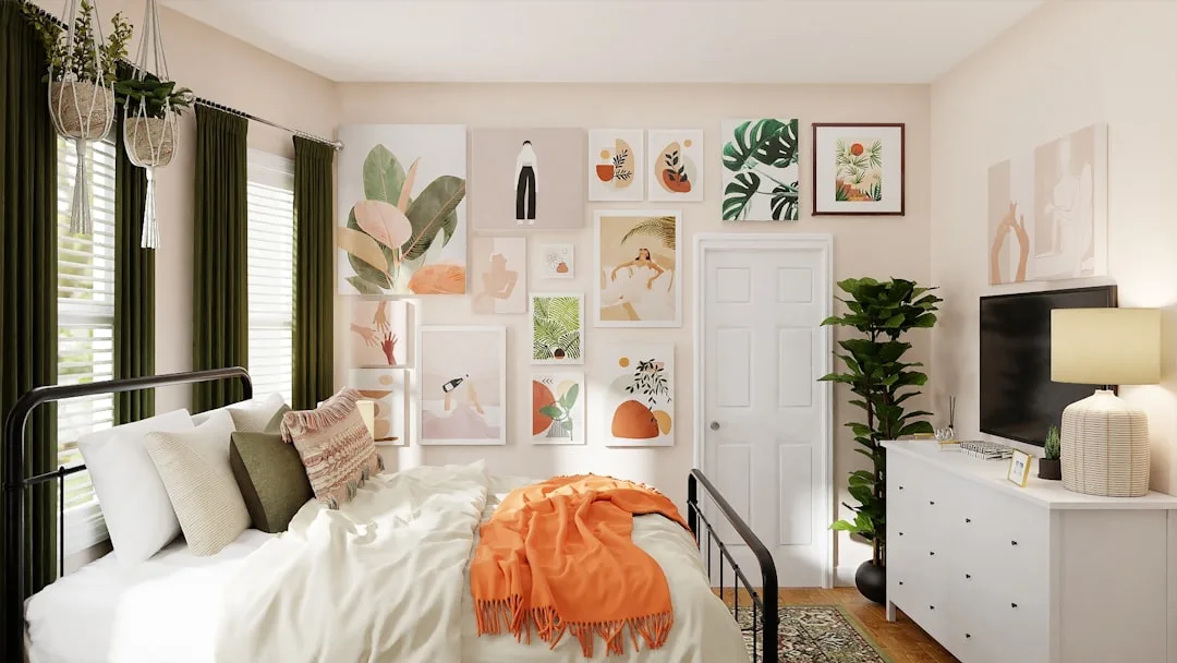
4. Maximalist Eclectic
Gallery walls, layered textiles, curated objects. This one works in dorms, but only under one condition: a unifying color palette of three colors maximum. Interior design research consistently shows that rooms with a defined palette of three or fewer colors are perceived as more spacious and intentional — a principle designer Emily Henderson has cited extensively in her work on small-space layering. Without that palette discipline, Maximalist Eclectic doesn’t read as curated. It reads as a storage problem.
5. Coastal Calm
Jute rugs, linen textiles, sandy neutrals, muted blues. What makes this practical for dorms specifically is portability — the key anchor pieces are lightweight, easy to transport, and almost universally inoffensive to university housing policies. A jute rug, two linen pillow covers, and a rattan lamp will cost you under $90 and establish the entire aesthetic.
6. Urban Industrial
Black metal accents, Edison-style warm bulbs, exposed-look shelving. This style performs well against the white walls that most dorms default to because dark accents create contrast that makes the room feel designed rather than just inhabited. One black-framed mirror and a clip-on Edison bulb lamp will take you 70% of the way there.
Actionable takeaway: Pick one style from this list and commit to it before you shop. The worst dorm rooms I’ve seen were the ones where the occupant tried to do two at once.
How to Choose Your Dorm Room Aesthetic Without Buying Anything First
This is the step that every competitor article skips. They hand you the listicle and send you straight to checkout. What they don’t tell you is that the best way to choose a dorm aesthetic is to spend about 45 minutes doing the following before a single dollar leaves your account.
Step 1: Audit what you already own.
Lay out your existing bedding, pull your most-worn clothing pieces, stack the books you’re bringing. Look at the actual colors you live in. Most people already have a latent aesthetic preference encoded in their possessions — they just haven’t named it yet. I had a client who thought she wanted a coastal room and then pulled out her wardrobe, which was entirely rust, olive, and cream. Her room ended up being the best earthy-minimalist space I helped style that year. She almost ignored the information she already had.
Step 2: Photograph the room before you unpack anything.
Or, if you haven’t moved in yet, get the floor plan dimensions and the wall color from your university housing office. Identify what you cannot change: flooring type, wall color, window placement, built-in furniture. These are the constants your aesthetic has to work with, not against.
Step 3: Identify your hero color.
One dominant color should appear in at least 40% of the room’s decor. This doesn’t mean painting walls — it means your bedding, your rug, or your primary textile carries this color consistently. Everything else coordinates with it.
Step 4: Select one anchor piece before anything else.
This is your rug, your bedding set, or your largest wall print — whichever covers the most visual real estate. Every subsequent purchase gets evaluated against this single item. If it doesn’t coordinate, it doesn’t come in.
Step 5: Commit to three textures maximum.
In a confined space, texture behaves like color — too many sources of it creates sensory clutter. Pick three: maybe linen, natural wood, and matte ceramic. Or cotton knit, rattan, and painted metal. Three. Not five.
Worth mentioning: color psychology research from the University of Texas found that rooms with beige and white tones induced feelings of low energy in occupants, while blue-green tones produced feelings of calm focus. If you’re choosing a dorm palette that you’ll also be studying in for eight months, this is useful information to factor in.
Actionable takeaway: Complete steps 1 and 2 this week — no spending, no browsing. Just auditing. You’ll know more about your actual aesthetic preferences than any quiz can tell you.
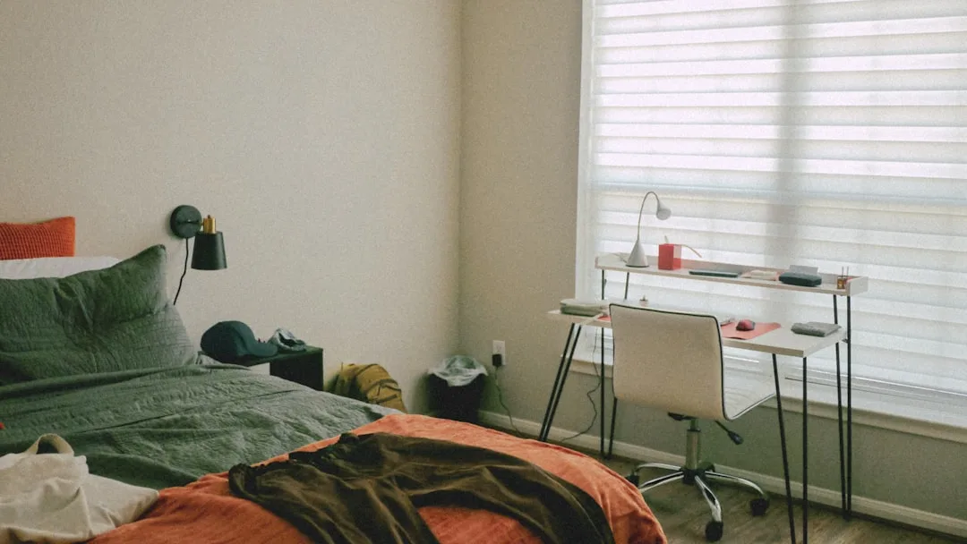
The Furniture Arrangement Rules Designers Use That Transform Any Dorm Layout
Here’s something I learned the hard way, on behalf of a client whose budget I watched disappear into beautiful furniture that made the room feel smaller than it did empty: arrangement matters more than acquisition. You can have mediocre furniture in a well-arranged room and it will feel considered. You can have beautiful furniture pushed against every wall and it will feel like a waiting room.
The float-and-anchor rule is the most counterintuitive thing I tell people: do not push all your furniture flush against the walls. Floating even 2–3 inches away from the wall — a desk chair, the side of a bed — creates visual depth that the brain registers as space. It looks intentional because it is.
Vertical space is the most systematically wasted asset in dorm rooms. Most students treat the wall from the desk surface upward as a blank afterthought. Wall-mounted shelves, a tall narrow bookcase, hanging planters that go near the ceiling — these extend the perceived ceiling height and return floor area to circulation. Floor area in a 150-square-foot room is not decorative real estate. It’s breathing room.
The 36-inch clearance rule: there should be an unobstructed path of at least 36 inches from your door to your primary sleeping and seating areas. Rooms that fail this test feel cramped regardless of how well-styled they are. I’ve seen genuinely beautiful dorm rooms that felt suffocating because this path was blocked by a bean bag chair that nobody ever moved.
Zone the room into three micro-areas — sleep, study, lounge — using rugs, lighting placement, and furniture orientation. A small rug under the desk chair defines the study zone. A floor lamp angled toward a chair defines the lounge zone. The bed defines itself. This zoning technique comes directly from studio apartment design and it works for exactly the same spatial reasons.
Bed placement is the single highest-impact furniture decision you’ll make in a dorm room. The bed occupies 30–40% of your total floor space — sometimes more. Default bed placement (against the longest wall, pushed into the corner) is not always the optimal arrangement. Walk the room. Try the bed in at least two positions before accepting the default.
Feng Shui and Western spatial psychology converge on one point about bedroom furniture: placing the bed in what’s called the “command position” — where the occupant can see the door without being directly aligned with it — is associated with reduced anxiety and better sleep quality in confined spaces. Whether you care about Feng Shui or not, the spatial logic holds.
Actionable takeaway: Before you bring anything into the room, sketch the floor plan with measurements and place the bed in three different configurations. The best arrangement is almost never the first one.
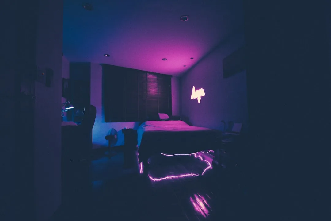
Lighting Is the One Design Element That Changes Everything in a Dorm Room

I will say this as plainly as I know how to say it: the overhead fluorescent fixture in your dorm room is your worst enemy, and it is absolutely winning if you don’t do something about it.
That single fixture — typically emitting cool, harsh light somewhere around 4000–5000K color temperature — is the primary reason dorm rooms look institutional rather than inhabited. It flattens everything. It makes skin look gray on video calls. It makes a beautiful linen duvet look like a hospital bed. Replacing what that light does to your room is the highest-ROI design decision you can make, and it costs less than a set of throw pillows.
Layered lighting is the professional standard: ambient, task, and accent working together rather than one overhead source doing all three jobs badly. In a dorm, this translates directly:
- Ambient: Warm LED string lights or a soft floor lamp (2700K–3000K bulbs, which emit warm white rather than clinical white)
- Task: A focused desk lamp with adjustable positioning — not decorative, functional
- Accent: LED strip lights behind a monitor or under a bed frame, or a small table lamp on the nightstand
A 2019 study published in Building and Environment found that warm-toned artificial lighting below 3000K significantly improved occupants’ perceived comfort and relaxation compared to cool-toned lighting in the same room. For students making lighting decisions that affect where they spend eight months of sleep and study, that’s not a trivial finding.
Plug-in sconces — no installation, no tools, no housing policy violations — mounted on either side of a dorm bed create the same visual symmetry as built-in bedside lighting in a professionally designed bedroom. The symmetry reads as intentionality. Two $25 plug-in sconces will do more for your room’s designed appearance than almost anything else at that price point.
One thing most people don’t consider: LED strip lights borrowed from hospitality and cinema design, placed behind a monitor or along the underside of a loft bed, add visual depth to what would otherwise be a flat white wall. The effect is disproportionate to the effort.
Actionable takeaway: On move-in day, plug in your string lights or floor lamp before you turn on the overhead fixture. Live with it for an hour. You’ll understand immediately what layered lighting does that a single overhead source cannot.
Wall Decor Strategies That Make a Dorm Room Look Like It Was Professionally Styled
“Add some art to the walls” is advice I’ve heard and given, and it means almost nothing without the compositional logic underneath it. A poster taped at shoulder height next to a random printout of a coffee shop menu is technically art on the wall. It is not a designed wall. There is a difference and it is visible from across the room.
The salon wall technique works in dorms when executed with discipline: group prints in odd numbers (3, 5, or 7 pieces), maintain consistent spacing of 2–3 inches between frames, and — critically — lay the entire arrangement on the floor first to test the composition before anything goes on the wall. Most people skip the floor-test step and end up with an arrangement that reveals its problems only after the Command Strips are set.
Frame consistency matters more than print consistency. Mixing a black-and-white photograph with a botanical illustration with a typographic print is perfectly coherent — if all three frames share the same finish. All matte black. All natural wood. All white. The frame unifies what the content diversifies.
The eye-level center rule: the visual center of any wall arrangement should sit at 57–60 inches from the floor. This is the standard used by MoMA and most professional gallery installations worldwide, and it works for exactly the same reason in a dorm — the human eye reads that height as natural and comfortable. Most students hang things too high, which is partly an instinct to fill vertical space and partly the absence of a measuring tape.
One large-format print — 24×36 inches or larger — creates more visual impact than a crowded grid of six small prints, and it reads more designed. I’ve seen dorm rooms transformed by a single well-chosen oversized poster in a $15 black frame. Clean. Committed. Effective.
Mirrors as wall decor deserve more credit than they get. A mirror positioned to catch natural light from your window doesn’t just reflect — it redistributes. You can effectively double the brightness of a dorm room with a single well-placed mirror, which is particularly valuable in rooms with one small window or a north-facing exposure.
Actionable takeaway: Before buying any wall art, tape paper cutouts of your intended frame sizes to the wall and step back. The arrangement will tell you immediately whether the composition works.
The Dorm Room Aesthetic Shopping Framework: What to Buy, What to Skip, and in What Order
The National Retail Federation reported that the average American family spent $1,199 on back-to-college shopping in 2023, with room decor and furnishings representing a meaningful share of that number. Based on what I’ve seen in actual finished dorm rooms, the pattern holds: a significant portion of that spending goes to items that don’t meaningfully improve the room’s aesthetic coherence. They fill space. They don’t do design work.
Here’s the framework I’d give a client working with any budget:
Tier 1 — Invest here (60% of your total budget)
- Bedding set (this covers the most square footage of any single item)
- Area rug (the second-largest visual surface in the room and the biggest contributor to warmth and zone definition)
- Primary lighting (a floor lamp or two plug-in sconces that establish the room’s ambient temperature)
Tier 2 — Select intentionally (30% of your budget)
- 1–2 framed art pieces or prints in the scale appropriate to your wall
- One accent throw and one coordinating pillow set (not three pillows — one set)
- One plant in a planter that fits the aesthetic palette
Tier 3 — Fill in affordably (10% of your budget)
- Adhesive hooks, cable management clips, matching storage baskets — functional items that still coordinate visually
Common over-purchases that eat budgets without earning their place:
- Throw pillows beyond three total. They stack on your desk chair every night because they have nowhere else to go.
- Candles. Banned in most dorms and a fire hazard regardless.
- Neon signs. The light temperature is almost always wrong for the aesthetic you’re building, and they date quickly.
For rugs and lamps specifically, Facebook Marketplace, ThriftedU, and campus swap groups routinely surface items at 80–90% below retail. The aesthetic quality is identical. A jute rug that was $140 new costs $18 used and brings exactly the same visual warmth to a coastal-calm or Japandi room.
The one-in, one-out rule: before any new decor item enters the room, identify what it replaces or what leaves. This is not precious — it’s spatial discipline. Dorm rooms don’t have the volume to absorb gradual accumulation without it showing immediately.
Actionable takeaway: Spend your Tier 1 budget first and stop. Live in the room for a week before touching Tier 2. You’ll make better decisions once you’ve occupied the space.
How to Maintain Your Dorm Room Aesthetic All Year (Not Just Move-In Weekend)
Move-in weekend photographs are a genre. By November, most of those rooms bear no resemblance to the Instagram post from August. This is not a cleanliness issue — it’s a systems issue. Rooms without maintenance habits degrade aesthetically faster than they degrade physically, because visual clutter accumulates faster than dust.
Research from Princeton University’s Neuroscience Institute found that visual clutter — competing stimuli in the visual field — directly impairs the brain’s ability to focus and process information, with measurable effects on cognitive performance. This means that maintaining your dorm room’s aesthetic is not vanity. It affects how well you can work in the space. That’s worth treating seriously.
The 10-minute weekly reset is the single most effective maintenance habit I can recommend. Return every surface to its baseline. Remove anything that doesn’t belong in the room. Straighten frames, fold and reposition textiles, clear the area rug of anything that’s migrated onto it. Ten minutes. Same time every week — Sunday evening works well because it creates the mental reset before Monday. Do it once and you’ll feel the difference in the room immediately.
Seasonal variety without spending money is simpler than it sounds: rotate which prints are displayed (store the others flat under the bed), swap a cotton throw for a heavier wool-blend knit in November, rearrange the objects on your desk surface. The room reads differently and you spent nothing.
Storage is a designed element — not a concession to practicality. Matching bins or baskets in your aesthetic’s color palette make a loaded shelf look intentional. Random bags, mismatched boxes, and plastic bins from different retail chains make the same shelf look like a problem waiting to be solved. This is worth the cost of two coordinating baskets from a thrift store.
The clear surface rule is one I give every client regardless of space size: always leave at least one full, unobstructed surface visible in the room. Nightstand, windowsill, a corner of the desk. One clear surface signals order in a way that registers before the brain consciously processes anything else. It makes the entire room read cleaner than it is.
Cord management is where aesthetics go to die and almost nobody talks about it. Visible cables running from outlets to lamps to laptops to phone chargers undermine every other design decision in the room. Cable clips, adhesive channels, and a simple cable box — all available for under $20 total — eliminate this problem completely and permanently.
Actionable takeaway: Right now, today, identify the one surface in your room that accumulates the most clutter. Clear it completely. Keep it clear for one week. Notice what it does to the way the room feels.
Frequently Asked Questions
What is the easiest dorm room aesthetic to achieve on a tight budget?
Soft minimalism is the most budget-forgiving aesthetic because its power comes from restraint, not quantity. A set of cream or warm-white bedding (available at Target or IKEA for $40–60), a single textured throw in a complementary neutral, and one piece of wall art in a consistent frame will take you 80% of the way there. The aesthetic is also the most forgiving of imperfect execution — because the room doesn’t rely on many pieces, the pieces you do choose look more deliberate. Coastal calm is a close second: a jute rug and two linen pillow covers establish the entire palette at minimal cost, and the rest of the room can stay relatively sparse without reading as unfinished.
How do I make my dorm room look aesthetic without damaging the walls?
Command Strips are the industry standard for a reason — they hold reliably when you use the right weight rating (check the package; one strip per pound of frame weight is the working rule) and remove cleanly when you follow the pull-tab removal instructions exactly. For gallery walls, foam mounting tape and adhesive picture-hanging strips handle most standard frames. Removable wallpaper panels have improved significantly in the last few years and can now be used on painted dorm walls without leaving residue, provided the surface is clean before application. Avoid anything with permanent adhesive backing, and always check your university’s housing policy before using even the removable options — some schools are specific about what’s permitted.
What should I buy first when decorating a dorm room?
The rug or the bedding — whichever you’re less certain about. Here’s the logic: you can’t evaluate anything else in the room until your largest visual surfaces are established. Buying art before you have a rug means buying art without knowing the dominant color that everything needs to coordinate with. The rug and bedding together tell you the room’s color temperature, its textural language, and its general aesthetic direction. After those two items are in place, every subsequent decision becomes much easier because you have a reference point. If budget forces a choice between the two, buy the bedding first — it covers more visual space and you’ll sleep under it every night.
How do I choose a dorm room aesthetic that won’t feel dated in a year?
Avoid anything that’s described using a compound trend name from a TikTok or Pinterest micro-category from the past six months. Not because trends are inherently bad, but because the more specific the trend name, the shorter its shelf life. The six styles outlined in this article — minimalism, dark academia, Japandi, maximalist eclectic, coastal calm, and urban industrial — have been visually coherent for at least a decade and will continue to be. They’re not immune to evolution, but they’re not going to look embarrassing by sophomore year. If you’re uncertain, anchor the room in neutrals and natural materials, which are the closest thing to permanent in residential design. A room built on warm whites, natural wood, and linen has never looked dated in any year I’ve worked.
Pick one section from this article and act on it today. Not the shopping section — the audit section. Sit in your room, or pull up the floor plan, and spend twenty minutes deciding how you want the space to feel. Everything that costs money comes after that. Everything.