The dining room was the last room added to the American home floor plan — and in most houses built in the last thirty years, it shows. Not in an obvious way. Not in a way that shows up on a listing photo or a floor plan printout. It shows up the first Tuesday you try to pull your chair out while someone is walking to the kitchen, or the first time you set a sideboard against what you thought was a wall and realize the door swings directly into it. These rooms weren’t designed badly on purpose — they were designed for a lifestyle that assumed people would eat formally three times a week and never thought too hard about what happened the other four nights. That assumption collapsed. The rooms are still here. Awkward dining room layout solutions exist — but they only work if you’re solving the right problem, which most people aren’t.
Quick Answer
The dining room was the last room added to the American home floor plan — and in most houses built in the last thirty years, it shows.
Most content about awkward dining rooms treats the problem as aesthetic. Wrong rug size. Wrong pendant height. Not enough “warmth.” What I kept seeing, over eleven years of working with actual clients in actual apartments and houses across two cities, was something structurally different: rooms that fight back because their geometry was never reconciled with how people physically move through a home. The styling advice doesn’t reach that. It can’t.
This is about fixing the real problem.
Diagnosing Your Dining Room Type Before You Move a Single Chair
In This Article
- Diagnosing Your Dining Room Type Before You Move a Single Chair
- The Pass-Through Problem: Dining Rooms That Double as Hallways
- The Corridor Pinch: Fixing Long, Narrow Dining Rooms
- The Oversized Dead Zone: When the Room Is Too Big for Its Purpose
- The Open-Plan Orphan: Creating Dining Presence Without Walls
- Furniture Selection for Rooms That Don’t Behave
Before you buy anything, measure anything, or take a single piece of furniture apart — stop. The single most expensive mistake I watched clients make, over and over, was misidentifying what kind of problem they had. They’d read an article about open-plan orphan dining zones and rearrange their pass-through room accordingly, then wonder why it felt worse. The advice wasn’t wrong in isolation. It was wrong for their room.
Most dysfunctional dining rooms fall into one of four archetypes, and each one responds to a completely different set of awkward dining room layout solutions:
- The Pass-Through: Traffic from other rooms cuts directly through the dining space. The table is technically in the room, but it sits in a crossroads. People walk around it, between it and the wall, and through the dining experience itself.
- The Corridor Pinch: The room is long and narrow — disproportionately so — and the table runs the length of it like a ship in a bottle. Getting in and out of chairs is a daily negotiation.
- The Oversized Dead Zone: The room is too large for its purpose and its furniture. The table floats in the middle of it, surrounded by open space that reads as emptiness rather than breathing room. Everything feels provisional, like the furniture hasn’t fully moved in.
- The Open-Plan Orphan: There is no room, technically. There is a designated area of floor in a larger space — great room, loft, combined kitchen — where a table sits without walls, without definition, and without any spatial logic anchoring it to anything.
The five-minute floor audit works like this: get a roll of masking tape and mark out your current furniture footprint on the floor. Then mark the door swing arcs — open every door fully and trace the radius with tape. Then walk every path you actually use in a day: from kitchen to table, from table to back door, from hallway to living room. Do it ten times. You’ll see where the tape lanes overlap with the furniture tape, and that overlap is your real problem, not the chair style or the pendant height.
According to the National Kitchen and Bath Association, 68% of remodeling complaints involve traffic flow conflicts between dining and adjacent kitchen or living spaces. That’s a structural problem. It’s confirmed by the number, and confirmed by every client I’ve ever seen spend $3,000 on new dining furniture and still feel like the room doesn’t work.
Actionable takeaway: Do the masking tape audit before you spend a dollar. If you can’t walk cleanly from every entry point to every other without weaving around furniture, you have a pass-through or corridor problem — not a styling problem.
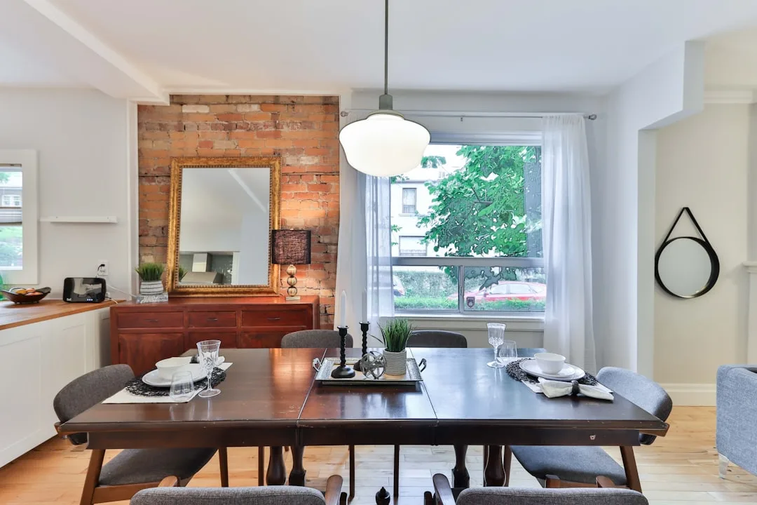
The Pass-Through Problem: Dining Rooms That Double as Hallways
The pass-through is probably the most common dysfunction I encountered, and it’s the one that produces the most daily friction — not because it’s the hardest to fix, but because people adapt to it instead of solving it. They start angling their bodies when they walk through. They stop pulling their chairs out fully. They absorb the inconvenience until it becomes invisible, and then they wonder why they never want to eat in that room.
The core tension is a numbers problem. Interior design ergonomics standards recommend a minimum 36 inches of clearance around all sides of a dining table — 36 for clear passage, 48 ideally for comfortable chair pull-out. In pass-through rooms, most homeowners are working with 24 inches on at least one side. That’s the gap between a room that functions and one that you unconsciously avoid.
The fix isn’t to squeeze the table smaller and hope. It’s to redirect the traffic.
Furniture placement — not walls, not room dividers, not curtains hung from the ceiling (please) — is the most reliable traffic redirect in an existing space. A console table or open-back bookcase positioned perpendicular to the traffic path signals to the eye and the body that a detour is expected here. The key word is open-back: a solid room divider kills light and creates a visual wall that makes the whole space feel severed. Open shelving — the kind you can see through — stops the casual throughline without making either zone feel smaller.
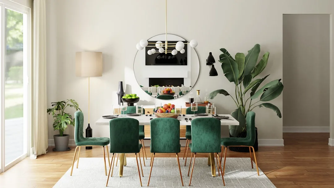
Round tables are genuinely better in pass-through rooms, and not for the decorative reason people usually cite. A round table has no corners to navigate. In a room where someone is always moving around the dining perimeter, corners are the collision points. The specific diameter range that works depends on square footage:
- Rooms under 120 square feet: 42–48 inch diameter
- Rooms between 120 and 180 square feet: 48–54 inch diameter
- Rooms over 180 square feet: 54–60 inch diameter, but verify actual clearance after placement
One thing I learned the hard way — I once placed a beautiful 60-inch round table in a pass-through dining room and it looked perfect in isolation and was a disaster in practice because the room was only 11 feet wide. The math was technically fine. The experience was not. Measure the actual clearance after the table is placed, not the room width before.
Among all the awkward dining room layout solutions I’ve tested in pass-through rooms, the traffic redirect using open furniture is consistently the one that costs the least and delivers the most immediate change in how the space feels day-to-day. It works because it addresses behavior, not just aesthetics.
Actionable takeaway: Identify the primary traffic path through your dining room, then position one piece of furniture — a console, a low open bookcase, a bench — perpendicular to that path. You’re not blocking it. You’re bending it. The difference in daily experience is immediate.
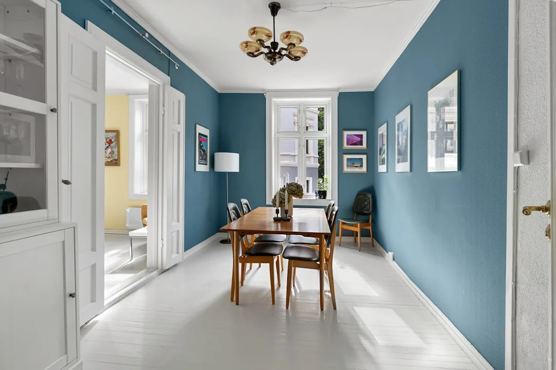
The Corridor Pinch: Fixing Long, Narrow Dining Rooms
Long narrow dining rooms are a specific kind of difficult. The proportions feel wrong the moment you walk in — too much length, not enough width — and every standard piece of dining furniture seems to make it worse. A rectangular table running the length of the room turns the space into a refectory. A round table in the center looks stranded. Sideboards on the long walls eat the remaining clearance and leave you shuffling sideways to reach your seat.
The instinct most people have is to fight the proportions — to try to make the room feel wider through color, mirrors, or horizontal-stripe rugs. That instinct isn’t wrong, but it’s incomplete. Visual tricks address perception. They don’t address the physical reality of trying to seat six people in a room that’s 8 feet wide.
The dimensions that define a corridor pinch:
- Room width under 10 feet with a table in place
- Less than 30 inches of clearance on the long sides of a rectangular table
- A length-to-width ratio greater than 2:1
When you’re working in those constraints, the most effective awkward dining room layout solutions involve table shape and seating configuration more than anything else.
What actually works in corridor-pinch rooms:
- Bench seating on the long-wall side. A bench tucks under the table completely when not in use, recovering 8–12 inches of clearance that individual chair legs scatter across the floor. It also eliminates the chair-push-out problem on that side — people swing their legs over rather than pushing backward.
- A rectangular table pushed against one long wall. This feels counterintuitive. You lose seating on one side entirely. But what you gain is a full unobstructed lane down the other side — enough to walk through without contact, enough to serve from without acrobatics. The table becomes a peninsula. One side seats three or four. The open side passes freely.
- Extending tables stored at minimum size. A 60-inch extension table stored at 36 inches buys you 24 inches of daily clearance you only surrender when you actually need seating for six. Most households seat six maybe twelve times a year. The other 353 days, the clearance matters more.
- Wall-mounted fold-down tables for rooms under 9 feet wide where even a small table creates an obstacle course. These aren’t a compromise — in the right space they’re the most functional option available.
The ceiling also matters in narrow rooms in a way people underestimate. A pendant hung at the standard 30–36 inches above the table surface in a narrow room compresses the visual field vertically and makes the room feel more tunnel-like, not less. Raising the pendant to 40–44 inches — or switching to a flush or semi-flush ceiling fixture entirely — opens the vertical dimension and counteracts the horizontal constraint.
Actionable takeaway: In a corridor pinch, your two best investments are a bench for one long side and an extension table stored at its smallest dimension. Together they can recover 12–18 inches of functional clearance without touching a wall.
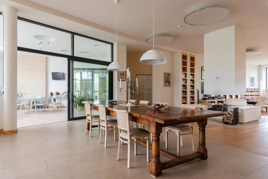
The Oversized Dead Zone: When the Room Is Too Big for Its Purpose
The oversized dining room creates a different kind of psychological discomfort — not the friction of too-tight, but the unease of too-loose. Furniture floats. Voices carry. The room never settles into itself. Guests sit at the table and feel exposed rather than gathered, as if they’re eating in the middle of a parking lot that happens to have a chandelier.
This problem shows up most often in older homes built with formal entertaining in mind, and in newer construction where the builder maximized square footage without thinking about how people actually use rooms. The result is the same: a table that seats eight surrounded by empty floor on all sides, a sideboard pushed against a wall fifteen feet away, and nothing pulling the room together.
The oversized dead zone responds to zoning, not filling. The mistake is trying to furnish the whole room — to buy enough furniture to match the square footage. That approach produces a room that looks overstuffed without ever feeling comfortable. What works instead is collapsing the active zone to a human scale and letting the periphery serve a different function.
Here’s how that plays out practically:
- Define the dining zone with a rug sized to the table and chairs. The rug should be large enough that all chair legs stay on it when chairs are pulled out — typically 8×10 for a six-person table, 9×12 for eight. This isn’t decorative guidance. The rug creates a room within the room, a defined territory that the table and chairs belong to.
- Pull furniture away from the walls. This is the opposite of what feels right. When furniture lines the walls, the center feels emptier, not fuller. Floating furniture — a sideboard or buffet positioned 18–24 inches from the wall — creates a back zone that feels intentional rather than abandoned.
- Add a secondary function to the perimeter. A reading chair and floor lamp in one corner. A bar cart. A low credenza with books and objects. You’re not filling the room — you’re giving the edges something to do, so the empty space reads as deliberate transition rather than failed design.
- Use lighting to define scale. A chandelier or pendant sized to the table — not the room — pulls the eye down and creates a lit zone that visually contracts the space to its functional core. The industry standard is a fixture 1 inch in diameter for every foot of room width, but in oversized rooms, err toward the smaller end of that range to maintain intimacy rather than grandeur.
Actionable takeaway: In an oversized room, your first move is the rug — the right size, positioned correctly under the table. Everything else can wait. The rug establishes the zone that makes the rest of the furniture decisions make sense.
The Open-Plan Orphan: Creating Dining Presence Without Walls
The open-plan orphan is arguably the hardest problem to solve because it’s not really a room problem — it’s a boundary problem. There are no walls to work with. The dining area exists as a convention, a zone agreed upon by whoever put the table there, in a larger space that has no reason to recognize it. Light passes through. Sound passes through. Traffic passes through. The table sits in the current of the whole floor plan with nothing to hold it in place.
Open-plan living was sold as the great liberation of domestic space, and in some ways it delivered. But the dining area was always the casualty. Kitchen and living room adapted relatively well — they have functional anchors, appliances and sofas and televisions that establish their territory. The dining area has a table and some chairs, which is not enough to claim space in a 1,200-square-foot combined floor plan.
The awkward dining room layout solutions for open-plan orphans all involve the same underlying principle: manufactured boundary. You’re building, through furniture and light and material, the suggestion of enclosure. Not walls — walls would destroy the open plan’s only virtue. The suggestion of enclosure. Enough of a boundary that the body registers a transition when it enters the dining zone.
The tools for manufactured boundary:
- The rug, again, but more critically here. In a room with walls, the rug defines and refines. In an open plan, the rug is load-bearing. It is the floor of the dining zone. Without it, the dining area is just a table on a continuous floor — visually connected to everything, belonging to nothing.
- A statement light fixture hung low and deliberately. In open-plan spaces, the ceiling is often the only architectural element specific to a zone. A pendant hung at the right height — 30–34 inches above the table surface — plants a visual stake in the space. It says: this is where the dining zone is, and everything below this light belongs to it.
- A partial partition using open shelving or a sofa table. A six-foot open bookcase placed between the dining zone and the living area creates a visual boundary without blocking light or sightlines. The key is consistency of material — a bookcase that matches the dining furniture reads as part of the dining zone. A bookcase that reads as living room furniture blurs the boundary rather than reinforcing it.
- Acoustic differentiation. Sound is underused as a zoning tool. A rug and upholstered seating in the dining zone absorbs sound differently than the hard surfaces of a kitchen. That difference — subtle, not always conscious — is part of what makes a dining zone feel like a place rather than a position.
What doesn’t work:
- Hanging curtains from the ceiling to create a soft boundary. This feels theatrical in execution and never delivers the separation it promises.
- Relying on paint color alone to define the zone on a continuous wall. Color zoning works in theory. In practice, a color change on a shared wall reads as a design choice, not a spatial boundary.
- Placing the table at an angle to the room grid. This is offered constantly as a solution to open-plan dining. It rarely works. The angled table draws attention to itself as a deliberate act without actually claiming any territory.
Actionable takeaway: In an open-plan dining zone, start with two anchors — the rug under the table and the pendant over it. Those two elements, properly sized and positioned, do more spatial work than any other combination of interventions.
Furniture Selection for Rooms That Don’t Behave
Once you’ve diagnosed your room type and understood the structural fix, furniture selection becomes less about style and more about geometry. The wrong table shape in the right room, or the right table shape in the wrong position, produces the same failed result. This section is about the specific furniture decisions that solve layout problems rather than just filling square footage.
Table shape by room type:
- Pass-through rooms: Round or oval tables. No corners to navigate, continuous perimeter clearance, and the oval gives you seating capacity without the footprint penalty of a large round.
- Corridor pinch rooms: Rectangular tables pushed to one wall, or — for very narrow rooms — wall-mounted fold-downs. Avoid square tables, which consume the width dimension without adding meaningful seating capacity.
- Oversized dead zones: Any shape works, but the table should be sized to the rug and the intended seating capacity, not to the room. A table that’s too large for its rug is worse than a table that’s too small for the room.
- Open-plan orphans: Rectangular tables with a strong visual presence — a dark stain, a distinctive material, a substantial base. In a space with no walls, the table needs to hold visual weight on its own.
Chair selection and clearance math:
The standard dining chair occupies roughly 18–20 inches of depth when pushed in, and requires 16–18 additional inches to push out comfortably. That means every chair needs approximately 36 inches of depth from the table edge to function without conflict. When clearance is limited, consider:
- Armless chairs: Remove 2–4 inches of width compared to armed versions, which matters significantly in corridor pinch rooms where you’re threading multiple chairs on a narrow side.
- Stackable or backless stools for supplemental seating that stores away from the table entirely.
- Upholstered chairs for end seats only. End chairs have more clearance than side chairs in most rooms. Upholstering the ends adds visual weight and comfort where space allows, keeping side seats slimmer.
Storage furniture and the clearance trap:
Sideboards, buffets, and credenzas are among the most common sources of layout dysfunction in dining rooms, and they’re almost never identified as the problem. The standard sideboard is 54–72 inches wide and 15–20 inches deep. In a room where clearance is already marginal, adding 18 inches of depth to a wall removes what might have been the last viable passage.
The clearance math:
- Minimum 36 inches between sideboard face and nearest table edge for basic passage
- Minimum 42 inches to open sideboard doors without backing into the table
- Minimum 48 inches to serve from the sideboard comfortably while someone is seated
Most homeowners place a sideboard in a dining room with 30–32 inches between it and the table and spend years ducking and angling their way through dinner service. Measuring before placing is the obvious fix. Choosing a shallower cabinet — 12–14 inches — is the less obvious one, and often the more practical.
Actionable takeaway: Before purchasing any storage piece for your dining room, measure the clearance you’d have between its face and the nearest table edge. If it’s under 42 inches, choose a shallower option or place it on a different wall.
FAQ
Q: My dining room is technically a dedicated room but it’s only 10×10 feet. What’s the largest table I can realistically fit?
A 10×10 room gives you 100 square feet, but door swings and any passage requirements immediately reduce your working area. A round table in the 42–48 inch range is usually the maximum in a square room this size — it keeps the 24–30 inches of clearance you need on all sides while seating four comfortably and six in a squeeze. Rectangular tables in a square room create an asymmetry that tends to pinch clearance on two sides while wasting it on the others. If you need to seat more than four regularly, look at an extension table stored at 36 inches that opens to 54 — you gain seating capacity on demand without sacrificing daily clearance.
Q: I’ve tried every awkward dining room layout solution I can find and the room still feels wrong. What am I missing?
The most common overlooked factor is ceiling height relative to lighting. A room with 8-foot ceilings and a pendant hung at standard height creates a compressed zone that no amount of furniture rearrangement corrects. The second most common is acoustic hardness — a room with hard floors, no rug, and bare walls feels wrong in a way that’s sensory rather than visual. If you’ve addressed traffic flow and furniture scale and the room still doesn’t settle, check what’s happening above eye level and what’s happening with sound absorption. Both are invisible in the usual diagnostic.
Q: Does a round table actually help in a pass-through room, or is that just a style preference people have dressed up as practical advice?
It’s genuinely practical, and the reason is specific: rectangular tables have four corners that protrude into traffic paths, and those corners are where contact happens — shin corners, elbow corners, the corner you catch with the serving dish. A round table removes that entirely. The continuous curve also means there’s no “wrong side” to approach from — clearance is consistent at every point around the perimeter, which matters in a room where traffic comes from multiple directions. The style preference exists independently, but the ergonomic case stands on its own.
Q: We’re in an open-plan apartment and our dining table has been in three different positions over two years. None of them feel right. How do we find the right position?
Start by mapping the fixed anchors: the kitchen entry point, the living area seating, and any natural light sources. The dining table needs to sit in a position where it doesn’t interrupt the primary path between kitchen and living area — which means it usually belongs against one axis of the space rather than in the center of it. From that starting constraint, test positions with the rug first — lay the rug down, live with it for a few days without moving the table onto it, and see if the zone it creates feels right before you commit to furniture placement. The rug is lighter to move than the table and gives you a faster read on whether the position is working.
Q: We have a long narrow dining room and we’ve been told to use a bench on one side. We tried it and it’s awkward for people to get in and out. What are we doing wrong?
Usually the gap between the table and the wall. A bench works well when the table is positioned so people can enter and exit from the ends, and when the table height clears the bench seat by at least 11–12 inches — standard bench height is 17–18 inches, and standard table height is 29–30 inches, so that gap is usually fine. The more common problem is that the bench is too long relative to the table, extending past the table edge with no way to exit. The bench should be 6–8 inches shorter than the table on each end, so there’s always an exit point. If the room is narrow enough that even the end exits are tight, consider a bench with legs only at the ends — no central legs to step over — and make sure the aisle opposite the bench is your priority clearance zone.