The most-searched bedroom renovation in America costs less than a tank of gas — and most people still manage to do it wrong. If you’ve been collecting diy accent wall ideas bedroom inspiration on Pinterest for months without pulling the trigger, you’re probably stuck on the same three mistakes everyone makes: picking the wrong wall, skipping the prep, and choosing a trendy pattern that dates in 18 months. They end up with something that looks exactly like what it is: a rushed weekend project. This article fixes that.
Quick Answer
The most-searched bedroom renovation in America costs less than a tank of gas — and most people still manage to do it wrong.
Are Accent Walls Out of Style in 2026? (Short Answer: No — But Most People Do Them Wrong)
In This Article
- Are Accent Walls Out of Style in 2026? (Short Answer: No — But Most People Do Them Wrong)
- What Wall in a Bedroom Should You Actually Choose?
- What Is the Easiest Accent Wall to DIY? (Ranked by Skill Level)
- 13 DIY Bedroom Walls That Look Expensive (But Aren’t)
- The Most Common DIY Accent Wall Mistakes (And How to Avoid Them)
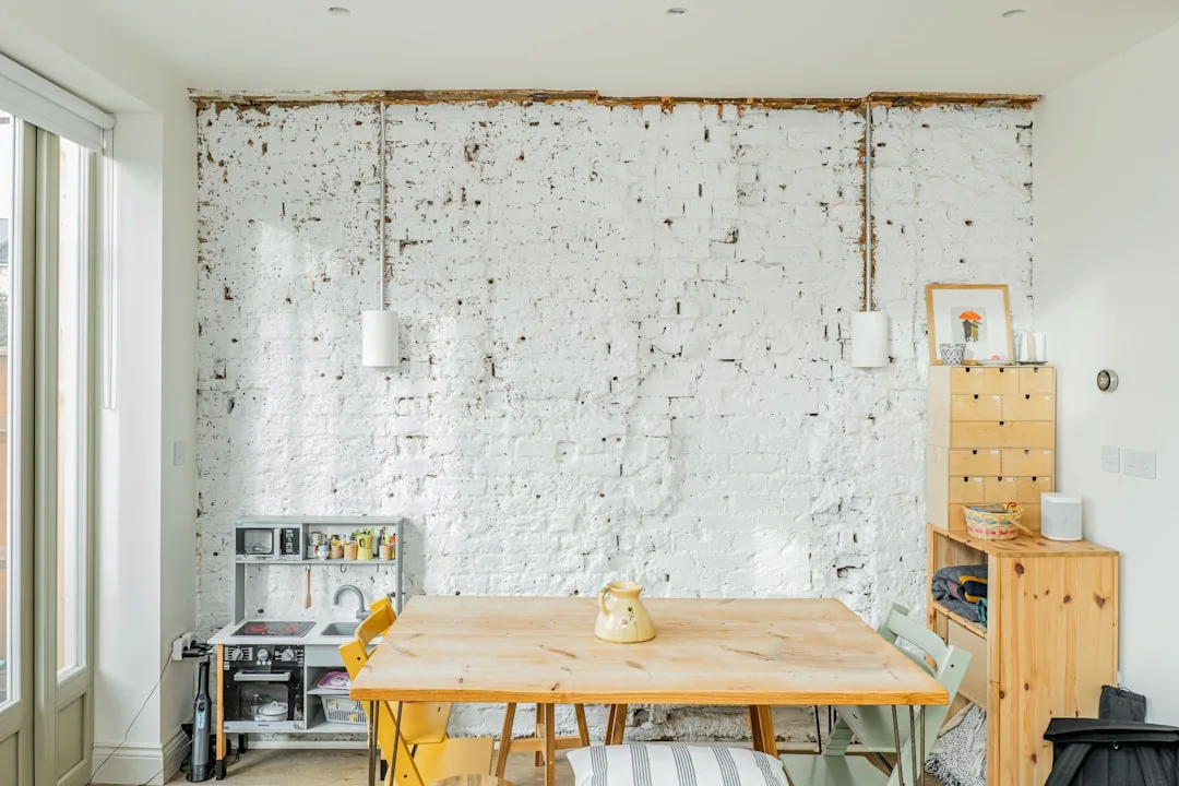
The accent wall didn’t die. The shiplap version did. There’s a difference.
After a post-pandemic slump, Google Trends data shows “accent wall bedroom” searches rebounded more than 40% between 2023 and 2025. The concept never lost its design logic — a single wall treated differently creates depth, anchors furniture, and gives a room a reason to exist. What fell out of favor was lazy execution: the lone gray shiplap wall surrounded by builder white paint, the peel-and-stick subway tile above a bed, the oversized word art framed as a “gallery moment.”
The shift from 2024 onward has been toward texture, material layering, and tonal contrast — what Elle Decor and Architectural Digest have both tracked under the broader “quiet luxury” umbrella. This isn’t about spending more. It’s about finishing better. Limewash paint over a smooth wall. Venetian plaster texture achieved with a $15 bag of joint compound. Tonal color blocking that uses the same paint family in dramatically different depths.
Interior designers who’ve been doing this for decades will tell you the accent wall problem was never conceptual. It was executional. People chose the wrong finish, skipped wall prep, and treated the surrounding walls as an afterthought. The wall looked cheap not because the idea was cheap, but because the process was careless.
What’s trending now doesn’t require a contractor or a renovation budget. It requires patience, the right materials, and understanding why certain techniques create that “how did they do that?” quality. Organic, tactile surfaces — raw plaster, woven textures, layered paint — are replacing the flat, graphic statements of the early 2020s.
Actionable takeaway: Before choosing any technique from this list, search “quiet luxury bedroom walls” on Pinterest and save 10 images that appeal to you. The pattern in what you save — texture vs. pattern, warm vs. cool, minimal vs. layered — will tell you which of the 13 ideas below is actually right for your room.
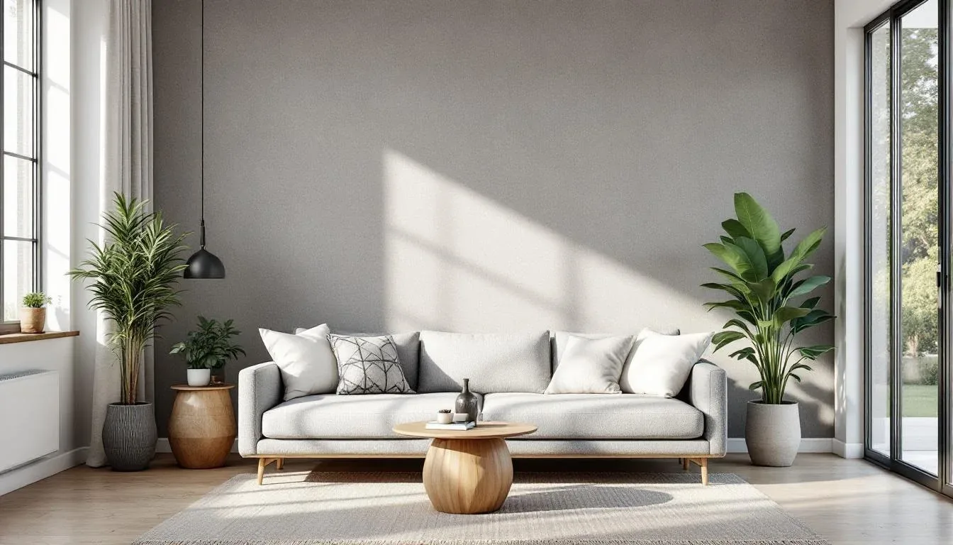
What Wall in a Bedroom Should You Actually Choose?
Most people default to the headboard wall without thinking about it. Most of the time, they’re right — but not always.
The headboard wall works because of sightline logic. When you stand at the bedroom doorway, your eye travels straight to the bed. The wall behind the bed is the natural anchor point for the entire room, framing the most important piece of furniture and reinforcing the bed as the focal element it’s supposed to be. In a standard US master bedroom — typically around 14×16 feet — this sightline is almost always clear.
But there are real exceptions:
- Asymmetrical rooms: If your headboard wall has a window offset to one side, an accent treatment will fight the window rather than work with it. Light will illuminate the wall unevenly, and any geometric treatment will look slightly off.
- North-facing walls: A dark accent on a wall that never gets direct sunlight creates a cave effect by 3pm. Test with samples before committing.
- Low ceilings on the headboard wall: If ceiling height drops below 8 feet, a heavily textured or dark accent wall behind the bed can feel oppressive rather than cozy.
- Long, narrow rooms: A side wall accent can visually widen the space. Treating the far short wall makes a narrow room feel like a bowling alley.
The quick rule experienced designers use: stand at the bedroom doorway and let your eye land naturally. Where it stops first — that’s your wall. Don’t override that instinct with geometry unless you have a specific structural reason.
For small bedrooms under 150 square feet, the opposite wall (the one you see when lying in bed) is sometimes more effective than the headboard wall. It creates depth without closing the space in.
Actionable takeaway: Stand at your bedroom doorway for 30 seconds without trying to decide anything. Wherever your eye goes first — that’s the wall. If it’s not the headboard wall, trust the room over the convention.
What Is the Easiest Accent Wall to DIY? (Ranked by Skill Level)
Not every technique on this list requires the same commitment. Here’s how to self-select honestly before you buy anything.
Tier 1 — Beginner (no tools, 2–4 hours):
- Peel-and-stick wallpaper or grasscloth panels
- Limewash paint applied with a sponge or brush
- Fabric stretched over a simple frame (no staple gun needed with the right tension method)
- Removable paint murals using projector transfer
Tier 2 — Intermediate (basic tools, 4–8 hours):
- Painted geometric shapes with painter’s tape and a laser level
- Tonal color blocking with a clean horizontal line
- High-contrast faux wainscoting using paint only
- Framed molding grids (requires a miter box and brad nailer or strong adhesive)
Tier 3 — Advanced (power tools, 1–3 days):
- Wood slat walls using poplar or pine strips
- Board and batten with actual lumber
- Venetian plaster or joint compound texture (no tools, but high skill ceiling)
- Reclaimed wood patchwork
These time estimates align with Home Depot’s project guide benchmarks and reflect realistic timelines including dry time — not optimistic YouTube speeds.
The most important thing to understand: skill level doesn’t predict visual impact. A perfectly executed Tier 1 limewash wall will look more sophisticated than a Tier 3 wood slat wall with uneven spacing and visible nail holes. The jump between tiers isn’t about aesthetics — it’s about tools and physical process.
Beginners consistently underestimate Tier 3 projects and overestimate the impact they’ll get from complexity. A single well-mixed limewash paint application in Benjamin Moore’s “Newburyport Blue” or Sherwin-Williams “Urbane Bronze” reads as expensive in photographs and in person.
Actionable takeaway: Be honest about your weekend. If you have four hours on a Saturday, choose from Tier 1. A finished Tier 1 project beats an abandoned Tier 3 every time.
13 DIY Bedroom Walls That Look Expensive (But Aren’t)
The median diy accent wall ideas bedroom project costs between $50 and $300 in materials. Professional installation of the same treatments runs $800 to $2,500. The gap isn’t skill — it’s labor markup. Here’s what that $50–$300 can actually get you.
1. Limewash Paint
Why it looks expensive: The depth. Limewash creates variation within a single color — some areas absorb more, some less, resulting in a layered, aged effect that flat paint simply cannot replicate. It looks like a wall that’s been lived in for decades inside a Tuscan farmhouse, except you mixed it yourself on a Sunday morning.
What it actually costs: A single-wall application runs $40–$80 in materials. Portola Paints’ Lime Wash is the most widely referenced brand in design circles. Romabio Classico Limewash is the professional-grade option at about double the price — still under $120 for a single bedroom wall.
The technique that makes or breaks it: Application direction matters more than anything else. Work in X-shaped strokes, not back-and-forth roller strokes. The crossing motion creates that mineral depth. If you roll it like standard paint, it will look like watered-down paint — which is exactly what it is without the right application method.
Best color picks for 2025–2026: Warm terracotta tones, deep slate blues, and muted sage greens are all performing well in this finish. Avoid pure whites — limewash in white tends to read as a bad skim coat, not an intentional design choice.
2. Tonal Color Blocking
Why it looks expensive: Restraint. A wall that uses three tones of the same color — light at the top, mid-tone at the horizon line, deep at the bottom — reads as deeply considered rather than decorative. It’s the kind of thing you see in boutique hotels where someone has clearly thought about how light moves through a room at different times of day.
What it actually costs: You’re buying two or three paint samples and one quart of full paint. Total cost: $30–$60. The technique is painter’s tape and patience, nothing more.
The execution detail most people miss: The dividing line should follow a room feature — top of a headboard, chair rail height, window sill level — not an arbitrary measurement from the floor. When the color break aligns with furniture or architecture, it looks intentional. When it floats in the middle of the wall with no logic, it reads as a mistake.
3. Framed Molding Grid
Why it looks expensive: Molding suggests craftsmanship and permanence. A grid of rectangular picture-frame molding on a painted wall is one of the oldest tricks in traditional interior design — it’s been in Georgian townhouses and Southern plantation homes for 300 years. The reason it still works is the same reason it always worked: shadow lines.
What it actually costs: $60–$150 in primed pine molding from Home Depot or Lowe’s, plus paint, construction adhesive (Liquid Nails), and a few finish nails. A brad nailer speeds the process up significantly but isn’t strictly required if you’re patient with adhesive cure time.
The measurement rule: Rectangles should be taller than they are wide — typically a 2:3 ratio. Squares look static. Horizontal rectangles look like you measured wrong. The vertical rectangle proportions echo the human figure and create an upward visual pull that makes ceilings feel higher.
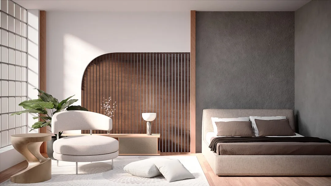
4. Wood Slat Wall
Why it looks expensive: Texture plus rhythm. Evenly spaced vertical strips of wood create a visual pattern that photographs beautifully and reads as architectural in person. It’s the kind of feature that makes a builder-grade bedroom look custom.
What it actually costs: $80–$200 depending on wood species and wall size. Poplar is the premium budget choice — it’s smooth, takes paint and stain evenly, and runs about $1.50–$2.00 per linear foot at most lumber yards. Pine is cheaper but requires more sanding. Primed MDF strips are the most budget-friendly option and work well if you’re painting rather than staining.
The spacing decision: 1.5 to 2 inches between slats is the visual sweet spot. Narrower than 1 inch starts to look like a crate. Wider than 3 inches loses the rhythm effect and starts to look like you ran out of wood.
The mistake that ruins it: Uneven spacing. Measure twice. Mark with chalk line. Use a spacer cut from scrap wood so every gap is identical. The human eye is extremely sensitive to spacing inconsistency — a single slat that’s 2mm off reads as “off” even when you can’t quantify why.
5. Joint Compound Texture
Why it looks expensive: It looks like Venetian plaster, which costs $300–$500 per wall when professionally applied. A $15 bucket of premixed joint compound with the right trowel technique is effectively indistinguishable in photographs and nearly indistinguishable in person.
What it actually costs: $15–$40 total. You need joint compound (all-purpose or lightweight), a wide plastering trowel, and one coat of primer before and one after. Optional: mix a small amount of paint directly into the compound to create a tinted base before topcoat.
The technique: Apply compound in random, overlapping, slightly curved strokes with the trowel held at a 30-degree angle. Don’t try to smooth it out — the variation is the point. Let it dry completely (24 hours minimum), then lightly sand any sharp ridges that would catch light harshly. Seal with matte or eggshell paint in the same color family as the compound.
6. Peel-and-Stick Grasscloth Wallpaper
Why it looks expensive: Natural fiber textures are expensive in real life — genuine grasscloth wallpaper runs $8–$20 per square foot professionally installed. Peel-and-stick versions have improved dramatically since 2020. The texture reads correctly in photographs and holds up to normal bedroom humidity.
What it actually costs: $30–$80 for a single accent wall, depending on dimensions and brand. RoomMates, Chasing Paper, and Tempaper are the three most-reviewed brands with consistent quality across design community feedback.
The installation truth: Corners are the failure point. Peel-and-stick grasscloth around inside corners requires scoring the panel and overlapping slightly, not trying to wrap it in one piece. Every tutorial that skips this step produces visible bubbling at corners within six months.
7. Painted Arch
Why it looks expensive: Architectural detail implies intention. A large painted arch — in a contrasting color or the same color as the wall in a different sheen — creates a framing device that makes the space behind it feel curated. It’s a technique that showed up in high-end interior design editorial starting around 2021 and has since migrated to accessible DIY territory.
What it actually costs: Under $20 in paint and materials. You need string, a pencil, and painter’s tape. Tie the string to a pencil, pin the other end to the wall at your center point, and draw the arc. The radius determines everything — typically 18–24 inches for a bed-centered arch that doesn’t overwhelm a standard 9-foot ceiling.
The sheen trick: Paint the arch interior in a satin or semi-gloss finish while leaving the surrounding wall in matte. Same color, different reflectivity. The arch catches light differently and creates definition without introducing a second color into the room.
8. Board and Batten
Why it looks expensive: Wainscoting in any form signals traditional craftsmanship. Board and batten — vertical boards with flat battens covering the seams — is the simplest version of that language, and it’s been a staple of American farmhouse and colonial architecture for centuries.
What it actually costs: $100–$250 in lumber and supplies for a single wall. The height of the treatment matters more than most guides acknowledge: bringing board and batten to 48–54 inches (rather than the standard 36-inch chair rail height) makes a room feel significantly more finished.
Paint strategy: Paint the boards, battens, and wall behind them all the same color. The visual interest comes entirely from the shadow lines between elements, not from color contrast. This is what separates it from looking like a DIY project versus a built-in architectural feature.
9. Fabric Panel Wall
Why it looks expensive: Upholstered walls are a hospitality design standard — boutique hotels and high-end residential projects use fabric panels for acoustic softness and visual warmth. The DIY version uses canvas stretcher bars (available at any art supply store) wrapped with fabric and hung flush.
What it actually costs: $50–$120 depending on fabric choice. The stretcher bars run about $15–$30 for a set of four at the size needed for a standard panel. Linen, bouclé, and performance velvet are the textures that read most intentionally — plain cotton or polyester blend reads as a drop cloth.
The arrangement logic: Odd numbers of panels look more deliberate than even numbers. Three panels of equal size, hung with consistent spacing, read as installation art. Four panels look like you weren’t sure where to stop.
10. Stenciled Pattern
Why it looks expensive: A well-executed repeating pattern in a single color — slightly darker or lighter than the base wall — creates the visual effect of wallpaper at a fraction of the cost. The key word is “well-executed.” Poorly registered stencils, inconsistent paint loading, or bleed-through immediately read as amateur.
What it actually costs: $25–$60. Stencil cost ($15–$35 from Royal Design Studio or Cutting Edge Stencils), painter’s tape, and a foam roller or stencil brush.
The technique that separates good from bad: Offload the paint. Before applying a stencil roller to the wall, roll it on a paper plate until the paint looks almost dry. The semi-dry roller presses color into the stencil edges without bleeding underneath. This is the single step most tutorials skip.
11. Horizontal Stripe (Tonal)
Why it looks expensive: Wide horizontal stripes in the same color family — one matte, one satin, same hue — create a wall that looks different at different times of day. At noon it almost disappears. At evening with lamplight it reads as a deliberate architectural gesture.
What it actually costs: $20–$50. Two finishes of the same paint color, a laser level, and painter’s tape.
The width rule: Stripes below 12 inches wide look like a child’s bedroom. Stripes above 18 inches start to read as tonal color blocking rather than stripes. 14–16 inches is the range that reads as sophisticated horizontal rhythm.
12. Plywood Panel Wall
Why it looks expensive: When plywood is cut cleanly, sanded smooth, and painted or stained consistently, it reads as an intentional material choice — not a budget workaround. The panel seams, when spaced deliberately, create a grid that implies custom millwork.
What it actually costs: $80–$180. A sheet of birch plywood runs $50–$80 at most lumber yards. Have it cut to your panel dimensions at the store (most Home Depot and Lowe’s locations do this for free or $1 per cut). Use construction adhesive to mount panels, leaving a consistent 1/4-inch gap between them.
The finish that makes it work: Satin or semi-gloss paint in a deep neutral — charcoal, navy, warm black — brings out the panel structure. Light colors flatten it. The seam lines need shadow to read correctly.
13. Color Drenching
Why it looks expensive: Color drenching — painting walls, ceiling, trim, and sometimes furniture all the same color — is a technique championed by Farrow & Ball and adopted by high-end designers as a way to make a room feel deliberately immersive rather than accidentally monochromatic.
What it actually costs: One gallon of paint plus trim paint in the same color: $50–$90. The cost is entirely in the quality of the color choice. Color drenching in a weak or unsaturated color looks like a mistake. It works in deep, complex tones — Farrow & Ball’s “Hague Blue,” Sherwin-Williams “Black Magic,” or Benjamin Moore’s “Wrought Iron.”
The rule: Commit completely or don’t do it at all. Painting three walls and stopping at the trim — or leaving the ceiling white — undercuts the entire effect. The immersive quality only emerges when the color wraps the room without interruption.
The Most Common DIY Accent Wall Mistakes (And How to Avoid Them)
Even the best diy accent wall ideas bedroom inspiration falls apart at the execution stage for predictable reasons. These aren’t rare edge cases — they’re the same four mistakes appearing in before-and-after photos across every design forum online.
Skipping wall prep. Any textured technique — limewash, joint compound, Venetian plaster — will amplify every imperfection on the surface below it. Holes, dents, and tape lines from old picture hooks become more visible, not less, under texture. Fill, sand, and prime before starting. This adds two to four hours to the project. It’s not optional.
Using sample-pot quantities. A 2-ounce paint sample isn’t enough to test color on a wall that receives different light at different times of day. Buy the smallest full-size can ($12–$18), paint a 12×12-inch section, and live with it for 48 hours before committing. Morning light, afternoon sun, and evening lamp all read differently on the same color.
Ignoring the surrounding walls. An accent wall doesn’t exist in isolation. The three surrounding walls in builder-white will make even a beautifully executed accent look like an afterthought. Either pull a lighter version of the accent color onto the adjacent walls, or repaint them in a fresh neutral that complements — not just contrasts — the accent.
Rushing dry time. Joint compound, limewash, and multi-coat paint treatments all require full cure time between coats. “Dry to touch” is not the same as “ready for next coat.” Moving too fast produces cracking, peeling, and color inconsistency that appears within weeks.
Frequently Asked Questions
How much does a DIY accent wall typically cost?
Most DIY accent wall projects fall between $50 and $300 in materials depending on technique and wall size. Paint-based techniques (limewash, color blocking, stenciling) stay at the low end — $20–$80. Material-based approaches (wood slats, board and batten, plywood panels) run $100–$300. That compares to $800–$2,500 for professional installation of the same treatments, so the labor savings are significant even when you factor in tool rental.
Which diy accent wall ideas bedroom projects work in small spaces?
The best diy accent wall ideas bedroom options for small rooms are techniques that add depth without adding visual weight: tonal color blocking, limewash in a mid-tone, and painted arches. Avoid anything that comes forward visually — dark wood slats, heavily textured joint compound in deep colors, or high-contrast geometric patterns. In rooms under 150 square feet, treat the wall opposite the door rather than the headboard wall to maximize the sense of depth.
Do I need to prime before a peel-and-stick wallpaper accent wall?
Yes — but the goal isn’t the standard primer coat. You want a smooth, clean, slightly porous surface. Wipe down the wall with a damp cloth to remove dust, then apply a thin coat of flat white paint if the existing surface is high-gloss. Peel-and-stick adhesive bonds poorly to gloss finishes, which is why bubbling and edge lifting tend to appear within 3–6 months on unprepared walls.
How do I make an accent wall look intentional rather than like an afterthought?
Three things signal intention: proportion (the treatment fills the wall fully, not partially), consistency (the technique is applied evenly with no visible hesitation marks or restarts), and integration (the surrounding walls and furniture acknowledge the accent rather than ignoring it). The most common reason accent walls look unfinished is that the rest of the room was left untouched — same bedding, same rug, same lamp placement — which makes the wall feel like a patch applied to an unchanged room rather than a design decision.
What’s the most reversible diy accent wall if I’m renting?
Peel-and-stick wallpaper and fabric panels are the most rental-friendly options, with peel-and-stick being the most common choice. The caveat: cheaper peel-and-stick products can pull paint off older walls. Test a small section in an inconspicuous corner for 72 hours before committing to the full wall. Brands like Tempaper and Chasing Paper have better adhesive formulations specifically designed to release cleanly. Fabric panels hung on removable Command strips are the safest option for older painted walls where peel testing isn’t possible.
What is the easiest accent wall to DIY?
How much does a DIY accent wall typically cost?
Are accent walls out of style in 2026?
Most DIY accent wall projects fall between $50 and $300 in materials depending on technique and wall size. Paint-based techniques (limewash, color blocking, stenciling) stay at the low end — $20–$80. Material-based approaches (wood slats, board and batten, plywood panels) run $100–$300. That compares to $800–$2,500 for professional installation of the same treatments, so the labor savings are significant even when you factor in tool rental.
How to make an accent wall in your bedroom?
Which diy accent wall ideas bedroom projects work in small spaces?
What is the best wall for an accent wall in a bedroom?
The best diy accent wall ideas bedroom options for small rooms are techniques that add depth without adding visual weight: tonal color blocking, limewash in a mid-tone, and painted arches. Avoid anything that comes forward visually — dark wood slats, heavily textured joint compound in deep colors, or high-contrast geometric patterns. In rooms under 150 square feet, treat the wall opposite the door rather than the headboard wall to maximize the sense of depth.