Most households eat the overwhelming majority of their meals at home — and most people are eating them standing at a counter, scrolling a phone, because the table they bought doesn’t fit the room they actually have. Not aesthetically. Physically. The chairs can’t pull out without hitting the island. The walkway to the fridge requires a full body turn sideways. Someone decided to buy a table last, after every other decision had already been made, and the room never forgave them for it. The eat in kitchen design ideas that actually solve this problem start with layout logic, not furniture shopping — and that sequence matters more than any single piece you could buy.
Quick Answer
The average household eats 84% of its meals at home — and most people are eating them standing at a counter, scrolling a phone, because the table they bought doesn’t fit the room they actually have.
I spent eleven years doing interior design in Chicago and New York apartments, and the eat-in kitchen was the single most consistently botched space I walked into. Not because people had bad taste. Because they’d treated the eating zone as something that would work itself out once everything else was in place. It never does. Layout logic has to come first — before furniture, before lighting, before you fall in love with a particular table at a vintage market on a Saturday afternoon.
This article is about eat-in kitchen design ideas that actually work. Not just photograph well. Work.
What an Eat-In Space Actually Needs to Function (Not Just Look Good)
In This Article
- What an Eat-In Space Actually Needs to Function (Not Just Look Good)
- What Does an Eat-In Space Look Like When It Actually Works?
- The Layout Mistakes That Make Kitchens Feel Small (Even When They Aren’t)
- Specific Eat In Kitchen Design Ideas by Room Shape
- Materials and Furniture Choices That Hold Up to Daily Use
Before anything else, let’s talk about the floor. Specifically, what happens on it when you’re trying to move between the stove, the sink, and anywhere a human being might be sitting down to eat.
The minimum clearances are not suggestions. The National Kitchen and Bath Association recommends a minimum 36-inch clearance for single-cook kitchens and 42 inches for multi-cook households. Most eat-in setups I’ve walked into violate this the moment a table gets added — not because the kitchen is small, but because the table was placed last, after every other element had already staked its territory. A chair pulled out from a 30-inch-deep table extends roughly 18 additional inches into the room. Add a person sitting in it, and you’re at 24 inches minimum before that chair moves back in. That math matters enormously in rooms where the fridge is across from the island and someone needs to open it during breakfast.
There’s also a distinction worth making early: a true eat-in kitchen and a breakfast nook are not the same planning problem. A breakfast nook is a designated zone — usually architecturally separated, often built-in — that exists for eating and nothing else. A true eat-in kitchen integrates the dining function into the working kitchen footprint. The reason the label matters is that nooks allow you to tighten clearances because traffic doesn’t flow through them. An integrated eating zone in an open kitchen is always competing with the cook’s path.
Traffic flow is where I see the most damage done. The fridge, sink, and stove form what kitchen planners call the work triangle — and most people accidentally place their table directly inside it. The table becomes an obstacle between two of those three points. Every meal prep becomes a negotiation with the furniture. I once watched a client spend $800 on a farmhouse table that essentially made her kitchen into a one-person room because it sat precisely between her fridge and her cooktop. She thought the problem was the table’s style. The problem was 14 inches of clearance that no longer existed.
The order of operations matters more than any single design decision. Map your traffic flow first. Mark your clearances. Then figure out where seating can live.
Before you place a single piece of furniture, work through this sequence:
- Walk the fridge-to-sink path, the sink-to-stove path, and the stove-to-fridge path. These are your primary traffic corridors.
- Mark the width of each path with masking tape on the floor — 36 inches minimum, 42 inches if two people cook simultaneously.
- Identify where those paths converge. That intersection is your exclusion zone for any permanent or semi-permanent seating.
- Measure the remaining floor area after corridors are marked. That number — not the total square footage — is your actual working budget for seating.
- Only after those steps: consider table shape, size, and configuration.
> Actionable takeaway: Before buying a single piece of furniture, stand in your kitchen and walk the path between your fridge, sink, and stove three times. Mark where those paths cross on a piece of tape on the floor. That’s your exclusion zone for seating placement.
What Does an Eat-In Space Look Like When It Actually Works?
Five configurations come up repeatedly in kitchens that function well — and notably, the island-plus-barstool setup that dominates every Pinterest board is the one I’d put last on that list for families who actually want to sit and eat together.
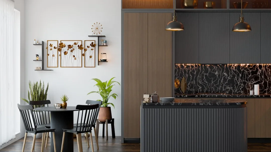
The peninsula banquette anchors seating against a structural element already in the room. The peninsula acts as one side of the enclosure; a built-in bench runs along the wall perpendicular to it. Traffic doesn’t penetrate the eating zone because the layout physically prevents it. This is probably the highest-performing configuration in medium kitchens — roughly 180 to 250 square feet.
The floating table zone works when there’s genuine square footage to work with — nothing about it functions in a tight room. A table placed away from walls with chairs fully accessible on all sides sounds obvious, but most people push tables toward walls instinctively, which I’ll address in the layout section because it’s one of the more destructive habits in residential kitchen planning.
Bay window nooks are the configuration I’d build if I were designing my own home. The bay creates natural enclosure, brings in directional light that lands on the table surface — not the ceiling — and the built-in seating below the sill uses space that would otherwise be dead anyway. The constraint is that you either have a bay or you don’t; they can be added during structural renovation but not as a furniture purchase.
Open-plan dining peninsulas work when the kitchen opens into a living area and you need the eating zone to act as a visual and spatial transition between cooking and living functions. The peninsula does the zoning work. A pendant light — hung 30 to 34 inches above the table surface, not at standard ceiling-fixture height — closes the zone above.
Drop-leaf extensions on galley kitchens are underused and underrated. A well-designed drop-leaf can disappear entirely when not in use and seat two to four when extended, without any permanent footprint cost.
Comparing the five configurations at a glance:
| Configuration | Best room size | Permanent footprint | Works for families? | Clearance risk |
|---|---|---|---|---|
| Peninsula banquette | 180–250 sq ft | Fixed bench, flexible table | Yes | Low |
| Floating table zone | 250+ sq ft | Fully moveable | Yes | High if placed wrong |
| Bay window nook | Any, with bay | Built-in bench | Yes | Low |
| Open-plan peninsula | Open floor plans | Peninsula fixed, seating flexible | Yes | Moderate |
| Drop-leaf galley extension | Under 150 sq ft | Near-zero when folded | 2–4 people | Low |
Here’s the bar stool problem specifically: a standard dining chair seat height is 17 to 19 inches. Standard counter height is 36 inches, which requires a stool seat at 24 to 26 inches. That 7-inch difference changes your entire posture — hips higher than knees, no lumbar support, feet often unsupported. For a 15-minute breakfast, tolerable. For a 45-minute dinner, uncomfortable for most adults and genuinely difficult for children and older adults. Bar seating is fine as a secondary option. It fails as the primary meal solution for a household that actually eats together.
Visual separation matters even without walls. A rug under the table, a pendant light overhead, a half-height shelf acting as a room divider, or even a change in flooring material — tile giving way to wood, for instance — all signal that the eating zone is distinct from the cooking zone. This isn’t just aesthetic. It psychologically prepares people to sit down and stay rather than grab and go.
Visual separation tools, ranked by cost and impact:
- Pendant light above the table — Low cost, high psychological impact. A single pendant hung 30 to 34 inches above the table surface defines the zone from above without touching the floor plan.
- Area rug under the table — Moderate cost, immediately legible as a zone marker. Choose a rug at least 8 feet in diameter so chairs stay on the rug when pulled out.
- Flooring material change — Higher cost, permanent, and the strongest spatial signal available without walls. A shift from tile to hardwood or from one tile pattern to another reads as a room transition even in open plans.
- Half-height shelf or open bookcase — Moderate cost, adds storage while creating a soft visual boundary. Works especially well as a separator between kitchen and dining in open-plan layouts.
- Paint or wallpaper on a single accent wall — Low to moderate cost. Enclosing the eating zone on one side with a distinct color or texture gives it an identity without construction.
> Actionable takeaway: Identify which of the five configurations maps to your actual kitchen shape. Then ask whether your natural light enters the room from a direction that would illuminate your table surface — not just the room in general. Light direction determines how the space feels to eat in, not just to cook in.
The Layout Mistakes That Make Kitchens Feel Small (Even When They Aren’t)
Most eat in kitchen design ideas fail not because the room is too small, but because a handful of repeatable layout errors compound on each other until the space stops working entirely. These are the ones I encountered most consistently across eleven years of residential work.
Pushing the table against the wall is the most universal mistake in eat-in kitchens. It feels logical — you’re preserving floor space in the center of the room. What it actually does is eliminate seating on one full side of the table, reduce the table’s functional capacity by 25 to 50 percent, and force the people seated against the wall into an awkward extraction every time they need to get up. A round table floating 18 inches from the wall outperforms a rectangular table pressed against it in almost every household scenario.
Choosing rectangular tables when round ones would work better. Rectangular tables have a directional logic — they imply a head of the table, which implies formal dining. Round and oval tables distribute attention evenly, scale better in smaller rooms because they eliminate corners that nobody sits at, and allow conversation across every seat without anyone being stranded at a distant end. For eat-in kitchens specifically — where the point is casual, frequent use — round or oval tables almost always perform better.
Ignoring the chair itself as a spatial object. A chair isn’t just its seat. It’s the space it occupies when pushed in, the space it requires when pulled out, and the space someone needs to stand behind it to sit down. A chair that requires 18 inches when pushed in and 24 inches when pulled out with a person in it is a 42-inch object, minimum. Most people plan for the table dimensions and forget to account for the chairs as independent space consumers.
Lighting the table from the center of the ceiling. A recessed light or flush-mount fixture centered in the room almost never falls centered over a table pushed to one side of that room. The result is a table in shadow and a lit patch of empty floor. Pendant lighting should be planned after table placement is confirmed — not roughed in during construction and hoped to align with whatever furniture arrives later.
Scaling up for hypothetical guests instead of actual daily users. A couple who occasionally hosts four people does not need a table that seats six. They need a table that seats two comfortably every morning and extends to four or six when needed. Extension tables, drop-leaf designs, and nesting configurations exist precisely for this reason. Buying for the exception rather than the rule is the single biggest driver of overcrowded eat-in kitchens I’ve seen.
Specific Eat In Kitchen Design Ideas by Room Shape
The configuration advice above applies differently depending on what you’re actually working with. Here’s how eat in kitchen design ideas translate into real decisions across the most common kitchen shapes.
Galley kitchens have two parallel walls of cabinets and appliances with a corridor between them. Seating at the end of the corridor — rather than along the sides — is almost always the answer. A small round table or a fold-down wall-mounted surface at the terminus of the galley preserves the corridor for traffic while giving the kitchen a genuine eating zone. If the galley opens at one end into a larger room, that opening is where the table belongs — just outside the kitchen footprint, using the adjacency without occupying the corridor.
L-shaped kitchens create a natural corner that most people ignore. That corner — the inside of the L — is often the best location for a banquette or built-in bench, because it’s already outside the primary traffic path that runs along the two cabinet walls. A corner banquette in the inside of an L can seat four to six people without touching the work triangle at all.
U-shaped kitchens are the trickiest for eat-in seating because the U configuration already uses three walls, leaving only the open end as a traffic entry. A peninsula closing the open end of the U creates a natural counter-height eating zone, but as noted above, that works better as a secondary option than a primary dining solution. For U-shaped kitchens, the most successful eat-in solutions usually involve either a peninsula with a 42-inch height (standing/stool-height) for quick meals, or extending the kitchen zone into an adjacent room and treating the entry to that room as the eating area.
Open-plan kitchens attached to living or dining rooms have the most flexibility and the most opportunity for the table to end up in a spatial no-man’s-land — close enough to the kitchen to catch cooking smells and noise, far enough from the living area to feel disconnected from both. The solution is commitment: define the eating zone with a rug, pendant, and furniture arrangement that makes it clearly neither the kitchen nor the living room, but its own zone with a specific identity.
Kitchens with breakfast nooks already built in require less problem-solving on layout and more attention to the nook’s own proportions. Standard nook mistakes include benches that are too deep (anything over 18 inches of seat depth and you’re sitting too far from the table), tables that are too wide (a nook table should be 28 to 32 inches wide for two-sided seating), and cushions that are too thin (3 inches minimum for actual comfort over a meal’s duration).
Materials and Furniture Choices That Hold Up to Daily Use
Eat in kitchen design ideas that photograph well but fall apart under daily use are everywhere. A table you eat at every morning gets coffee spilled on it. Chairs get pulled out roughly. Cushions get sat on by children who haven’t washed their hands. These are the material realities, and they should drive the material choices.
Table surfaces worth considering for daily use:
- Solid hardwood with an oil finish takes marks and scratches but can be refinished. It looks better with age if you accept the patina. Avoid veneer in high-use kitchens — once the veneer chips, it’s finished.
- Quartz composite is nearly indestructible, easy to clean, and available in sizes that work for kitchen tables. It’s heavy and expensive but essentially maintenance-free.
- Butcher block works for eat-in kitchens with the understanding that it needs periodic oiling and will show cuts and stains. Many people find this acceptable and even appealing over time.
- Laminate on a solid core — not particleboard — is the practical choice for households with young children. Modern laminates are more durable and better-looking than their predecessors and clean up without drama.
- Marble and natural stone are high-maintenance in genuine daily-use settings. They photograph extremely well and perform poorly under coffee cups, citrus, and anything acidic. Sealed properly and maintained carefully, they’re manageable — but they require consistent attention.
Chair considerations beyond aesthetics:
- Upholstered seats in kitchens require either performance fabric (crypton, outdoor-grade textiles) or slipcovers that can be washed. Standard linen and cotton upholstery in an eat-in kitchen is a short-term choice.
- Wooden chairs with no upholstery are the most durable option but require seat cushions for meals longer than 15 to 20 minutes. Tie-on cushions in outdoor fabric are the practical solution.
- Chairs with arms require more width per person at the table — typically 24 to 28 inches per seat instead of the standard 18 to 20 inches. In tight eat-in kitchens, armless chairs give you more seating without expanding the table footprint.
- Stackable or folding chairs for the occasional extra seat are worth having stored nearby, especially in apartments where the eat-in kitchen is also the primary dining space for guests.
Frequently Asked Questions
What is the minimum kitchen size for a proper eat-in setup?
There’s no single number, but as a working rule: a kitchen needs at least 100 square feet of total floor area to accommodate an eat-in zone without violating clearance requirements — and that only works if the table is small (two to four people maximum) and the layout is specifically planned around it. In kitchens under 100 square feet, a drop-leaf wall-mounted surface or a peninsula with counter seating is usually the more honest solution than trying to fit a freestanding table.
How much space do I need between the table and the wall?
Minimum 36 inches between the edge of the table and any wall or obstruction that people need to pass. If the wall side has seating, you need 36 inches from the table edge to the opposite surface even when no one is seated — because someone will need to walk through while someone else is sitting. For a wall where no one sits and no traffic flows, 24 inches is passable for a push-in chair position only.
Should the eat-in table match the kitchen cabinets or the living room furniture?
Neither, necessarily. In an eat-in kitchen, the table is doing a different job than the cabinets (storage and work surface) and a different job than the living room furniture (lounging and leisure). It should read as a piece that belongs to the eating zone specifically. Finish relationships — wood tone, metal finish on legs versus hardware — matter more than matching. A table that picks up one finish from the kitchen and one from an adjacent living area often integrates better than one that tries to match either fully.
Is a round or rectangular table better for an eat-in kitchen?
Round or oval in almost every case where space is limited. Round tables eliminate the corner seats that nobody wants, allow easier conversation across the table, and scale more gracefully in smaller rooms. The exception is a galley or narrow room where length runs in one direction — there, a narrow rectangular table aligned with the long axis of the room often works better than a round one that would protrude into the corridor.
How do I make an eat-in kitchen feel like a real dining space rather than an afterthought?
Three elements do the most work: dedicated lighting over the table (a pendant hung 30 to 34 inches above the surface, not a ceiling fixture centered in the room), a rug that defines the zone and is large enough that chairs stay on it when pulled out, and seating that’s actually comfortable for the duration of a meal. If all three are present, the space reads as intentional. If any one is missing — especially the lighting — it reads as a table that was added to a kitchen rather than a dining zone that was designed as part of one.