You have pumpkins, a wreath, and a candle — and your entryway still looks like a stock photo from 2015. Not because the objects are wrong. Because the logic behind them is.
Quick Answer
You have pumpkins, a wreath, and a candle — and your entryway still looks like a stock photo from 2015.
Fall entryway decor has calcified into a formula so predictable that it no longer reads as personal, intentional, or even seasonal — it reads as default. The mums, the grapevine wreath, the matching bundle from HomeGoods you grabbed because the colors looked right in the store. You follow the steps and still stand in your doorway wondering why it doesn’t feel the way you imagined it would. That gap between expectation and result isn’t a budget problem. It’s a principles problem.
This isn’t a product list. It’s a framework — built from eleven years of standing in other people’s entryways, watching what worked and watching what didn’t, and learning to tell the difference between a space that performs and one that just sits there looking seasonal.
Why Your Fall Entrance Feels Flat (And What’s Actually Missing)
In This Article
- Why Your Fall Entrance Feels Flat (And What’s Actually Missing)
- How to Decorate an Entryway for Fall Without Copying Everyone Else
- What Is the Rule of 3 When Decorating — And Why Fall Is Where It Shines
- How to Decorate Your Front Door for Fall
- Entrance Decor Mistakes That Silently Kill the Whole Look
- The Textures That Make a Fall Entryway Feel Expensive
- A Room-by-Room Is the Wrong Way to Think About This — Here’s the Transition Strategy
- Sourcing Fall Entryway Pieces Without Buying Everything New
Most fall entryways don’t fail because of wrong objects. They fail because the objects are arranged without any understanding of how the human eye — and the human nervous system — actually processes a space.
The core problem is layering logic. Or rather, the absence of it. People collect fall things and place them. They don’t think in terms of height variation, texture contrast, or negative space. They fill surfaces because bare surfaces feel unfinished. And filling surfaces without logic is just clutter wearing a seasonal costume.
Here’s what I kept seeing across dozens of projects in Chicago and New York: clients would bring in beautiful individual pieces — a genuine hand-thrown ceramic, a gorgeous dried wheat bundle, a lantern with real presence — and then surround them with four other objects of equal visual weight until none of them read at all. The eye needs somewhere to rest. It needs contrast to know what to look at first. Without that, everything collapses into sameness and the whole composition goes flat.
Texture gets ignored almost universally. Fall is a tactile season — rough bark, heavy wool, the dry crunch of leaves — and when an entryway is all smooth surfaces and glossy ceramics, it communicates the wrong thing entirely. The warmth isn’t there. The season isn’t there. Just the color palette of it.
Psychology research on environmental perception confirms something designers have known intuitively for decades: people form a first impression of an interior space in under 7 seconds — faster than they can read a single sign or label. Your entryway is doing emotional work before your guests have processed a single conscious thought. Which means it cannot afford to be generic. Generic reads as nothing. Nothing doesn’t land in 7 seconds.
Intentional restraint is the difference between a styled entryway and a seasonal dump. One strong focal point — a tall vase with a single branch, a lantern at floor level, a console with three considered objects — beats ten weak ones every single time.
Takeaway: Before buying a single new thing, stand in your entryway and identify the one object that could anchor everything else. Build from that anchor outward. If you can’t name that object, you’re not ready to decorate — you’re just ready to accumulate.
How to Decorate an Entryway for Fall Without Copying Everyone Else
Google Trends data consistently shows search interest in “fall entryway” spikes in the first two weeks of September — weeks before most people think to actually start decorating. Meaning the ideas flooding Pinterest and Instagram in early October are already recycled by the time most of us act on them. By the time you’re placing your pumpkins, you’re following a trend that peaked six weeks ago.
The escape from that cycle starts with a mood anchor — one dominant sensory theme that governs every single decision you make. Not “fall vibes.” Something specific. Warm spice. Woodland dusk. Harvest going dark. Late afternoon in an orchard. Whatever it is, it should be concrete enough that you can hold a potential object up and ask: does this belong in that world? If the answer is uncertain, the object doesn’t belong.
Work in three zones:
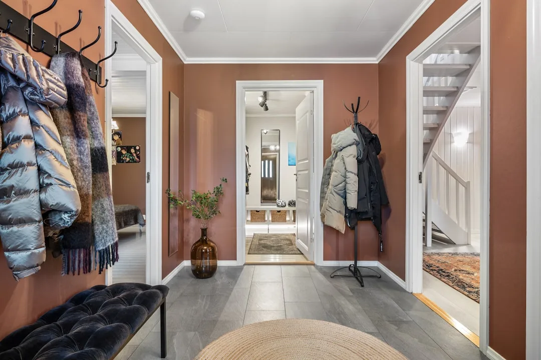
- Floor level — a jute or wool runner, a basket with contents, a pair of planters, a single oversized pumpkin placed deliberately off-center
- Surface level — your console table, shelf, or bench; where your primary vignette lives
- Eye level — a wreath, a mirror surrounded by a dried garland, a piece of artwork swapped in for the season
Each zone needs at least one fall element for the whole thing to feel cohesive rather than spot-decorated. One zone ignored breaks the spell. This is where most people fail — they style the surface beautifully and leave the floor bare and the wall empty, so the composition floats.
Use unexpected fall proxies. Dried citrus slices in a shallow bowl. A single branch with genuine turning leaves in a tall, narrow vase. Linen textiles in ochre or deep terracotta draped over a bench or folded basket. A wooden bowl holding a few walnuts, not as decoration per se but as presence — the kind of thing that belongs to a season without announcing it aggressively.
The coordinated-set approach — buying a complete fall collection from one brand — produces catalog pages, not spaces. It’s the visual equivalent of wearing a matching tracksuit. Everything communicates at the same volume. Nothing has personality.
Takeaway: Choose your mood anchor before you choose a single object, and use it as a filter. Anything that doesn’t fit the mood gets cut, regardless of how “fall” it looks.
What Is the Rule of 3 When Decorating — And Why Fall Is Where It Shines
The rule of 3 traces back to classical rhetoric and visual composition — the same principle that makes film posters, magazine covers, and retail window displays work. The brain processes odd-numbered groupings more fluidly than even ones. Two objects create tension. Four create symmetry that tips toward rigidity. Three creates a natural hierarchy — a lead, a support, and a counterpoint — and the eye knows exactly how to move through it.
For fall entryways, applying this rule is almost mechanical once you understand it:
- Vary height: tall, medium, low — within the same grouping
- Vary texture: at least one hard organic (wood, ceramic, stone), one woven or braided (basket, rattan), one soft or dried (linen, wheat bundle, dried flowers)
- Vary tone: not the same shade of burnt orange three times; work in a tonal range
A specific example — because “vary height and texture” means nothing without a picture of it: try a tall dark iron lantern at the back, a medium woven basket at mid-height in front of it, and a small brass dish holding a few acorns at the front. Three objects. Three distinct heights. Three distinct textures. Dark, warm-medium, light-metallic. That’s the rule in action, and it costs almost nothing if you source thoughtfully.
The color application of the rule of 3 is just as important:
- Anchor with a neutral — warm white, linen, taupe, soft gray
- Layer in a warm mid-tone — rust, amber, burnt orange, deep mustard
- Punctuate with a dark accent — espresso brown, forest green, deep burgundy, near-black
That third color — the dark accent — is what most people skip. They go neutral-plus-fall-orange and wonder why the palette reads as flat. The dark accent is what gives the other two colors somewhere to breathe against.
One mistake I watched play out more than once: clients would apply the rule of 3 in groupings but forget it across the whole console. Seven objects arranged in two groups of three and one lonely candle on the end. The rule applies to the composition as a whole, not just the individual clusters.
Takeaway: Set up your next entryway vignette with exactly three objects before adding anything else. If it works — and it usually does — add one more thing. If it stops working, you’ve found your limit.
How to Decorate Your Front Door for Fall
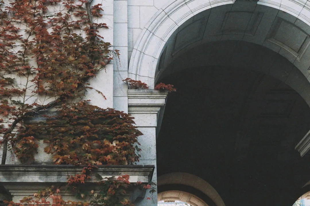
Your front door and your interior entryway are doing different jobs, and most guides blur them together in a way that doesn’t help either. The front door is architecture. It’s the visual anchor of your home’s entire exterior presentation — and color contrast between the door and whatever decorative element you place on it matters more than the object itself.
A burgundy wreath on a burgundy door disappears. A wheat-toned dried bundle against a deep navy door reads from thirty feet away. Start there, with contrast, before anything else.
NAR research suggests exterior presentation influences perceived home value by up to 7%, with the front entrance cited as the single highest-weighted factor in that impression. That’s not a small number for what amounts to a $40 wreath decision.
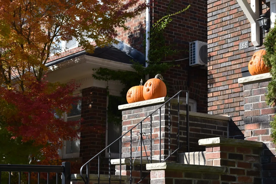
Swap the standard grapevine wreath — which has been ubiquitous since roughly 2012 — for something with actual structural interest:
- Dried wheat bundles tied with a wide linen ribbon and hung flat against the door
- A wreath built around a single oversized pinecone cluster with matte eucalyptus and dark berry stems
- A minimal half-wreath anchored to one side of the door, which reads as intentional asymmetry rather than default symmetry
- A bundle of dried corn husks with a leather or raffia tie — agricultural, not decorative-store, which is the distinction that matters
Consider the door surround, not just the door surface. A pair of matching planters flanking the entrance — even if mismatched in size — reads as architectural and deliberate. Unmatched heights between two planters creates the same three-zone logic as interior groupings: lead, support, ground. Plant them with ornamental kale, mums in a darker-than-expected color (burgundy, deep purple, near-black), and a trailing element if the planter is deep enough.
Lighting. The most underused tool at the front door, and the one with the highest visual return from October onward when darkness arrives before anyone’s finished with dinner. A single battery-operated lantern hung at door height — not porch height, door height — transforms an entrance after 5pm in a way that no wreath can. Fall is a season of early dark. Decorate for it.
Takeaway: Before buying a new wreath, hold what you’re considering against a photo of your door color on your phone. If the contrast doesn’t stop you, it won’t stop anyone else either.
Entrance Decor Mistakes That Silently Kill the Whole Look
Interior designers consistently cite scale and proportion errors as the number one reason DIY decorating fails — not budget, not taste, but object-to-space ratio. Which means most people are making the same fixable mistake over and over, in every season, without knowing it.
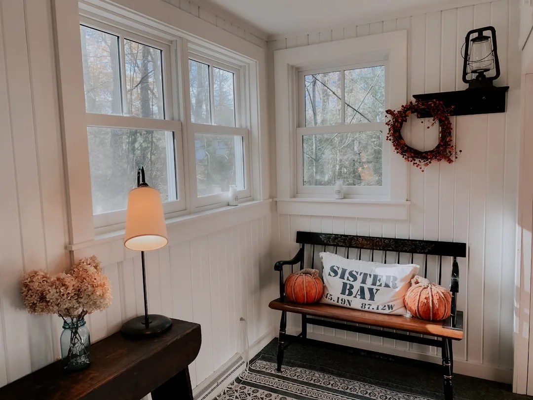
Mistake 1: Seasonal overload. When every surface in an entryway screams fall, the cumulative effect is noise, not atmosphere. One strong focal point — done well, given space — reads more powerfully than five weak ones fighting for attention. The restraint is the style.
Mistake 2: Ignoring scale. A 12-inch wreath on a 36-inch door looks like a button on a coat. A single taper candle on an 8-foot console disappears. I once watched a client spend forty minutes arranging a beautiful vignette on a console table that was simply too large for the objects she owned — the whole thing looked like a shelf in an antique store, not a designed space. Scale is the first thing. Everything else comes after.
Mistake 3: Matching too hard. Buying a coordinated “fall set” from a single brand or store produces exactly one thing: a space that looks like a store display. Lived-in spaces don’t match. They accumulate objects from different sources with different histories, and that accumulation has a texture that manufactured cohesion can’t replicate. Mix eras, mix sources, buy one thing secondhand.
Mistake 4: Forgetting function. Entryways are working spaces. Decor that blocks a hook, crowds a bench where someone actually sits to put on boots, or makes it genuinely awkward to drop your keys will be removed within a week — not because you decided to change the decor, but because daily life will physically demand it. Every decorative object in an entryway needs to coexist with function or it’s on borrowed time.
Mistake 5: Neglecting light. Fall decor under flat overhead lighting looks like a school project. The warm ochre, the deep rust, the brushed brass — all of it goes muddy under cool white overhead light. Add a warm-toned lamp to the console, or place candles within the vignette itself, and the palette activates. The difference is not subtle. I’ve seen a thirty-dollar thrift store lamp transform a console that looked amateur into something that looked intentional.
Takeaway: Walk through your entryway at 6pm with only overhead lights on, then with one warm lamp added. If the second version looks dramatically better, the lamp isn’t optional.
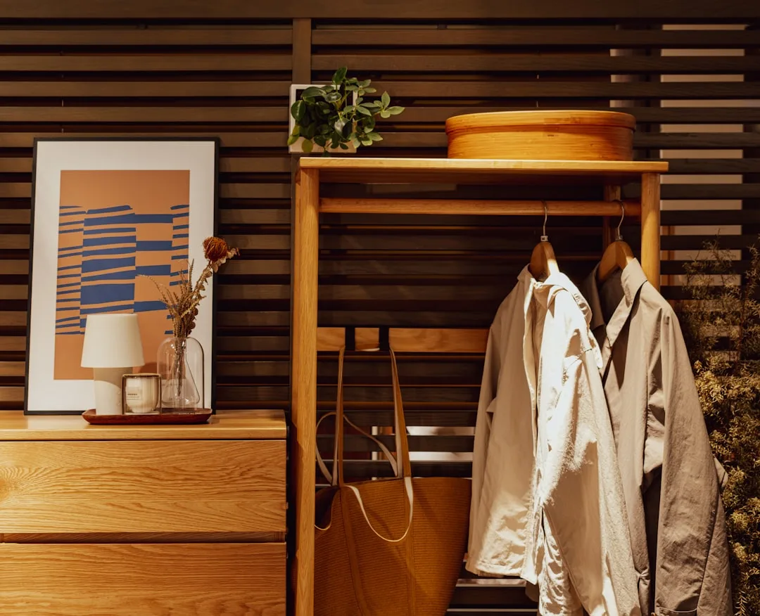
The Textures That Make a Fall Entryway Feel Expensive
Fall is the one season where texture does more emotional work than color. Every other season leads with color — spring is all pale bloom tones, summer is saturated, winter is white and metallic. But autumn’s emotional register — shelter, warmth, harvest, the closing of something — is fundamentally tactile. Rough bark. Heavy wool. The dry resistance of a dried seed head. When an entryway captures that, it feels expensive because it feels real.
Research in environmental psychology shows that tactile-suggestive visual textures — rough, matte, fibrous surfaces — activate the same neural pathways as physical warmth, making a room literally feel cozier to look at, not just warmer in palette. Which means your texture choices are doing subconscious work you may not even be aware of.
Layer at least three distinct textures in any fall vignette:
- Something woven or braided — a jute runner, a rattan basket, a macramé wall piece, a chunky-knit throw folded deliberately
- Something hard and organic — raw wood (a slice, a small stump, a branch), stone, dried seed pods, a rough-glazed ceramic with visible throwing marks
- Something soft or dried — a linen textile, a velvet ribbon, a bundle of dried grasses or pampas, a preserved magnolia leaf
Avoid shiny surfaces in fall decor. High-gloss ceramics and metallic finishes read as winter holiday — Christmas, New Year’s, the whole reflective-light aesthetic of December. Fall is matte. It’s raw. It’s the unfinished edge of a clay pot, not the polished surface of a lacquered bowl. If you have brass elements, choose brushed over polished. If you have ceramics, choose a matte or satin glaze over gloss. The distinction is the entire difference between autumn and the next season.
The single most underrated fall texture move: a simple jute or natural fiber runner layered under a darker wool rug. Two rugs. The layering immediately communicates depth and intentionality — it’s the floor-level equivalent of a tonal grouping, and almost no budget decor content ever mentions it.
Takeaway: Audit your current entryway for surface finish. If more than half your objects are shiny or smooth, your fall palette is fighting itself. Swap one glossy piece for something matte before you buy anything new.
A Room-by-Room Is the Wrong Way to Think About This — Here’s the Transition Strategy
Decorating one room at a time — or worse, one surface at a time — is how you end up with an entryway that feels like a seasonal island surrounded by an otherwise undecorated home. You walk in through a beautifully styled fall entrance and immediately into a completely neutral living room, and the emotional spell breaks the moment you cross the threshold. All that work, and it lands only for the three seconds it takes to step inside.
Interior designers call this “visual threading” — or sometimes “borrowed view” — the same technique used in open-plan commercial spaces to create coherence across zones without redundancy. The idea is that your eye should be able to travel from one space to the next and find a connected logic: not matching, but related. Not the same objects, but the same conversation.
The transition strategy works like this: identify the two dominant fall tones in your living room — let’s say deep amber and linen white. Echo them in the entryway with different objects at completely different scales. The amber in your living room might be a large throw on a sofa. In the entryway, it becomes a small brass dish or a dried orange slice. The linen might be a large area rug in the living room; in the entryway, a folded linen runner on the console. Same tones, different objects, different scales. The connection is felt, not seen.
What you’re avoiding is the “seasonal bubble” — an entryway so heavily fall-themed that it doesn’t relate to anything adjacent to it. I’ve seen this executed with real craft and real money, and it still felt wrong because the moment you looked past the entryway into the home beyond, the context collapsed. Seasonal decoration shouldn’t have hard edges. It should bleed gently into the rest of the space.
One practical move: take a single object from your living room — a small ceramic, a candle in a color that will repeat — and place it in the entryway as a deliberate echo. The object itself isn’t the point. The visual thread it creates is.
Takeaway: Before finalizing your entryway decor, stand at the front door and look straight into the first room beyond it. If those two spaces look like they belong to different homes, one element needs to move.
Sourcing Fall Entryway Pieces Without Buying Everything New
The secondhand home goods market has grown dramatically — resale trackers report a 40%+ increase in home decor resale searches over the past several years, with seasonal decor among the fastest-growing categories. Which makes sense. Seasonal objects are bought, used for six weeks, and stored — making the secondhand market for them unusually rich with pieces that are barely used.
But the better reason to source secondhand isn’t trend. It’s that objects with patina are inherently more fall-appropriate than brand-new equivalents. A wooden bowl with wear marks has more autumn character than a pristine one from a box. A brass candleholder with age on it reads as found and considered. The thrift store is doing your fall styling a favor that the big-box store cannot.
Specifically, look for:
- Woven baskets in any natural fiber — these never go out of fall relevance and cost $3-8 at estate sales versus $35-60 new
- Wooden bowls and platters with visible grain and honest wear
- Brass or iron candleholders — the older the finish, the better; avoid any that have been polished back to shine
- Ceramic vessels with matte or rough glazes, especially in earthy tones — crocks, pitchers, small vases
Audit what you already own through a fall lens before buying anything. A dark ceramic vase that sits unused year-round becomes a perfect anchor with a single dried branch inside. A wooden serving bowl becomes a vessel for acorns or dried orange slices. The object already exists — the seasonality comes from what you put inside it or next to it, not from the object itself.
Nature is the most underused free resource in fall decorating. Acorns, pine cones, dried seed heads, branches with turning leaves, dried corn husks, sweet gum balls — all of these cost nothing and read as intentional when placed with actual intention. The failure mode isn’t the object; it’s tossing a handful of acorns in a bowl without thinking about the bowl, what’s next to it, what height it creates, and whether it fits your mood anchor.
Takeaway: Before spending anything, take thirty minutes to pull every dark ceramic, wooden object, woven basket, and textile you own into one room. You may already have most of what you need.
Frequently Asked Questions
How do you decorate an entryway for fall on a budget?
The highest-ROI move is auditing what you already own before buying anything. Most households have at least three objects that can function as fall decor — a dark ceramic, a wooden bowl, a textile in a warm tone — sitting in other rooms. Consolidate those first. Then supplement with nature: acorns, pine cones, dried branches, and seed heads are free and genuinely beautiful when placed with care.
For actual purchases, thrift stores and estate sales are far better sources than seasonal sections at big-box retailers. Woven baskets, wooden bowls, and ceramic vessels with natural patina run $3-15 secondhand versus $30-60 new — and they look more fall-appropriate because they have actual age on them. Dried botanicals from craft stores (wheat bundles, dried eucalyptus, pampas grass) cost $8-20 and last multiple seasons.
The budget mistake most people make is buying many small cheap things instead of one or two pieces with real presence. Five plastic pumpkins and a foam wreath add up to $40 and look like $40. A single large wicker basket for $12 at a thrift store, styled correctly, looks like a design decision.
What is the rule of 3 when decorating?
The rule of 3 states that objects arranged in odd-numbered groupings — particularly three — are more visually interesting and easier for the brain to process than even-numbered arrangements. Two objects create tension. Four tend toward rigid symmetry. Three creates a natural hierarchy: a dominant element, a supporting element, and a counterpoint.
In practical terms for a fall entryway: vary height (tall, medium, low), vary texture (hard organic, woven, soft), and vary tone (neutral, warm mid-tone, dark accent) within each grouping. A tall lantern, a medium basket, and a small dish holding acorns is a perfect application. The rule also governs color selection — anchor with a neutral, layer in a warm seasonal mid-tone like rust or amber, and punctuate with a dark accent like espresso or forest green. That third dark tone is what most people leave out, and it’s what gives fall palettes their depth.
How do I decorate my front door for fall?
Start with contrast rather than objects. The color relationship between your door and whatever you place on it matters more than what you choose. A wreath that blends into the door color disappears; one with strong contrast reads from the street.
Move away from standard grapevine wreaths toward something with structural interest: dried wheat bundles hung flat, a half-wreath in dried eucalyptus and dark berry stems, or a minimal arrangement anchored asymmetrically. For the door surround, two flanking planters with different heights — planted with ornamental kale, dark mums, and a trailing element — reads as architectural rather than decorative.
Add lighting. Fall darkness arrives early, and a battery-operated lantern hung at door height (not porch-ceiling height) transforms the entrance from 5pm onward in a way that no amount of daytime styling can. It’s the single most underused tool at the front door.
What are the most common entrance decor mistakes to avoid?
Scale errors are the most pervasive. A wreath undersized for the door, a small candle on a large console, a grouping of tiny objects on a wide surface — these read as unfinished, not minimalist. Every object needs to be sized in deliberate relationship to its surroundings.
Right behind scale: seasonal overload. Filling every surface with fall objects creates noise, not atmosphere. One focal point done well outperforms five done adequately. Restraint is the technique.
Matching sets are a reliable path to a space that looks like a catalog page rather than a lived-in home. Buy from multiple sources, mix eras, and include at least one secondhand or found piece.
Ignoring function will undo any decorating effort within days. Entryways are working spaces — hooks, benches, and key-drop surfaces need to remain usable or the decor will physically get removed.
Finally: flat overhead light kills fall palettes. Warm-toned lamps or candles within the vignette activate the ochre, rust, and amber tones that make fall feel like fall. Under cool overhead light, the same arrangement looks dull and disconnected.
Start today, right now: Walk to your entryway and remove everything seasonal that’s currently there. Leave it bare. Then place a single object — one thing with fall character — back in the most important position. Live with just that for ten minutes before adding anything else. What you’re looking for is whether that one object earns its place. If it does, build around it. If it doesn’t, it was never the right anchor to begin with.