The same week Good Housekeeping declared floral prints the most searched wallpaper trend of the moment, three of the top Google results for “floral wallpaper living room” were still showing rooms that looked like they were decorated in 1987 — and that gap is exactly the problem this article solves.
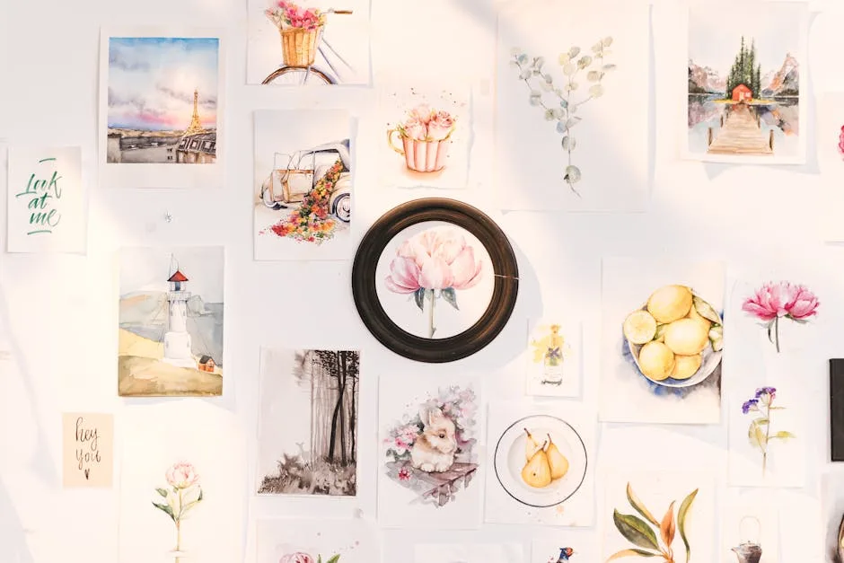
Here’s the truth most wallpaper content won’t tell you: floral print wallpaper never actually went away. It just went wrong. The country-cottage repeats, the cream backgrounds, the matching fabric tie-backs — those are the version of florals that earned the reputation. What’s happening right now is a completely different category. We’re talking oversized botanicals with graphic precision, dark-ground prints in forest green and charcoal, watercolor florals loose enough to read as art, and hybrid geometric-floral patterns that work in open-plan spaces where most wallpaper simply fails.
Good Housekeeping and major interior design outlets flagged floral wallpaper and upholstery as the two hottest décor applications driving search volume spikes in the most recent news cycle — and the readers searching for them aren’t looking for grandmother’s parlor. They want something that feels considered, current, and specific to how people actually live now.
The thing separating fresh from fussy isn’t the floral itself — it’s the scale, the colorway, and what you put next to it. Get those three variables right and a floral living room can look more modern than a plain painted wall. Get them wrong and you’ve got a period room.
Throughout this article, you’ll notice a recurring concept: the “modern anchor piece.” It’s simple. Every floral wallpaper idea needs one non-decorative, visually grounding element — usually a piece of furniture or lighting — that pulls the room into the present tense. Think of it as the translator between the pattern and the rest of the room. Without it, the floral reads nostalgic. With it, the floral reads intentional.
Seven ideas follow. Each one works. None of them look like 1987.
Why Floral Print Wallpaper Is Having a Serious Living Room Moment Right Now
The floral wallpaper revival isn’t random. It’s a direct reaction to the decade of grey — those years of grey walls, grey sofas, grey everything that dominated interiors from roughly 2012 to 2022. Designers who spent years watching clients choose greige over everything else started noticing something: people were craving pattern, warmth, and the kind of rooms that felt genuinely alive.
What came back wasn’t the old floral, though. The design shift happened across three specific axes:
- Scale: Modern floral wallpapers run large — botanical mural-scale prints that treat a single stem as a composition rather than a repeating motif. The repeat pattern, when it exists, is often 27 inches or more, which changes the entire visual register.
- Colorway: The pastels and creams of traditional florals have been replaced by terracotta backgrounds, inky navies, sage greens, and matte blacks. These backgrounds are what immediately signal “contemporary” rather than “cottage.”
- Pairing choices: The modern floral isn’t paired with chintz cushions and antique dressers. It sits next to concrete, brushed brass, raw linen, and matte ceramic — the same material palette that defines current interiors broadly.
Interior designers at practices like Studio McGee and Hecker Guthrie have been vocal about botanical prints as a long-term design investment rather than a trend, noting that nature-derived pattern has an almost infinite tolerance in well-composed spaces. The key word is “composed.” The floral has to be selected with the full room in mind, not just pinned to a wall and hoped for the best.
The modern anchor piece framework works precisely because it forces that composition decision. Before you order a single roll, you identify the one grounding element — usually a platform sofa, an industrial light fixture, or a piece of raw-material furniture — that will do the contextual work. The wallpaper becomes the art. The anchor piece is the frame.
Actionable takeaway: Before shortlisting any floral wallpaper, pull three swatches that represent the darkest color in the print and search for furniture in that exact tone. If you can find a modern silhouette in that color, the pairing will work.
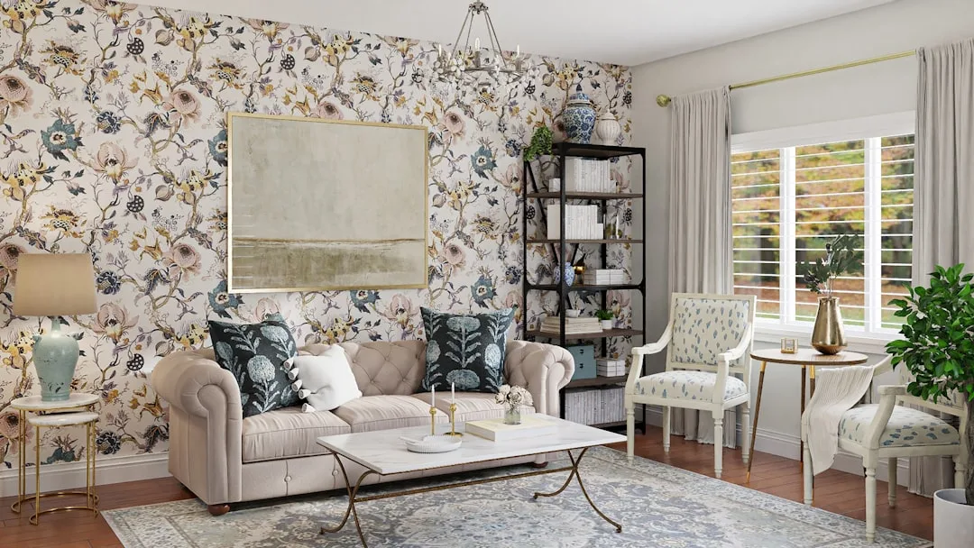
1. Oversized Botanical Murals Paired With Low-Profile Furniture
The biggest mistake people make with large-scale floral wallpaper is treating it like regular wallpaper — wrapping it around all four walls and wondering why the room feels unhinged. Oversized botanical murals are a different category. They’re closer to a framed artwork that happens to cover a wall, and they need the same curatorial thinking.
A single accent wall is the correct application for most living rooms under 200 square feet. One wall of a full-scale botanical — a realistically rendered magnolia branch, an oversized tropical leaf pattern, or a photographic-style peony mural — reads as a considered focal point. The same print on four walls reads as a decision someone made too fast.
The furniture equation is straightforward once you understand the visual logic. A botanical mural has enormous visual weight at height. To balance it, everything at floor level needs to recede. This is where low-profile furniture becomes the functional solution rather than just an aesthetic choice:
- A platform sofa with a seat height around 15 to 16 inches (the CB2 Decker sofa or the Article Timber sectional, for example) keeps the eye moving upward toward the print
- A concrete-finish or travertine coffee table sits heavy and grounded without competing for attention
- A jute or boucle rug in the background tone of the wallpaper unifies the floor plane without adding another pattern
The “too much vs. just right” distinction here is specific. Four walls of oversized botanicals paired with a patterned rug and a cluster of throw pillows creates visual chaos — the eye has nowhere to rest. One botanical feature wall with a concrete-finish coffee table, a clean-lined sofa in a pulled-from-the-print neutral, and bare hardwood flooring creates something that reads as editorial. Interior designers consistently describe this approach as treating the large-scale floral print as art rather than pattern, where the print serves as the room’s focal point and everything else recedes visually.
Brands doing this well at accessible price points include Photowall, who produce made-to-measure botanical mural panels starting around $180 for a standard accent wall, and Rebel Walls, whose “Branch” and “Blossom” collections specifically scale for residential feature walls.
Actionable takeaway: Measure your accent wall precisely and order a printed sample panel at least 24 inches square before committing. Scale is everything with botanical murals, and what reads beautifully on a phone screen can look completely different at actual wall height.
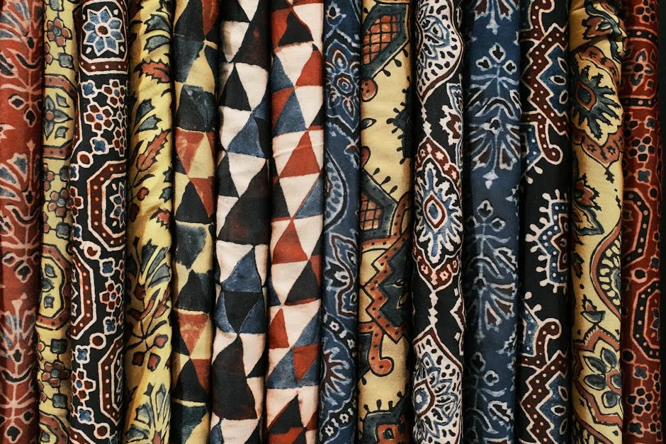
2. Vintage-Style Florals Made Modern With Industrial or Mixed-Metal Accents
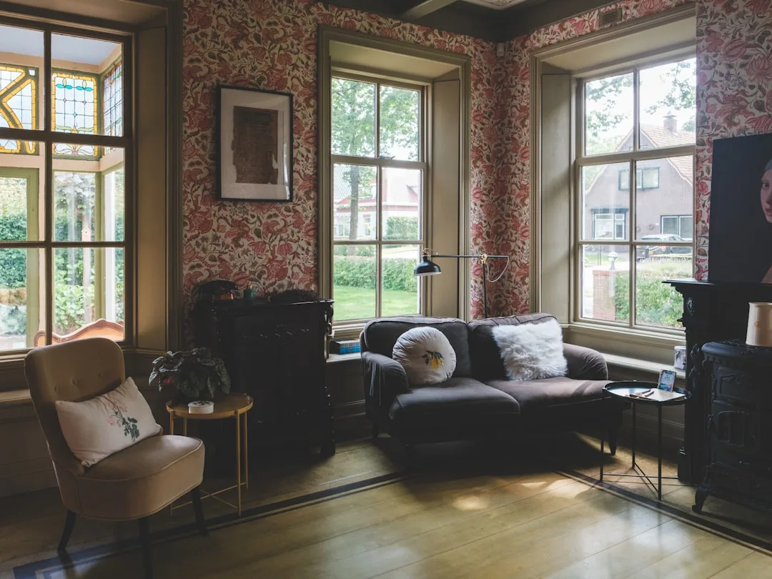
The vintage floral — that smaller, intricate, densely repeating print with a historical illustration quality — is the one most people are afraid of. It’s the one most associated with antique shops and National Trust gift stores. But interior designers working in Scandinavian and New York loft-style spaces have been using a specific counter-technique for years that completely reframes the association: pair the ornate pattern with something raw.
The contrast between an ornate, heritage-style floral print and an industrial material creates what designers call “intentional visual tension” — the sense that the room was assembled with knowledge rather than sentiment. It’s a documented approach in both Scandinavian interiors (where soft pattern meets raw wood and matte steel) and New York loft conversions (where period detail meets exposed pipe and smoked glass).
The colorway is where you start:
- Choose vintage florals in unexpected backgrounds. Dusty sage, terracotta, inky navy, and smoked slate all immediately distance the print from its pastel-pink, cream-background predecessors. Farrow & Ball’s archive-inspired prints and Cole & Son’s “Botanical Botanica” range both offer vintage-style illustrations in contemporary colorways starting around $120 to $220 per roll.
- The modern anchor piece is a fixture or shelving unit, not furniture. A matte black pendant light with an exposed bulb, iron-bracket wall shelving holding a stack of art books, or a smoked glass and steel side table — any of these performs the industrial counterpoint.
The comparison that clarifies it: vintage floral wallpaper plus antique furniture plus chintz cushions equals a period room that smells like old books. The same vintage floral wallpaper plus a steel-framed sofa in charcoal linen plus a jute rug equals something that looks like a thoughtful designer made specific choices. Same wallpaper. Completely different room.
Supporting furniture picks: the IKEA KALLAX shelving unit in black-brown with iron hairpin legs (under $200 total with aftermarket legs) or the West Elm Industrial Storage Bed frame reinterpreted as a room divider shelf both provide that raw-material counterpoint without requiring a renovation budget.
Actionable takeaway: If you’re working with a vintage floral, replace every soft, curved, or “period” accessory in the room with something that has a straight line and a raw or matte finish. One substitution at a time will tell you how far to go.
3. Moody Dark-Background Floral Wallpaper for a Dramatic Living Room Feature
Dark florals are where the fear is loudest and the results are most impressive. The concern is always the same: won’t a dark wallpaper make the room feel smaller? The answer, counterintuitively, is no — and understanding why changes how you approach the whole category.
Dark-background wallpapers have the optical effect of pushing walls outward in properly lit rooms. The pattern’s visual weight draws the eye inward and upward rather than compressing the space. It’s counterintuitive but consistent — a charcoal floral in a room with layered warm-toned lighting reads as expansive rather than cave-like. The key condition is “properly lit.” Dark wallpaper in a room with a single overhead bulb will feel oppressive. Dark wallpaper with a floor lamp, a table lamp, and accent lighting pointed at the wall itself will feel like a boutique hotel.
The colorway logic for dark florals is specific:
- Forest green backgrounds (think William Morris’s “Blackthorn” or Graham & Brown’s “Juliet” in deep teal) work best with natural wood and brass
- Charcoal and near-black backgrounds pair with jewel-tone velvet upholstery — an emerald sofa against a black floral reads as layered and intentional
- Deep burgundy or plum backgrounds pair with ochre, rust, and warm terracotta accents — a color palette that’s currently dominating design publications from Architectural Digest to Elle Decor
The modern anchor piece for a dark floral is almost always a velvet sofa in an adjacent jewel tone. Emerald against black-ground floral, ochre against deep navy — this creates the maximalist-but-intentional effect that distinguishes a sophisticated dark room from an accidental one. Brands like Swoon and Made.com produce jewel-tone velvet sofas in the £800 to £2,000 range that hit this note precisely.
The comparison: dark floral on all four walls, dark furniture throughout, and no intentional light sources equals a room that feels like a mistake. Dark floral on a single chimney breast wall with pale plaster on the remaining walls, white trim, and a mix of lamp heights equals sophisticated drama that photographs beautifully and lives comfortably.
Actionable takeaway: Before papering, tape a 4×4 foot piece of black card to your target wall and observe it at night with your current lighting. If it disappears, add a lamp before you order. If it sits well, you’re ready.
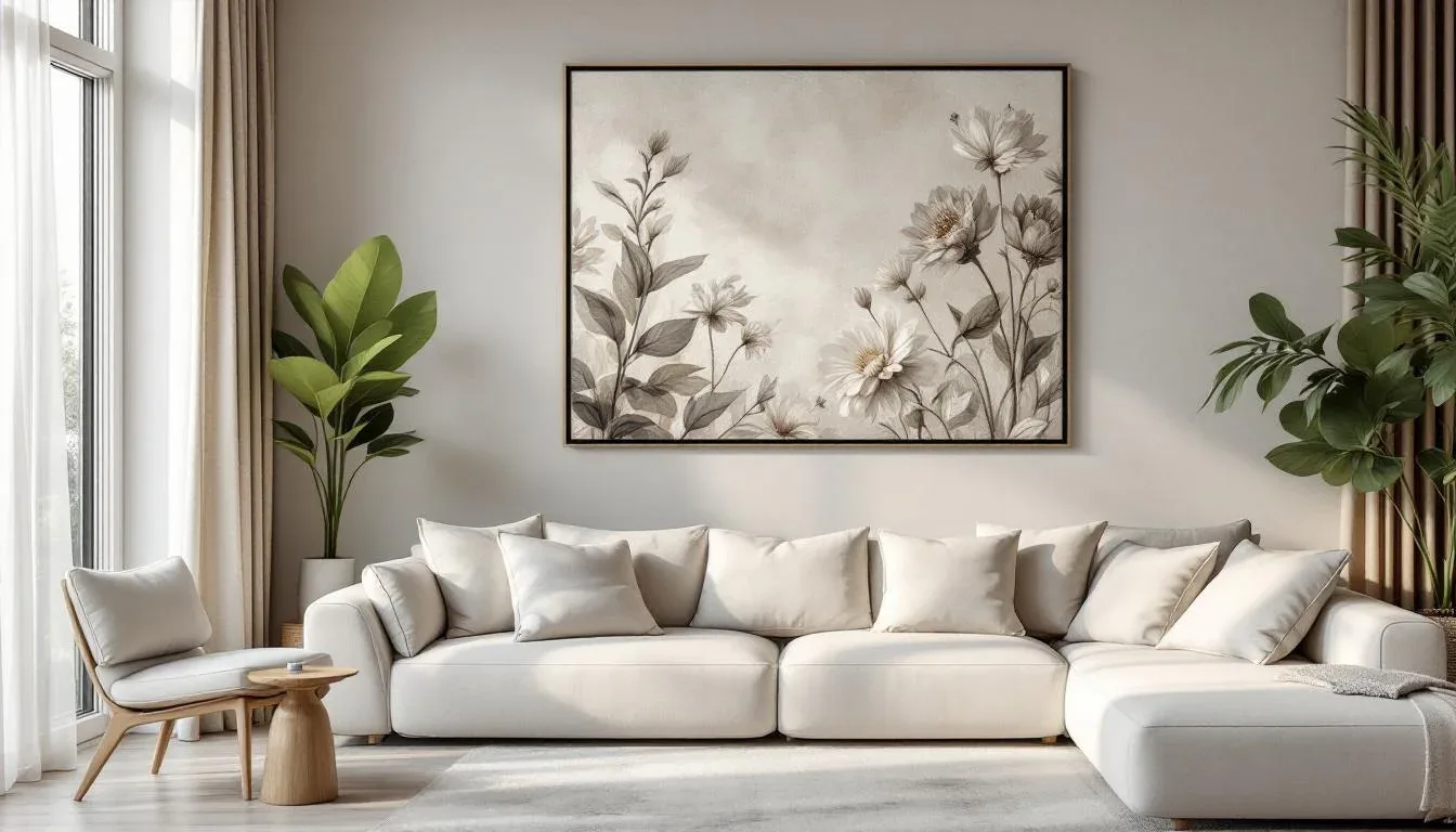
4. Watercolor Floral Prints That Work in Minimalist and Japandi Living Rooms
This is the least obvious intersection in the floral wallpaper category — and the most elegant when it works. Minimalist and Japandi spaces aren’t usually associated with pattern of any kind, but watercolor florals occupy a specific category that sidesteps the objection entirely. The reason is philosophical.
Japandi design specifically values imperfect, handcrafted, and nature-derived patterns — a principle that sits at the overlap of Japanese wabi-sabi and Scandinavian functionalism. A loose botanical watercolor print, with its unfinished edges, visible brushstroke texture, and muted, undyed palette, isn’t a decorative pattern in the conventional sense. It reads as a handmade object that happens to be on the wall. That’s a critical distinction for spaces where conventional decorative pattern would feel like clutter.
What makes a watercolor floral work in a minimalist context:
- Loose, unfinished edges — the blooms shouldn’t be hard-outlined or graphically clean; they should bleed slightly into the background
- Muted palette: blush with buff, sage with warm white, dusty mauve with greige — never saturated primaries
- Low repeat or no-repeat mural format — a single composition that reads as one continuous image rather than a tiled pattern
The modern anchor piece here is natural wood with visible grain — a white oak console, a solid ash dining bench, or a low teak platform bed frame. Washi paper pendant lighting from Japanese makers like Isamu Noguchi’s Akari series (available from $200 to $600) adds a material warmth that supports the watercolor’s handmade quality.
The comparison: watercolor floral wallpaper in a minimalist room with pattern-heavy cushions, a layered gallery wall, and visible clutter equals sensory confusion — the wallpaper’s quietness is overwhelmed. The same wallpaper with a single sculptural ceramic vase on a bare wood shelf, a linen slipcover sofa in undyed natural fiber, and bare hardwood flooring equals intentional wabi-sabi. The room breathes.
Designers working in this category recommend Rebel Walls’ “Floral Poetry” or Feathr’s loose botanical collections, both of which produce prints with the painterly quality that makes this pairing possible.
Actionable takeaway: If you’re in a Japandi or minimalist room, limit the entire space to three materials: the wallpaper, one wood tone, and one natural fiber textile. Everything else should either match or be removed.
5. Geometric-Meets-Floral Prints That Bridge Pattern Styles in Open-Plan Living Rooms
Open-plan living presents a wallpaper challenge most articles simply skip past. When your living room flows into a kitchen or dining area without a wall to delineate the transition, a conventional feature wall approach creates a room that looks like it can’t decide what it is. Geometric-floral hybrid prints exist at exactly this intersection — and they solve the open-plan zone problem better than almost any other wallpaper category.
The structural logic: a geometric-floral print — lattice backgrounds with floral fills, trellis-style repeats with botanical elements, or Art Deco-style frames containing hand-illustrated flowers — carries enough geometric discipline to create visual boundaries without requiring physical partitions. The repeat’s regularity does zone-definition work that a pure organic botanical cannot.
Open-plan living spaces account for a substantial proportion of new-build and renovation layouts, which makes zone definition through wallpaper a practical design solution rather than a decorative indulgence. The geometric grid in a hybrid print mirrors the angular silhouettes of modular or sectional furniture — creating a visual rhyme between the wall and the room’s largest objects that pulls the space together.
How to apply this in practice:
- Use the wallpaper on a single half-wall or kitchen peninsula back panel rather than a full feature wall — this places the pattern at the point of zone transition rather than anchoring it to one area
- Match the geometric print’s dominant color to one material used in both zones — a sage trellis that matches the kitchen cabinetry, for example, or a brass-toned lattice that matches pendant lights in the dining zone
- Keep soft furnishings in both zones neutral and cohesive — if the wallpaper is doing zone-definition work, the textiles should support rather than compete
The comparison: geometric-floral wallpaper in an open plan with competing patterns on furniture across multiple zones creates visual noise that reads as an unfinished renovation. The same wallpaper on a single transitional panel with cohesive neutral furnishings throughout both zones creates natural zone definition that feels deliberate and calm.
Wallpaper brands producing strong geometric-floral hybrids include Hygge & West’s trellis collections and Rifle Paper Co.’s garden lattice patterns, available from approximately $95 to $185 per roll.
Actionable takeaway: In an open-plan space, mark out your zone transition point with painter’s tape before deciding where the wallpaper goes. The print should sit at the boundary, not inside either zone.
6. Small-Scale Ditsy Florals Scaled Up With Tall Ceilings or Floor-to-Ceiling Application
The ditsy floral — those small, tightly spaced, all-over repeat prints with a folk-art quality — has a reputation problem. Applied as a waist-height feature wall in a standard 8-foot room, a small-repeat floral reads exactly like a wallpaper border in a 1990s bathroom. But change either the ceiling height or the application method, and the same print becomes something completely different.
Small-repeat florals need either a full-room wrap or a room with ceilings above 9 feet to escape their dated associations. This isn’t arbitrary — it’s perceptual. The small repeat reads as fussy when it’s isolated on one wall in a low-ceilinged room because the eye processes it as a fragment of something that should be more. Floor-to-ceiling application in a room with height, or a full four-wall wrap that commits entirely, changes the register from “decorative detail” to “considered environment.”
The vertical application technique is specific: running wallpaper floor to ceiling with no dado rail break, no picture rail, and no chair rail interrupt is a deliberate designer move that makes any repeat pattern — but especially small florals — elongate the room’s perceived height. Small-repeat florals benefit disproportionately from this treatment because the continuous vertical run gives the repeat room to accumulate into a texture rather than read as a pattern unit.
The modern anchor piece for this treatment needs to play against the smallness of the repeat through scale contrast:
- A curved, oversized sofa (the Anthropologie Roscoe or the Made.com Snug in a two-and-a-half-meter configuration) reads monolithic against a fine ditsy print
- An arc floor lamp that reaches 7 feet creates a vertical element that reinforces the height
- A round statement coffee table in marble or terrazzo sits sculpturally against the fine texture of a small repeat
The comparison: small ditsy floral applied to a low-ceilinged alcove with matching floral fabric cushions equals a period-room fragment that feels accidentally assembled. The same print floor-to-ceiling in a double-height loft or stairwell-adjacent living room with a concrete plaster statement sofa and nothing else equals unexpected and sophisticated. Same wallpaper, completely different outcome.
Actionable takeaway: Measure your ceiling height before deciding on ditsy floral. Under 9 feet, commit to a full four-wall application. Above 9 feet, a single floor-to-ceiling wall with no breaks will do more than you expect.
7. Tonal Floral Prints for a Subtle, Texture-Led Living Room Look
Not every floral wallpaper announces itself. Tonal florals — prints where the pattern and the background share the same color family, separated only by sheen, texture, or a slight value shift — are the category for people who want the depth and warmth of pattern without the visual commitment of a contrasting print. They’re also the most underrepresented category in the floral wallpaper conversation, which is exactly why they’re worth including here.
A tonal floral in a matte-on-matte finish reads as architectural texture rather than decorative pattern. Think ivory florals on a slightly warmer ivory ground, or sage blooms pressed into a sage background with a different surface finish. From across a room, the wall reads as a beautifully textured painted surface. Up close, the pattern emerges. This dual quality makes tonal florals exceptionally versatile — they work in rooms where you want floral’s warmth without its visual assertiveness.
The modern anchor piece for a tonal floral interior is typically the room’s lighting:
- Directional spotlights raking across a tonal floral wall create shadow play that makes the pattern visible and shifts through the day as natural light moves
- A statement pendant in smoked glass or hammered brass sits warm against a tone-on-tone background without competing
- Candles and low table lamps at dusk turn a tonal floral wall into something that feels genuinely atmospheric
Current brands producing strong tonal collections include Farrow & Ball’s “Silvergate” in matched colorways, Harlequin’s “Amazilia” in tonal celadon, and Zoffany’s botanical-weave wallpapers in their “Arcadian” collection — most in the $180 to $350 per roll range for UK sizing, with US equivalents available through designer trade accounts.
The pairing logic: a tonal floral wall reads refined and restrained. It gives you permission to layer in bolder furniture choices because the wall is contextually quiet. A cognac leather sofa, a cobalt ceramic table lamp, or a rust-orange wool throw all pop against a tone-on-tone background in a way they wouldn’t against a contrasting patterned print.
The comparison: tonal floral on all four walls with tonal furniture and no contrast elements reads as underdeveloped — a room that started with restraint and lost confidence. Tonal floral on three walls with one bold furniture piece and intentional accent lighting reads as quietly sophisticated.
Actionable takeaway: Order a minimum A3-sized sample of any tonal floral and hold it against your wall at three different times of day — morning, midday, and evening with artificial light. Tonal prints change more dramatically with light than any other wallpaper category, and this test will tell you which lighting scenario brings out the pattern’s best quality.
Frequently Asked Questions
How do I make floral wallpaper look modern instead of old-fashioned in a living room?
Three variables control whether a floral reads current or dated: scale, colorway, and what you put next to it. Large-scale prints with graphic clarity or mural-style compositions read contemporary regardless of the botanical subject matter. Colorways with dark backgrounds — charcoal, forest green, deep navy — instantly distance a floral from its cottage associations. And the furniture doing the most to modernize a floral isn’t the most expensive piece in the room — it’s the one with the clearest, most contemporary silhouette. A steel-framed sofa, a concrete coffee table, a matte-finish ceramic lamp base — any of these performs the contextual work that signals the room belongs to now rather than thirty years ago. Avoid matching the print’s colors in your fabric choices; instead, pull one color from the print and use it in a clean, modern material.
What furniture goes with floral print wallpaper in a living room?
The most successful furniture pairings for floral wallpaper share two qualities: a clean silhouette and a material that grounds the pattern rather than adding to it. Low-profile platform sofas, leather lounge chairs with exposed legs, steel-framed shelving, and solid-wood coffee tables all work well because they provide visual contrast to the pattern’s organic complexity. Avoid ornate furniture frames, busy upholstery patterns, and curved decorative legs — these compete with the wallpaper for attention rather than supporting it. If the floral is large-scale and dramatic, keep the furniture spare and solid. If the floral is small-scale and intricate, balance it with oversized, sculptural furniture pieces that play on scale contrast. The color rule: pull your sofa color from the wallpaper’s background tone, not its flower color.
Is it better to wallpaper one wall or all four walls with a floral print in a living room?
It depends entirely on the print’s scale and the room’s ceiling height. Large-scale botanical murals and oversized repeat prints almost always work best on a single feature wall — applying them to all four walls creates visual saturation that makes a room feel chaotic rather than bold. Small-scale ditsy florals, on the other hand, often benefit from a full four-wall application in rooms with standard 8-foot ceilings, because a single accent wall of a small repeat reads as a wallpaper fragment rather than a considered environment. Dark-background florals work beautifully on a single chimney breast or fireplace wall paired with pale plaster on the remaining walls — the contrast creates sophistication. Tonal or watercolor florals can work on all four walls if the room has strong natural light and furniture that provides clear contrast. The universal principle: one wall of a print requires that wall to work as a focal point, so your furniture arrangement needs to face it.
What are the best floral wallpaper colors for a small living room?
The instinct to go light in a small room is understandable but often counterproductive with floral wallpaper. A pale cream floral on an off-white background can make a small room feel cluttered and fussy because there’s insufficient contrast between the pattern and the wall surface — the whole thing merges into a busy, textureless mass. Dark-background florals in forest green, charcoal, or deep navy often work better in small spaces when applied to a single wall with good lighting because they create depth rather than expanding the surface area of the pattern. The background tone appears to recede, which paradoxically makes the room feel larger. For small rooms with limited natural light, a tonal floral in a warm neutral — soft terracotta on rust, ivory on parchment — on a single wall provides the pattern benefit without overpowering the space. The practical ceiling: in a room under 150 square feet, one wall maximum, and choose a print with a clear, uncluttered background.
Your Next Step Starts With a Sample, Not a Roll
Pick one of the seven ideas above that genuinely excites you — not the one that feels safest. Order a minimum of three large-format wallpaper samples (most brands offer A4 or A3 samples for $3 to $15 each) and tape them directly to the intended wall for at least 72 hours. Look at them in morning light, afternoon light, evening lamplight, and full artificial light at night.
The sample test is where most floral wallpaper decisions get made or unmade. Color shifts between a monitor and a wall are significant. Scale reads differently at 9 feet than it does on a phone screen. The print that felt overwhelming in a sample image often disappears at actual wall height — and the one that felt timid frequently becomes the most interesting thing in the room when it’s actually on the wall.
One decision to make before you order anything: identify your modern anchor piece first. Know what the grounding element will be — the platform sofa, the iron shelving, the velvet statement chair — before the wallpaper arrives. That single decision is the difference between a room that looks like an accident and one that looks like you knew exactly what you were doing.
You probably do.