The last time interior designers reached for mint green, powder blue, and blush rose in the same breath, Eisenhower was president — and according to the designers reshaping 2026 interiors, that is precisely the point. This isn’t nostalgia for nostalgia’s sake. It’s a deliberate, structurally sound aesthetic argument being made by people who understand exactly what these colors do to a room, and why they’re doing it right now.
What’s happening in the design world leading into 2026 looks nothing like the millennial pink moment that peaked around 2017. That wave was cool-toned, Instagram-flat, and rooted in a minimalism that aged about as gracefully as a fiddle-leaf fig. The current revival is warmer, richer in undertone, and far more considered. Designers are pulling from a specific postwar American optimism — the colors that showed up on kitchen appliances, bathroom tiles, and living room walls when the country collectively decided it wanted things to feel hopeful again.
Sound familiar?
Why the Soft Pastel Interior Color Palette of the 1950s Hits Different in 2026
The difference between a trend and a movement is intentionality. What’s building around 1950s-inspired pastels right now has both cultural momentum and design logic behind it — which is why it’s worth understanding before you pick up a paint brush.
The millennial pink era and the 1950s pastel revival are not the same animal. Millennial pink was a specific shade — closer to Pantone 699 or Benjamin Moore’s Ballet White — that read as blush only under certain lighting and paired almost exclusively with white, brass, and geometric sans-serif everything. It was tied to a visual language of Instagram minimalism, not to any coherent historical design tradition.
The 1950s palette is something else. These are pastels with a yellow or peach undertone base — warm, creamy, and slightly complex rather than flat. They existed in a design culture that also produced boomerang laminate patterns, terrazzo floors, and Eames chairs, which means they were never meant to exist in sparse rooms. They belonged to spaces with personality.
The Pantone Color Institute has documented that pastel revivals run in cycles of approximately 25 to 30 years, with the last major wave peaking in the late 1990s — think the soft sage greens and dusty mauves that dominated home catalogs from 1996 to 2002. If that timeline holds, a 2026 peak is right on schedule.
Color psychology adds another layer to why this is happening now. Research in environmental psychology consistently shows that warm, low-saturation hues reduce cortisol response and create a perceived sense of safety — the same instinct that drives people toward comfort food or familiar music when the broader world feels unpredictable. Nostalgic color operates the same way: it borrows emotional equity from a period the viewer associates with stability, even if they didn’t live through it.
Publications including Good Housekeeping, House Beautiful, and Architectural Digest have all flagged 1950s pastel as a directional trend for 2026, with editorial coverage accelerating through late 2024. Designers including Sheila Bridges and the team at Studio McGee have incorporated warm pastel accents into recent projects. The conversation is no longer speculative.
Takeaway: If you’re considering a pastel refresh, you’re not chasing a trend — you’re arriving at the right moment of a documented color cycle with real psychological grounding.
Decoding the 1950s Pastel DNA: Undertones, LRV, and Why These Shades Actually Work
Most pastel articles skip this part entirely, which is exactly why so many pastel rooms end up looking washed out, gloomy, or accidentally clinical. The reason authentic 1950s-era pastels work in real rooms — across varying light conditions, with different flooring materials and furniture — comes down to two things: undertone and Light Reflectance Value.
Light Reflectance Value (LRV) is a measurement on a scale from 0 to 100 that tells you how much light a paint color reflects back into a room. Pure white sits at 100; pure black sits at 0. Most 1950s-era pastels cluster between LRV 68 and 78 — a range that reflects enough light to keep a room feeling airy and open without washing out to near-white under bright conditions. This is the sweet spot. Colors in this LRV band are forgiving: they look intentional in both morning and afternoon light without requiring perfect exposure conditions to succeed.
Compare that to some contemporary pastels — dusty mauves or greyed-out sage greens that hover around LRV 45 to 55 — and you start to understand why those colors can feel heavy or murky in rooms with average natural light.
The undertone question is equally important and far more commonly misunderstood:
- True 1950s pastels carry a yellow or peach base undertone. This is what makes them feel warm and inviting rather than cold or sterile. Mint green becomes spearmint rather than hospital green. Powder blue carries a touch of warmth that stops it from reading as a nursery color. Blush rose has a peachy depth rather than a flat bubblegum quality.
- Modern clinical pastels tend to have a blue or gray base. These are the colors you’ll find in contemporary Scandinavian palettes — cool, clean, and precise. They’re not wrong, but they’re a different aesthetic category entirely.
The practical implication of this undertone difference shows up most clearly in directional lighting. In north-facing rooms, which receive only indirect, blue-shifted daylight, pastels with cool undertones will shift dramatically toward gray-green or gray-blue by afternoon. A powder blue that looks beautiful in the showroom can turn dingy by 3pm in a north-facing bedroom. The fix is selecting pastels with a warm yellow or peach base, which counterbalances the cool ambient light and holds the intended color across the day.
South-facing rooms have the opposite luxury — they receive warm, direct sunlight for most of the day, which means they can carry both warm and slightly cool pastels without the dreaded color shift.
Takeaway: Before you select any pastel, identify your room’s orientation and check the paint chip’s undertone against a white piece of paper. If the chip looks slightly yellow or peachy beside true white, it’s a 1950s-authentic warm pastel. If it reads gray or blue-gray, it’s a modern cool pastel — and you’ll want to reconsider it for any north-facing space.
The Core 1950s Soft Pastel Interior Palette: Four Combinations with Exact Paint Codes
This is where the aesthetic argument becomes actionable. Each of the four combinations below was selected for undertone accuracy, LRV performance, and availability in major paint lines. They’re not suggestions pulled from a mood board — they’re tested pairings with real structural logic.
Combination 1 — Mint and Warm Cream
Benjamin Moore ‘Spearmint’ 2033-50 paired with Benjamin Moore ‘White Dove’ OC-17
Spearmint sits at LRV 72 and carries that essential yellow-green warmth that separates it from cooler aqua-mints. White Dove, with its soft warm white base, prevents the contrast from turning harsh. This combination works exceptionally well in kitchens and sunrooms — spaces where natural light fluctuates and you need a palette that performs well under both overhead artificial light and full daylight. Spearmint on the cabinetry faces or an island, White Dove on upper walls and trim, is a specific application that avoids the overwhelming look of all-mint.
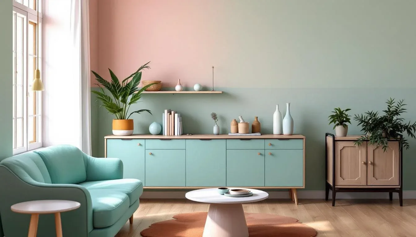
Combination 2 — Powder Blue and Butter Yellow
Farrow & Ball ‘Borrowed Light’ No.235 with Farrow & Ball ‘Dayroom Yellow’ No.233
Borrowed Light was reportedly among Farrow & Ball’s top 10 most searched shades in Q1 2025 — genuine consumer momentum confirming this isn’t just editorial speculation. At LRV 74, it’s one of the lightest blues in the Farrow & Ball range. Paired with the soft, warm-tinged Dayroom Yellow, you get a complementary contrast that doesn’t fight for dominance — the blue recedes and the yellow grounds. This is the living room combination for south-facing spaces where strong afternoon light keeps Borrowed Light from going cold.
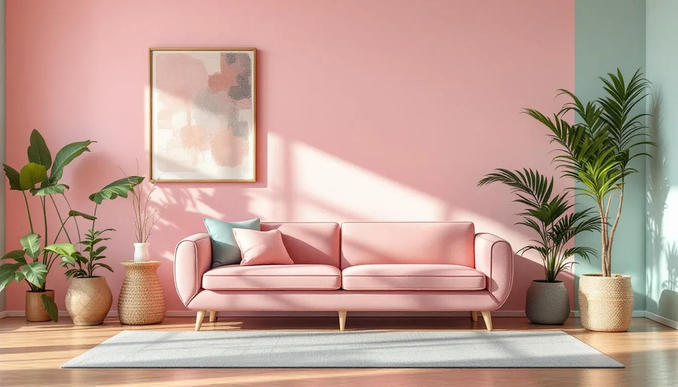
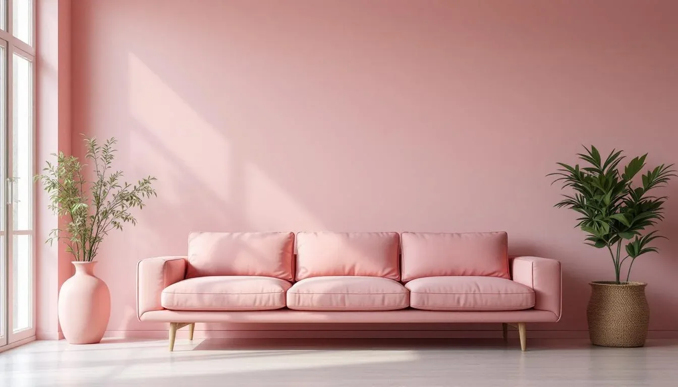
Combination 3 — Blush Rose and Sage
Sherwin-Williams ‘Alyssa’ SW 0053 anchored by Sherwin-Williams ‘Liveable Green’ SW 6176
This is the most versatile of the four combinations for contemporary rooms. Alyssa is a blush with a definite peach warmth — not pink-pink, but not pale either. Liveable Green functions as an anchor: it’s a gray-sage that shares the warm undertone family without matching the blush directly. Together, they read as intentionally nostalgic but not costume-y. Position this as the bedroom palette: the warm saturation levels of both shades are exactly the low-stimulation range that sleep researchers associate with easier transition to sleep.
Combination 4 — Lilac and Warm White
Benjamin Moore ‘Peony’ 2079-40 with Benjamin Moore ‘Chantilly Lace’ OC-65
This is the boldest of the four and the one most likely to go wrong without precision. Peony is a genuine lilac — saturated enough to read as a real color decision rather than an apology. Chantilly Lace is the brightest of the warm whites, which risks making Peony look washed out if the proportions are off. The solution: use Peony on three walls maximum in any given room, and run Chantilly Lace only on trim and ceiling. Adding unlacquered brass fixtures pulls the room into adulthood and out of the nursery territory that lilac risks without grounding.
Takeaway: Start with one combination based on your primary room’s orientation and function. Buy 12×12 sample boards of both colors (not the 3×5 chips from the rack) and live with them on the actual wall for 48 hours before committing.
Pairing Soft Pastel Walls with Modern Furniture Silhouettes — Without Looking Like a Diner
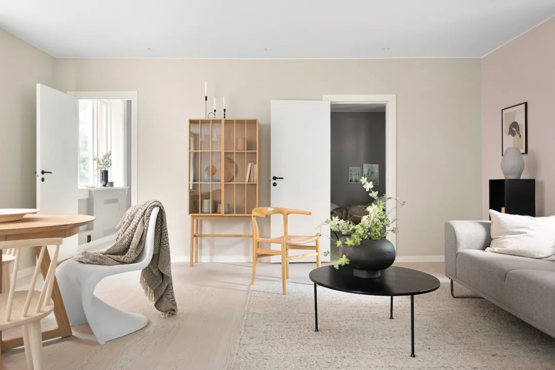
The fear is reasonable. Put mint walls and chrome barstools in the same room and you’ve got a diner. Put powder blue on the walls with a jukebox and some vinyl booths and you’ve crossed into theme park. The reason this happens isn’t the pastel — it’s the furniture pairing.
The principle that saves every pastel room: match organic, curved contemporary silhouettes to 1950s pastels, not literal period reproduction furniture. Curved boucle armchairs, arched sofas, tulip-base dining tables — these forms echo the soft geometry of the 1950s without quoting it directly. The result reads as 2026 with historical awareness, not as a set from Happy Days.
Curved furniture search volume on 1stDibs and Chairish reportedly rose over 40% between 2022 and 2024, which means the organic silhouette pairing that works aesthetically is also commercially available at multiple price points. You’re not hunting for a specific vintage piece anymore — you’re choosing between dozens of contemporary options.
Beyond silhouette, the material palette you choose around a pastel wall determines whether the room reads as retro or current:
- Unlacquered brass hardware oxidizes slightly over time and adds warmth without the cold precision of polished chrome or brushed nickel. It’s the single most effective moderating force in a pastel room.
- Raw or washed linen — on sofas, curtains, or throw pillows — shares the matte, slightly imperfect quality of true 1950s interiors. It pulls weight without adding color competition.
- Limewash plaster walls as an accent surface add texture and depth that prevent pastels from reading as flat or juvenile. Portola Paints’ Lime Wash line or Behr’s limewash-effect paint are accessible starting points.
What genuinely doesn’t work with 1950s pastels:
- Chrome furniture legs, which read as too modern-industrial and clash with the warm matte finish authentic pastels need
- Hard-edged geometric Scandinavian minimalism — the visual language of those two aesthetics are simply incompatible
- High-gloss lacquer finishes on cabinetry, which create a contrast-overload situation with soft pastel walls
Takeaway: Before buying furniture for a pastel room, check two things: is the form curved and organic, and is the dominant material matte rather than high-gloss? Those two filters eliminate most problematic combinations before you’ve moved a single piece.
Room-by-Room Logic for a Soft Pastel Interior Color Palette (With Actual Rationale)
Generic room guides assign colors by mood (“blush for romance!”) without addressing the structural reasons those assignments work or fail. Light direction, artificial light temperature, and the functional demands of each space actually determine which pastel goes where.
Kitchen
Mint green and butter yellow perform best in kitchens because their high LRV values — typically 70 and above — keep the space energized under the mixed artificial and natural light that kitchens experience throughout the day. One critical warning: avoid lavender or cool lilac in north-facing kitchens. In low, indirect light, cool-undertoned pastels deepen toward gray, and a lilac kitchen that looked charming in the showroom can feel dim and slightly unpleasant by dinnertime. Spearmint’s yellow-green warmth counteracts this entirely.
Living Room
The case for powder blue in the living room rests on a single condition: adequate warm natural light. South-facing living rooms with good window exposure can carry Borrowed Light No.235 beautifully — the abundant warm daylight prevents the blue from reading cold, and the room glows with a quality that north-facing spaces can’t replicate with the same shade. Pair with warm medium-toned wood floors (white oak or walnut, not cool gray-washed pine) to anchor the palette and add the grounding the lightness of the blue requires.
Bedroom
Blush rose paired with sage is the most psychologically supported bedroom choice in this palette family. A study from the University of Sussex found that bedroom colors with warm, low-saturation tones are associated with better perceived sleep quality than cool, higher-saturation alternatives — participants in warm-toned environments reported falling asleep faster and waking feeling more rested. The peach-warm base of a blush like Alyssa sits precisely in the low-stimulation range that sleep researchers identify as optimal for a sleeping environment.
Bathroom
Lilac is a bathroom ally when the lighting is right. Warm-spectrum bulbs in the 2700K to 3000K range preserve the warmth in lilac undertones and render the color accurately against skin tones — an important consideration in a grooming space. Switch to cool LED lighting (4000K and above) and the same lilac turns gray-purple, losing all the vintage warmth and making the room feel like an office bathroom. If you’re committed to lilac in a bathroom, check your bulb temperature before you paint.
Takeaway: Identify your room’s light source (direction and bulb temperature) before selecting a pastel. That single variable has more influence on how your color reads than the paint chip itself.
The Soft Pastel Interior Color Palette Mistakes That Age a Room Instantly
Experience in interiors isn’t knowing what to add — it’s knowing what ruins things. Pastel rooms have a specific failure pattern, and most of them trace back to three consistent mistakes.
Mistake 1: Bright White Trim
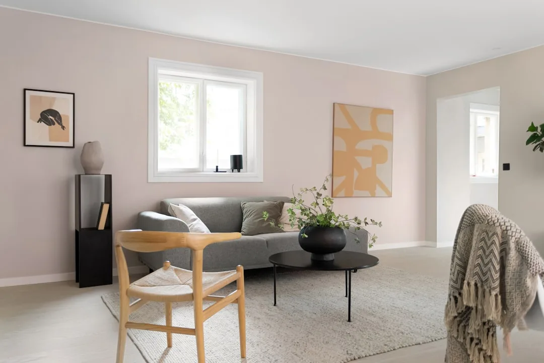
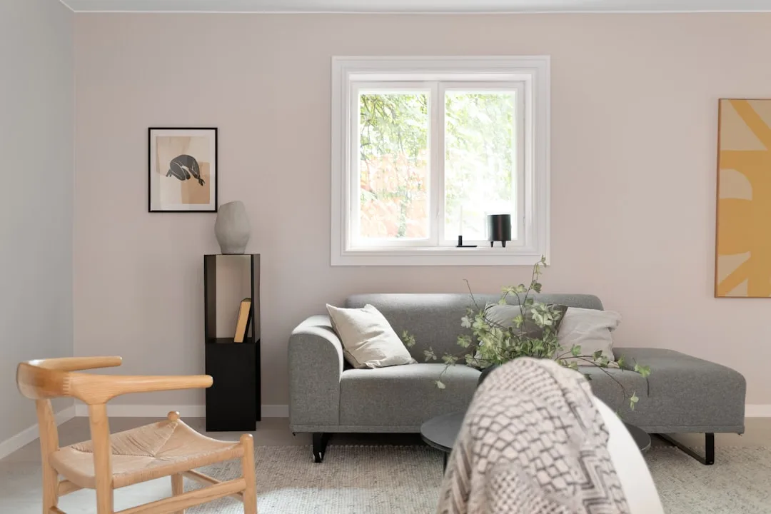
This is the most common pastel error and the one that most reliably makes a pastel wall look faded rather than intentional. Bright white trim — anything with an LRV above 90, like Pure White or Ultra Pure White — creates a contrast level that the soft pastel wall simply can’t match. The 1950s didn’t use bright white trim with pastels. Period-authentic interiors used cream or off-white — Benjamin Moore’s White Dove OC-17, Farrow & Ball’s Pointing No.2003, or Sherwin-Williams’ Antique White SW 6119 — which softens the edge between wall and trim and lets the pastel read as the deliberate choice it is.
Mistake 2: The Full-House Pastel Overcommit
Using all four pastel combinations across a single home isn’t maximalist — it’s incoherent. Pastels are a design language with grammar. Choose one hero palette per floor or zone and treat the other combinations as a different chapter in a different room. A home where the kitchen is mint, the living room is powder blue, the bedroom is blush rose, and the bathroom is lilac reads as a color-wheel exercise rather than a designed home. Pick one, maybe two, and let them breathe.
Mistake 3: Ignoring the Ceiling
The ceiling is the fifth wall and the most neglected one in pastel rooms. Color drenching — the technique of running your wall color at 50% saturation up onto the ceiling, or painting the ceiling in a tonal variation of the wall hue — is what separates a designer-executed pastel room from a DIY attempt. House Beautiful cited color drenching as one of the top five paint techniques gaining momentum through late 2024 and into 2025. A blush rose room with a pale cream-rose ceiling reads as architecturally considered. The same blush rose room with a flat white ceiling looks like the painting stopped before it was finished.
Takeaway: Fix the trim first. Swap any bright white trim for a warm cream or off-white before you do anything else in a pastel room — it’s the single change with the highest visual return.
How to Test a Soft Pastel Interior Color Palette Before You Commit (The Designer Method)
Sherwin-Williams has reported that its ColorSnap Visualizer has been used over 50 million times — which confirms that digital color testing is now a standard consumer behavior, not a niche workaround. But digital tools have real limitations with pastels specifically, and the designers who execute these rooms correctly use a layered testing approach that doesn’t rely on screens alone.
Step 1: The 12-Inch Sample Board Rule
Never evaluate a pastel from a 3×5 paint chip. The human eye needs context and scale to read undertone accurately, and small chips read differently against a white card background than they do on an actual wall. Buy a sample pot — all three major brands sell them for $5 to $8 — and paint it onto a piece of white foam board at a minimum of 12 inches by 12 inches. Then hold that board against your actual wall surface, against your flooring, and against your trim color simultaneously. View it at three different times of day: morning, midday, and late afternoon.
Step 2: Digital Visualizer Tools — and Their Limits
Both Sherwin-Williams ColorSnap Visualizer and Benjamin Moore’s Personal Color Viewer allow you to upload a photo of your room and preview paint colors on your actual walls. They’re genuinely useful for narrowing the field from ten options to three. Their limitation with pastels: screen rendering tends to saturate colors slightly and doesn’t accurately represent the matte finish texture of true pastel walls. Use them to eliminate obvious mismatches, not to make a final decision.
Step 3: The Linen Test
This one is specific to pastels and almost never mentioned in standard painting guides. Lay a piece of natural undyed linen or white cotton fabric beside your painted sample board and look at what happens to the fabric. If the fabric appears to go yellow or warm beside your paint, the paint has a cool undertone — the linen’s neutrality is making the paint’s base color visible by contrast. If the fabric looks slightly lavender or blue, the paint is warmer than it appears on the chip. This test catches undertone behavior that the eye alone won’t detect from a chip in a paint store.
Takeaway: Buy sample pots of your two or three finalists today. Paint 12-inch boards, not wall swatches — boards are moveable and let you test multiple positions and light conditions. Run the linen test before you commit to either color in a pair.
Frequently Asked Questions
What makes 1950s pastels different from modern pastel paint colors?
The defining difference is undertone. Authentic 1950s pastels carry a yellow or peach base — that warm quality is baked into the pigment mix. Modern pastels, particularly those associated with Scandinavian minimalism or contemporary clinical aesthetics, typically have a gray or blue base that makes them cooler and cleaner. The practical result: 1950s pastels hold their warmth across varying light conditions and read as inviting in real rooms, while cooler modern pastels can shift toward gray or feel flat, especially in rooms that don’t receive strong warm daylight. LRV is also a factor — 1950s pastels typically sit in the 68 to 78 range, keeping them functional across different light levels, whereas some contemporary pastels with more gray in them land lower and feel heavier than expected.
Which soft pastel colors work best in rooms with little natural light?
In low-natural-light rooms, your best performers are warm-undertoned pastels with high LRV values — specifically, anything sitting above LRV 68 with a yellow or peach base. Mint greens like Benjamin Moore Spearmint and warm creams like White Dove are reliable. Butter yellows are effective because the yellow pigment itself acts as a light-generating hue, making a room feel brighter than the actual footcandles would suggest. What to avoid: cool-undertoned pastels like lavender, gray-blue, and cool aqua, which deepen toward gray in indirect light. Lilac in a north-facing room is one of the most common pastel regrets — it looks hopeful in the store and dingy at home.
How do I stop a pastel interior from looking too retro or childish?
Two moves handle most of this problem. First, choose your furniture silhouettes carefully — curved, organic contemporary forms (boucle, arched sofas, tulip tables) reference the 1950s in form without quoting it literally. Avoid any actual period reproduction furniture, which tips the room from reference to costume. Second, add material counterweights that belong to the present: unlacquered brass hardware, raw linen, natural stone, and limewash plaster all ground pastel walls in a tactile maturity that prevents the nursery read. The trim choice matters enormously too — cream or off-white trim instead of bright white eliminates the “freshly painted children’s room” feeling that high-contrast bright white trim creates. One piece of contemporary art in a pastel room does more to signal intent than almost any other single choice.
Can I mix more than one pastel color in the same room without it clashing?
Yes, but the rules are specific. Stay within the same undertone family — mixing a warm-undertoned blush rose with a warm-undertoned sage works because both share the yellow base. Mixing a warm blush with a cool gray-lavender creates an undertone conflict that the eye registers as unresolved even if you can’t immediately name why. The other principle: use the 60-30-10 proportion rule, where one pastel dominates (walls, 60%), a second appears in significant but secondary amounts (a rug, upholstery, 30%), and a third, if you use one at all, appears only as an accent (cushions, a vase, 10%). The worst version of mixing pastels in one room is equal proportions of four different shades — that’s where the Easter-egg problem starts. One dominant, one supporting, one accent. That’s the grammar.
The most useful thing you can do right now is identify one room, check which direction its primary windows face, and pick one combination from the four above that matches both the light direction and the room’s function. Order sample pots of both colors in your chosen pairing. While you wait for them to arrive, look at your current trim and ask yourself honestly whether it’s warm enough — that swap from bright white to off-white may be the actual first step, not the wall color at all.
The palette has been waiting. The rooms are ready. The only decision left is which shade of optimism you’re starting with.