The gray paint you approved on the swatch, loved on the sample board, and watched dry on your walls — then hated — didn’t betray you. Its undertone did, and it was there the whole time.
Quick Answer
The gray paint you approved on the swatch, loved on the sample board, and watched dry on your walls — then hated — didn’t betray you. Its undertone did, and it was there the whole time.
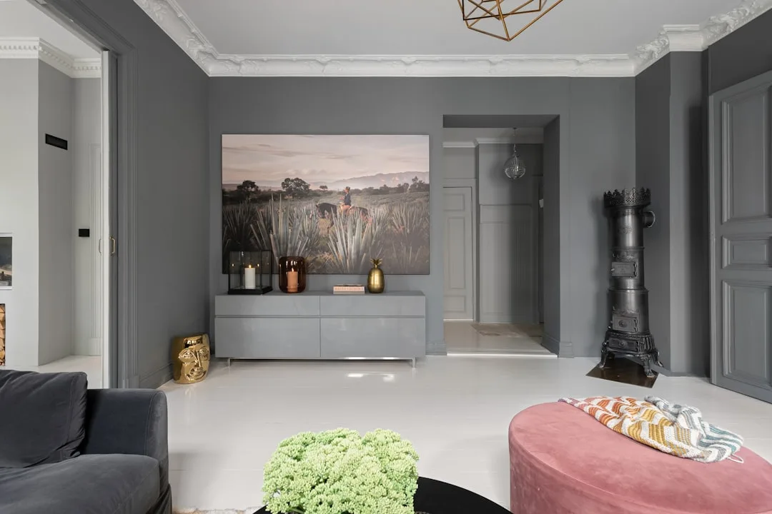
Gray has been the dominant interior paint color for over a decade. It is also, by a wide margin, the color most likely to end up on a return complaint form at a paint counter. I saw this pattern repeat constantly during my years doing interiors in Chicago and New York — clients who had done everything right, tested carefully, waited for it to dry, and still found themselves staring at a wall that had somehow turned lavender. Or seafoam. Or an unsettling shade of institutional taupe. The color hadn’t changed. Their understanding of what was always inside it had.
This is that understanding.
Why Gray Paint Looks Different on Every Wall — And It’s Not the Lighting
In This Article
- Why Gray Paint Looks Different on Every Wall — And It’s Not the Lighting
- The Four Undertones of Gray (Most Guides Only Tell You Three)
- How to Read a Gray Paint Chip Like a Pro (Not a Beginner)
- What Is a Good Undertone for Gray — And What Makes It ‘Good’ Depends on Your Room
- Gray Paint With No Undertones — Does It Actually Exist?
- The Color Quietly Replacing Gray in 2026 — And Why Undertones Are the Reason
- Undertone Conflicts: Why Your Gray Looks Wrong Even When You Tested It
- Gray Undertone Cheat Sheet by Room Type
Lighting gets blamed for everything. And yes, light affects how paint reads — but blaming light alone is how people end up repainting the same wall three times. The real culprit is buried in the paint’s formula itself.
Undertones are trace pigments built into the base mix of a gray paint. They are not an accident of mixing. They are structural. When a manufacturer creates a gray, they are blending black, white, and small amounts of other pigments — blue, violet, green, or brown — to prevent the color from reading as flat or lifeless. Those trace pigments don’t disappear when you apply the paint. They wait.
What activates them is the room around them. Every surface in a space — your flooring, your furniture upholstery, your trim color, even the view through your windows — reflects light back at your walls. That reflected light acts like a filter, and it has its own color temperature and its own bias. When that reflected light hits a gray wall with a blue undertone, it pulls the blue forward. The undertone that seemed invisible on a 2×2 chip suddenly has an entire 12-foot wall to express itself on.
This is why the same paint chip looks completely different in your sister’s house. Her wood floors are pulling the green. Your tile is pulling the blue. The paint is the same. The activation conditions are not.
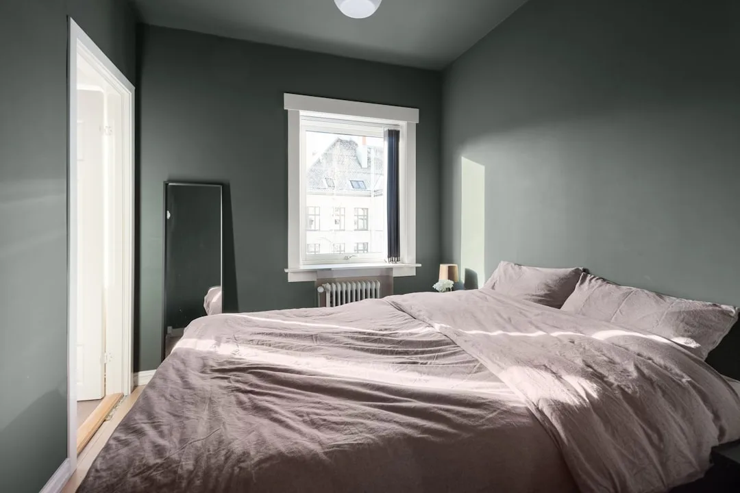
I once used Benjamin Moore Stonington Gray in a client’s bedroom that had warm honey-toned hardwood floors and a east-facing window. It looked beautiful — soft, cool, collected. The same client asked me to use it in her mother’s living room across town. The mother had north-facing light, cool gray tile, and white oak furniture. It went lavender within a week of painting. Same can. Different room. Entirely different result.
Gray has been the #1 interior paint color for over a decade, yet it generates more paint-return complaints than any other neutral — a frustration almost entirely rooted in unrecognized undertones working against the room’s existing conditions rather than with them.
Takeaway: Before you test a gray paint chip, inventory your room’s existing undertones first — floor color, dominant furniture tone, trim color. These are the activators, and they matter more than the chip itself.
The Four Undertones of Gray (Most Guides Only Tell You Three)
Every paint article on the internet tells you gray has three undertones: blue, violet, and green. Three. Mentioned in that order, framed exactly that way, with roughly the same examples each time. What they consistently leave out is the one undertone that affects more commercially popular grays than any of the other three combined.
Here are all four, with the specificity they actually deserve:
Blue undertones are the most common in commercial gray formulas. They create a crisp, contemporary feeling that reads beautifully in rooms with cool white trim, ample south-facing light, or chrome and nickel hardware. The problem is predictability — blue-undertone grays are well-behaved in ideal conditions and genuinely difficult in rooms that don’t cooperate. North-facing light flattens them. Warm incandescent bulbs greenify them in ways that are hard to diagnose.
Violet and purple undertones are the leading cause of gray paint shock. This is the undertone that looks almost identical to blue on the chip under store fluorescents, then transforms under evening lighting at home. Warm-spectrum incandescent and halogen bulbs are what bloom a violet undertone into obvious lavender — and most people evaluate their paint color in the evening, under exactly those bulbs, after a full day of living with it. The undertone was invisible at noon and arresting at 7pm.
Green undertones are subtle in the can. Dramatic on drywall. If your room has wood floors — particularly medium-toned oak, walnut, or similar — the warm orange-brown in the wood creates simultaneous contrast with the green, pushing it forward into something close to seafoam. Green-undertone grays in rooms with landscape views through large windows are particularly risky; the exterior green reflects back into the room and amplifies what’s already on the wall.
Brown undertones — the fourth category — are the most frequently overlooked in any organized framework. They appear in some of the most popular gray paint colors in existence: Sherwin-Williams Agreeable Gray, Benjamin Moore Revere Pewter, and dozens of others regularly marketed as “warm gray.” These grays drift toward taupe under warm artificial light, which many people actually find welcoming — but they’re sold without explanation, which means clients who expected a cool modern gray get something that reads like a 2009 transitional dining room and don’t understand why.
Takeaway: If you’re shopping a gray and the label says “warm gray” without specifying the undertone direction, assume brown until you test it — and test it under your actual room conditions, not the store.
How to Read a Gray Paint Chip Like a Pro (Not a Beginner)
The standard advice — hold the chip next to white paper, look at it in natural light — is worse than useless. White paper neutralizes undertones by flooding the chip with a neutral reference that suppresses the very thing you’re trying to see. I spent years watching clients do this and approving grays that turned on them within a week of painting.
Here is what actually works:
The layer method. Pull three different gray chips from the same brand family — a lighter, a medium, and a darker version of similar hues. Stack them overlapping in a fan. The contrast between chips in the same tonal range will reveal what each one is hiding. A chip that looked neutral will suddenly show green against its neighbors. This works because undertones are relative — they need contrast to become visible.
The flooring test. Hold the chip flat against your actual floor, not the wall. Your floor is the single largest fixed undertone activator in any room. It radiates reflected light upward continuously. A chip held vertically against a white wall is giving you approximately none of the information you need. Lay it flat. Watch what happens to the chip’s apparent color when the floor’s undertone starts pulling at it.
The time-of-day evaluation. Look at your painted sample — not a chip, a painted sample — at 7am, noon, and 7pm. Specifically 7pm, specifically under whatever bulbs are actually in your fixtures. This is when violet undertones bloom. This is when blue undertones green-shift under warm incandescent. A gray that looks clean and crisp at noon has three more hours to surprise you.
- Never test on white paper — it suppresses rather than reveals
- Test a minimum 4×4 inch peel-and-stick sample; the small chips are optically compressed by white packaging borders, which artificially suppresses undertones
- Test on the actual wall surface in the actual room, not a test board you carry around
- Leave it up for 48 hours before deciding — the first 24 hours are deceptive as the paint cures
Paint professionals recommend purchasing a minimum 4×4 inch peel-and-stick sample precisely because undertone suppression in small swatches is a documented optical effect — the white border of the packaging creates contrast that compresses the color information you’re actually trying to read.
Takeaway: Paint a sample directly on your wall — not a board, not paper — and evaluate it under your evening lighting before you commit. That’s the moment of truth.
What Is a Good Undertone for Gray — And What Makes It ‘Good’ Depends on Your Room
“Good undertone” is not a universal answer. It is a room-specific calculation. The pattern I kept seeing — over and over with real clients in real apartments — was that people went looking for the “best gray” rather than the right gray for their specific conditions. Those are completely different searches.
The undertone that works best is the one that counterbalances your room’s existing light conditions, not the one that looks best on a design blog photographed in a studio with controlled lighting and zero fixed furniture.
North-facing rooms receive cool, bluish, indirect daylight all day with no warm direct sun to balance it. Blue and violet undertones in these rooms go cold and flat and sometimes dingy. What actually works here is a brown-undertone gray — something with a warm, almost greige bias — because it counteracts the light’s cool cast rather than intensifying it. This is counterintuitive. People think they should fight cool light with a “warm gray,” but then they pick something marketed as warm without checking whether the warmth comes from brown undertones or from something that reads taupe. Know the difference before you buy.
South-facing rooms are the easiest to work with. They receive warm, direct sunlight for a significant portion of the day, which effectively neutralizes cool undertones. A blue-undertone gray in a south-facing room can look genuinely beautiful — sophisticated, serene, exactly what it promised on the chip. The sunlight does the correction work.
Open-plan spaces with large windows facing landscape views are where green-undertone grays cause the most damage. The exterior vegetation reflects green-spectrum light back through the glass continuously, and it activates whatever green is sitting latent in your wall paint. I’ve seen what seemed like a perfectly reasonable gray turn an entire great room into something that felt like a terrarium. Not unpleasant, but absolutely not what the client wanted.
Interior lighting color temperature is part of this equation too — bulbs below 3000K (warm white) activate warm undertones aggressively, while daylight bulbs above 5000K will intensify any blue or violet undertone already in the paint. Rooms with mixed lighting sources — recessed cans on one circuit, table lamps on another — can show genuinely different undertone behavior across the same wall depending on which lights are on.
- North-facing rooms: warm brown-undertone gray
- South-facing rooms: blue-undertone grays work beautifully
- East/west-facing rooms: mid-temperature grays with brown undertones handle the light shift from morning to evening most gracefully
- Open-plan with views: avoid green undertones; test brown or blue undertones instead
Takeaway: Orient yourself before you paint. Which direction does the room face? What are your dominant light sources? Answer those questions before you open a chip deck.
Gray Paint With No Undertones — Does It Actually Exist?
Technically, yes. Practically, it’s a much stranger answer than the question implies.
True neutral gray — a color with no undertone bias whatsoever — sits at a=0 and b=0 on the CIE color scale. Paint manufacturers use these coordinates (called Lab values) alongside LRV (Light Reflectance Value) to measure where a color actually lands. A color at a=0, b*=0 is mathematically neutral. Most commercial gray paints deviate from this measurably — which is the point. A truly neutral gray, achieved in practice, tends to look flat, clinical, and vaguely unpleasant on residential walls. It’s the color of industrial spaces. Of concrete. Of institutional corridors.
Brands do market certain grays as near-neutral: Sherwin-Williams Repose Gray and Benjamin Moore Stonington Gray are frequently cited. Both have measurable undertones — Repose Gray carries a faint violet-blue bias, and Stonington Gray leans blue with a whisper of violet in incandescent light. “Near-neutral” is marketing shorthand for “undertone that doesn’t misbehave in typical conditions.” It does not mean undertone-free.
The closest real-world option to a zero-undertone gray is a custom-tinted color mixed at a zero-chroma base, sometimes available through professional paint suppliers or custom color matching services. Some designers use this for very specific applications — retail spaces, galleries, backgrounds for artwork — where an actual visual neutral is necessary. In residential design, I’ve almost never found a reason to recommend it. It reads as unfinished. Bleak. People think they want no undertone and what they actually want is a well-behaved undertone that doesn’t draw attention to itself.
The no-undertone gray is not aspirational. It just looks like nothing was decided.
Takeaway: If you want a gray that “doesn’t do anything weird,” you don’t need no undertone — you need a brown-undertone gray in a mid-LRV range. That category behaves the most predictably across mixed conditions.
The Color Quietly Replacing Gray in 2026 — And Why Undertones Are the Reason
Gray isn’t being replaced because people stopped liking it. It’s being replaced because people got burned by it enough times that they started looking for something they could actually predict.
Warm putty tones, soft stone, and what designers are calling “greige 2.0” are the emerging replacement palette — essentially grays where the brown undertone has been pushed far enough forward that the color is no longer ambiguous about what it is. It announces its warmth. It doesn’t hide a violet surprise in its formula. Trend forecasters tracking interior color directions heading into 2026 are consistently pointing toward warm mineral neutrals with visible brown and clay undertones as the category gaining the most traction — a market correction after years of cool gray dominance and the frustration that followed.
The specific directions gaining momentum include mushroom tones, clay-adjacent neutrals, warm linen, and what some brands are calling “soft stone” — all of which share one critical characteristic: their undertones behave consistently across light conditions because the undertone isn’t subtle. When brown is a dominant element of the color rather than a trace pigment, it doesn’t surprise you under different bulbs. What you tested is what you get.
This shift tells you something important about why undertone education matters. Consumers didn’t abandon gray because trends changed. They abandoned it because they couldn’t make it work and didn’t know why. The colors replacing it aren’t dramatically different in temperature — they’re just honest about what they are.
I’ve been recommending warm putty tones for clients who’ve had gray failures for the past two years. Not one of them has called me to complain about what it looked like at night.
Takeaway: If you’re abandoning gray after a bad experience, look at warm mineral neutrals in the greige-2.0 category before committing to something entirely different — you may just need a gray where the brown undertone is doing the heavy lifting.
Undertone Conflicts: Why Your Gray Looks Wrong Even When You Tested It
This is the situation nobody writes about. You did the work. You painted the sample. You looked at it morning, noon, and night. You approved it. And three weeks after the paint crew left, something is still wrong and you cannot articulate what.
The problem is usually a conflict between your gray’s undertone and a fixed surface you forgot to account for.
The grout problem is the one I’ve encountered most often in bathrooms and kitchens. Tile grout creates a repeating undertone field — a grid of color that covers sometimes 20-30% of the visual surface of a tiled wall or floor. Warm beige grout in a kitchen will pull the brown out of anything near it. Cool gray grout will intensify a blue-undertone wall paint dramatically. The paint chip test didn’t show this because you tested the paint in isolation.
Trim color conflict is the other major culprit. Stark white trim — the cool, slightly blue-white trim that became standard in the early 2000s — amplifies cool gray undertones significantly. It pushes blue grays cooler. It makes violet grays look more lavender. Cream or warm-white trim suppresses cool undertones. Changing your trim color from stark white to a warm white is often less expensive and less disruptive than repainting your walls — and it will do more to resolve the conflict than a second coat of the same gray.
Color interaction between adjacent surfaces follows a principle from color theory called simultaneous contrast: any two colors placed side by side mutually intensify each other’s opposing qualities. A gray with green undertones next to a brown leather sofa doesn’t look green-gray. It looks seafoam. The warm brown leather pulls the green forward so aggressively it’s almost comical once you understand the mechanism. Less funny when it’s your living room.
The ceiling factor is underestimated. Gray walls under a bright white ceiling experience what I’ve always called undertone bounce — the ceiling reflects and intensifies whatever the wall undertone already carries. It’s why a gray that looked reasonable on the lower portion of your sample wall looks noticeably more saturated at ceiling height.
- Check your grout color before selecting a gray for any tiled space
- Match your trim to your desired undertone behavior (warm trim suppresses, cool trim amplifies)
- Account for large upholstered or leather furniture pieces as undertone activators
- Test your sample at ceiling height as well as eye level
Takeaway: Write a list of every fixed surface in your room — floor, grout, trim, major furniture — and identify each one’s undertone before you select a paint. Conflicts happen between surfaces, not between you and your paint chip.
Gray Undertone Cheat Sheet by Room Type
Not every situation deserves long-form deliberation. Sometimes you need to make a decision, and you need a reliable framework to make it faster. Here is what I’d tell a client who called me with five minutes before they had to leave for the paint store:
Living room: Reach for a warm brown-undertone gray — something in the greige-adjacent category — because living rooms have the most varied conditions of any space in a home. Mixed light sources, mixed furniture styles, use across all hours of the day. Brown undertones are the most forgiving across all of these because they don’t spike dramatically in any direction.
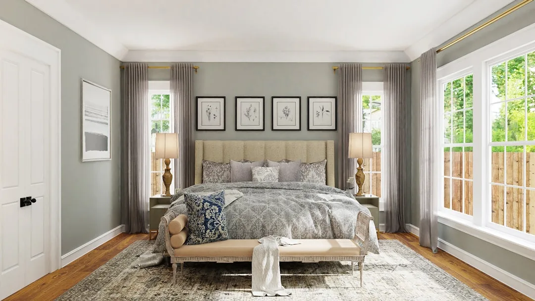
Bedroom: This is actually where violet-undertone grays can work in your favor. Bedrooms are used predominantly in the evening, under warm artificial light. That’s the exact condition where a violet undertone blooms into something that reads as soft lavender. In a bedroom, that’s not a mistake — it’s calming. The undertone shift that ruins a living room becomes an asset in a bedroom if you use it deliberately.
Kitchen and bath: Blue-undertone grays pair well with white cabinetry and chrome or nickel hardware — but confirm your grout color won’t conflict before you commit. As noted above, warm beige grout and a cool blue-gray wall will fight each other continuously.
Home exterior: Green-undertone grays often perform beautifully in exterior applications. Natural light is balanced and full-spectrum, which prevents the undertone spikes you get indoors under artificial light. Green-undertone grays read as sophisticated against landscaping, natural stone, and dark trim in a way that rarely translates well indoors.
Basement and windowless spaces: Avoid cool undertones entirely. Rooms with controlled artificial lighting show the most extreme undertone shifts because there is no neutral daylight to moderate the paint — warm-spectrum bulbs in these spaces can shift a cool gray 30-40% warmer in perceived color temperature, meaning a blue-gray goes greenish and a violet-gray goes pink. Use the warmest brown-undertone gray you can find in these rooms, or step away from gray entirely and consider a warm putty or linen tone.
Takeaway: Match your undertone category to your room’s primary lighting condition and dominant use time. The room tells you what it needs. You just have to listen before you paint.
Frequently Asked Questions
What is a good undertone for grey?
There is no single good undertone — but there is a most forgiving one. Brown undertones, found in greige-adjacent grays like Agreeable Gray or similar warm-gray formulas, behave the most consistently across varied light conditions, room orientations, and mixed furniture styles. For rooms where you’re uncertain, or where you have both natural and artificial light at different hours, a brown-undertone gray is your lowest-risk option. For north-facing rooms specifically, warm undertones are almost always the right choice. For south-facing rooms with abundant warm sunlight, cool blue undertones work beautifully. The “good” undertone is the one that counterbalances your room’s existing light conditions rather than intensifying them.
What color is replacing grey in 2026?
Gray isn’t being replaced by something radically different — it’s being replaced by an evolved version of itself. Warm putty tones, soft stone, clay-adjacent neutrals, and mushroom colors are the directions gaining traction heading into 2026. These are essentially grays where the brown undertone has been pushed forward so decisively that the color stops being ambiguous. They behave more predictably than cool grays because their warmth is explicit rather than hidden. The shift reflects years of consumer frustration with blue and violet undertones behaving unexpectedly — and a collective move toward colors that deliver what they promise.
What are the four undertones of grey?
Most sources list three: blue, violet, and green. The fourth — and the one most frequently left out — is brown. Brown undertones appear in some of the most commercially successful gray paints on the market, including grays that are typically sold as “warm gray” without further explanation. A gray with brown undertones will drift toward taupe under warm artificial light and hold a genuine gray in cooler, natural light. Understanding all four undertones — blue, violet, green, and brown — gives you the complete picture of what a gray paint formula may be hiding, and why the same chip reads differently under different conditions.
What gray paint color has no undertones?
No commercial gray paint is completely undertone-free. A true neutral gray sits at a=0 and b=0 on the CIE color scale — a technical standard that virtually no mass-market paint achieves exactly. Colors frequently marketed as near-neutral, like Sherwin-Williams Repose Gray or Benjamin Moore Stonington Gray, both have measurable undertones that become visible under specific lighting conditions. Custom zero-chroma gray can be mixed at professional paint suppliers, but in practice, a truly undertone-free gray reads flat, institutional, and lifeless in residential spaces. What most people actually want isn’t no undertone — it’s an undertone that doesn’t call attention to itself. A mid-LRV brown-undertone gray typically fits that description better than anything marketed as “pure neutral.”
One thing you can do right now: Go stand in the room you’re planning to paint. Not with chips, not with your phone open to a paint website. Just stand in it. Look at your floor. Look at your trim. Look at the furniture that isn’t going anywhere. Every one of those surfaces is an undertone activator, and understanding what they already carry will tell you more about which gray will work than any swatch ever could. Write down what you see — warm, cool, brown, blue — and take that list to the paint store with you. That’s the conversation that prevents the repaint.