Most warm whites don’t turn yellow in the paint store — they turn yellow in your living room, under your lights, next to your floors, and it has almost nothing to do with the color you chose.
Quick Answer
Most warm whites don’t turn yellow in the paint store — they turn yellow in your living room, under your lights, next to your floors, and it has almost nothing to do with the color you chose.
I’ve watched this happen to clients more times than I can count. They pick something from a chip that looks soft and creamy and intentional, they pay for a full paint job, and then they walk back into their living room at 7pm on a Tuesday and the walls look like aged mustard. The panic call comes next. And nine times out of ten, when I actually go over and look — the paint is fine. The situation is broken.
That distinction matters enormously, because the fix is completely different depending on which one you’re dealing with.
What Makes a Warm White Different From Just ‘Off-White’
In This Article
- What Makes a Warm White Different From Just ‘Off-White’
- The Real Reason Your Warm White Looks Yellow (It’s Not the Paint)
- What Is a Warm White Color for a Room — and How to Match It to Your Space
- What Is the Most Popular Warm White Paint Color (and Should You Actually Use It)
- What Is the Best Warm White That Doesn’t Look Yellow — Specific Options by Room Condition
- What Is a Warm Shade of White Paint — Understanding the Spectrum From Barely Warm to Near-Cream
- How to Test Warm White Paint Before Committing — The Process That Saves Repaints
- Pairing Warm White Walls With Trim, Ceilings, and Accents Without Looking Washed Out
“Off-white” is one of those terms that sounds specific but means absolutely nothing. I’ve seen paint labeled off-white in a store that had a distinctly green undertone, a pink one, and a yellow one — all sitting next to each other on the same display. The word tells you nothing useful about how a color will actually behave on your walls.
Warm white is a specific zone on the Light Reflectance Value scale — typically between 82 and 92 LRV — where colors sit between pure white and cream without crossing into either territory. For reference: pure white on the LRV scale registers at 100, pure black at 0. Most warm whites cluster in that 82–92 range, which means they’re still bouncing the majority of light back into the room while carrying just enough color to feel deliberate rather than sterile.
What separates a warm white from a yellow paint isn’t just hue — it’s chroma, which is the saturation level of the color. Once you drop below LRV 80 and the chroma climbs, you’ve crossed out of warm white and into yellow. The visual difference is exactly what you’d expect: warm whites feel cozy; high-chroma yellows feel aggressive, even at low saturation.
The undertone direction is where things get genuinely complicated. Off-white tells you the color is lighter than cream. It doesn’t tell you whether the undertone is pulling toward pink, green, yellow, or beige — and those four directions behave completely differently depending on your room’s fixed elements and light conditions.
Here’s the practical breakdown of undertone directions in warm whites:
- Yellow-based warm whites: Read warm and sun-drenched in the right light; tip into dingy or greenish in north-facing rooms
- Pink-based warm whites: Flatter most skin tones; work beautifully against warm wood floors; occasionally read lavender under cool lighting
- Greige-based warm whites: The most forgiving category; hold up across multiple light conditions without significant shifting
- Beige-based warm whites: Traditional, grounded; can feel heavy in small rooms without enough natural light
Actionable takeaway: Before you even look at specific colors, identify your undertone direction by holding a pure white piece of paper next to your chip. Whatever direction the chip pulls away from that white — that’s your undertone.
The Real Reason Your Warm White Looks Yellow (It’s Not the Paint)
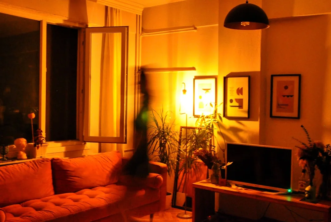
Here’s what nobody tells you clearly: bulbs do more damage to warm whites than almost any paint choice you could make. I learned this the hard way on a project in Lincoln Park — a client had Sherwin-Williams Alabaster on the walls of her living room and she was convinced the painter had used the wrong color. The walls looked unmistakably yellow. I walked in, turned on the overhead light, and immediately saw the problem. She had vintage-style Edison bulbs running at 2200K scattered across three lamps and a chandelier. The paint was perfect. The bulbs were catastrophic.
Color temperature is measured in Kelvin, and it matters more than most paint tutorials will admit. At 2700K — the warm, amber end of the LED spectrum — any warm white will read noticeably yellower than it does in a paint store’s lighting. At 3000K, you get neutral warmth that lets the paint’s actual undertone come through. At 4000K, you’re in cool-white territory that starts pulling warm whites toward gray.
South-facing living rooms with warm-temperature bulbs are the single most common culprit behind the “it looked fine in the store” problem. You’re layering direct afternoon sun — which already has a warm yellow cast — on top of artificially warm light sources. The warm undertone in your paint gets amplified twice, and the result looks like something went wrong even when nothing did.
Natural light direction also shifts the apparent color by what I estimate at three to four visual shades depending on the time of day. A color that reads beautifully at noon can look completely different at 7am or 7pm. That’s not the paint being inconsistent — that’s physics.
The chip test process that actually works:
- Paint a minimum 12×12 inch sample board — not directly on the wall
- Observe it at 7am with whatever morning light your room gets
- Check again at noon under full ambient conditions
- Look at it at 7pm with all your actual light fixtures turned on
- Note whether the shift between morning and evening feels acceptable to you
The fix, more often than not, is switching to a 3000K–3500K LED bulb rather than repainting. That adjustment alone has saved three clients of mine from completely unnecessary repaint jobs.
Actionable takeaway: Before buying a single sample pot, replace one bulb in your living room with a 3000K LED and observe what happens to your existing wall color. If it reads better, your diagnosis is done.
What Is a Warm White Color for a Room — and How to Match It to Your Space
The question I got asked constantly wasn’t “what’s a good warm white” — it was “what’s a good warm white for my room.” Those are completely different questions, and the second one is the only one worth answering.
Room size determines your LRV floor. Small living rooms — anything under roughly 200 square feet — need warm whites sitting at LRV 88 or above. Below that threshold, the color absorbs too much light and the room starts feeling enclosed in a way that has nothing to do with furniture arrangement or window size. I once watched a client paint a 160-square-foot studio living area in Farrow & Ball’s Pointing, which sits at a lower LRV than most people expect, and the room went from tight-but-manageable to genuinely oppressive. We repainted. Lesson retained.
The fixed elements in your room are non-negotiable variables that determine which undertone direction you can actually use. Before you choose any color, audit these four things:
- Flooring undertone: Dark hardwood with orange tones will pull yellow-based warm whites toward orange on the walls — choose pink- or greige-based whites to neutralize
- Trim color: Bright white trim needs a warm white with LRV 88+ on the walls to avoid looking gray by comparison; soft white trim can pair with a wider range
- Natural stone or tile: Beige or tan tile reads warm; gray tile reads cool — your wall color needs to acknowledge whichever you’re working with
- Permanent wood tones: Honey oak reads very differently than walnut, and your warm white undertone needs to harmonize with whichever one is dominant in the space
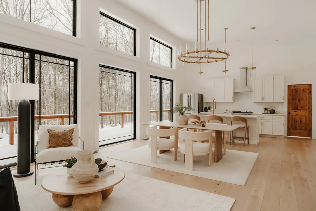
High-ceiling rooms get a bit more latitude. Rooms with ceilings at ten feet or above can handle warm whites down to LRV 83 without feeling closed-in, because the vertical space absorbs the darker value without compressing the room’s perceived volume. That’s where colors like Alabaster get to shine — they’re genuinely beautiful in rooms with architectural scale.
Open-plan spaces connecting a living room to a kitchen present a specific challenge: the warm white has to hold up under both ambient living room light and under kitchen task lighting, which is often cooler and more direct. Colors with strong yellow undertones tend to shift noticeably between the two zones. Greige-based warm whites are almost always the right call here.
Actionable takeaway: Write down your flooring undertone, trim color, and ceiling height before you look at a single paint chip. Those three variables will immediately eliminate at least half the options on your consideration list.
What Is the Most Popular Warm White Paint Color (and Should You Actually Use It)
Sherwin-Williams Alabaster is the most-searched warm white on the internet. That’s not an opinion — it’s a consistent pattern that’s been true long enough that the design industry treats it as established fact. But Alabaster’s LRV of 82 makes it noticeably darker than most people realize when they’re drawn to it on a chip or in someone’s Instagram renovation photos.
The thing about Alabaster is that it photographs beautifully because cameras tend to boost exposure slightly, which bumps the apparent LRV. In real life, in a north-facing living room with modest window coverage, it reads as a warm beige — not a white at all. I’ve seen it on walls in three different north-facing Chicago apartments and it looked muddy in all three. In south-facing rooms with high ceilings? Spectacular. The color earns its reputation in the right context.
Benjamin Moore White Dove (OC-17) is the designer’s choice for a different reason entirely. Its LRV of 92.2 reads almost as a pure white with just a whisper of warmth — it’s the color designers reach for when clients want warmth but are nervous about commitment. Simply White (OC-17’s close neighbor at LRV 91.7) skews slightly more yellow and performs better in rooms that need some life added to them.
Here’s why the LRV numbers matter in practice:
| Color | LRV | Undertone | Works Best In | Struggles In |
|---|---|---|---|---|
| SW Alabaster | 82 | Yellow-beige | South-facing, high-ceiling rooms | North-facing, small rooms |
| BM White Dove | 92.2 | Warm neutral | North-facing, smaller rooms | Rooms with lots of warm wood |
| BM Simply White | 91.7 | Warm yellow | Light-filled rooms wanting warmth | Rooms with orange-toned floors |
The hidden risk of defaulting to the most popular choice is a mismatch nobody warned you about. When your living room has cool-toned furniture — charcoal sofas, cool gray rugs, slate tile — Alabaster’s yellow-beige undertone will fight everything in the room and look like someone made a mistake.
Popularity means the color works in the conditions where it was photographed. It says nothing about your conditions.
Actionable takeaway: Look up the LRV of any “popular” warm white you’re considering before you buy a sample. If the number surprises you, that’s information.
What Is the Best Warm White That Doesn’t Look Yellow — Specific Options by Room Condition
Generic lists of warm whites are everywhere. What they don’t give you is conditional logic — which color for which room situation. After years of seeing the same mismatches repeated, here’s how I actually think about this:
For south-facing living rooms with warm lighting, you’re working with a room that already has natural warmth baked in. You don’t need the paint to add more. Benjamin Moore Chantilly Lace (OC-65) is technically a cool white but reads as a clean, barely-warm neutral in south-facing light — the sun does the warming for you. Sherwin-Williams Alabaster works here too, precisely because the strong ambient light keeps it from going muddy.
For north-facing rooms where yellow is the real risk, you need high LRV and minimal yellow undertone. Benjamin Moore White Dove is the most reliable choice here — the 92.2 LRV keeps it bright, and its neutral-warm undertone doesn’t tip yellow under cool indirect light. Farrow & Ball All White is another strong option; it’s marginally more expensive per gallon but reads remarkably clean without going clinical.
For rooms with warm wood floors — particularly orange-toned oak or honey pine — avoid any warm white with a yellow base entirely. The floor already supplies all the yellow you need. Reach instead for Benjamin Moore Navajo White, which carries a pink-beige undertone that complements rather than doubles the wood tones. Sherwin-Williams Accessible Beige technically crosses into greige territory, but in rooms with warm wood it acts as a warm white anchor that ties everything together.
For open-plan living and kitchen combinations, Sherwin-Williams White Snow (SW 7010) has become my go-to precisely because it holds up under both ambient and task lighting without shifting into a different apparent color when you cross from one zone to the other. Its undertone is neutral enough to survive kitchen LEDs without going gray.
For high-contrast modern living rooms where you want warmth without cream, Benjamin Moore Cloud White (OC-130) walks that line with unusual reliability. It reads as a warm white in warm light and a clean white in cool light — which is a rare versatility.
Here’s the full comparison breakdown:
| Color | LRV | Undertone Direction | Best Room Condition | Worst Room Condition |
|---|---|---|---|---|
| BM Chantilly Lace OC-65 | 92.5 | Barely-warm neutral | South-facing, modern rooms | Dark or heavily shadowed rooms |
| SW Alabaster SW 7008 | 82 | Yellow-beige | South-facing, high ceilings | North-facing, small rooms |
| BM White Dove OC-17 | 92.2 | Neutral warm | North-facing, designer interiors | Heavy warm wood flooring |
| BM Navajo White OC-95 | 85.6 | Pink-beige | Warm wood floors, traditional rooms | Cool modern spaces |
| SW White Snow SW 7010 | 91 | Greige-neutral | Open-plan, mixed lighting | Rooms wanting obvious warmth |
| BM Cloud White OC-130 | 89.2 | Soft warm | High-contrast modern rooms | Very dark or dramatic spaces |
Actionable takeaway: Identify your room condition first — light direction, floor tone, lighting temperature — then match to the table above rather than picking a color and hoping it works.
What Is a Warm Shade of White Paint — Understanding the Spectrum From Barely Warm to Near-Cream
There’s a spectrum here that most people collapse into a single category, and it causes real problems. “Warm white” covers an enormous range — from something that reads nearly identical to a crisp white to something that sits comfortably next to cream. The commitment level you choose has lasting consequences for how the rest of your room needs to be designed.
Level 1 — LRV 90–95 — is the barely-warm zone. Chantilly Lace lives here, as does Swiss Coffee at the lower edge. These colors read as bright whites with a whisper of warmth that you might only notice if you hold them against something truly white. Modern spaces wanting softness without sentimentality belong here. The risk is that in inadequate light, Level 1 can read as dirty white rather than intentionally warm — so you need either strong natural light or well-chosen artificial lighting to make it work.
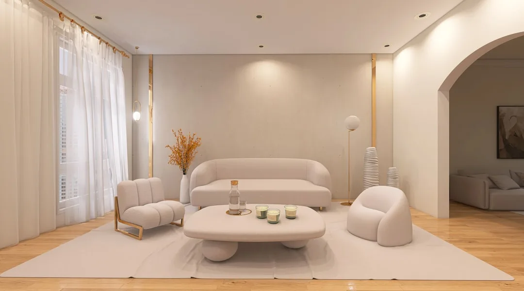
Level 2 — LRV 83–90 — is the classic warm white. Alabaster, White Dove, Simply White. This is where most people land when they say “I want a warm white for my living room.” The warmth is noticeable. It reads intentional. It changes the entire character of a space from corporate-neutral to lived-in. This level works with the widest range of design styles, from transitional to Scandinavian to farmhouse.
Level 3 — LRV 70–83 — is where warm white becomes warm-leaning cream. Navajo White and Benjamin Moore Linen White live here. Traditional living rooms, rooms with antique furniture, spaces with exposed beams or brick — these settings absorb the warmth and give it back as richness. In a minimalist space with flat surfaces and sparse furniture, Level 3 can feel overwhelming and slightly yellowed even when it isn’t.
How to decide which level your room needs:
- Count the saturated colors already in the room: the more color present in furniture, rugs, and art, the lower the warmth level you need in the walls
- Look at your trim: Level 1 warm whites need bright white trim to avoid looking gray by comparison; Level 3 needs soft or antique white trim to look purposeful rather than accidental
- Consider the season you live in most: rooms in cold-climate cities where the windows are often closed and light is limited tend to benefit from Level 2 or 3; rooms with year-round sun can handle Level 1 without feeling cold
Actionable takeaway: Decide which level you’re targeting before you look at specific colors — it cuts the decision field by two-thirds immediately.
How to Test Warm White Paint Before Committing — The Process That Saves Repaints
A full repaint because you trusted a 2×3 inch chip. I’ve seen it happen. The cost isn’t just money — it’s the particular kind of frustration that comes from knowing you could have spent $15 on sample pots and avoided all of it.
The cardinal rule is this: paint large boards, not walls. A 12×12 inch piece of foam board or primed cardboard gives you enough surface area to see the color behave, and — critically — you can move it around the room. Paint directly on the wall and you’re committed to observing it in one spot forever. Move a sample board and you’ll immediately see how the color changes when it’s three feet from the window versus the darkest corner.
The three-observation protocol isn’t arbitrary:
- 7am: Cool morning light reveals any gray or cool cast hiding in the undertone
- Noon: Neutral ambient light shows you the color closest to how it was mixed
- 7pm with your fixtures on: This is where warm whites either survive or collapse — if it looks yellow here, it will always look yellow
Place your sample board — not a tiny chip, the full board — directly next to the largest fixed element in the room. If you have a dark walnut media console, hold the board against it. If you have a cream sofa, same thing. Undertone conflicts that are invisible on a chip become obvious at board scale next to real materials.
The 48-hour rule exists because rooms feel different on overcast days than on sunny ones. A warm white that looks perfect on a bright Saturday afternoon can read as yellow and flat on a gray Tuesday. You need to observe both.
Why digital visualizers fail you consistently: every screen renders color differently based on calibration, brightness settings, and the ambient light around the screen itself. I’ve used the major paint brand apps and they have never — not once — accurately represented how a color read in the actual room afterward. They’re useful for eliminating obvious mismatches. They are not a substitute for physical samples.
The industry recommendation that actually holds up in practice: test at least three colors simultaneously on the same wall section or board. Comparison is what reveals undertone differences. A warm white in isolation tells you almost nothing; the same warm white next to two competitors immediately tells you which direction each one pulls.
Actionable takeaway: Buy three sample pots today, paint three boards, and observe them across the same 48-hour period before you make any decision.
Pairing Warm White Walls With Trim, Ceilings, and Accents Without Looking Washed Out
Getting the wall color right and then having the rest of the room flatten out is one of the most common finishing mistakes I’ve seen — and I’ve made a version of it myself. On an early project, I matched a client’s walls and trim so closely that the room looked like it had been dipped in a single color with no definition anywhere. Beautiful color. Formless room.
The LRV contrast principle is your structural guide: a 7–10 LRV point difference between wall warm white and trim creates visible, cohesive definition. Below 5 points, the contrast looks accidental — like you ran out of one paint and used another. Above 15 points, the contrast turns stark and fights the warm, enveloping feeling you were trying to create in the first place.
Trim strategy maps directly to the wall LRV you chose. If your walls are at LRV 85, your trim wants to be at LRV 92 or higher — a brighter white that frames the warm wall without introducing cold contrast. Benjamin Moore Chantilly Lace is a reliable trim choice for walls in the Level 2 warm white range.
Ceilings deserve their own logic. A ceiling painted the exact same warm white as the walls creates a box — cozy for some, suffocating for others. The ceiling should always read one shade lighter than the wall, which usually means going up 3–5 LRV points. A bright white ceiling lifts the eye and adds perceived height without creating the jarring stop that a stark white ceiling creates above a very warm wall.
Accent color pairings that actually honor the warmth rather than fighting it:
- Terracotta and clay tones: sit naturally within the warm spectrum without competing
- Warm navy: the contrast is strong but the temperature is compatible — dark and warm plays beautifully against a warm white backdrop
- Sage and muted olive greens: earthy enough to feel harmonious; avoid yellow-greens which amplify the undertone
- Ochre and mustard as accents: used in small doses — a throw, a cushion, a piece of art — these reinforce the warmth without overwhelming it
The metallics question trips people up. Brass and bronze are the natural hardware companions for warm whites — they share a temperature family and reinforce each other. Chrome and polished nickel fight the warm undertone because they introduce cool-blue reflections that make the wall color look dirtier by comparison. This isn’t a rigid rule — mixed metals are increasingly common — but if you’re choosing primary hardware, lean warm.
Warm white walls do something useful for art that cold white walls don’t. The slightly warm surface causes artwork colors to appear slightly more saturated by contrast, which means your living room gallery wall will read richer than it would on a crisp cool white. That’s not a styling trick — it’s a basic principle of simultaneous contrast, and it consistently delights clients when they notice it.
Actionable takeaway: When finalizing your wall color, hold your trim sample and your wall sample together and count the LRV difference. If it’s below 7, go brighter on the trim.
Frequently Asked Questions
What is the most popular warm white paint color?
Sherwin-Williams Alabaster (SW 7008) is the most searched and most frequently appearing warm white in renovation content and social media. Its LRV of 82 gives it a noticeably warm, soft quality that reads beautifully in well-lit and south-facing rooms. Benjamin Moore White Dove (OC-17) is the more popular choice among professional interior designers specifically — its higher LRV of 92.2 makes it more versatile across different lighting conditions, and it holds up in smaller or north-facing rooms where Alabaster can tip muddy. Both are legitimate choices; they perform differently enough that room conditions, not popularity, should drive the decision.
What is a warm white color for a room?
A warm white for a room is any paint color sitting roughly between LRV 82 and 92 that carries a yellow, pink, beige, or greige undertone rather than a blue or green one. It sits above cream in brightness but below pure white in coolness. The right warm white for your room depends on your light direction, flooring undertone, ceiling height, and existing fixed elements. A warm white that works beautifully in a south-facing room with oak floors will look completely different — sometimes wrong — in a north-facing room with gray tile. The color category is a starting point; room conditions are the filter.
What is a warm shade of white paint?
Warm shades of white fall on a spectrum with three general levels. Barely-warm whites (LRV 90–95) like Chantilly Lace read almost as bright whites and work best in modern spaces wanting minimal softness. Classic warm whites (LRV 83–90) like Alabaster and White Dove are the most versatile, reading as intentionally warm without suggesting cream. Warm-leaning creams (LRV 70–83) like Navajo White and Linen White belong in traditional or rustic spaces with natural materials, antique furniture, and architectural detail that can absorb and return the richness. The distinction matters because the lower you go in LRV and the higher you go in warmth, the more deliberately the rest of the room needs to be styled to match.
What is the best warm white that doesn’t look yellow?
The warm whites least likely to tip yellow under typical living room lighting are those with pink or greige undertones rather than yellow ones. Benjamin Moore White Dove (OC-17) is the most reliable — its high LRV and neutral-warm undertone resist yellowing under most lighting conditions. Farrow & Ball All White performs similarly for those willing to pay the premium. For rooms with warm wood floors specifically, Benjamin Moore Navajo White’s pink-beige undertone neutralizes the orange in the wood rather than amplifying it. The most important variable isn’t the paint itself but your bulb color temperature — switching to 3000K–3500K LED bulbs eliminates the majority of yellow-cast complaints before you change a drop of paint.
Right now, today — not when you’re ready to buy paint, not when the room is finished — go into your living room at 7pm, turn on every light you normally use, and look at your current walls or your current color chip. If what you see looks yellower than you expected, change one bulb to a 3000K LED before you do anything else. Then pull three sample boards. Then look at the table in the fifth section of this article and match your room conditions to a color. That sequence, in that order, is the thing that actually prevents a repaint.