The average person has hundreds of home decor images saved across Pinterest, Instagram, and their camera roll — and has implemented almost none of them. Not because they lack taste. Because no one taught them how to filter inspiration for the room they actually live in.
That gap — between the beautiful image and the actual room — isn’t a creativity problem. It’s a system problem. And it’s fixable.
Why Your Home Decor Inspiration Isn’t Working (And It’s Not Your Taste)
Pinterest has over 500 million monthly active users, and home decor consistently ranks among the most-searched categories on the platform. Yet if you spend five minutes in threads like r/malelivingspace or r/femalelivingspace, you’ll find the same story repeating: people with beautiful, carefully curated saved folders who haven’t changed a single thing about their actual apartment in two years. Renovation regret and decorating paralysis are common — and they almost always trace back to the same root cause.
The bottleneck isn’t imagination. It’s translation.
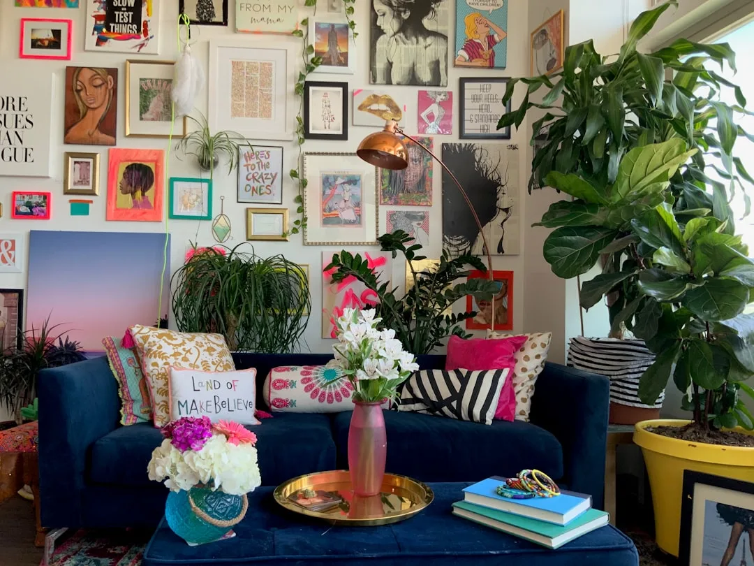
Social media platforms are built to surface aspirational content — professionally styled, photographed with wide-angle lenses under controlled lighting, and staged in spaces that have been emptied of real life before the shoot. That 650-square-foot studio in your saves? It photographs like 1,200 square feet. The “cozy dark academia reading nook” was shot with three off-camera lights and a smoke machine. None of that information is in the image.
There’s also the issue of volume. Saving inspiration before auditing your actual space is like grocery shopping before checking your fridge. You come home with things that don’t fit, duplicate what you already have, and ignore what’s actually missing.
The result is decision fatigue layered on top of aesthetic confusion — which is why most decorating attempts stall before a single item gets ordered.
What works is a completely different sequence: assess first, then collect. Every image you save after understanding your real constraints is automatically filtered for relevance. Every image you save before is mostly noise.
> Actionable takeaway: Before opening Pinterest or Instagram today, close every tab and open your phone’s notes app. Write down your three biggest spatial constraints — something like “no painting walls,” “8-foot ceilings,” “no direct sunlight.” That list is your first filter.
Step One: Audit Your Space Before You Save a Single Image
Most decorating advice skips straight to the fun part — mood boards, color palettes, accent chairs. But the designers whose rooms actually look good in real life, not just in photos, always start with the room itself.
Here’s what a proper space audit covers:
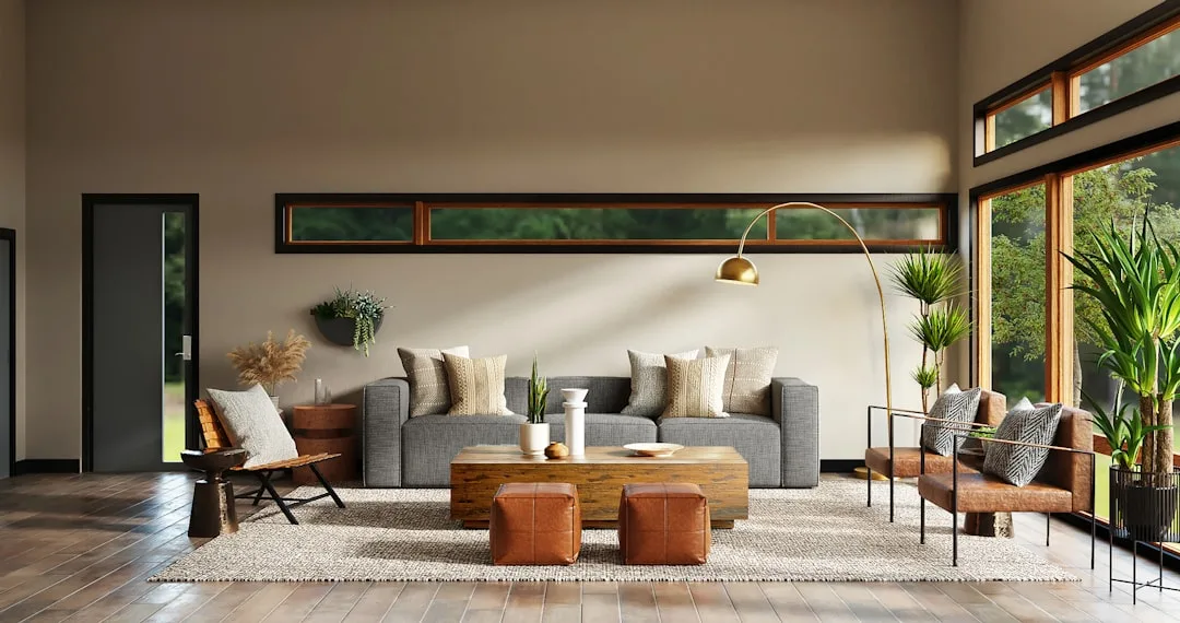
Measure everything. Every wall length, doorway width, ceiling height, and window placement. Write it in a phone note or sketch a rough floor plan — nothing fancy, just accurate. You need to know, for instance, that your living room is 14 feet wide before you fall in love with a sectional that requires 16. A standard three-seat sofa runs about 84–96 inches wide. A king bed needs at least 10 feet of wall clearance with nightstands on both sides. These numbers aren’t optional — they’re the difference between a room that works and one that always feels slightly off.
Map your light conditions by room. Note whether each room gets morning sun (east-facing), afternoon sun (west-facing), all-day sun (south-facing), or almost none (north-facing). This single piece of information eliminates entire color palettes upfront. A warm terracotta that looks incredible in a south-facing room turns muddy in a north-facing one. Cool whites that feel crisp in afternoon light can read blue and cold in rooms that never see direct sun.
Document your non-negotiables. This is where most people underestimate their constraints. Approximately 36% of U.S. households rent, according to the National Association of Realtors — meaning more than a third of everyone searching for home decor inspiration is working inside landlord restrictions that most of that inspiration completely ignores. No painting walls. No drilling into tile. No permanent fixtures. These aren’t creative enemies. They’re guardrails that actually focus your decisions.
Also write down: existing furniture you’re keeping (with dimensions), a realistic monthly budget cap, and any functional requirements — like a home office corner that can’t move, or a dog who destroys anything below knee height.
> Actionable takeaway: Spend 20 minutes this week measuring your three most-used rooms and recording the numbers in your phone. Add your light conditions and rental restrictions. That document will save you hundreds of dollars in return shipping fees alone.
How to Identify Your Real Design Style vs. Your Aspirational One

Here’s something most style quizzes won’t tell you: the aesthetic you’re drawn to in photos and the aesthetic you’ll actually be happy living in every day are often two different things.
The most reliable way to find your real style is to stop looking outward and start looking at what you already have. The objects you’ve kept and genuinely loved for over a year — not displayed out of obligation, but because you actually like seeing them — those reveal your real taste far more honestly than any saved folder. Is there a consistent warmth, a preference for natural materials, an instinct toward clean surfaces? That pattern is your baseline.
Then apply what experienced interior designers call the “morning test.” Imagine yourself in that dark-green, velvet-draped, maximalist room at 7am on a Tuesday when you’re tired and running late. Some people feel energized by visual richness at any hour. Others need visual calm in the morning and find that the rooms they pinned at 11pm on a Saturday feel oppressive in daily use. Neither response is wrong — but knowing your answer before you buy $800 worth of dark-green linen curtains is worth the 60 seconds of honest reflection.
Now go back to your saved images and look for patterns:
- What colors appear in more than 70% of your saves? That’s your actual palette preference.
- What’s the consistent clutter level? Open shelves look gorgeous in editorial photos and require weekly styling to maintain. If you hate that kind of upkeep, that’s a conflict worth resolving before you buy a Kallax unit.
- What scale of furniture recurs? Big, low-profile pieces signal a preference for visual weight and groundedness. Lots of legs and light frames signal an preference for airiness. Your instinct here is usually consistent.
Design psychologists who study what’s called “environmental fit” — how well a space matches the way a person actually inhabits it — consistently find that lifestyle-aligned interiors produce significantly higher long-term satisfaction than trend-chased rooms. A room built around how you live beats a room built around how you wish you lived, every single time.
> Actionable takeaway: Open your saved folders right now and tag each image as either “I’d want to wake up in this” or “beautiful but not for me.” The first group is your real style. The second is just entertainment.
Building Your Filter Framework: A System for Collecting Only Relevant Inspiration
Random saving is how you end up with 400 pins and zero direction. A simple folder structure changes everything — not because organization is inherently virtuous, but because the act of categorizing forces you to evaluate each image before it enters your reference set.
Set up three folders:
- Full Room Vibe — Overall mood and atmosphere. These images aren’t meant to be replicated; they’re meant to remind you how you want the finished room to feel.
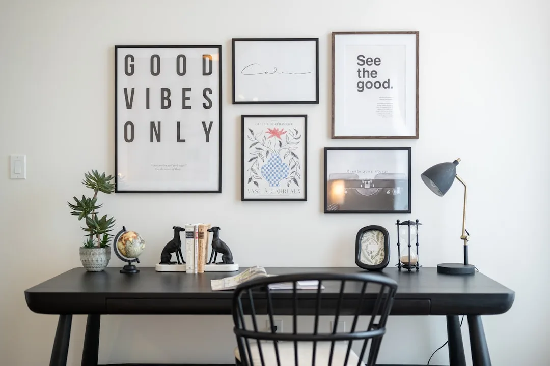
- Specific Elements I Can Actually Use — A lamp you can source, a gallery wall arrangement that fits your wall dimensions, a paint color that works in your light. Every image in this folder should have a direct path to implementation.
- Reference Only — Techniques, proportions, and spatial relationships to learn from. The way a rug anchors a seating area. How high that mirror is hung. The ratio of dark to light in a room that feels balanced. You’re extracting principles here, not copying objects.
Before saving any image, run it through a three-second filter: Does this work with my light? Does this fit my square footage? Can I afford a version of this? If it fails two of three, don’t save it. That single rule cuts most people’s saved folders by 60% — and makes the remaining 40% genuinely useful.
Cognitive load research shows that decision fatigue sets in dramatically after evaluating more than 20 options in a single category. Keeping a constraint-filtered inspiration folder of under 30 images per room isn’t a limitation — it’s the condition under which good decisions actually get made. More saves don’t equal better outcomes. Fewer, better saves do.
Also use Pinterest’s reverse-image and “shop the look” tools strategically — not to buy exactly what’s shown, but to identify the design elements you actually respond to. Is it the finish (matte brass vs. polished chrome)? The silhouette (tapered leg vs. chunky base)? The scale? Once you know what specifically appeals to you, you can find it at any price point.
> Actionable takeaway: Create your three folders today. Then take your 10 most-saved existing images and sort them. You’ll immediately see which ones have a clear path to your actual room — and which ones were just pretty pictures.
How to Translate a Pinterest or Instagram Image Into a Real Room
Professional interior photographers routinely use wide-angle lenses — typically 16–24mm — that make rooms appear significantly larger than they are. A room that looks 400 square feet in an editorial spread may be 180 square feet in reality. This is the single biggest reason direct replication fails: you’re trying to recreate proportions that don’t exist.
The fix is deconstruction. Break every inspiration image into five layers:
- Architecture — Walls, floors, ceiling height, window placement. Mostly fixed.
- Large furniture — Sofa, bed, dining table, major storage.
- Accent furniture — Side tables, shelving, accent chairs.
- Textiles — Rug, curtains, throw pillows, bedding.
- Objects — Art, plants, books, decorative items.
Here’s the key insight: you only need to nail three of five layers to capture the feel of a room. Most people try to recreate all five simultaneously, run out of budget or space, and abandon the whole project. Pick the three layers where your inspiration image is strongest and work backward from there.
In each image, identify the “hero element” — the one thing that’s doing most of the work. In a Japandi-style living room, it might be a low-profile walnut credenza. In a moody bedroom, it might be a woven rattan pendant light. Reverse-engineer your budget toward that single anchor piece, and build everything else around it more affordably.
Lighting is the most underestimated translation tool. That dark, atmospheric library aesthetic you saved? It looks that way because of specific warm-toned bulbs (usually 2700K), directional floor lamps, and the absence of overhead lighting. You can recreate that mood in your actual room with a $90 Brightech floor lamp loaded with 2700K bulbs before you commit to a single can of Benjamin Moore Wrought Iron.
> Actionable takeaway: Take one saved image you love and spend five minutes identifying its hero element. That’s the one thing worth spending real money on. Everything else can be approximate.
Budget Calibration: Finding Inspiration at Your Actual Price Point
The U.S. home furnishings market is valued at over $115 billion annually — but searches for “budget home decor” and “affordable room makeover” consistently outpace searches for luxury equivalents. Most people searching for inspiration need budget-filtered references. Most content serves them designer showrooms instead.
Fix this by searching smarter, not harder. Add price anchors directly to your search terms:
- “Japandi living room IKEA”
- “dark academia bedroom under $500”
- “rental-friendly gallery wall no holes”
- “mid-century bedroom thrifted”
These qualifiers immediately surface solutions from people who solved the same problem with the same constraints — not professional stylists working with a $30,000 client budget.
Then apply the 80/20 budget rule: spend approximately 80% of your room budget on the one or two items that carry the most visual weight. In a living room, that’s almost always the sofa or the primary light fixture. In a bedroom, it’s the bed frame and the overhead or bedside lighting. Everything else — side tables, throws, art — can be sourced from IKEA, thrift stores, or Etsy at a fraction of the cost without materially affecting the room’s overall quality.
For real-budget inspiration with receipts:
- r/malelivingspace and r/femalelivingspace regularly feature full room transformations with itemized costs — a $2,400 living room refresh with IKEA, Facebook Marketplace, and one splurge item is far more useful than an Architectural Digest feature.
- @thriftedandthriving and similar “before/after with receipts” accounts on Instagram show exactly what things cost and where they were sourced.
- IKEA’s room visualizer lets you test actual product dimensions in a room that matches your measurements — free, and underused.
> Actionable takeaway: Before your next purchase, search for the exact aesthetic you want plus “IKEA” or “under $300.” If you find a workable version, your original saved image was just expensive validation of a taste you already had.
Room-Specific Inspiration Strategies for Challenging Spaces
The U.S. Census Bureau reports that the median new single-family home runs about 2,300 square feet — but the majority of first-time decorators and renters work in spaces between 400 and 900 square feet. That segment is massively underrepresented in mainstream home decor content, which means you often need to search specifically for your constraints rather than a general aesthetic.
For small spaces:
Search “[room type] in [X] square feet” — as in “studio apartment in 450 square feet” or “bedroom in 10×12.” This surfaces solutions from people who actually solved your problem rather than aspirational open-plan lofts. Specifically look for furniture with exposed legs (it creates visual breathing room), mirrors placed opposite windows (they genuinely double perceived light), and dual-purpose pieces — the IKEA Hemnes daybed, for example, functions as a sofa by day in a small space without looking like a compromise.
For dark or north-facing rooms:
Stop fighting the darkness with white paint — it reads gray and cold in low-light rooms. Instead, search Scandinavian and Japanese interior accounts specifically. These design traditions have spent decades mastering low-light interiors using warm wood tones, layered artificial lighting at multiple heights, and light-reflective textiles like linen and matte cotton. A room with three warm light sources at different levels feels dramatically warmer than the same room with one overhead light, regardless of wall color.
For rentals:
Make “renter-friendly” and “no-damage” mandatory search filters. Then expand your reference pool to boutique hotel design — an industry that creates high-impact, personality-driven interiors within strict structural limitations that often mirror rental restrictions exactly. Removable wallpaper (brands like Chasing Paper and Tempaper have genuinely good options now), adhesive hooks rated for 5+ pounds, freestanding shelving, and furniture-based room dividers are all strategies hotels and experienced renters use to transform a space without a single nail.
> Actionable takeaway: Search your most difficult room type plus its actual square footage on Pinterest and Google Images this week. You’ll find a completely different, more useful set of references than any general aesthetic search returns.
From Inspired to Implemented: Building a Realistic Action Plan
Consumer behavior research on home improvement projects consistently shows that having a written plan — even a simple phased list — increases project completion rates by over 60% compared to inspiration-only approaches. The difference between the person with a beautiful Pinterest board and the person with a beautiful room is almost always a written plan.
Phase your implementation in three waves:
Wave 1 — Foundational: Wall treatment (paint, removable wallpaper, or a gallery), major furniture, and primary lighting. These are the decisions that everything else is built around. Don’t move to Wave 2 until Wave 1 is complete — this is where “half-finished room” syndrome starts.
Wave 2 — Layered: Rug, curtains, secondary seating or storage, and secondary lighting. This is the phase that makes a room feel intentional rather than furnished. A rug anchors a seating area. Curtains that reach floor-to-ceiling — even in a room with 8-foot ceilings — make the room read taller. These aren’t decorative details; they’re structural to the room’s visual logic.
Wave 3 — Finishing: Art, plants, books, objects, and seasonal textiles. This is the phase most people try to start with — it’s the most fun and the most Instagram-friendly. But objects layered into an unfinished foundation never look the way you planned. They look like clutter.
Assign a timeline and budget ceiling to each wave before purchasing anything. Rooms decorated in one impulsive shopping session almost always feel incoherent because each piece was chosen in isolation — picked to match an image rather than to work within an evolving, coherent system.
Revisit and prune your inspiration folder every 30 days. Tastes shift. Budgets change. And as your room begins to take shape, you’ll see much more clearly what it actually needs versus what you were theoretically attracted to.
> Actionable takeaway: Write your three waves down right now, even if the list is incomplete. Assign a rough budget and a month-by-month timeline. That document — imperfect as it is — is the difference between planning and collecting.
Frequently Asked Questions
How do I figure out my actual home decor style when I like everything I see online?
Liking everything online is normal — you’re responding to good photography, not necessarily to rooms you’d want to live in. The most effective way to find your real style is to look at what you already own and genuinely like. Pull everything you actually use and love out of your current space and look for patterns: Are there consistent materials (wood, metal, ceramic)? Consistent colors? A consistent level of visual complexity? Those patterns reflect real preferences formed through lived experience, not algorithmic browsing.
Then narrow your saved images down to 10 that you’d want to wake up in every day — not your 10 favorites visually, but your 10 most livable. The overlap between what you already own and what those 10 images share is your actual style.
How can I find home decor inspiration that works for a small or awkward space?
Search with dimensions in your terms. “Living room in 12×14” or “studio apartment 400 sq ft” surfaces references from people who solved your exact problem. Mainstream home decor content almost exclusively features large, open-plan spaces — you have to search past it intentionally.
For awkward layouts, look specifically for rooms with similar architectural challenges. Sloped ceilings? Search “attic bedroom decor.” One wall entirely occupied by windows? Search “window-dominant living room.” Someone has already solved your specific spatial puzzle and documented it online — you just have to search precisely enough to find them.
What’s the best way to use Pinterest for home decor without getting overwhelmed?
Use Pinterest as a search engine, not a scroll feed. Go in with a specific query — “warm minimalist bedroom north-facing” or “rental kitchen no paint” — save only what passes your three-second filter (fits my light, fits my space, fits my budget), and leave. The discovery feed is designed to keep you browsing, not to help you decorate. The search function is what actually serves your goal.
Cap each board at 30 images. When you add an image that brings you to 31, delete the weakest one. That constraint forces evaluation and keeps your inspiration functional rather than aspirational.
How do I decorate my home on a tight budget without it looking cheap?
The most important thing to understand is that “cheap” usually looks cheap because of inconsistency — mixing too many styles, too many finishes, and too many scales without intention. A room furnished entirely from IKEA with a consistent aesthetic looks more deliberate than a room mixing one expensive piece with five random budget finds.
Spend your real money on the one or two items that dominate the room visually — the sofa, the bed frame, the statement light. Source everything else from Facebook Marketplace, thrift stores, IKEA’s RÅVAROR and KALLAX lines, or sales from West Elm and Article (both of which regularly discount 40–50% at end of season). Use consistent hardware finishes — if everything metal in your room is matte black or brushed brass, the room reads cohesive regardless of what each piece actually cost.
Plants are the single highest-return decorating investment at any budget. A $12 pothos in a $6 ceramic pot adds more life to a room than most $50 decorative objects.
Here’s what you can do right now, today: open your phone’s notes app and write four things — your most constrained room’s dimensions, its light direction, your single non-negotiable limitation (no painting, must keep the couch, strict $200/month budget), and one room you’ve walked into in real life that made you feel immediately comfortable. Not a photo — a real room you actually stood in.
That four-line note is more useful than 400 saved images. Build from there.