The paint color looked perfect in the store, perfect in the photos, and perfect on the chip — and then you put it on the wall, and something was completely, inexplicably wrong.
You’re not imagining it. You’re not bad at this. The color genuinely did change — and there are specific, documented reasons why. The problem isn’t your taste. It’s that most people use a feelings-first, grab-a-chip approach for a decision that actually requires a sequence of deliberate steps. Skip any one of them, and regret is almost guaranteed.
This guide walks you through the full process professional designers use: not a shortcut, but a repeatable system that gets you to the right color the first time.
Why Most People Choose the Wrong Paint Color (And It’s Not Their Fault)
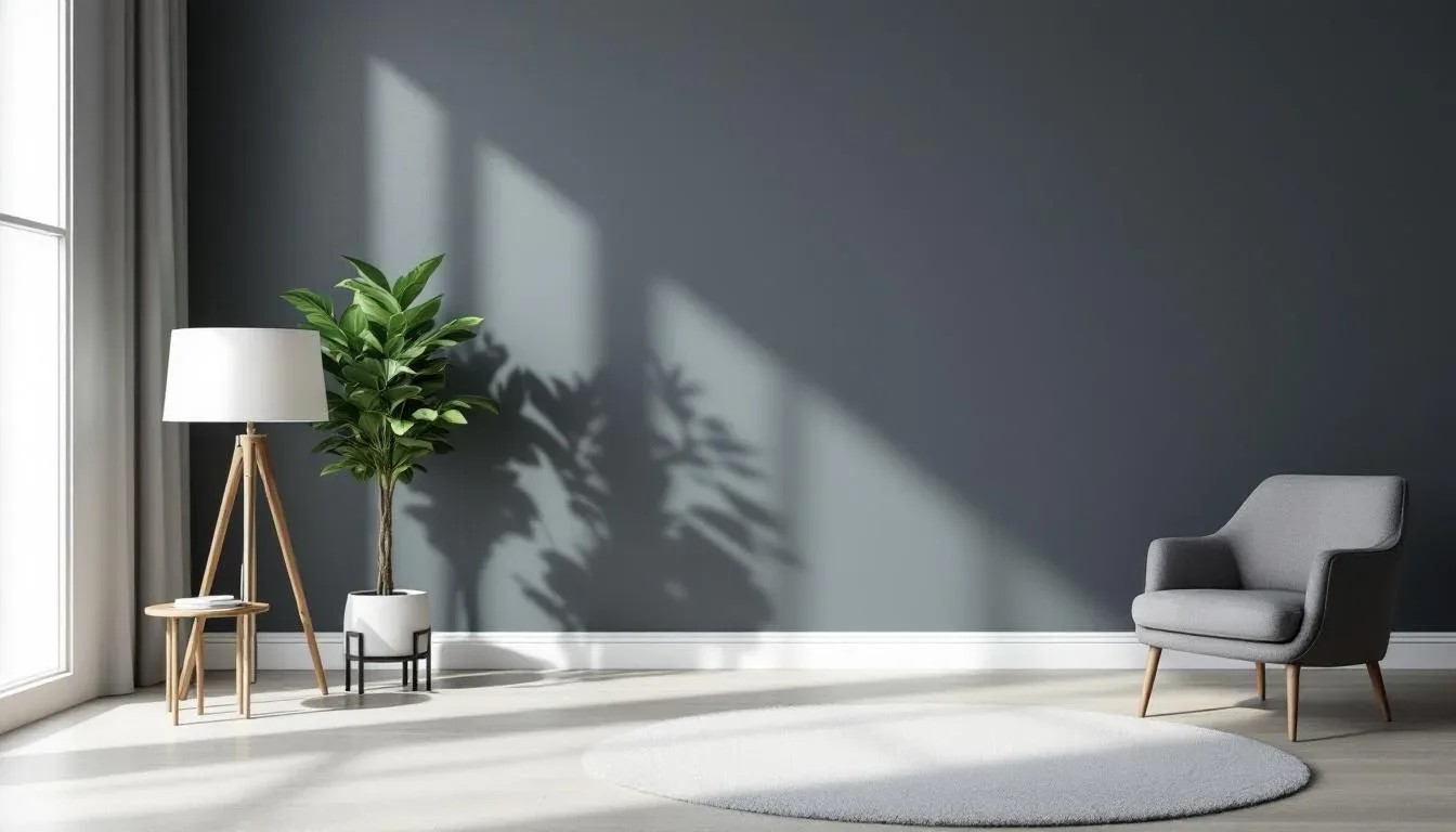
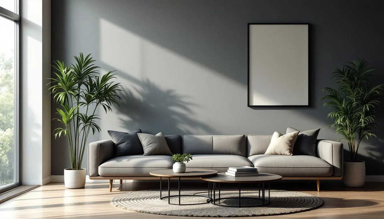
Paint color doesn’t exist in isolation. That’s the core truth nobody tells you directly. The color you see on a chip under fluorescent store lighting is being perceived by your brain without any of the context that will define it in your home — your floors, your trim, your sofa, your windows, the direction they face, the bulbs in your fixtures. Strip all of that away and you’re essentially choosing a color for a room that doesn’t exist.
The human brain evaluates color relationally, not absolutely. Show someone a gray chip in a white-walled store and they see gray. Put that same color on a wall flanked by warm oak floors and ivory trim, and it suddenly reads lavender. Same pigment. Completely different experience. This isn’t a flaw in your perception — it’s exactly how human color vision works.
The systemic failure goes deeper than that, though. Most paint guides, including the ones produced by the paint brands themselves, walk you through what to do without ever explaining why each step matters. So when someone reads “test the color in your room,” they grab a fan deck chip and hold it up for 30 seconds. That’s not a test. That’s a guess with extra steps.
Here’s what actually causes the failure:
- Color reacts to everything around it. Adjacent surfaces don’t just sit next to your paint — they actively change how it reads.
- Chip size lies. A 2×3 inch chip cannot show you how a color behaves at scale across 400 square feet of wall.
- Most guides skip the “why.” Without understanding the mechanism, readers skip the steps that feel like extra work — which are always the most important ones.
The good news: the process is learnable. Once you understand why each step exists, you won’t skip it.
Step 1: Audit Your Room’s Light Before You Touch a Paint Chip
Light is not a backdrop for your paint color. It’s an active ingredient. The same paint formula will look like two entirely different colors under different lighting conditions — not slightly different, meaningfully different. Getting this step right before you ever pull a sample is the single most efficient thing you can do for this entire process.
Start by visiting your room four times in a single day and photographing what you see each time:
- Early morning — First light, usually cool and soft
- Midday — Brightest and most neutral, closest to the true color
- Late afternoon — Increasingly warm, especially in west-facing rooms
- Evening with all artificial lights on — The most revealing test for undertone shifts
Your room’s orientation determines its light personality for life. North-facing rooms receive cool, diffused, blue-tinted light all day — they never get direct sun, which means warm undertones get washed out and cool undertones intensify. South-facing rooms receive warm, bright light that amplifies saturation and makes colors feel richer. East-facing rooms are warm and golden in the morning, shifting to neutral by early afternoon. West-facing rooms stay cool most of the day and then glow amber from late afternoon onward.
Knowing your orientation tells you which undertone families will thrive in your room — before you’ve spent a dollar on samples.
Artificial light matters just as much. Color temperature in residential lighting typically ranges from 2700K (warm incandescent equivalent) to 5000K (cool daylight) — a range wide enough to make the same paint chip read as two entirely different colors under each end of the spectrum. Incandescent and warm LED bulbs (2700K–3000K) pull out yellow and orange undertones in paint. Cool daylight bulbs (5000K and above) amplify blue and green undertones. Before you commit to a paint color, make sure you know what color temperature your room’s fixtures are running.
Actionable takeaway: Visit your room at all four light conditions this week and photograph each one. Write down in plain language what the light looks and feels like at each time. That documentation will guide every sample decision you make.
Step 2: Understand Undertones — The Real Reason You Picked the ‘Wrong’ White
Undertones are where most paint decisions go wrong — and most explanations of undertones go just vague enough to be useless. Here’s the version that actually helps.
Every paint color has an undertone: a secondary hue embedded in the pigment formula that sits beneath the dominant color. You don’t see it looking at the chip alone. You see it when the paint goes on the wall and starts reacting to light and adjacent surfaces. And once you see it, you cannot unsee it.
The four dominant undertone families you’ll encounter in residential paint:
- Pink/red undertones — Common in beiges, greiges, and many “warm whites”
- Yellow/orange undertones — The most common undertone in whites and creams; warm and flattering in the right light
- Green undertones — Appears frequently in grays and certain beiges; can read sickly in the wrong room
- Blue/purple undertones — Common in cool whites and soft grays; beautiful in south-facing rooms, harsh in north-facing ones
The easiest way to identify an undertone without a design background: hold the chip flat against a sheet of pure, bright white printer paper. The contrast immediately reveals the undertone — what looked like a neutral white suddenly reads pink or green when compared to something truly neutral.
Here’s where it gets critical. Your room’s existing surfaces don’t just coexist with the undertone in your paint — they amplify it. If your floors are warm honey oak and your trim is bright cool white, a “neutral” wall paint will read strongly as either too pink, too yellow, or too green depending on which undertone it carries. The warm floor intensifies warm undertones; the cool trim intensifies cool ones. Your walls are essentially caught in the middle.
Benjamin Moore’s most popular white, Simply White (OC-17), has a yellow-cream undertone that photographs warm and reads beautifully in south-facing rooms with good light. In north-facing rooms with cool, diffused daylight, that same yellow undertone can make the walls look dingy and flat — which explains thousands of online complaints from people who bought the same color and had entirely different results. Same paint, different room, different light. That’s the undertone story.
The matching principle is simple: in warm-light rooms with warm existing finishes, choose a paint with a warm or neutral undertone. In cool-light rooms with cool finishes, a slightly warm undertone can actually balance the space rather than fight it.
Actionable takeaway: Before your next store visit, pull the chips you already like and test each one against printer paper. You’ll immediately see undertones you couldn’t see before — and you can discard the ones that conflict with your room’s light before you ever buy a sample pot.
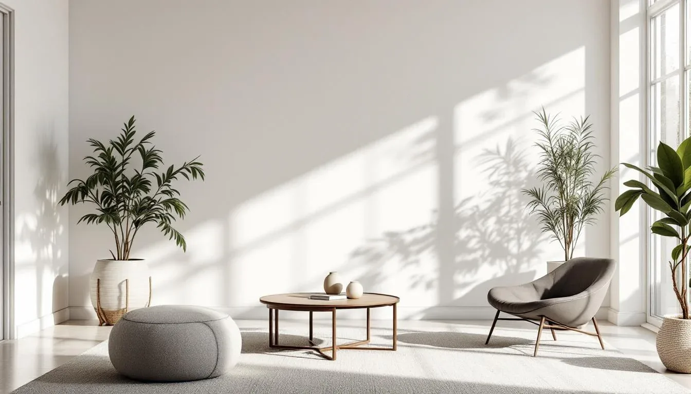
Step 3: Let Your Room’s Fixed Elements — Not Your Favorites — Lead the Selection
This is the step where emotional decision-making usually takes over — and where most paint regret originates. You found a color on Pinterest that stopped you cold. You fell for a shade at a friend’s house. You’ve wanted this particular sage green in your living room for two years. And none of that information is useful until you’ve looked at your fixed elements first.
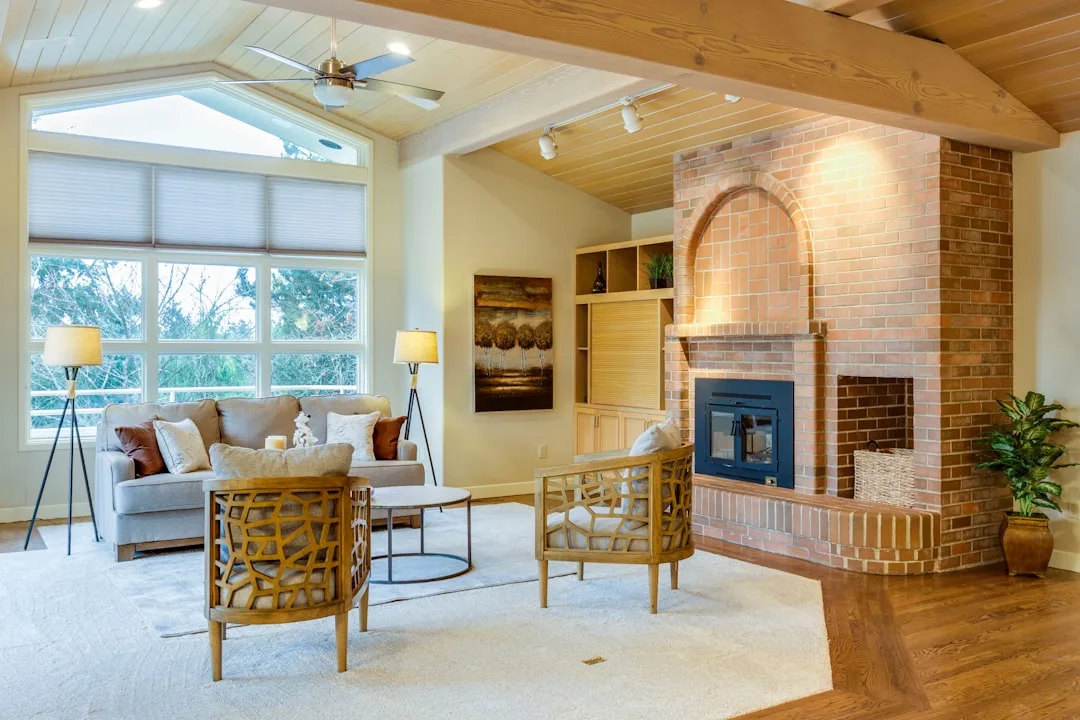
Fixed elements are anything that will not change with the paint: flooring, countertops, tile, brick, built-ins, major upholstered furniture, cabinetry, and architectural trim. These are your non-negotiables. They’re already in the room, they’re staying in the room, and your paint color has to work with all of them simultaneously.
The “love it in isolation” trap is real and it’s expensive. A color that thrills you in a design blog image is being photographed in a specific room with specific floors, specific trim, and specific light — most likely with a professional photographer adjusting white balance in post. It’s not your room. It’s essentially a different color in your room.
The practical method professional designers use:
- Pull the three dominant undertones from your fixed elements. Look at your floor, your primary upholstered piece, and your countertop or largest fixed surface. What undertone families do you see? Write them down.
- Treat those undertones as parameters, not inspiration. Your wall color must harmonize with all three simultaneously — not just one.
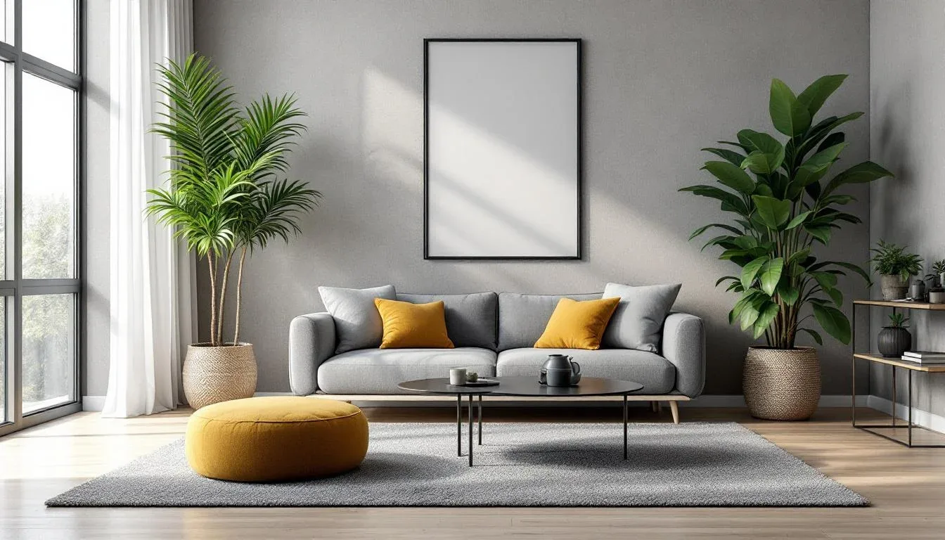
- Apply the 60-30-10 framework. Wall color represents roughly 60% of the visual space. It should function as a background that makes the 30% (major furniture) and 10% (accents and art) feel intentional and balanced — not competitive.
- Filter by function. A bedroom calls for colors in the blue, green, and soft neutral families that physiologically support rest. A kitchen benefits from colors that feel clean and energizing. A home office works best with colors that don’t distract. Define the room’s purpose before narrowing the palette.
Experienced interior designers consistently start with flooring and upholstery samples before ever opening a paint fan deck — a complete reversal of the instinctive process most homeowners use, which starts with a loved color and works backward. Starting with fixed elements isn’t limiting. It’s what makes the final choice feel inevitable and right.
Actionable takeaway: Before your next paint store visit, gather physical samples of your three most dominant fixed elements — a tile fragment, a flooring sample, a fabric swatch — and bring them with you. Hold paint chips directly against them in the store. You’ll eliminate 80% of the options immediately.
Step 4: Narrow to Three Candidates Using the Designer’s Shortlisting Method
Decision fatigue is a real obstacle in paint selection. Benjamin Moore alone offers over 3,500 colors. Sherwin-Williams carries more than 1,700. Standing in front of an entire wall of fan decks without a method isn’t choosing — it’s hoping. Here’s how to cut through it efficiently.
Begin with undertone as your primary filter. Most major paint brands — Sherwin-Williams, Benjamin Moore, Farrow & Ball — organize their collections by undertone or hue family on their websites and apps. Start there, not at the physical rack. Use the knowledge you’ve already gathered about your room’s light and fixed elements to identify your target undertone family, then filter to that family first.
Introduce LRV as your secondary filter. LRV, or Light Reflectance Value, measures how much light a color reflects on a scale from 0 (pure black) to 100 (pure white). It’s one of the most useful and underused tools in residential paint selection. Sherwin-Williams publishes LRV data for every color on its website — a free resource that most homeowners have never heard of.
Here’s how to use it practically:
- Rooms with limited natural light: Target wall colors with an LRV of 60 or higher to prevent the space from feeling dark and compressed
- Rooms with abundant natural light: You can go deeper — LRV in the 40–60 range will feel rich rather than oppressive
- Ceilings: Typically want LRV of 85 or higher to avoid visually lowering the ceiling height
Pull no more than five chips from your filtered range. Then eliminate any that feel too saturated or too muted relative to your room’s light level — bright rooms can carry deeper saturation; darker rooms need higher LRV to stay alive.
Your final three candidates should belong to the same undertone family but offer different values: one light, one medium, one slightly deeper. This setup gives you a meaningful test-patch comparison. If all three candidates are nearly identical in value, you won’t be able to see the real difference in your room.
Actionable takeaway: Look up the LRV for every color you’re currently considering on the Sherwin-Williams or Benjamin Moore website. If any of them fall below 55 and your room has limited natural light, remove them from consideration before you buy a single sample pot.
Step 5: The Test-Patch Protocol That Most People Skip — and Why It Changes Everything
Here’s what most people do when they test a paint color: they hold a chip against the wall for 30 seconds, nod, and move on. Here’s what that actually tests: nothing. The chip’s small size prevents your brain from evaluating how the color reads at scale, and the paper coating reflects light differently than flat or eggshell wall paint on a textured surface. You’re comparing two entirely different objects and calling it a test.
The correct test-patch method:
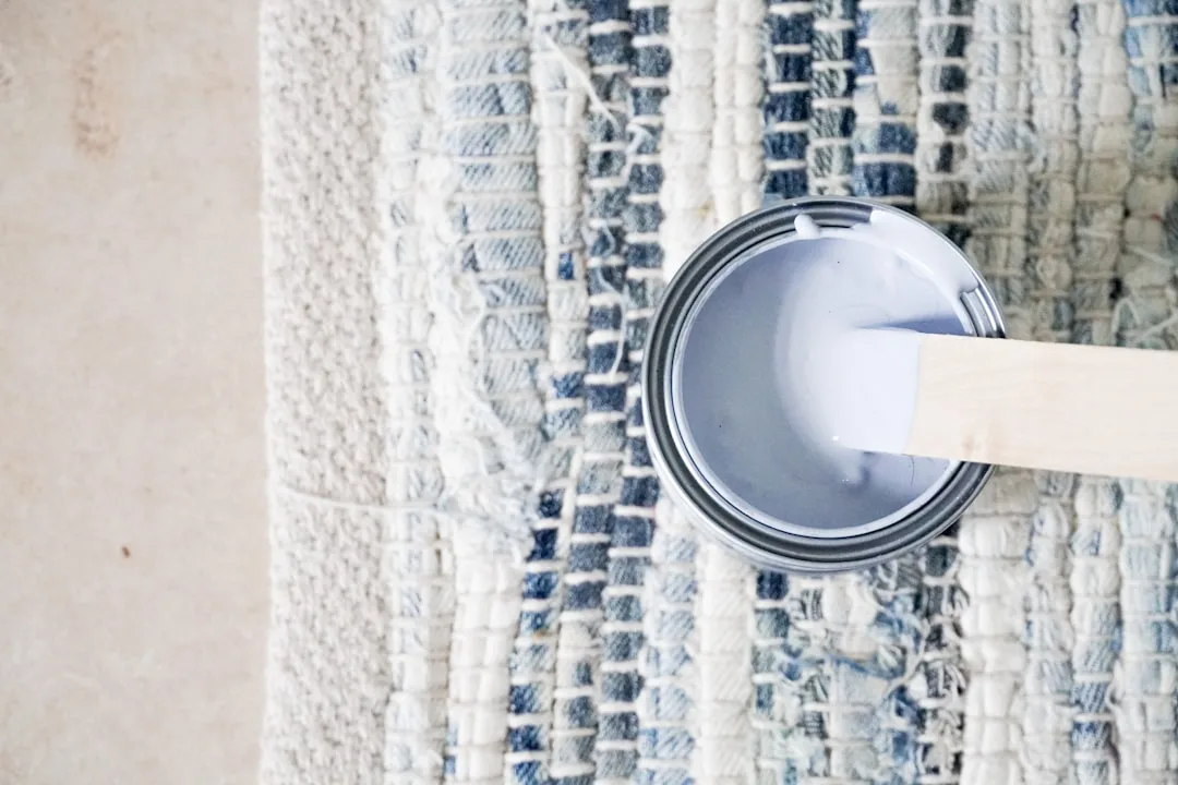
- Buy sample pots for all three candidates. At $5–$8 per pot at most major retailers, you’re making a minimal investment that can prevent a $200–$800 full-room repaint. Each pot covers a 12×24 inch test area with two coats.
- Paint directly on the wall — not on sample boards you move around the room. The wall’s texture, primer, and existing paint affect how the new color absorbs and dries. A portable board doesn’t replicate that.
- Make each patch at least 12×12 inches. Larger is better. Your eye needs enough surface area to actually evaluate the color at scale.
- Paint each patch near a corner, trim edge, or doorframe. You need to see the transition zone — how the paint undertone interacts with adjacent surfaces. A patch in the middle of a blank wall tells you almost nothing about how the color will behave in the real room.
- Evaluate at three separate times: morning natural light, afternoon natural light, and evening with your room’s artificial lights on. Photograph each condition — don’t rely on memory.
- Wait a full 24 hours before deciding. Wet paint reads approximately 10–20% darker than dried paint. Evaluating a wet patch is like choosing a haircut based on wet hair.
The most common version of this mistake: someone paints a patch, evaluates it while it’s still wet and under the wrong lighting, decides it’s too dark, and goes two shades lighter — then lives for years with a color that’s too pale because the original choice was actually correct when dry.
Actionable takeaway: Order your three sample pots this week and commit to the full 24-hour evaluation before making any decision. The 48-hour total investment of time will save you from the weeks of frustration that come with a wrong color at full scale.
Step 6: Account for Adjacent Room Colors and the Undertone Shift Effect
Open floor plans and connected hallways create a problem that most single-room paint guides never address: two wall colors existing in the same visual field at the same time, actively changing each other’s appearance.
This isn’t a matter of taste or preference. It’s a documented optical phenomenon. Simultaneous contrast — first systematically described by chemist Michel Eugène Chevreul in the 19th century and later formalized by Josef Albers in his foundational work Interaction of Color — explains why two colors placed adjacent to each other shift in perceived hue. A warm beige next to a cool gray will make the beige look more orange and the gray look more blue than either would appear in isolation. Your eyes and brain are constantly comparing colors against each other, and the comparison changes both.
In practice, this means your living room color and your hallway color aren’t independent decisions. They’re a system.
How to manage adjacent colors effectively:
- Run the flow test. Stand at every doorway and sightline in your home. Look at what’s visible from each position. Note every room color that appears in the same frame. These pairings need to be evaluated together, not separately.
- Anchor the whole home in one undertone family. If your main living areas are warm (yellow/orange undertone), keep all connected spaces in the warm family — vary by value and saturation, not undertone direction.
- Use value variation to create definition without conflict. Lighter in hallways and transitional spaces, slightly deeper in primary rooms. This creates flow and hierarchy without jarring transitions.
- Reserve contrast for visually isolated rooms. A deep, dramatic color in a powder bath or a windowless dining room can break completely from your main palette — because if there’s no direct sightline between the rooms, the simultaneous contrast effect doesn’t apply. Visual separation justifies chromatic separation.
The situation that catches most people off guard: a neutral they chose carefully for the living room suddenly reads completely differently once they paint the adjacent dining room. The colors shifted each other. Testing in isolation didn’t reveal the problem.
Actionable takeaway: Before finalizing any color, stand in the doorway between the two most connected spaces in your home and photograph both walls in the same frame. If you don’t like what they do to each other, one of them needs to move — regardless of how much you love it alone.
The Finish Formula: Matching Sheen Level to Room Function
You’ve gone through the entire process. You’ve identified the right undertone, matched your fixed elements, tested patches in real light, and confirmed the color works across adjacent spaces. Don’t let the final decision — finish level — undermine everything.
Sheen affects how a color reads, how much light a room feels like it has, and how long the paint job lasts. It’s not just a durability question. It’s a visual question.
Here’s the practical breakdown:
- Flat/matte: Absorbs light, hides surface imperfections, delivers the deepest, richest version of any color. Ideal for ceilings, low-traffic adult bedrooms, and feature walls. Not wipeable — a scuff mark is a permanent mark. Flat finishes reflect as little as 5–10% of light.
- Eggshell: The most versatile residential finish. Soft, barely-there sheen with enough durability for occasional cleaning. Works in living rooms, dining rooms, primary bedrooms — essentially any space that isn’t a kitchen or bathroom.
- Satin: Slightly more reflective than eggshell, noticeably more durable. Good for kids’ rooms, hallways, and spaces that take regular abuse. Wipes clean without damaging the finish.
- Semi-gloss: Reflects up to 70% of light — a significant contrast from flat’s 5–10%. Makes colors appear lighter and more vivid. Standard for trim, doors, cabinetry, kitchens, and bathrooms. The reflectivity is an asset in moisture-prone rooms; in large wall applications it can make imperfections glaringly visible.
- High-gloss: Reserved for trim details, furniture, and accent doors where the lacquer-like finish is an intentional design statement.
The same paint in flat versus semi-gloss reads as two different values. Flat appears slightly darker and more absorbed; gloss appears lighter and more saturated. If you’re debating between two values of a color, test both in both sheens — the combination might solve the problem.
Actionable takeaway: Decide your finish before you order the full gallons, not at the register. Write down each room, its traffic level, and your cleaning expectations — that alone will point you to the correct finish category and prevent you from defaulting to whatever the store labels “standard.”
Frequently Asked Questions
Why does my paint color look completely different on the wall than it did on the chip?
Several things happen simultaneously when paint goes from a small chip to a full wall. First, scale changes everything — a 2×3 inch chip physically cannot show you how a color reads at 400 square feet; colors read deeper and more saturated at large scale. Second, the chip’s paper coating reflects light differently than a textured, primed wall surface. Third — and most significantly — the undertone in the paint starts reacting to adjacent surfaces: your floors, trim, and furnishings all activate the secondary hue in the pigment in ways the chip couldn’t predict. A color with a green undertone looks perfectly neutral on a chip in isolation; on a wall flanked by warm wood floors, the contrast makes that green undertone appear immediately. The chip didn’t lie. It just couldn’t tell the whole story in isolation.
How do I find the undertone of a white paint before buying it?
The fastest method requires nothing more than a sheet of printer paper and daylight. Hold the paint chip flat against the printer paper and look at them side by side in natural light — not in a store under fluorescent bulbs. The printer paper is close to a true neutral white, and the contrast between it and the chip will reveal whatever secondary hue is embedded in the pigment. A chip that looks white in isolation will immediately read pink, yellow, green, or blue against the paper’s true neutral. You can also compare multiple white chips against each other — grouping them by the undertone they reveal. For online research, paint brands increasingly publish undertone information in the color descriptions, and design communities like Houzz and Design Seeds often include user-submitted photos showing whites in real room conditions across different light orientations.
What LRV should I look for in paint colors for a dark or north-facing room?
For rooms with limited natural light — north-facing, basement, or rooms with few or small windows — target wall colors with an LRV of 60 or higher. Below that threshold, the combination of limited incoming light and a color that reflects relatively little of it will make the room feel cave-like regardless of how beautiful the color is in a sunlit space. LRV data is freely published by Sherwin-Williams and Benjamin Moore on their websites for every color in their catalog — look for it in the color detail page. An important nuance: simply choosing a very light, high-LRV color isn’t the only solution. A medium-value color with a warm undertone (yellow-cream or soft peachy) can make a north-facing room feel warmer and more livable than a stark bright white with a cool undertone, even if the bright white has a higher LRV on paper.
How do I choose paint colors for an open floor plan so everything flows together?
The most reliable method is to anchor the entire open floor plan in a single undertone family and vary the colors only by value and saturation — not by undertone direction. For example, if your main living area uses a warm white with a yellow undertone, your adjacent kitchen should also use a warm white or a light warm neutral — not a cool gray that carries blue or green undertones. The visible contrast between those undertones creates the “something feels off” sensation that’s hard to name but impossible to ignore. Once you’ve locked in your undertone family, you can layer in depth: slightly lighter in transitional hallways, more saturated in intimate spaces like a dining room, deeper in a study that doesn’t connect directly to the main living area. The goal is a palette that reads like a family — related, not identical. Photograph your shortlisted colors together in the same frame before committing, not individually.
Start Here, Right Now
Pick one room. Go stand in it right now — not when you have time, now — and notice what the light looks like. What direction do the windows face? What time does the sun hit the floor directly? What do the walls look like at night under your current bulbs?
Write down three words that describe what the light does. That’s your light audit, started. Then pull out whatever flooring sample, fabric swatch, or tile piece is most dominant in that room and set it on the counter.
You’ve already done more than most people do before spending $400 on paint and four hours of their Saturday. The rest of the process builds from exactly this point.