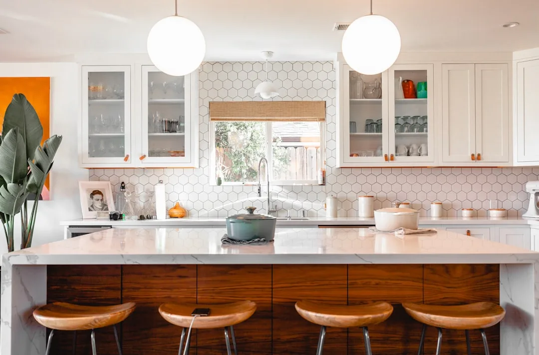
The kitchen that photographs beautifully and the one that photographs awkwardly often cost exactly the same — the difference is almost always the pairing, not the price of the materials. This is the core principle behind countertops and cabinetry by design: every surface decision exists in relationship to every other surface decision, and getting those relationships right matters more than any individual material choice. Spend $180 per square foot on a dramatic quartzite slab and set it against the wrong cabinet tone, and the whole room will feel confused. Spend $55 per square foot on a solid mid-range quartz, pair it correctly, and the space reads as intentional and expensive. This is not a secret designers are keeping from you. It is just not how most people are taught to shop.
Quick Answer
The kitchen that photographs beautifully and the one that photographs awkwardly often cost exactly the same — the difference is almost always the pairing, not the price of the materials.
Why Most Kitchen Makeovers Miss the Point Before a Single Cabinet Is Ordered
In This Article
- Why Most Kitchen Makeovers Miss the Point Before a Single Cabinet Is Ordered
- The Common Pairing Mistakes That Countertops and Cabinetry by Design Professionals See Every Time
- Should Countertops Be Lighter or Darker Than Cabinets? Here Is the Real Answer
- How Material Properties Affect Long-Term Pairing Satisfaction
- Is Granite Outdated in 2026? What the Surface Actually Looks Like Today
Somewhere between the inspiration board and the showroom, most homeowners stop thinking about the kitchen as a single visual system. They choose cabinets on one Saturday and countertops three weeks later, and they are mildly surprised when the combination feels off. I watched this happen repeatedly during my years working with clients in Chicago — not because they had bad taste, but because nobody told them that surfaces are in constant conversation with each other, and that conversation changes depending on what time of day you are having it.
The light issue is real and it is specific. A warm cream countertop that looked luminous next to white shaker cabinets under the halogen floods of a north shore showroom can turn distinctly yellow-gray in a north-facing kitchen in February. The swatch is not lying to you. The context is. This is why pulling samples into your actual kitchen — not a store, not someone else’s kitchen — and living with them through at least one full day of light is not a suggestion, it is the only reliable test.
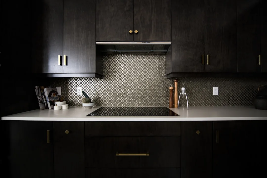
Visual weight is the concept that most budget-level design content glosses over entirely, which is maddening because it is one of the most practical frameworks available. Dark surfaces read as heavier, which makes a room feel smaller and more enclosed. Light surfaces recede and open space up. This is not about color preference — it is about how your eye processes density. A run of dark lower cabinets paired with a dark countertop in a galley kitchen is not just aesthetically bold, it is spatially risky unless there is significant natural light or reflective elements to counterbalance the mass.
Actionable takeaway: Before you finalize any cabinet or countertop selection, place a large physical sample of each surface in your kitchen simultaneously, under your actual lighting, at 8am and again at 6pm. If you still like what you see, proceed.
The Common Pairing Mistakes That Countertops and Cabinetry by Design Professionals See Every Time
Most pairing errors fall into a handful of repeatable patterns. Naming them specifically is more useful than offering general cautions, because most people do not recognize they are making one of these mistakes until after the installation is complete and the fabricator has left the building.
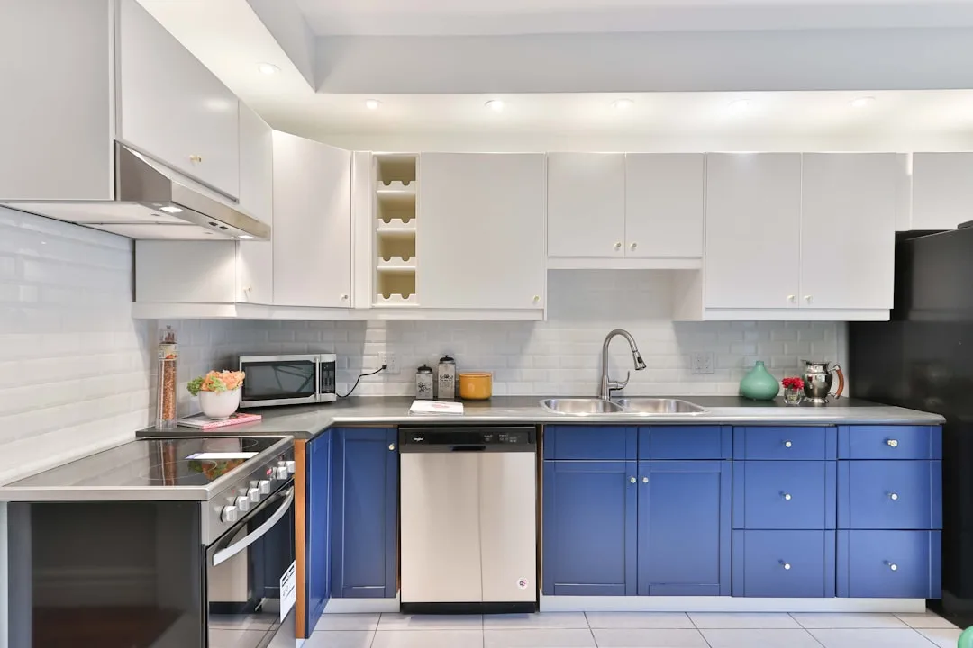
Undertone collision is the most frequent offender. Every neutral surface — white cabinets, cream countertops, beige tile, gray quartz — carries an undertone that is either warm (yellow, pink, red) or cool (blue, green, purple). When you pair a warm-white cabinet with a cool-gray countertop, neither surface looks wrong in isolation, but together they create a visual friction that reads as a cheap or unfinished result. The room looks like the materials were chosen separately, because visually they were. The fix is not choosing matching colors — it is choosing harmonizing undertones. A warm white cabinet wants a countertop with a warm gray, a creamy veining, or a soft beige base. A cool white cabinet opens up naturally to cooler marble-look surfaces, blue-gray stones, or stark contrast pairings.
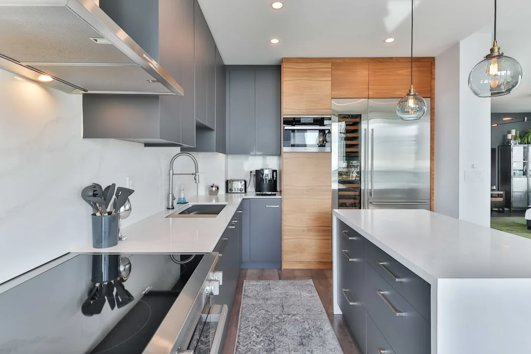
Finish uniformity is the subtler error and it shows up more in higher-budget kitchens than low ones, which surprises people. When every surface in a kitchen is matte — matte cabinet paint, honed countertop, matte hardware, flat tile backsplash — the room flattens out regardless of how beautiful the individual selections are. Light needs something to reflect off. The most livable and photogenic kitchens almost always carry at least two finish levels: one surface with sheen (polished stone, glazed tile, lacquered cabinet fronts, brushed metal) and one that absorbs light (honed stone, painted wood, flat plaster). The contrast between finishes is what gives a room its dimension.
Scale mismatch in pattern is less discussed but equally damaging. A countertop with large, dramatic veining reads as busy next to a cabinet door with heavy raised paneling. The eye has nowhere to rest. The principle that experienced kitchen designers apply without thinking about it: if the countertop has movement, the cabinet face should be calm, and vice versa. A plain shaker door paired with a heavily veined marble slab is a classic combination precisely because one surface is doing the visual work and the other is holding the frame. Both trying to be the statement piece results in a kitchen that feels exhausting rather than interesting.
Here is a practical checklist for evaluating any pairing before you commit:
- Do the undertones of both surfaces pull in the same direction (both warm or both cool)?
- Is there at least one matte and one reflective surface in the combination?
- Is one surface doing the visual work (pattern, movement, color) while the other recedes?
- Have you viewed both samples simultaneously under your kitchen’s light at multiple times of day?
- Have you checked both surfaces against your flooring and your wall color at the same time?
If you can answer yes to all five, the pairing is almost certainly going to hold up once it is installed.
Should Countertops Be Lighter or Darker Than Cabinets? Here Is the Real Answer
Let me say this plainly: the rule that countertops should be lighter than cabinets is a safe default, not a design law. It works consistently in low-light rooms and smaller kitchens because it keeps the eye moving upward and makes the space feel less compressed. But treating it as absolute has produced approximately ten thousand kitchens that are technically correct and completely boring.
The framework that actually matters is contrast calibrated to your conditions. High-contrast pairings — dark lower cabinets against a white or very light countertop — create genuine drama. They are also unforgiving. That drama requires strong natural light to land as striking rather than heavy, and it requires confident choices in every other surface in the room: the backsplash, the flooring, the hardware. Walk that combination into a galley kitchen with one north-facing window and it will feel like a hallway in a boutique hotel that has seen better days.
Tonal pairings — where the countertop and cabinet are close in value, meaning similarly light or similarly dark — feel sophisticated when they work and feel flat when they do not. The difference is texture. A warm putty cabinet paired with a creamy quartzite at a similar light value only reads as intentional if one of them has enough surface movement to separate them visually. Smooth-face cabinets next to a still, honed countertop with no variation is where tonal pairings go to die.
The 60-30-10 rule, applied specifically to kitchen surfaces, gives you a workable starting point:
- 60% dominant surface — your cabinetry, which covers the most visual square footage
- 30% secondary surface — your countertop, which anchors the eye at the working level
- 10% accent — hardware, backsplash tile, open shelf styling, or a statement light fixture
The 30% countertop role is important. It is not an afterthought. It is the surface you touch every day and the one that mediates between the wall color and the cabinet face — which is exactly why choosing it last, after everything else is already ordered, is such a consistent mistake. Countertops and cabinetry by design operate as a unified system, and the sequence in which you select them should reflect that.
One verified data point worth knowing: a 2023 National Kitchen and Bath Association study found that white or light-toned countertops were selected in 58% of new kitchen installations, largely paired with medium-toned wood cabinetry or navy. That tells you the default is lighter-countertop. It does not tell you that default is right for your kitchen.
It is also worth understanding how cabinet door style affects how a countertop reads, because the relationship between profile complexity and surface character is direct:
- Flat-front or slab cabinets are visually quiet and can support almost any countertop, including highly figured stone, bold color, and dramatic veining. They are the most flexible cabinet format from a pairing standpoint.
- Shaker cabinets carry a moderate amount of line and frame detail. They pair best with countertops that have either clear visual movement or clear tonal contrast — something that separates the countertop visually from the cabinet face.
- Raised-panel or inset cabinets have significant surface detail and should generally be paired with quieter countertop materials — solid surfaces, subtly veined stone, or low-pattern quartz — so the room does not compete with itself.
Actionable takeaway: Determine your light conditions first — measure natural light by compass direction and note how many hours of direct sun the kitchen receives daily. That answer should drive your contrast level before you ever look at a swatch.
How Material Properties Affect Long-Term Pairing Satisfaction
Most pairing advice stops at aesthetics, which is only half the problem. The other half is how surfaces age relative to each other — because a pairing that looks cohesive on installation day can look mismatched five years later if the two materials age at different rates or require incompatible maintenance.
Granite and painted cabinets are a common pairing, and they generally hold up well together over time because granite is highly resistant to staining and scratching when properly sealed, and quality cabinet paint maintains its finish for years without significant fading. The risk point in this pairing is the cabinet finish itself: flat or eggshell paint will scuff and mark near the countertop edge faster than the countertop shows wear, which means the cabinet ends up looking tired before the stone shows any age at all. Choosing at least a satin finish on cabinet interiors and edges adjacent to the countertop is a practical longevity decision, not just an aesthetic one.
Quartz countertops and wood or wood-look cabinets create a pairing question that involves UV exposure. Most engineered quartz is not UV-stable — prolonged direct sunlight can cause color shift or surface discoloration over years, particularly in lighter slabs with resin-heavy formulations. Natural wood cabinets, by contrast, darken slightly with age and UV exposure. In a kitchen with significant south or west-facing light, this means the countertop may lighten or discolor while the cabinets deepen — and the tonal relationship you selected originally shifts out of balance. This is not a reason to avoid quartz in sunny kitchens, but it is a reason to choose quartz slabs with lower resin content and to ask your fabricator specifically about UV performance ratings.
Marble and painted cabinets present a different long-term dynamic. Marble will develop a patina — a soft etching and gentle clouding from acidic contact that is either beautiful or distressing depending on your temperament. That patina actually harmonizes well with aged or gently distressed cabinet finishes, limed wood, and plaster-toned paint colors. It works against high-gloss lacquered cabinets over time because the perfection of the lacquer makes the marble’s aging look like damage rather than character. If you are drawn to marble, think about what your cabinets will look like in ten years as much as what they look like today.
A few practical pairings with documented long-term stability:
- Honed granite with painted inset cabinets — both surfaces age slowly and compatibly
- White quartz with flat-front thermofoil or lacquered cabinets — consistent finish maintenance keeps the pairing sharp over time
- Butcher block accent countertop paired with stone primary countertop — natural material variation between zones reads intentional and both surfaces develop character with age
- Soapstone with natural wood cabinets — both surfaces are warm-toned, both develop patina, and the aging is visually complementary
Is Granite Outdated in 2026? What the Surface Actually Looks Like Today
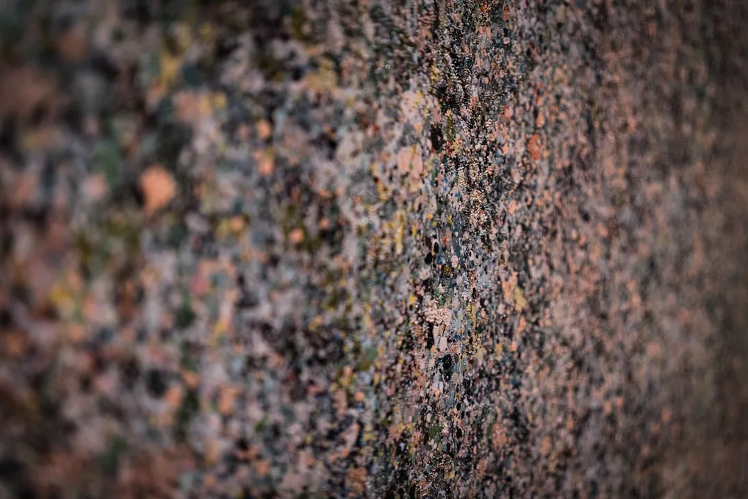
Granite developed a reputation problem it does not entirely deserve. What is actually outdated is a specific granite aesthetic — the uniform speckled beige or flat black slabs that appeared in roughly every developer-grade kitchen between 1998 and 2012. That aesthetic is dated. The material is not.
Here is the distinction worth making: granite is having a quiet, serious revival driven by exactly the quality that engineered stone cannot replicate — each slab is unique. Book-matched granite, where two adjacent slabs are opened like a book to create a mirror-image pattern across a kitchen island, is appearing in the same editorial spaces as unlacquered brass hardware and limewash plaster walls. The reason is that uniqueness itself has become valuable in a market saturated with engineered surfaces that look identical from one kitchen to the next.
The granites that read as current in 2026 share a few characteristics worth noting:
- Dramatic movement — large-scale veining, directional flow, or significant contrast within the slab rather than uniform speckle
- Less common colorways — blue granite, green granite, and warm terracotta-toned granites are appearing in high-design kitchens where neutral quartz would have been the default five years ago
- Leathered or honed finishes — the high-polish mirror finish that dominated the early 2000s reads as dated; the same stone in a leathered texture reads entirely contemporary
- Island-only applications — using granite as a statement material on the island while keeping perimeter countertops in a quieter engineered stone is a practical and visually effective approach
What makes granite pair well with current cabinetry directions is its warmth. The flat-front painted cabinet in sage, warm white, or greige that dominates current kitchen design has an organic quality that polished quartz can fight against. Granite, particularly in warmer tones or with natural movement, reads as belonging in the same material family as painted wood. It does not look like it came from a different design era the way a high-polish speckled slab sometimes does.
The practical consideration that often gets omitted from granite revival coverage: slab selection requires in-person decision-making in a way that engineered stone does not. You are selecting a specific slab, not a pattern, and the variation between slabs of the same named granite can be significant. Building time into your project schedule to visit a slab yard and tag specific pieces before fabrication is not optional — it is the step that determines whether you get the dramatic, singular result you are planning for or a competent but generic approximation of it.
Actionable takeaway: If granite is on your consideration list, visit a slab yard rather than a showroom sample. Bring a physical sample of your cabinet finish, hold it against multiple slabs in the yard under natural light, and tag the one that works rather than ordering by name or photograph.
Frequently Asked Questions About Countertops and Cabinetry by Design
Q: Do countertops and cabinets need to match in finish — both matte or both glossy?
No, and in most cases having both surfaces at the same finish level works against the room rather than for it. A kitchen where every surface is matte reads as flat, regardless of the quality of the individual materials. A kitchen where every surface is high-gloss can feel clinical and cold. The most successful pairings almost always carry at least two finish levels — one surface that reflects light and one that absorbs it. A polished stone countertop with painted matte cabinet fronts is a classic example of this working correctly. The contrast in finish is part of what gives the room depth and visual interest.
Q: I have dark lower cabinets already installed. What countertop colors actually work with them?
The most reliable options for dark lower cabinets fall into two categories. The first is high contrast — a light countertop, typically white, cream, or a light-veined marble or quartz, which creates a clear visual break and prevents the lower portion of the kitchen from feeling heavy. This works best in kitchens with strong natural light. The second is tonal continuity with texture — a countertop close in value to the dark cabinet, but with significant surface movement, veining, or a leathered finish that creates visual separation without brightness contrast. This approach works well in rooms with warmer, more enclosed atmospheres where the drama of a dark kitchen is intentional rather than accidental.
Q: How do I know if my countertop undertone matches my cabinet undertone without a designer’s help?
Bring a large physical sample of your countertop material and hold it directly against your cabinet door in your kitchen’s actual light. Look specifically at the white or neutral areas in both surfaces — if they look different colors next to each other, your undertones are not harmonizing. A warm-white cabinet next to a cool-white countertop will make one of them look dirty or yellowed. The test is simple and completely reliable if you do it in your own kitchen rather than a showroom.
Q: Is there a countertop material that pairs universally well with most cabinet colors?
Warm white or soft cream quartz with subtle, low-contrast veining comes closest to a universally workable countertop. It harmonizes with both warm and cool cabinet tones because the veining reads as neutral movement rather than strong color, it reflects light without being blinding, and it does not carry the strong undertone directionality that pure bright white surfaces do. It is not the most exciting choice, but it is genuinely compatible with a wider range of cabinet colors, hardware finishes, and flooring materials than almost any other option at a comparable price point. If you are uncertain about your pairing and need a surface that will hold the room together while other decisions get made, this is the practical answer.
Q: Can I mix countertop materials — for example, stone on the island and a different material on the perimeter?
Yes, and when done with intention it is one of the more effective ways to add depth to a kitchen without adding complexity to the cabinet selection. The principle that makes mixed countertop materials work is clear differentiation — the two materials should be visually different enough that the choice reads as deliberate rather than as a budget correction. A warm quartzite island against white quartz perimeter countertops works because the contrast in material character is obvious. A warm beige granite island next to a warm beige quartz perimeter looks like a close-but-not-quite match that was never resolved. When mixing, also consider how the materials will age relative to each other — surfaces that develop patina at very different rates can make the mixed-material choice look unbalanced over time.
Q: What is the biggest mistake people make specifically when selecting countertops and cabinetry by design principles?
Choosing the countertop after the cabinets are already ordered or installed. The countertop is not a secondary decision — it is the surface that mediates between the cabinet face, the flooring, the backsplash, and the wall color simultaneously. When it is selected as a final confirmation rather than as a design anchor, it has to work around constraints on every side rather than being chosen for what it does best. The sequence that consistently produces better results: establish your light conditions, choose your countertop material and general character first, then select cabinet color and finish to support it.
Q: Do countertops and cabinets need to match in finish — both matte or both glossy?
No, and in most cases having both surfaces at the same finish level works against the room rather than for it. A kitchen where every surface is matte reads as flat, regardless of the quality of the individual materials. A kitchen where every surface is high-gloss can feel clinical and cold. The most successful pairings almost always carry at least two finish levels — one surface that reflects light and one that absorbs it. A polished stone countertop with painted matte cabinet fronts is a classic example of this working correctly. The contrast in finish is part of what gives the room depth and visual interest.
Q: I have dark lower cabinets already installed. What countertop colors actually work with them?
The most reliable options for dark lower cabinets fall into two categories. The first is high contrast — a light countertop, typically white, cream, or a light-veined marble or quartz, which creates a clear visual break and prevents the lower portion of the kitchen from feeling heavy. This works best in kitchens with strong natural light. The second is tonal continuity with texture — a countertop close in value to the dark cabinet, but with significant surface movement, veining, or a leathered finish that creates visual separation without brightness contrast. This approach works well in rooms with warmer, more enclosed atmospheres where the drama of a dark kitchen is intentional rather than accidental.
Q: How do I know if my countertop undertone matches my cabinet undertone without a designer’s help?
Bring a large physical sample of your countertop material and hold it directly against your cabinet door in your kitchen’s actual light. Look specifically at the white or neutral areas in both surfaces — if they look different colors next to each other, your undertones are not harmonizing. A warm-white cabinet next to a cool-white countertop will make one of them look dirty or yellowed. The test is simple and completely reliable if you do it in your own kitchen rather than a showroom.
Q: Is there a countertop material that pairs universally well with most cabinet colors?
Warm white or soft cream quartz with subtle, low-contrast veining comes closest to a universally workable countertop. It harmonizes with both warm and cool cabinet tones because the veining reads as neutral movement rather than strong color, it reflects light without being blinding, and it does not carry the strong undertone directionality that pure bright white surfaces do. It is not the most exciting choice, but it is genuinely compatible with a wider range of cabinet colors, hardware finishes, and flooring materials than almost any other option at a comparable price point. If you are uncertain about your pairing and need a surface that will hold the room together while other decisions get made, this is the practical answer.
Q: Can I mix countertop materials — for example, stone on the island and a different material on the perimeter?
Yes, and when done with intention it is one of the more effective ways to add depth to a kitchen without adding complexity to the cabinet selection. The principle that makes mixed countertop materials work is clear differentiation — the two materials should be visually different enough that the choice reads as deliberate rather than as a budget correction. A warm quartzite island against white quartz perimeter countertops works because the contrast in material character is obvious. A warm beige granite island next to a warm beige quartz perimeter looks like a close-but-not-quite match that was never resolved. When mixing, also consider how the materials will age relative to each other — surfaces that develop patina at very different rates can make the mixed-material choice look unbalanced over time.