The average American kitchen-dining combo is 180 square feet — and most of them feel half that size not because of bad square footage, but because of one layout decision made on the day the furniture was delivered. Not the paint color. Not the lighting fixture. The moment someone centered a too-large table in the middle of the room and called it done. If you’ve been searching for small kitchen dining combo ideas that actually work, the answer almost never starts with a product — it starts with a framework for thinking about the room before anything is purchased or moved.
Quick Answer
The average American kitchen-dining combo is 180 square feet — and most of them feel half that size not because of bad square footage, but because of one layout decision made on the day the furniture was delivered.
I spent eleven years walking into these rooms. Chicago walk-ups, NYC railroad apartments, suburban open-plan kitchens where removing the wall somehow made everything worse. The problem was almost never the room. It was the way people had mentally sorted the space — or hadn’t sorted it at all — before a single piece of furniture was chosen.
This is a guide about layout logic, not product lists. If you want someone to tell you to buy a drop-leaf table, there are approximately ten thousand articles that will do that for you. What I want to give you is the framework that makes every subsequent decision — furniture, color, lighting, storage — actually work.
Why Most Eat-In Kitchens Feel Cramped Before You Buy a Single Piece of Furniture
In This Article
- Why Most Eat-In Kitchens Feel Cramped Before You Buy a Single Piece of Furniture
- The Zone-First Method: How to Mentally Divide the Room Before Touching Anything
- Table Geometry: Picking the Right Shape for the Room’s Actual Footprint
- The Small Kitchen Dining Combo Ideas That Designers Actually Use
- Why Lighting Is Doing More Zone Work Than Your Furniture Is
- The Measurements That Actually Matter (And How to Use Them)
- The Round Table Problem Nobody Writes About
Most people approach a kitchen-dining combo the way they’d approach a single room with one purpose. They set a budget, they browse furniture, they measure the table and check that it technically fits. And then they live in a room that makes them slightly miserable every day and can’t figure out why.
The root problem is zoning failure. A combined kitchen-dining room is asking one undifferentiated space to perform two jobs that have physically incompatible requirements. Cooking requires movement — a continuous, looping traffic flow from refrigerator to prep surface to stovetop to sink. Dining requires stillness. You cannot optimize a single space for both without deliberately drawing a line between them, even if that line is invisible.
Here’s the conflict that plays out in real rooms: the cooking path and the seating path overlap. Someone gets up to refill a glass and walks directly through the zone where someone else is carrying a hot pan. The table is placed where it technically fits — which is usually the center of the room — and suddenly you have zero clearance on four sides instead of generous clearance on two.
The 36-inch clearance rule from the National Kitchen & Bath Association exists precisely because of this overlap. The NKBA recommends a minimum of 36 inches between a kitchen island and any adjacent dining surface — yet most prefab dining sets are sized for rooms with at least a dedicated 10×10-foot dining footprint, making them structurally wrong for combined rooms under 200 square feet before you even account for the kitchen’s own clearance requirements.
Open-plan layouts make this worse in a specific way that nobody talks about. When you remove a wall to create an open kitchen-dining room, you gain square footage but lose the only natural divider you had. The wall was doing zone logic for you without you realizing it. Remove it, and suddenly both zones collapse into one undifferentiated blob — and you’re left with a bigger room that somehow feels more chaotic than the smaller one it replaced.
Common zoning mistakes in small kitchen dining combo ideas that people actually implement:
- Placing the table in the geometric center of the room instead of anchoring it to one wall or zone
- Choosing furniture sized for a dedicated dining room and forcing it into a combined space
- Ignoring the serving path entirely when planning furniture placement
- Treating the kitchen and dining areas as one visual zone with no distinguishing anchor elements
- Buying chairs that require more than 18 inches of pull-out clearance behind them
Actionable takeaway: Before buying or moving anything, identify where your cooking loop ends and your dining zone begins. If there’s no clear answer, that’s the problem — and everything else is downstream of fixing it.
The Zone-First Method: How to Mentally Divide the Room Before Touching Anything
Every designer I worked with — the good ones, anyway — started with activity corridors, not furniture. The question isn’t “where does the table go?” It’s “what paths do people walk, and how do I make sure those paths don’t sabotage each other?”
There are three distinct corridors in any kitchen-dining combo:
- The cooking path: Refrigerator → prep surface → stovetop → oven. This is a working corridor, and it needs to stay clear during meal preparation.
- The serving path: From stovetop or counter to the table. This is the one most homeowners underestimate. It needs a minimum clear width and shouldn’t require anyone to squeeze past chair backs.
- The seating path: The route people walk to sit down and stand up from the table, including the space chairs need to slide back.
These three paths should never cross. When they do — and in most combined rooms, they do — every meal becomes a minor negotiation of bodies in space.
Implied zoning is how designers create separation without walls. This is documented in NKBA planning guidelines as a technique where visual cues replace structural dividers to define use areas without reducing square footage. It works because the human eye interprets visual anchors as boundaries. A pendant light hanging over the dining table tells your brain “this area is different.” A shift in flooring material — even just a large area rug — communicates the same thing. Ceiling height variations, if you have them, do it most powerfully of all.
Visual zoning tools ranked by impact:
- Pendant lighting — hung 30 to 34 inches above the table surface, it creates both a visual ceiling for the dining zone and a practical task light. Nothing else signals “dining area” as efficiently.
- Area rugs — a rug sized to sit under all four chair legs even when pulled out anchors the dining zone to the floor plane. Minimum size for a four-person table is typically 8×10 feet.
- Flooring transitions — where you have the option, a material shift between kitchen tile and dining-zone wood or LVP does the zone work permanently without any furniture required.
- Color changes — an accent wall behind the dining table, or a different paint color on the ceiling above it, separates the zones without physical structure.
- Ceiling-height variation — a dropped soffit or tray ceiling above the dining area is the most architectural solution and works even in rooms without any other visual separation.
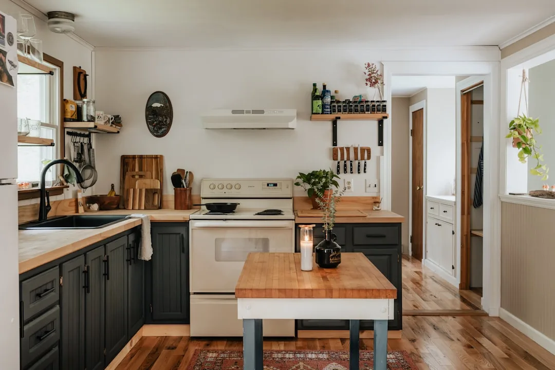
The anchor-point principle is the practical version of this. Every zone needs one dominant element that declares its purpose to anyone entering the room. For the kitchen zone, that’s usually the island or the range. For the dining zone, it needs to be the pendant light, the rug, or a banquette — something with enough visual weight that the eye registers it as a center of gravity.
I once watched a client spend $1,200 on a new dining set that made no difference whatsoever, because the zone logic underneath was broken. The table was in the right place but there was no anchor element over it — no pendant, no rug, no visual signal that this area was distinct from the kitchen counter eighteen inches away. It just read as “the part of the kitchen with chairs.”
Actionable takeaway: Before spending a dollar, sketch the three corridors on a piece of paper. Then decide where each zone’s dominant anchor element is. If you can’t name the anchor, the zone doesn’t exist yet.
Table Geometry: Picking the Right Shape for the Room’s Actual Footprint
“Get a smaller table” is the advice. It’s not wrong, exactly — it’s just nowhere near specific enough to be useful.
Shape determines footprint more than size does, and most people never think about this. A round table and a rectangular table that seat the same four people require dramatically different zones — not just different amounts of square footage, but different proportions of square footage.
Here’s what the measurements actually tell you:
- A round 42-inch diameter table seats four people and requires a minimum 9×9-foot zone when you account for chair clearance
- A 36×60-inch rectangular table also seats four, but demands a 9×12-foot zone — a 33% larger footprint for identical seating capacity
- A 36-inch square table seats four in a 9×9-foot zone and performs nearly identically to a round table in square rooms, but tucks against walls more efficiently
- A 24×48-inch drop-leaf table (leaves down) can function in a zone as small as 7×7 feet and expand for guests — the only format that genuinely changes its footprint on demand
- A banquette with a 30-inch-deep bench on two walls can seat six people in a corner zone as small as 5×7 feet, making it the highest-density option in real small kitchen dining combo ideas
Round tables have another advantage in combined kitchens that never appears in buying guides: the absence of corners. In a tight space, rectangular table corners are a daily hazard — they catch hips, obstruct traffic flow, and shrink every adjacent path by the width of a protruding corner. A round or oval table eliminates this entirely, which is why designers consistently reach for them in rooms under 150 square feet.
Which table shape to choose based on your room:
- Square room under 12×12 feet: Round or square table, pushed toward a wall
- Rectangular room under 10×14 feet: Drop-leaf rectangular or oval table anchored to the shorter wall
- L-shaped or galley kitchen with dining area at one end: Banquette in the corner, freeing the maximum floor area for kitchen clearance
- Open-plan room over 200 square feet: Standard rectangular table is viable, but zone anchoring still applies
The Small Kitchen Dining Combo Ideas That Designers Actually Use
Most of what circulates online as small kitchen dining combo ideas stops at “get a smaller table” or “use a kitchen island with stools.” Those aren’t wrong — but they’re the surface layer of a set of principles that go much deeper. Here’s what actually changes how a room functions.
Approaches that consistently work in real rooms:
- Banquette seating against a wall or in a corner — frees floor area that chairs would otherwise claim, and allows the table to sit closer to the wall because you don’t need chair-pull clearance on the banquette side. A corner banquette can recover 12 to 18 square feet of usable floor space compared to a four-chair arrangement
- Bench seating on one side of a rectangular table — same logic as a banquette but without built-ins. A bench slides under the table completely when not in use, which a chair never does
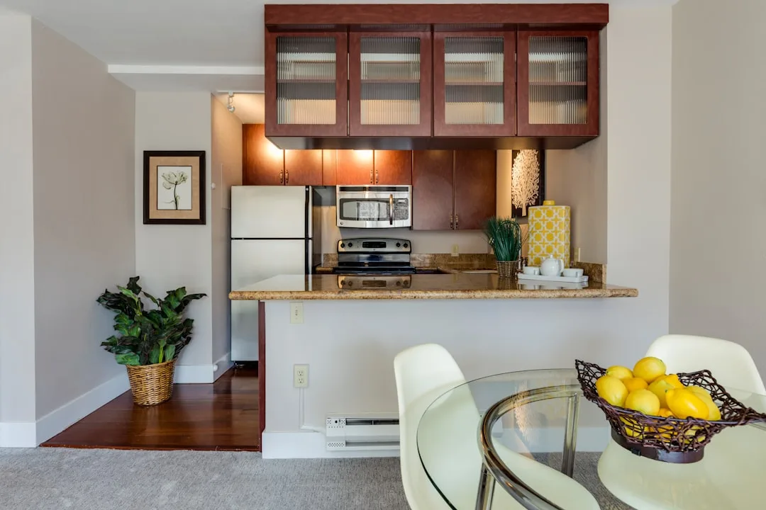
- Counter-height dining at the kitchen island — eliminates the dining zone entirely as a separate footprint. Works only if your kitchen has or can accommodate an island with overhang, and only if you’re comfortable with bar-height seating daily
- Drop-leaf or gate-leg tables — the only table format that genuinely changes its footprint based on demand. A drop-leaf at 24 inches wide takes up almost no floor space and expands to 48 inches when needed
- Floating shelves replacing a buffet or sideboard — in a combined room, freestanding storage competes with dining zone floor area. Floating shelves move storage to vertical space without occupying any floor footprint
- Mirrored or glass-top dining tables — don’t reduce the actual footprint but reduce the visual weight significantly, making the zone read as lighter and more integrated with the kitchen
- Monochromatic color across both zones — when walls, cabinetry, and dining furniture share a tonal palette, the room reads as unified rather than cramped. Two distinct color schemes in one small room creates visual noise that registers as clutter
Why Lighting Is Doing More Zone Work Than Your Furniture Is

Most combined rooms are lit the way offices are lit — flat, even, undifferentiated. One overhead fixture, maybe two, casting the same light across the entire room. This is the single fastest way to make a kitchen-dining combo read as one formless space rather than two distinct areas.
Layered lighting is how designers break this, and the logic is simple: different activities require different light qualities, and different light qualities create different zones.
The three-layer lighting framework for combined rooms:
- Task lighting in the kitchen zone — under-cabinet strips, pendant lights directly over the island or prep surface, recessed lighting positioned over work areas. This light is bright, direct, and functional. Color temperature: 3000–4000K.
- Ambient lighting in the dining zone — a pendant or chandelier hung 30 to 34 inches above the table surface, on a dimmer. This light is warm, diffuse, and social. Color temperature: 2700–3000K.
- Accent lighting as zone punctuation — toe-kick lighting under cabinets, lit open shelving, or picture lighting above art. This is the layer most people skip, and it’s the one that makes a room photograph well and feel considered rather than functional.
The pendant over the dining table is doing double duty: it’s providing task light for eating and it’s visually marking the dining zone as distinct from the kitchen. This is why “get a pendant” is advice that appears everywhere — it works, and it works at two levels simultaneously.
A dimmer switch on the dining pendant alone changes how the room feels at different times of day. Bright at lunch, dimmed at dinner — the same room communicates two different moods without a single thing moving.
The Measurements That Actually Matter (And How to Use Them)

Numbers matter more in combined rooms than in dedicated ones, because every inch of clearance is shared between two competing functions.
Critical clearances for small kitchen dining combo layouts:
- 36 inches — minimum clearance between kitchen work surfaces and any dining furniture (NKBA standard)
- 42 inches — preferred clearance when two people need to pass each other in the same corridor
- 18 inches — minimum chair pull-out clearance behind a seat (36 inches preferred for comfortable exit)
- 30 to 34 inches — pendant light height above table surface
- 12 inches — minimum table overhang for comfortable knee clearance at counter-height seating
- 24 inches — minimum width per person at a dining table (26 to 30 inches is comfortable)
- 80 inches — minimum ceiling height for a pendant that won’t feel oppressive over a dining table
How to use these numbers:
Before placing any furniture, tape out the footprints on your floor with painter’s tape. Include the chair-clearance zones, not just the table footprint. Then walk the three corridors — cooking, serving, seating — and confirm none of them overlap. If they do, the layout doesn’t work, regardless of how good the furniture looks in isolation.
This is the step that almost no one takes, and it’s the reason rooms that measured correctly on paper still feel wrong in person. The tape doesn’t lie.
The Round Table Problem Nobody Writes About

Round tables are universally recommended for small combined rooms, and the recommendation is mostly correct. But there’s a specific failure mode that gets ignored.
A round table in the wrong position doesn’t save space — it wastes it. Because a round table has no flat edge to push against a wall, it must float in space with clearance on all sides. In a room where you have one wall that could anchor the dining zone, a round table forces you to leave clearance behind it that a rectangular table (pushed against the wall on one edge) would never require.
The solution is an oval table, which gets overlooked almost entirely in standard advice. An oval table seats the same number of people as a comparable round table, has no corner hazards, and has two flat-ish ends that can sit closer to a wall without looking awkward. In rooms between 150 and 200 square feet, oval consistently outperforms both round and rectangular in combined space efficiency.
The alternative, if you want a round table, is to pair it with a banquette on one or two sides — which effectively gives the round table a wall to reference, recovers the clearance behind the banquette seats, and usually seats more people in the same footprint.
Round table + open chairs on all sides: beautiful in a showroom, problematic in a 12×14-foot combined room. Round table + banquette on two sides: the same visual, half the floor impact.
The layout decision you make before anything else enters the room is the one that determines whether every subsequent choice amplifies the space or fights it. Most people make that decision by default — by buying furniture that fits and placing it where it lands. The rooms that work are the ones where someone drew the corridors first, named the anchors, and checked the clearances before a single chair was purchased.
That’s not design intuition. It’s a sequence anyone can follow.
FAQ: Small Kitchen Dining Combo Ideas
Q: What’s the minimum square footage needed for a functional kitchen-dining combo?
A functional combined room can work in as little as 150 square feet, but only with specific layout choices — typically a banquette or bench seating against a wall, a round or drop-leaf table, and deliberate zone separation using lighting and a rug. Below 150 square feet, counter-height seating at an island is usually more practical than a separate dining zone.
Q: Is a kitchen island with seating a real substitute for a dining table in a small space?
Yes, but with conditions. Island seating works as a primary dining solution only if the island has a minimum 12-inch overhang for knee clearance, the stools are the correct height for the counter (bar height for 42-inch counters, counter height for 36-inch counters), and you’re comfortable eating at that height daily. For households with children or anyone with mobility considerations, island seating as the only dining option is often more practical in theory than in daily use.
Q: Should I use a rug in a kitchen-dining combo, and what size?
A rug in the dining zone is one of the most efficient zone-separation tools available — it costs less than furniture and works immediately. Size is where most people go wrong: the rug must be large enough that all four chair legs sit on it even when chairs are pulled out for seating. For a four-person table, that typically means 8×10 feet minimum. A rug that’s too small makes the room read as more crowded, not less.
Q: How do I stop a small combined kitchen and dining room from feeling like one chaotic space?
The two-anchor rule: give each zone one dominant visual anchor that declares its purpose. For the kitchen, that’s usually the range or island. For the dining zone, it needs to be a pendant light, a rug, or a banquette. When both anchors are present and correctly scaled, the room reads as two coordinated areas rather than one undifferentiated room. The anchors don’t need to match — they need to be distinct enough that the eye registers them as separate centers of gravity.
Q: What’s the single most impactful change in a small kitchen dining combo?
Lighting, specifically adding a pendant on a dimmer directly over the dining table. It costs less than new furniture, requires no layout change, and simultaneously solves zone separation and mood differentiation. Every other intervention — new table, new chairs, paint — works better after the lighting is right than before it.