When clients ask me about matching vs mismatched bedroom furniture, I tell them the same thing I’ve told everyone for eleven years: the question itself is almost never the real problem. The most expensive bedroom mistake isn’t buying the wrong furniture — it’s buying pieces that have no invisible logic connecting them, whether they match or not. I spent eleven years watching clients make this mistake from both directions: the couple who bought the full seven-piece mahogany suite and couldn’t breathe in their own room, and the woman who spent three years collecting pieces she loved individually but could never make work together. Neither problem was about matching. Both problems were about the absence of a deliberate system.
Quick Answer
The most expensive bedroom mistake isn’t buying the wrong furniture — it’s buying pieces that have no invisible logic connecting them, whether they match or not.
This article is about that system.
Should You Mix and Match Bedroom Furniture?
In This Article
Framing this as a yes-or-no question is part of why so much bedroom design advice fails. The real question is whether your choices feel deliberate or accidental — and that distinction has almost nothing to do with whether your pieces came from the same collection.
Mixing furniture pieces allows layering and personality that a single set simply cannot replicate. A room built over time — where the nightstand came from an estate sale, the dresser was your grandmother’s, and the bed frame was the one intentional new purchase — reads as inhabited in a way that no showroom floor can fake. Interior design surveys consistently show that personalized, layered bedrooms rank higher in perceived comfort and desirability than matched sets. The reasoning isn’t mysterious: the “curated over time” look signals that a real person lives there, not a catalog shoot.
Matching sets, on the other hand, offer something genuinely valuable: visual cohesion and decision efficiency. In small or visually busy rooms, repetition of finish and form actually calms the space down. That’s not a consolation prize — it’s a real design outcome.
What separates the designers who mix successfully from everyone else isn’t talent or budget. It’s that they work with invisible logic:
- Repeated finishes: even if no two pieces are alike, every piece belongs to either warm or cool finish territory
- Consistent undertones: wood tones that share a yellow or gray base don’t fight each other
- Unified scale: no single piece feels disproportionately heavy or light relative to the bed
- Era coherence: pieces that reference the same design period, even loosely, coexist naturally
Matching versus mismatching is a surface-level choice. The invisible logic underneath it is the actual design.
When clients come to me mid-project — having already bought two or three pieces they can’t make work together — the diagnosis is almost always the same: they optimized for each piece individually rather than for the relationship between pieces. A beautifully crafted mid-century walnut dresser and an equally beautiful French provincial nightstand are both excellent objects. They simply speak different languages. Getting mismatched bedroom furniture right means choosing pieces that may look different on the surface but share a grammatical structure underneath: the same weight class, the same finish temperature, the same degree of ornamentation.
The most reliable test I’ve found is what I call the squint test. Stand in the doorway of your bedroom and squint until the details blur. What you’re left with is pure shape, mass, and value. If the room still reads as balanced in that blurred state — if no single piece jumps forward or recedes awkwardly — the mix is working at the structural level. If something looks wrong even without detail, no amount of styling will fix it.
Actionable takeaway: Before buying anything, photograph your current room and identify whether your existing pieces share a warm or cool finish temperature. That single observation will tell you more than any style quiz.
Is Matching Bedroom Furniture Out of Style?
Poorly executed matching is out of style. Matching itself is not. I want to be precise about this because the conflation has caused real damage — clients tearing out perfectly good furniture because they read somewhere that sets were “dated.”
The specific aesthetic that earned a bad reputation is the big-box bedroom suite — the seven-piece dark-wood collection with gilded hardware that fills every wall from floor to ceiling, all purchased on the same Saturday afternoon. That look reads as visually exhausted not because the pieces match, but because the room has nowhere to rest. Every surface is doing the same thing at the same volume.
Google Trends data shows that searches for “bedroom furniture sets” remain consistently high year over year, which means the consumer appetite for matched sets has not collapsed. The style shift isn’t in whether people buy sets — it’s in how they style around them. The set becomes the foundation rather than the whole story.
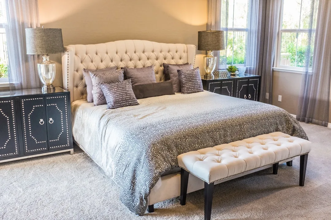
High-end designers still use matching pieces constantly. A paired set of nightstands flanking a bed is a compositional anchor, not a design failing. What those designers do differently is introduce deliberate contrast through:
- Textiles in a different color family than the wood tone
- Lighting that references a different material — rattan, ceramic, or forged metal
- Art that disrupts the expected symmetry
- One piece of furniture from a different era, used with editorial intention
Context also shapes the answer in ways most design advice glosses over. A vacation rental, a child’s room, or a guest room — spaces without a specific occupant’s personality to express — are natural fits for matched sets. The visual simplicity serves the space. A primary bedroom belonging to someone with a particular aesthetic history is a different conversation entirely.
Matched sets work exceptionally well in minimalist rooms: Japandi interiors, Scandinavian-influenced spaces, or any room where the goal is visual quiet. In those contexts, a matched set reads as restrained and intentional. The problem arises when a set designed for visual weight gets placed in a room that can’t carry it.
There’s also a practical argument for matched sets that rarely gets discussed honestly: they protect against the single worst outcome in bedroom design, which is a room that feels actively chaotic. Mismatched bedroom furniture done poorly doesn’t just look unpolished — it disrupts sleep psychology. Research on environmental stress consistently connects visual disorder with elevated cortisol and impaired sleep onset. A matched set eliminates that risk entirely. For clients who don’t want to manage the complexity of mixing, a set isn’t a compromise — it’s the right tool for the job.
The category has also improved significantly at every price point. The matched bedroom sets available today — particularly from Scandinavian and Japanese-influenced manufacturers — bear almost no resemblance to the heavy suites that generated the dated reputation. Clean lines, tapered legs, understated hardware, and neutral finishes have replaced the carved ornamentation and high-gloss veneers that defined the earlier generation. Dismissing matched sets as categorically old-fashioned requires ignoring the last decade of product development.
Actionable takeaway: If you own or are considering a matched set, ask whether your room’s architecture supports the visual weight of the collection — not whether matching is fashionable.
Should All Your Bedroom Furniture Be the Same Color?
Same color does not mean same finish, and this distinction is where most people lose the thread. Mixing a matte and satin version of the same tone — say, a flat-painted dresser alongside a lacquered nightstand in the same warm white — creates depth without clash. The eye reads them as related. It doesn’t read them as identical, which is actually the better outcome.
Warm and cool undertones are the most common color-mixing failure I saw in eleven years of client work. A cool gray-painted bed frame next to a warm walnut nightstand will almost always look unintentionally mismatched, regardless of how expensive or well-made the individual pieces are. The undertone conflict reads as an error even to people who can’t name what they’re seeing. They just know something feels wrong.
Color psychology research indicates that bedrooms with a cohesive but not identical palette — two to three harmonious tones — are associated with lower perceived visual stress and higher reported relaxation. The operative word is harmonious. That doesn’t mean identical.
A practical framework I’ve used with clients:
- Dominant tone (roughly 60%): the bed frame and largest storage piece — dresser, wardrobe, or armoire — should share a color family
- Secondary tone (roughly 30%): nightstands, a bench, or accent chair can introduce one contrasting element — but that contrast should feel chosen, not defaulted to
- Accent (roughly 10%): hardware, a lamp base, a tray on the dresser — this is where you can introduce a materially different finish without disrupting the whole
Two-tone approaches work particularly well when the contrast is intentional and anchored. A room with white-painted case goods and natural oak accents reads as deliberate. The same room with white-painted case goods and a stained pine nightstand reads as unconsidered — even if the actual color difference is smaller — because pine lacks the tonal clarity that makes oak a confident contrast partner.
One underused technique for mixed-color bedrooms is repeating a single material throughout the room at different scales. Brass, for example, appearing in drawer pulls, a mirror frame, and a lamp base creates a throughline that holds disparate wood tones together. The eye uses that repeated material as a connective thread, and the result is a room that reads as unified even when the furniture colors vary considerably. This is one of the main reasons that accessory and hardware choices matter far more than most people expect when dealing with matching vs mismatched bedroom furniture.
Natural wood tones deserve specific attention because they’re simultaneously the most forgiving and the most treacherous category. Within the same broad species — oak, for example — finish variations can push pieces toward completely different temperature territories. A wire-brushed white oak reads cool and Scandinavian. A honey-oiled oak reads warm and organic. A cerused or fumed oak reads moody and almost gray. Treating these as interchangeable because they’re “both oak” is a mistake that produces exactly the low-grade visual discomfort that clients can feel but rarely diagnose. When mixing natural wood tones, sample chips held next to each other in your actual room lighting are non-negotiable — photograph references are categorically unreliable for undertone comparison.
Actionable takeaway: Identify the undertone of your dominant piece first — warm, cool, or neutral — and use that as the filter for every subsequent purchase. Pieces that don’t pass the undertone filter don’t enter the room, regardless of how good they look in isolation.
How to Mix Bedroom Furniture Without It Looking Like a Mistake

The difference between a deliberately mismatched bedroom and an accidentally mismatched one is usually visible within about four seconds of entering the room. What creates that immediate read isn’t any single element — it’s the accumulation of small decisions that either signal control or signal drift.
The most reliable way to mix bedroom furniture successfully is to impose one non-negotiable constraint and then allow variation within it. That constraint can be finish temperature, material family, design era, or color palette — but it must exist, and it must be enforced consistently. Without it, even beautiful individual pieces accumulate into visual noise.
Here’s how that works in practice across different constraint types:
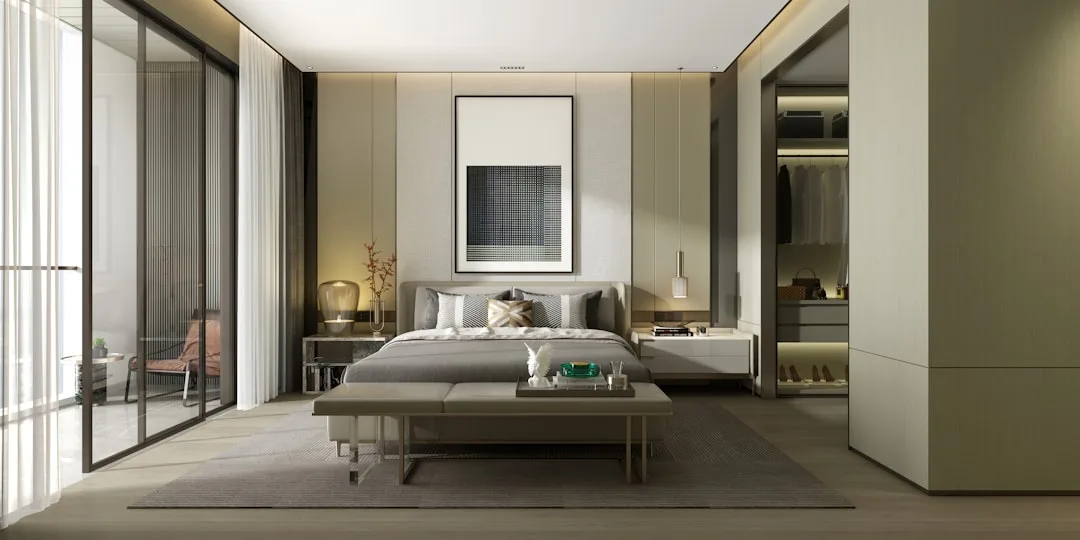
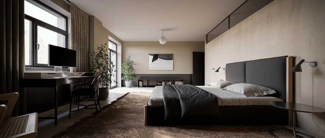
Finish temperature as the constraint: Every piece in the room must read warm or every piece must read cool. Within that rule, you can vary wood species, paint color, material, and style period freely. A warm room can contain walnut, rattan, aged brass, terracotta linen, and a caramel-leather bench without conflict because every element belongs to the same temperature family. Introduce one cool-toned piece — a gray-washed nightstand, chrome hardware, a blue-based white paint — and the warm logic unravels.
Material family as the constraint: Natural, organic materials — wood, linen, stone, leather, rattan — have a strong internal coherence even when they vary in color and form. A room built entirely from natural materials can mix considerably in tone and era because the material language holds everything together. This is the organizing principle behind most successful organic-modern and Japandi bedrooms. The constraint isn’t color — it’s the exclusion of synthetic or industrial materials from the primary furniture palette.
Design era as the constraint: Pieces referencing the same twenty-to-thirty-year window in design history tend to coexist without friction, even when they differ in color, finish, and scale. Mid-century pieces share proportional logic — tapered legs, low profiles, restrained ornamentation — that creates family resemblance across different manufacturers and materials. The same is true for Arts and Crafts, Art Deco, and contemporary minimalism. Mixing eras deliberately is an advanced technique; mixing them accidentally is how you get a room that feels confused.
Scale is the variable that even experienced decorators underweight. A bed frame with a tall, upholstered headboard creates a visual mass that requires corresponding weight elsewhere in the room to feel balanced. Pairing it with low-slung, light-framed nightstands produces the design equivalent of a top-heavy diagram. The fix isn’t matching — it’s finding nightstands with enough visual presence to hold the relationship, whether or not they share a finish with the bed.
The Real Cost of Getting This Wrong
Most discussions of matching vs mismatched bedroom furniture treat it as a purely aesthetic question. It’s not. The bedroom is the room where you spend the most unconscious time, and environments that produce low-grade visual stress — even stress you can’t consciously identify — affect sleep quality, morning mood, and the general feeling of being at home in your own life.
This isn’t abstract. Clients who finally resolved a bedroom that had never quite worked — sometimes after years of living with it — consistently described the change in functional terms: they slept better, the room felt easier to leave in the morning, they stopped avoiding it in the evenings. None of them could have articulated beforehand that the problem was undertone conflict between their nightstands and their bed frame. They just knew the room felt wrong.
The investment in getting the logic right — whether that means a matched set executed with thoughtful contrast, or a carefully assembled mix that shares invisible structure — pays returns that no individual piece of furniture can match. The goal was never matching or mismatching. The goal was a room that works.
Frequently Asked Questions
Is it okay to have mismatched nightstands?
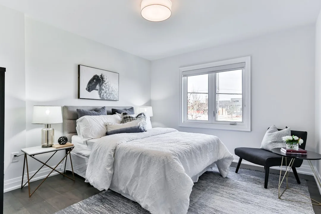
Yes — mismatched nightstands are one of the most effective single moves in bedroom design when done with intention. The key is that asymmetry should feel chosen rather than circumstantial. Nightstands that differ in form but share a finish tone, or differ in material but share a scale, read as a deliberate design decision. Nightstands that differ in every dimension — height, color, material, style period — read as two pieces that happened to land on either side of a bed. The former adds personality. The latter adds noise.
Can you mix wood tones in a bedroom?
You can, and it often produces richer results than a single wood tone throughout. The practical limit is two or three distinct tones, and they need to share either temperature (all warm, all cool) or value (all light, all medium, all dark). The most common successful combination is a medium-tone primary wood — walnut, oak, teak — paired with either a lighter natural accent or a painted piece in a coordinating color. The combination that consistently fails is warm and cool tones in equal proportion with no third element to mediate between them.
Do bedroom furniture pieces need to match?
No, but they need to share invisible logic — some organizing principle that creates coherence beneath the surface variation. That principle can be finish temperature, material family, design era, scale, or color palette. Without at least one of those shared elements, pieces that don’t match also won’t cohere, and the room will read as accidental regardless of the quality of individual pieces.
How do you make mismatched bedroom furniture look intentional?
Three reliable techniques: first, repeat one material or finish throughout the room at different scales — hardware, a lamp base, a mirror frame — to create a visual throughline. Second, impose a strict constraint on finish temperature and hold to it even when a piece you love violates it. Third, address scale deliberately: every piece should feel proportionally related to the bed, which is the visual anchor of the room. When scale is right, differences in style and finish read as variety rather than error.
What’s the difference between a matched set and a coordinated bedroom?
A matched set is furniture purchased as a collection from a single manufacturer, designed to be used together, sharing the same finish, hardware, and proportional language throughout. A coordinated bedroom is any room — whether built from a set, from mixed sources, or from inherited pieces — where the elements share enough invisible logic to read as unified. A matched set is one way to achieve a coordinated bedroom. It’s not the only way, and it doesn’t guarantee that outcome on its own — a matched set in a room with conflicting textiles, lighting, and architectural finish can still read as incoherent.
Is it okay to have mismatched nightstands?
Yes — mismatched nightstands are one of the most effective single moves in bedroom design when done with intention. The key is that asymmetry should feel chosen rather than circumstantial. Nightstands that differ in form but share a finish tone, or differ in material but share a scale, read as a deliberate design decision. Nightstands that differ in every dimension — height, color, material, style period — read as two pieces that happened to land on either side of a bed. The former adds personality. The latter adds noise.
Can you mix wood tones in a bedroom?
You can, and it often produces richer results than a single wood tone throughout. The practical limit is two or three distinct tones, and they need to share either temperature (all warm, all cool) or value (all light, all medium, all dark). The most common successful combination is a medium-tone primary wood — walnut, oak, teak — paired with either a lighter natural accent or a painted piece in a coordinating color. The combination that consistently fails is warm and cool tones in equal proportion with no third element to mediate between them.
Do bedroom furniture pieces need to match?
No, but they need to share invisible logic — some organizing principle that creates coherence beneath the surface variation. That principle can be finish temperature, material family, design era, scale, or color palette. Without at least one of those shared elements, pieces that don’t match also won’t cohere, and the room will read as accidental regardless of the quality of individual pieces.
How do you make mismatched bedroom furniture look intentional?
Three reliable techniques: first, repeat one material or finish throughout the room at different scales — hardware, a lamp base, a mirror frame — to create a visual throughline. Second, impose a strict constraint on finish temperature and hold to it even when a piece you love violates it. Third, address scale deliberately: every piece should feel proportionally related to the bed, which is the visual anchor of the room. When scale is right, differences in style and finish read as variety rather than error.
What’s the difference between a matched set and a coordinated bedroom?
A matched set is furniture purchased as a collection from a single manufacturer, designed to be used together, sharing the same finish, hardware, and proportional language throughout. A coordinated bedroom is any room — whether built from a set, from mixed sources, or from inherited pieces — where the elements share enough invisible logic to read as unified. A matched set is one way to achieve a coordinated bedroom. It’s not the only way, and it doesn’t guarantee that outcome on its own — a matched set in a room with conflicting textiles, lighting, and architectural finish can still read as incoherent.